Daily UI: 100 Day Design Challenge
My full collection of Daily UI challenges. 100 days, 100 prompts, 100 different UI components and screens. A personal project to build speed, sharpen instincts, and experiment outside of client work.
The Daily UI challenge
The Daily UI challenge is a 100-day series of design prompts sent straight to your inbox. Each prompt is a different UI component or screen. It’s a great way to sharpen your skills, build speed and experiment with ideas outside of client work. Here’s my full collection.
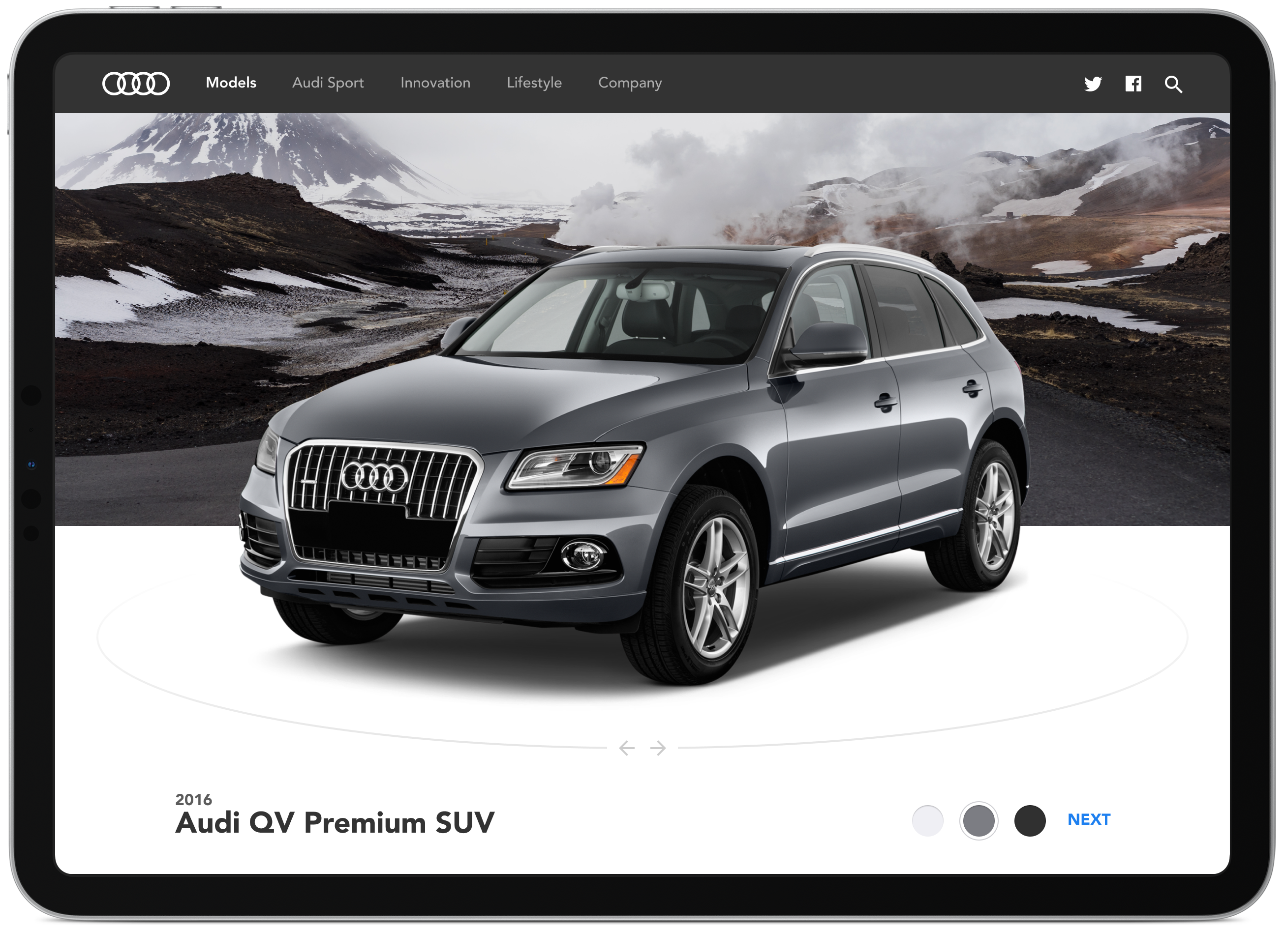
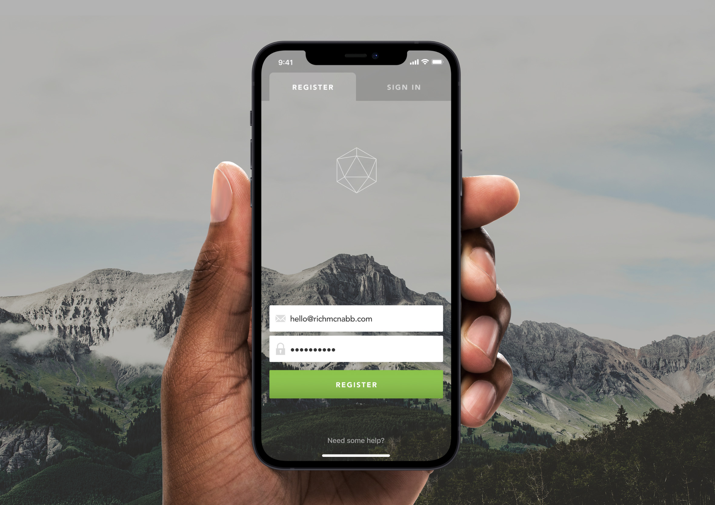
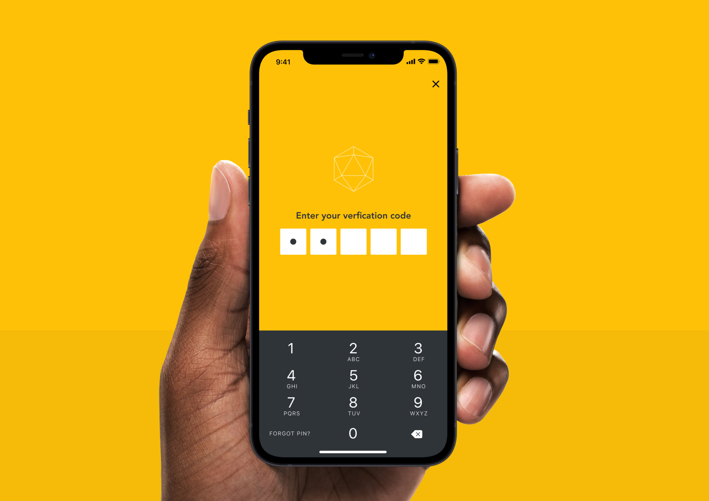
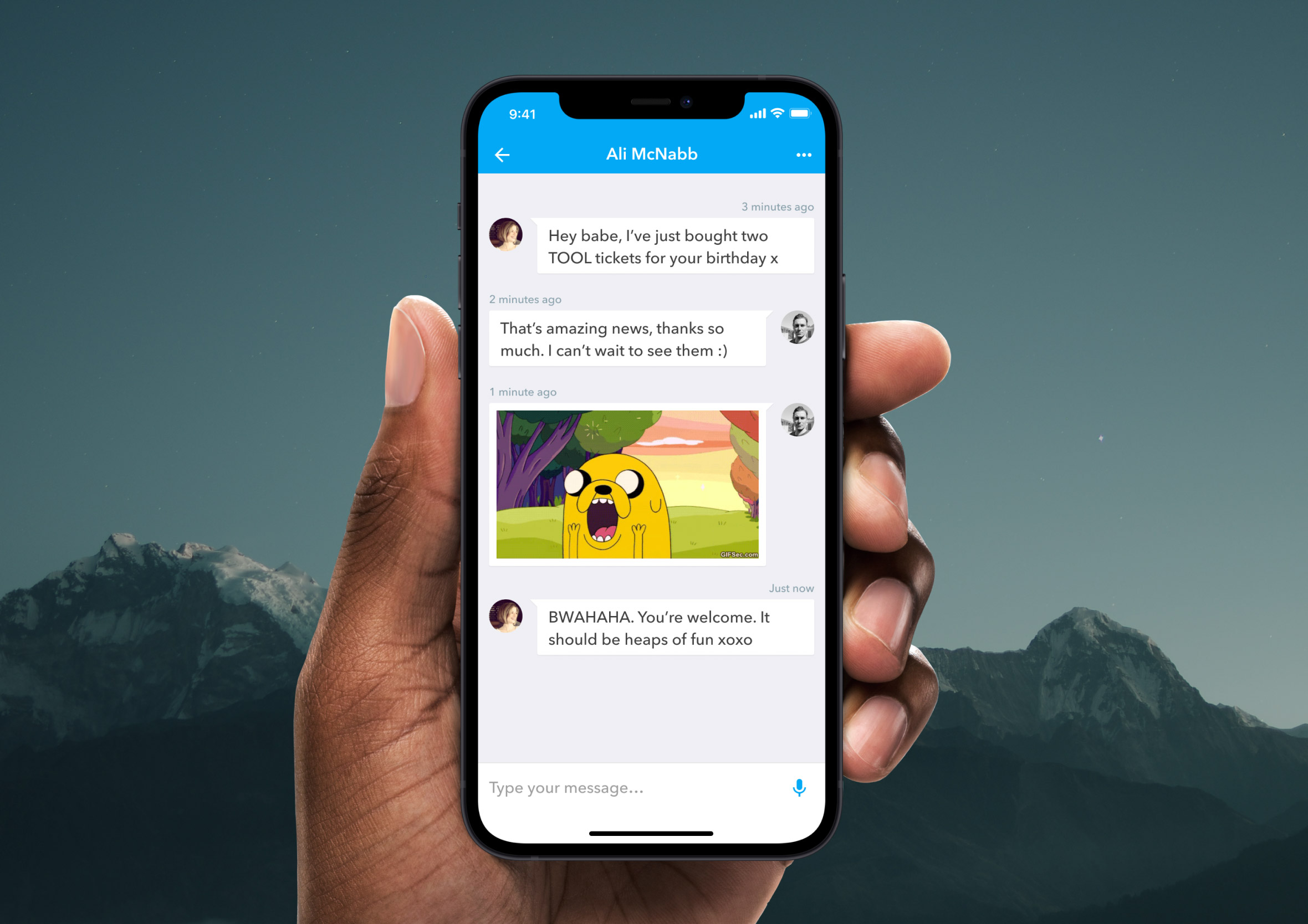
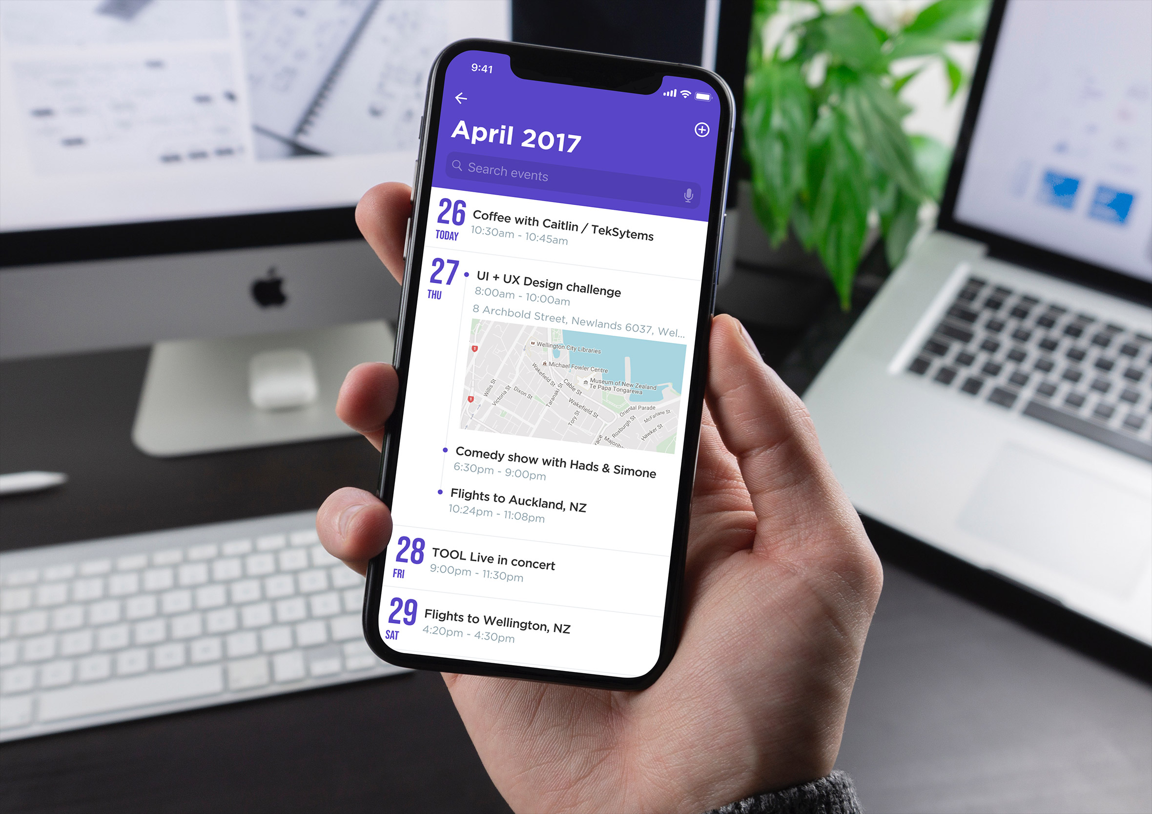
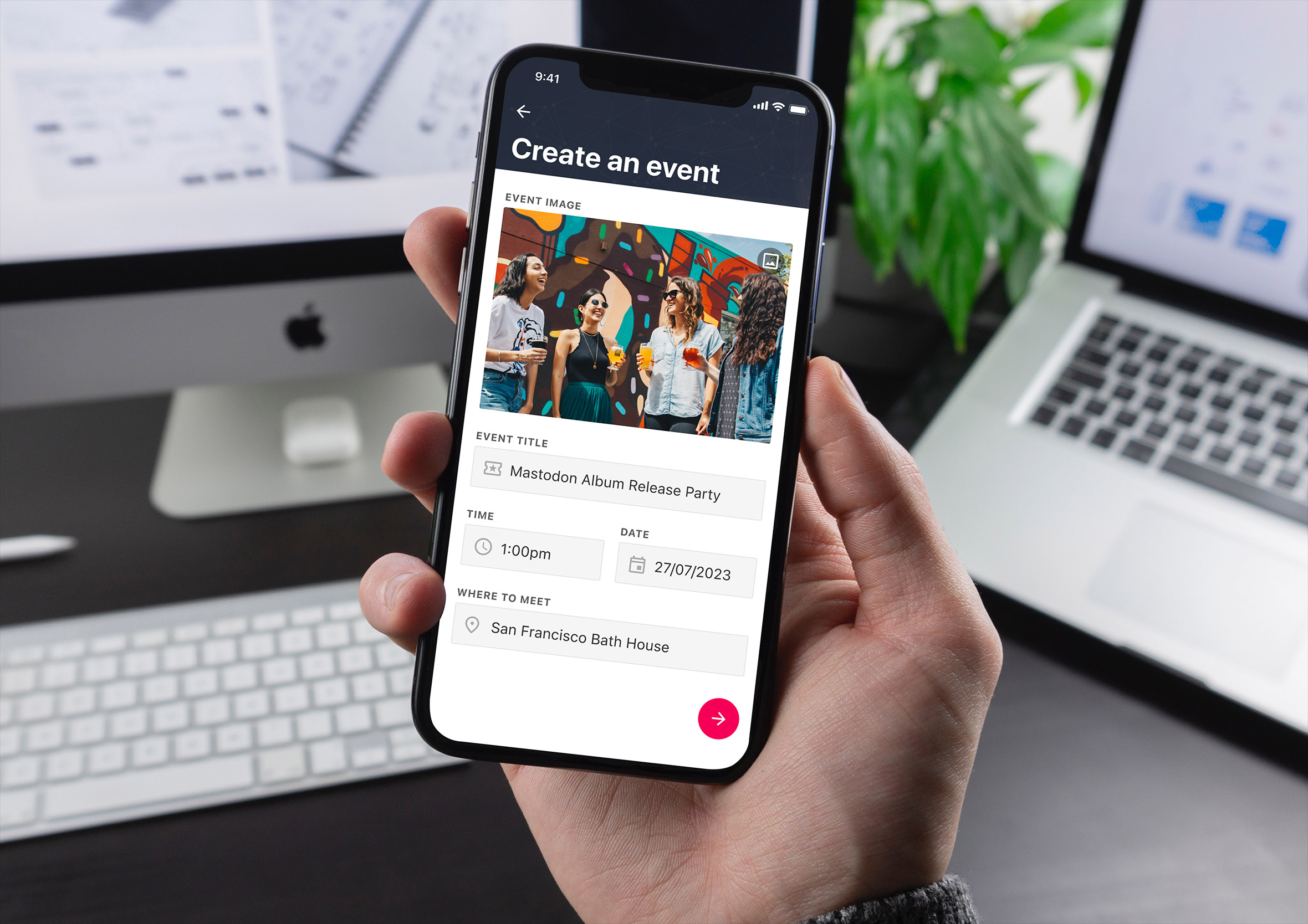
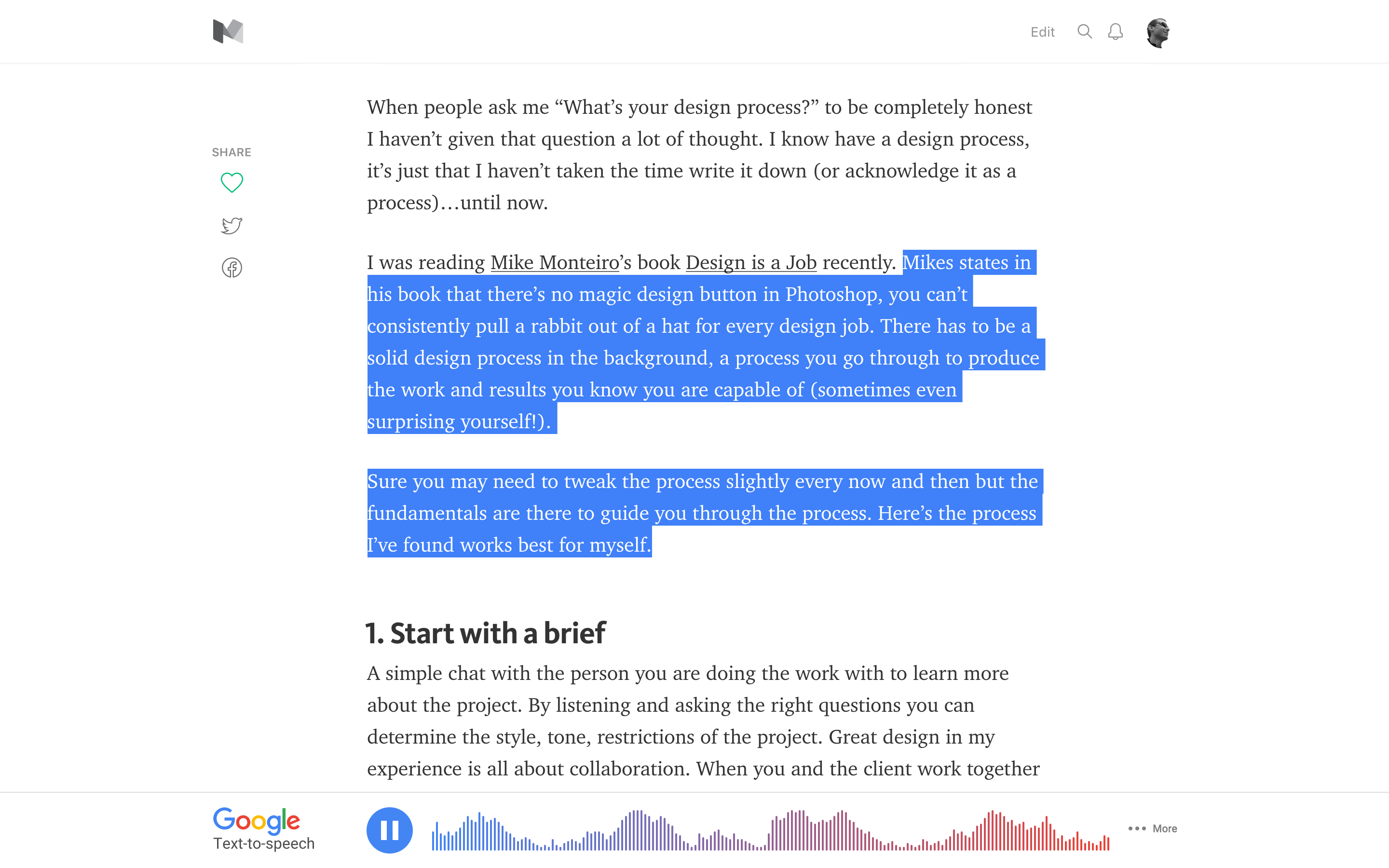
Day 1: Sign up
Challenge: “Design a sign up page, modal, form, app screen, etc”. I decided to experiment with a few different concepts (normal, pin number and tabbed for sign-up/sign-in).
Sign up forms are deceptively tricky. On the surface it’s just a few fields and a button, but get it wrong and you’ve lost someone before they’ve even seen what your product can do. I explored three different concepts here: a clean conventional approach, a PIN-based flow borrowed from banking apps, and a tabbed sign-up / sign-in toggle. Each one solves the same problem with a different level of friction.
The tabbed version was the most interesting to design. That switch between “I’m new” and “I’m back” is a moment a lot of designers get wrong. Too close together and people tap the wrong one. Too far apart and the UI feels disconnected. Getting the active state to feel obvious without being heavy-handed took a few iterations.
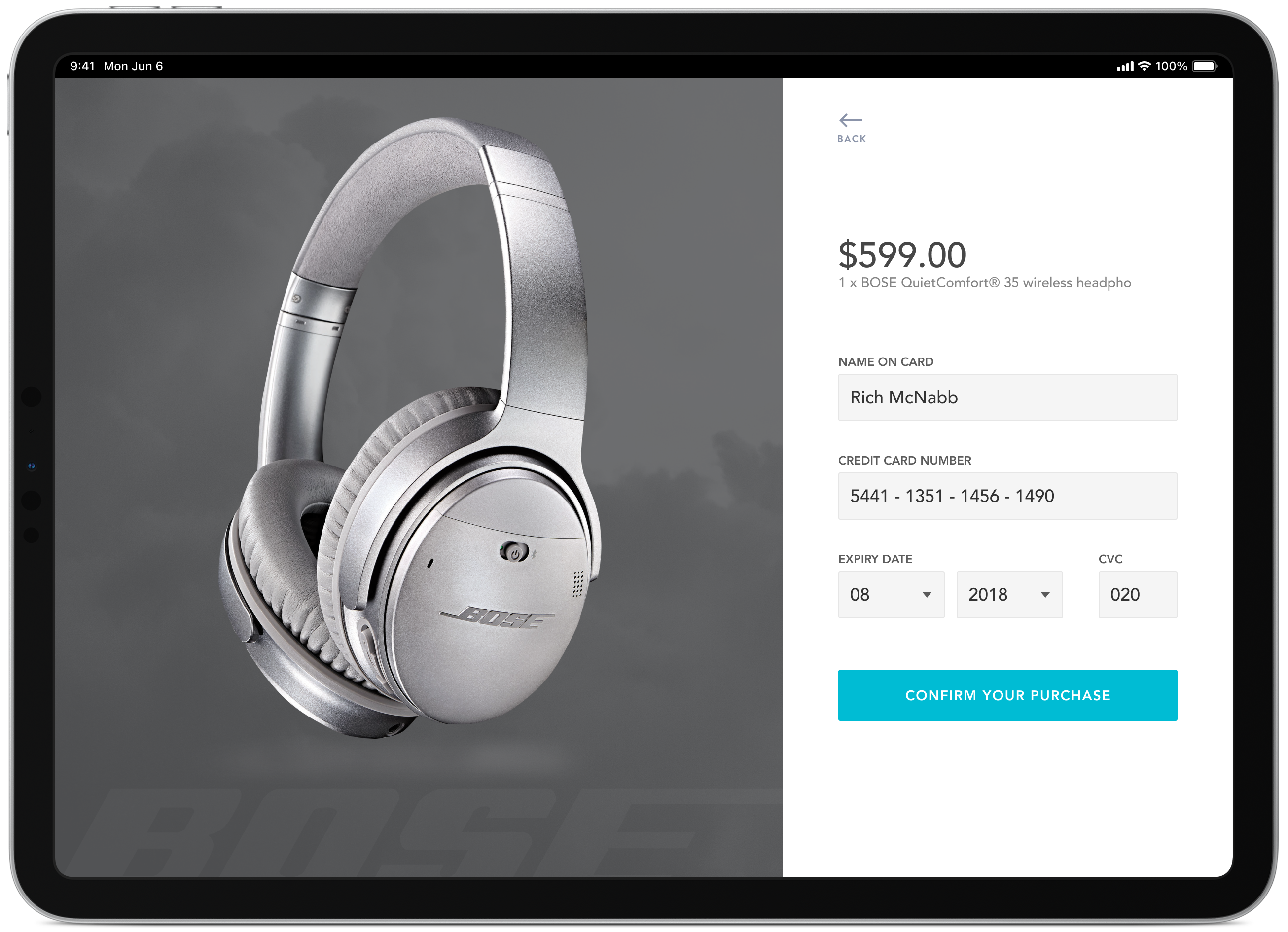
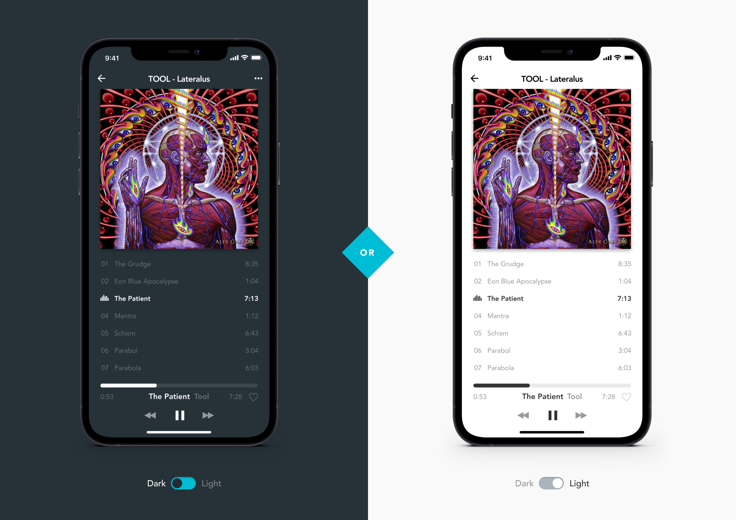
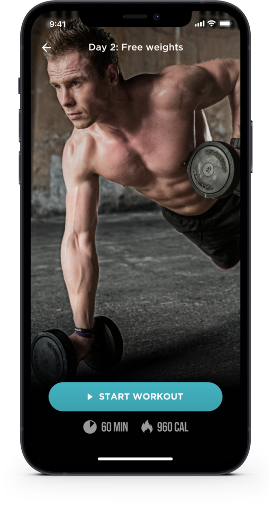
Day 2: Credit card checkout
Challenge: “Design a credit card checkout form or page. Don’t forget the important elements such as the numbers, dates, security numbers, etc”. I experimented with a light and dark version of the design.
There’s an unwritten rule in checkout design: the page needs to feel trustworthy before a single field is filled in. I went light and dark on this one to compare how each version affected the overall tone. The dark version leans into that high-security fintech aesthetic. The light version is more approachable, closer to a standard retail experience.
The card preview that updates as you type was the detail I spent the most time on. It sounds like a nice-to-have, but it does real UX work. It confirms the input is landing in the right place and closes a small but important feedback loop that builds confidence at exactly the right moment.
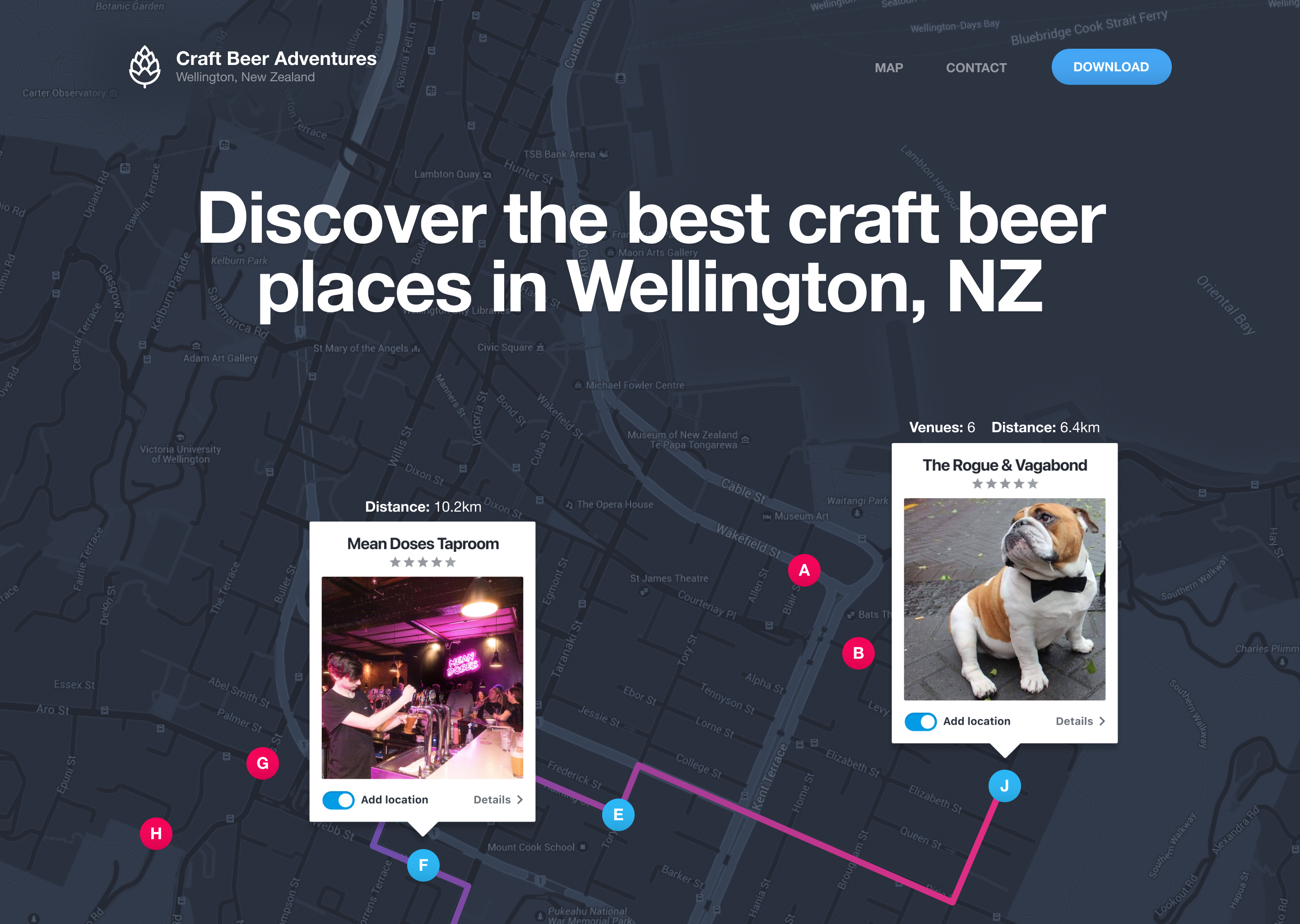
Day 3: Landing page
Challenge: “Design a landing page. What’s the main focus? Is it for a book, an album, a mobile app, a product? Consider important landing page elements (call-to-actions, clarity, etc.)” I wanted to convey how the app looked and how it worked.
I used this prompt to design a landing page for a Wellington craft beer iPhone app concept. The brief I set myself was simple: make someone want to download this before they’ve read a single word of copy. That meant leading with the UI, not a description of it. Show the app, not a tagline about the app.
What I kept coming back to was hierarchy. A landing page with too many calls to action is a landing page with no call to action. Every element either earns its place by moving someone toward that download button, or it shouldn’t be there.
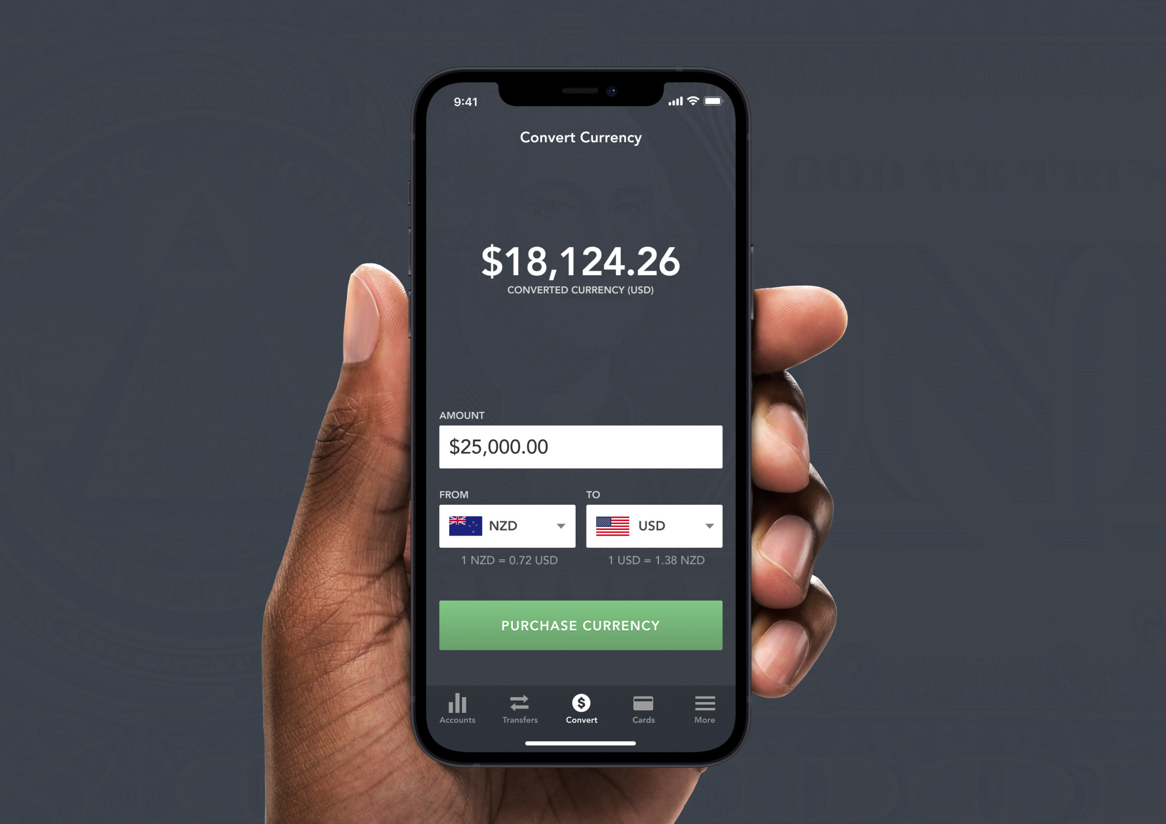
Day 4: Calculator
Challenge: “Design a calculator. Standard, scientific, or speciality calculator for something such as a mortgage? Is it for a phone, a tablet, a web app?” I tried to think outside of the box on this one and designed a banking app that lets you convert currency for people travelling overseas.
I didn’t design a standard calculator. The interesting question with this prompt isn’t what the buttons should look like, it’s what a calculator could be genuinely useful for in a real context. My answer was currency conversion for travellers: a banking app feature that lets you check what your money is worth before you spend it overseas.
The tricky part was that neither number is the “answer” in the traditional calculator sense. Both currencies carry equal weight depending on which direction you’re converting. That single constraint shaped most of the layout decisions.
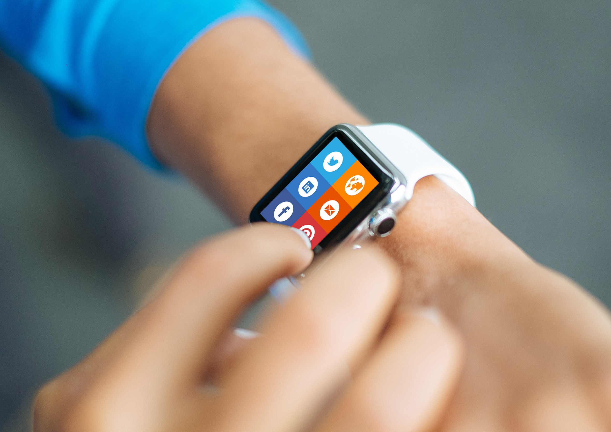
Day 5: App icon
Challenge: “Design an app icon. What best represents the brand or product? Or is it incredibly unique? Does it look great at a distance and does it stand out when put on your home screen alongside other apps?”
App icons live at brutal constraints. One square, a tiny canvas, and it needs to communicate brand, purpose, and personality at the size of a fingertip. The test I always come back to is whether it still reads at 29×29 pixels, the smallest size it appears in an Apple Watch notification. If the detail disappears, it’s the wrong design.
The mockup puts the icon in context alongside other apps, which is the most honest test available. Icons never live in isolation. They’re always competing in a grid, and the best ones win without trying too hard.
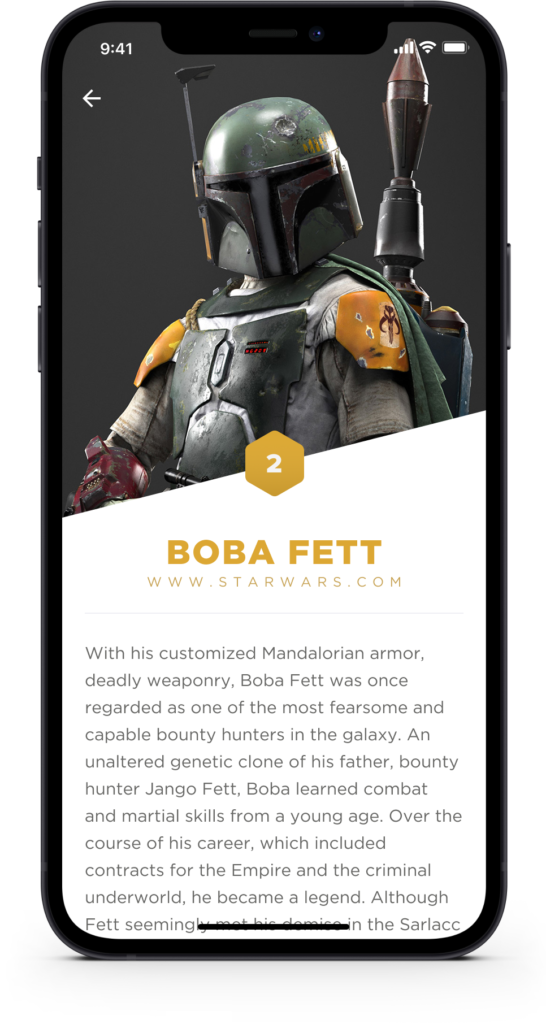
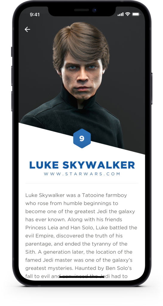
Day 6: User profile
Challenge: “Design a user profile and be mindful of the most important data, names, imagery, placement, etc. Is it for a serious profile? A social profile?”
I went full Star Wars with this one: Boba Fett and Luke Skywalker as the profile subjects. The brief gives you permission to have fun here, and user profiles are a good place to do it because the underlying UX challenge is identical regardless of who’s in the photo.
The real question with any profile screen is: what does the viewer actually need versus what does the user want to show? Those two things are often different. I built the layout around that hierarchy: name and avatar first, quick-read details next, deeper content below. The two-character comparison also tested whether the template held up across very different personalities. It does.
Day 7: Settings
Challenge:“Design settings for something. Is it for security or privacy settings? Game settings? What is it and what’s important?”
Settings screens are the UX equivalent of terms and conditions. Nobody wants to be there, but everyone needs to find what they’re after quickly when they are. I used the Wellington craft beer venue app for this one: notifications, location, saved venues, preferences.
The challenge with settings is that the content is almost always less interesting than the reason someone opened it. They’re there because something isn’t working how they expected. The job is to get them sorted and back to the thing they actually wanted to do. Clear grouping and strong visual hierarchy are the only tools that matter here.
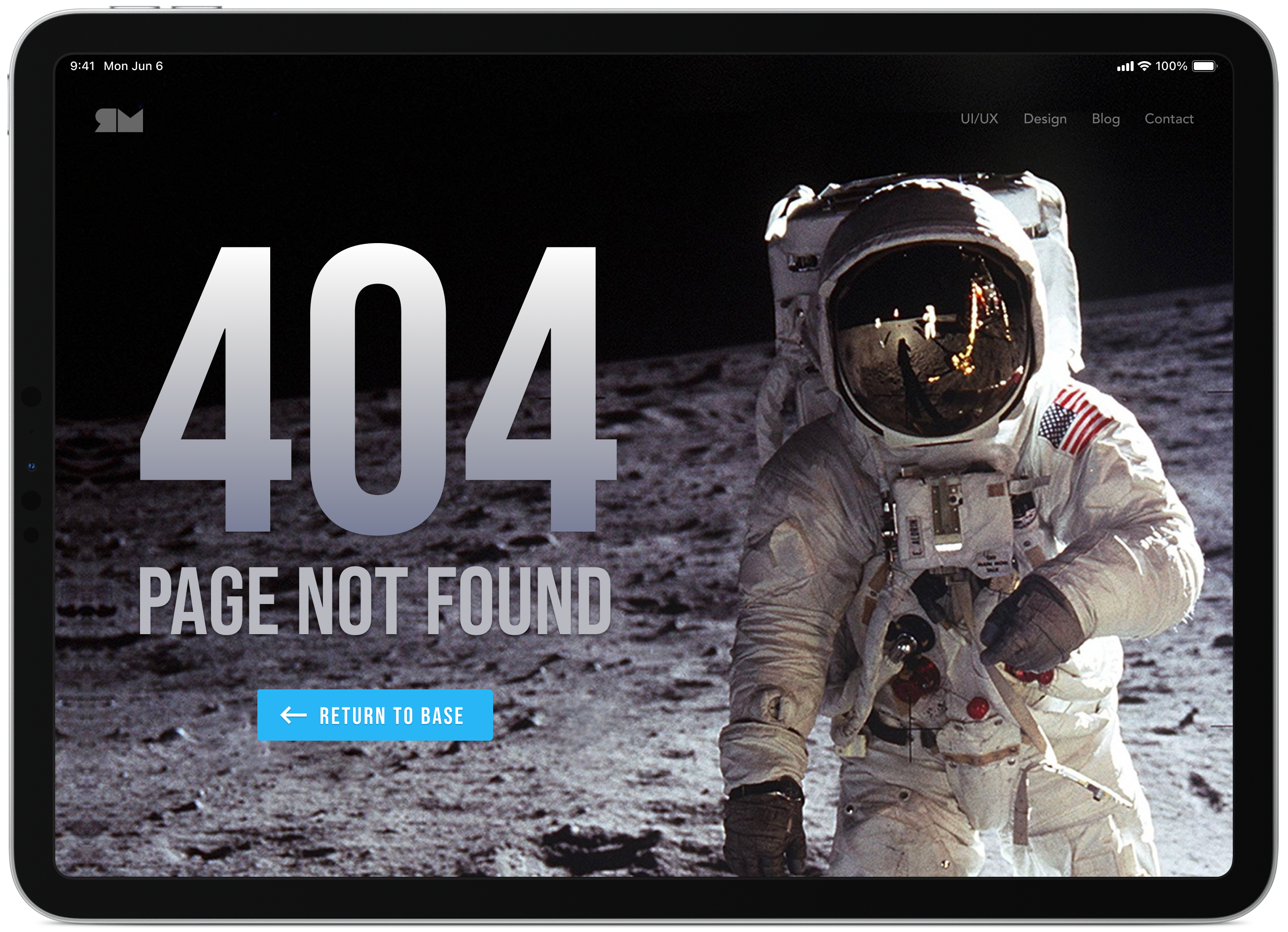
Day 8: 404 Page
Challenge: “Design a 404 page. Does it suit the brand’s style? Is it user-friendly?”
The 404 is a screen most products treat as an afterthought and then regret. It’s the moment where someone hits a dead end, and how you handle it says a lot about how much care went into the experience beyond the happy path. A good 404 does three things: acknowledges what happened, gives the user somewhere useful to go next, and does it with enough personality that the moment doesn’t feel like a complete failure.
I kept the copy light and the navigation obvious. The temptation is to get too clever with the messaging. A mild joke is fine. A complicated metaphor that makes someone read three sentences before they find the link back home is not.
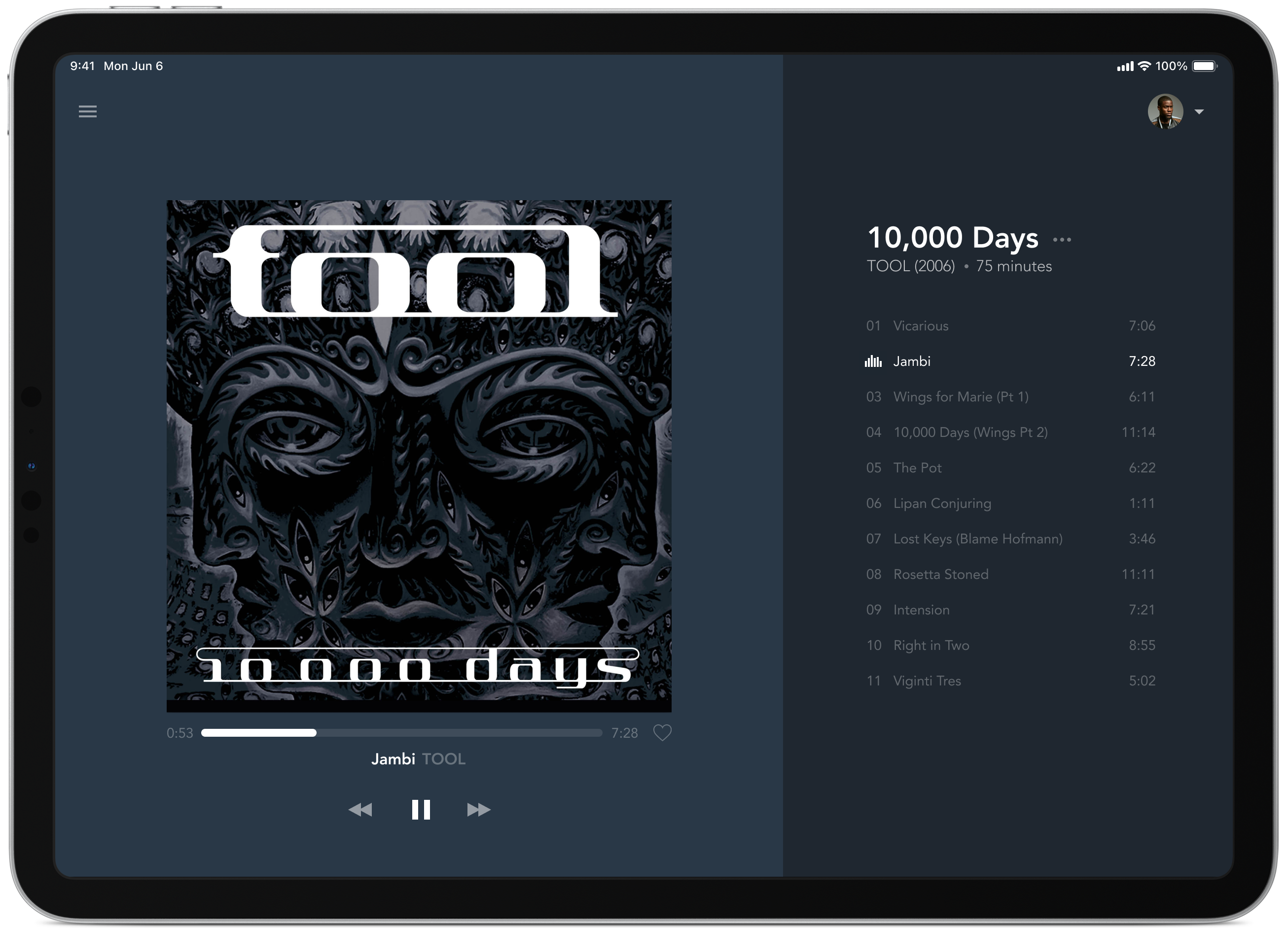
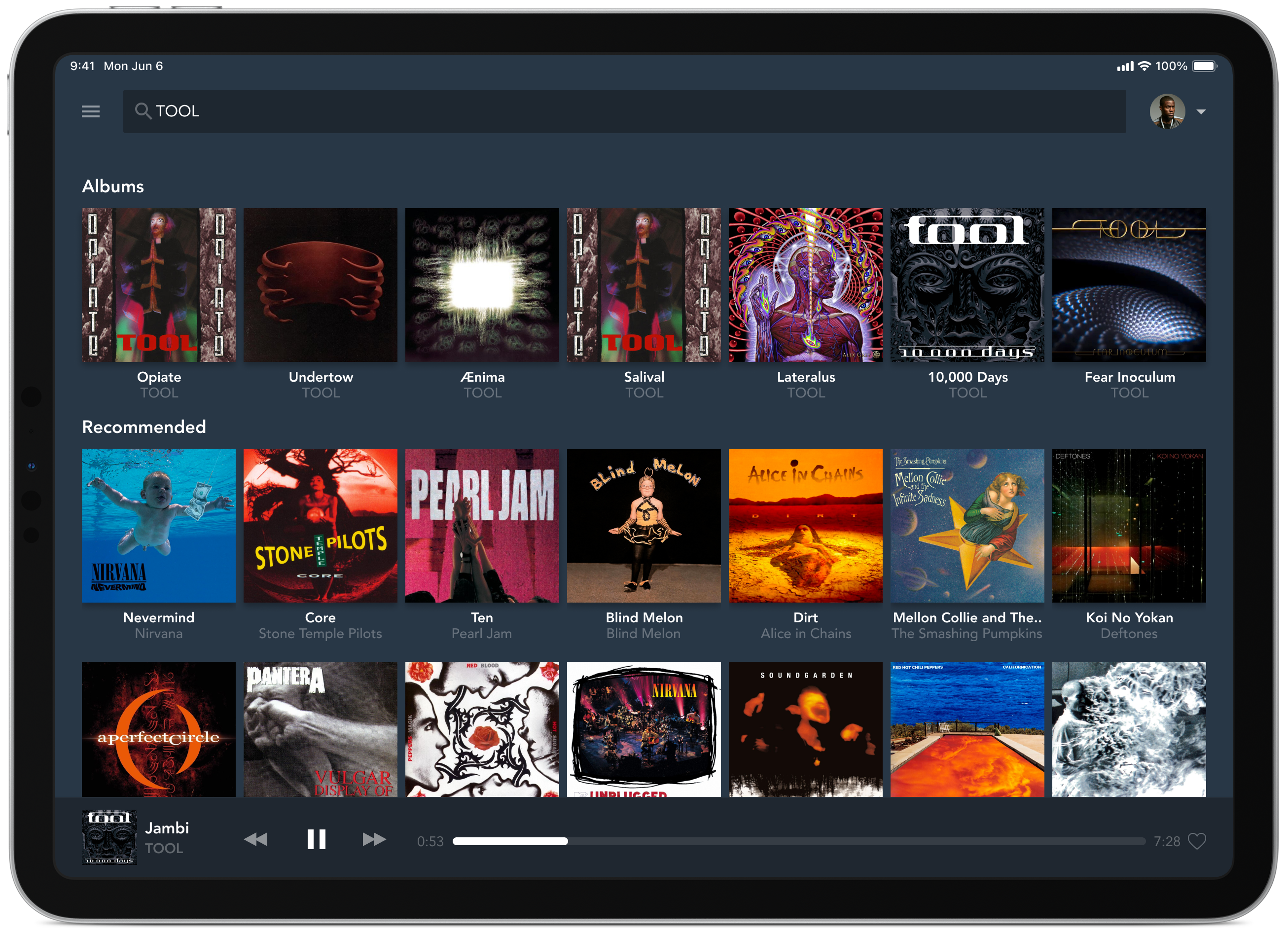
Day 9: Music player
Challenge: “Design a music player. Consider the controls, placements, imagery such as the artist or album cover, etc.”
Album art does a lot of emotional heavy lifting in a music player. It sets the mood before a note plays. I gave it maximum real estate and built the rest of the layout around it. Controls sit near the bottom of the screen in comfortable thumb reach, and the progress bar is generous enough to scrub accurately without dominating the layout.
I also thought about the streaming context. This isn’t a local library player, it’s connected to a catalogue of millions of tracks. That changes what the discovery areas need to do, and it informed how much space I gave to “what’s next” versus the playback controls themselves.
Day 10: Social share
Challenge: “Design a social share button/icon and be mindful of the size, imagery, placement, and purpose for sharing.”
Share buttons look simple until you start thinking about all the contexts they need to work in. A share button on a recipe is doing different work than one on a news article or product page. The intent behind the share is different, and the design should reflect that. I focused on placement and proportion: visible enough to be discovered, restrained enough not to pressure the reader before they’ve decided they want to share.
Icon choice matters too. The native share icons on iOS and Android carry platform-level recognition. Using a completely custom icon risks adding a learning step that shouldn’t be there.
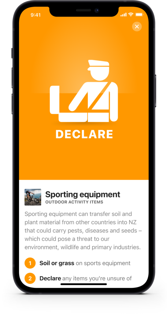
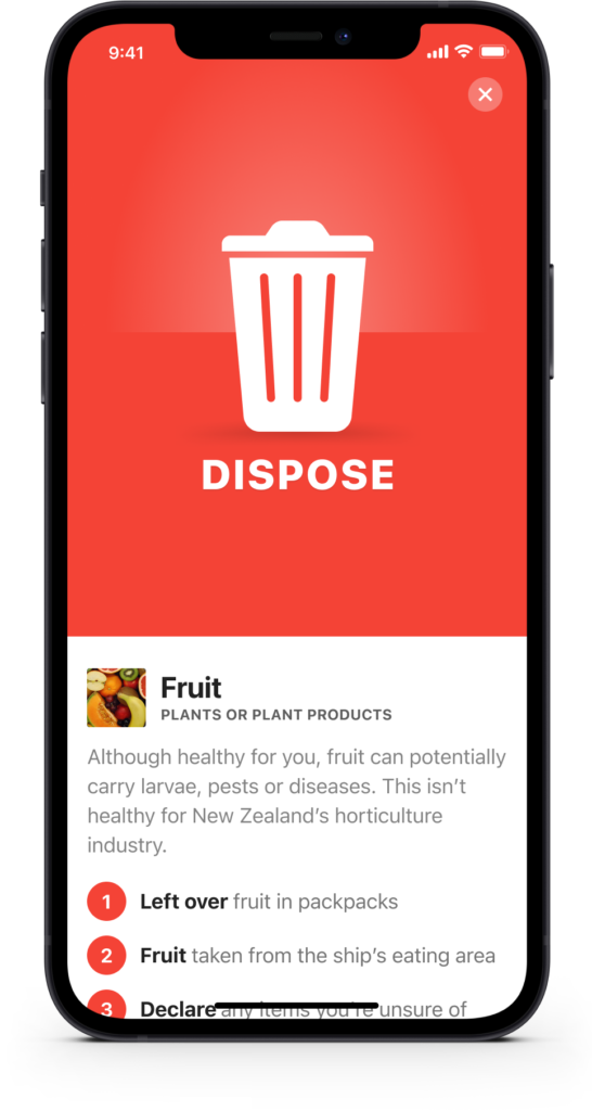
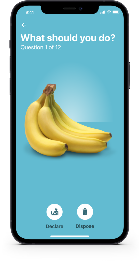
Day 11: Flash message
Challenge: “Design a Flash Message with both the outcome for an error and success. Is it for a sign up form? A download/upload message?”
Flash messages are tiny but they carry real weight. They’re the moment the system talks back to the user, and the tone has to match the stakes. A success message after submitting a form should feel warm and confirming. An error message needs to be clear without being alarming.
I used a biosecurity app context here, specifically the “Coming to New Zealand” declare or dispose flow. The stakes in that scenario are genuinely high, so the messaging needed to be direct and unambiguous. Getting the colour, iconography, and copy working together in a small amount of screen space was the core challenge.
Day 12: E-Commerce shop
Challenge: “Design an e-commerce shop. Is it simple for a local business or a large online retailer? Is it for clothing, shoes, handmade soap, or something else?”
E-commerce design lives or dies on product presentation. The layout needs to get out of the way and let the products do the talking, while still giving the shopper enough context to make a confident decision. Hierarchy, filtering, and clear pricing are non-negotiable.
I focused on a clean grid layout with enough breathing room that nothing feels cluttered. The filter and sort controls sit where shoppers expect them, not where they look interesting. Predictability in e-commerce is a feature, not a limitation.
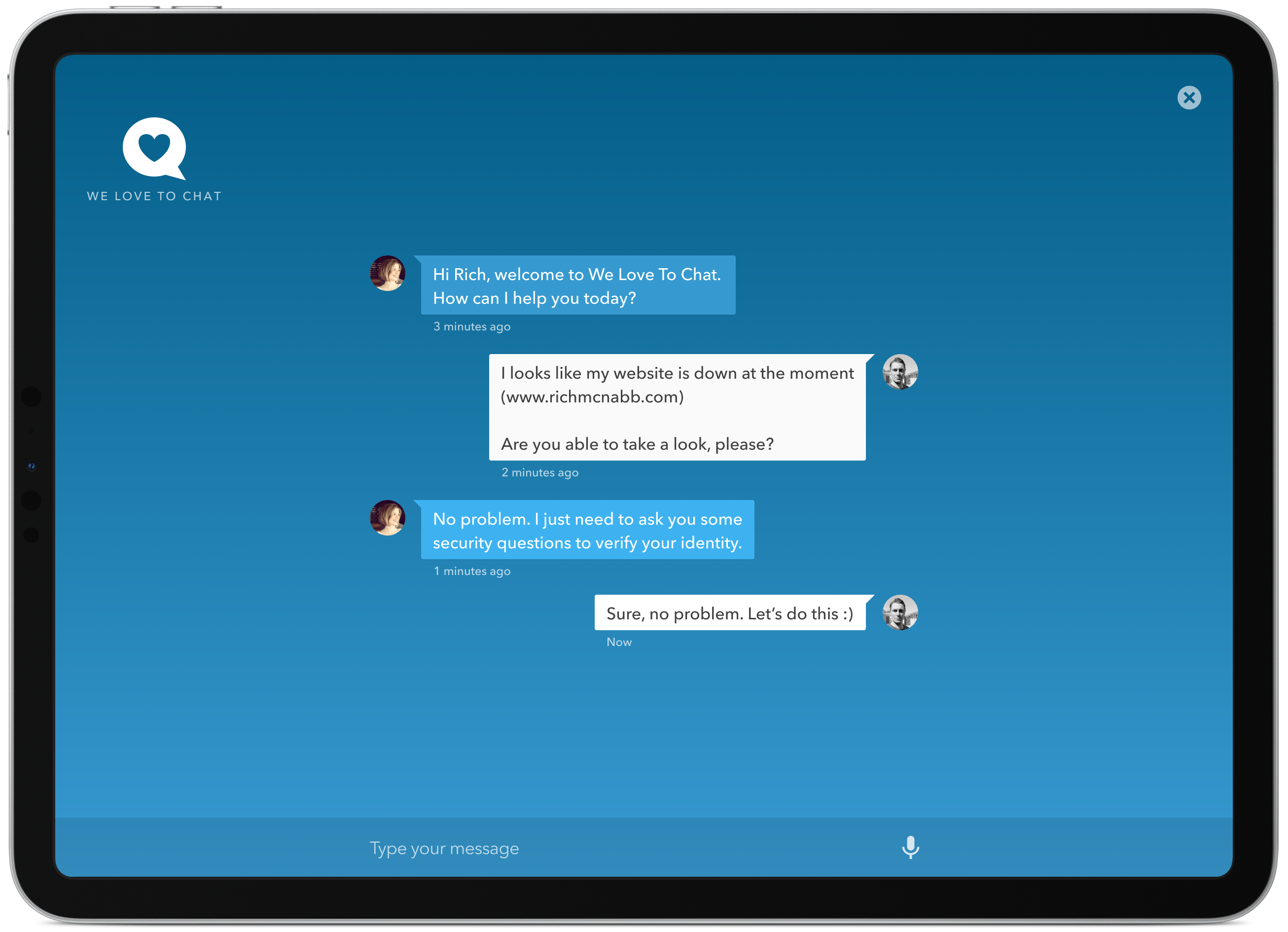
Day 13: Direct messaging
Challenge: “Design a Direct Messaging app, profile, or chatbox. Consider the parties involved in the messages, images, placement, and context of the messages. Are the messages for social purposes? Customer support?”
Chat UI is one of those patterns that looks deceptively simple because we use it every day. But the visual logic underneath it, who said what, when, and in what context, needs to be immediately clear without any labels. Alignment, colour, and bubble shape do all of that work silently.
I designed this around a customer support scenario where the power dynamic between the two parties is slightly different. The agent side needed to feel professional and responsive without being cold. Getting that balance right in a chat interface, where every message is read in a fraction of a second, is a genuinely interesting constraint.
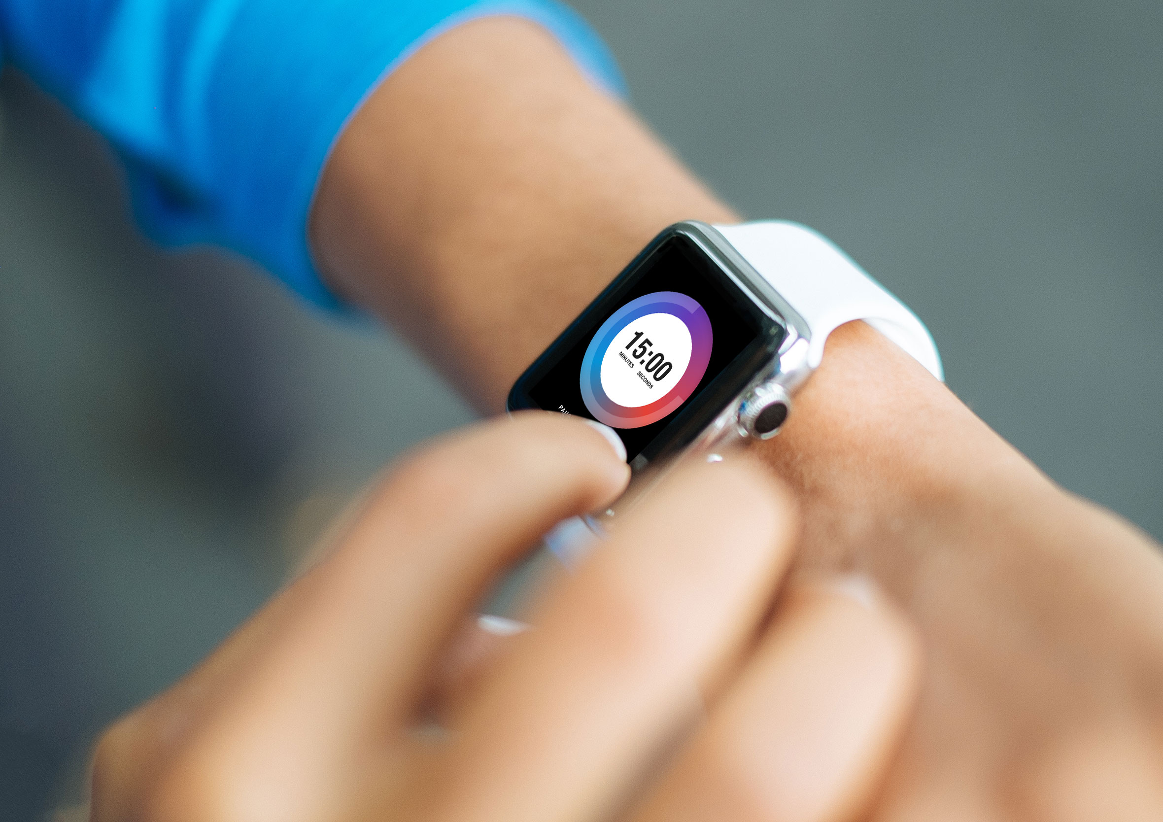
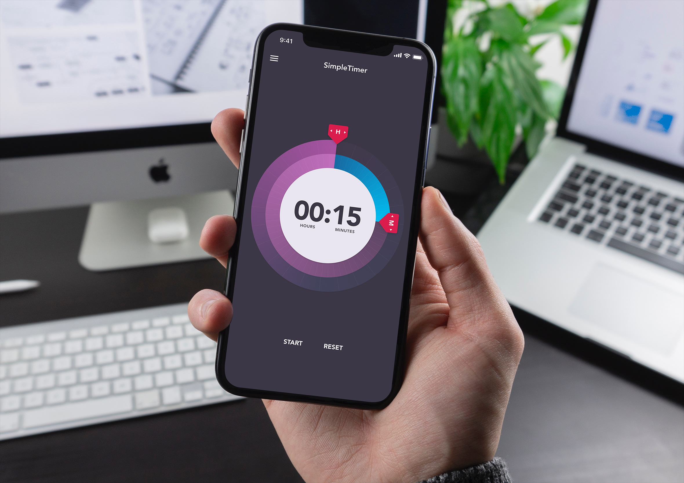
Day 14: Countdown timer
Challenge: “Design a Countdown Timer. Is it for an app? An interface for an oven? A sport related countdown? A launch countdown for NASA?”
Countdown timers are all about creating urgency without creating anxiety. The numbers need to be large enough to read at a glance, and the visual treatment needs to reinforce the sense of time moving rather than just displaying a static number.
I went with a bold typographic approach here, letting the digits dominate the screen. The supporting elements, the label, the progress indicator, stay minimal so nothing competes with the core information. When the primary job of a screen is to communicate one thing, everything else should step back.
Day 15: On / Off switch
Challenge: “Design an On/Off Switch. Consider what’s being turned on/off and how it should be done.”
Toggle switches are one of the most common UI patterns around and still one of the most frequently misused. The off state needs to look clearly different from the on state, not just in colour but in shape, position, and sometimes motion. If someone has to look twice, something has gone wrong.
I explored this in the context of app settings, where multiple toggles live side by side. That’s the hardest environment to get right because the eye moves across a list of them quickly. Each toggle needs to communicate its state independently, without relying on the label next to it to do the job.
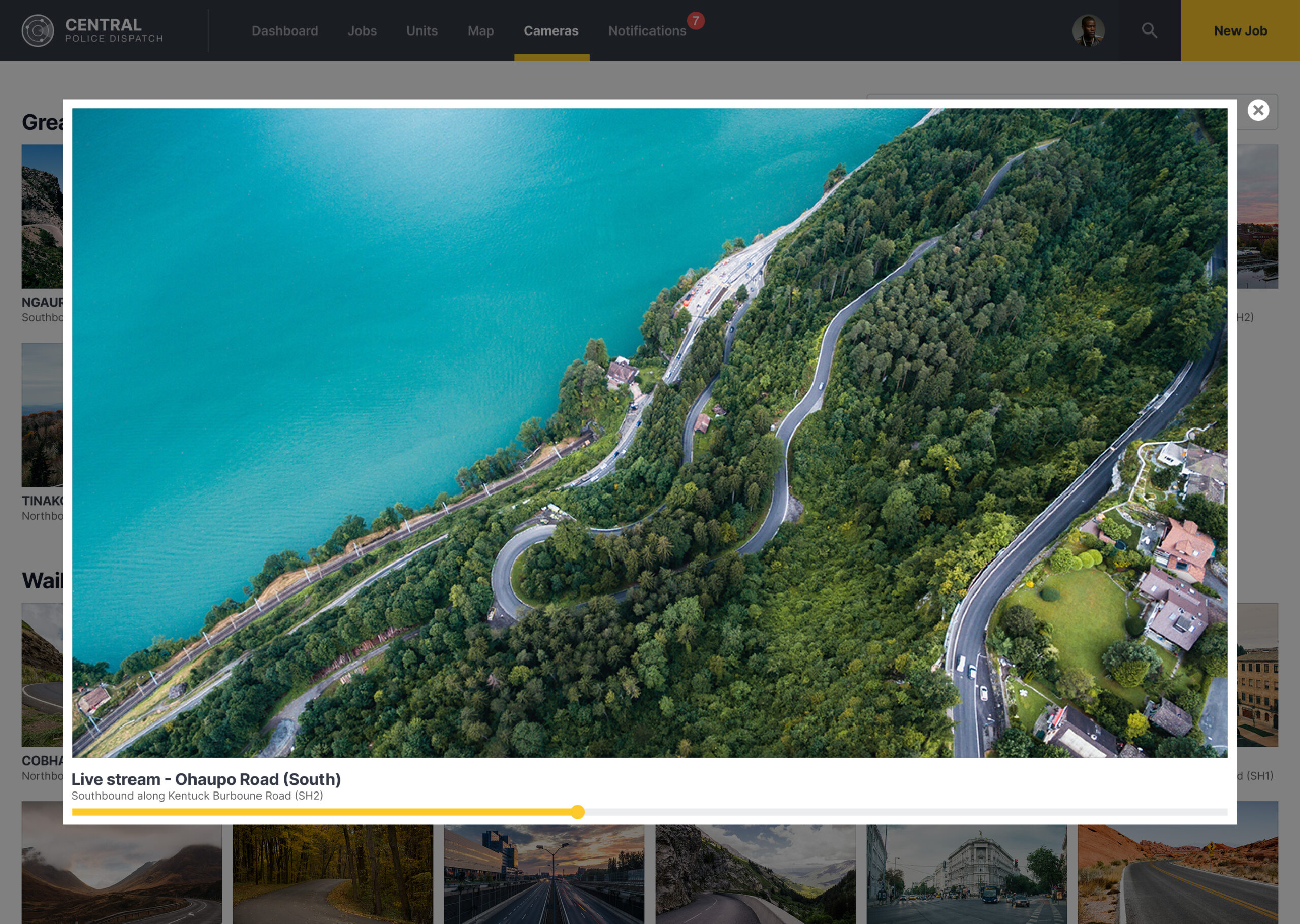
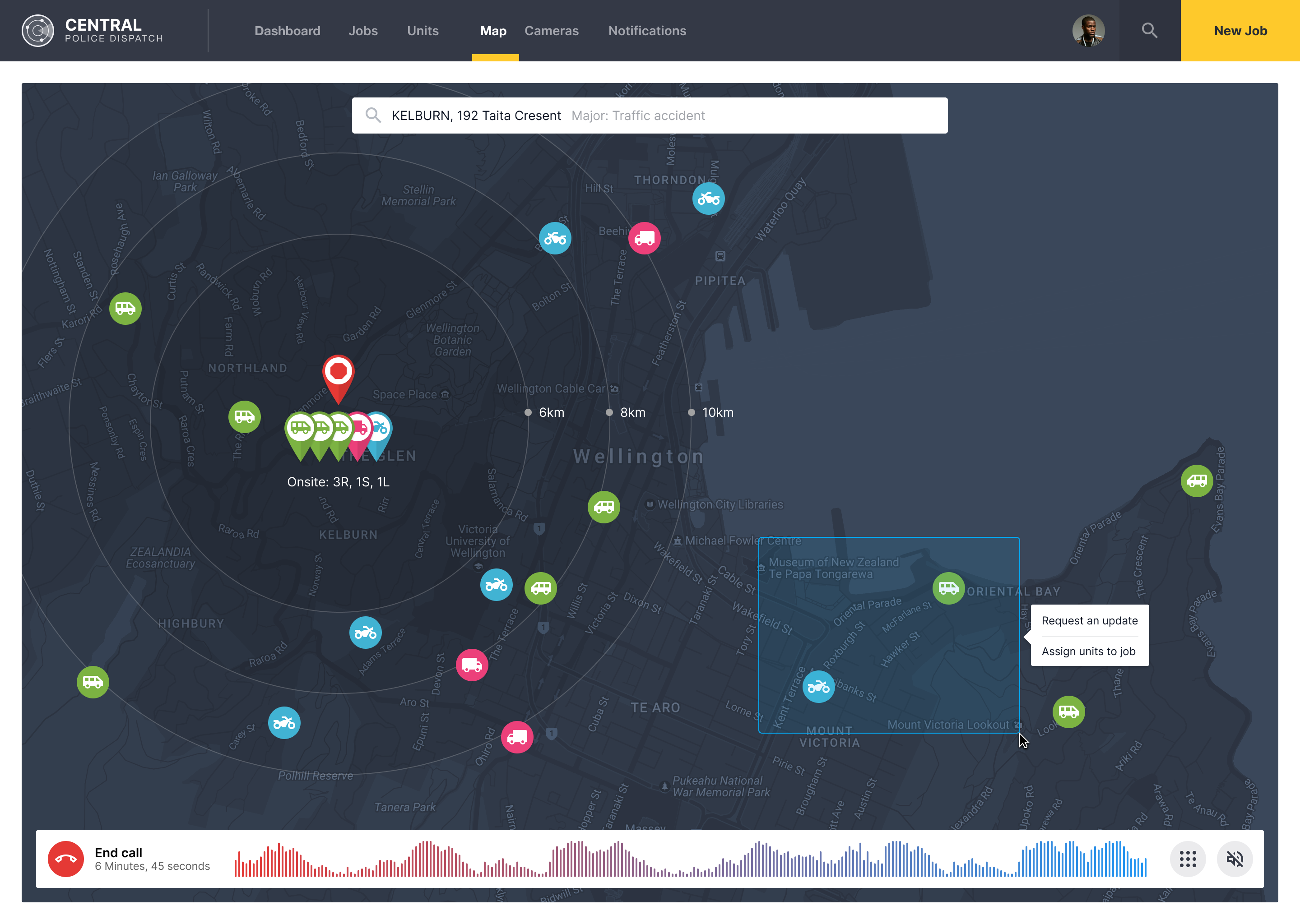
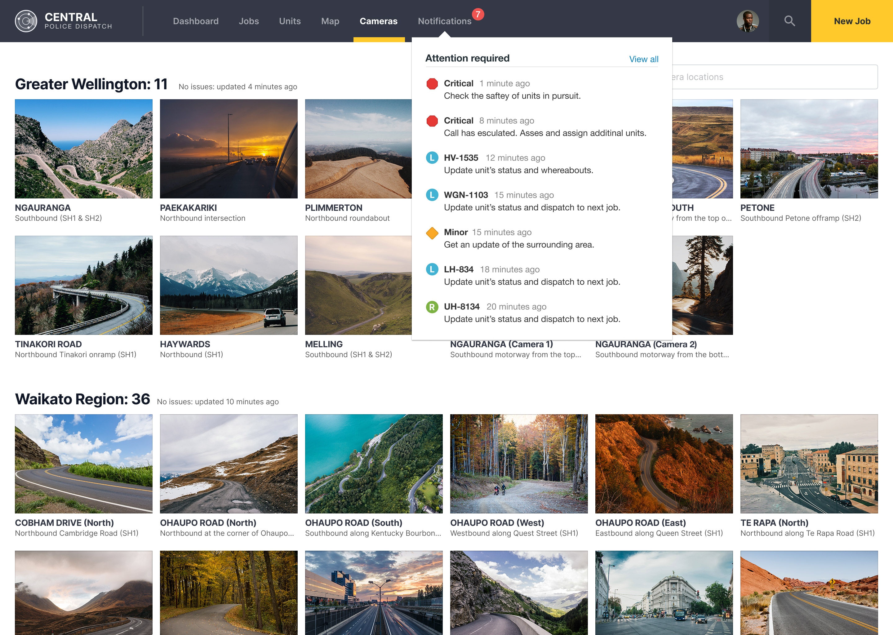
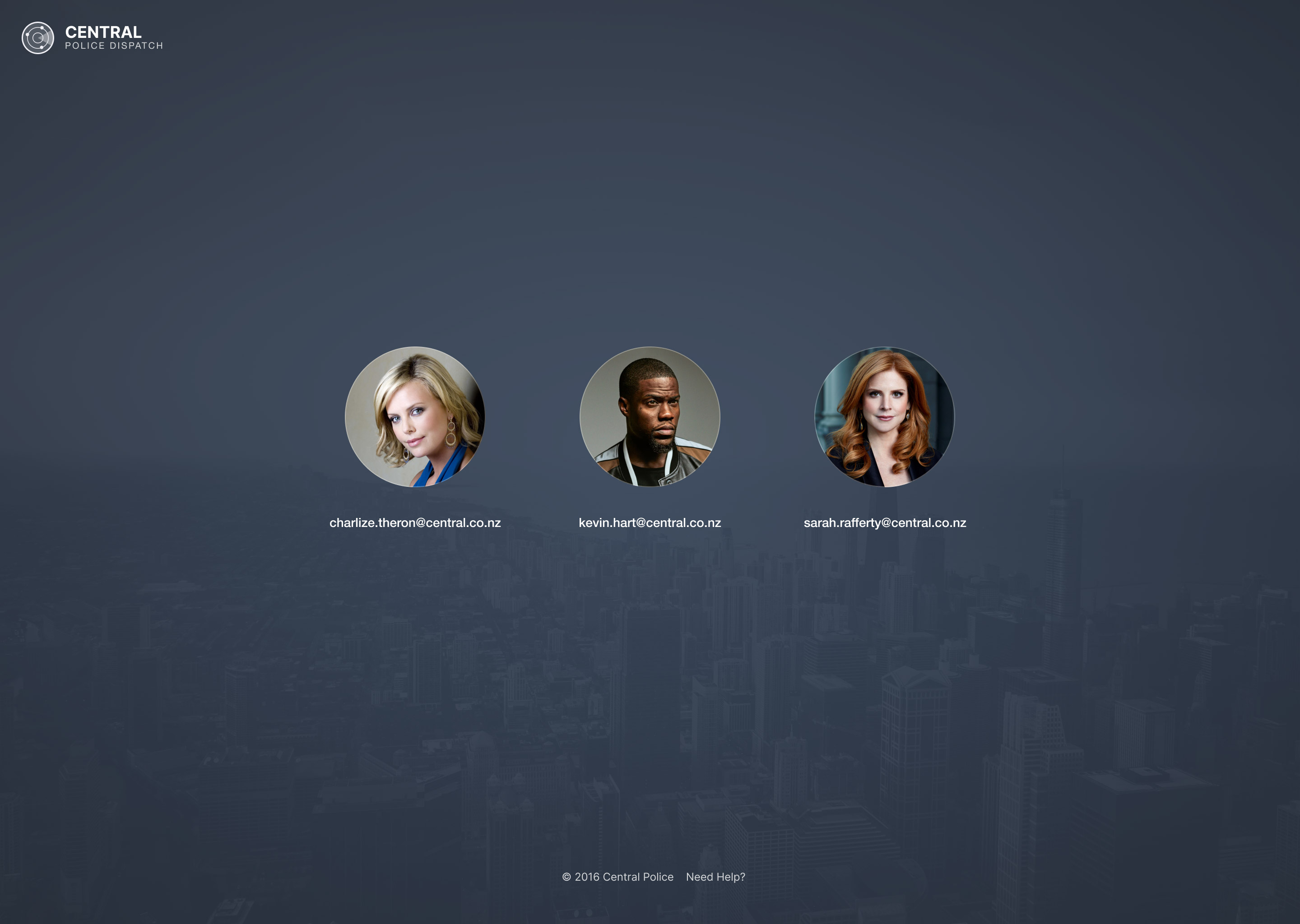
Day 16: Pop-up / overlay
Challenge: “Design a Pop-Up/Overlay. Is it a web sign-up form that pops up? Is it an ad overlay?”
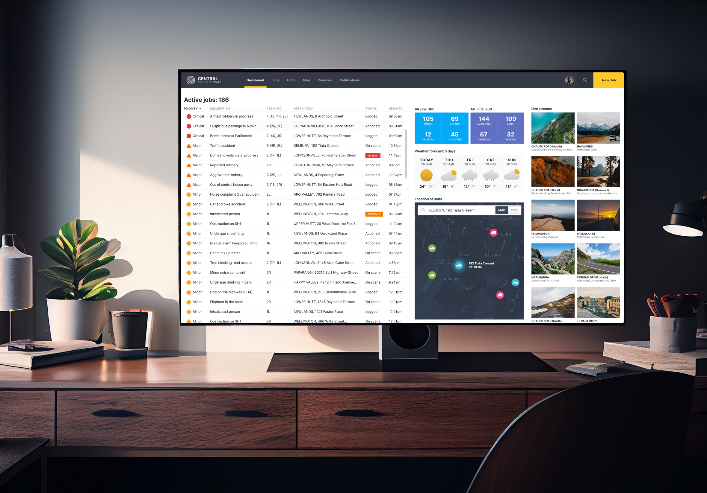
Overlays get a bad reputation because most of them interrupt at the wrong moment and make it harder than it should be to close. A well-designed overlay earns its interruption. It appears at a point where it’s genuinely relevant, offers something useful, and makes the dismiss action obvious.
I took a different angle here and used a police dispatch dashboard scenario. The overlay in this context is a live camera feed that surfaces when an incident is flagged. The stakes are high, the information needs to be immediate, and there’s no room for a confusing close button. Context shapes everything in overlay design.
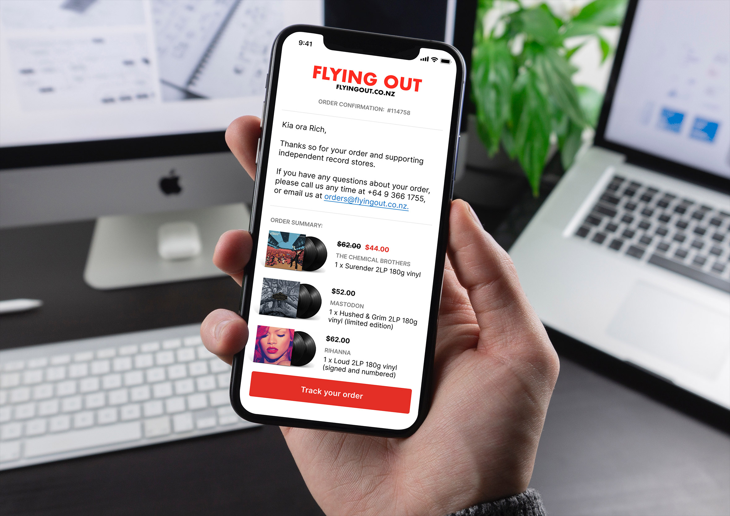
Day 17: Email receipt
Challenge: “Design an Email Receipt. What was purchased? On what date? Consider other elements such as a customer support info, a tracking number, pictures, related items, etc.”
Email receipts are functional documents that most companies treat as an afterthought. But they’re also one of the highest-opened emails a brand will ever send. Someone opens a receipt because they want to confirm something. That’s a moment of genuine attention and most receipts waste it.
I focused on a clear, scannable layout where the most important details, what was bought, how much, and what happens next, are findable in seconds. The branding is present but restrained. A receipt that looks like a marketing email has already lost the reader’s trust.
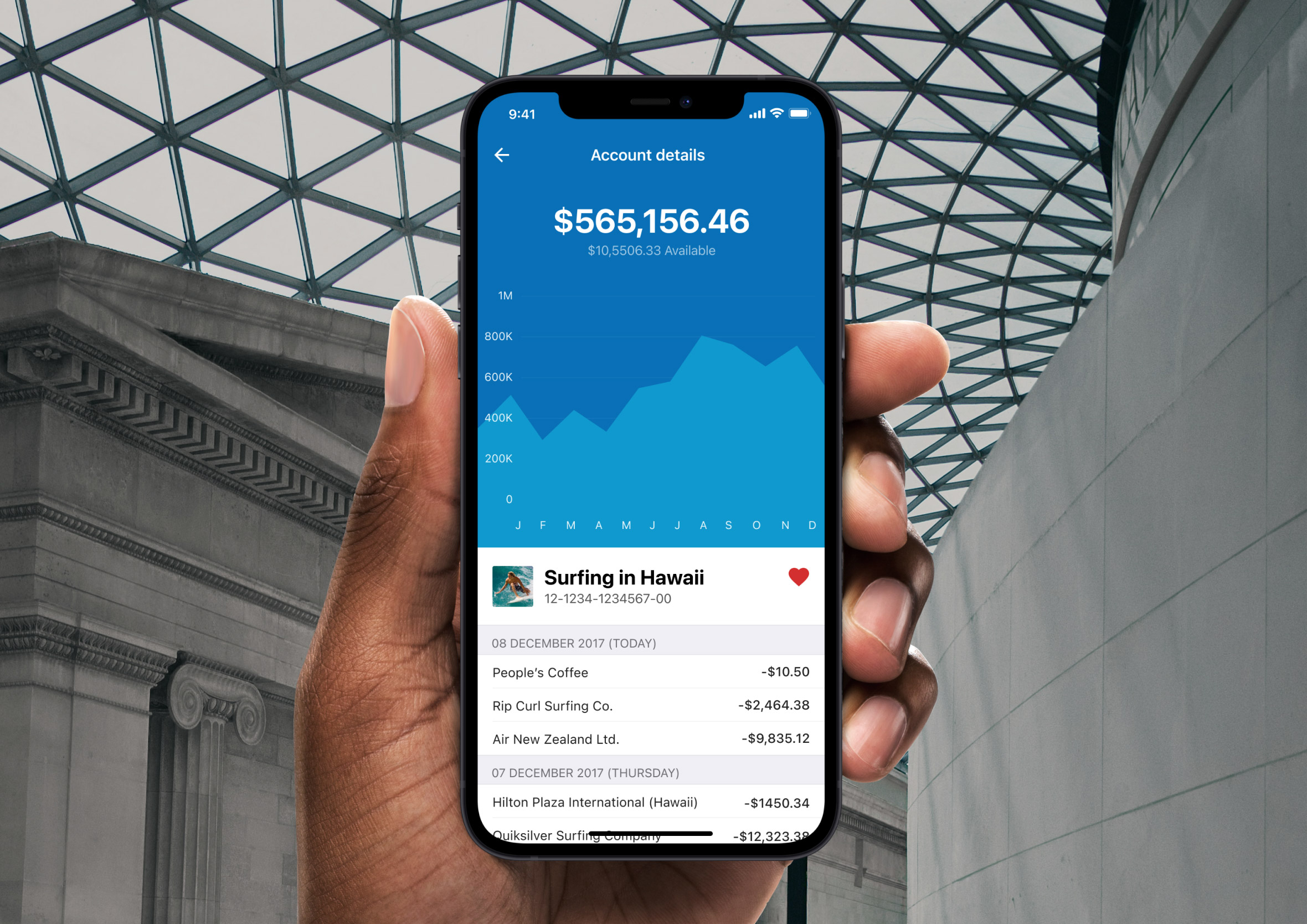
Day 18: Analytics chart
Challenge: “Design an analytics chart. Is it to be used for web or app analytics, a health monitor, e-commerce analytics?”
Data visualisation is one of those areas where the temptation to show everything can completely undermine the ability to understand anything. The best charts answer one question clearly. Every additional data series, colour, or label adds cognitive load that the viewer has to pay for before they get to the insight.
I kept this one focused on a single metric over time, using colour and scale to make the trend readable at a glance. The supporting context, labels, timeframes, comparison markers, earns its place only if it helps answer the question faster. If it doesn’t, it’s decoration.
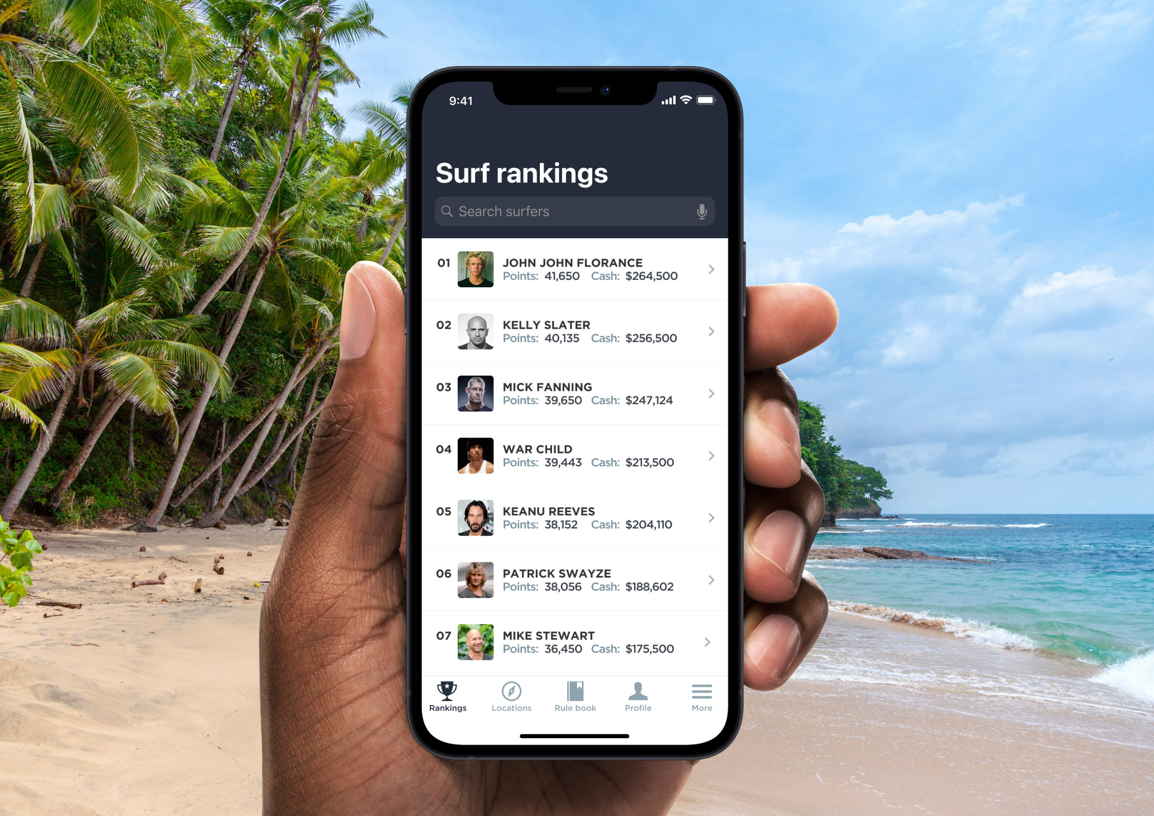
Day 19: Leaderboard
Challenge: “Design a leaderboard. Is it for gaming, sports, politics, or something else? Consider the important statistics to show, percentages, points, profile pictures, etc.”
Leaderboards are motivational tools as much as they are data displays. The top three positions should feel genuinely different from the rest of the list, not just by rank number but by visual treatment. That hierarchy is what makes someone feel the gap between where they are and where they want to be.
I used a gaming context here and gave the podium positions real visual weight. Avatars, scores, and rank all need to be readable in a fast scan. The lower positions are still clear, but they don’t compete with the drama at the top. Leaderboards only work if the person looking at them immediately knows where they stand.
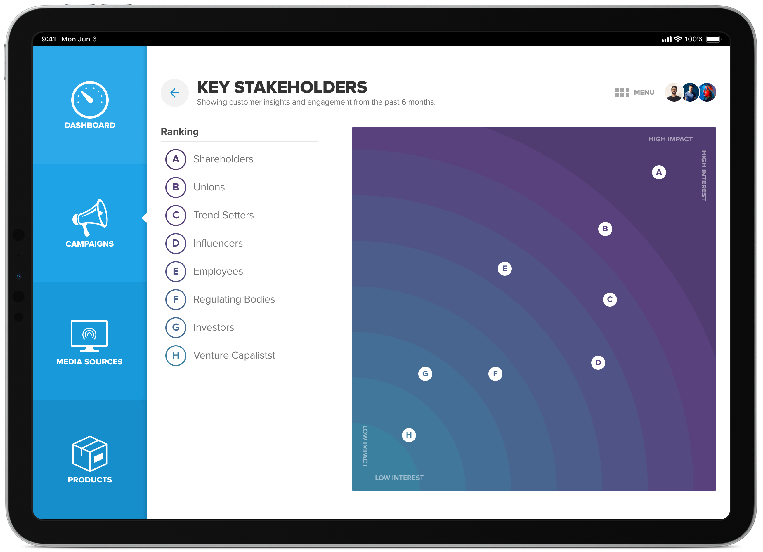
Day 20: Location Tracker
Challenge: “Design a location tracker. Consider the icon, placement, and purpose of location. Mapping something? Is it a tracking beacon? Is the NSA tracking you? ok, maybe they are ;)”
Maps in UI need to balance two competing demands: enough context to orient the user, and enough focus on the specific thing being tracked to make the map useful. Too much detail and the map becomes noise. Too little and it loses meaning entirely.
I used a police dispatch dashboard for this one, showing an active caller’s location alongside other incident markers. The challenge here was making a single active location stand out from the surrounding context without making the rest of the map feel irrelevant. Colour, scale, and animation all contribute to that hierarchy, even in a static mockup.
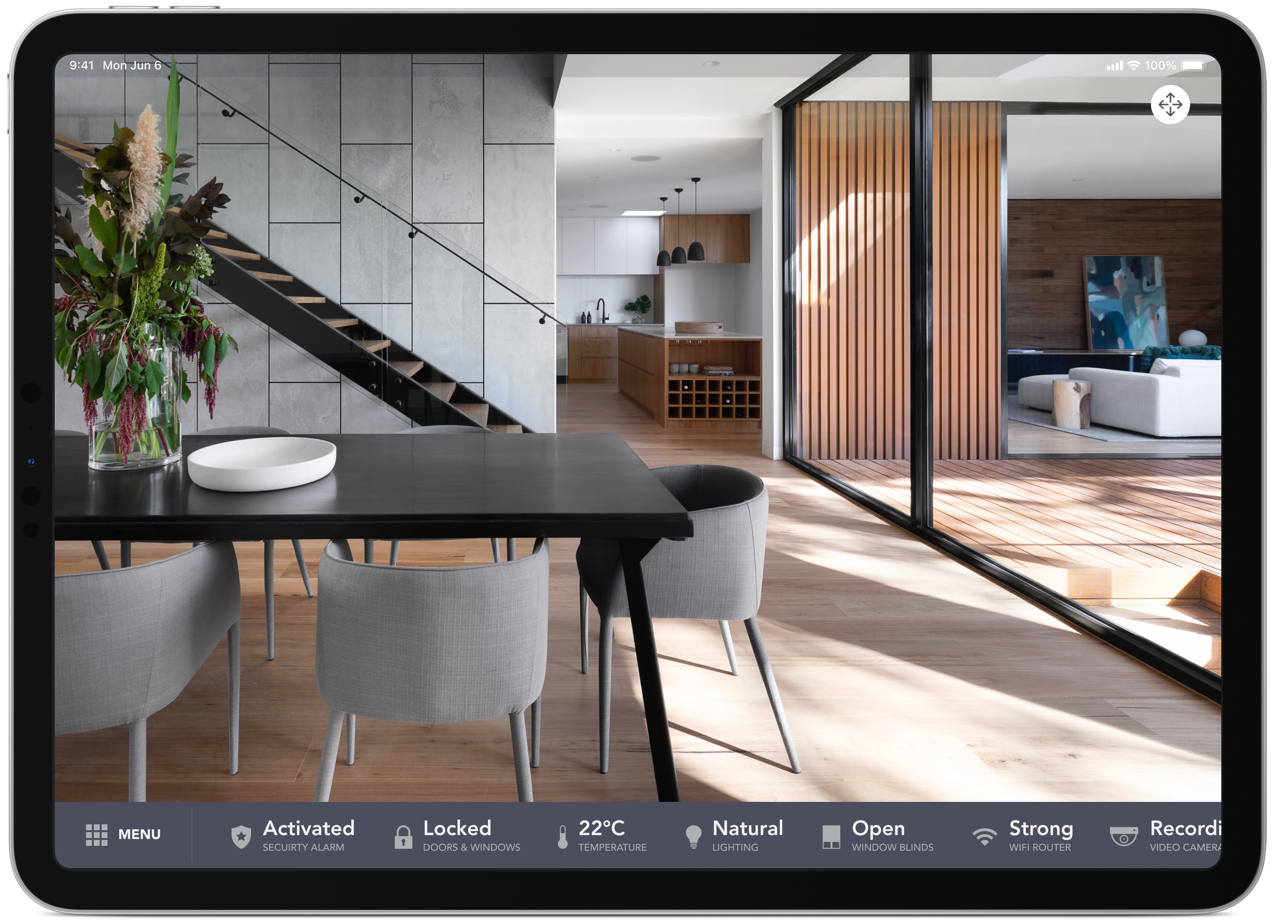
Day 21: Home monitoring dashboard
Challenge: “Design a home monitoring dashboard. Be creative! What would make a dashboard visually appealing and fun to use, while also being mindful of the data? Try to make it a realistic exercise as if it were your own dashboard… one that you need to refer to daily. What is the most relevant data and what’s the most appropriate placement for it?”
Dashboards are where UX and data design collide, and the home monitoring context makes it personal. The data has to feel relevant to your actual life, not just impressive on a screen. I started by thinking about what I’d genuinely want to check first thing in the morning: temperature, security, energy, maybe a quick look at who’s home.
The layout follows a clear priority order. The most time-sensitive information sits at the top, secondary status information below. Colour does real work here too, green means everything is fine, amber means something needs attention, without the user needing to read a single label to know the difference.
Day 22: Search
Challenge: “Design something search related. It could be a search bar, an advanced search window, a search function, etc.”
Search is one of those interactions users have a strong mental model for before they even open your app. The bar goes at the top, results appear below, and the whole thing should feel instant. Deviate from that pattern without a very good reason and you’re adding friction before someone has found what they came for.
I designed this in the context of a music streaming app, where search does double duty: finding specific tracks you already know, and surfacing new things you might like. Those are two different user intents and the results layout needs to serve both without feeling cluttered.
Day 23: Onboarding
Challenge: “Design something onboarding related. Are you recruiting people for an organisation? To sign up for a new website? A mobile app?”
Onboarding is the moment a product makes its first real impression. The sign-up form got someone through the door, but onboarding is what convinces them to stay. Done well it feels like a helpful guide. Done badly it feels like homework before you’ve even started.
I focused on a mobile app flow here, keeping each screen to a single idea. One screen, one ask, one piece of context. The temptation in onboarding is to front-load everything the app can do. The better approach is to show just enough to get someone to their first moment of value as quickly as possible.
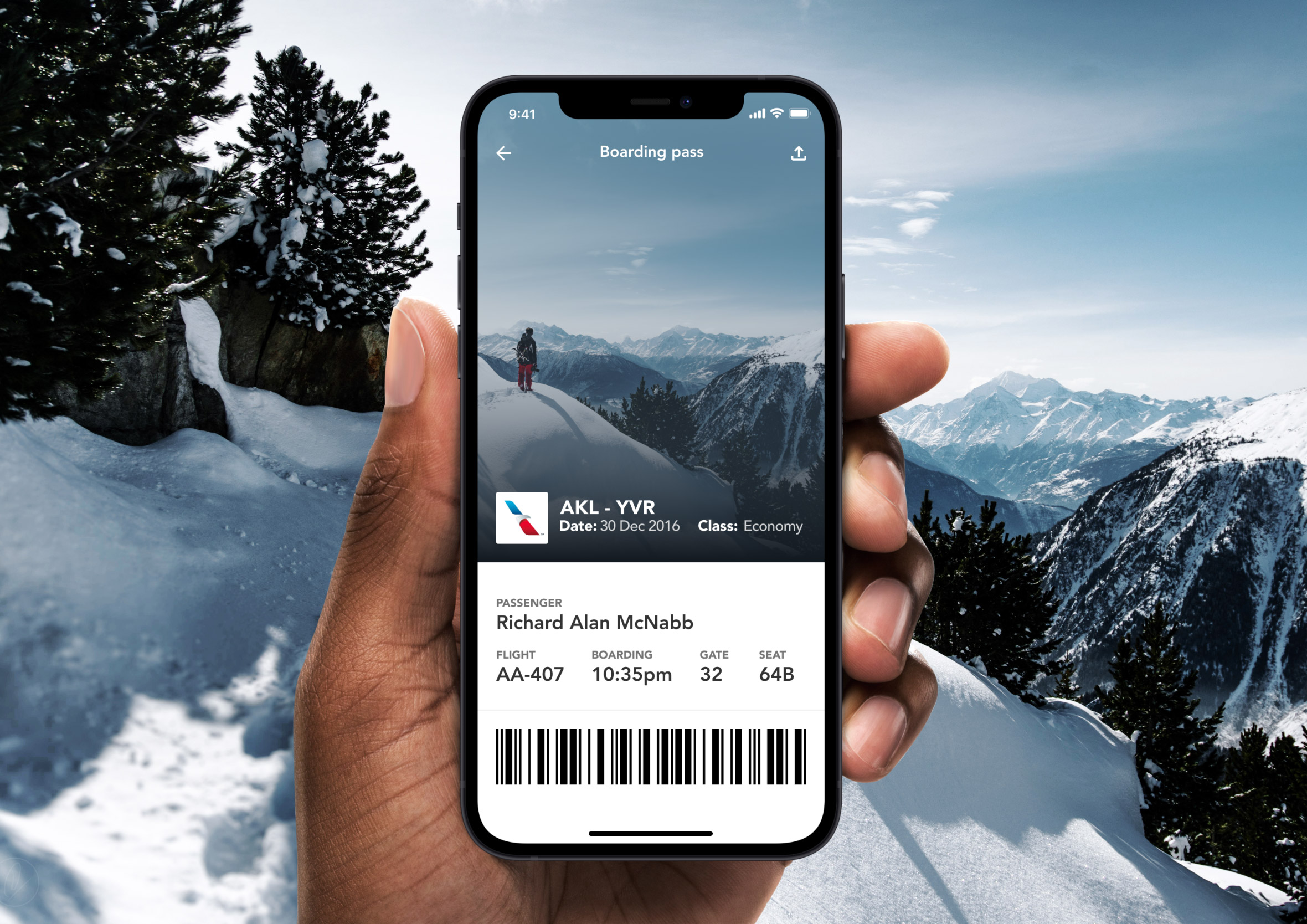
Day 24: Boarding pass
Challenge: “Design a boarding pass. Consider the origin, the destination, gates, seats, the airline, etc.”
Physical boarding passes are a masterclass in information density done badly. Tiny fonts, inconsistent hierarchy, and data that’s been squeezed into a format designed for a printer from 1987. The digital version is a chance to do all of that properly.
I stripped it back to what a traveller actually needs in the moment: where am I going, what gate, what seat, and when do I need to be there. The QR code is large enough to scan without hunting for it. Everything else steps back. A boarding pass that causes confusion at the gate has failed at its one job.
Day 25: TV App
Challenge: “Design an app for a smart TV. What type of app is it? What are the features/controls? Does it have a carousel selection feature? What it is?”
Designing for a TV screen is a completely different discipline from designing for a phone. The viewing distance is metres, not centimetres. The input method is a remote, not a finger. Every tap costs more and every piece of text needs to be readable from the couch.
I focused on a content browsing experience with bold imagery, large type, and a carousel layout that works with directional navigation rather than fighting it. The focus state, showing which item is currently selected, does more visual work here than it would in any other context. On a TV, that highlight is the entire interaction model.
Day 26: Subscribe
Challenge: “Design a subscribe form, button, widget, etc. What type of information are you looking to capture from the user? Their name and email? Their zip code? Something else?”
Subscribe forms have one job: reduce the barrier between someone’s interest and their commitment. Every extra field is a reason to abandon. Every piece of unclear copy is a moment of hesitation. The form needs to answer “what do I get?” before it asks for anything in return.
I kept this one to the minimum viable ask: email address and a clear value proposition. The button copy matters more than most designers give it credit for. “Subscribe” is functional but passive. Something that tells the user what happens next does far more work in the same space.
Day 27: Dropdown
Challenge: “Design a dropdown element. Is it a menu dropdown? Or a tip that’s dropped down during a tutorial?”
Dropdowns are everywhere and poorly implemented more often than not. The common failure is a list that’s too long to scan quickly, or options that aren’t ordered in a way that makes sense to the person using it. A dropdown should feel like a shortcut, not a decision tree.
I focused on a form context where the dropdown narrows a set of options down to something specific. The open state needed to feel clearly layered above the rest of the UI, with enough contrast that the selection is unambiguous. Small details like the active state, the hover highlight, and the selected value display are what separate a functional dropdown from a polished one.
Day 28: Contact us
Challenge: “Design a Contact Us page or form. Is it for customer support? A purchase inquiry? To schedule an appointment? Think about a scenario and the most important feature it would require.”
Contact forms are often the last resort. Someone has already tried to find what they need and couldn’t. That context matters. The form shouldn’t feel like another obstacle, it should feel like a direct line to a real person who can actually help.
I went with a clean two-column layout: the form on one side, key contact details and context on the other. The subject field and message area are given generous space because the quality of what someone writes there directly affects how quickly they get a useful response. A form that rushes that input is working against itself.
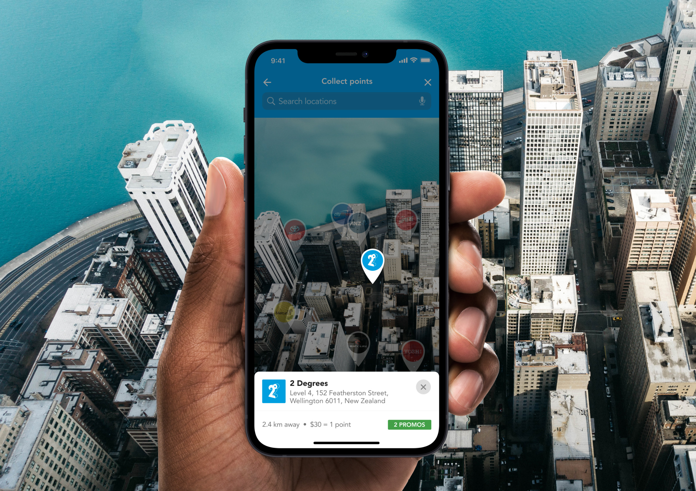
Day 29: Map
Challenge: “Design a map. Not one of those old school paper ones though. Ok, that might actually be kinda neat too. ;)”
Maps in apps are rarely just maps. They’re always maps plus something: nearby locations, a route, an active event, a pin someone dropped. The UI around the map has to complement the spatial information without covering the thing the person is actually trying to see.
I designed this around a venue-finding context, with map pins representing locations the user can tap into for more detail. The bottom sheet pattern works well here: keep the map visible, surface the detail on demand, and let the user stay oriented while they browse. The worst map UIs hide the map under their own interface.
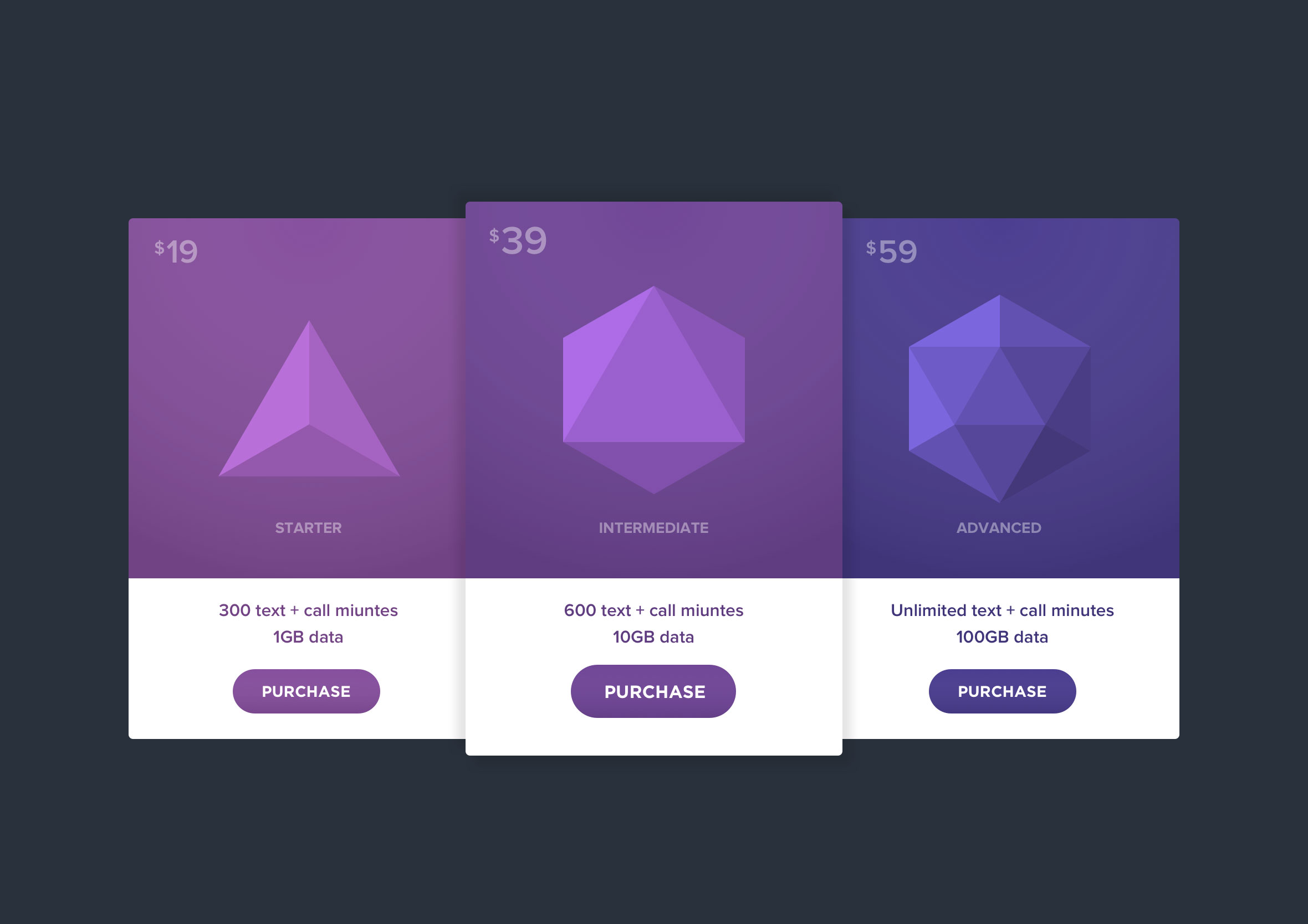
Day 30: Pricing
Challenge: “Design something related to pricing. Is it a pricing table? A restaurant menu with pricing?”
Pricing pages carry a lot of psychological weight. The layout is making an argument: here’s what you get, here’s what it costs, and here’s why the middle tier is the one you should pick. Every pricing page has a recommended option, and the design should make that obvious without feeling pushy.
I used a three-tier table layout with the most popular plan visually elevated above the others. The feature comparison sits below each price point rather than in a separate table, so the value is connected to the cost in the same visual moment. Separating price from features forces the user to do mental work that the layout should be doing for them.
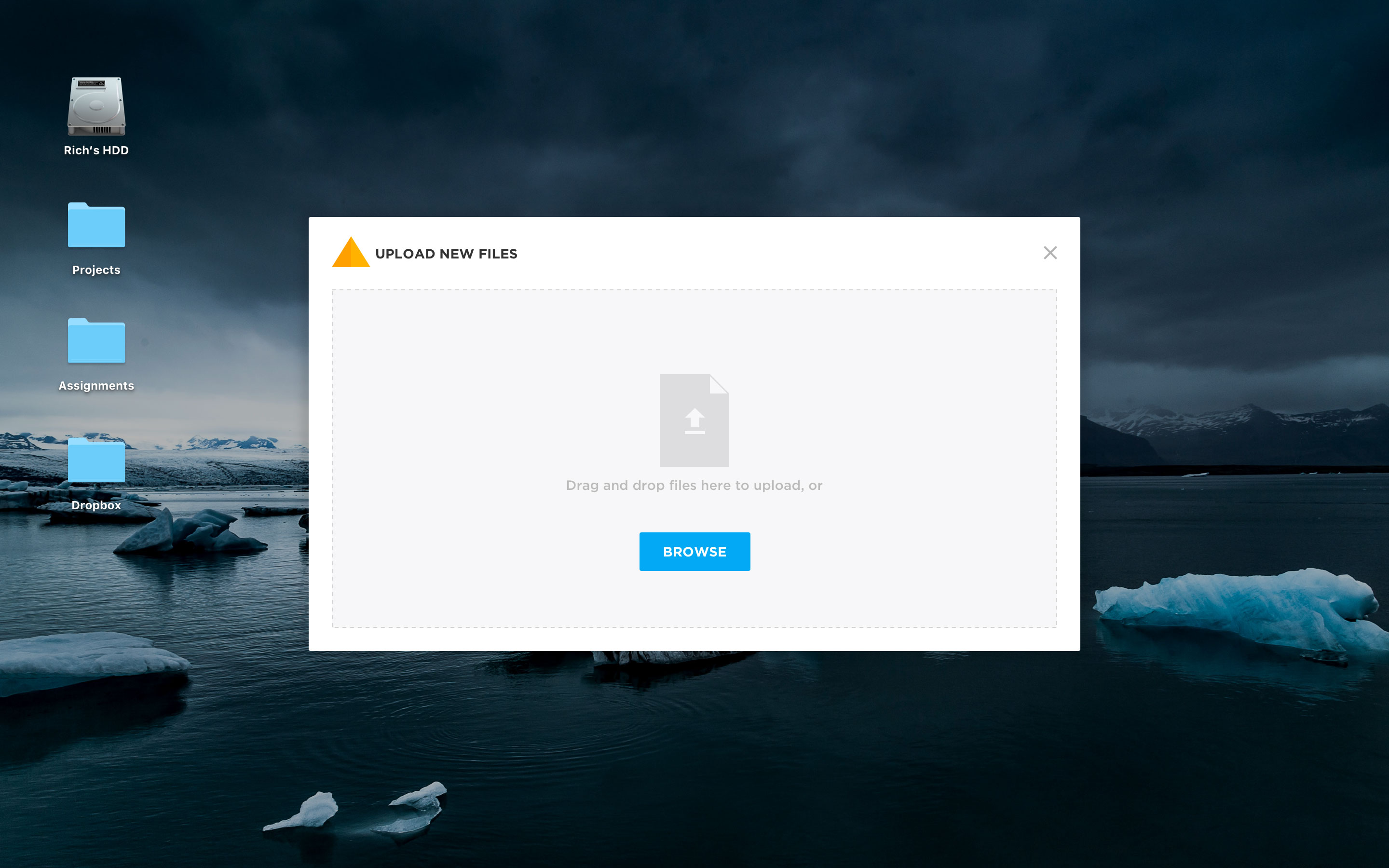
Day 31: File upload
Challenge: “Design a file upload element. Is it the loading screen and icon? A progress element? Are folders being uploaded by flying across the screen like Ghostbusters? ;)”
File upload is one of those interactions that feels trivial until something goes wrong. The drop zone needs to be obvious, the accepted file types need to be clear upfront, and the progress state needs to communicate enough that the user doesn’t wonder if it’s actually doing anything.
I focused on the in-progress state here, where the feedback loop is most important. A progress bar with a percentage gives the user enough information to decide whether to wait or come back. An upload that shows nothing but a spinning indicator is an upload experience that creates anxiety unnecessarily.
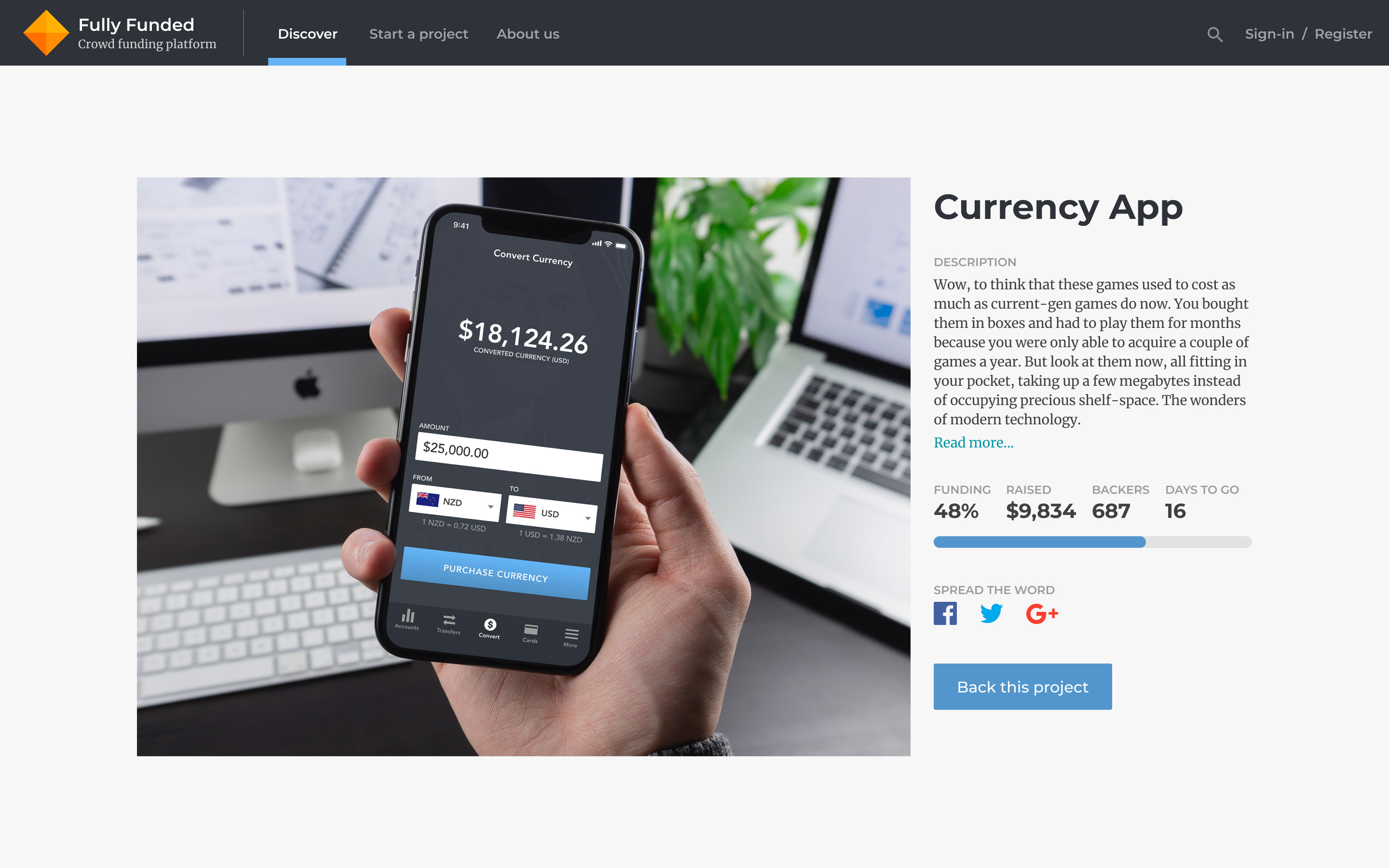
Day 32: Crowdfunding campaign
Challenge: “Design a crowdfunding campaign. Keep in mind the purpose… raising funds. It’s important to make it compelling if you’re seeking money. So what’s really important? The numbers of contributors, the total raised, campaign details and highlights? Also consider size, imagery, placement, slogans, etc.”
Crowdfunding pages are persuasion by design. Every element is working toward a single outcome: getting someone to back the project before they talk themselves out of it. The social proof, how many people have already contributed, is often more convincing than the project description itself.
I led with the funding progress bar because it tells the most compelling story at a glance. A campaign that’s 80% funded feels urgent in a way that a static target figure never does. The supporting detail, the story, the rewards, the team, earns its place below that hook once the emotional case has already been made.
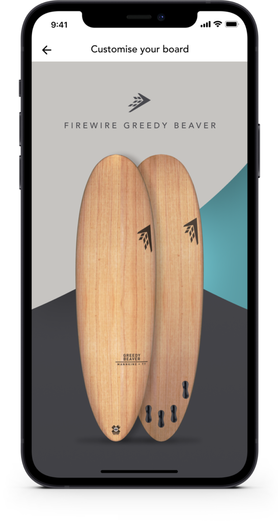
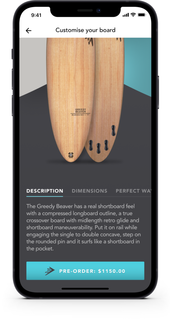
Day 33: Customise product
Challenge: “Design something related to customising a product. It could be a custom t-shirt, shoes, etc.”
Product customisation is one of the most satisfying interactions to design because the feedback is immediate and personal. Every change the user makes has a visible result, and that tight loop between action and outcome is what makes the experience feel playful rather than like filling in a form.
The challenge is keeping the configuration controls accessible without covering the product preview. The user needs to see what they’re building in real time. I kept the controls anchored to one side, leaving the product itself with maximum screen real estate. The customisation UI should feel like a tool, not the main event.
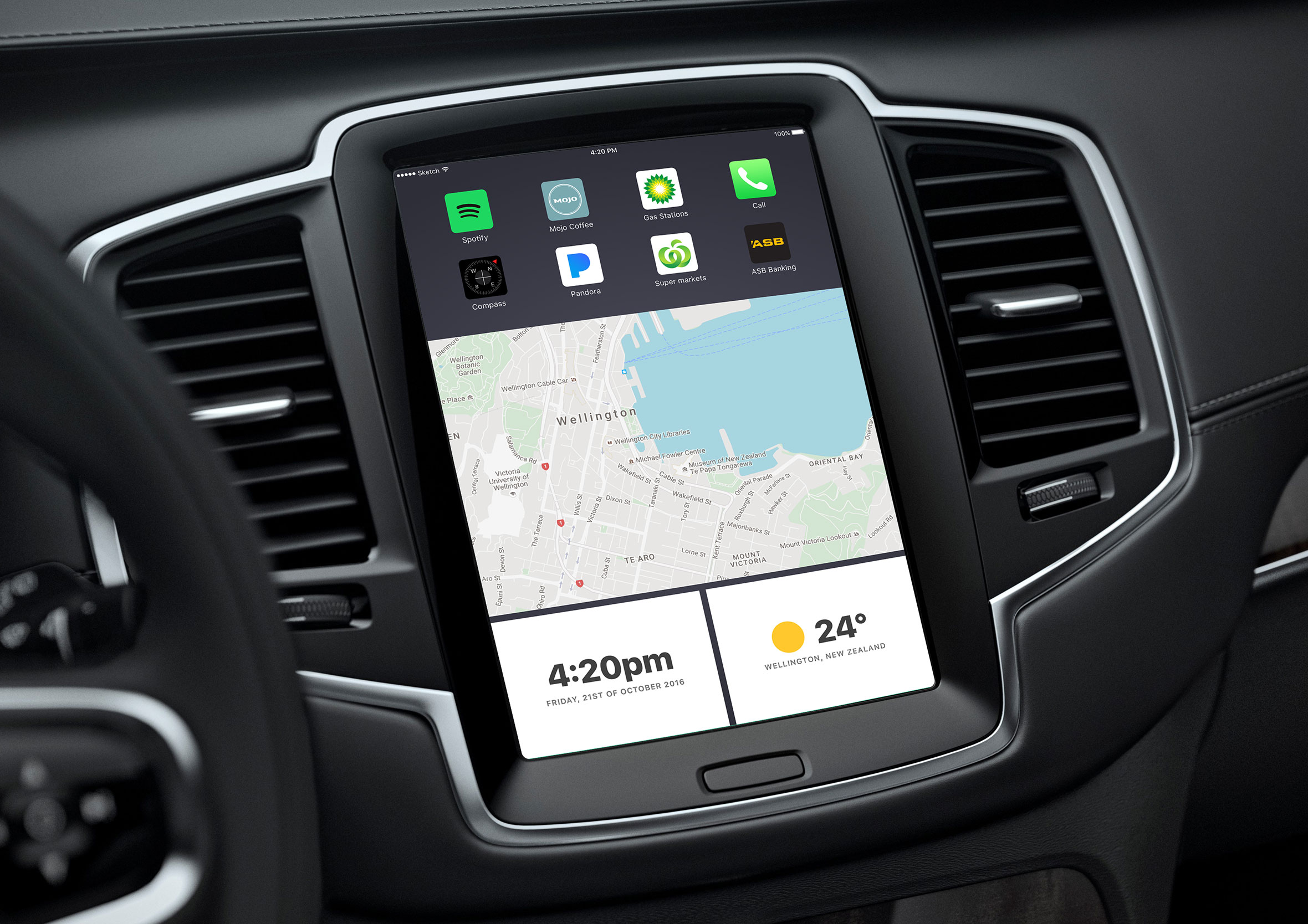
Day 34: Car Interface
Challenge: “Design a car interface. Consider the elements you’d want and need in your own dashboard. Be creative, yet logical.”
In-car interfaces have a constraint that almost nothing else in UX has: the primary task is not using the screen. The driver’s attention belongs on the road, which means every interaction needs to be completable in under two seconds or not require eyes at all. That constraint shapes every decision.
I focused on the information hierarchy rather than feature richness. Speed, navigation, and media controls are the things you reach for most often and they need to be instantly accessible. Climate and settings can live a level deeper. A car interface that buries the most-used controls is a safety problem, not just a UX problem.
Day 35: Blog post
Challenge: “Design a blog post. Consider what’s important- the content of course. Also consider the author, date, category, comments, layout, etc.”
Blog post design is really content design. The typography, line length, spacing, and hierarchy all exist to serve the reading experience. If the layout is doing its job, the reader shouldn’t notice it at all.
I explored a mobile-first article layout here, with the hero image and headline doing the initial work of drawing someone in. The reading column is constrained to a comfortable line length, the author and date sit unobtrusively above the content, and the related posts at the bottom give the reader somewhere to go when they’re done. Every blog post is a small retention opportunity if you design the ending well.
Day 36: Special offer
Challenge: “Design a special offer. What’s on sale? Is it a promotion, a clearance item, a buy one get one offer, or something else? Is it the discount size/percentage that’s important? Does it look compelling?”
Special offers live or die on clarity and urgency. The discount needs to be immediately obvious, the original price needs to be visible for context, and the time or quantity constraint needs to feel real without feeling manufactured. Fake urgency is one of the fastest ways to lose a customer’s trust.
I led with the offer itself rather than the product detail. The percentage saved is the hook. Everything else, the product name, the conditions, the CTA, flows from that anchor. Visual contrast between the original and sale price does a lot of work here without needing a single word of persuasive copy.
Day 37: Weather
Challenge: “Design something related to weather. It could be a UI for a mobile app a web app, or something completely different such as a weather alert widget. Consider its elements: city, temperature, forecasts, colours, weather icons/graphics, etc.”
Weather apps are a classic design exercise because the core information is simple but the presentation possibilities are enormous. Temperature and conditions are all most people need. Everything else is context. The challenge is making that context feel useful rather than overwhelming.
I used a dashboard context here, integrating weather data alongside other operational information rather than as a standalone screen. Weather as a supporting data point rather than the hero changes the layout priorities significantly. It needs to be readable at a glance without demanding attention it hasn’t earned.
Day 38: Calendar
Challenge: “Design a Calendar focused element. Is it for scheduling an appointment? A reservation, flight, hotel, or concert calendar? Is it a calendar reminder feature? For email or something else entirely?”
Calendar UI is one of the most spatially complex design problems in mobile. You’re fitting a month of information into a screen that fits in a pocket, and the user needs to be able to navigate it quickly without losing their place. Grid density, touch target size, and the today indicator are all doing critical work in a very small area.
I focused on a booking context where selecting a date triggers the next step in a flow rather than simply marking a calendar. That intent changes the visual weight of the selectable states. Available dates need to feel inviting. Unavailable dates need to feel clearly closed. The selected date needs to feel confirmed.
Day 39: Testimonials
Challenge: “Design a customer’s testimonial or a quote from a person whose opinions you value and respect.”
Testimonials are social proof, and social proof only works if it feels genuine. A quote in a decorative speech bubble next to a stock photo convinces nobody. A real name, a real face, and specific language that sounds like a person rather than a press release is what actually builds trust.
I kept the layout clean and let the quote lead. The attribution sits directly below with enough detail to feel credible without feeling like a LinkedIn endorsement. One strong testimonial presented well outperforms a carousel of six mediocre ones every time.
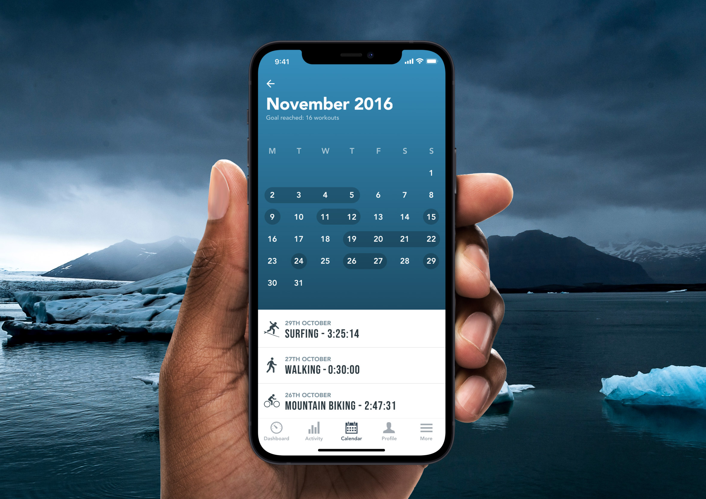
Day 40: Recipes
Challenge: “Design a recipe for food or drink or instructions to assemble some kind of object.”
Recipe design is a step-by-step communication problem. The reader is standing in a kitchen with wet hands, glancing up at a screen between tasks. The layout needs to hold up in that context: large enough to read from a distance, clear enough to follow without re-reading, and structured so you always know where you are in the process.
I went with a mojito recipe here, which gave me a nice mix of a short ingredient list and a multi-step method. The two-column ingredient layout keeps the list scannable. The method steps are numbered and generously spaced so nothing gets lost mid-pour.
Day 41: Workout tracker
Challenge: “Design an interface for people to track and monitor their workouts.”
Workout trackers need to work in one of the least forgiving environments for a screen: a gym, with sweaty hands, limited attention, and a brain that’s already focused on the next set. The UI has to be operable with minimal cognitive load. Big tap targets, clear numbers, and an obvious path to the next action.
I focused on the active workout state rather than the planning or history views. That’s where the real UX pressure lives. The current exercise, the set count, the rest timer, and the next exercise all need to coexist on one screen without competing. When someone is mid-workout, they don’t want to think about the interface at all.
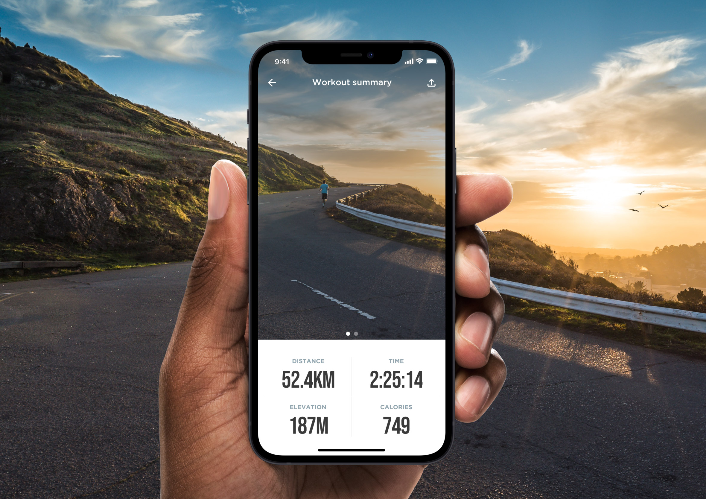
Day 42: Todo list
Challenge: “Design a checklist or to-do list of things you want to accomplish or don’t want to forget.”
Todo lists are the “hello world” of productivity app design, which makes them a surprisingly deep exercise. The basics are trivial. Adding a task, checking it off, deleting it. The interesting design decisions live in the edge cases: overdue items, priority levels, empty states, and what happens to completed tasks.
I kept the visual language simple and satisfying. The completion interaction is the emotional centre of a todo app, that moment of ticking something off needs to feel good. Clear typography, generous spacing, and a subtle visual treatment for completed items does that without making the list feel gamified or patronising.
Day 43: Food/Drink Menu
Challenge: “Design an interactive menu for an online store or restaurant.”
Restaurant menus translated to digital are an interesting challenge because the physical version has centuries of design convention behind it. People know how to read a menu. The digital version needs to honour that familiarity while adding the things a screen can actually do better: filtering by dietary requirement, surfacing what’s popular, and making the ordering action obvious.
I went with a clean category-led layout where the food does the visual work. Large imagery, clear pricing, and a frictionless add-to-order action. The menu categories stay accessible at the top so navigation never requires scrolling back to the beginning. A menu that makes someone work to find what they want is a menu that loses orders.
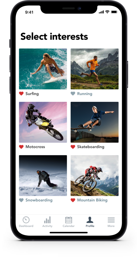
Day 44: Favourites
Challenge: “Design a simple interaction to save or favourite something of interest.”
The favouriting interaction is small but it carries real meaning. It’s a user saying “I want to come back to this” and the design needs to honour that intent with immediate, satisfying feedback. A heart that fills, a star that activates, a subtle animation: these micro-moments are where an app starts to feel alive.
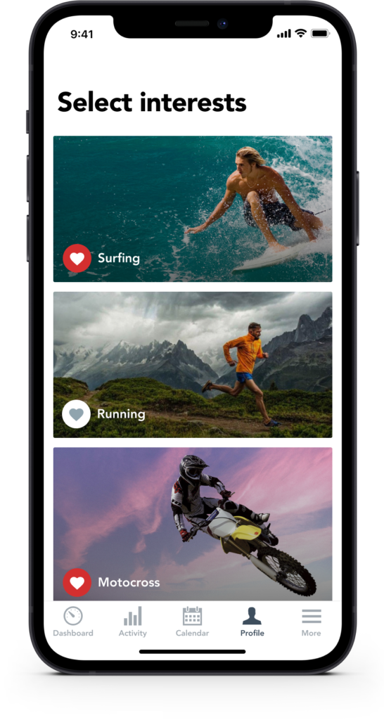
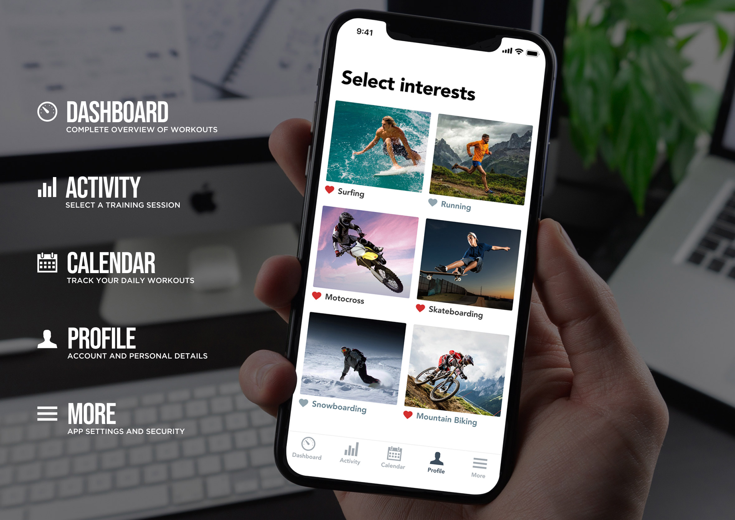
I explored this in a health and fitness app context where users select their interests during onboarding. The grid and row layout comparison was deliberate: both solve the same problem but create a completely different browsing rhythm. Grid scanning is faster. Row scanning is more considered. The right choice depends entirely on how many options you’re presenting.
Day 45: Info cards
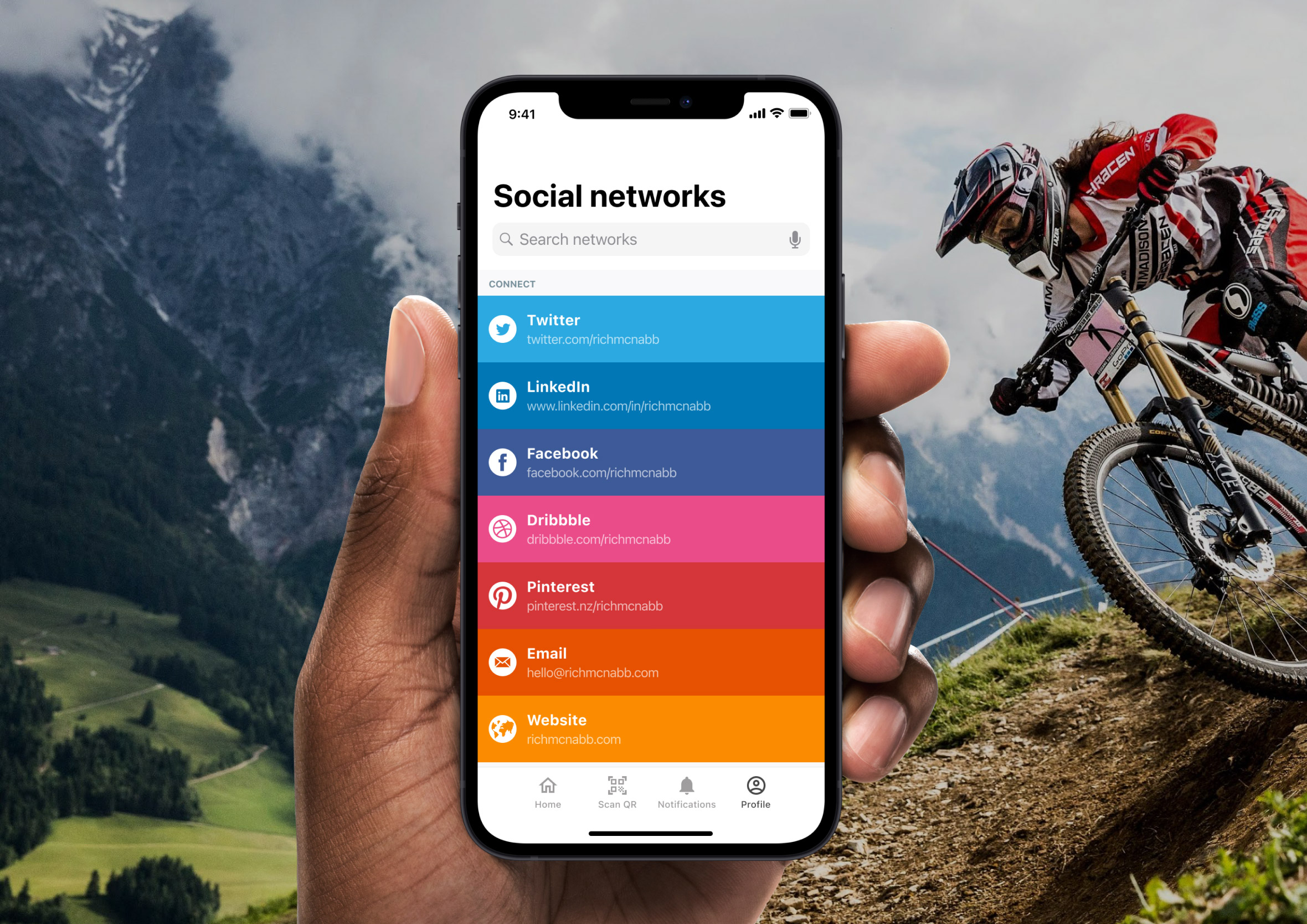
Challenge: “Design a simple info card, contact card of social network information screen.”
Info cards are modular by nature, which makes them a good test of whether a design system is actually working. The same card component needs to hold up with a long name, a short name, missing data, and an avatar that hasn’t loaded yet. Designing the ideal state is easy. Designing for the messy real world is the actual job.
I focused on a contact card scenario with a consistent layout that prioritises the most scannable information first. Name, role, and the primary contact action sit above the fold. Secondary details live below for the people who need them. A card that buries the phone number under three taps has missed the point entirely.
Day 46: Invoice
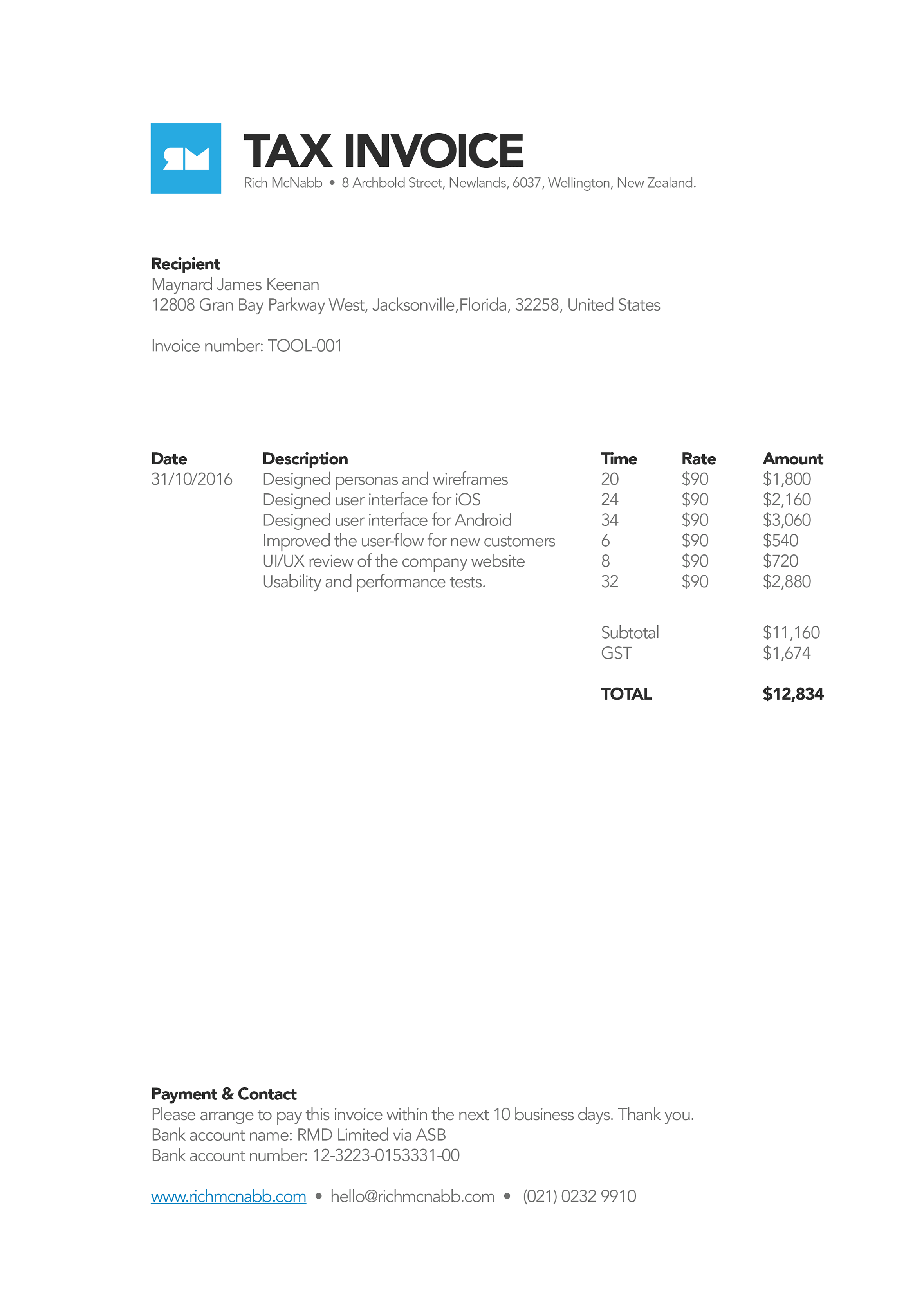
Challenge: “Design an invoice for an online purchase or for a company delivering services.”
Invoices are functional documents but they’re also brand touchpoints. Every invoice a business sends is a moment of contact with a client, and a well-designed one communicates professionalism without saying a word about it. A poorly designed one raises quiet doubts about everything else.
I focused on clarity and scannability. The most important numbers, the total, the due date, and the payment details, need to be findable in seconds. The line items below give the detail for anyone who needs to check them. A clean invoice is one where no one has to email asking what they’re being charged for.
Day 47: Activity feed
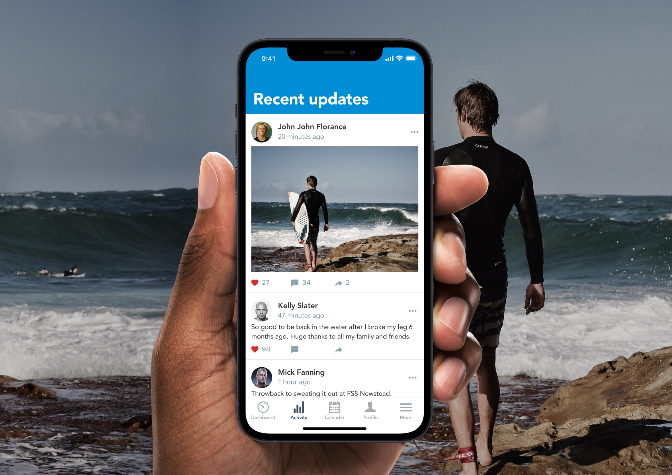
Challenge: “Design an activity feed for alerts, news stories or notifications.
Activity feeds are one of the most information-dense patterns in UI design and one of the easiest to get wrong. When every item looks identical, nothing stands out. When everything is visually differentiated, it becomes exhausting to scan. The right balance is a consistent baseline with just enough variation to signal importance.
I designed this around a notification context where different alert types carry different urgency levels. Colour, iconography, and typographic weight all contribute to that hierarchy without requiring the user to read every item in full. The goal is to let someone triage their feed in a single pass, acting on what matters and skimming past what doesn’t.
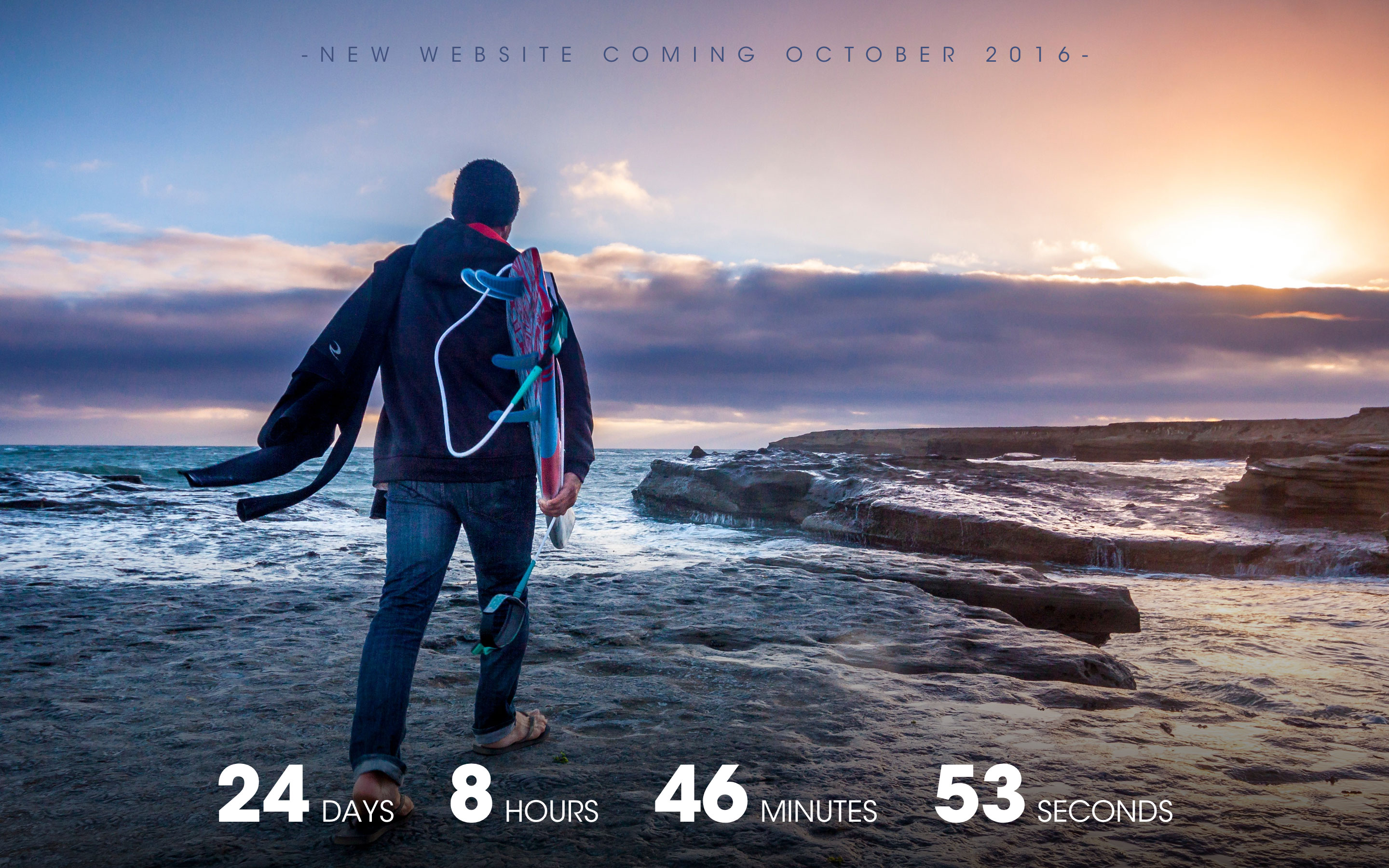
Day 48: Coming soon
Challenge: “Design a countdown or coming soon page for a website launch or release of a new product.”
Coming soon pages are an exercise in generating anticipation with almost no information. You’re asking someone to care about something that doesn’t exist yet, which means the visual design and copy have to carry the full emotional weight. Vague is fatal here. Specific and intriguing is the target.
I led with the countdown timer because it creates an immediate sense of event. Something is happening on a specific date and the clock is running. The supporting copy sits below with just enough detail to explain what’s coming without giving everything away. An email capture field gives interested visitors somewhere to put their enthusiasm before the page disappears.
Day 49: Notifications
Challenge: “Design an alert of notification for users to be made aware of information or tasks that need to be completed.”
Notifications are one of the most abused patterns in mobile design. When everything is urgent, nothing is urgent. A well-designed notification system earns attention by being selective and specific. The user should never have to wonder why they’re being interrupted.
I focused on the in-app notification panel rather than the lock screen alert, where the context is richer and the actions can be more nuanced. Each notification leads with the most relevant information, uses iconography to communicate type at a glance, and surfaces the most useful action without requiring the user to open the full screen to do anything about it.
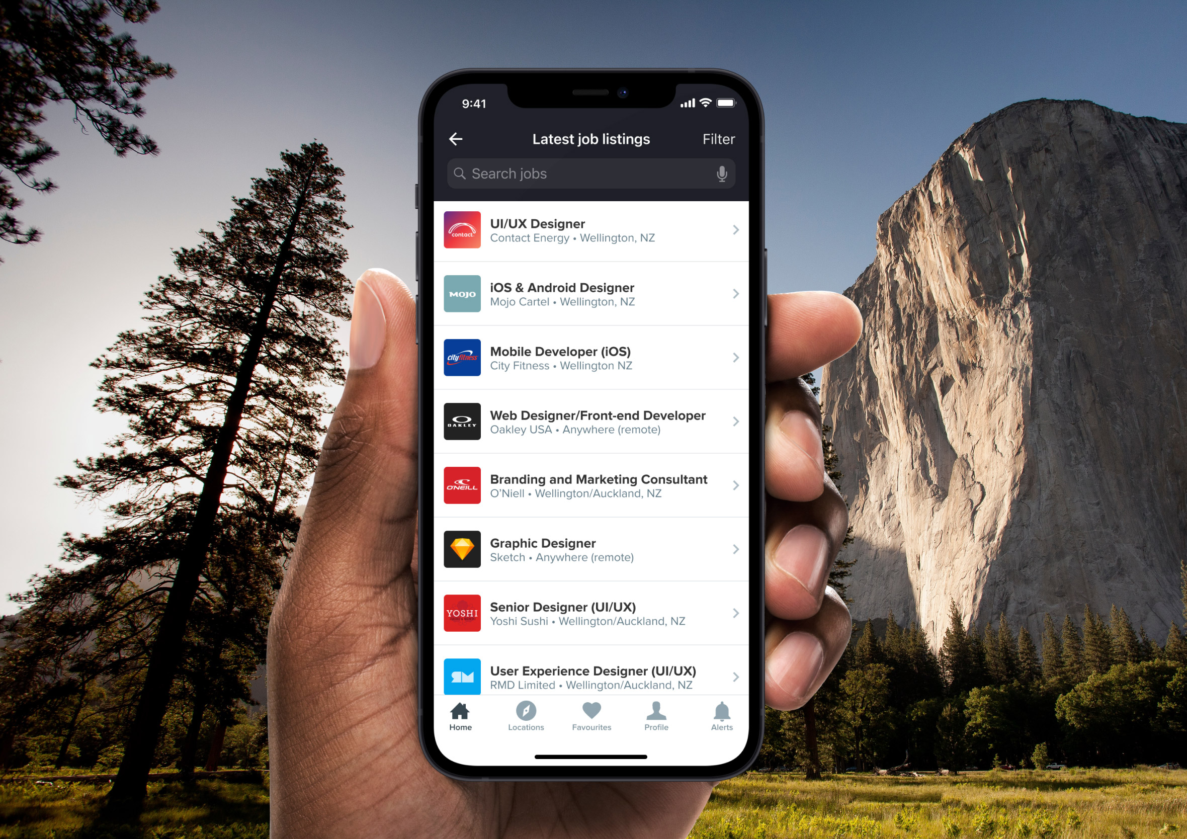
Day 50: Job listing
Challenge: “Design job advert or a number of vacancies to search, filter and apply for. Think about company and location information”
Job listing pages are high-stakes information architecture. Someone’s career decision might hinge on whether they can quickly find a role that fits. The filtering system needs to be genuinely useful, not just present. Location, salary range, contract type, and experience level are the filters that do real work. Everything else is noise.
I focused on the listing card design and the filtering panel working together. Each card communicates the essentials at a glance: role title, company, location, salary, and how recently it was posted. The apply action is accessible from the card without requiring a full page load. When someone is job hunting, reducing friction at every step is the most respectful thing a designer can do.
Day 51: Press page
Challenge: “Design a media kit, client page or press page for visitors to learn more about your business.”
Press pages are often the most neglected corner of a company’s website and the one that journalists, podcasters, and potential partners hit first. If the assets they need aren’t immediately findable, they move on. The design job here is pure information architecture: what does someone need, in what order, and how quickly can they get it.
I focused on a layout that surfaces the most commonly requested assets upfront: logo files, a company description, key facts, and a direct press contact. Everything is downloadable in one click. A press page that makes a journalist fill out a form to get a logo file is a press page that doesn’t get used.
Day 52: Logo
Challenge: “Design a logo. Will it be animated? In what capacity will it be used?Branding is generally a serious matter for most companies and the considerations for size, placement, colour, etc. should be thought out carefully.”
Logo design is the most reductive design challenge there is. You’re distilling an entire brand into a single mark that needs to work at 16 pixels and 16 metres. Every line, curve, and colour choice carries weight because there’s nowhere to hide when the canvas is that small.
I explored both the mark in isolation and in context, set against a background that tests how it holds up in real conditions. A logo that only works on white in a Figma file isn’t finished yet. The second mockup here shows it breathing in an environment, which is always the more honest test of whether it actually works.
Day 53: Header navigation
Challenge: “Design the header navigation for a website. Is it a sidebar, carousel or something else?
Navigation is the skeleton of a website. Get it right and nobody notices it. Get it wrong and it becomes the thing every user complains about. The header nav has roughly one second to orient a new visitor: where am I, what can I do here, and how do I get where I’m going.
I focused on a clean horizontal layout with a clear visual hierarchy between primary and secondary navigation items. The active state is unambiguous, the CTA button is visually distinct from the nav links, and the whole thing collapses gracefully on mobile. Navigation that works beautifully on desktop and falls apart on a phone hasn’t been designed, it’s been started.
Day 54: Confirmation
Challenge: “Design a confirmation interaction, alert or notification. Is it something that is about to happen or confirming a task has been completed?”
Confirmation screens are a moment of resolution. Something just happened and the user needs to know it worked. The design has one job: make that success feel clear, complete, and trustworthy. An ambiguous confirmation is almost worse than no confirmation at all because it leaves the user in a state of uncertainty.
I kept the layout minimal and led with a strong success signal before any supporting detail. The primary message is large and immediate. The secondary information, reference numbers, next steps, support options, sits below for the people who need it. Most users will read the headline and leave feeling confident. That’s exactly what should happen.
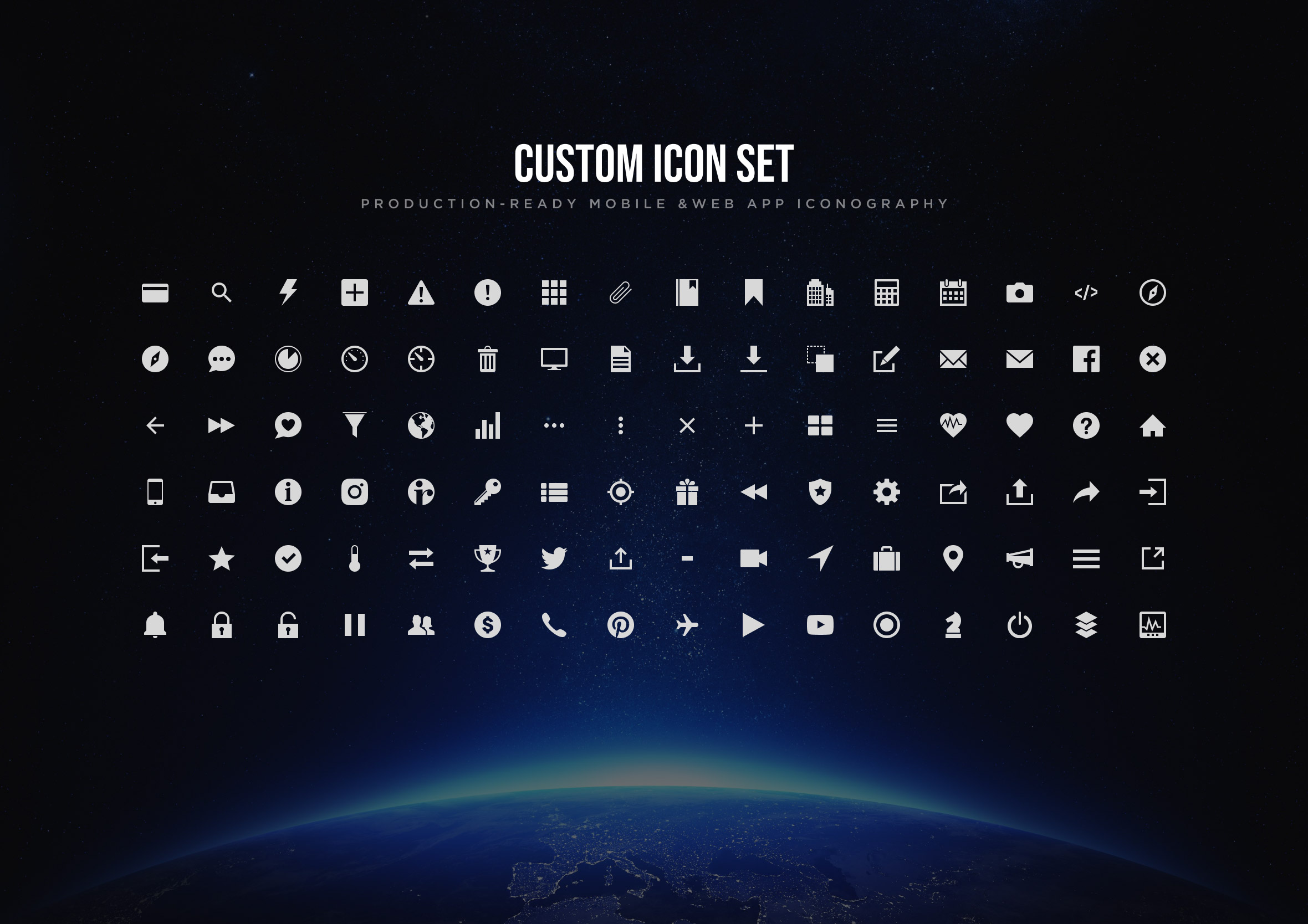
Day 55: Icon set
Challenge: “Design a set of common icons for a wide range of applications”
Icon design is where visual consistency becomes a discipline. A single icon is a drawing problem. A set of icons is a system problem. Every mark needs to feel like it came from the same hand, with consistent stroke weights, corner radii, optical sizing, and visual balance across very different subject matter.
I focused on a set of common UI icons: navigation, actions, and status indicators. The challenge is making a house icon and a settings gear feel like siblings even though their geometry is completely different. That shared visual language is what makes an icon set feel intentional rather than assembled from different sources.
Day 56: Breadcrumbs
Challenge: “NOT the edible kind. 😉 Although a seemingly small detail, breadcrumbs are quite necessary yet often neglected in terms of appearance and functionality. And to truly achieve great design sense and skills you need to consider even the smallest details.”
Breadcrumbs are one of those UI patterns that are invisible when they work and deeply frustrating when they don’t. They answer a question users ask constantly without realising it: where am I in relation to everything else? On deep-hierarchy sites and apps that question comes up constantly, and breadcrumbs handle it quietly in the background.
The design challenge is making them readable without giving them more visual weight than they deserve. They’re supporting navigation, not primary navigation. I kept the type small, the separators minimal, and the current page visually distinct from the clickable ancestors. Breadcrumbs that look like headings are breadcrumbs that confuse the hierarchy they’re supposed to clarify.
Day 57: Video player
Challenge: “Design a minimal video player. Don’t forget to include things like volume, closed captions, quality, etc.”
Video player UI is a masterclass in progressive disclosure. The controls need to appear when the user needs them and disappear when they don’t. An interface that’s always visible competes with the content it exists to serve. One that’s impossible to find when you need it is just as frustrating.
I focused on the control bar layout and the balance between the essential controls and the secondary ones. Play, pause, and scrubbing are the actions that happen constantly. Volume, captions, and quality settings happen occasionally and can live a layer deeper. Getting that hierarchy right means the player stays out of the way of the video.
Day 58: Shopping cart
Challenge: “Design a simple shopping cart icon or perhaps the contents of an online shopping cart. Remember to show details so that visitors can make informed decisions.”
The shopping cart is where e-commerce transactions either complete or abandon. Cart abandonment rates are notoriously high and bad cart design is a significant contributor. Every piece of friction between seeing the cart and completing the purchase is a reason for someone to leave.
I focused on the cart contents view with clear product summaries, editable quantities, and a running total that updates without a page reload. The checkout button is the most prominent element on the page because it’s the only action that matters. Everything else is confirmation and context that supports that single conversion moment.
Day 59: Background pattern
Challenge: “Design a background pattern, seamless texture, abstract or subtle background effect to add depth to a design.”
Background patterns are the seasoning of visual design. Used well they add depth and warmth without drawing attention to themselves. Used badly they compete with the content and make everything harder to read. The test is simple: if you notice the pattern more than the content sitting on top of it, it’s too much.
I explored a geometric repeat here, keeping the contrast low enough that it reads as texture rather than graphic. The pattern tiles seamlessly so there are no visible edges or repetition artifacts. Subtle surface interest is the goal, not decoration for its own sake.
Day 60: Colour picker
Challenge: “Design a colour pick for making selections or the ability to design your own colour palette”
Colour pickers are a fascinating UI problem because the input space is essentially infinite and the interface has to make it feel navigable. The spectrum, the saturation and brightness controls, the hex input, and the saved swatches all need to coexist without overwhelming someone who just wants to pick a blue.
I used a weather app context here where colour selection was part of a personalisation feature. The challenge was making a technically complex control feel approachable to a non-designer audience. Predefined palette options alongside the full picker gives users a fast path and a deep path, and most people take the fast one.
Day 61: Redeem coupon
Challenge: “Design a coupon, loyalty program, voucher or something similar where customers can save money as they shop.”
Coupon and redemption flows are high-stakes micro-interactions. Someone arrives with a code that represents real money off their purchase and if the redemption fails or feels uncertain, the goodwill that coupon was supposed to generate evaporates instantly. The design needs to make success feel immediate and failure feel fixable.
I focused on the input and confirmation states: the moment the code is entered, the validation feedback, and the updated total that confirms the saving has applied. Clear colour coding between valid and invalid states does most of the heavy lifting. A coupon field that just says “invalid code” without suggesting why or what to do next is a conversion killer.
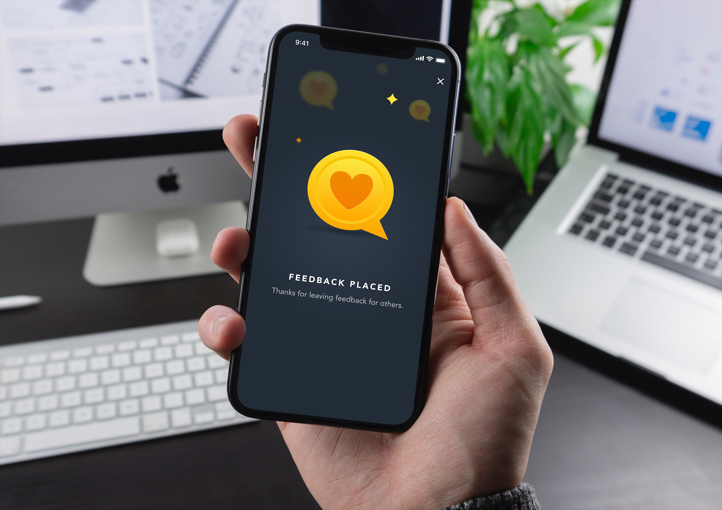
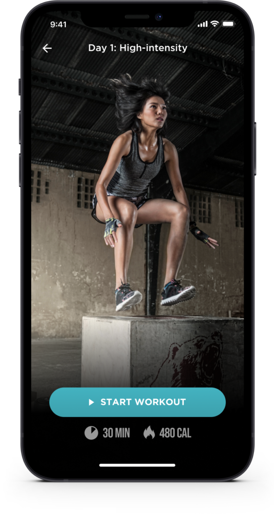
Day 62: Workout of the day
Challenge: “Design a health and activity interface to motivate and educate users to lead better lives and make better choices.” Image credit: https://lindyhealth.com/
Health and fitness apps walk a fine line between motivating and moralising. The best ones make you feel capable and informed. The worst ones make you feel guilty for opening them on a rest day. The tone of the copy and the visual language both contribute to which side of that line you land on.
I used a hero-led layout with a strong image and a clear daily focus. The workout detail sits below with enough information to get started without overwhelming someone who just wants to know what they’re doing today. Personalisation cues, the user’s name, their streak, their goals, make the interface feel like it knows them rather than broadcasting at them.
Day 63: Best of 2015
Challenge: “Design something that reflects at event or memory that happened during 2015.”
Year-in-review content is a design challenge as much as an editorial one. The structure needs to create a sense of journey: here’s where we started, here’s what happened, here’s where we ended up. Without that arc it’s just a list, and lists don’t make people feel anything.
I designed this as a visual retrospective with a strong typographic hierarchy and a timeline structure that moves the reader through the year. The key moments are given visual prominence relative to their significance rather than just their chronological position. A year-end piece that treats every event as equally important misses the point of telling the story at all.
Day 64: Select user type
Challenge: “Design an interface where the user can select who they are. Is it for a game, a login or something else?”
User type selection is one of the first decisions a product asks someone to make, which means it carries more weight than its apparent simplicity suggests. Get it wrong and people select the wrong path and have a broken experience. Get it right and every subsequent screen feels like it was built specifically for them.
I focused on making the options feel distinct and self-explanatory. Each user type needs enough context to make the choice obvious without requiring a paragraph of explanation. Visual differentiation through illustration or iconography helps enormously here. A selection screen where both options look identical except for a label is a screen that creates hesitation.
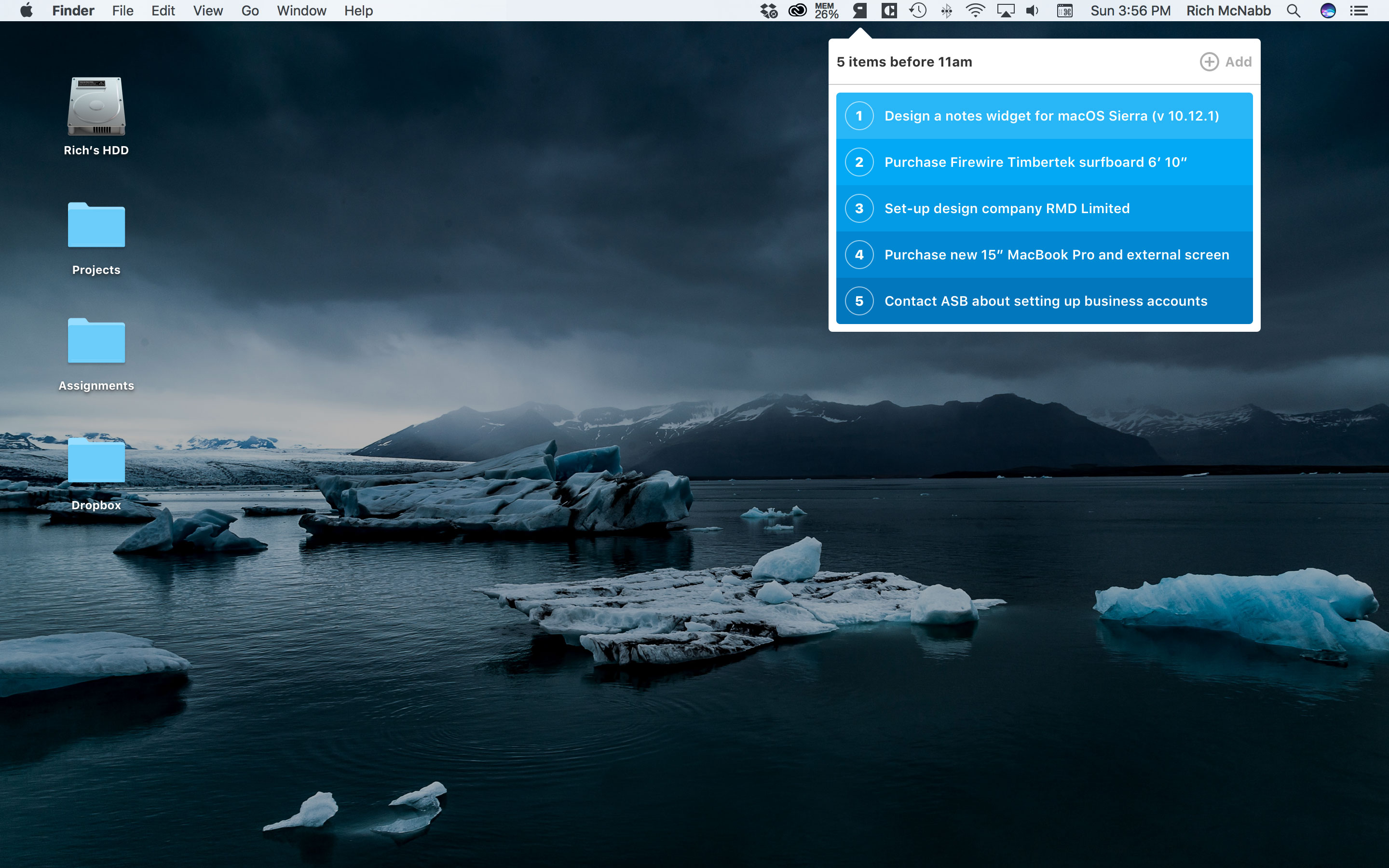
Day 65: Notes widget
Challenge: “Design a widget that allows you to create notes, capture ideas and improve your productivity.”
Notes widgets live in the margins of a workflow. They’re not the main app, they’re the thing you reach for when an idea arrives inconveniently in the middle of something else. That context demands speed above everything. The time between thinking something and capturing it is where ideas get lost.
I kept the interface minimal with a large input area, fast formatting options, and an obvious save action. The widget format means real estate is limited and every element needs to justify its presence. A notes widget with a complex toolbar is a widget that slows down the exact workflow it exists to support.
Day 66: Statistics
Challenge: “Design a graph or visual to convey complex statistics.”
Complex statistics are only complex until someone designs them well. The job of data visualisation is translation: taking numbers that mean something to an analyst and making them mean something to everyone else. That translation work happens in the choices about chart type, colour, labelling, and what gets left out.
I used a social marketing dashboard context here, where multiple data streams needed to coexist without fighting for attention. Each metric has a clear visual owner, comparisons are handled through proximity rather than colour coding alone, and the most important numbers are the largest things on the screen. Good data design makes the insight feel obvious in retrospect.
Day 67: Hotel Booking
Challenge: “Design a hotel booking experience.”
Hotel booking is one of the most research-heavy purchase journeys in consumer UX. People compare, revisit, compare again, and then finally commit. The design needs to support that non-linear behaviour rather than pushing users toward a decision before they’re ready. Trust signals, photos, reviews, and cancellation policy all factor into a booking decision as much as the price does.
I focused on the property detail page rather than the search results, because that’s where the conversion actually happens. The imagery leads, the key details sit in a scannable summary, and the booking widget is persistently accessible without dominating the layout. A booking page that buries the dates and price behind multiple scrolls is asking users to work for information they need to make a decision.
Day 68: Flight search
Challenge: “Design an interface or app that allows travellers to search for the cheapest flights on the web.”
Flight search is one of the most data-dense experiences in consumer UX and one of the most emotionally loaded. Someone searching for flights is usually planning something meaningful: a holiday, a visit to family, a work trip with a tight budget. The interface needs to handle a lot of variables without making the person feel like they’re filling out a tax return.
I focused on the search results view where the real comparison work happens. Clear pricing, flight duration, number of stops, and airline are the four data points that drive most decisions. The filtering panel keeps the heavy lifting accessible without cluttering the results. A flight search that surfaces the cheapest option without making it obvious why it’s cheap is a search that erodes trust.
Day 69: Trending
Challenge: “Design a graph, alert, notification or something else that shows it is trending.”
Trending indicators are about communicating momentum, not just current state. A number on its own tells you where something is. A trend line tells you where it’s going. That direction is often more useful than the absolute value, especially in fast-moving contexts like social media, stock prices, or live events.
I used a bold typographic treatment with a directional indicator that makes the trend readable in a single glance. The supporting sparkline gives enough historical context to make the direction meaningful without requiring a full chart. Trending UI that buries the trend behind the data has lost the thread of what it’s trying to communicate.
Day 70: Event Listing
Challenge: “Design an event listing page.”
Event listings need to answer four questions immediately: what is it, where is it, when is it, and how do I get a ticket. Everything else is supporting detail. A listing that leads with a long event description before surfacing the date and location is a listing that loses people who are just scanning to see if it fits their schedule.
I used an executive lunch invitation format here, which gave the challenge a more formal register than a typical gig listing. The hierarchy shifts slightly in that context: the host and occasion carry more weight than they would for a concert. But the core principle stays the same. Date, location, and the action to attend need to be the most prominent things on the page.

Day 71: Schedule
Challenge: “Design a TV schedule, a calendar app or travel itinerary. Anything that allows users to see an overview of their day, week or month.”
Schedule interfaces live at the intersection of time and space, and getting that spatial layout right is everything. Too dense and the user can’t parse what’s happening at a glance. Too sparse and the layout wastes the screen real estate that makes a schedule useful in the first place. The grid has to do the communicating before a single label is read.
I focused on a day view layout where time blocks are proportional to their duration, so a two-hour meeting visually occupies twice the space of a one-hour meeting. That proportionality is what makes a schedule feel honest rather than abstract. Colour coding for event types adds a second layer of scanability without adding complexity to the reading experience.
Day 72: Image slider
Challenge: “Design an image slider for a product, application of photo gallery website”
Image sliders get a bad reputation in UX circles and mostly for good reason. Auto-advancing carousels that move before you’ve finished reading are a genuine usability problem. But a well-designed manual slider with clear navigation controls and an obvious current position indicator is still one of the most space-efficient ways to present multiple images in a constrained layout.
I focused on the controls and the transition between states. The previous and next affordances need to be large enough to hit confidently on a touchscreen. The position indicator at the bottom tells the user how many images exist and where they are in the sequence. A slider with no indication of how many items it contains is a slider that creates uncertainty rather than resolving it.
Day 73: Virtual reality
Challenge: “Design an interface for a virtual reality experience.”
Designing for virtual reality breaks almost every spatial convention that flat screen UI relies on. There’s no chrome, no scroll bar, no window to contain the interface. Elements float in three-dimensional space and the user interacts with them through gaze, gesture, or a controller. Every assumption about proximity and hierarchy needs to be rethought from scratch.
I explored an iconography and spatial layout system that could work in a VR context, thinking about how UI elements behave when they exist in a physical space rather than on a surface. The visual language needs to be readable at arm’s length, distinguishable under varying lighting conditions, and simple enough to understand without the safety net of a cursor.
Day 74: Download app
Challenge: “Design a website, button or sign-up for to allow people to be able to download your app”
App download pages have one conversion goal and the design should be ruthlessly organised around it. Everything on the page either builds the case for downloading or provides the mechanism to do it. Anything that does neither is friction that costs you installs.
I focused on a hero-led layout with the device mockup showing the app in action, a concise value proposition, and the App Store and Google Play badges sitting prominently below. The badges are the action and they need to be impossible to miss. Supporting social proof, ratings, download numbers, or a short testimonial, earns its place by reducing hesitation in the final moment before the tap.
Day 75: Pre-order
Challenge: “Design a user experience that allows user to research your product and have the ability to pre-order if they are interested.”
Pre-order flows ask users to commit money to something they can’t yet have, which means the design needs to do serious trust-building work before it asks for anything. The product needs to feel real, the delivery timeline needs to feel credible, and the value proposition needs to be compelling enough to justify the wait.
I designed a two-screen mobile flow: the product detail page that makes the case, and the pre-order confirmation that closes the loop. The detail page leads with the product hero and keeps the pre-order CTA persistently accessible as the user scrolls through the supporting information. The confirmation screen gives the user a clear record of what they’ve committed to and when to expect it.
Day 76: Loading
Challenge: “Design a loader, spinner or animation to display activity. Consider if you know the time to complete the task or if it is unknown.”
Loading states are the design equivalent of hold music. Nobody wants to be there, but how you handle the wait says a lot about how much you respect the user’s time. A spinning indicator with no context is tolerable for a second or two. Beyond that, users start wondering if something has gone wrong.
The key distinction is between determinate and indeterminate loading. When you know how long something will take, show a progress bar with a percentage. When you don’t, a spinner is honest about the uncertainty. What’s never acceptable is a loading state that gives no feedback at all. Silence from an interface is indistinguishable from a crash.
Day 77: Thank you
Challenge: “Design a thank you card, confirmation message or something else to convey gratitude.”
Thank you screens are the emotional punctuation at the end of a completed action. They close the loop, confirm success, and leave the user with a feeling about the brand. A well-designed thank you screen is warm, specific, and points somewhere useful next. A generic “thank you for your submission” does none of those things.
I kept the layout generous and unhurried. The primary message is large and positive. The supporting detail gives the user the information they need to feel confident the action worked. The secondary action at the bottom gives them somewhere to go next without pressuring them to do anything immediately. Gratitude should never feel rushed.
Day 78: Pending invitation
Challenge: “Design the UX/UI of an app that lets you invite people to collaborate on your project”
Collaboration invitations occupy an interesting UX space because they involve two parties: the person sending and the person receiving. The sender needs confidence that the invitation went out and clarity on its status. The recipient needs enough context to understand what they’re being invited into before they accept.
I focused on the sender’s view here, showing a list of pending invitations with clear status indicators for each. Sent, viewed, and accepted states all need to feel visually distinct so the sender can manage the team-building process without chasing people manually. A pending invitation UI that shows no status beyond “sent” leaves the sender completely in the dark.
Day 79: Itinerary
Challenge: “Design a travel itinerary.”
Travel itineraries are a sequencing problem wrapped in an information design problem. The user needs to know what’s happening, in what order, where each thing is, and how to get between them. That’s a lot of data to present in a way that feels like a plan rather than a spreadsheet.
I used a location-based layout here, anchoring each itinerary item to a map view so the spatial relationship between stops is always visible. The list and map work together rather than competing. Tapping an item on the list highlights it on the map, and vice versa. A travel itinerary that shows times and places without showing how they connect spatially is an itinerary that leaves the traveller doing mental work the interface should be doing for them.
Day 80: Date picker
Challenge: “Design the ability for a user to be able to select a date. Remember things like the ability to change month or year.”
Date pickers are one of those components that are technically straightforward and experientially treacherous. The default browser implementation is notoriously inconsistent across platforms and devices. A custom date picker gives you control over the experience but demands careful attention to accessibility, touch target size, and keyboard navigation.
I focused on a clean calendar grid with clear month navigation and an unambiguous selected state. The today indicator gives the user an anchor point so they’re never lost in the calendar. Year navigation sits above the month controls for tasks that require jumping further back or forward. A date picker that makes someone tap through twelve months to get to the right year is a date picker that causes unnecessary frustration.
Day 81: Status update
Challenge: “Design a status update. Is it a reminder, an alert, a notification or a tool to forecast based on real-time data?”
Status updates are the nervous system of any data-driven interface. They tell the user whether the system is healthy, whether something needs attention, and whether the information they’re looking at is current. A dashboard that shows data without communicating when that data was last updated is a dashboard that quietly erodes trust.
I used a weather monitoring dashboard context here, where real-time status is genuinely critical. The visual hierarchy puts system health front and centre, with supporting metrics arranged around it. Colour does immediate work: green means everything is running, amber means check this, red means act now. That traffic light logic is so universally understood that it requires no legend to interpret.
Day 82: Form
Challenge: “Design a simple form for sign-in up, searching, or something else. You decide.”
Forms are the workhorses of UI design and one of the most frequently mishandled patterns on the web. The mistakes are almost always the same: too many fields, unclear labels, unhelpful error states, and a submit button that looks like every other button on the page. Good form design removes every possible reason to abandon before completion.
I went with a customer support chat initiation form here. The context matters because someone opening a support chat is already experiencing friction somewhere else. The form needs to be fast, forgiving, and reassuring. I kept the fields to the minimum necessary, used inline validation rather than end-of-form errors, and made the submit action feel like the start of a conversation rather than the end of a process.
Day 83: Button
Challenge: “Design a button for a form, a game, a banking transaction or something else.”
Buttons are the most fundamental interactive element in UI design and still one of the most inconsistently implemented. The core requirements are simple: a button needs to look tappable, communicate its action clearly, and provide feedback when pressed. Everything else is context.
I used a game interface here, specifically a puzzle app, where the button design needed to feel playful without sacrificing clarity. Game buttons carry more visual personality than their enterprise counterparts but the same rules apply. The label tells you what happens, the visual treatment communicates the hierarchy, and the pressed state closes the feedback loop. A button that looks identical before and after being tapped has left the user wondering if it registered.
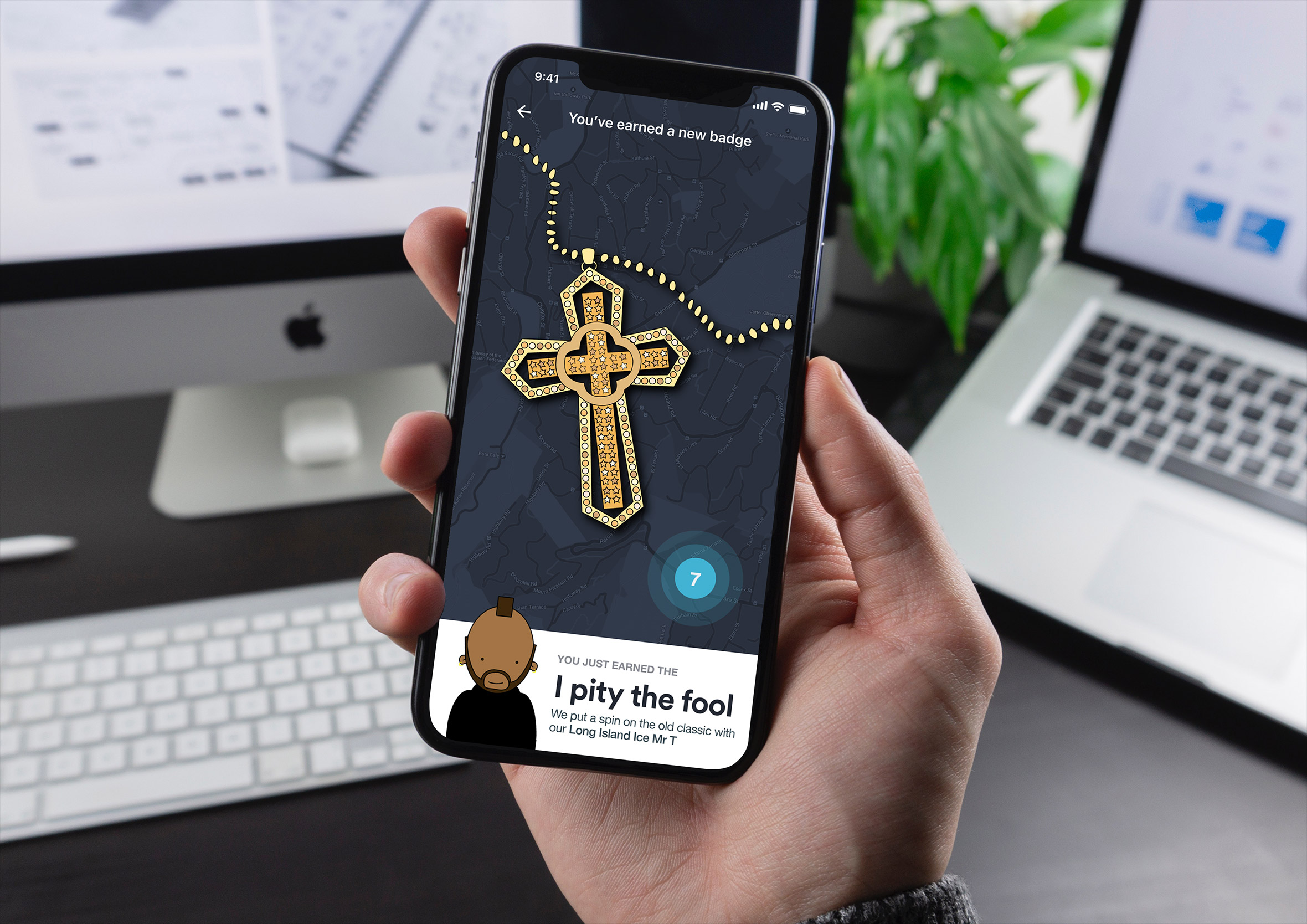
Day 84: Badge
Challenge: “Design a badge, tile, toast, card or notification of something a player is awarded with.”
Achievement badges are one of the most effective tools in game design for sustaining engagement over time. They give players something to work toward, a moment of celebration when they get there, and a visible record of progress that makes the effort feel meaningful. The design needs to make earning one feel genuinely rewarding rather than arbitrary.
I focused on the badge reveal moment, the screen a player sees when they unlock something new. The badge itself leads with strong iconography and a clear achievement title. The supporting copy explains what was accomplished and why it matters within the game world. A badge that just appears without ceremony is a missed opportunity to create a moment worth remembering.
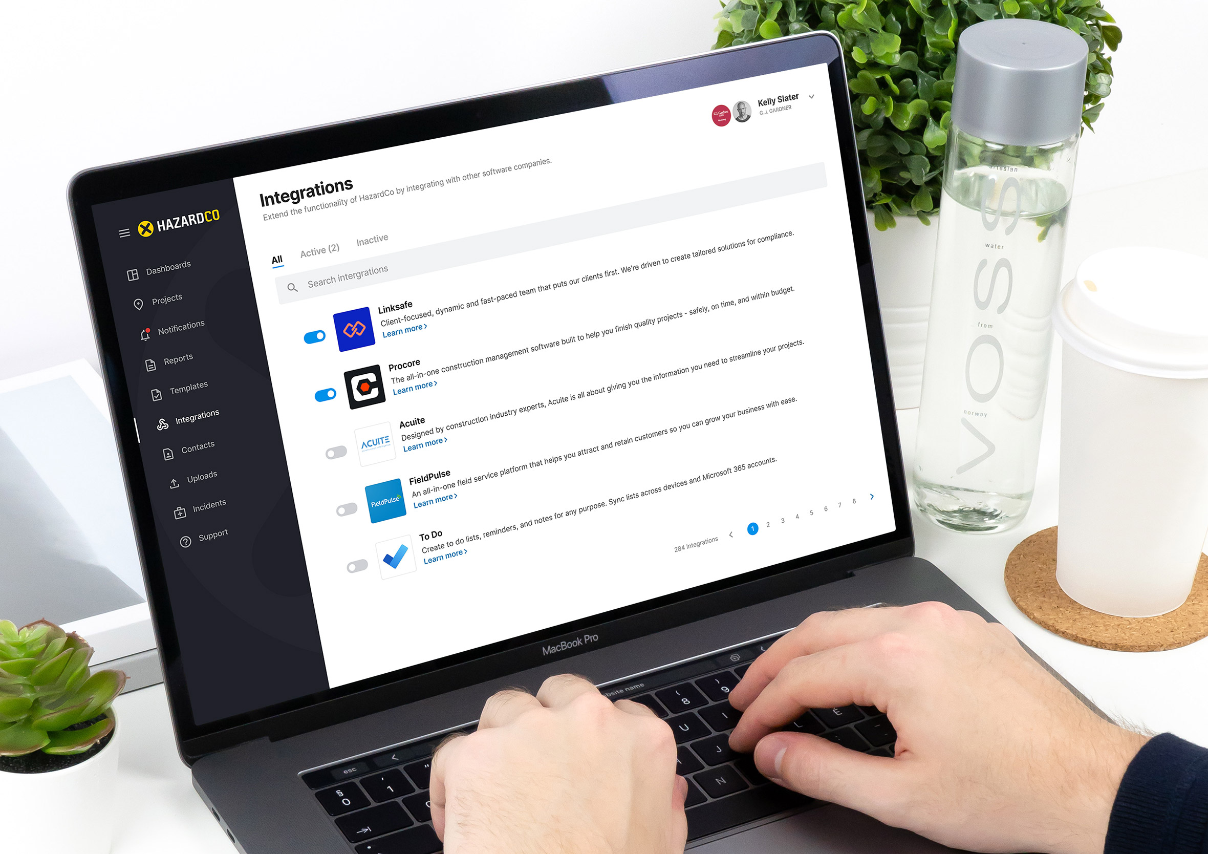
Day 85: Pagination
Challenge: “Design a simple pagination to move between long lists of data. Don’t forget to show the amount of records :)”
Pagination is one of those patterns that only gets noticed when it fails. A user deep in a long list needs to know where they are, how many pages exist, and how to get to the next one without losing their place. Strip any of those three things out and the experience immediately degrades.
I used an integrations dashboard context here where the record count is genuinely useful information. Knowing you’re on page 3 of 12 with 240 total results tells a very different story than seeing an endless list with no sense of scale. The page controls are large enough to hit confidently, the current page is unambiguously highlighted, and jumping to the first or last page is a single tap rather than a repeated click.
Day 86: Progress Bar
Challenge: “Design a progress bar, activity indicator so users can gauge activity and time remaining to complete a task.”
Progress bars are one of the most psychologically interesting UI patterns because they manage expectation as much as they communicate information. Research consistently shows that users tolerate waits better when they can see progress happening, even when the total time is longer than an unmarked wait. The bar is doing emotional work as much as informational work.
I used a timer app context here where the progress bar is the primary UI rather than a supporting element. The bar needed to be large, clear, and visually satisfying as it depletes. The time remaining sits prominently above it so the two pieces of information work together. A progress bar that moves in uneven jumps or stops unexpectedly breaks the psychological contract it was created to establish.
Day 87: Tooltip
Challenge: “Design a tooltip to provide help on how something works or to provide hidden content to speed up task completion rates.”
Tooltips are a pressure valve for interface complexity. When a UI element needs more explanation than its label can provide, a tooltip surfaces that context exactly when and where it’s needed without cluttering the primary interface. The best tooltips feel like a knowledgeable colleague whispering a helpful clarification, not a manual you have to read before you can do anything.
I focused on placement and timing here. A tooltip that appears instantly on hover is annoying. One that requires a deliberate pause feels intentional. The content needs to be concise enough to read in a single glance and specific enough to actually help. A tooltip that restates the label it’s attached to has added words without adding value.
Day 88: Avatar
Challenge: “Design an avatar upload, profile screen or user management system. You decide.”
Avatar upload flows touch something personal. A profile picture is how someone represents themselves in a digital space and the upload experience needs to respect that. Crop controls, zoom, and a preview before committing are table stakes. An interface that accepts any image without giving the user a chance to frame it correctly produces bad profile photos and frustrated users.
I focused on the upload and crop state here, giving the user clear control over how their image is framed within the circular avatar. The preview shows exactly what others will see before anything is saved. The controls are simple and forgiving, with an easy way to start over if the result isn’t right. Avatar upload is a small interaction with an outsized impact on how someone feels about the product they’re using.
Day 89: Terms of service
Challenge: “Design a simple term of service or software agreement to be used for a desktop/mobile/web application.”
Terms of service screens are the design equivalent of a legal document handed to you as you walk through a door. Everyone scrolls to the bottom and taps accept without reading a word, and both parties know it. The design challenge is making the experience feel honest and respectful rather than like a trap being set.
I focused on a clean, readable layout with genuine typographic hierarchy rather than a wall of undifferentiated legal text. Key terms are surfaced in plain language above the full document for anyone who wants the summary. The accept action is clearly separated from the decline option and neither is hidden or visually manipulated to nudge the user toward one over the other. Dark patterns in legal consent flows are a trust problem waiting to happen.
Day 90: Create new
Challenge: “Design an interface that allow users to add, create or modify something. Is it part of the on-boarding process or as simple as composing a new email?”
Create flows are where a product shows its confidence in its own design. A cluttered, overwhelming creation interface suggests the product doesn’t quite know what it is. A focused, well-sequenced one makes the user feel capable from the first interaction. The blank canvas moment, before anything has been created, is one of the most important screens in any creative or productivity tool.
I designed this around a content creation context where the primary action is starting something new. The interface presents only what’s needed to get going: a title field, a type selector, and a clear create action. Advanced options are accessible but not upfront. Getting someone to their first created item as quickly as possible is the entire job of this screen.
Day 91: Curated for you
Challenge: “Design a list of blog articles, breaking news or think outside the box and come up with something new.”
Personalised content feeds live or die on the quality of their curation. A feed that feels genuinely tailored to someone’s interests is one of the most powerful retention tools a product has. One that serves generic content with a “for you” label is one that trains users to ignore it. The design needs to surface enough context alongside each item that the recommendation feels considered rather than algorithmic.
I focused on a card-based layout where each item communicates its relevance quickly: category, headline, and a short summary that gives enough context to decide whether to tap in. The visual hierarchy makes scanning fast and the card proportions give imagery enough space to do emotional work without overwhelming the text. Content discovery should feel like a pleasant surprise, not a chore.
Day 92: F.A.Q
Challenge: “Design an F.A.Q (Frequently Asked Questions) to educate your users and reduce calls and emails to support.”
A well-designed FAQ page is a support cost reduction disguised as helpful content. Every question answered clearly on the page is a ticket that doesn’t get raised, a phone call that doesn’t happen, and a frustrated user who leaves with their problem solved. The design job is making the right answer findable in the shortest possible time.
I used an accordion layout here, keeping the question list scannable while collapsing the answers until they’re needed. A search input at the top handles the case where someone’s question doesn’t fit neatly into a category. The most common questions sit at the top of each section rather than in alphabetical order, because frequency matters more than tidiness when someone is looking for help.
Day 93: Splash
Challenge: “Design a simple splash screen for a website, app or software product. Something simple while the application is loading in the background. Think about imagery and branding.”
Splash screens exist in a narrow window of time between launch and usability. Done well they fill that gap with something that reinforces brand identity and sets the tone for the experience ahead. Done badly they’re just a logo on a background that makes the loading time feel longer than it actually is.
I kept this one focused on a single strong brand mark with a subtle loading indicator below it. The background colour is pulled directly from the brand palette so the transition into the main UI feels seamless rather than jarring. A splash screen that takes longer to animate than the app takes to load has its priorities exactly backwards.
Day 94: News
Challenge: “Design a news related interface.”
News interfaces carry a unique design responsibility because the content itself shapes public understanding. The hierarchy decisions, what leads, what gets a large image, what gets buried in a secondary column, are editorial decisions as much as design decisions. The layout is never neutral.
I focused on a clean editorial layout with a strong hero story and a supporting grid of secondary items below. Typography does most of the heavy lifting: headline size communicates story importance before a word is read. The reading experience is uncluttered and focused, because news that’s hard to read is news that doesn’t get read. Dense, distraction-free layouts respect both the content and the reader’s time.
Day 95: Product tour
Challenge: “Design an overview highlight any UI changes, a simple tour explaining how something works or the product’s features.”
Product tours are a delicate balance between being helpful and being in the way. A tour that hijacks the interface and forces the user through a linear sequence before they can do anything is a tour that gets dismissed at step one. The best product tours feel optional, contextual, and easy to exit without penalty.
I designed a tooltip-driven tour that surfaces tips in context rather than pulling the user out of the interface entirely. Each step highlights a specific feature where it actually lives, with a simple next control and a visible exit. The progress indicator at the bottom tells the user how long the tour is so they can make an informed decision about whether to continue or explore on their own terms.
Day 96: Currently in-stock
Challenge: “Design an e-commerce website or app for a product which is on sale or in-stock.”
Stock availability is one of the most psychologically powerful signals in e-commerce design. “Only 3 left” creates urgency that no amount of persuasive copy can match. But that urgency has to be honest. False scarcity is one of the fastest ways to lose a customer’s trust permanently and there’s enough of it around that users have become good at spotting it.
I focused on the product detail page with clear availability status, honest stock indicators, and a prominent add to cart action. The in-stock confirmation sits close to the price so the two pieces of information that drive the purchase decision are always in the same visual moment. A product page that makes users hunt for availability information before they can commit is a page that loses sales to competitors who make it easier.
Day 97: Giveaway
Challenge: “Design a giveaway, voucher, coupon or some other idea to give something away for free.”
Giveaway interfaces need to generate excitement without generating confusion. The prize needs to be clear, the entry mechanism needs to be simple, and the terms need to be findable without dominating the page. A giveaway that requires three paragraphs of reading before you understand what you’re entering for has already lost most of its audience.
I led with the prize because that’s the entire reason someone is on the page. The entry action sits directly below with as few steps as possible between interest and participation. The deadline creates natural urgency without any manufactured pressure. Supporting details about how the winner is selected and when they’ll be notified sit below for the people who want that reassurance before they enter.
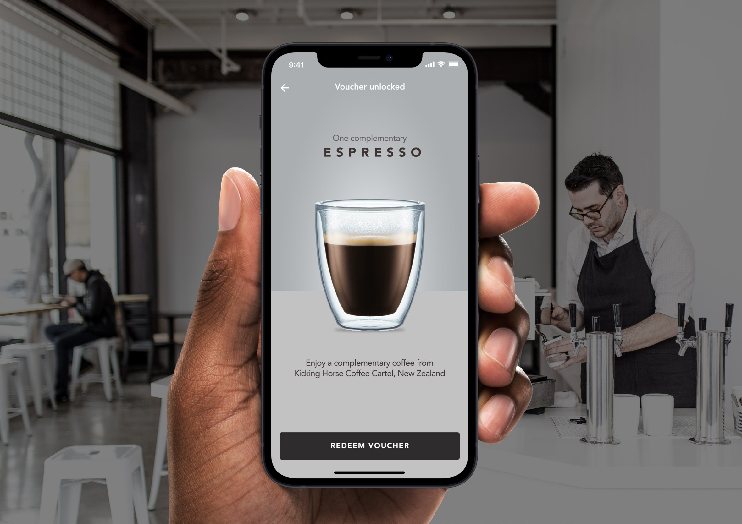
Day 98: Advertisement
Challenge: “Design an advertisement to promote you app, website event or something else.”
Digital advertising has a trust problem built up over decades of interruptive, irrelevant, and misleading ads. A well-designed advertisement earns attention rather than demanding it. The best ads feel like content that happens to be promoting something rather than a promotion that’s trying to look like content.
I used an executive lunch invitation format here, a high-value event promoted to a specific professional audience. The design is intentionally premium: restrained typography, quality imagery, and a clear value proposition aimed squarely at the right person. An ad that knows exactly who it’s for and speaks directly to them will always outperform one trying to appeal to everyone.
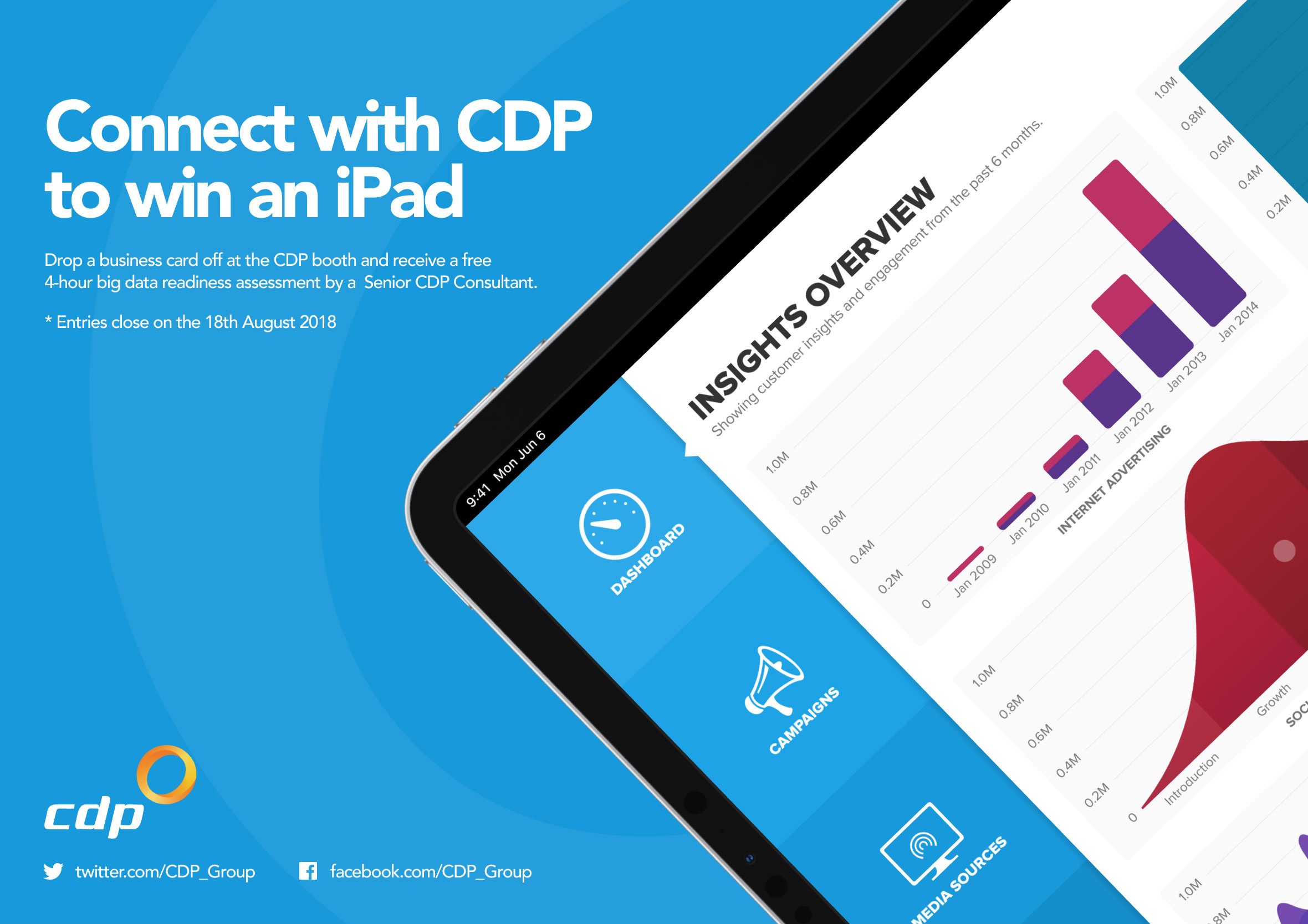
Day 99: Categories
Challenge: “Design a breakdown of items, is it a logical collection of elements, categories for a blog or something else?”
Category pages are often the most underdesigned pages on a website. They exist between the navigation and the content, helping users orient themselves and find what they’re looking for. When they’re done well they feel like a curated shop window. When they’re done badly they feel like a filing cabinet.
I focused on a visual grid layout where each category is represented by an image, a label, and a count of items within it. The imagery does the emotional work of communicating what each category feels like before the user commits to exploring it. Clear visual weight between populated and sparse categories helps users make better navigation decisions without needing to click into each one to find out what’s there.
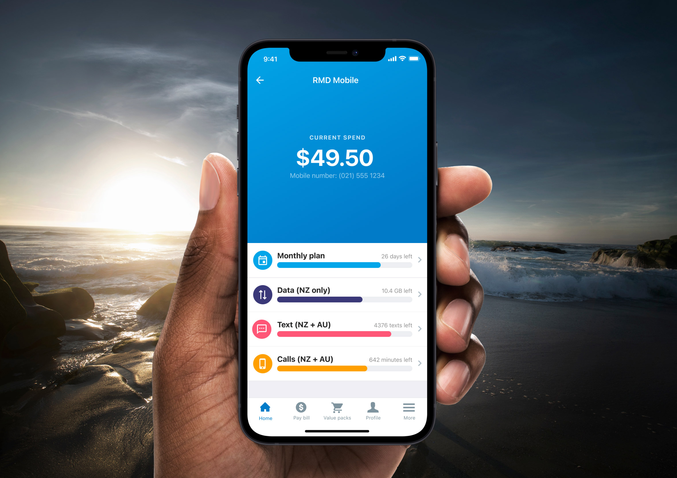
Day 100: Daily UI landing page
Challenge: “What would it take for a site’s landing page to appeal specifically to designers? What would interest you? Oh, and another benefit is that if your design is super cool and others like it as well, then (with your permission) it’ll be our inspiration for our new design. And in that case… you’ll be proudly featured on our site.”
One hundred days. One hundred prompts. And the final challenge is to design the landing page for the challenge itself. There’s something satisfying about that full-circle moment: the skills built across ninety-nine previous exercises all pointing back at the thing that started them.
I approached this as a designer-to-designer communication problem. The audience knows good design when they see it, which means there’s nowhere to hide behind clever copy or stock photography. The page needs to demonstrate craft, not just describe it. Strong typography, a confident layout, and a clear call to action that respects the intelligence of the people reading it. A fitting way to close out one hundred days of design.
What 100 days of design taught me
A challenge like this is easy to underestimate. One prompt a day sounds manageable until you’re forty days in, staring at “Design a dropdown” at 10pm wondering if there’s anything genuinely interesting left to say about a dropdown. There always was. That’s probably the biggest thing this challenge reinforced: every UI pattern, no matter how familiar, has a design decision hiding inside it worth thinking about properly.
The prompts that pushed me toward real contexts produced the best work. Designing a calculator as a currency converter, using a police dispatch dashboard for an overlay, building a biosecurity flash message around a real product I’d worked on. Constraints and context make design decisions meaningful.
You can see that thinking carried through into the full case studies on the portfolio, like the Coming to New Zealand biosecurity app and the HazardCo worksite health and safety app, where real user needs shaped every screen.
If you’re a designer looking to sharpen your instincts, build speed, or just get out of a creative rut, I can’t recommend the Daily UI challenge enough. One hundred days of deliberate practice changes how you think about interfaces, and that thinking carries into everything else you work on. Browse the full design portfolio to see where those instincts ended up.