StrategyBlocks: Customer onboarding user flows
A UX case study for StrategyBlocks, an online strategic planning platform. Covering information architecture, wireframes, form validation, user onboarding and the registration flow from welcome screen through to launch.

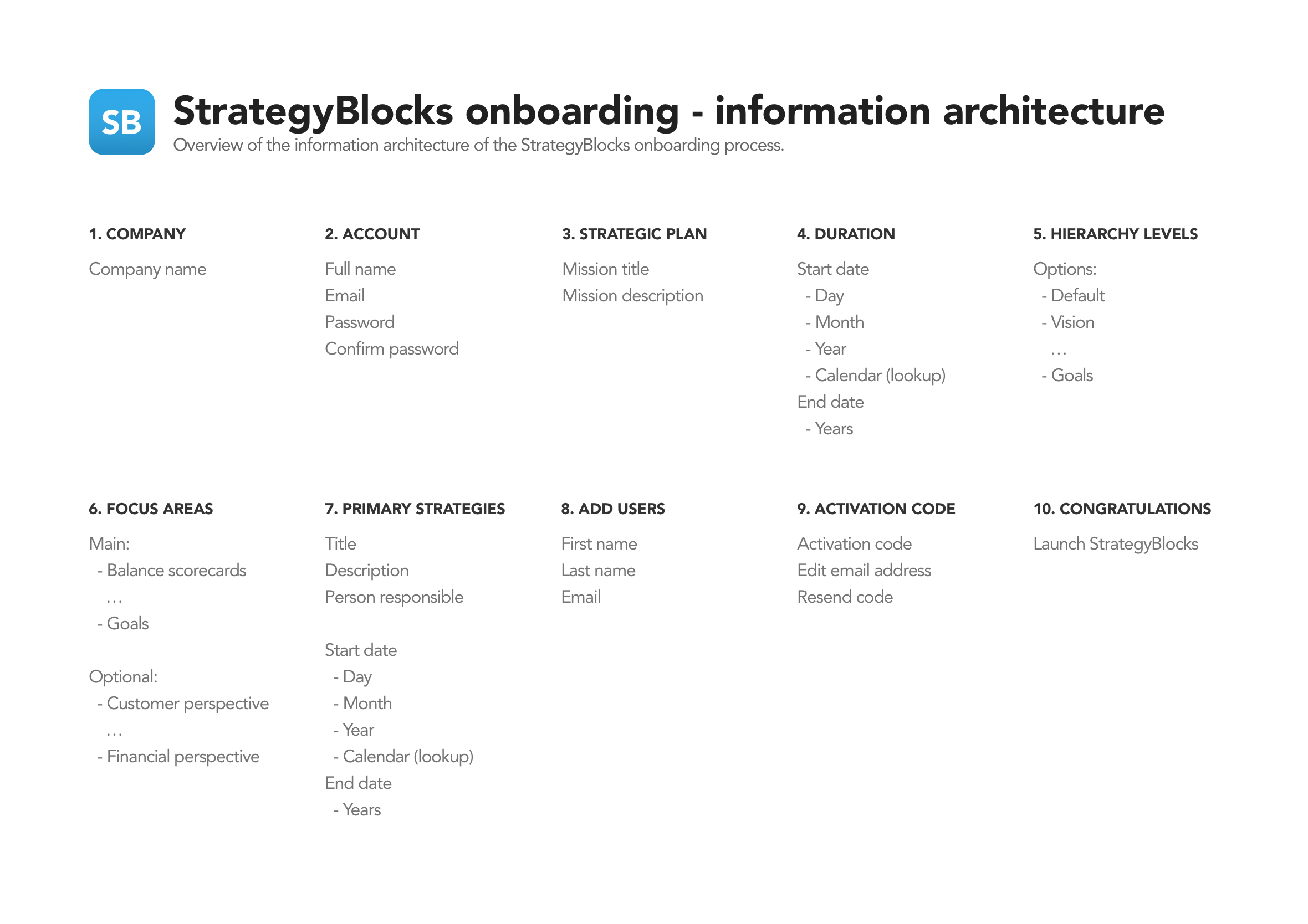
Information architecture
The information architecture goes hand in hand with the wireframing process to map out exactly which screens are required and all the necessary user interface elements that make up the structure of the user flows. By having everything in the one place it makes it easier to identify areas of improvements or gaps in the overall user experience.
Sketching: Quantity vs. quality
With the information architecture and necessary screens mapped out I normally produce rapid sketches to experiment with potential layouts, concepts, and hierarchy. The process is to produce quantity over quality during the early stages of exploration.
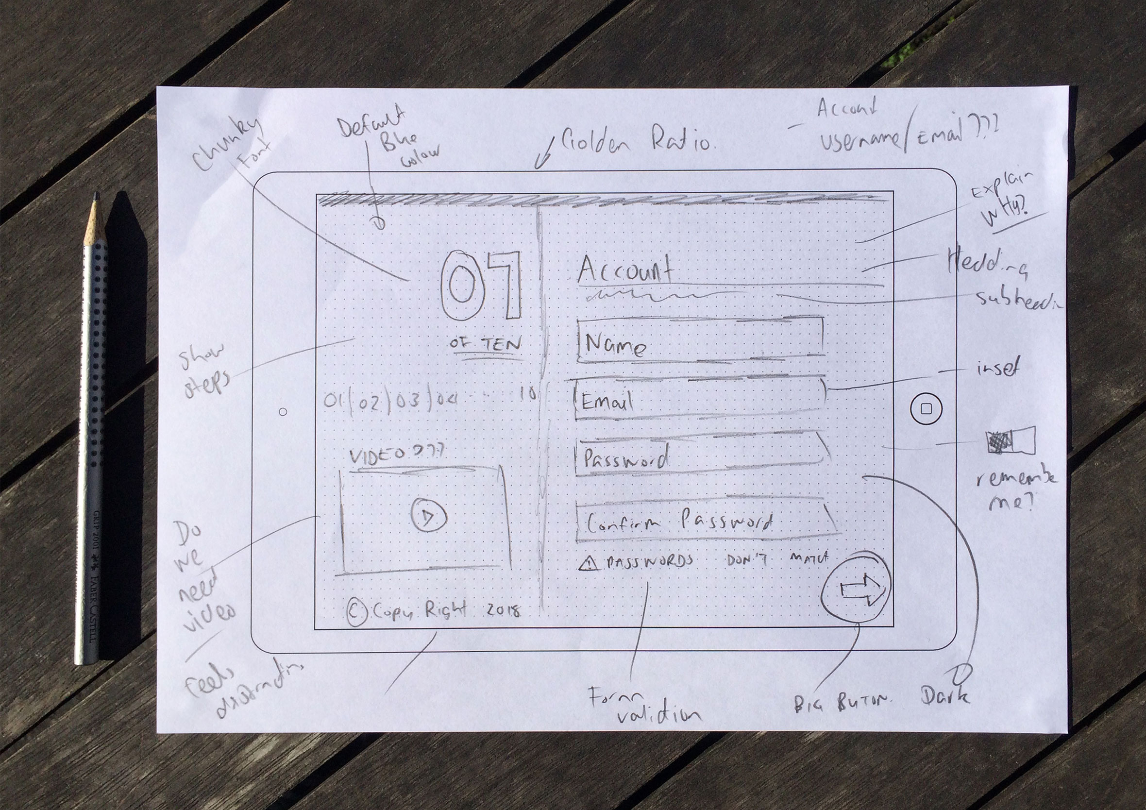
Rapid wireframes
Wireframes were created and shared with the wider team to get feedback and deepen our collective understanding of the user journey. The low-fidelity approach means you can collaborate with developers and work in an agile way without getting caught up in the smaller details too early. While the developers build the basic structure and framework, you can start delivering final visuals screen by screen. A continuous design and development loop.
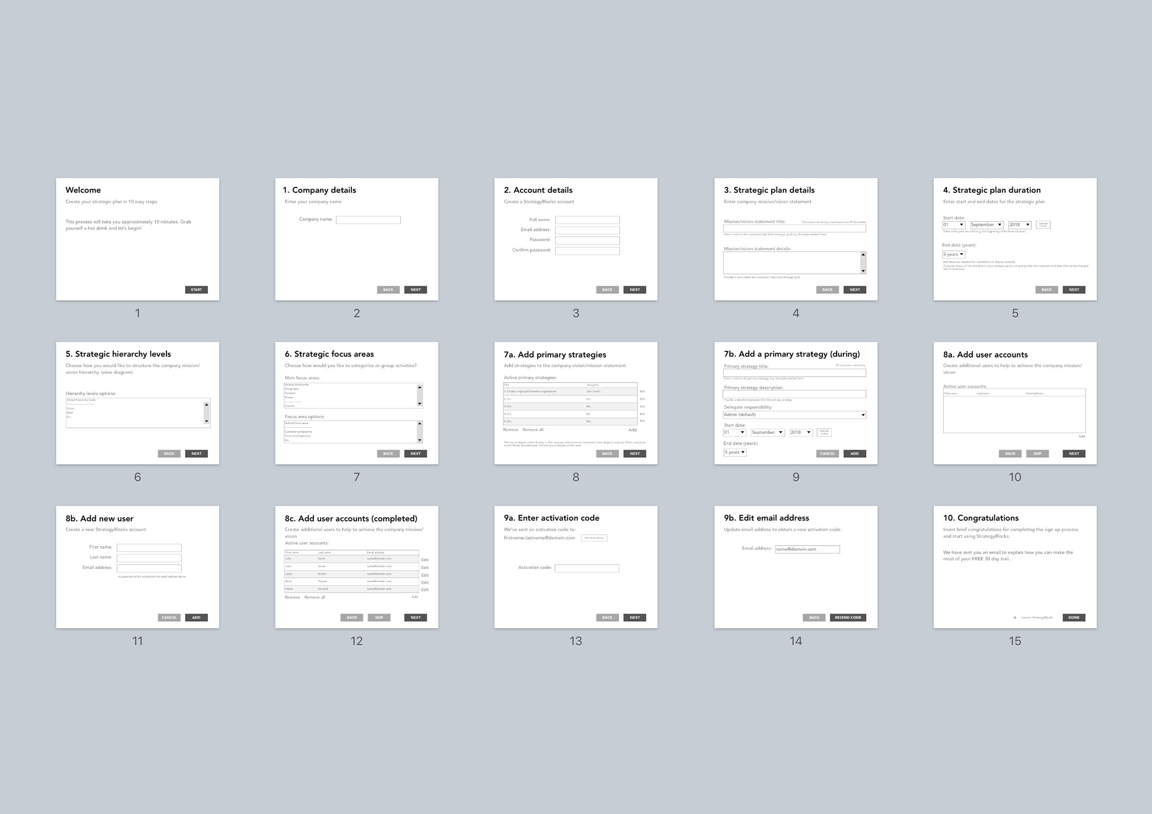
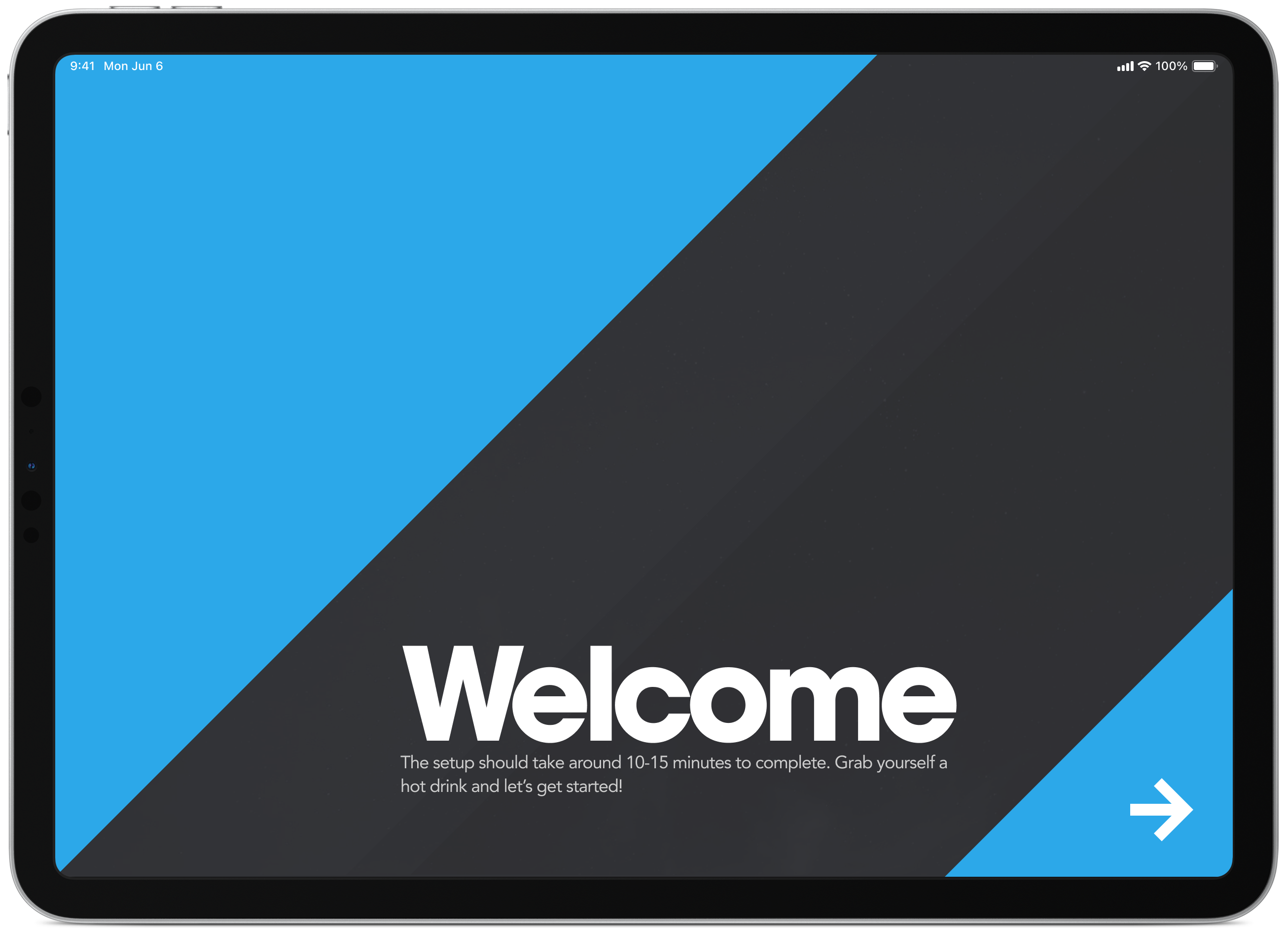
Welcome and information screen
The welcome screen to tells users it’s going to take approximately 10 minutes to complete the registration process. This helps get people in the right mindset before starting the process so they can allocate the time required to get up and running.
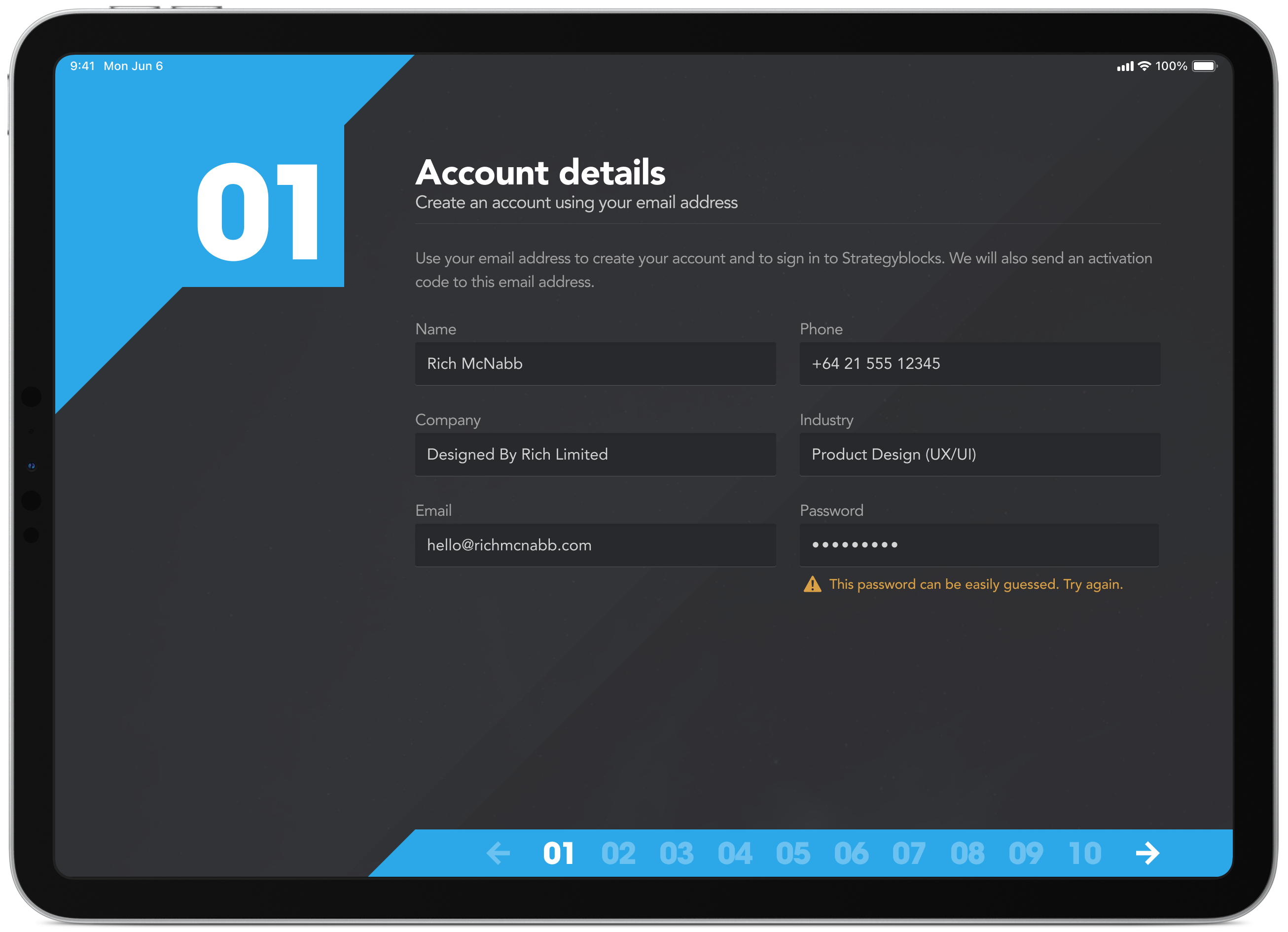
Inline form validation
The simple task of creating a new user account comes with built-in form validation to assist with the onboarding process along the way. The registration process is broken down into logical steps to help break the content and to help keep the user focused on the task at hand.
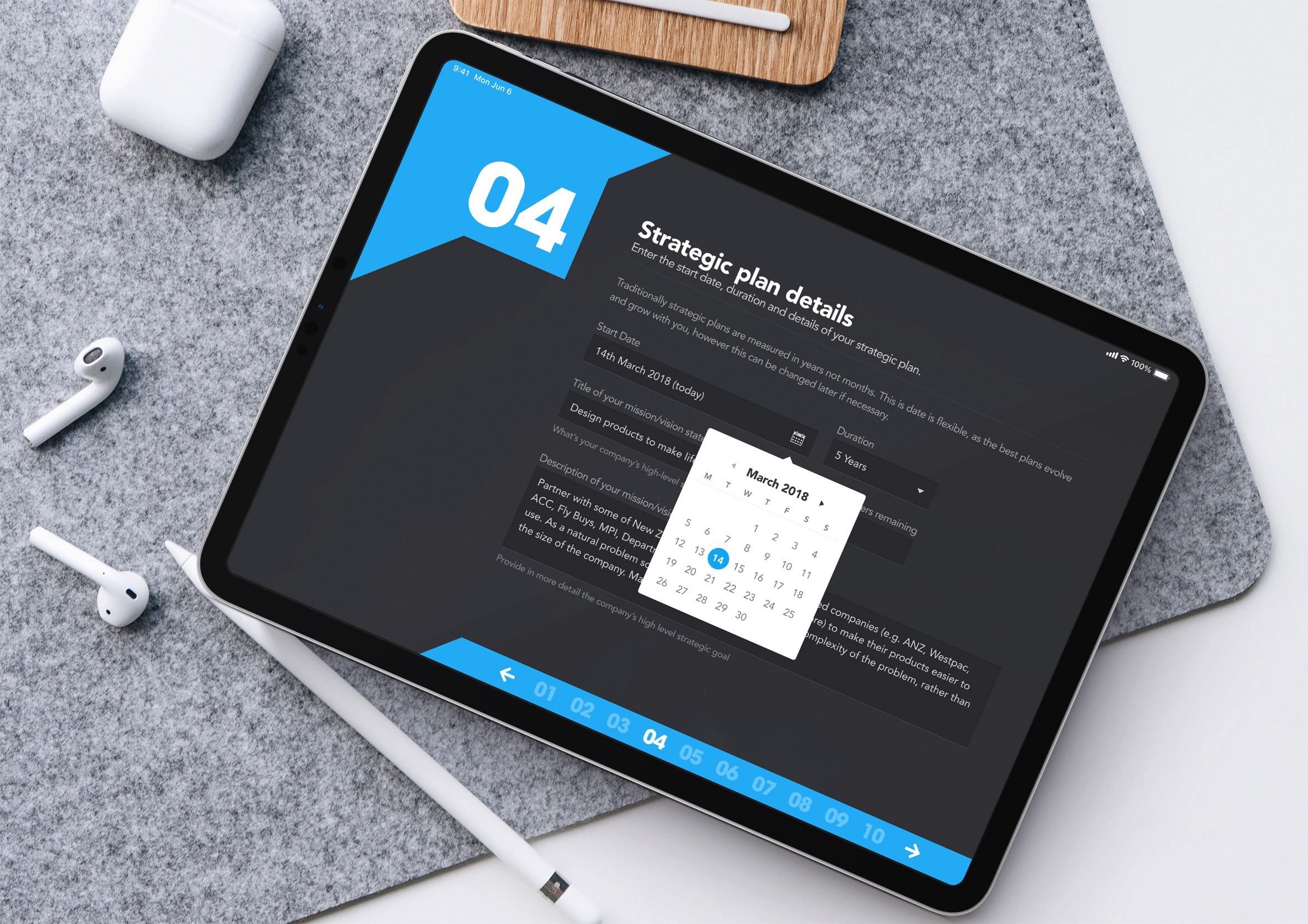
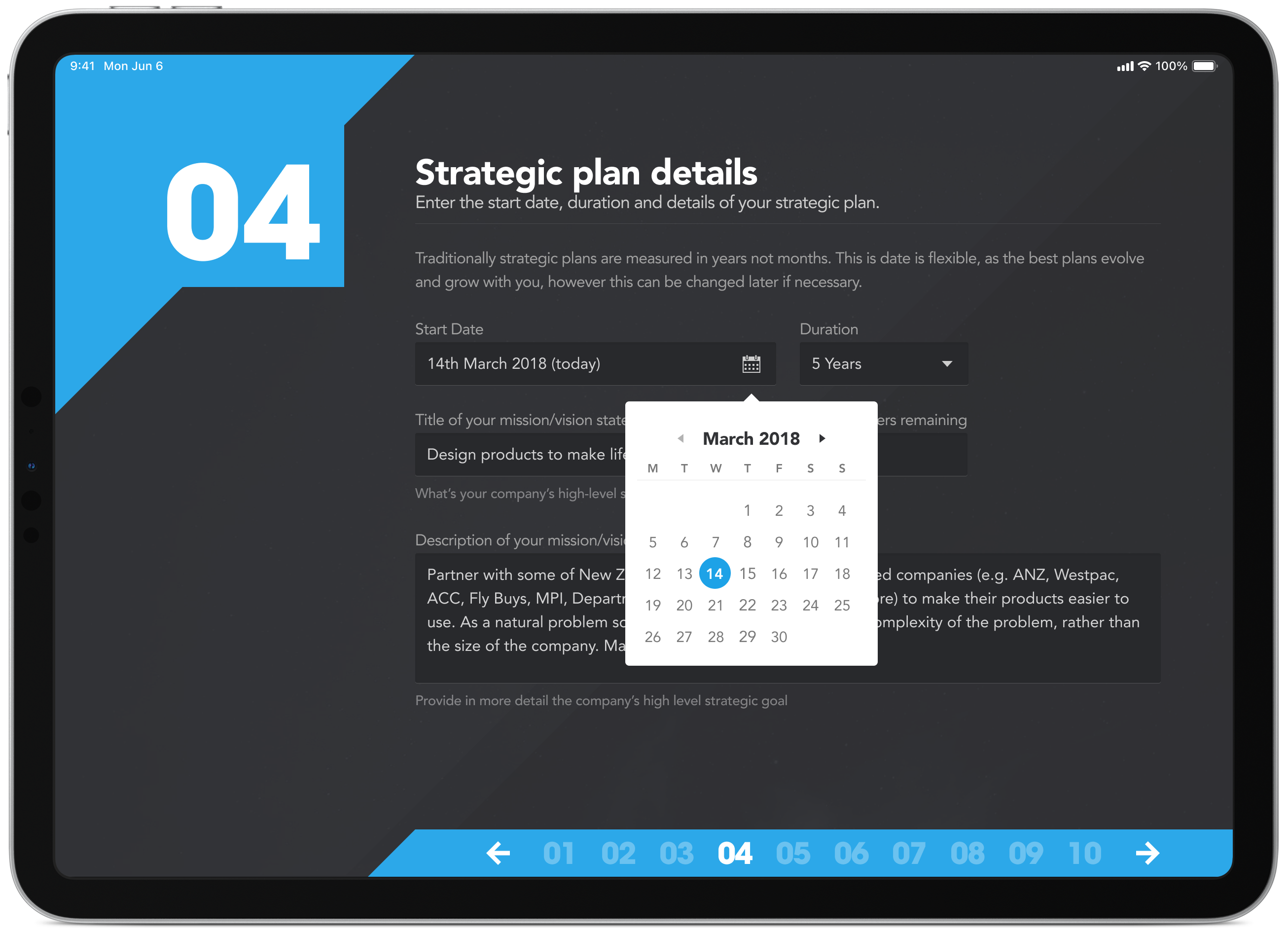
Strategic plan duration
Custom form elements for quickly selecting the start and end date of a strategic plan. Really happy with how the date picker came out on this one.
Strategic hierarchy levels
Throughout the whole process, we wanted to describe exactly what was happening and why. By introducing headings, sub-headings and intro text in plain English it made it easier for people to understand why they were being asked to do a particular task at the same time providing clarity on how the product works.
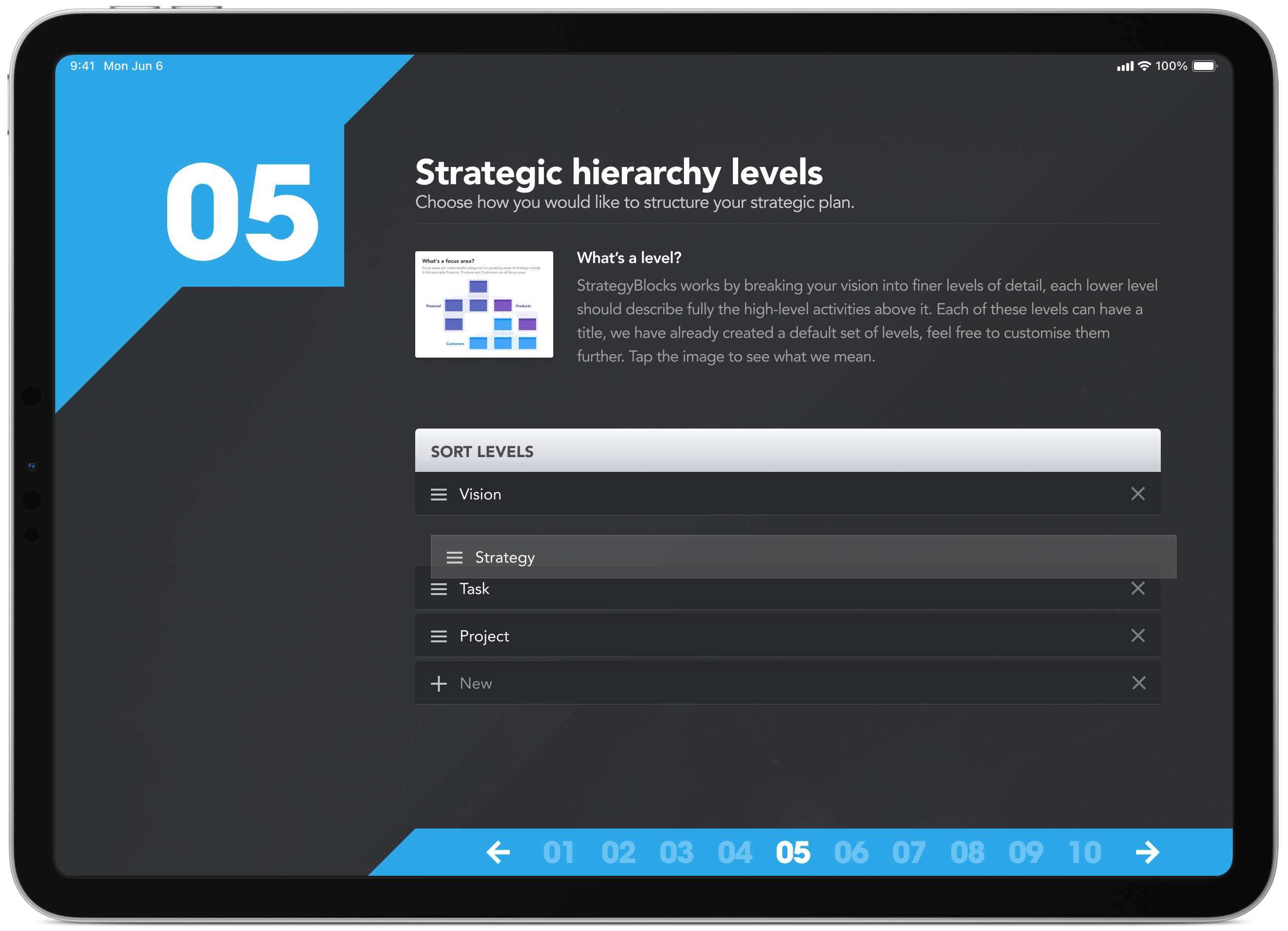
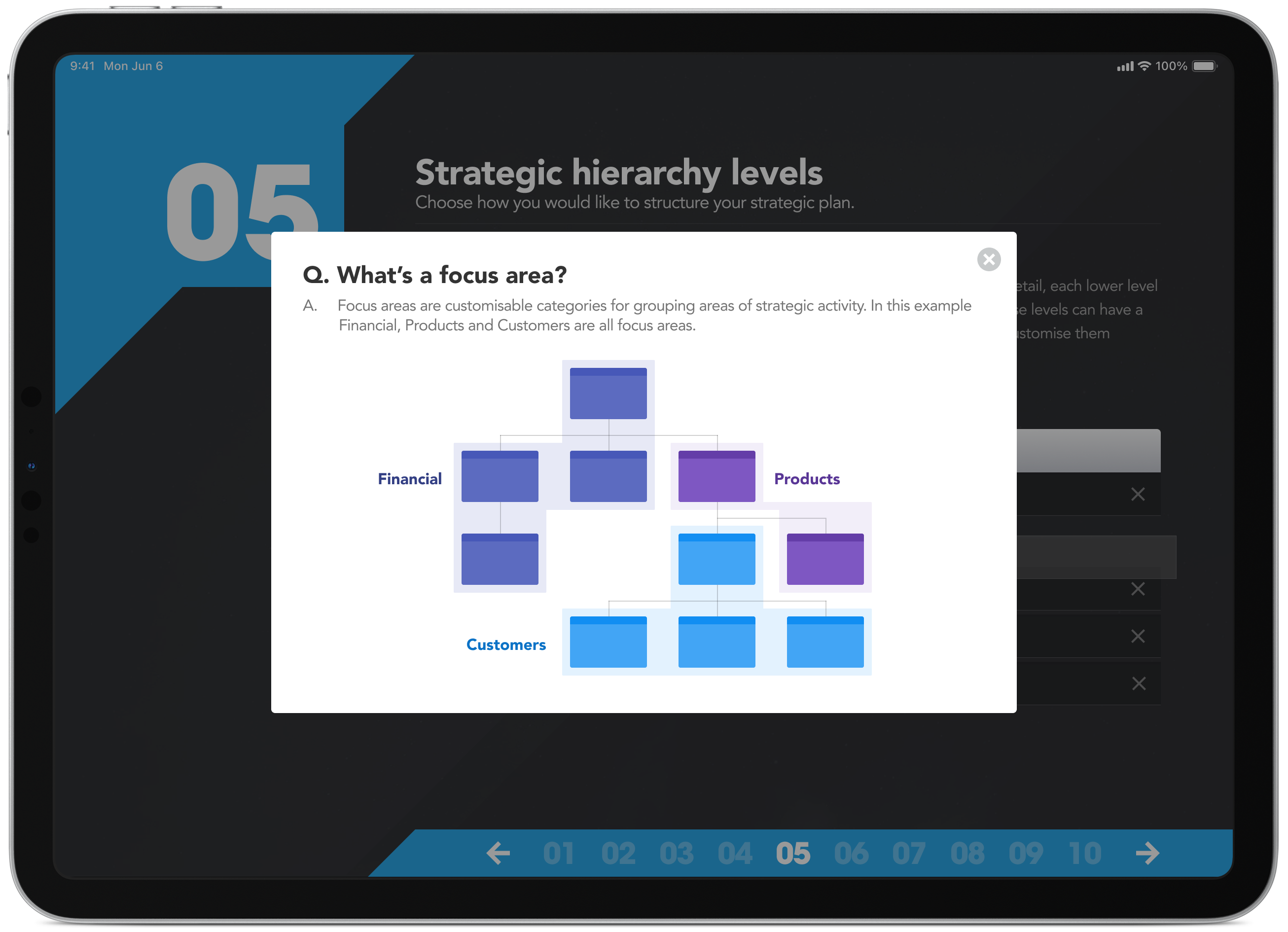
Strategic hierarchy levels (with diagram)
In some cases, good copywriting wasn’t enough, we had to back it up with a diagram to further explain a more complex concept. A picture is worth a thousand words.
Strategy is a team activity
Many hands make light work when it comes to implementing a company’s strategy. On this screen, you can start adding the people who will help bring your vision and mission to life.
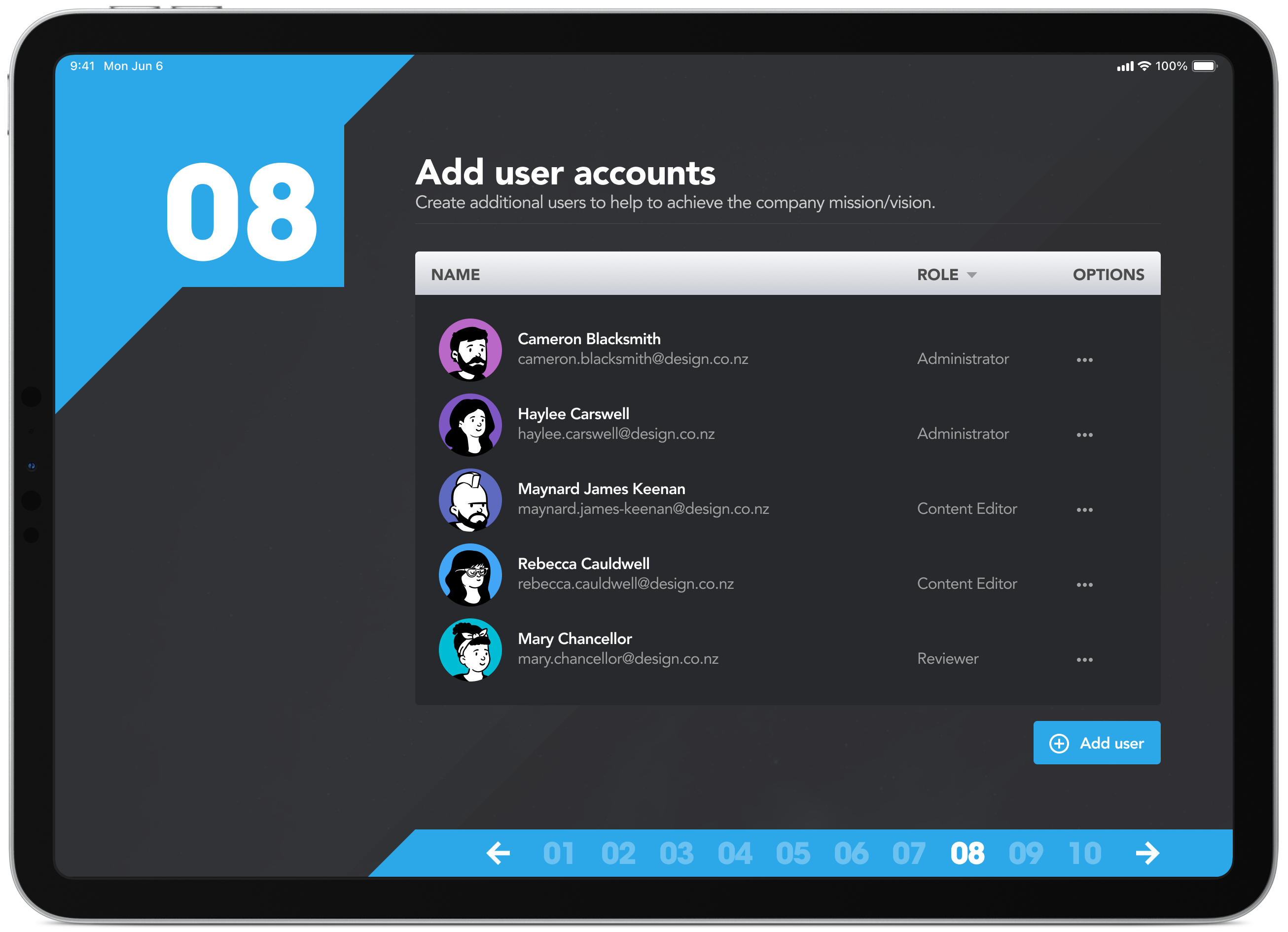
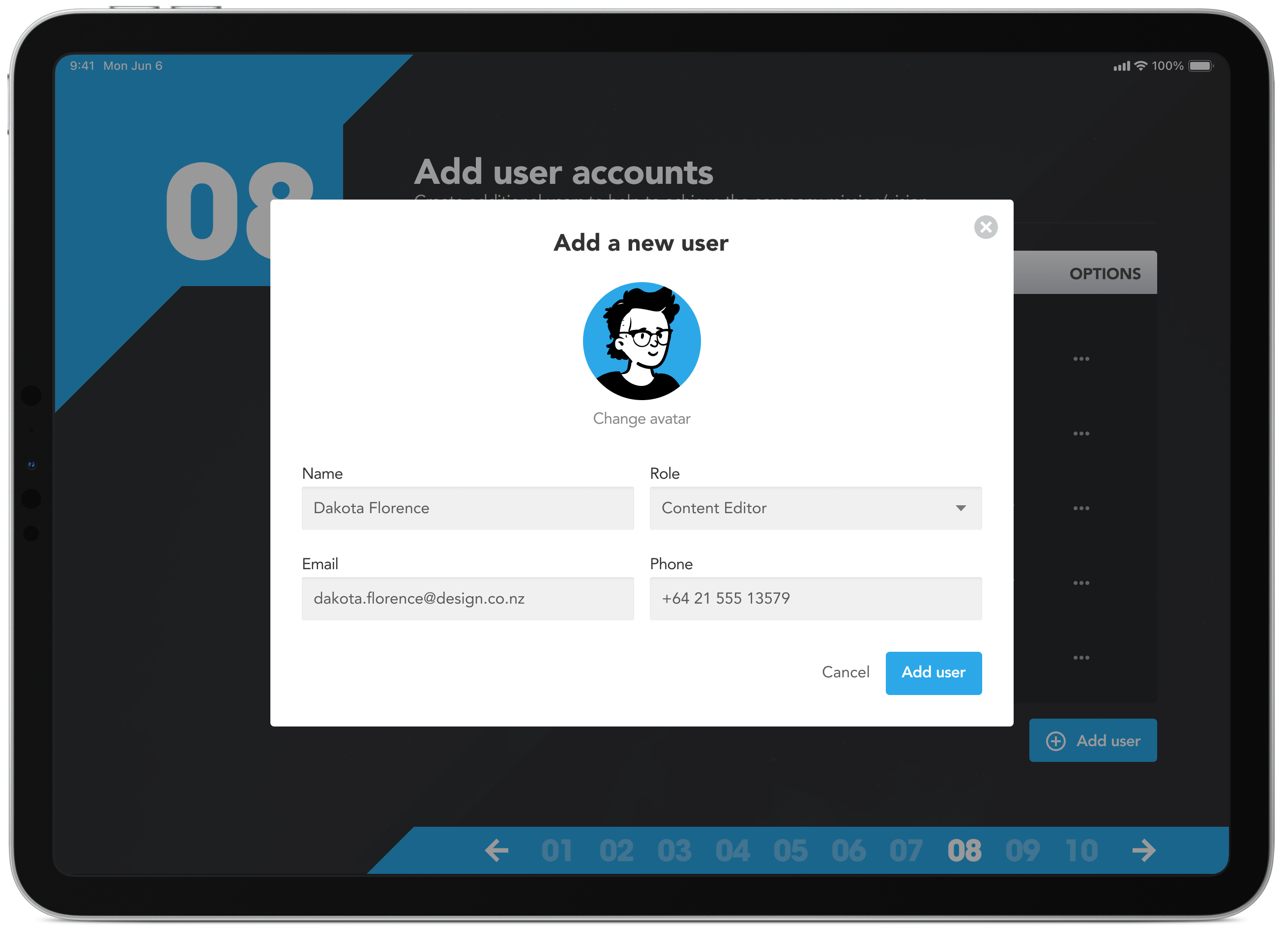
Build out your team
Add people and apply role-based permissions such as administrator, content editor and reviewer. They’ll receive an email to confirm their account and can choose a pre-defined avatar or upload a photo to personalise their profile.
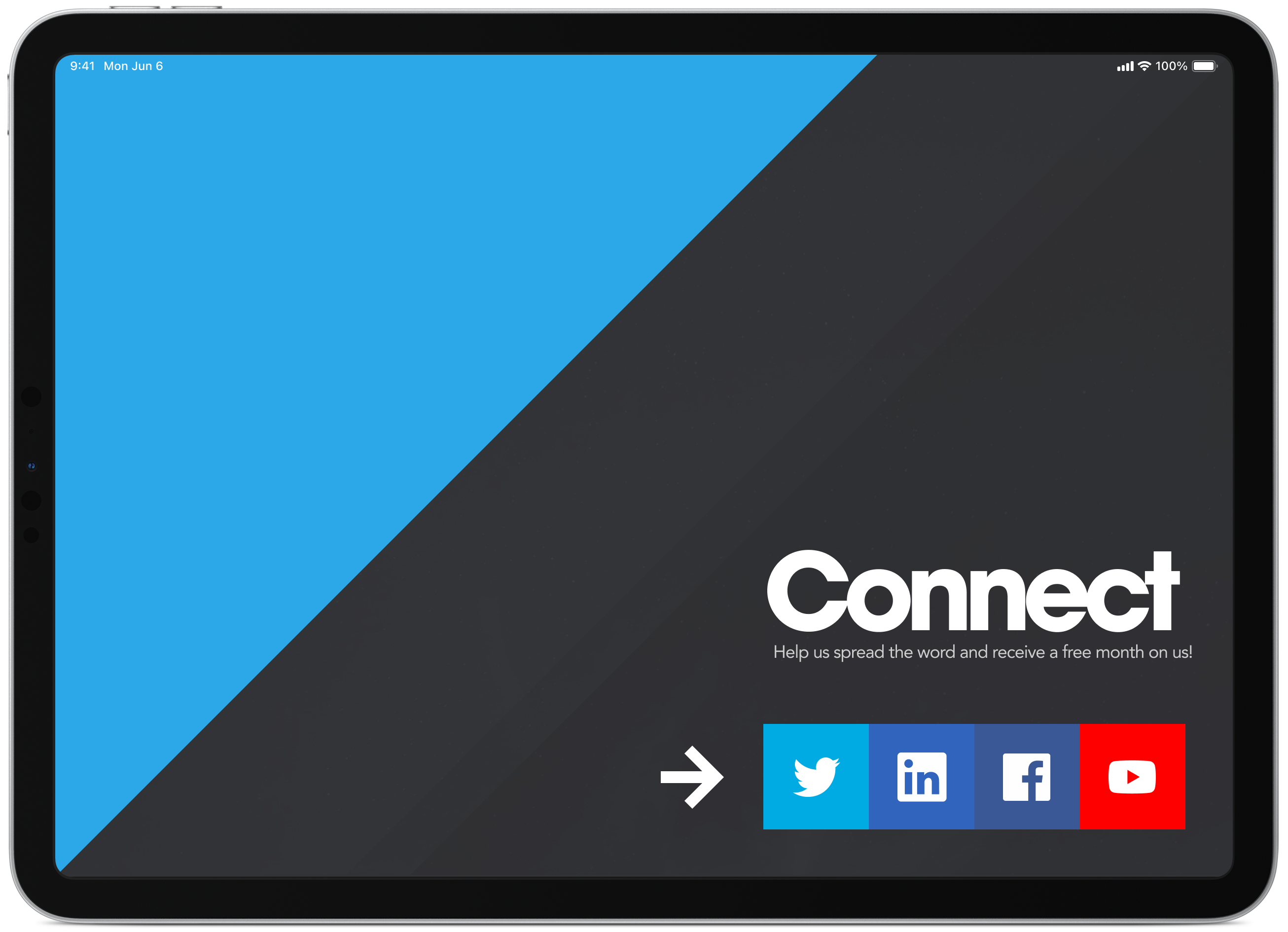
Social media connections
At the end of the process, people have the option to connect and stay up to date with new features and improvements. It’s also a great way to encourage customer feedback, announce upcoming features and build a connection with your user base.
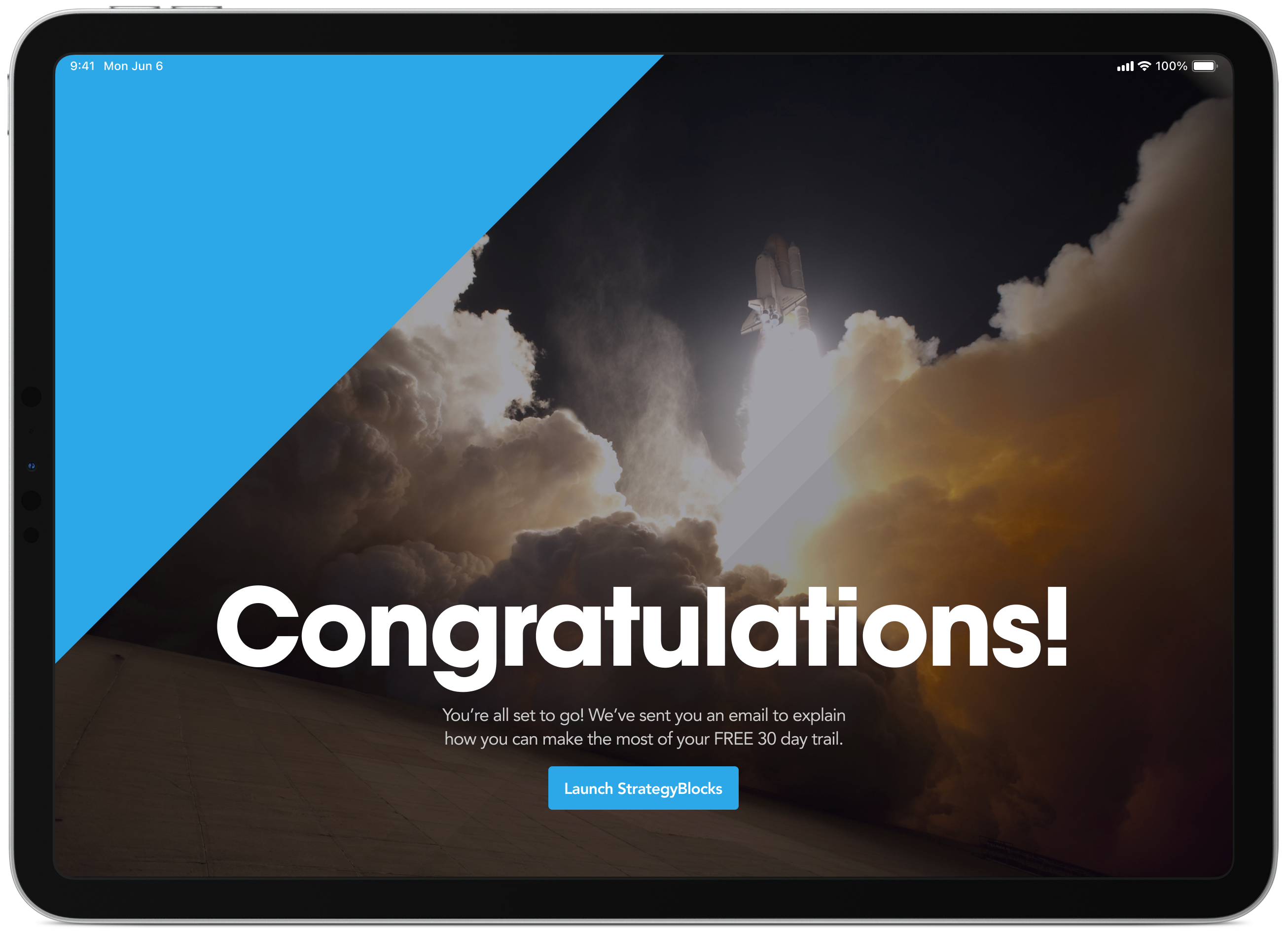
Celebrate the small things
On the surface, completing a 15-minute setup of a mission and vision statement might not feel like something worth celebrating. But for some people, starting a new company is both exciting and nerve-wracking, and that deserves to be acknowledged.
Final design
Before launch I created a series of mockups for the marketing team to use across email, Facebook and Twitter to help promote the new app and drive early adoption.