#Data visualisation
Custom charts, telemetry and visual information representation, turning dense numbers into something scannable at a glance, from a marketing dashboard and weather widget through to a design challenge and network dashboard.


Custom charts, telemetry and visual information representation, turning dense numbers into something scannable at a glance, from a marketing dashboard and weather widget through to a design challenge and network dashboard.
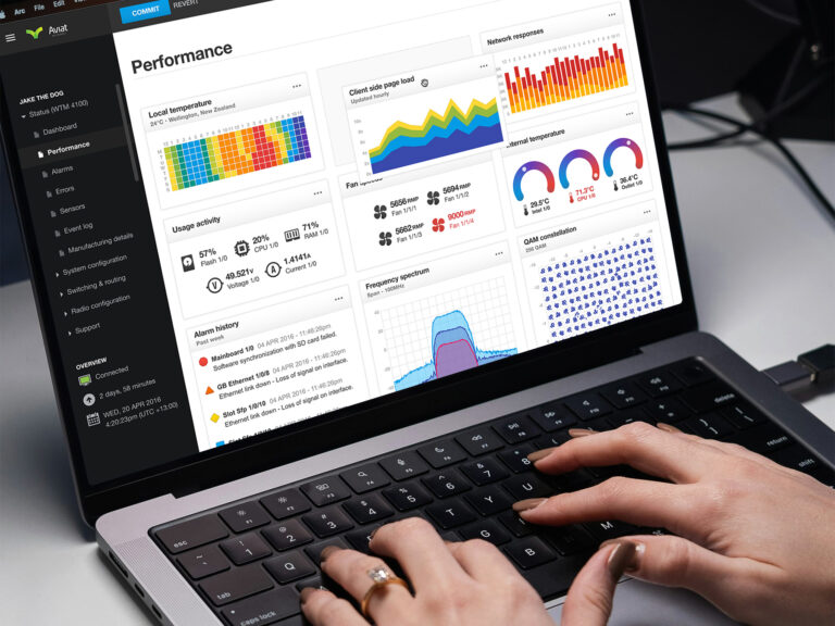
Dense technical data, distilled. A dashboard for configuring and monitoring radio router network hardware, covering port management, GPS and VLANs, without drowning technicians in noise, alerts or a confusing interface.
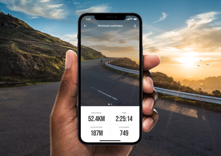
100 days in a row, 100 prompts, 100 different UI components and screens. A personal challenge to build speed and sharpen instinct outside client work, later shared on Dribbble and credited by designers at Netflix.
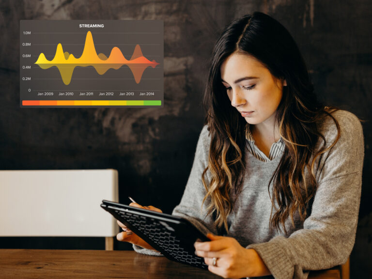
One question, answered fast: what's actually working. Mero is a marketing dashboard built to track campaigns across every channel and surface the signal at a glance, built for quick decisions, not another report to read later.
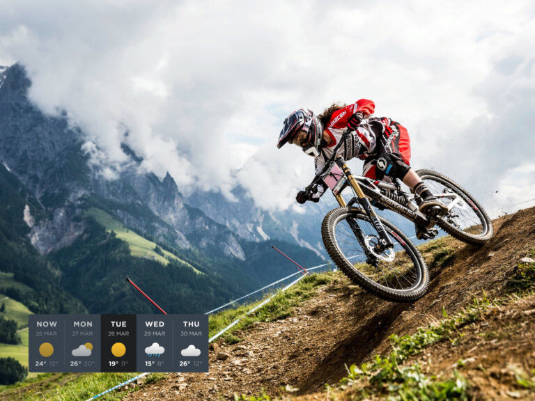
A personal side project pushed further than a widget usually goes. Configurable layouts, a live data preview and a companion Apple Watch face, all built over weekends just to see how far a simple weather widget could go.