

Central Police Dispatch: Emergency dashboard
Real-time jobs, live feeds and split-second decisions, an emergency dispatch dashboard built for the moment it matters. Grounded in real site observation and creative personas, not a generic guess at how dispatch teams work.
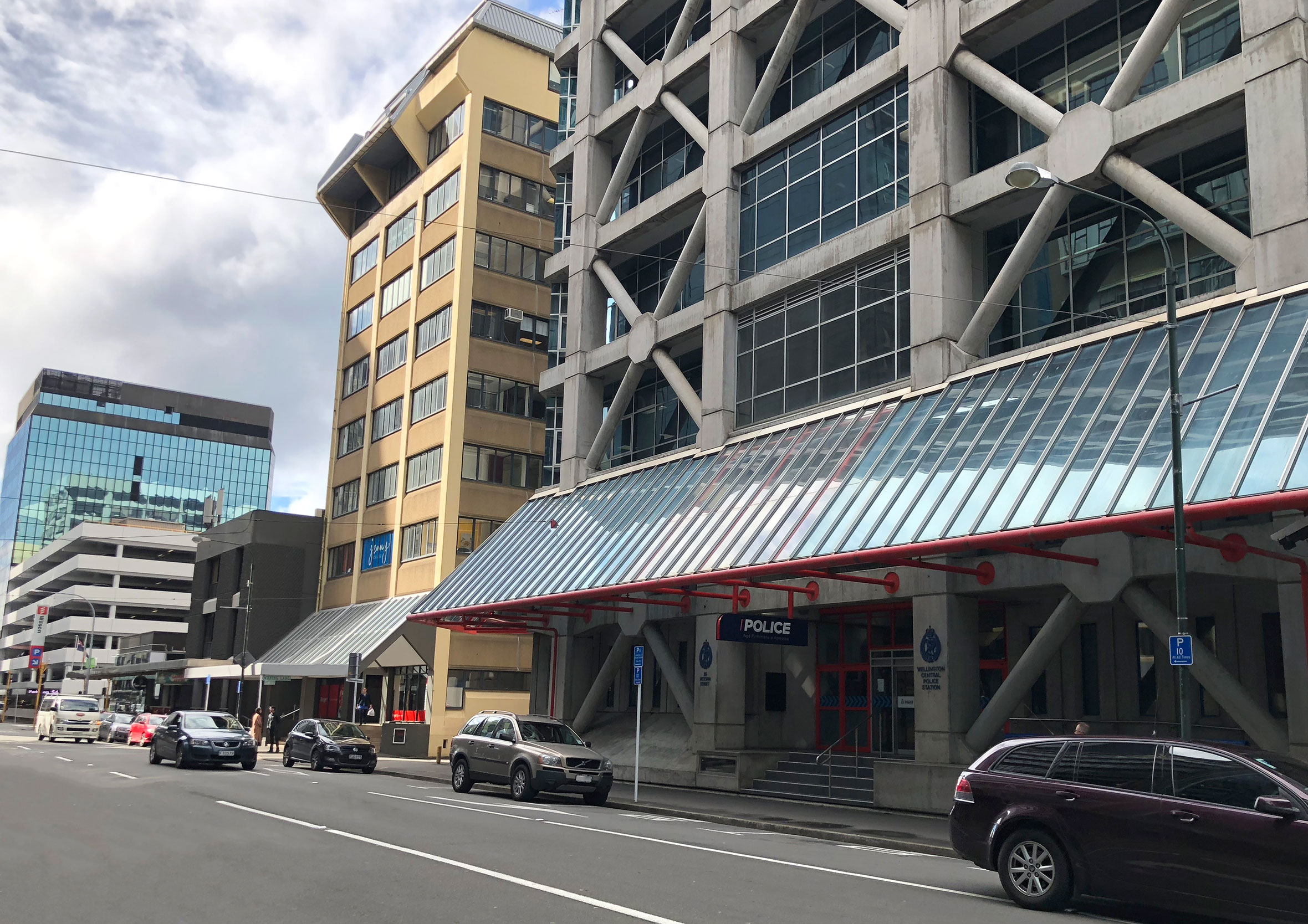
Site observation and user interviews at Wellington Central
Central Police Dispatch is a Computer-Aided Dispatch (CAD) dashboard concept for emergency call centres, built as part of a university paper rather than real client work, though the research behind it was real enough. During the discovery phase, I visited the Wellington Central Police Station (I’m lucky enough to have a long-time friend who works there as a Police Dispatcher) to observe the working environment and speak with people who could eventually be using the dashboard. At times the role can be extremely high stress and a fast-paced environment so the dashboard had to be intuitive and focused on completing tasks quickly and with accuracy and confidence.
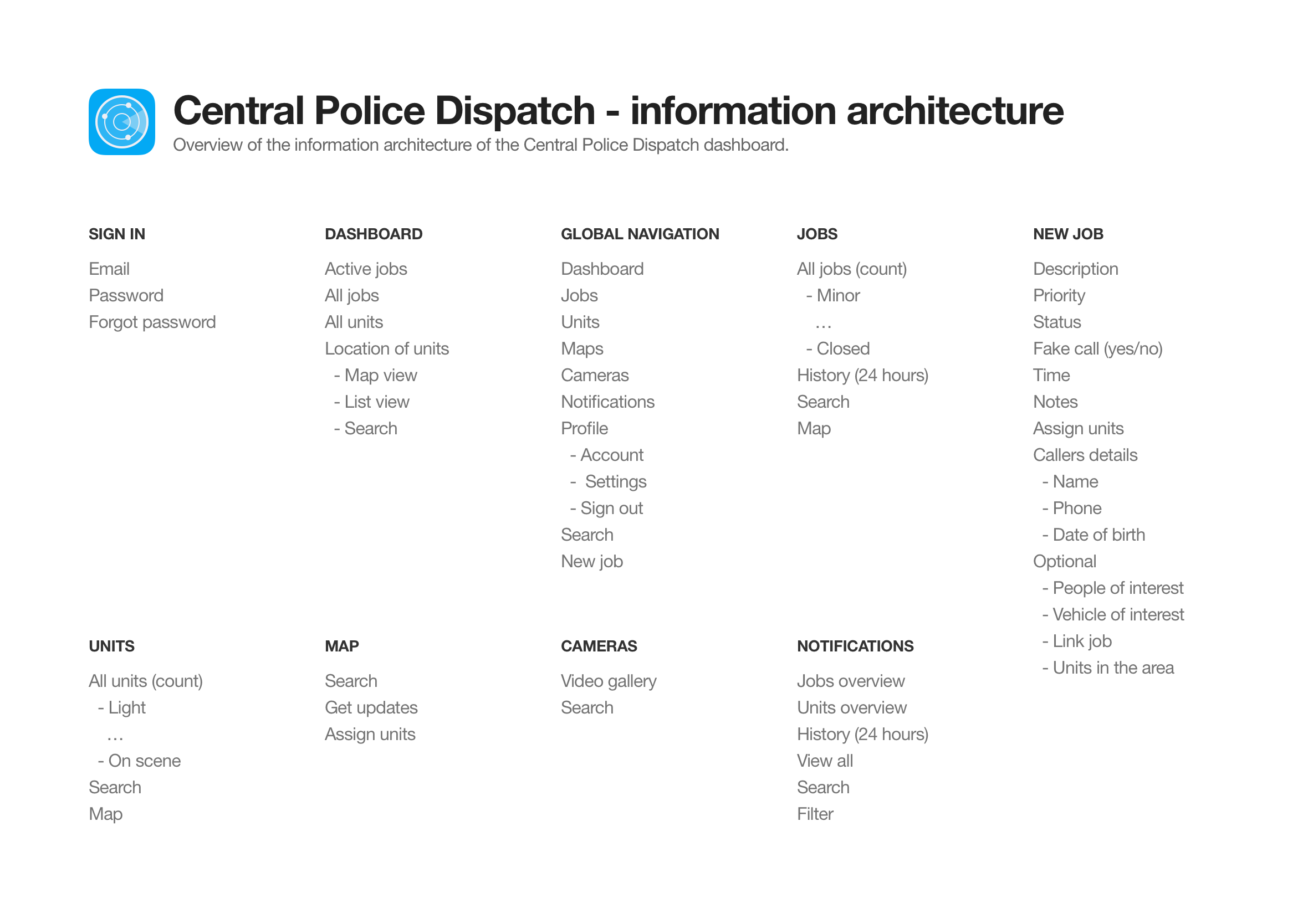
Information architecture to map requirements with screens
A spreadsheet was created to map out the dashboard’s information architecture and business requirements. It was a great way to ensure everything had been captured or to identify any gaps that need to be addressed.
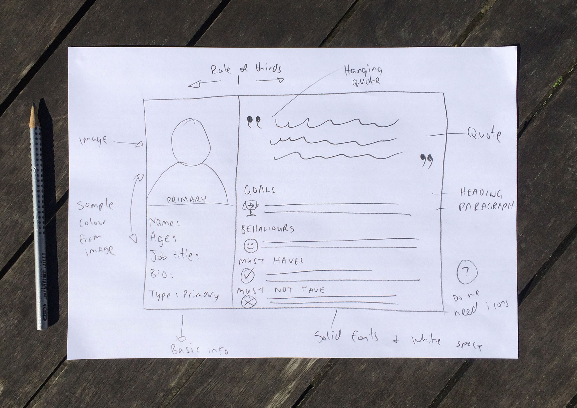
Primary and secondary Central Police Dispatch personas
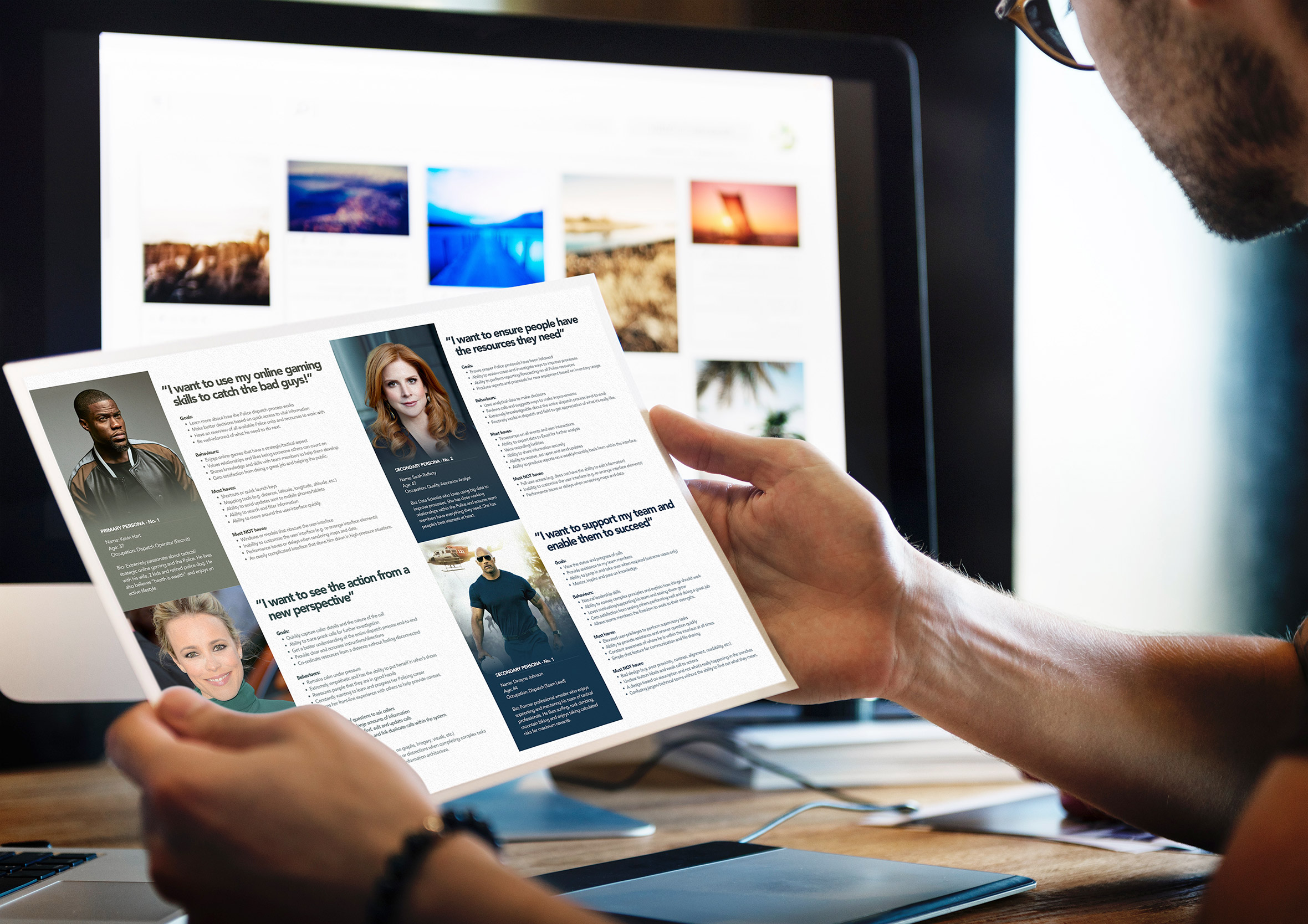
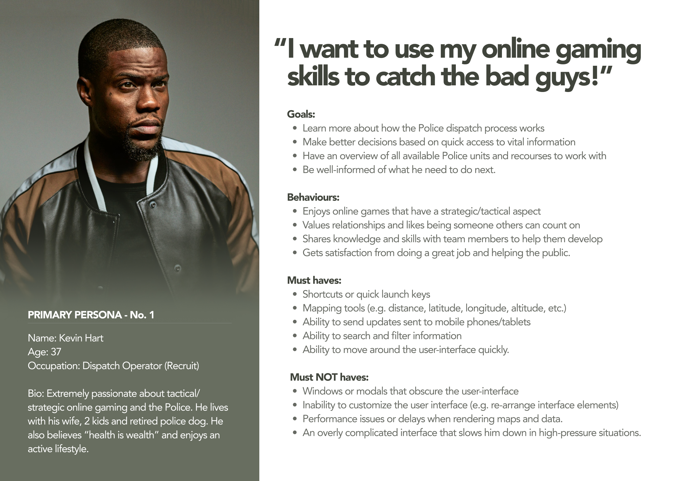
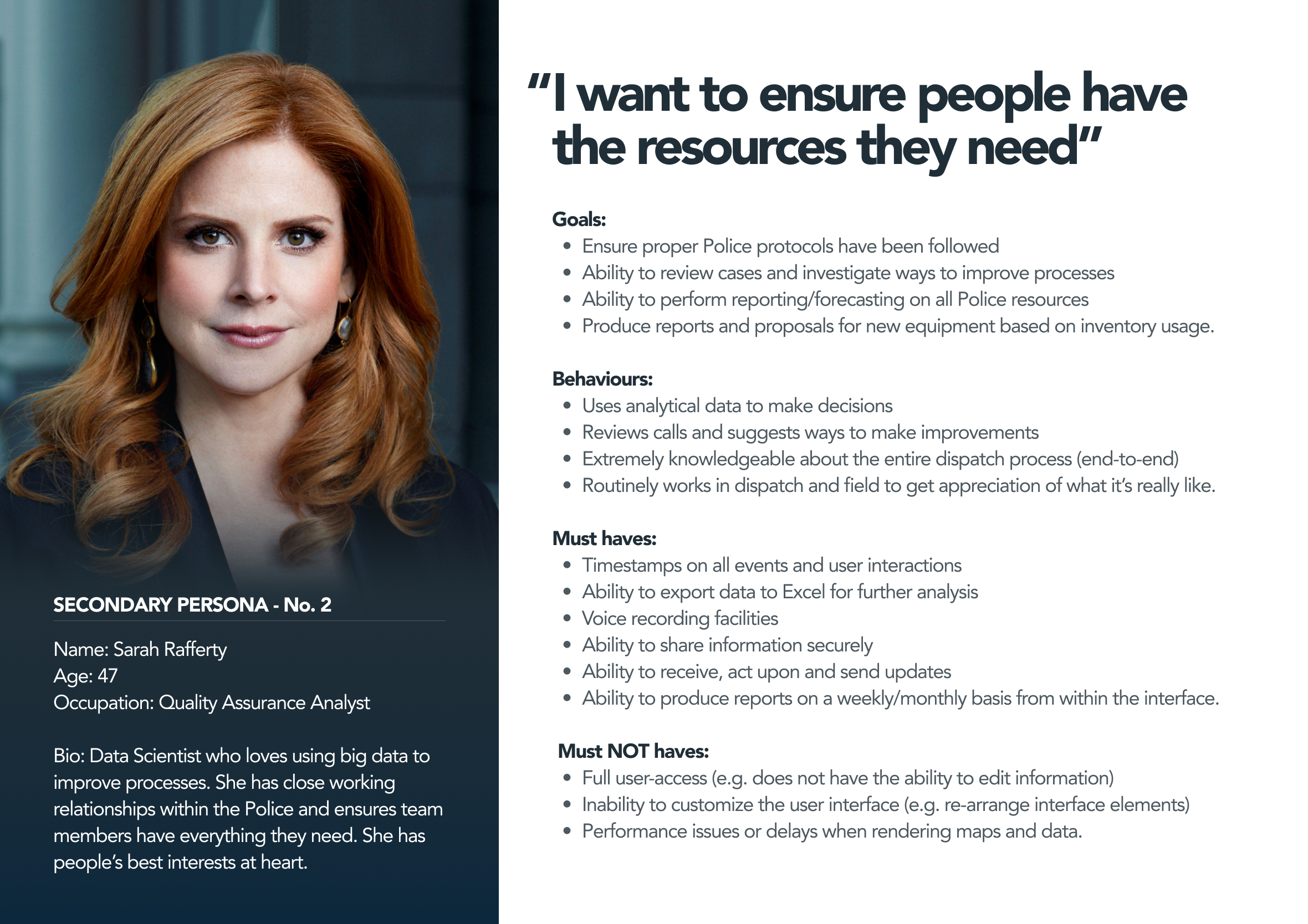
Primary personas were created to provide added insights into the various user demographics such as age, background and the main user tasks of the people who will be using the system. Specifying user goals, behaviours and must-have features helps to keep the overall user experience targeted to these users and solve real user needs. With the secondary personas, I tried to think outside of the box (e.g. hostage negotiation, bomb squad, previous Police field experience, etc.) as I thought it would generate more creative ideas and ultimately a better user interface. This is a great way to think about how to enhance the current user experience and add some nice-to-have features.
From sketches, wireframes to fully designed screens
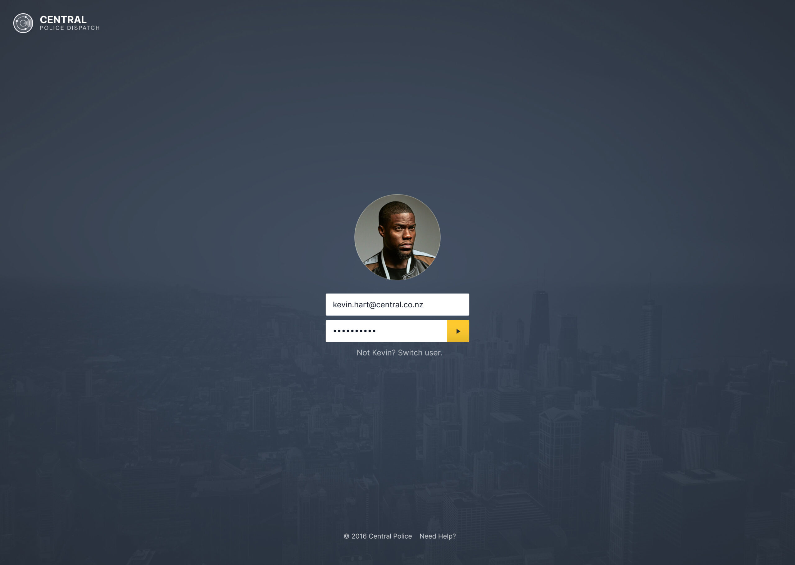
I like to sketch out a number of different design concepts and then convert them into wireframes or designs to start user testing with. A minimally designed sign-in screen was produced allowing for Dispatch Operators to access the dashboard, this was required for security reasons and helps with accountability. Every task is recorded with their username and timestamp to keep track of activity.
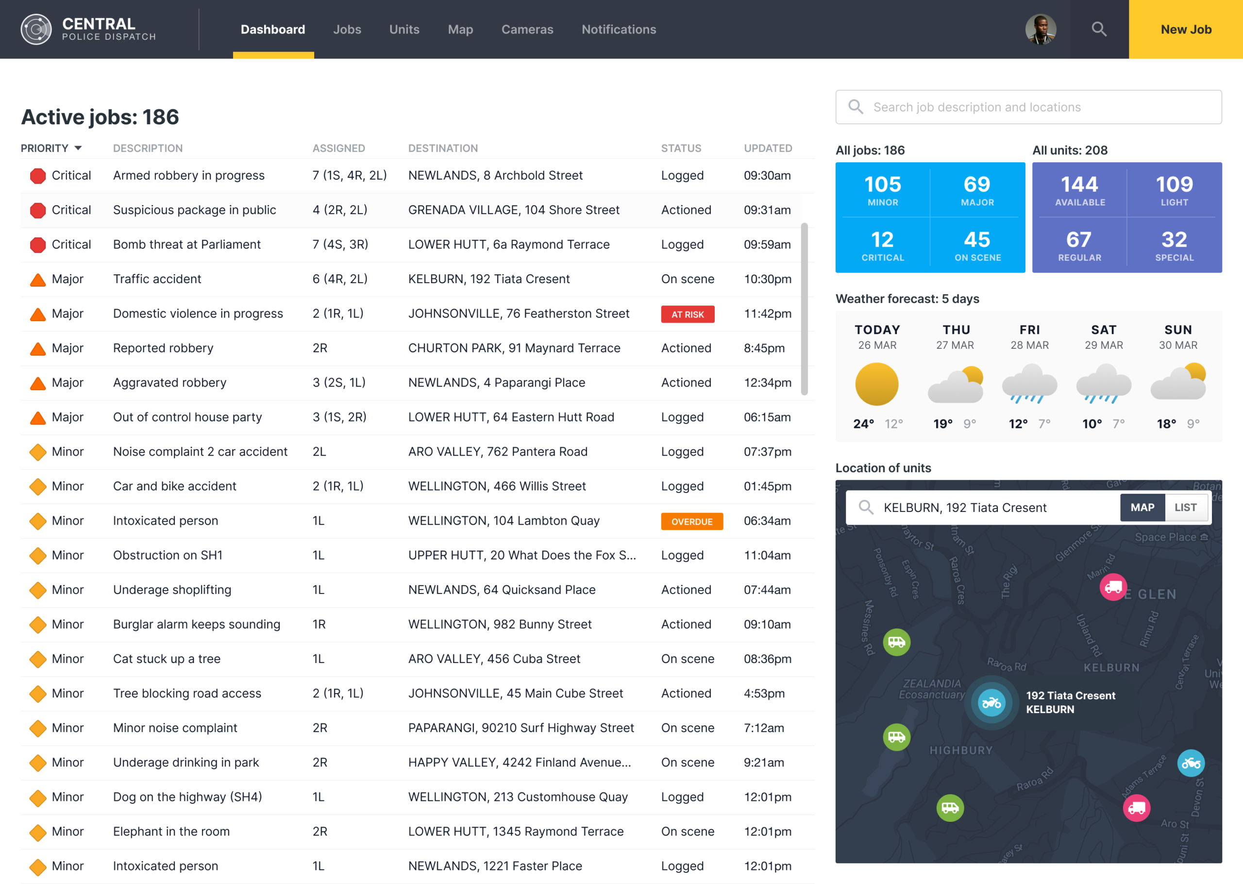
A real-time dashboard built for decisions under pressure
Call Operators and Dispatch Officers get a complete overview of what’s happening at any given time. They can make informed decisions based on call volumes, availability and the severity of active jobs. From these insights, they can produce reports for forecasting, budgeting and monitor trends. The same challenge, cramming dense, constantly changing data into something scannable at a glance, shows up in data dense visualisation too, just with routers and radio hardware instead of active jobs.
Taking and updating calls without missing critical details
The process of taking calls can be very stressful. Trying to find the information you need to capture all the relevant aspects of each call to ensure nothing is missed. Well-crafted forms (with hint-text) help ensure this process goes as smoothly as possible.
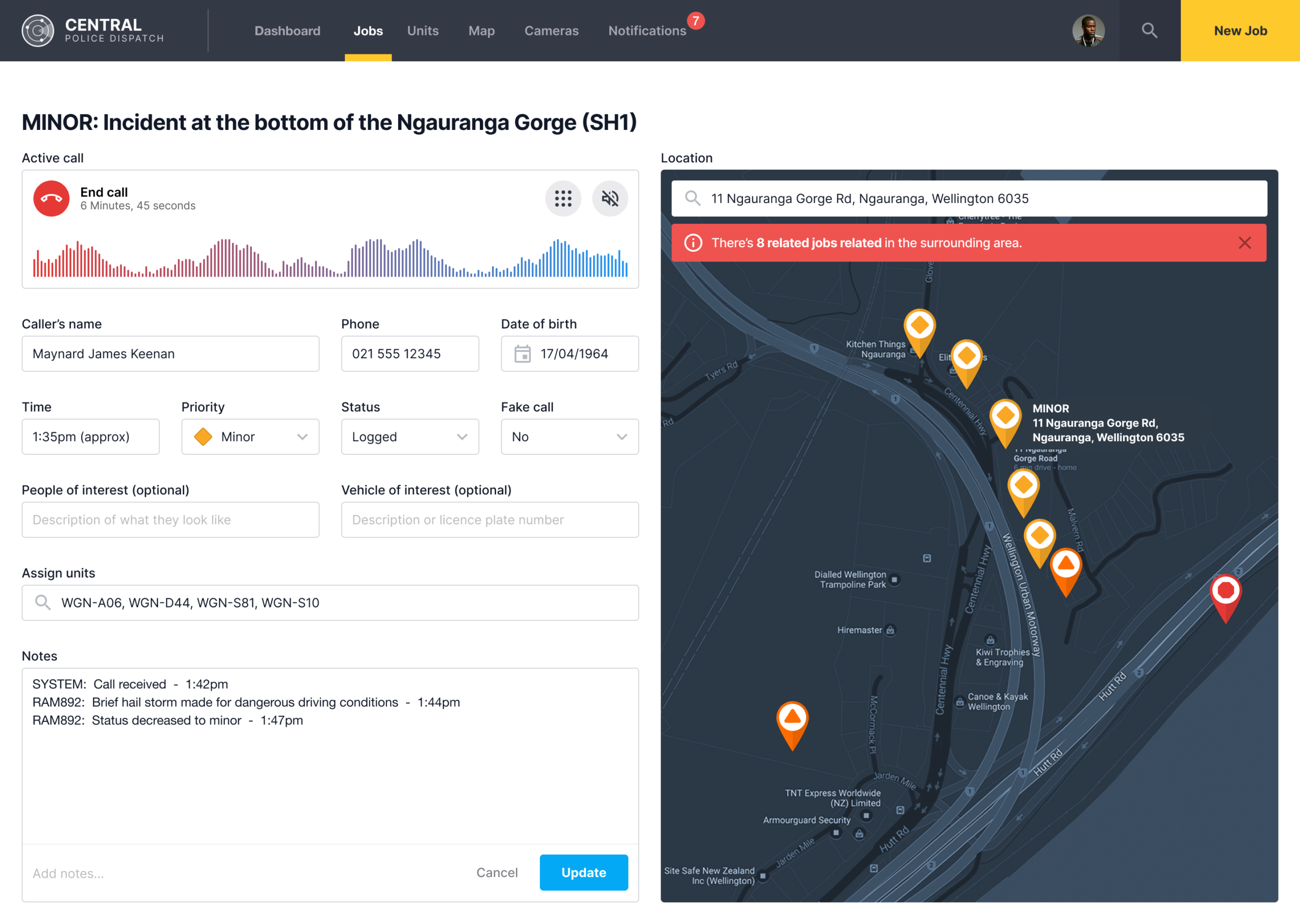
Multiple entry points into the same workflow
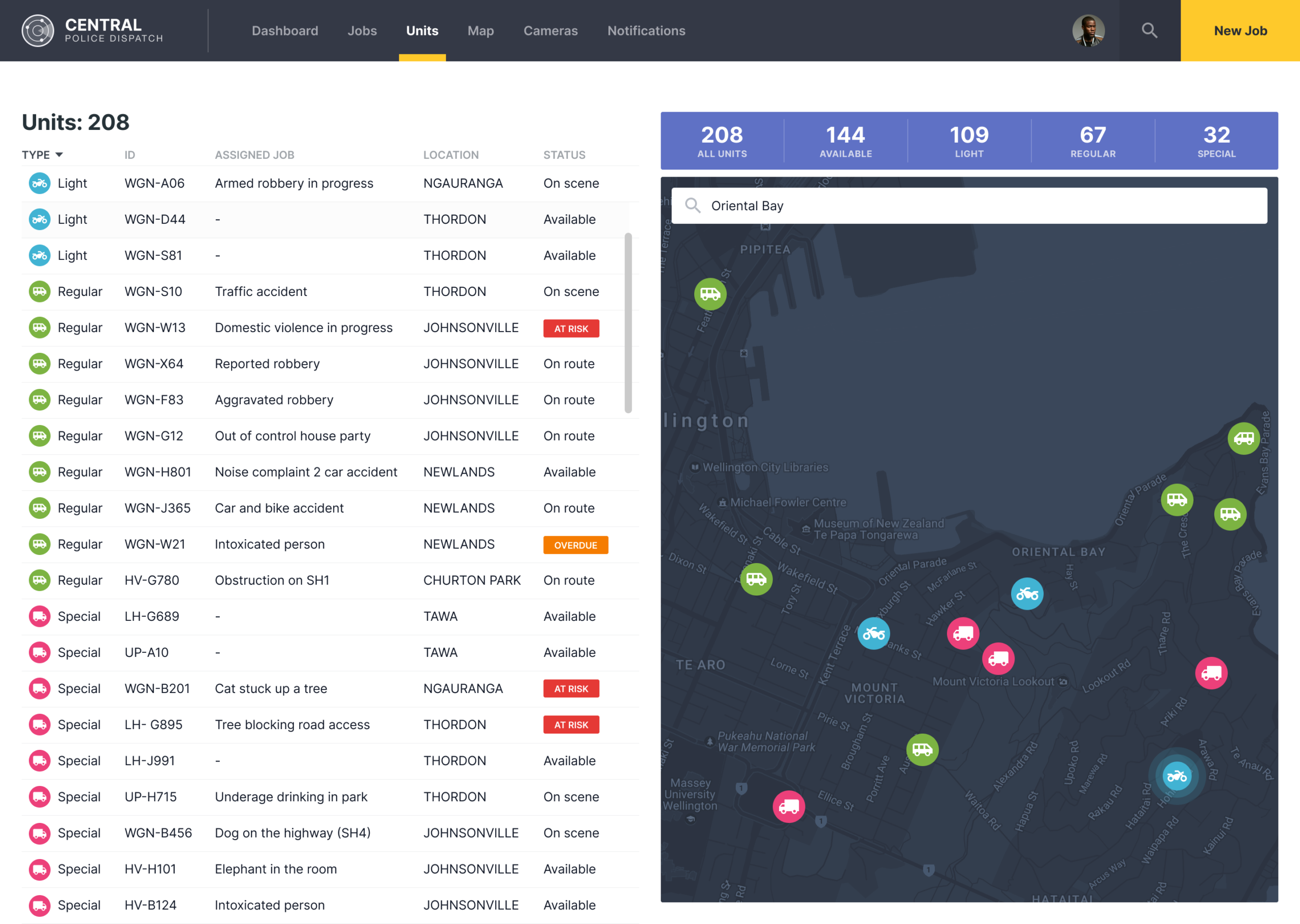
Depending on how the user likes to work they can manage their workflow from the main dashboard screen, the Jobs or Units screen. There are multiple entry points to get into a user flow – this is contextual as to where the user is within the dashboard and what they can do on a particular screen.
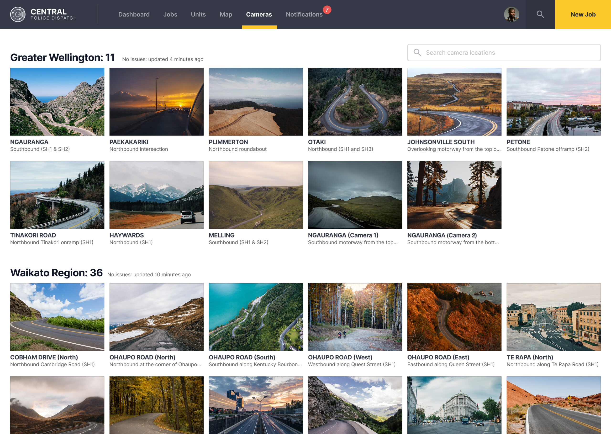
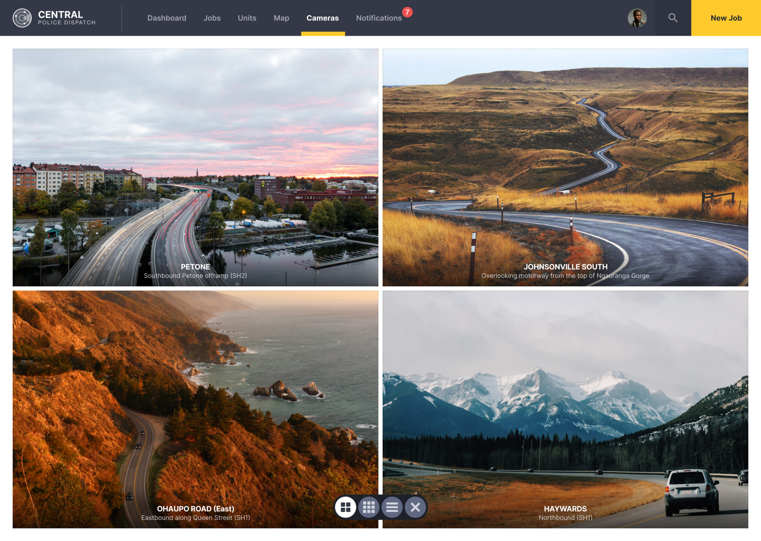
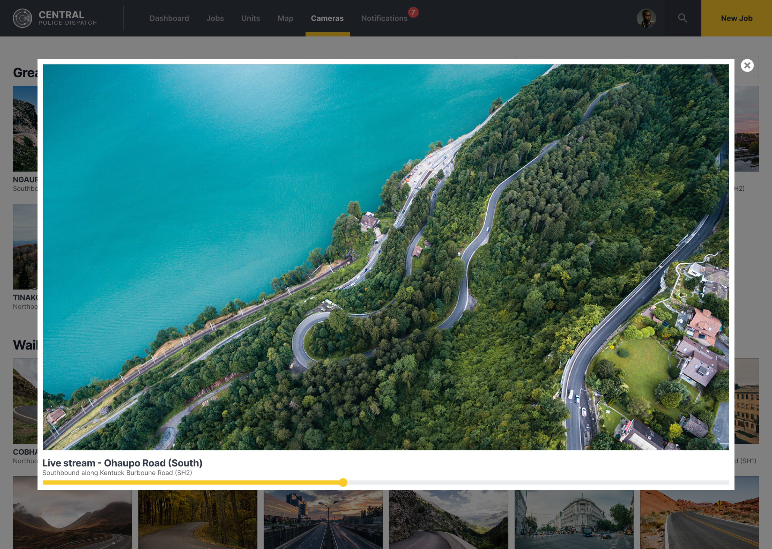
Live CCTV video feeds to keep eyes on the ground
Wherever possible, police can get a better view of what’s happening in a particular area if there happens to be a CCTV camera available. This is a great way to get “eyes on the ground” and assess a situation, to help make more informed decisions and help with troubleshooting related incidents.

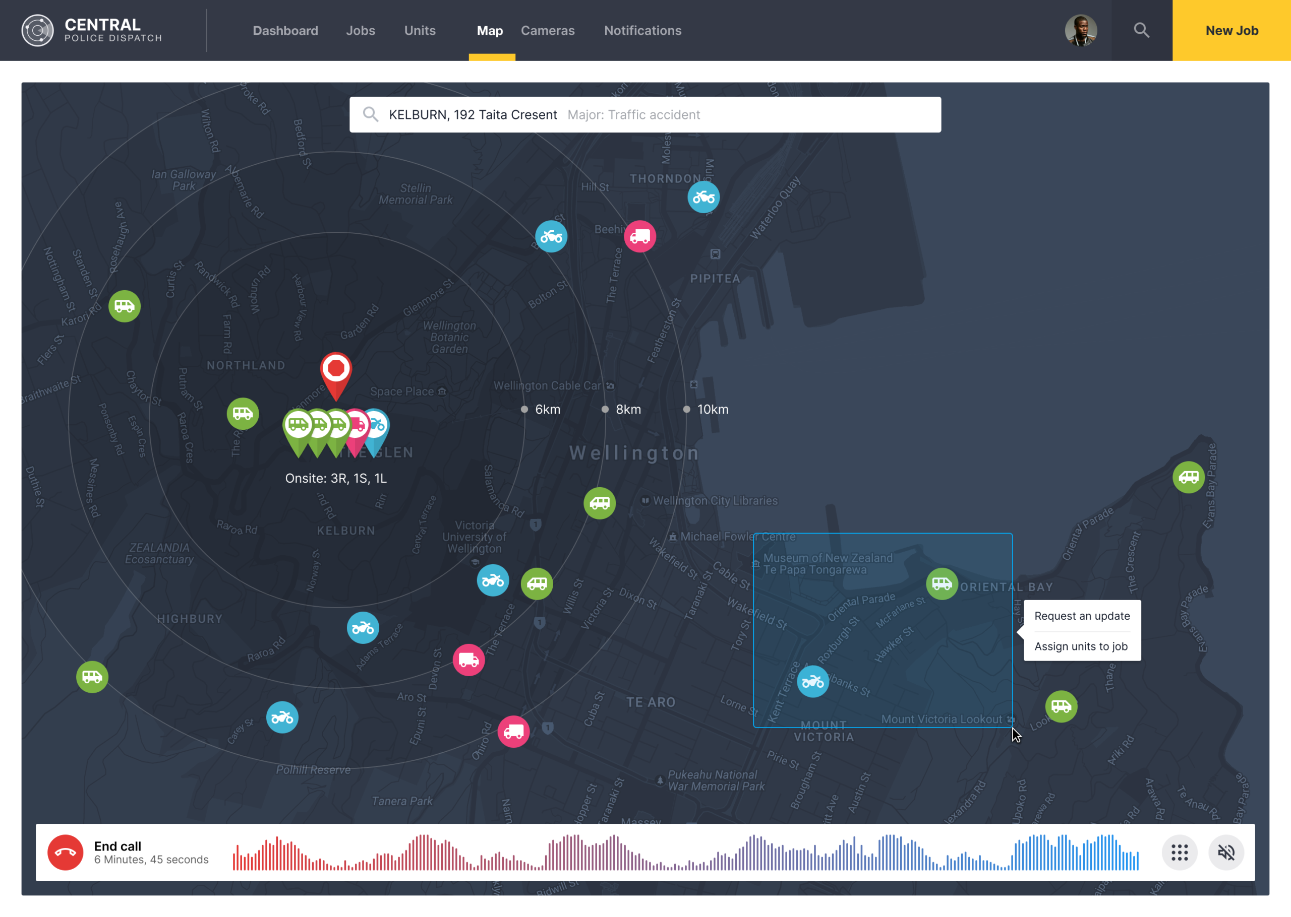
A map view built for assigning resources fast
There’s a map where you can get a better view of where jobs and resources are based on a location. The rings around an address help to indicate the distance a person is to their destination. The Dispatch Operator can select multiple resources at once by dragging a box around them to quickly assign more resources to a particular job.
Designing for the call you hope never comes
This one started as a university paper, not client work, though the research behind it was real. A friend of mine works as a police dispatcher, and she let me sit in and watch the job for what it actually is, high stress, fast paced, no room for a screen that makes someone think twice.
Most of the persona work was straightforward, call operators, field units, the people actually using the thing every shift. Though I pushed the secondary personas further than a university assignment really needed, hostage negotiation, bomb squad, a dispatcher with years of prior field experience. Thinking through edge cases that dramatic forces you to design for situations you hope never actually happen, and that discipline carries over into the ordinary ones too.
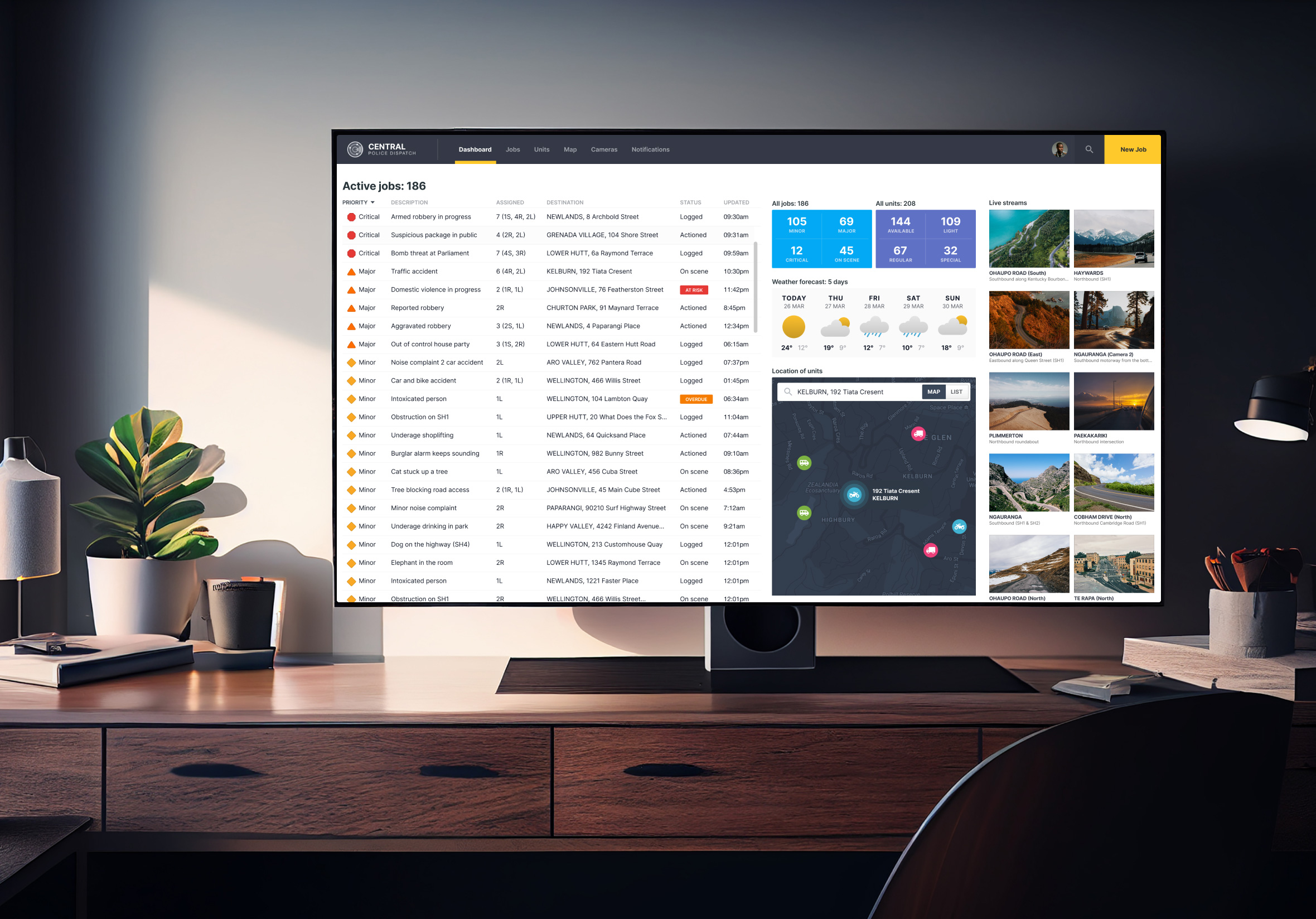
Here’s how it looked pulled together on a large screen, close to how it would run in an actual dispatch room. A working prototype was built and walked through on video by the end of the course, more to prove the flows actually held together than to impress anyone marking it.
ACC’s risk assessment work leaned on the same idea years later, complex government work, though the stakes there were construction sites instead of emergency calls.