

Travel Rewards: Customer loyalty app
Codename Nexus swaps the stamped loyalty card for biometric sign-in and Apple Watch support, with a points balance that’s always one glance away. A loyalty app built to replace every card in your wallet, not add another one.
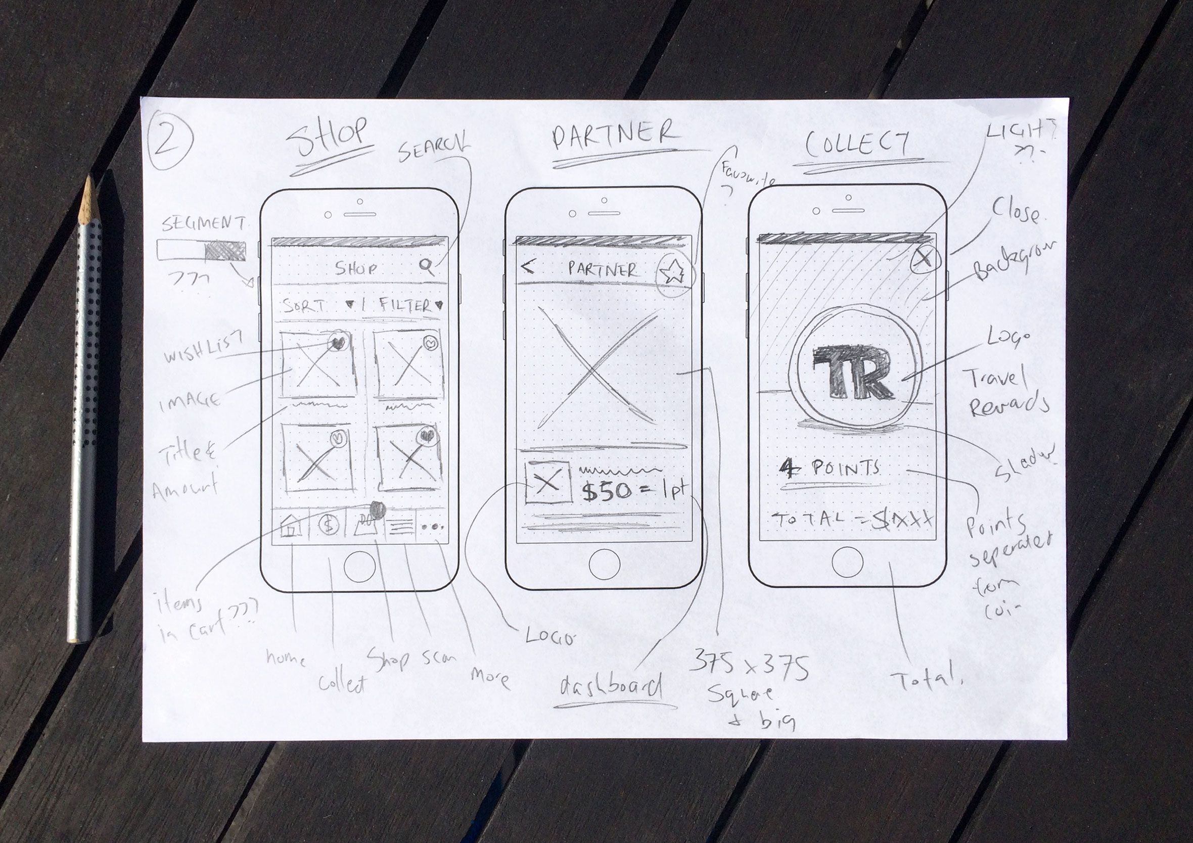
Sketching out the idea before touching any technology
Travel Rewards is a customer loyalty app built around a simple, genuinely disruptive idea: get rid of the physical card entirely, and link rewards straight to the cards people already carry. When capturing ideas I prefer to go low-fidelity and sketch on paper to generate as many concepts as possible. From there I’ll either produce wireframes or jump straight into design and rapid prototyping to validate ideas and assumptions.
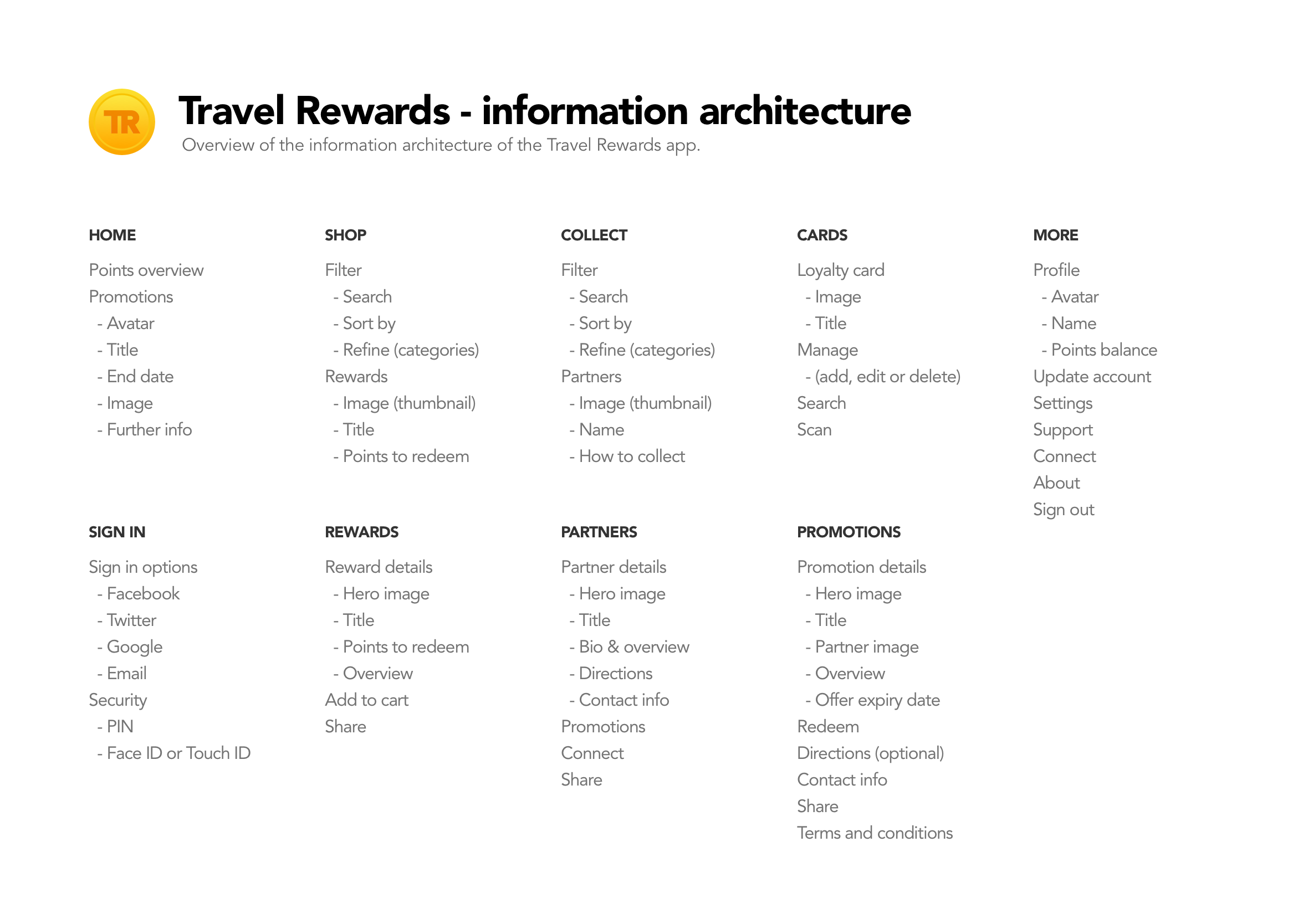
Information architecture: mapping every screen and flow
The information architecture maps out which screens are required and all the user interface elements which make up the structure of the app. By having everything in the one place it makes it easier to identify areas of improvements or gaps in the user experience.
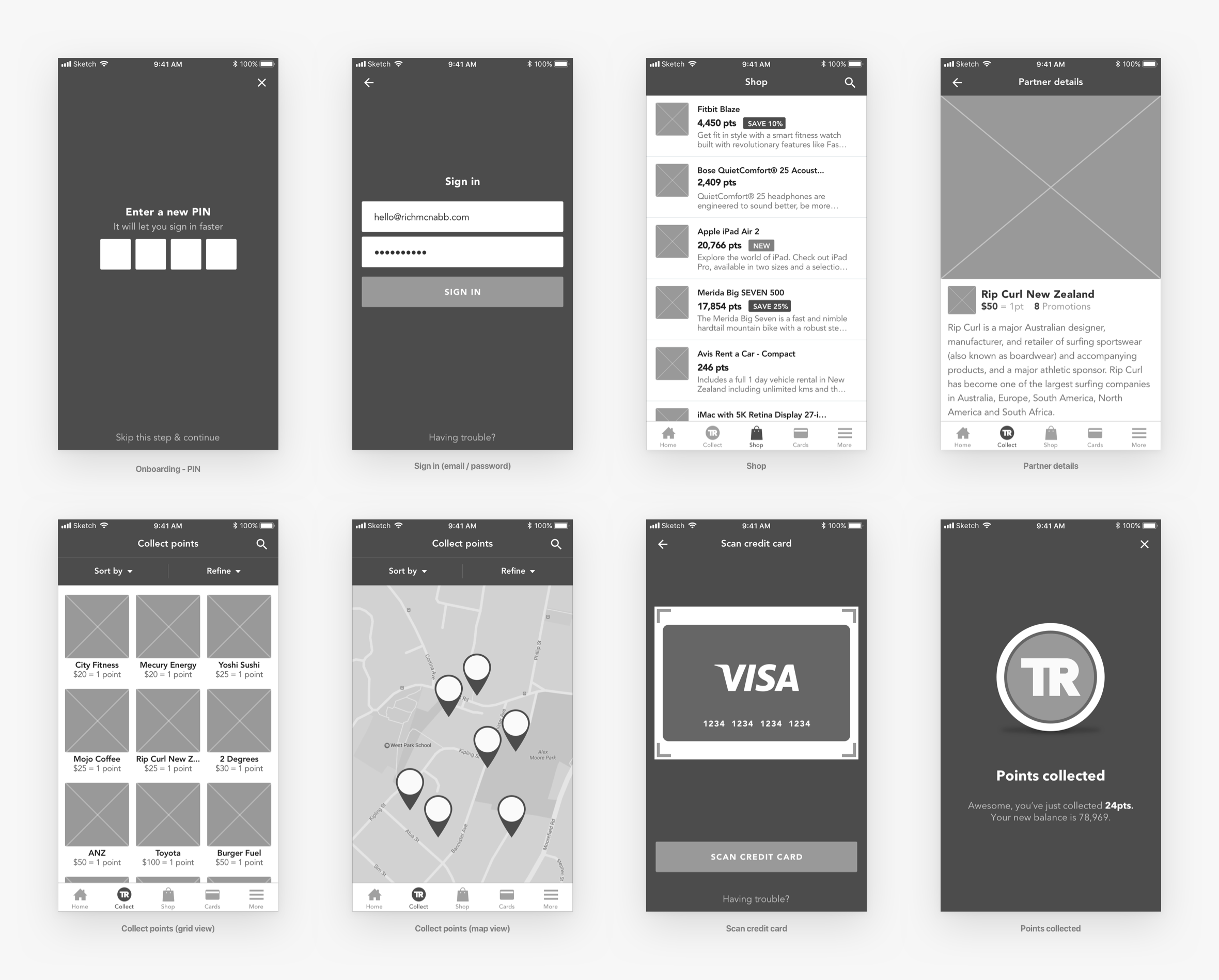
Wireframes help to stay a few screens ahead of developers
Wireframes were created and shared with the product owner and developers to get feedback and a better understanding of any technical limitations. The beauty of this low-fidelity approach is you can collaborate with the developers and work agile without getting caught up and wasting time on the smaller details ahead of time. While the developers are coding up the basic structure and framework you can start providing them with final visuals screen by screen. A continuous design and development loop.
Single sign-on removes friction and the need for passwords
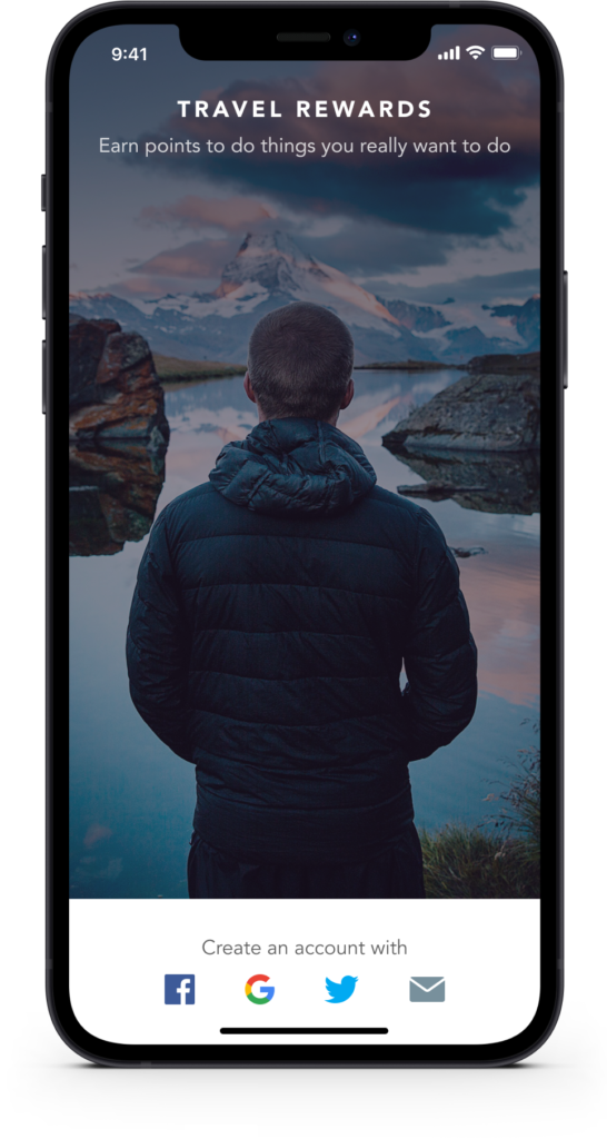
Using an SSO (Single Sign-On) approach during registration makes it easier for users to get started. It also removes clutter from the screen while leveraging platforms such as Facebook, Google or Twitter to reduce the amount of information users have to provide.
Faster sign-in with PIN, Touch ID and Face ID
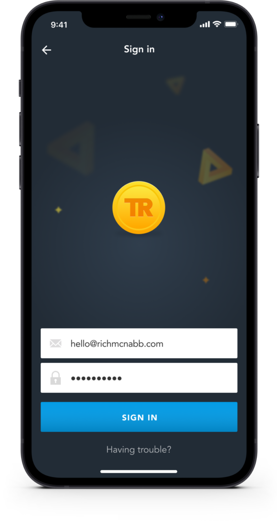
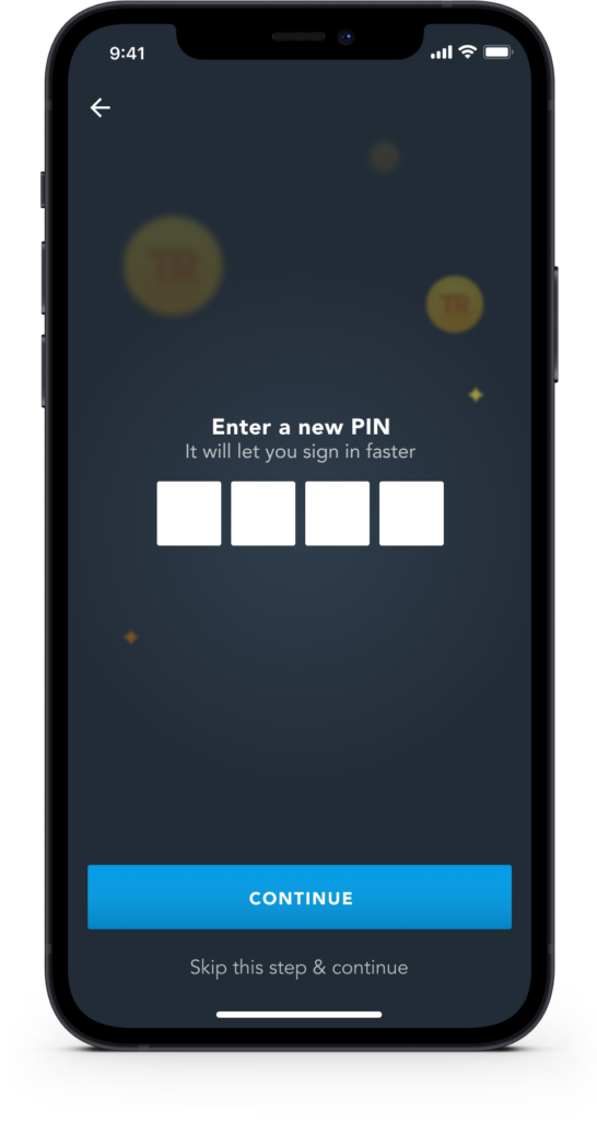
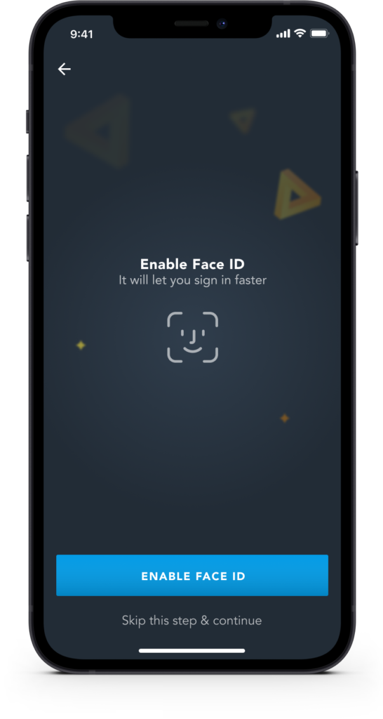
During user research, I discovered users were having trouble remembering their registered email address or Travel Rewards card number. We implemented additional ways to allow users to quickly sign in: PIN, Touch ID, and Face ID.
Personalised promotions based on where you like to spend
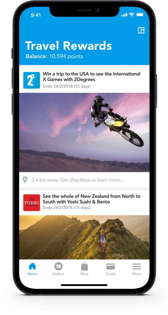
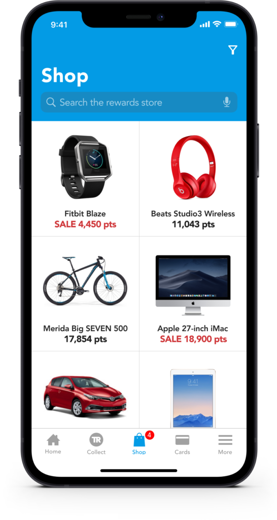
Receive promotional information based on your spending preferences (accessible via the more tab). See what you can spend your Travel Reward points with the ability to browse, search or view categories to find what you’re looking for.
Say goodbye to physical loyalty cards for good
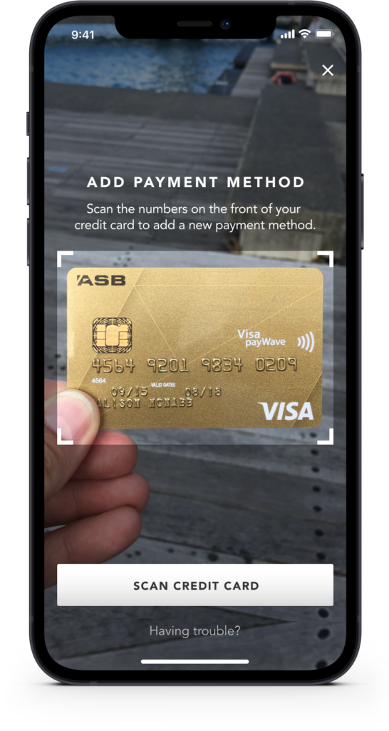
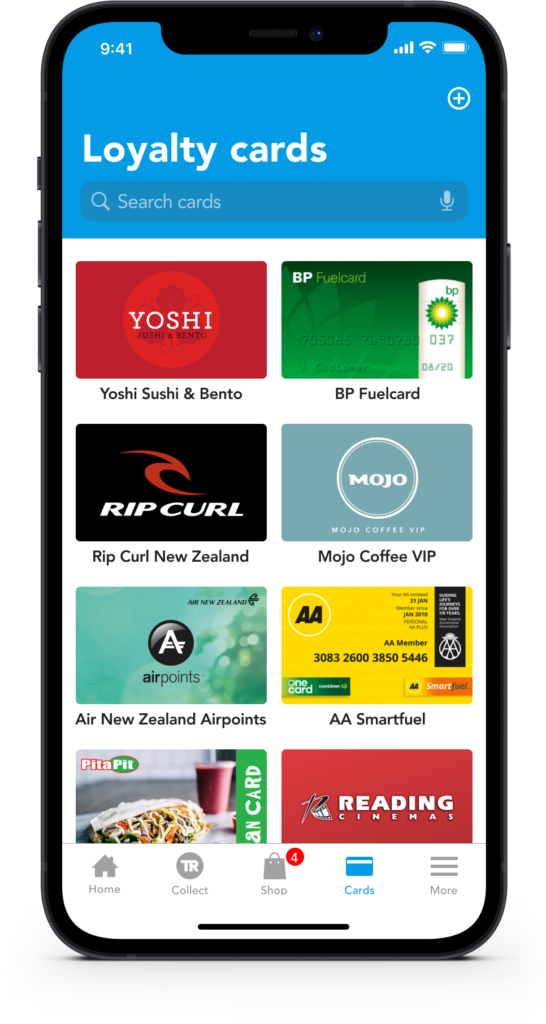
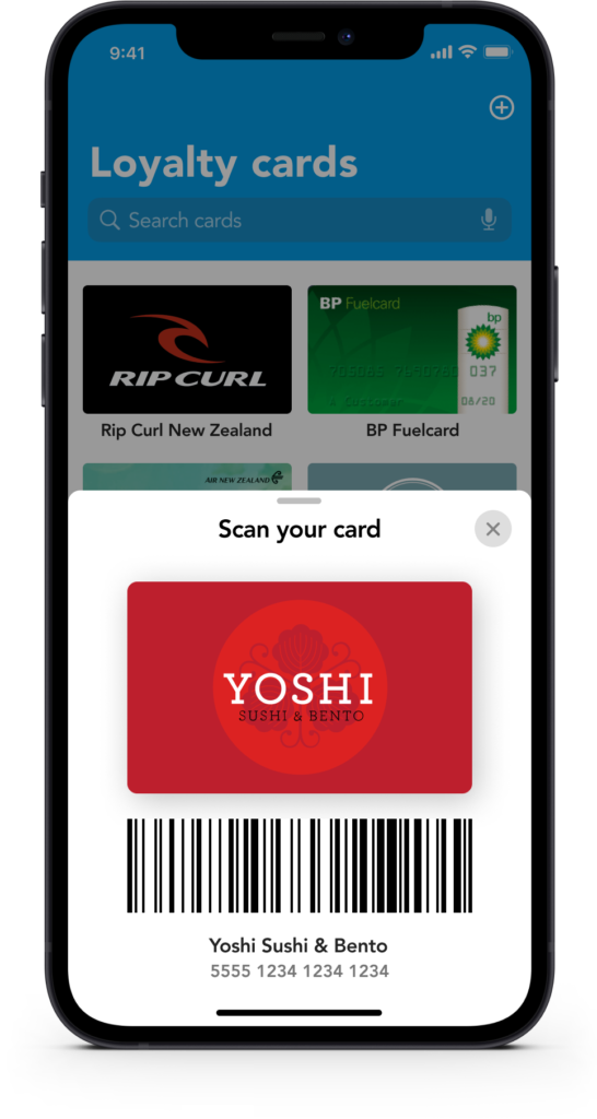
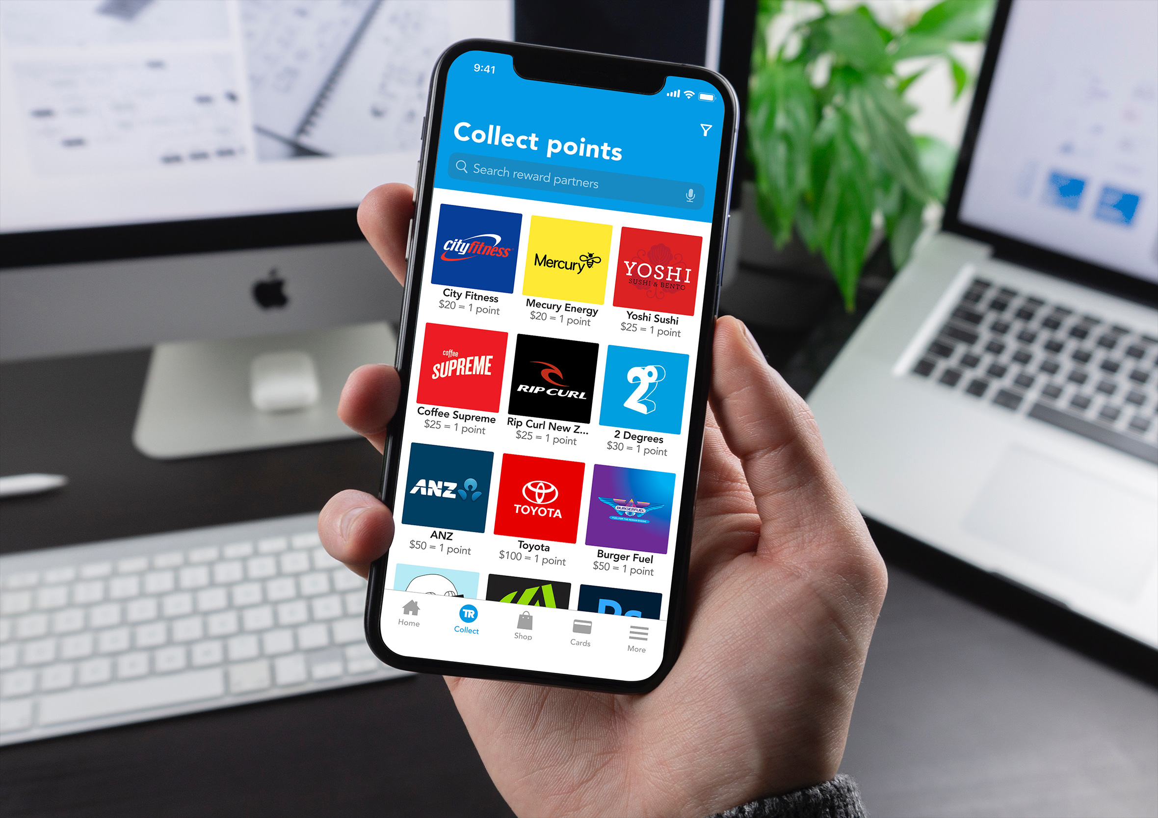
Quickly scan credit card numbers instead of entering a 16-digit number into a form field. Or scan your barcode via the app and reduce the number of loyalty cards you need to carry. Loyalty cards are linked to your credit cards so you earn points automatically every time you use your payment cards.
Invite friends and family to share, collect and spend points
You can invite friends and family to collect points and share the rewards. You can also scan a loyalty card’s barcode straight from your phone when you’re in line at the checkout.

Clear feedback with added touches of gamified delight
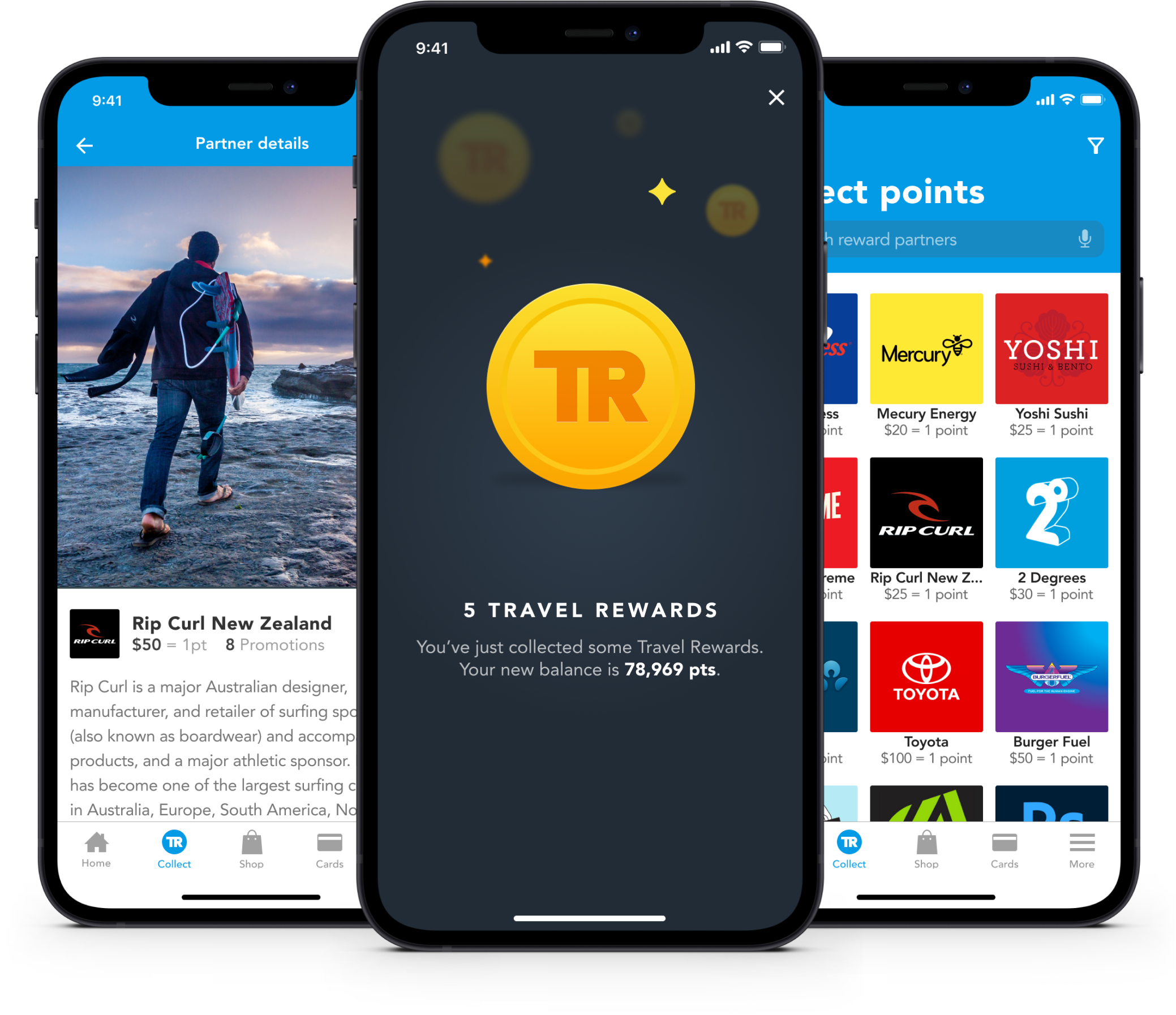
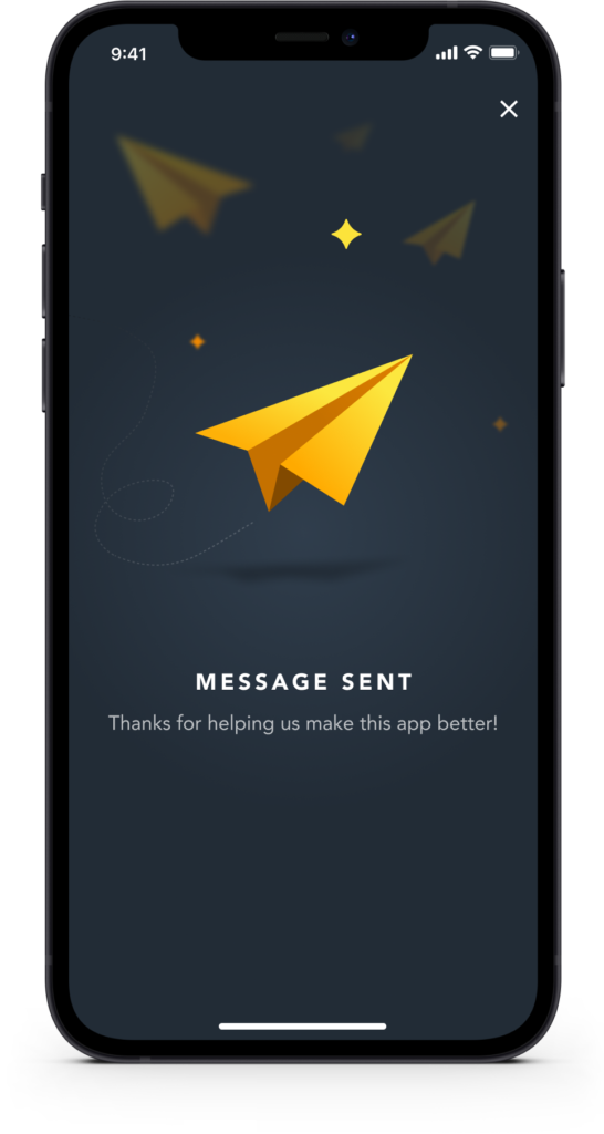
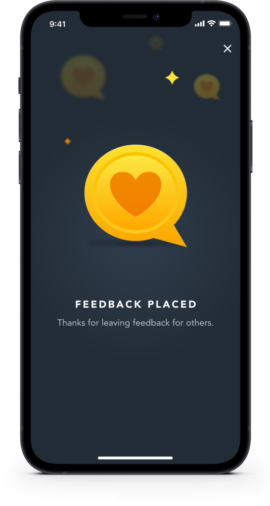
User feedback is given to ensure users are aware of something has worked, or the steps they need to take to correct an issue. Gamification combined with simple animation help to create a more immersive and fun user experience.
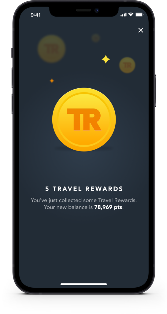
Collecting points gets its own small celebration, a simple animation and a clear confirmation the moment it happens, rather than a number that just quietly updates somewhere in the background. Little touches like this are what stop a loyalty app from feeling like a spreadsheet.
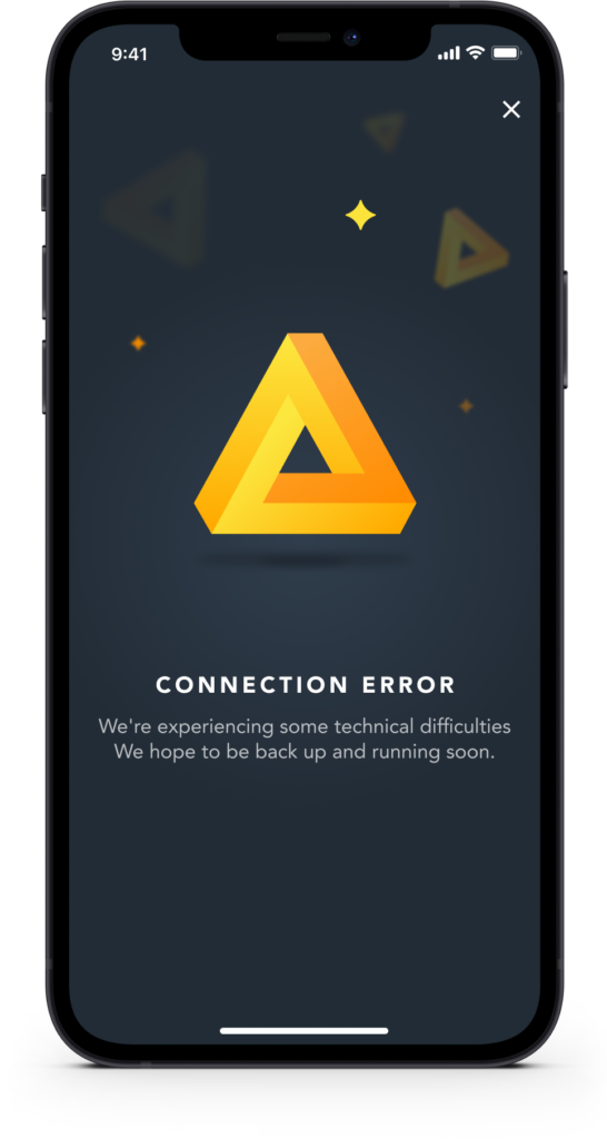
Not every moment of feedback is a good one though. When something goes wrong, a connection drops or a request fails, that same clarity matters just as much. Users can jump straight into an in-app chat rather than being left staring at a vague error with no way to ask what happened.
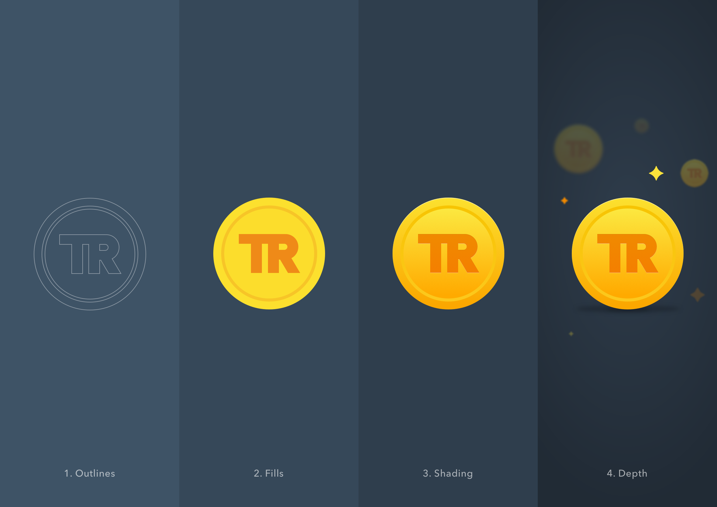
From rough sketch to polished illustration
In some ways, digital design is the complete opposite of sculpture. With sculpture, you start with something solid and chip it down over time until you reach the vision in your head. With digital design it’s the reverse. You start with a rough sketch and iterate, adding details and polish until it meets your expectations. Digital design is far more forgiving than sculpture.
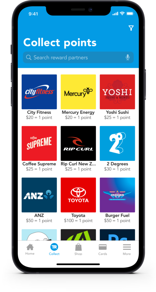
Browse partners to see where to collect and redeem points
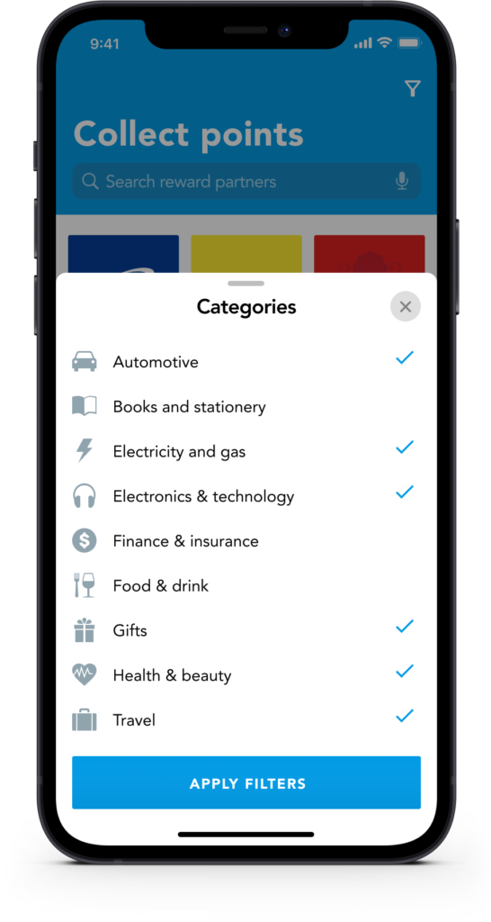
Find participating partner locations where you can earn Travel Rewards points. Similar to the Shop screen users can browse, search or filter to find what they’re looking for. A nice little touch is if the user selects points the supporting text changes to reveal that information, alternatively if they sort by the distance that information is updated to reflect what information the user is most interested in.
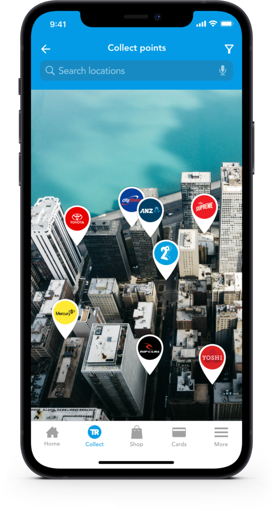
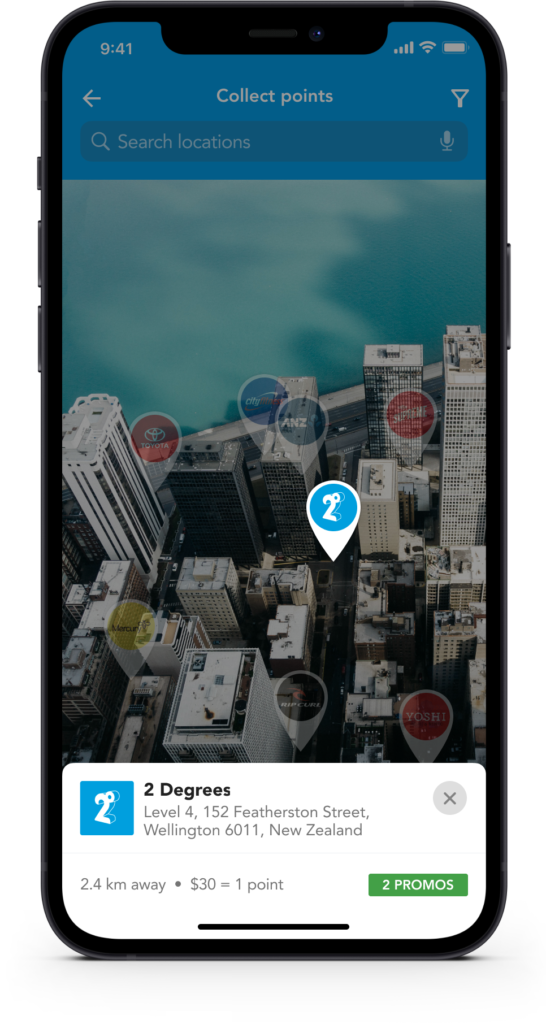
Find nearby partners on an interactive map
The interactive map allows you to find stores based on your current location. Like list view, you can filter and refine your search result to hide partners that aren’t of interest to you.
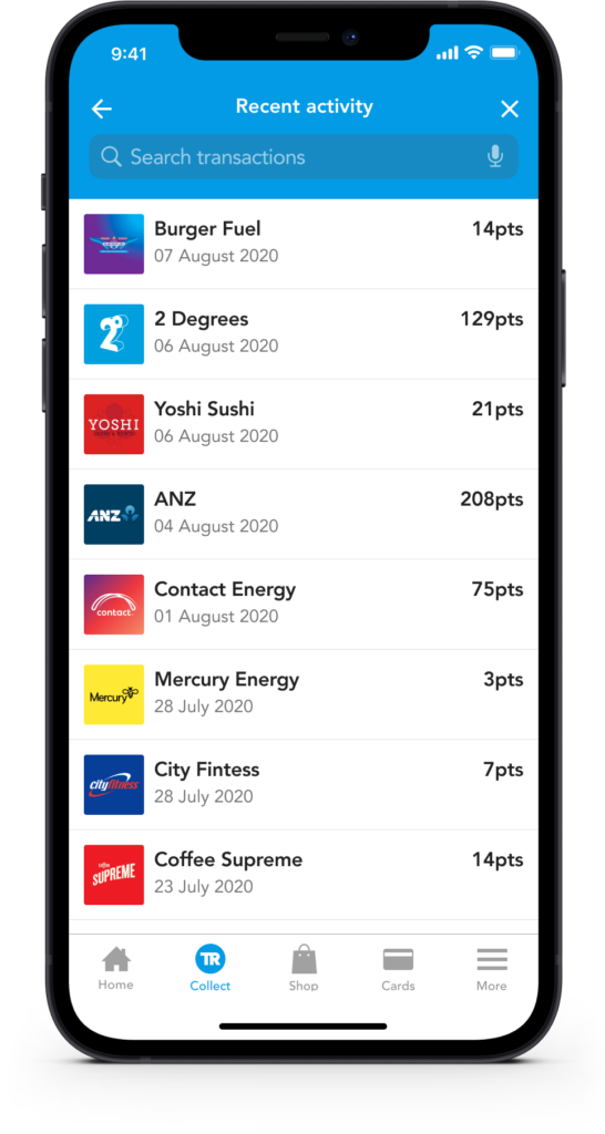
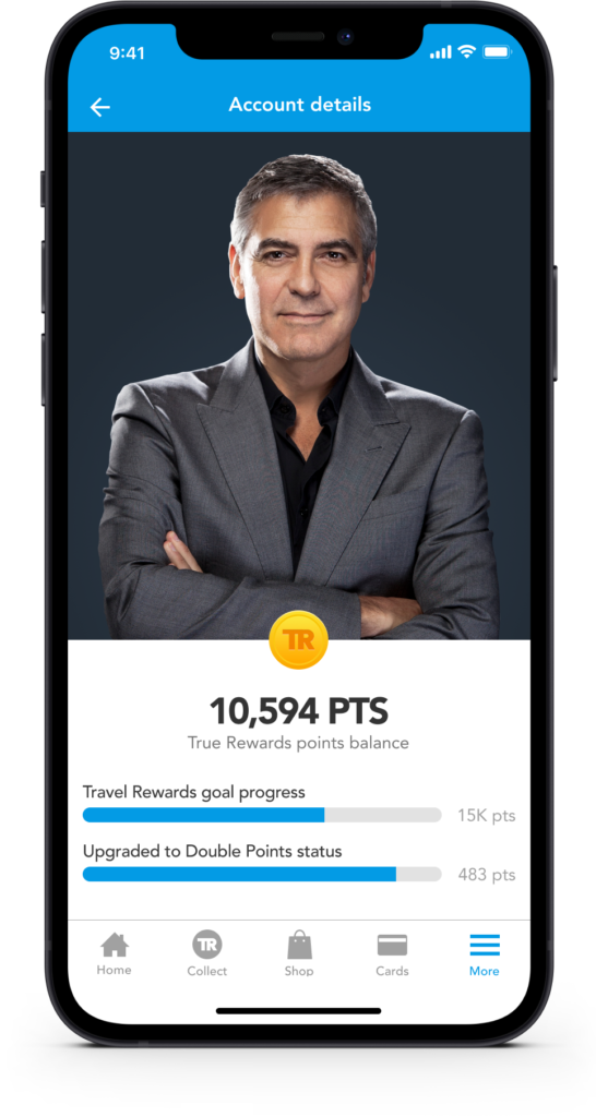
Track your points and set a reward goal
See where you’ve earned Travel Rewards points (locations and dates) and even set a reward goal to motivate you towards a larger purchase or an overseas trip.
Everything you need to know about a partner
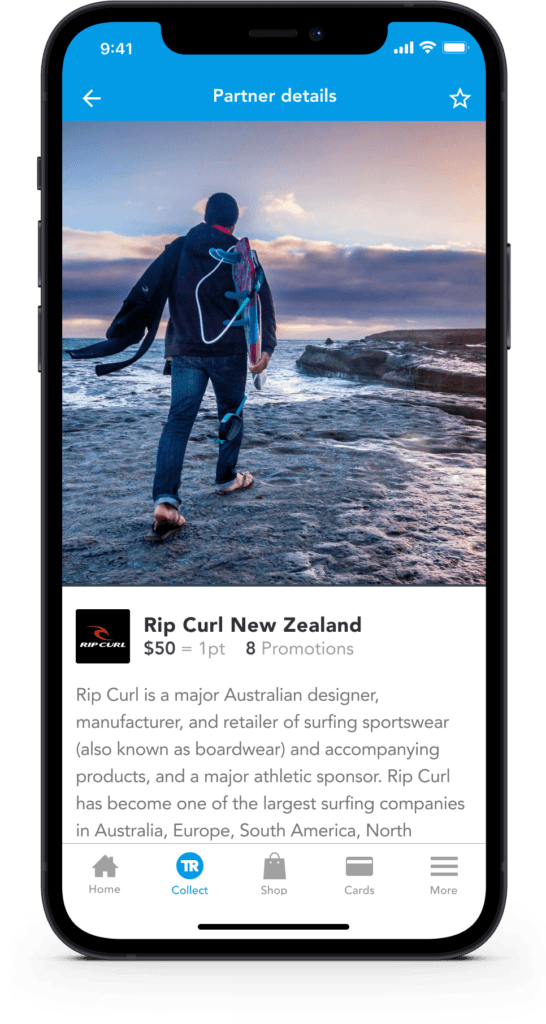
Learn more about participating stores, how to collect Travel Reward points, current promotions and even directions (physical stores only) to the closest store. This is where partners can let people know what products and services they offer and how they can contact, connect or ask questions.
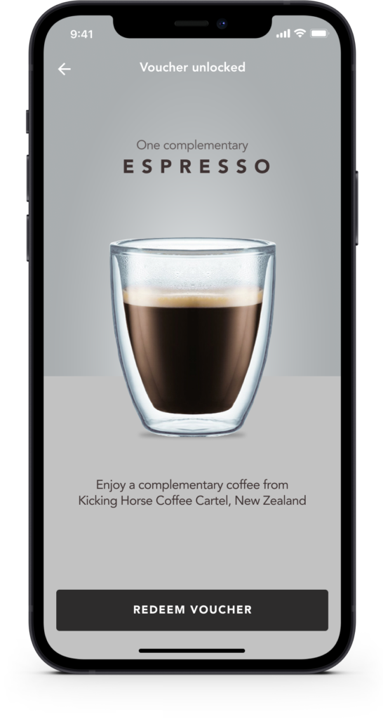
Shot down, so I designed Nexus out myself instead
On 5 May 2017, partway through a UX/UI consulting contract at Davanti, I emailed the Flybuys team with a pitch I’d called Nexus, five ideas for turning a single loyalty card into a whole rewards platform.

Centralised platform
Bring loyalty programmes into a single platform, including programmes outside the Flybuys network. Eliminate the need for physical reward cards across the board.

Banking partnerships
Work with banks to promote and integrate the rewards platform directly into the banking experience, a seamless connection that benefits consumers, retail partners and the banks alike.

Rewards dashboard
View, manage and connect your loyalty programmes from within your existing banking platform, with links to redeem and learn more.

One card, every reward
Connect rewards to your payment card, or use one unique barcode or QR code instead of carrying a wallet full of loyalty cards.

Real-time activity
Use the date and amount of each purchase to show points earned instantly, making every transaction more rewarding.
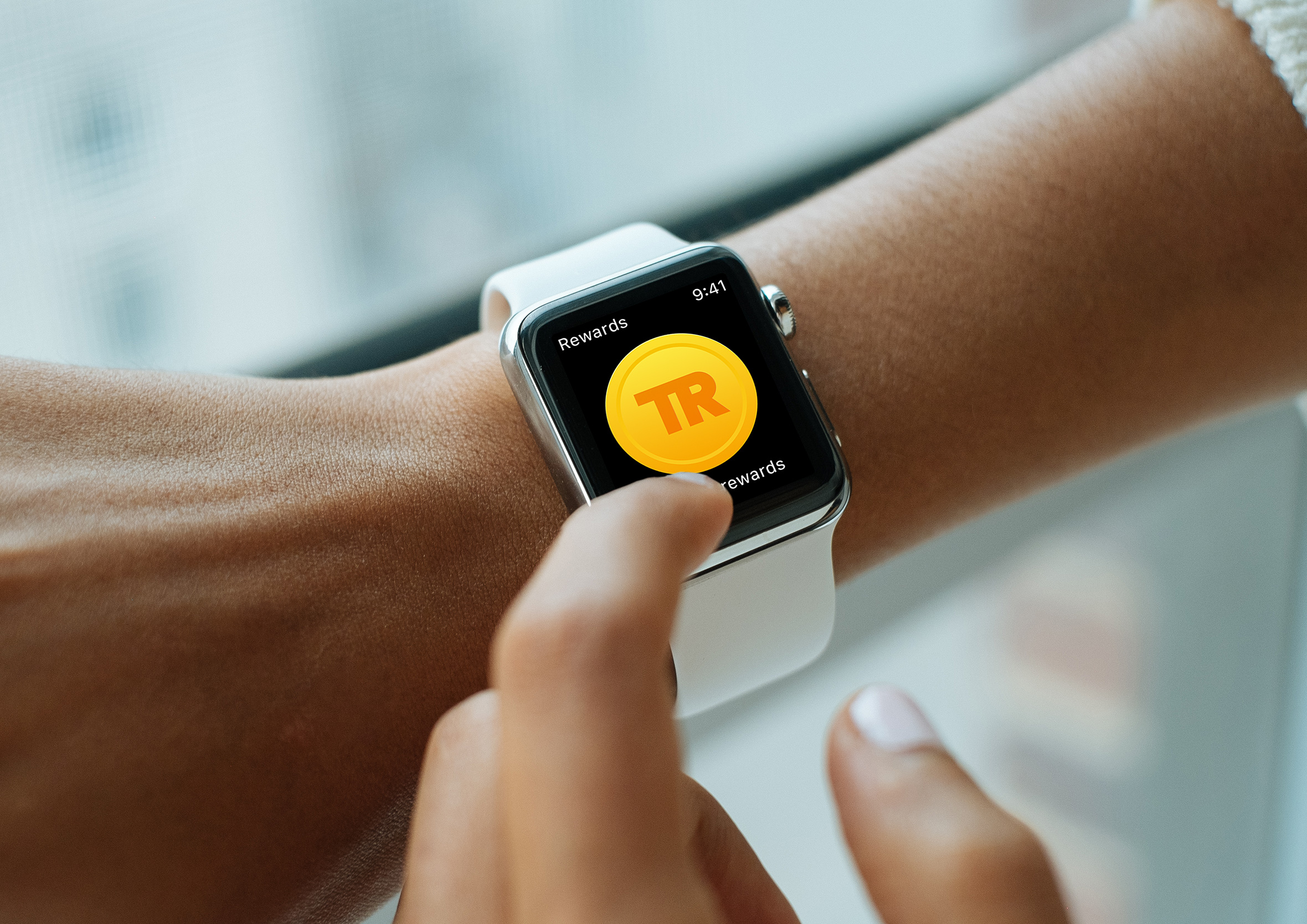
Link it to a payment card and a physical loyalty card would never be needed again. You’d see what you’d earned in real time, while you were still standing in the store, not days later checking an app that may or may not have caught up.
It got a polite no. Not for lack of good reason, an idea that size genuinely needed a dedicated team to pull off, and that wasn’t going to happen inside a partnership project. Though if nobody else was going to build it, I decided to design it out myself instead, end to end, if only to prove to myself it actually held up. Travel Rewards is what came out of that, the platform-level ambition scaled back into a single, complete app, cards linked automatically, biometric sign-in, and points you can actually watch update.
Flybuys itself closed for good at the end of 2024, after 28 years. Loyalty NZ’s own explanation was that the old model, a shared card across retailer partners, had run its course now that businesses can build tailored, embedded loyalty directly into their own products, more or less the direction Nexus was already pointed in, seven years before it became the obvious answer.
A lot of what makes an app like this work comes down to the same handful of gamification techniques, personal records worth chasing, small milestones worth celebrating, progress that’s actually visible. That same thinking, maps, badges, a bit of friendly competition, resurfaced years later in Craft Beer Adventures, a behavioural onboarding app built on a lot of the same instincts.