

MPI: New Zealand declaration & travel app
Arriving in a new country is stressful enough without the paperwork. This biosecurity and customs app guides cruise passengers through it with interactive maps, risk items and a physical card game, for a smoother border experience.
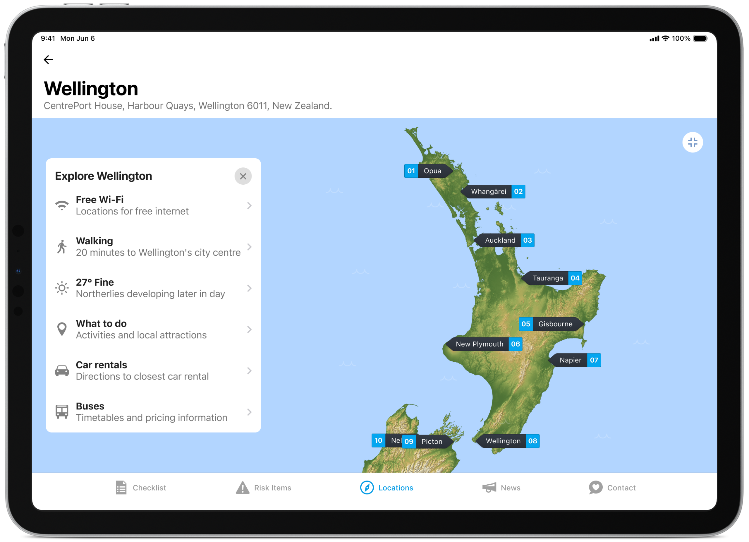
Pencil to paper to sketch out ideas
MPI’s Coming to New Zealand app helps cruise ship passengers understand New Zealand’s biosecurity rules before they even step off the boat, turning a paper customs form into something that actually explains itself. I love putting pencil to paper and capturing as many ideas as possible during the concept stage. The goal isn’t to produce high-quality drawings. It’s about quantity and the ability to jump quickly from idea to idea, exploring potential solutions that help inform the design direction.
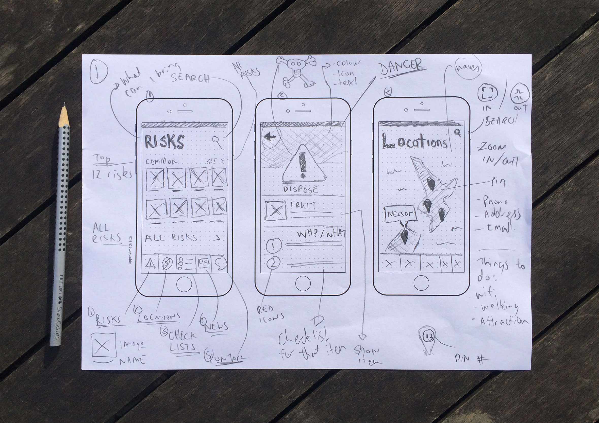
Information architecture: mapping every screen and flow
The information architecture maps out which screens are required and all the user interface elements which make up the structure of the app. By having everything in the one place it makes it easier to identify areas of improvements or gaps in the user experience.
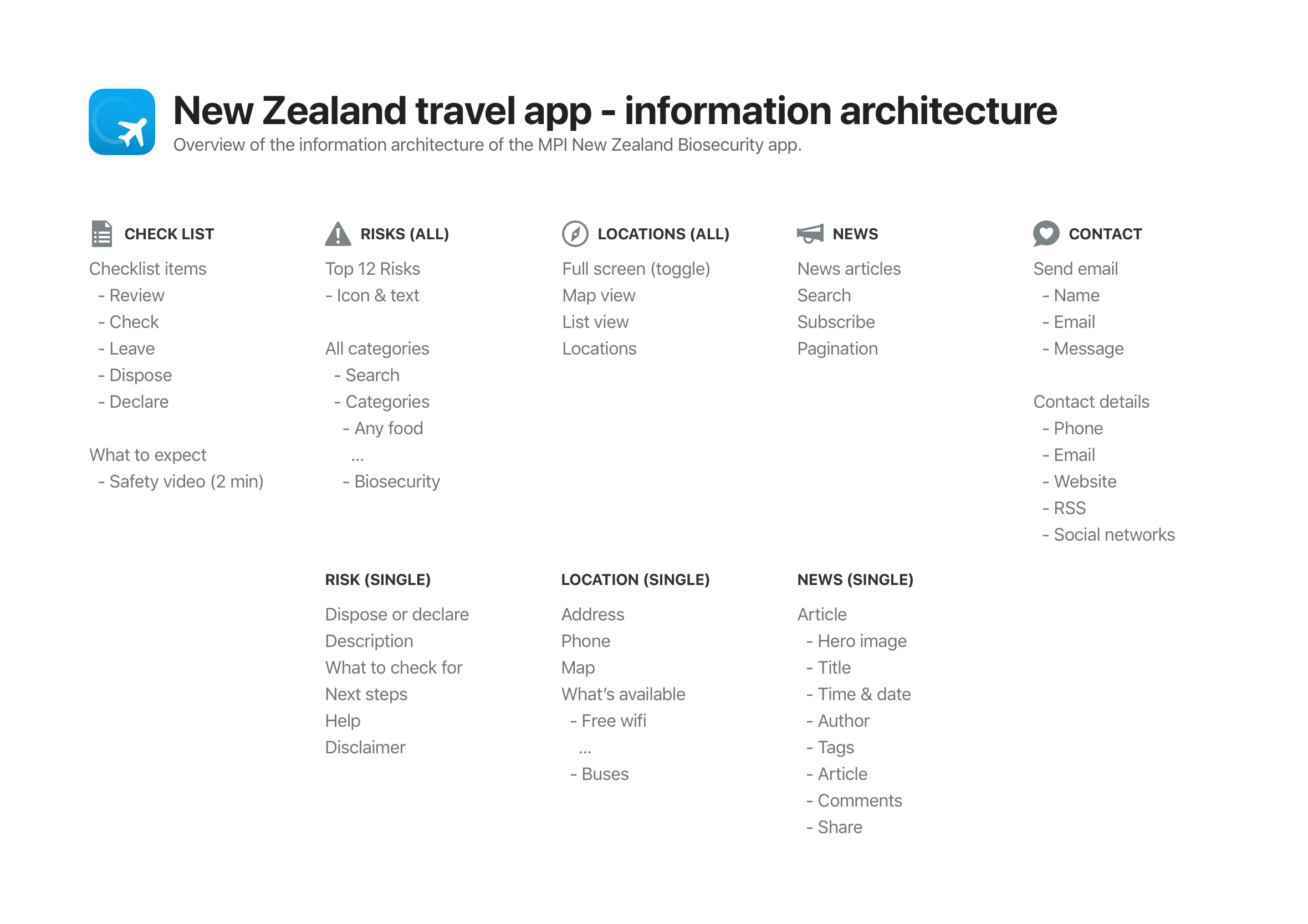
Wireframes to identify gaps in the experience and interactions
Wireframes were created and shared with the product owner and developers to get feedback and a better understanding of any technical limitations. The beauty of this low-fidelity approach is you can collaborate with the developers and work agile without getting caught up and wasting time on the smaller details ahead of time. While the developers are coding up the basic structure and framework you can start providing them with final visuals screen by screen. A continuous design and development loop.
Designed with travellers in mind
The app was never designed to replace the original New Zealand Passenger Arrival Card it was designed to help educate and provide clarity to travellers on how they can speed up the time it takes to go through biosecurity checkpoints by being better informed on the risks to New Zealand. This becomes especially important for travellers where English is their second language, or they have no English skills.
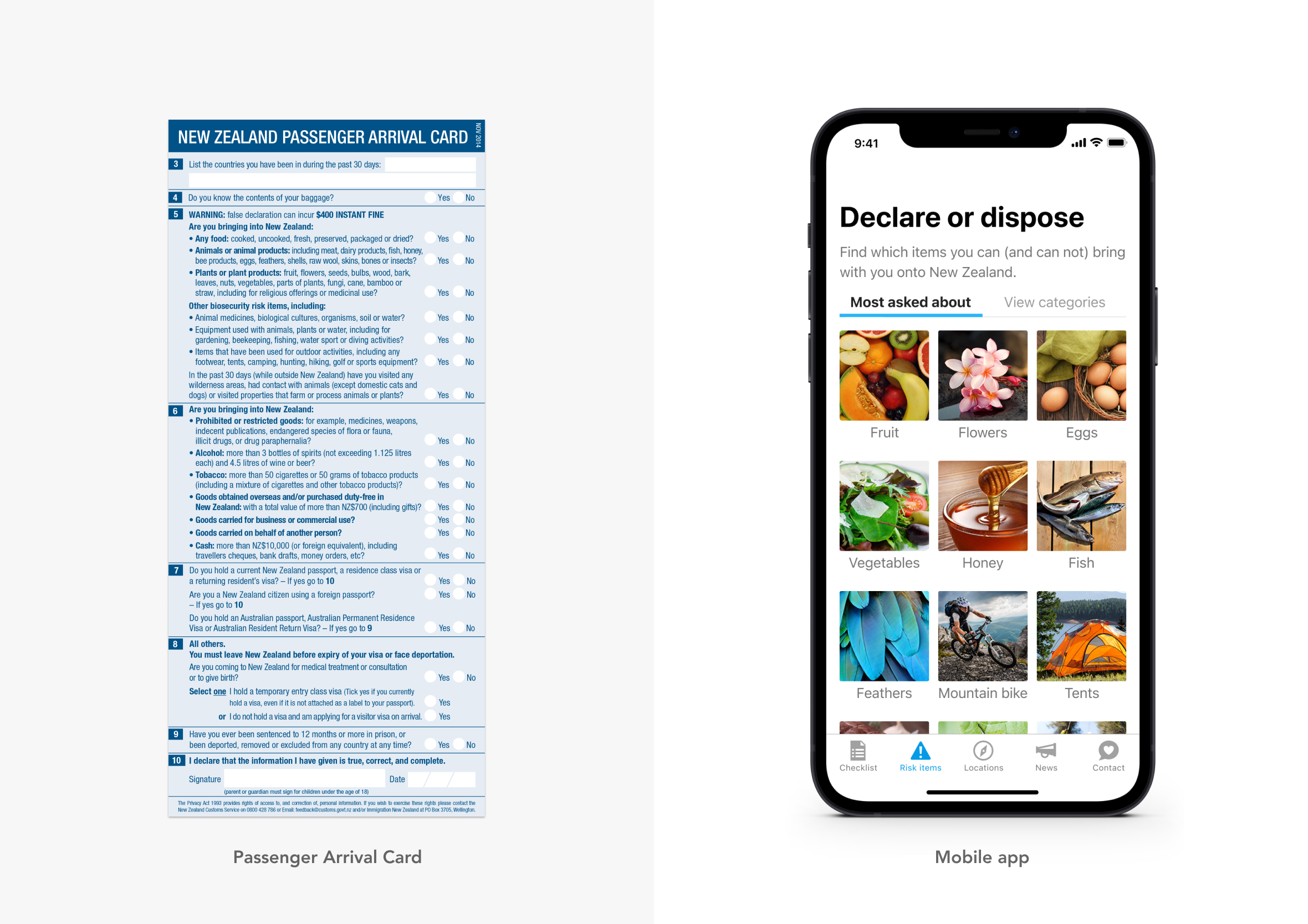
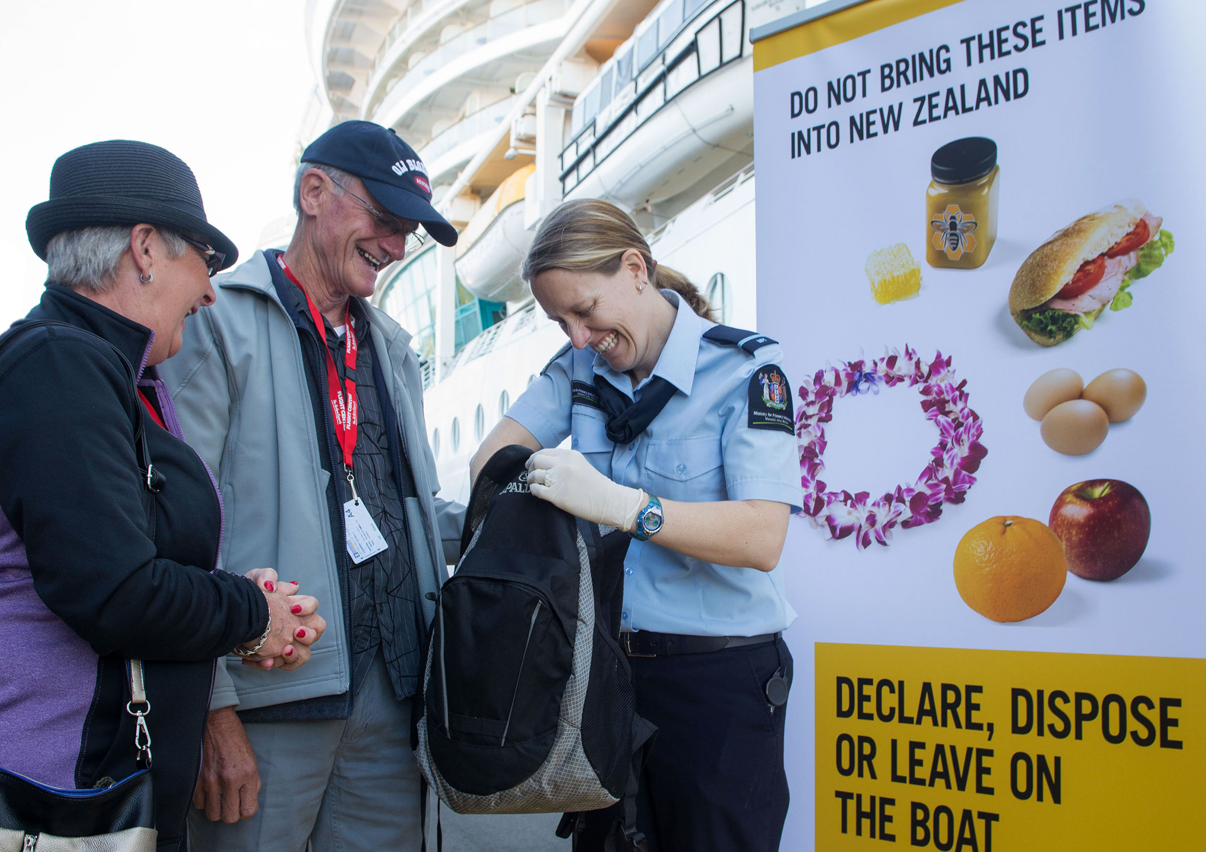
Customer interviews, site observations and useful insights
To make sure we were building something people actually wanted and would use, we went aboard cruise ships and spoke with crew members, MPI officials and passengers. Once we had a working prototype we went out again to complete usability testing, validate assumptions and get feedback on how travellers thought the app could be improved further.
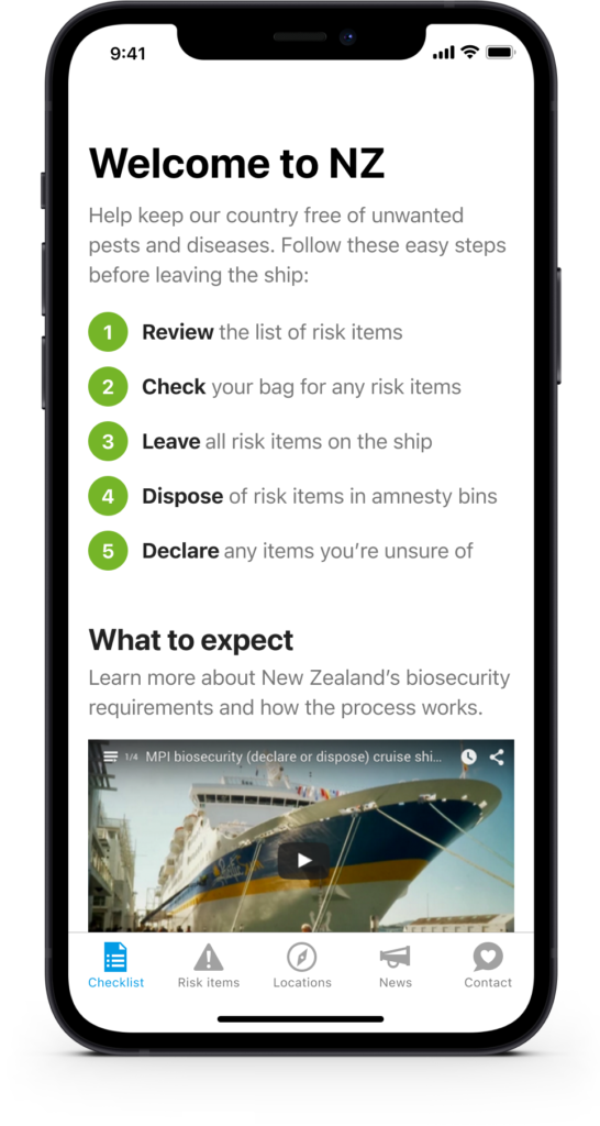
Everything you need in one place
The splash screen uses beautiful beach imagery to allude to the fact the app was designed especially for cruise line passengers. The checklist is a simple reminder of all the things to think about before coming to New Zealand. The emphasis is placed on trying to maximise the time the traveller has at each port.
Explore popular New Zealand destinations and help tourists
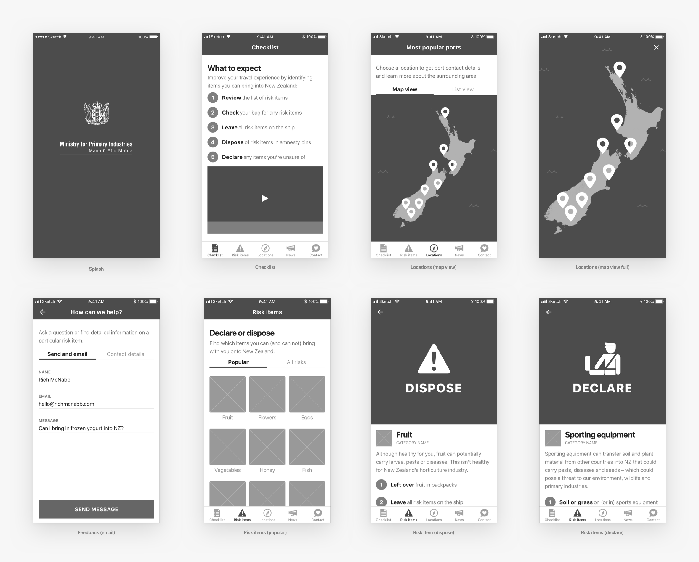
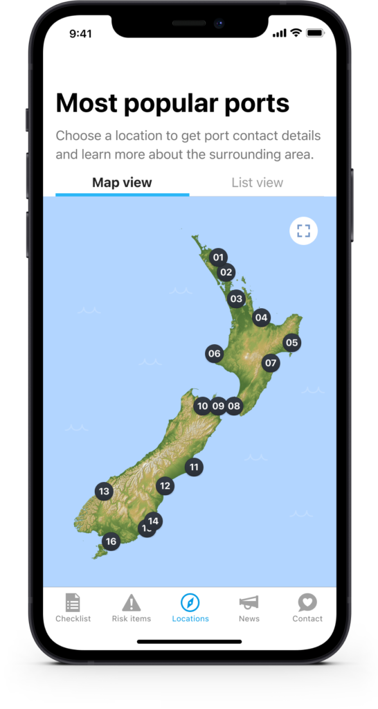
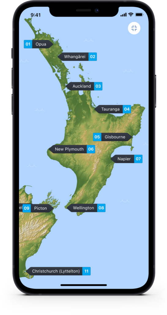
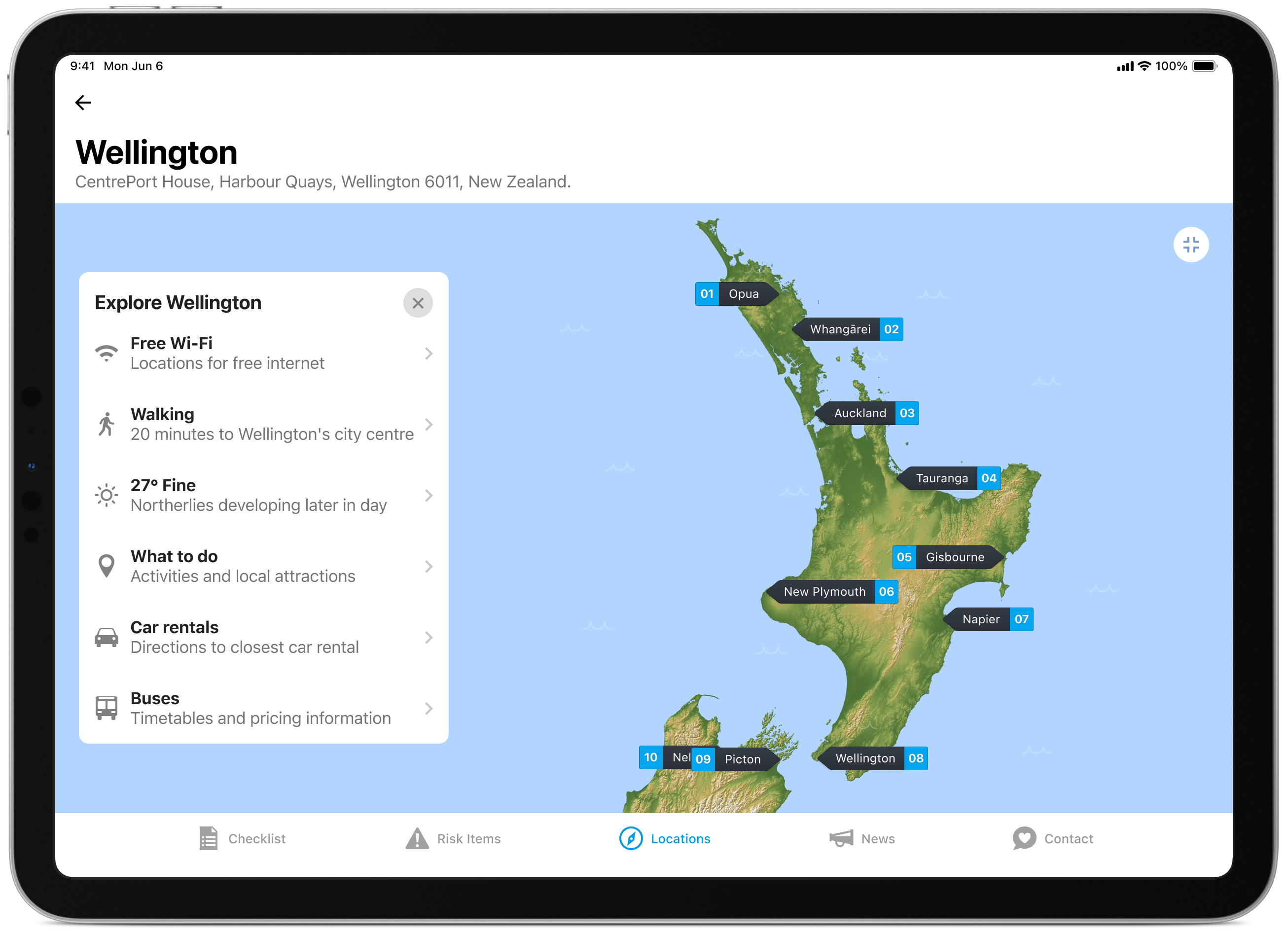
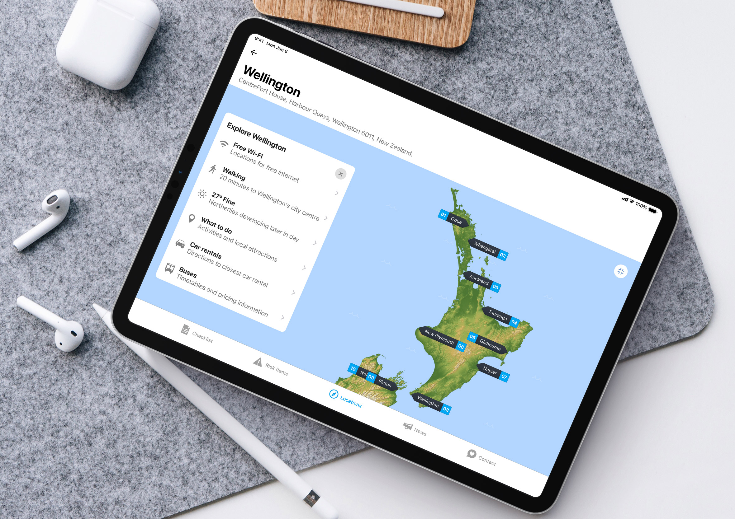
The interactive map is a great way for travellers to learn more about New Zealand’s geography and research their next destination. The ability to zoom in allows more information to be shown on smaller screens.
Travel tips for each location make exploring easier
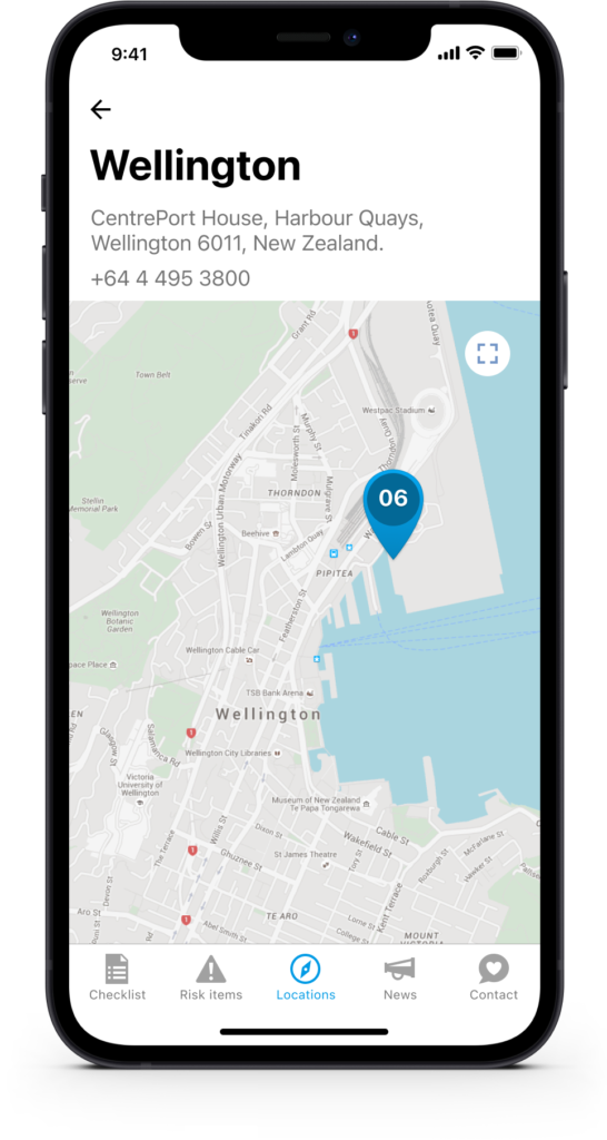
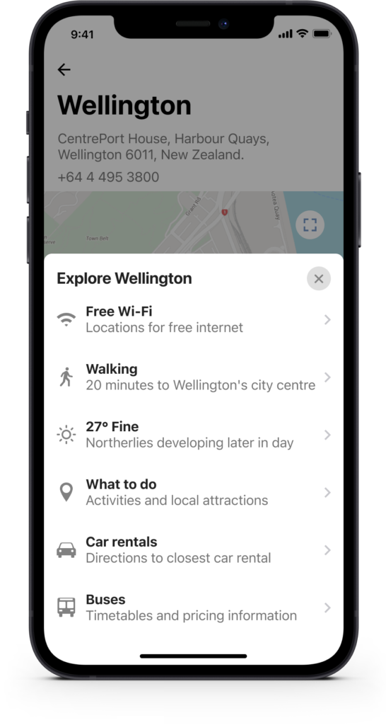
Each individual port location provides access points for necessary travel information and is designed to answer travellers’ frequently asked questions. The feature also encourages people to return to the app while staying up-to-date and well-informed with MPI’s strict biosecurity requirements.
What can you bring in with you?
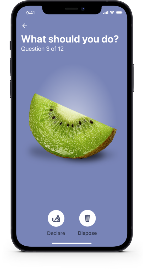
Travellers can research which risk items they can (and can not) bring into New Zealand. The “Most asked about” are the top 12 items (based on MPI’s intercept analytics) and are designed to catch the low-hanging fruit or 90% of infringements. “View categories” allows a person to find obscure risk items and learn more about New Zealand’s biosecurity laws.
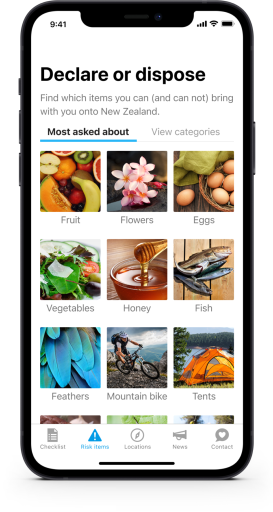
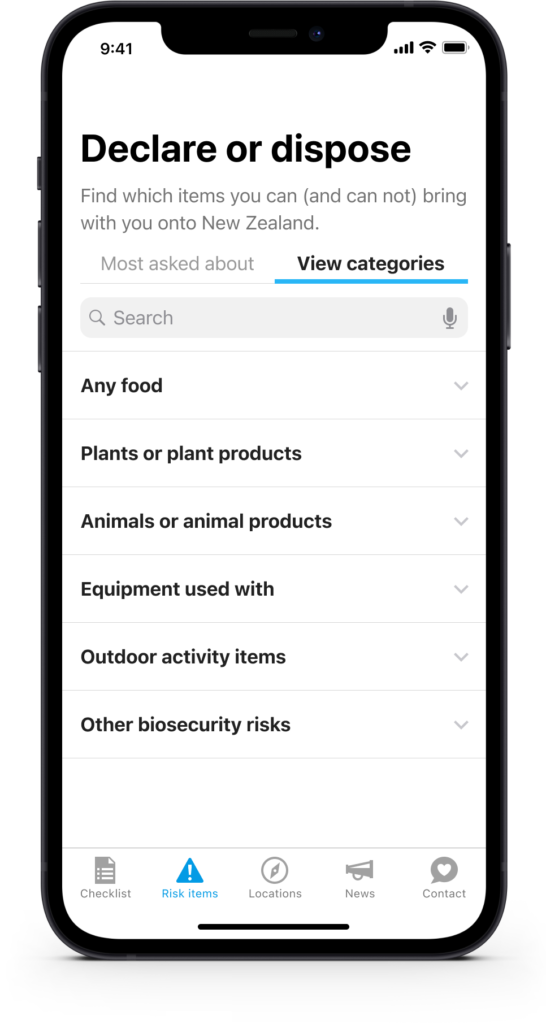
Quickly check to find out what you need to do ahead of time
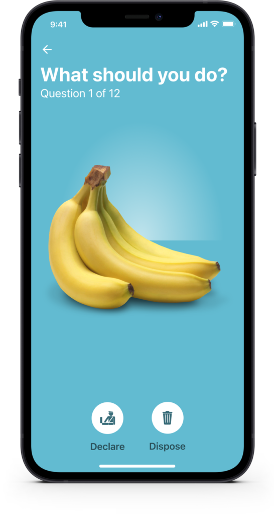
The Declare and Dispose screens for each risk item makes no confusion about an item’s status and provides information to clearly and concisely answer the “what” and “why” and provide some context around the law. If a person has any question or wants to challenge a decision we’ve made it easy for people to ask questions and/or get more information from MPI.
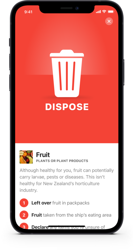
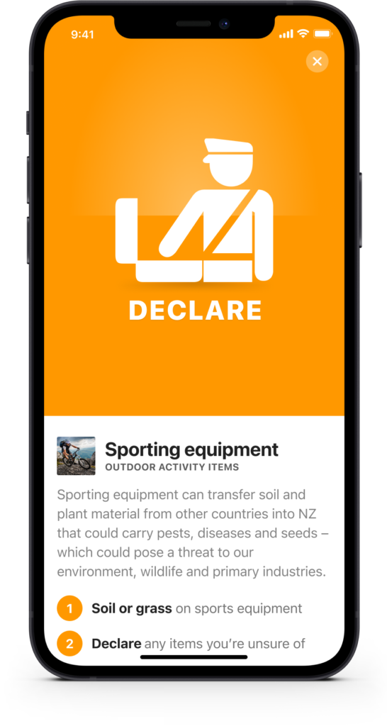
Some screens that didn’t make the first release
These screens didn’t make it into the final version of the app, though they were still a lot of fun to design.
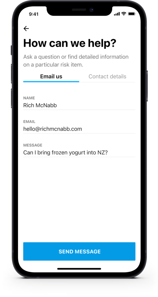
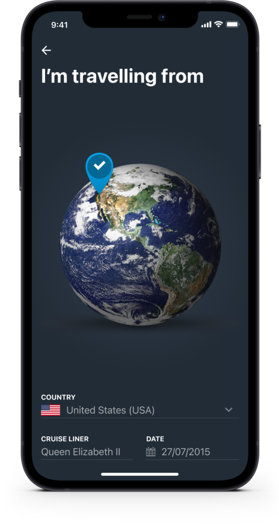
We also designed with iPad travellers in mind
Based on what we observed at the ports and the people we spoke to we quickly discovered an iPad/Tablet version of the app would be required to ensure our target audience was properly catered to.
Experimented with a declare or dispose mobile app game
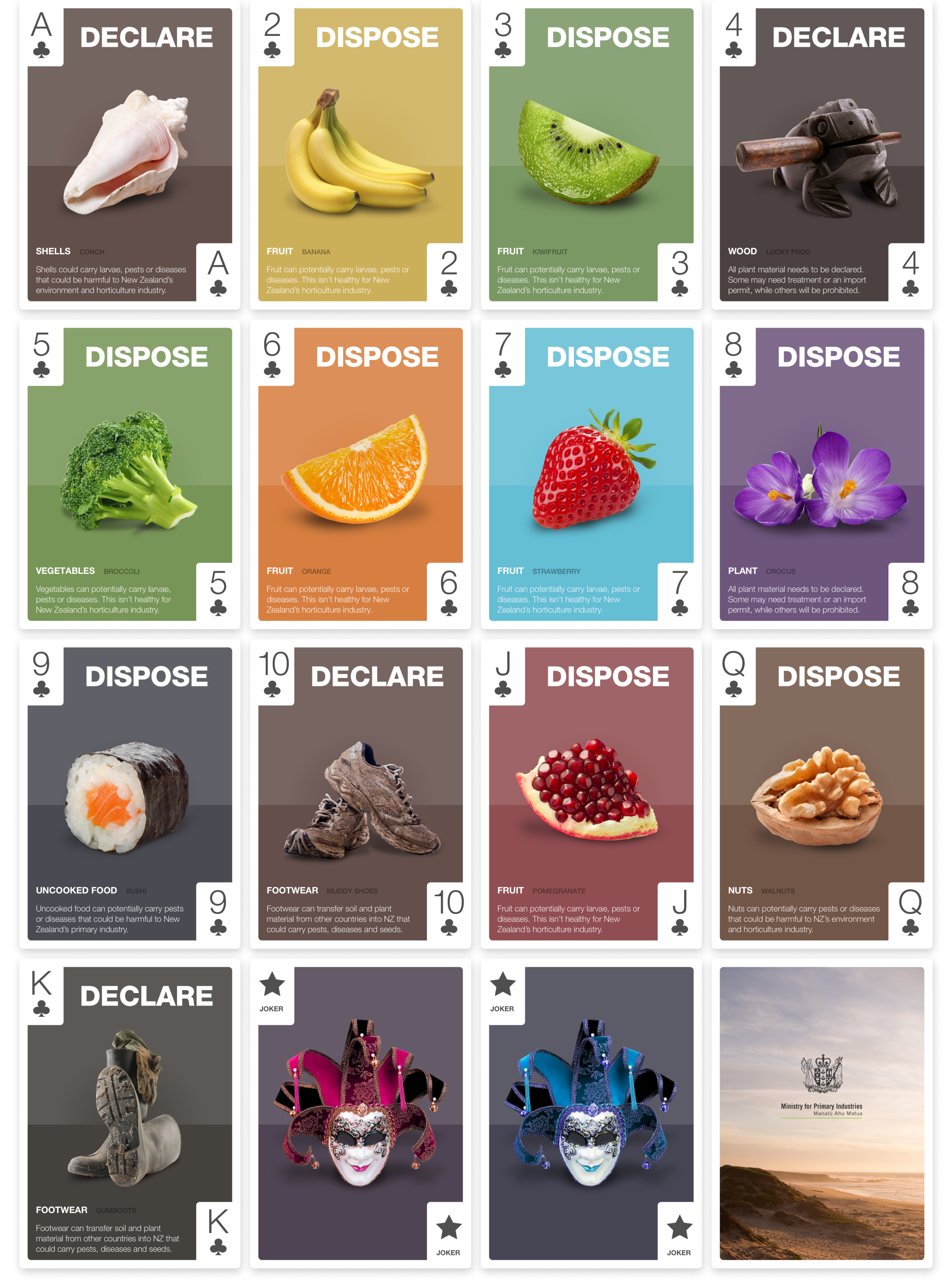
Similar to the travel playing cards, passengers can enjoy some downtime while learning about New Zealand’s biosecurity requirements. This format also allows content to be delivered via video and links to external resources where travellers can find more information or ask questions.
Traveller playing cards for when you’re waiting around
If you don’t have a smartphone or want to test your skills offline we have created a deck of playing cards which entertain and educate the travellers. The benefits of this approach is MPI gets the chance to communicate their message in a way the breaks away from traditional platforms or previous approaches. It’s also a great way to burn time in between flights.
Wellington is a very small city
Wellington is a genuinely small city, small enough that I ended up on this project purely by coincidence. I was chatting with another dad at daycare, we’d been friends since our kids started there, and he mentioned an app idea his company was building. He was working at MPI as a business analyst.

The following week, my own employer assigned me as lead designer on a new project. It turned out to be the exact same one, our two bosses had worked together years earlier, something neither of us knew until it all lined up.
We got to test the app at the docks with real passengers, and even got a tour of the cruise liner itself, which is about as far from a usability lab as user research gets.
That same constraint shaped ACC’s design principles too, a construction safety app built around the same idea, that instructions need to land the same way no matter someone’s first language.