How to advance early on in your UX/UI design career
Relax, this isn't a "buy my course" article, I swear. There's no funnel, no upsell waiting at the end, just what's actually worked for me across almost 20 years of UX/UI design. It's a choose your own adventure instead.
In 2009 reality didn’t match my career expectations
I graduated from Natcoll Design Technology (now Yoobee School of Design) in 2009 with a Diploma of Interactive Design. Project-based modules and assessments were what I loved most about Natcoll, learning by doing rather than sitting a big exam that tests knowledge you could just Google.
The timing could not have been worse. New Zealand’s economy was already deep into the aftershocks of the Global Financial Crisis by 2009, and nobody was hiring designers straight out of study with zero real-world experience. It felt a bit like Ready Player One, the moment you take the VR goggles off and there’s this jolt, the world you’d been picturing in your head as you graduated slowly colliding with the actual reality unfolding right in front of your eyes.
The Ready Player One film by Steven Spielberg | Credit: Warner Bros. Pictures.
Any advice from seasoned professionals, no matter how small, would have made a huge difference, especially when your choices were limited and opportunities were few and far between. I emailed a handful of designers around the world whose work I admired, people whose skill was well beyond anything I was capable of doing when I was starting out. I wasn’t asking for ongoing mentorship or a huge commitment of their time. I would have been beyond stoked with a few short paragraphs, some words of wisdom, book recommendations, or links to websites pointing me toward where to explore and grow.
Most never replied. Looking back, I get it. Everyone is busy, juggling deadlines at work and family life at the end of a long day. Still, I know how much even a quick email back would have meant to me back then. That’s why I reply to every single designer who messages me on LinkedIn or sends me an email to this day. I remember what it’s like starting out, acutely aware of how your skills fall short of where you want to be. There’s a disconnect, and you’re not sure how you’re meant to close that gap.
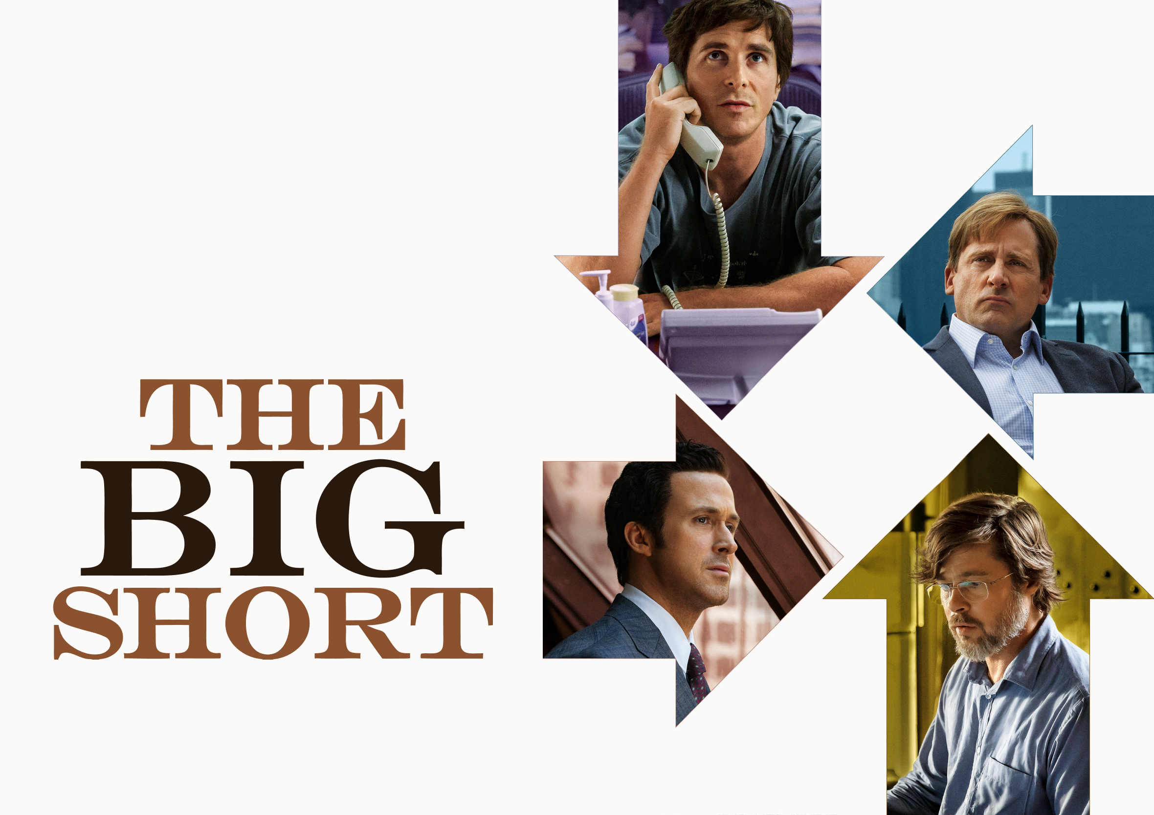
The Big Short | Credit: Paramount Pictures
Less imposter syndrome, more humility. Imposter syndrome is driven by a genuine fear of being exposed as a fraud despite real success. Humility is the opposite. It’s grounded in reality, an objective self-awareness of both your strengths and your limitations. And that gap sucks. Hopefully this article makes it suck slightly less.
For a while, writing back to someone meant a slightly different version of the same reply each time, tweaked to whatever the person had asked or whatever I could remember in the moment. Better than nothing, though not the most considered or useful way to help someone.
This article is my attempt at a more structured answer, one you can take what is useful from and pass forward yourself one day.
Focus on quantity over quality
Design is messy, and that is where the best breakthroughs happen. Or if you’re lucky, you may stumble across happy accidents when you work at pace. “We don’t make mistakes, we just have happy accidents,” is the most famous catchphrase of legendary American painter and television host Bob Ross. The idea is to pump out as much work as possible, focusing on quantity, the actual output, rather than quality, the polish. You don’t have to share this work if you don’t want to. This approach simply gives you permission to experiment and build fundamental skills and problem-solving ability as you try to paint yourself out of a corner, or abandon that direction entirely.
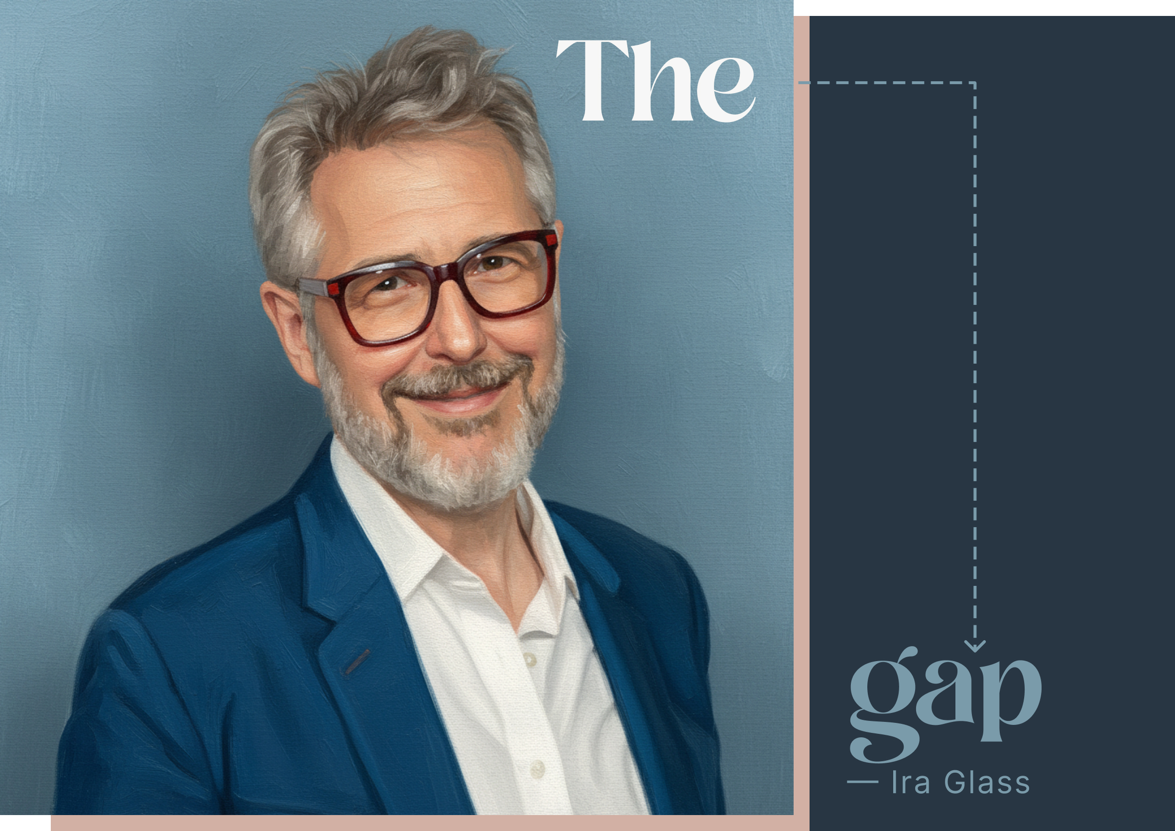
Like most things in my life, it has been a lot of trial and error with a handful of wins along the way. It is what has worked for me across almost 20 years as a UX/UI designer. There’s a name for that in-between stage, when you know your work is falling short of your own expectations. Ira Glass calls it The Taste Gap, the space between the taste that got you into design in the first place and the actual skill needed to make good work. Every designer I respect has lived in that gap far longer than they’d care to admit.
It is only by going through a volume of work that you will close that gap, and your work will be as good as your ambitions — Ira Glass
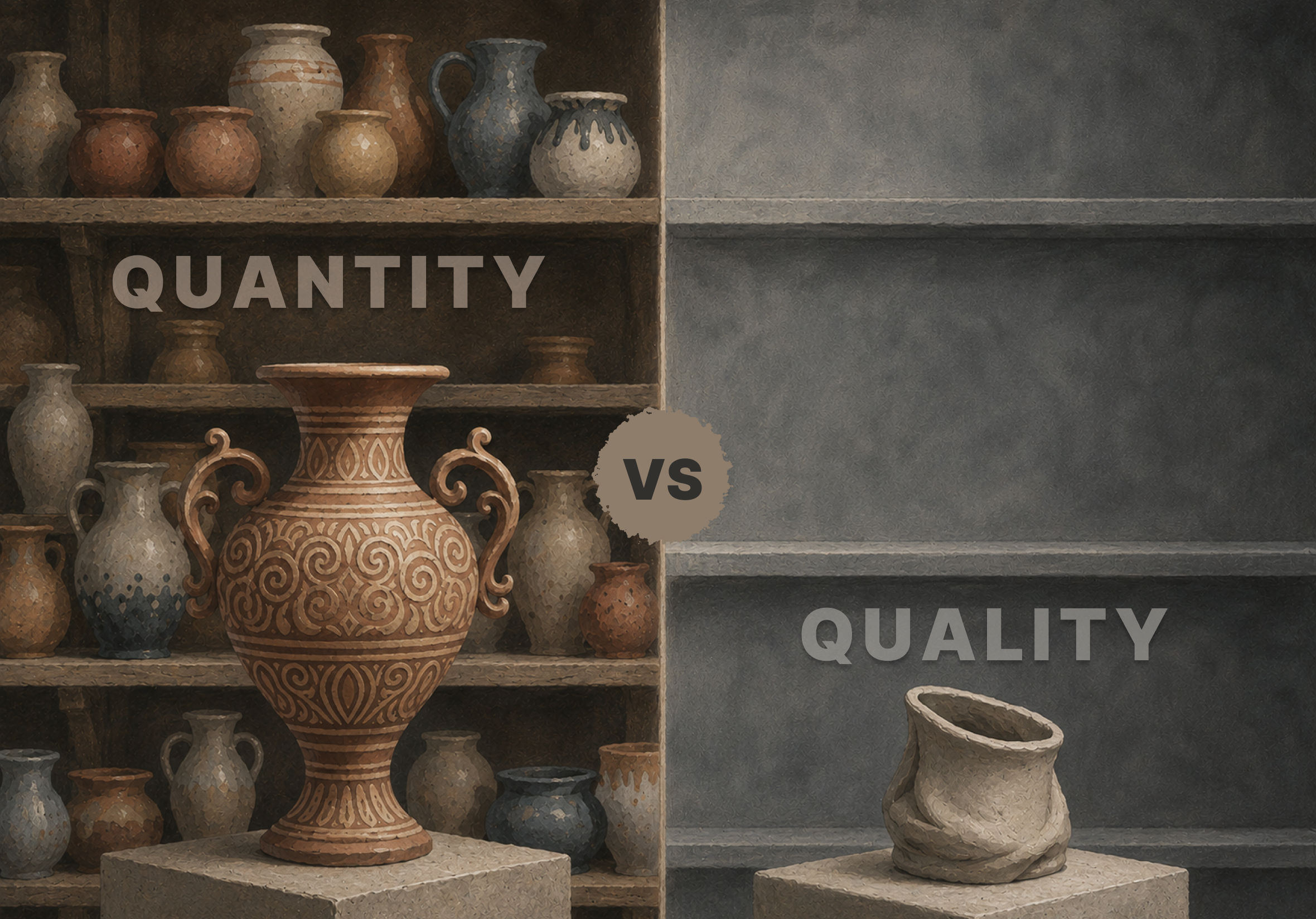
Most of what’s covered in this article comes down to one thing: progress over perfection. One of my favourite stories on this topic comes from David Bayles and Ted Orland’s book Art & Fear, The Ceramics Class, a story about why quantity often outperforms quality. A pottery class was split into two groups, one group was graded purely on how much they made, the other on producing just one item, the ultimate perfect piece. The quantity group spent the semester in practice, making pot after pot and learning from what broke. The quality group spent that same time in theory, debating technique and aesthetics before ever really testing anything. The quantity group produced the better pots, every time, simply because they kept their hands moving.
Your version of quantity over quality may not focus on ceramics, but the approach is still applicable, even if you have to adapt it to your own circumstances. Remember, there are no wrong answers here. Try what makes sense for where you’re starting from, adapt the rest, and see what resonates.
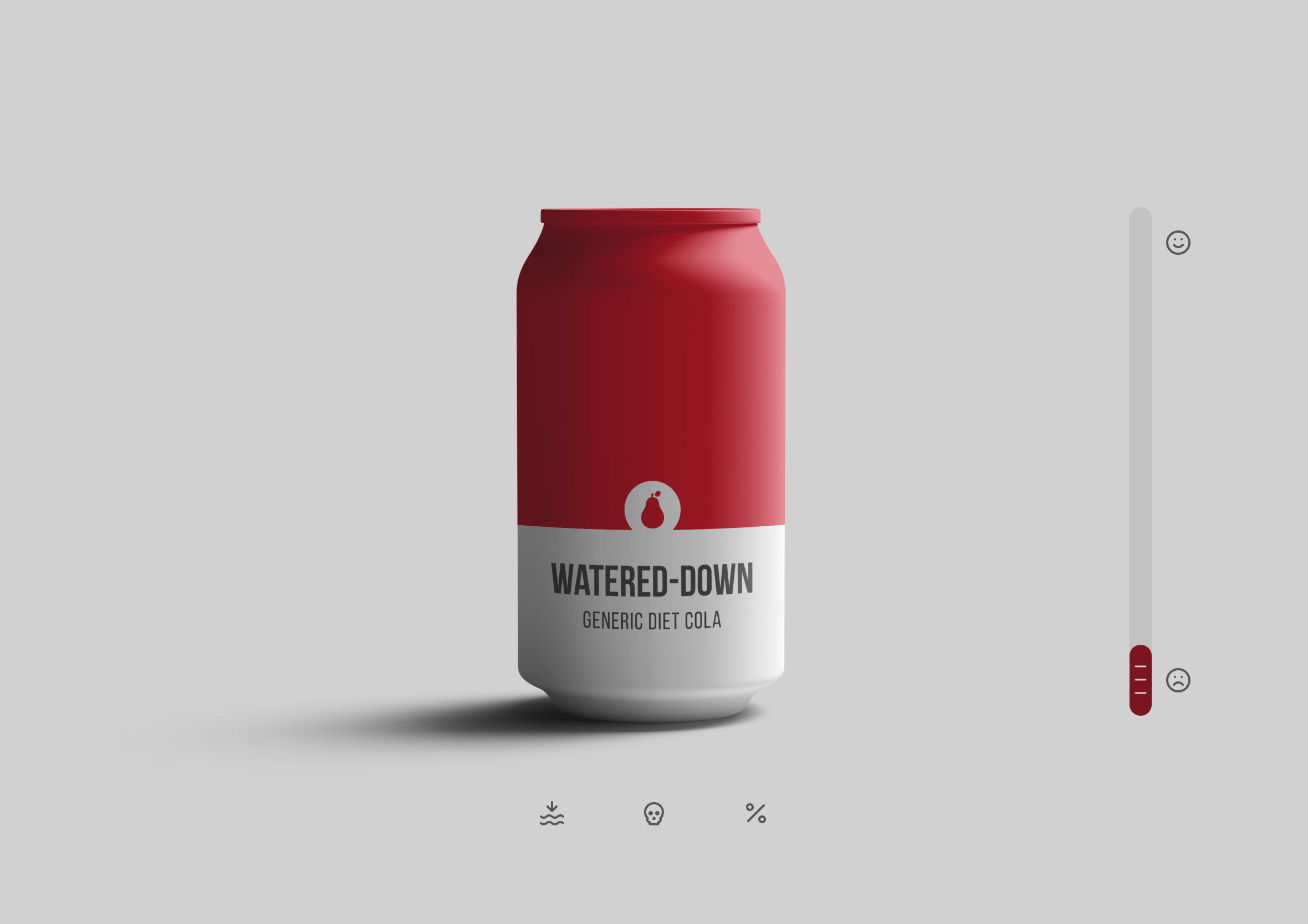
Progress over perfection: Progress beats perfection, especially when you’re just starting out (purposely made with AI so you can judge for yourself)
Collaborate with AI yet always keep the human in the loop
Always question the responses and reasoning you get back from AI when something feels off. Push back with the same confidence AI comes at you with, even if you need to challenge it multiple times. That’s often what it takes to get the correct information, deepen your own understanding, or close gaps in your knowledge. Fact check and cross-reference all the important details.
“Trust, but verify” is a famous Russian proverb, and for good reason. Work through it as a collaborative brainstorming session. That’s a real skill, one worth developing with purpose rather than leaving it up to chance. This only works if you stay in the loop. You don’t have to look far to find examples of AI being handed the wheel with no human oversight, and it showing in the result.
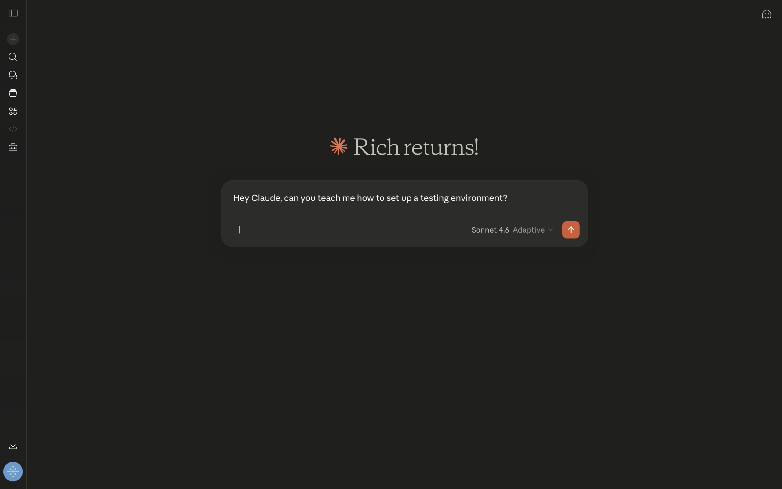
Every article on this site starts as a back-and-forth conversation like this one
I rebuilt my entire design portfolio website this way, using AI to teach me what I needed to do, rather than do it for me. Six weeks of nights and weekends, hundreds of prompts. The result completely replaced my old website with something built on modern technology, something I’m genuinely proud of and a real pleasure to design with.
Towards the end of the rebuild process, and in most of the articles I’ve written since, I stumbled onto a technique that changed how I approach complex problems: reverse prompting, where AI asks me questions instead of the other way around. It’s a more streamlined way to get ideas out of your head and onto the screen, and your tone, voice, and personality, everything that makes you you, stays intact the whole way through.
First drafts without a human editor often taste like this, flat and over-processed
Build solid design fundamentals right into your workflow
The principles you don’t always notice, grids, responsive breakpoints, padding, margins, gutters, and typographic scale, are the cornerstone of good design. They add structure and give method to the madness, even when the people using the finished product never notice they’re there. Rest assured, they’re doing the lion’s share of the work. Often, these fundamentals separate the good designs from the great ones.
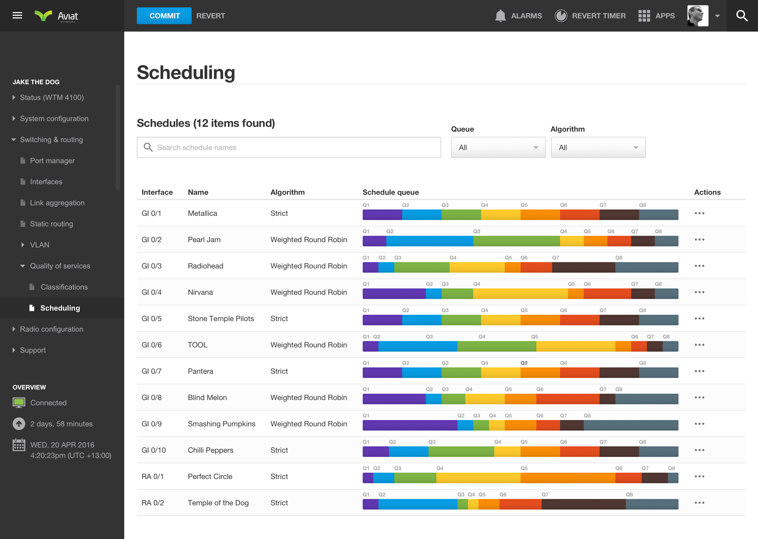
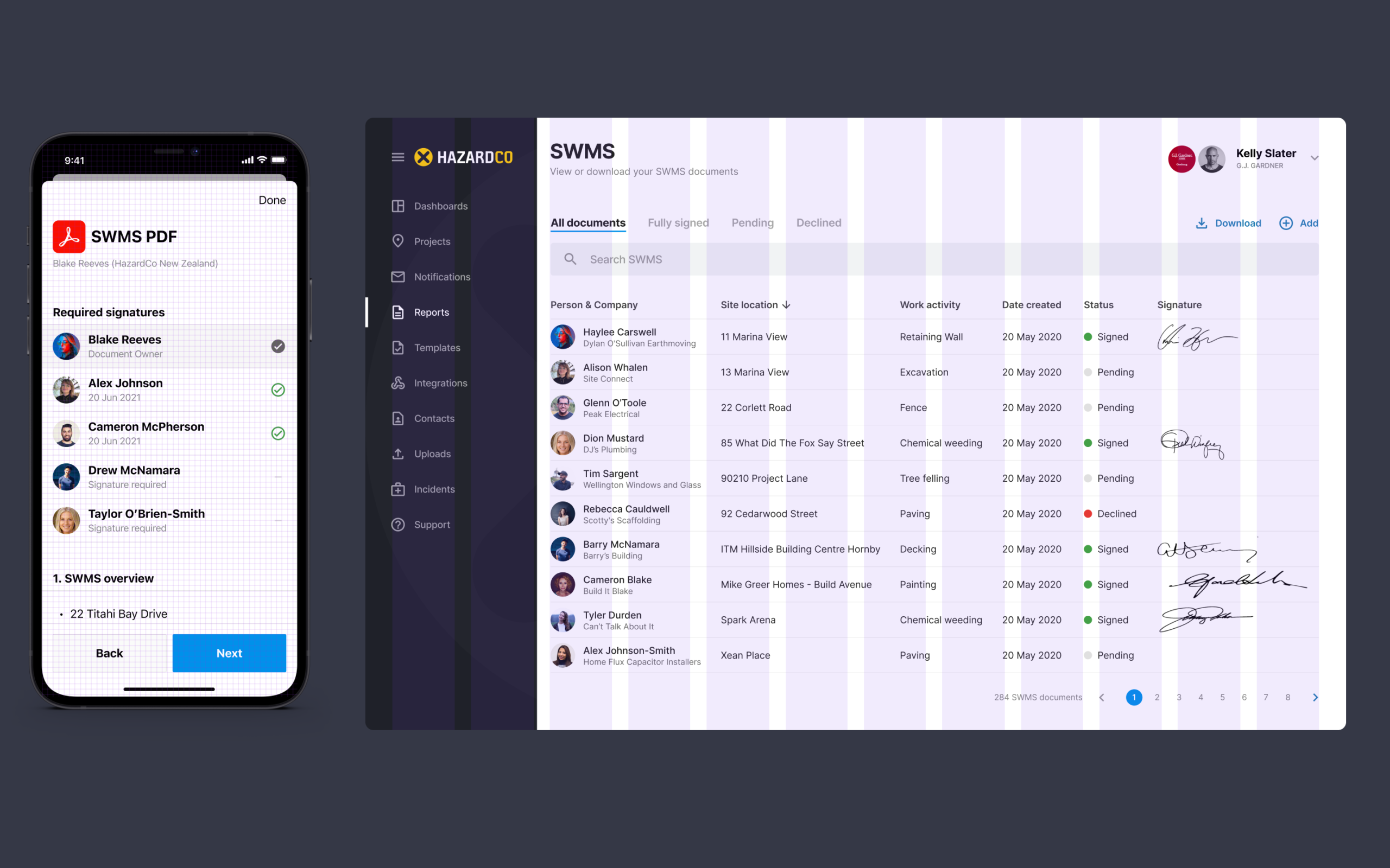
The networking dashboard built for Aviat Networks was super complex and challenging, dense data that still had to stay usable at a glance
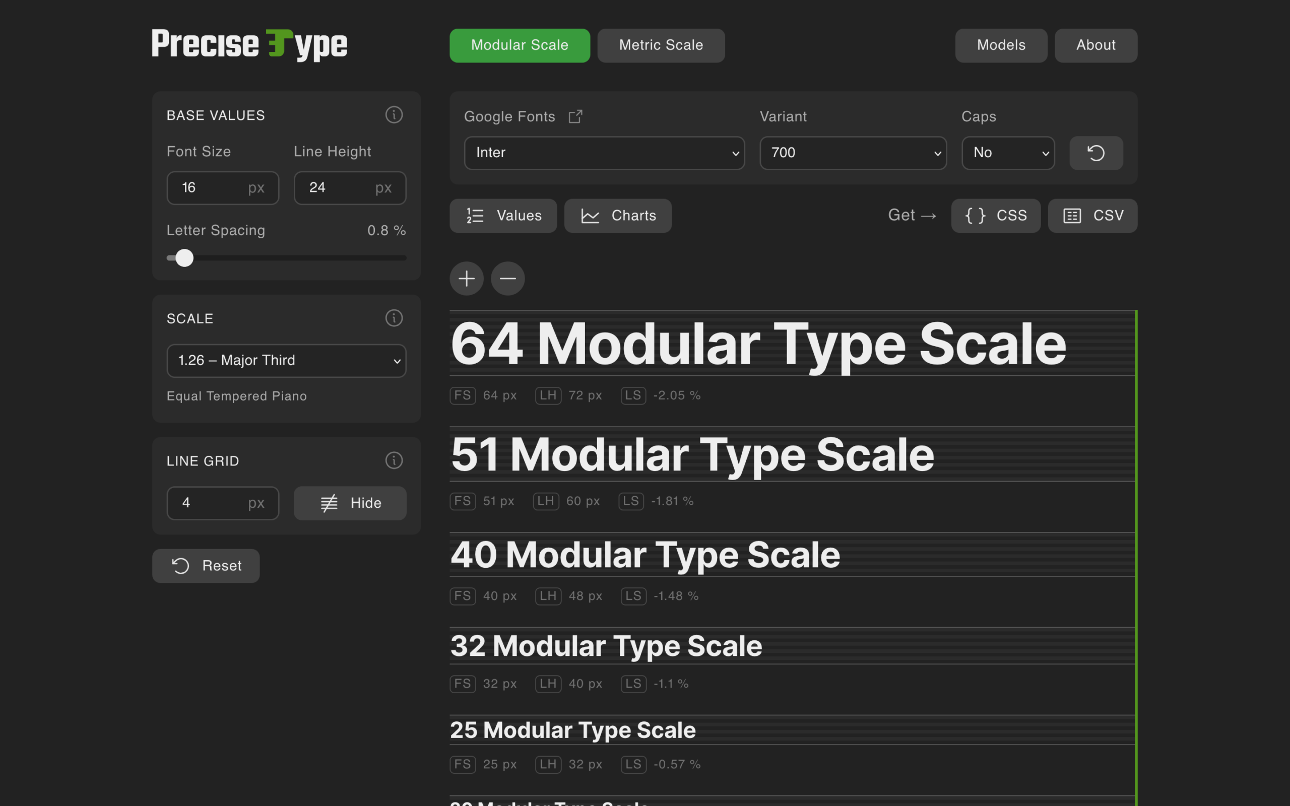
I tend to use a 4px/8px baseline grid alongside a traditional typographic scale to keep things consistent across web and mobile. Sounds like a small detail. It shows up everywhere once you know to look for it, including on a networking dashboard that needed that structure just to stay usable. My website uses that exact approach, built using Precise Type as the foundation for the CSS, so the typographic scale and size adjusts automatically whether you’re viewing it on mobile, tablet, or desktop.
Typography carries more emotional weight than people give it credit for. Think of it like a well-tailored suit, it should dress up your words to match the tone and feeling behind them, not just make text legible. On this site I lean on Inter, a workhorse of a typeface that stays legible at almost any weight or size, paired with a proper typographic scale rather than guessed-at font sizes. If you want more options beyond Inter, I’ve put together a collection of fonts the professionals use for web and mobile work.
This scale keeps every heading and paragraph in proportion, across the whole site
Standard breakpoints work the same way at team level. Everyone starts from the same page, aligned on where a layout shifts and why, instead of guessing at different numbers for the same problem.
Each one is a detailed guideline the developer you’re working with has read and refers to on a regular basis. Make sure you leverage these resources as you go to get a better understanding of what’s possible. Design within those conventions rather than around them, and a lot of the back-and-forth over what’s actually feasible disappears before it even starts. That familiarity cuts both ways, though. Once you understand the limitations well enough, you also know exactly when there’s a genuine case for breaking from them.
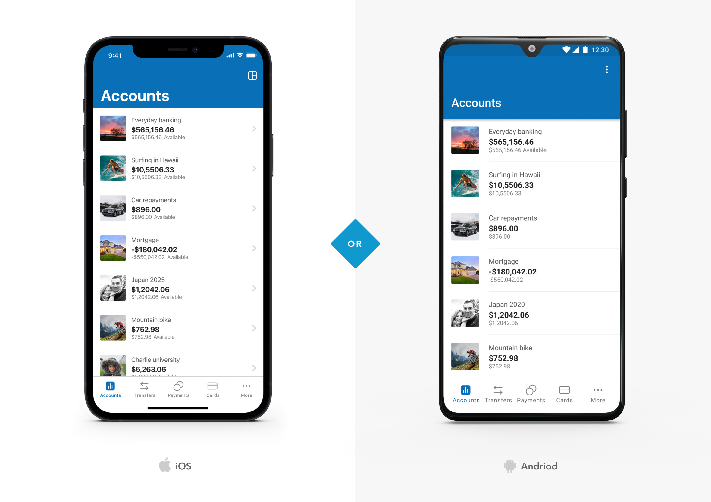
Building with those components in mind made it far easier to design and build a mobile banking app that had to feel native on both iOS and Android. iOS came first, then we looked at how the same experience needed to adapt once it moved onto Android. Following each guideline also meant accessibility and gesture handling came built in, rather than something we had to invent and test from scratch ourselves.
iOS and Android look similar here, but each screen is built from the design components and foundations specific to its own platformEvery breakpoint mapped out ahead of time, so nothing gets guessed at mid-build
Go on side quests that work towards a bigger main quest
Start building, and start small, with something that barely counts as a commitment. That’s the whole trick.
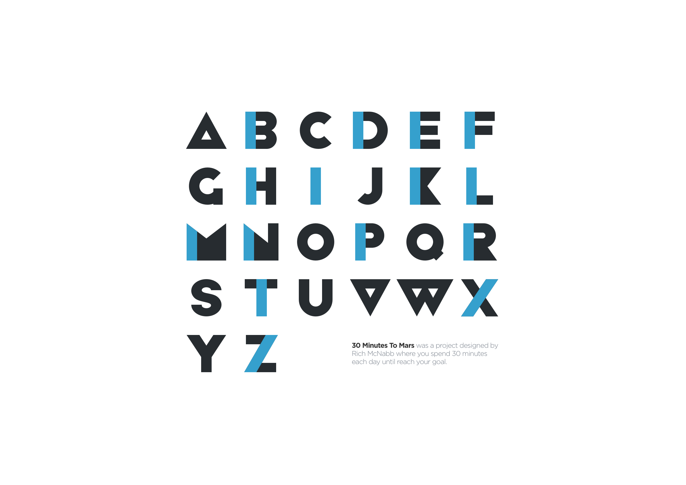
From there, increase the constraint slightly and commit to it properly. My own rule is 30 Minutes to Mars, just half an hour a day, and that’s the whole idea. It never needs to be a big time commitment. It’s the same logic behind Kaizen, the idea that small, consistent improvement beats occasional bursts of effort. One percent better most days compounds quickly, adding up to something real a lot faster than people expect, and it never demands the kind of willpower that burns out by week two.
Each letter built 30 minutes at a time, the same habit this section was written
Some projects took weeks, others took months, scheduled in around work and everything else going on in life. Thirty minutes a day, slowly working towards the quest, got me there anyway. Two free geometric fonts came out of that habit, one inspired by modular Lego-like shapes, the other by Herbert Bayer’s 1925 universal typeface.
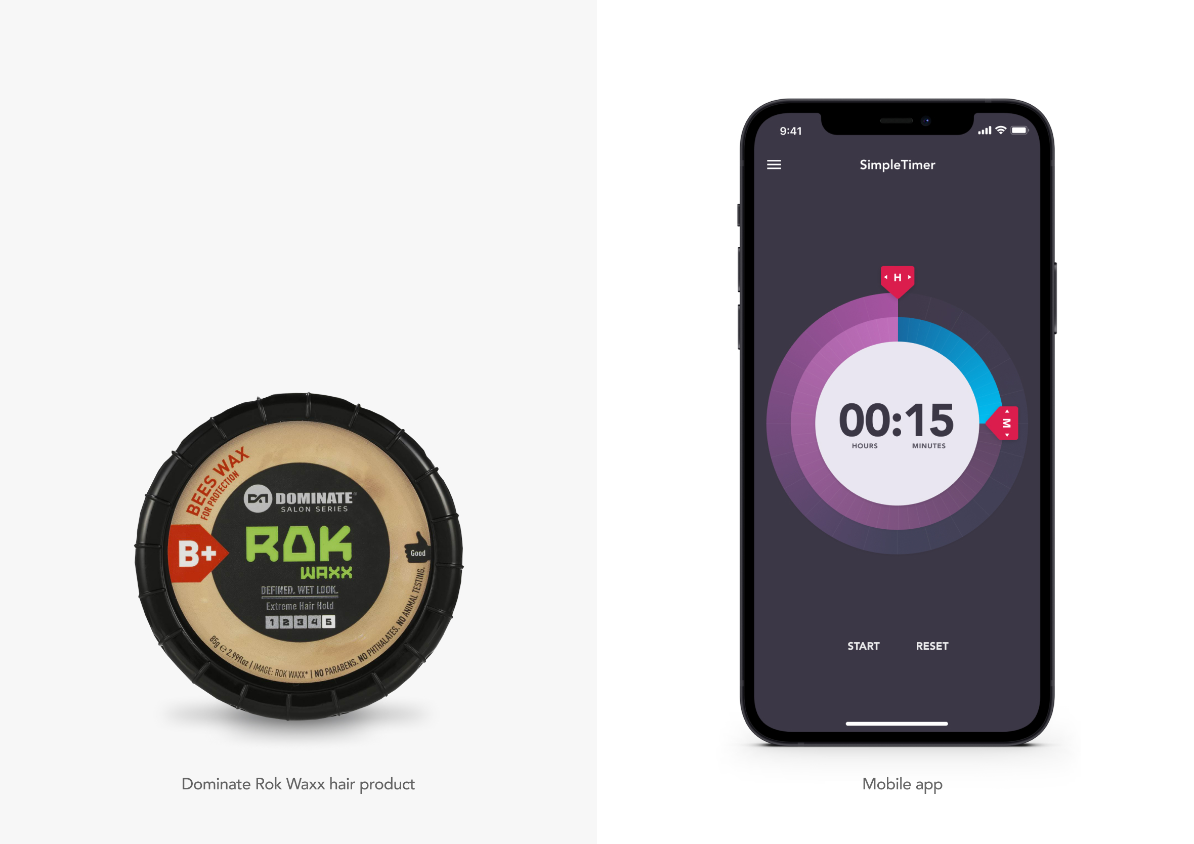
Minimal iPhone stopwatch and timer app inspired by the circular design of a hair product.
Ideas for a project can come from anywhere, including places that have nothing to do with design. My SimpleTimer stopwatch app started life as a plastic hair product container, the circular shape on the packaging turned into the timer’s core interaction. Illustrator Christoph Niemann works the same way, turning a hammer into a footballer’s boot or a red pencil into a megaphone using nothing but objects lying around his desk. Different field, same instinct, and it’s exactly the kind of thing covered in design documentaries I love.
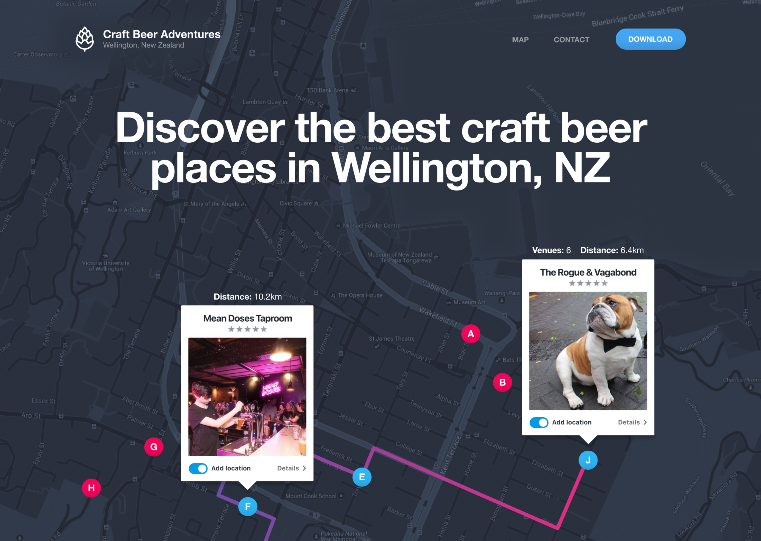
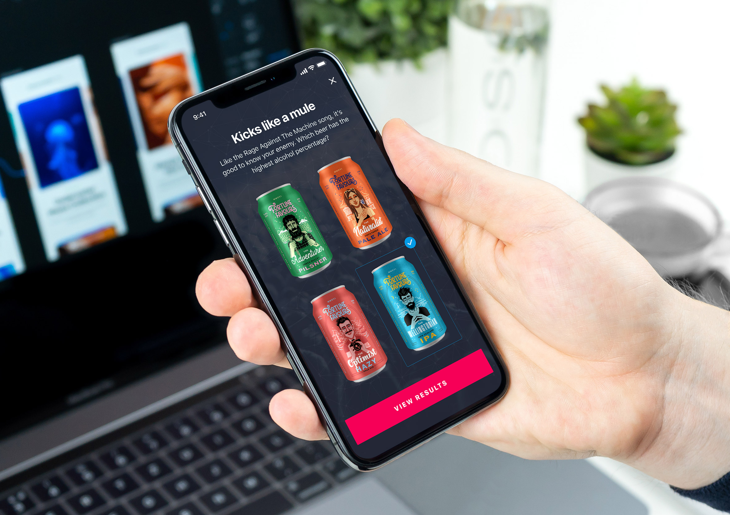
The landing page that started as a work night out and became a real appA quick quiz that matched each person to bars suited to their taste
Sometimes the side quest is a real-world problem you’ve noticed hiding in plain sight. Organising a night out with friends to visit craft beer locations in Wellington turned into an idea for an app. Designing and planning a craft beer tour app, working out the shortest walking route between bars, letting the group message each other using the phone’s own calling and texting rather than building something new from scratch, and adding badges people could earn for checking into each stop along the way to gamify the experience. Bigger scope than the 30 minutes a day habit above, but the same principle underneath it, start with the actual problem in front of you, then build outward from there.
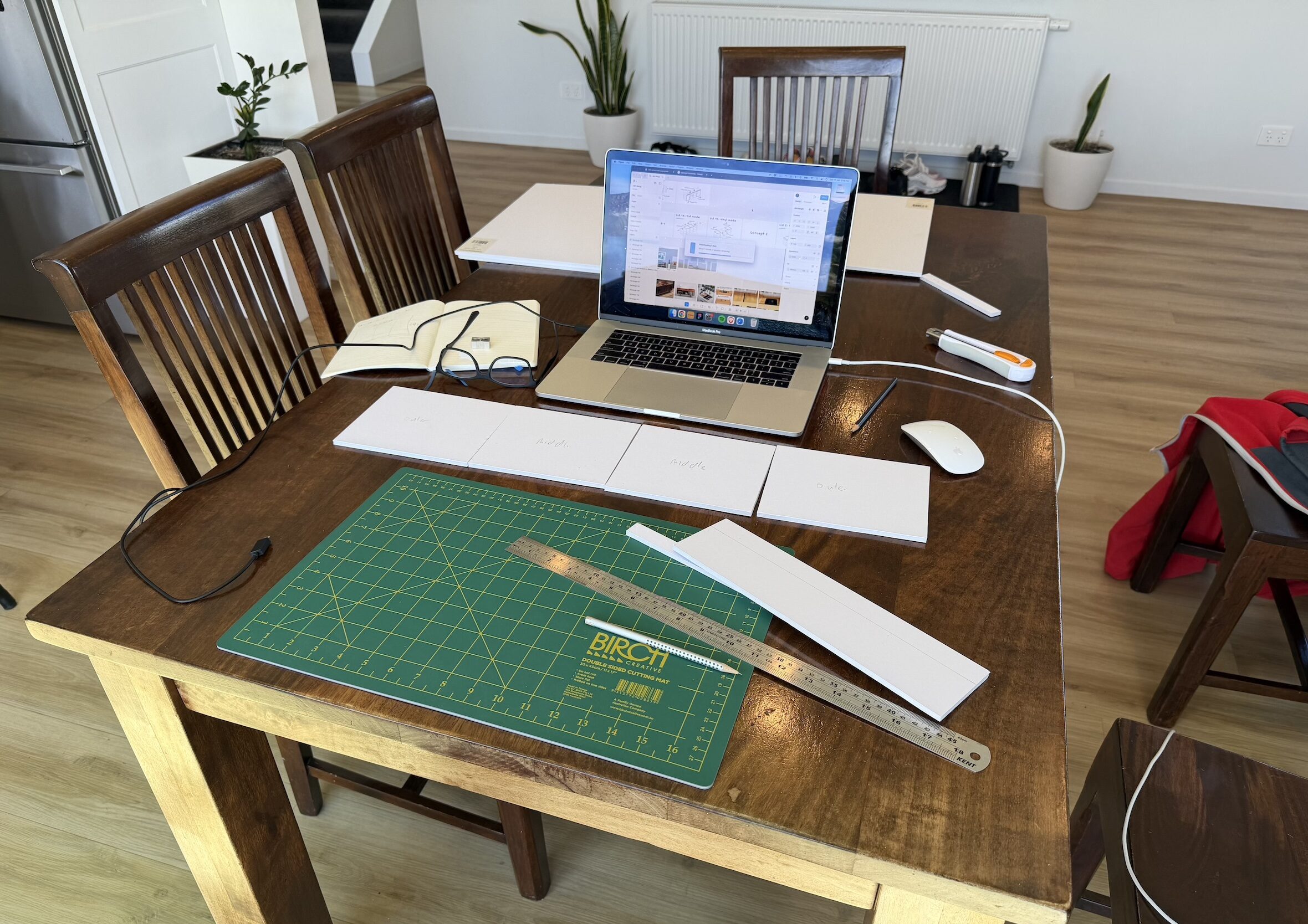
A small project can turn into something much bigger too. What started as a search for a turntable stand became a full custom built Hi-Fi furniture, foamcore prototyping and all. Briefing a builder turned out to raise the same communication questions as briefing a developer.
Kitchen table doubled as the workshop, foamcore panels labelled and ready to test form and functionality
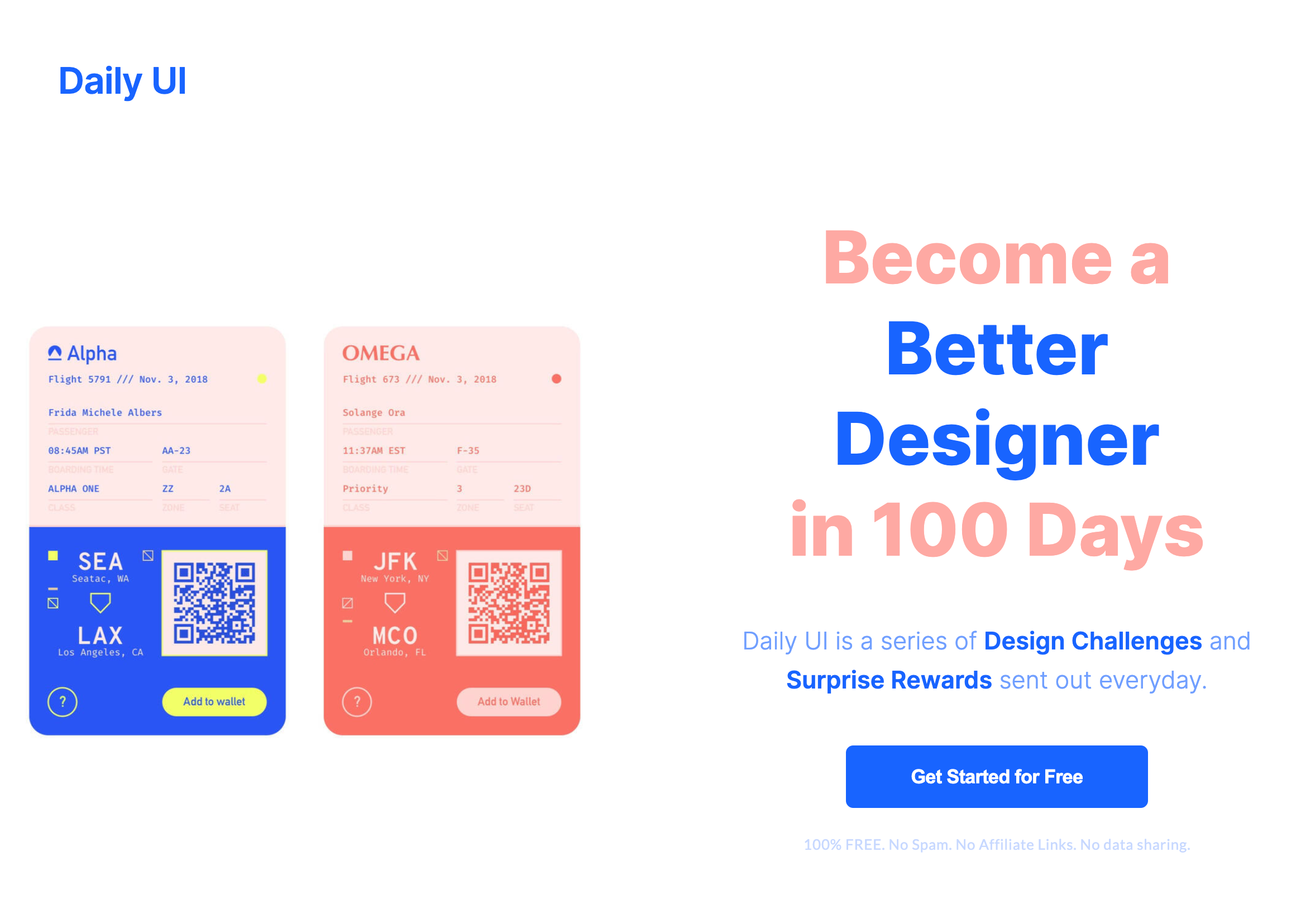
Level up your UI/UX skills with the Daily UI Challenge
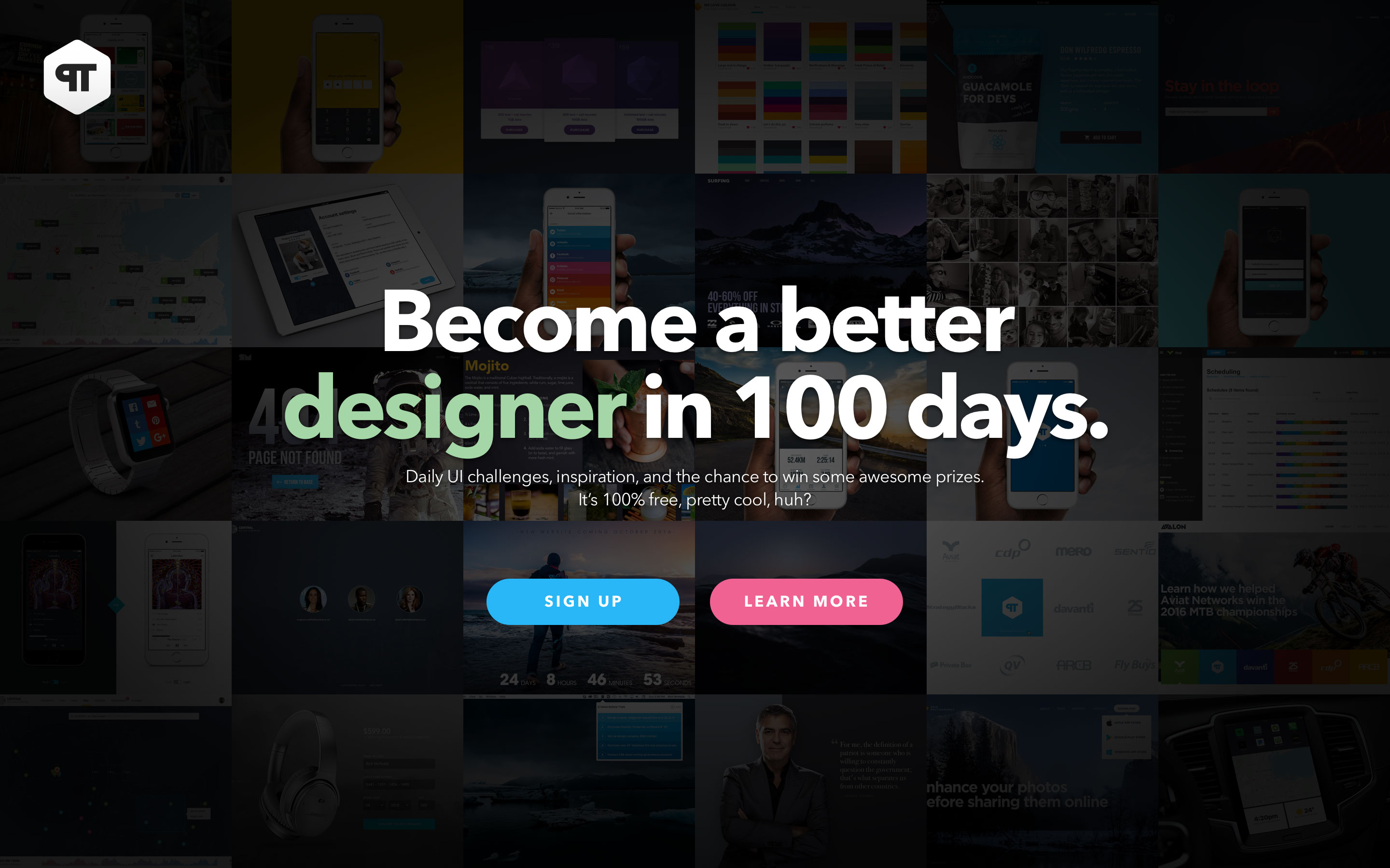
Free registration: Sign up at dailyui.co and a new interface challenge lands in your inbox most weekdays, spread out over 100 days 🚀
Nothing too intimidating, just a one-line brief and total creative freedom on how to solve it, then you share what you made on Dribbble or Twitter under #dailyui. Designers at places like Netflix have credited it as a great way to explore and experiment with interactions, user flows, and visual styles without the pressure of delivering to a real-world client brief.
I chose to take some creative licence with a few of the challenges and ended up designing a currency converter instead of the standard UI calculator. Other challenges pushed me toward the kind of digital products you encounter on a regular basis, a 404 page, a social share button, and a full settings screen and landing page, both built around the craft beer event app I mentioned above. You can view my 100 days of design if you want more examples of what the challenges actually look like day to day before signing up.
One email, one brief, one small win towards a hundred-day streakThe craft beer app’s landing page, reworked as one of the hundred challenges
Share work, get feedback and encourage collaboration
Dribbble, Behance, and Instagram are online platforms where you can upload finished designs, rough concepts, and work in progress. It’s a place to demonstrate your skills, explain your design thinking, and get involved in the design community over time. Building your own WordPress site, like this one, works just as well, and gives you full control over how your work gets presented.
Building your own site isn’t the only option though. Squarespace suits designers who want something polished without much fuss, clean templates and solid typography out of the box. Webflow feels closer to designing right inside of Figma, with more control over layout and interaction, which suits detailed case studies well. Framer leans on AI-assisted building and tight Figma integration if you want something quicker to stand up. Wix gives you the most creative freedom of the bunch, with a genuinely gentle learning curve. With so many free or inexpensive platforms out there, there’s no excuse not to share what you’re making, whichever one you land on.
Design your custom game plan
During an interview, I was asked, “What’s your design process?” and it threw me for a loop.
It’s one of those questions which is so simple that you should be able to answer without thinking. That is, it should be easy to answer if you’d taken the time to actually think about it from start to finish. I hadn’t.
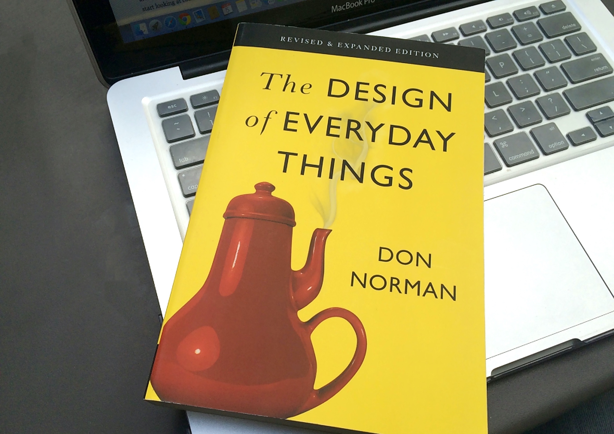
I knew I had a design process, I just hadn’t thought to write it down and articulate it, until I read Mike Monteiro’s Design is a Job. One line in Mike’s book stuck with me: there’s no magic “make pretty” button hiding in your design tools, and you can’t keep pulling a rabbit out of a hat for every project. That’s when it clicked. I already had a process. I’d just never detailed the steps.
The book that made me notice bad design everywhere, not just on screens
Don Norman’s Design of Everyday Things shaped this just as much, long before I’d have called any of it a process. It’s the book that made me notice affordances and friction everywhere, not just in interfaces, and a lot of how my brain naturally sorts a problem still traces back to it.
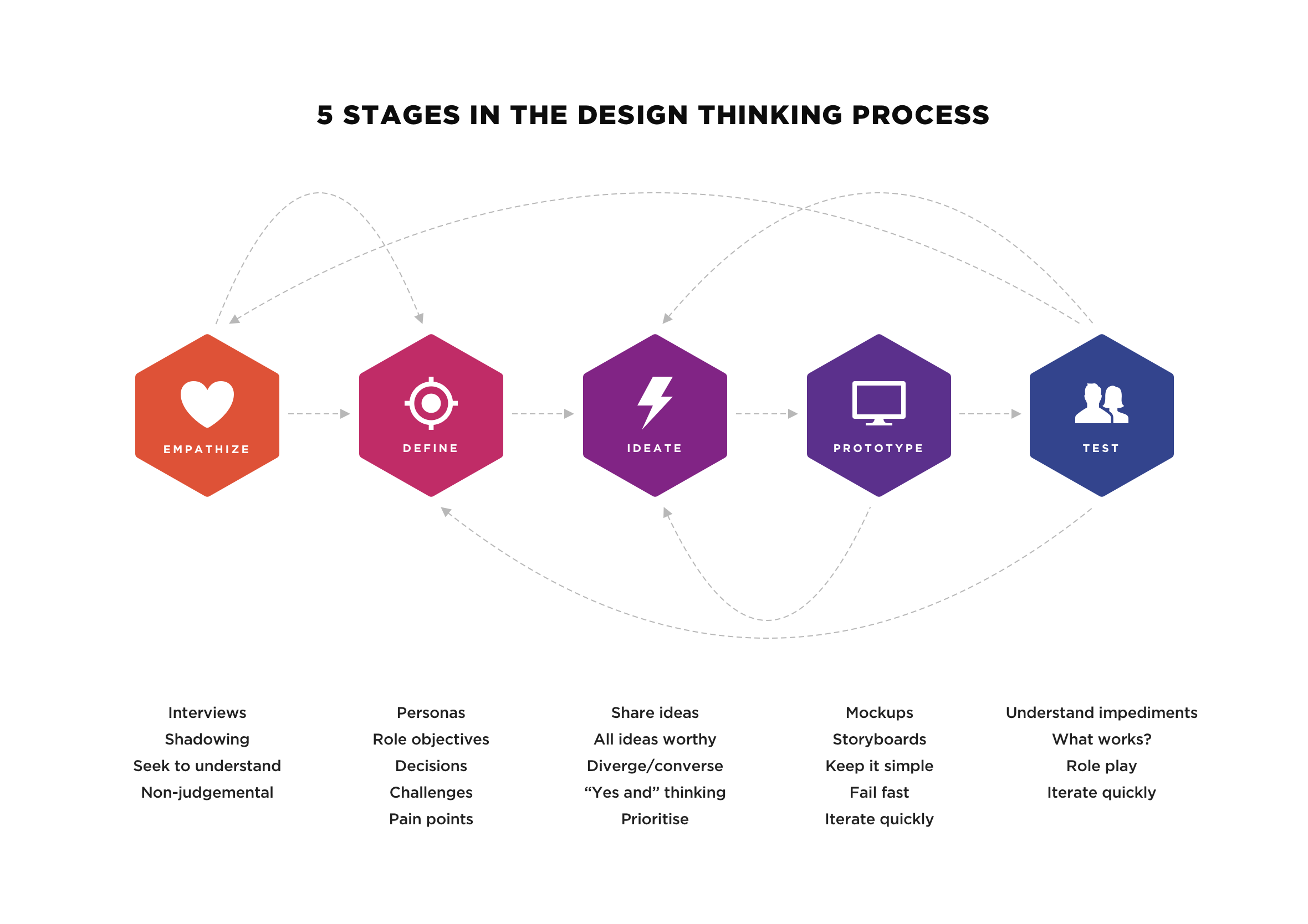
My design process breaks down into four phases outlined in my 10-step design process from the first brief through to final delivery. It’s not a rigid set of rules carved in stone. It’s something to push against when a project gets complicated, and it means you’re never starting from a completely blank page. I’ve also found the Design Thinking methodology helpful when working with large product teams.
Discover
Understanding the underlying problem and gathering deep context from users
Define
Turning insights into early sketches and user flows with the engineering team
Design
Setting up design foundations and building high-fidelity, interactive prototypes
Deliver
Running walkthroughs, championing the user, and shipping polished, accessible work
Empathy first, testing last, and a loop back or jump to any step in the process when required (non-linear)
Explore other worlds beyond UX for inspiration and strategies
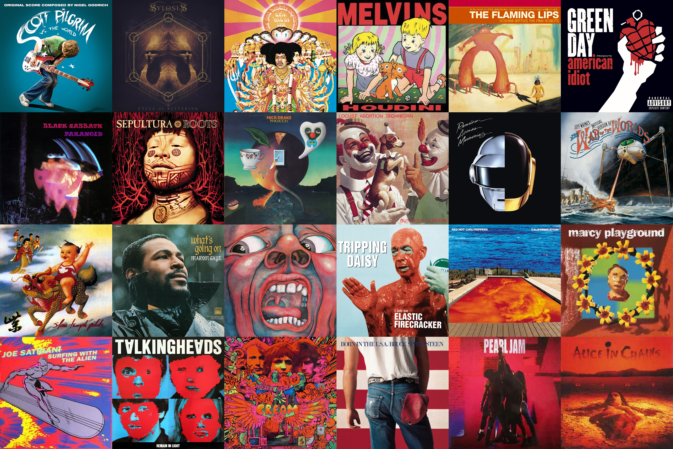
Not every design lesson worth remembering comes from a UX article. There are diverse design disciplines, each with their own depth, history, and principles to inspire, educate, and entertain. Documentaries, stand-up comedy, album artwork, and books, some of which have nothing to do with design, or at least not at first glance, until you dig deeper down the rabbit hole. These mediums may challenge how you think about your own work in ways a textbook never will.
Bonus side-effect: it’s also a great use of the downtime between work, so you’re not caught up in #hustle culture or the race to the bottom.
Great storytelling squeezed into a tight constraint, where every word has to earn its place
Stand-up comedy: Joke writing shares real DNA with a well-crafted headline or a tight piece of UX copy, cutting everything back to the smallest number of words that still land. Eddie Murphy’s Delirious, filmed at just 22, is still held up as close to the gold standard for stand-up. My favourite stand-up comedy specials are less about the laughs and more about how differently each comedian sees the same world everyone else walks past.
Album covers: Composition, typography, colour, concept, album cover artwork is graphic design people rarely credit as such. David Bowie’s Legacy compilation shows restraint doing all the work, white type on black with a single silhouette, released right after his death and landing as a memorial rather than a cash grab.
Design documentaries: Helvetica traces the history and politics of a single typeface. Abstract goes wider, eight designers across totally different fields, including the Christoph Niemann episode that introduced me to his everyday-object sketches mentioned earlier. Both sit on my list of design documentaries worth an evening.
Books outside the industry: Dale Carnegie’s How to Win Friends and Influence People is nearly 90 years old, and every principle still holds. Atomic Habits and Extreme Ownership taught me more about consistency and accountability than anything written for designers ever has. None of these are design books. All of them shaped how I design, along with the rest of my thought provoking books.
A handful of covers that almost made the top of the list, but not quite
Gather the puzzle pieces as you work to assemble the case study
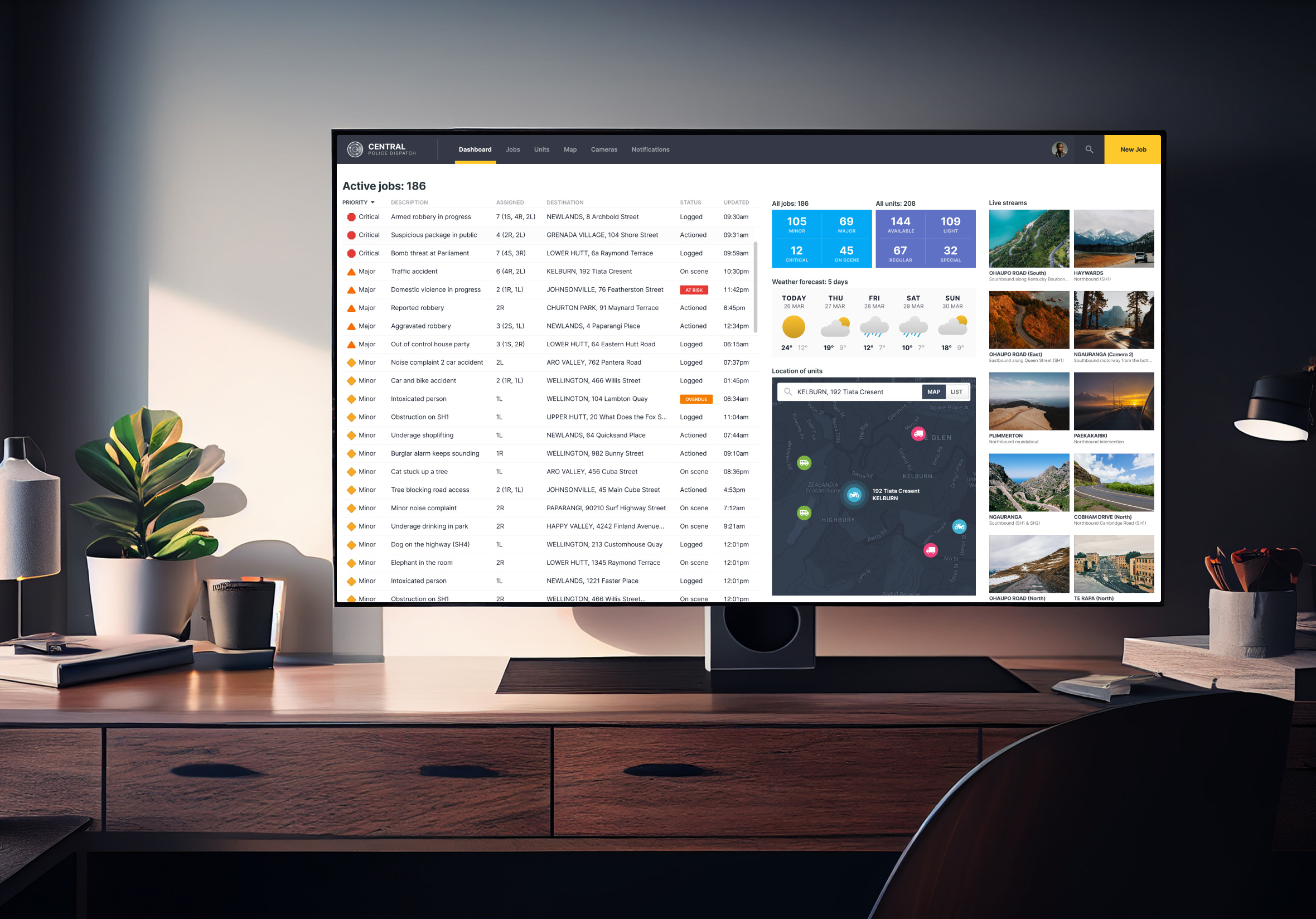
A university assignment doesn’t have to stay a university assignment. One project was designing a police dispatch dashboard for a User Experience paper at Victoria University, and I documented the process each day, week by week, right from the first sketch.
Persona sketches, wireframes, mind maps, screenshots of every iteration, even a user-evaluation form at the end. None of these artefacts were precious or high-quality final designs at the time. It just meant that when the assignment was completed, all I had to do was build the case study, an accurate recollection of events, not something reconstructed or misremembered months later.
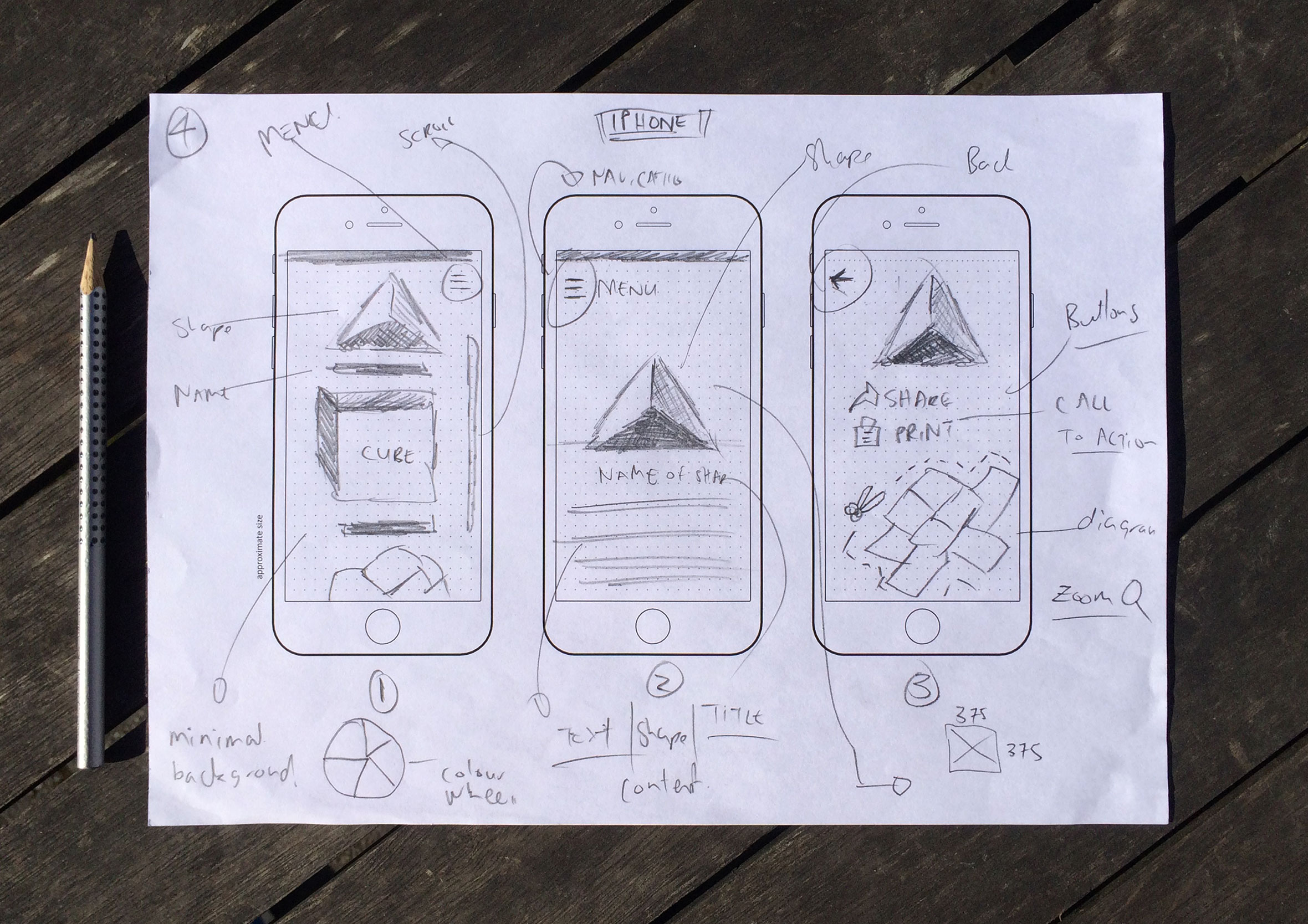
It’s not just the police project either. My early sketches for an origami-building app started the same way, rough shapes on paper before anything got near a screen, so the thinking behind a decision is still there long after the project wraps up.
Rough and unpolished, exactly the kind of thing worth hanging onto
Reading about process is one thing. Building something real, brief through to prototype, teaches you things no article can. It’s the same instinct behind most of what’s shown on this site: rough notes, to-do lists, voice memos, half-formed ideas, shaped by AI reverse prompting into something worth reading rather than left as a draft that never goes anywhere.
Once you’ve got a few case studies behind you, curation becomes the skill. What you leave in shows as much as what you take out. I’ve taken down and retired my logo and web development work from my own site over the years. It was only ever there to pad out my portfolio, and honestly, it was never my strongest work. It also risks sending the wrong message, someone lands on the site and thinks, “Nice, this guy does logo design,” when mobile apps and dashboards are what I actually want to be hired for these days.
Add more of what you want to be hired for. Subtract what you don’t.
Months of persona sketches and iteration, ending here on the big screen
Go to the next level with the Interaction Design Foundation
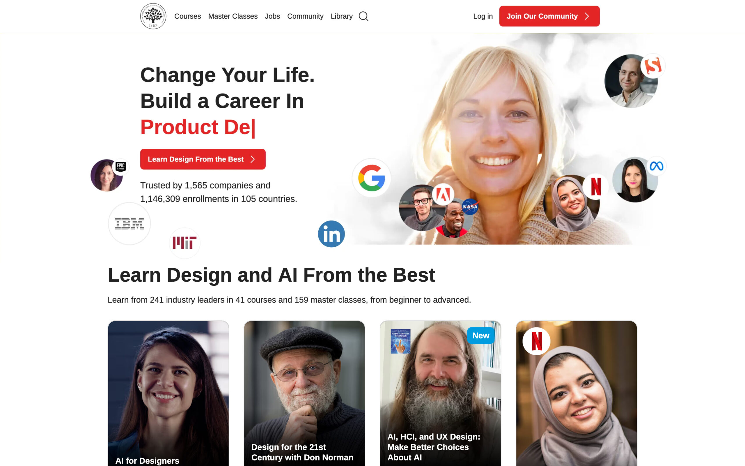
Side projects and self-initiated learning build real momentum. Pairing them with structured, consistent learning takes you further still. After almost 15 years in UX/UI, I wanted some formal qualifications behind the practical experience, something to balance instinct with time-tested theory. I’ve worked through 32 UX/UI courses with the Interaction Design Foundation, true to their name, they focus on fundamentals rather than trends, which means what you learn stays useful for years rather than going stale in a season.
Multiple choice questions, short essays, video lessons, peer discussion, optional exercises, a genuine mix rather than video after video. Same 30-minutes-a-day habit as everywhere else in this article, just aimed at study instead of a side project. For the price, it’s been one of the better investments I’ve made in my own career. It also has the practical advantages of online training, closed captions, the ability to rewind if you miss a vital piece of information, or play back at 1.5x speed.
32 courses in, still finding gaps in my own knowledge to fill
Leverage your own character, strengths and values
Knowing your own values makes those trade-offs so much easier to weigh up. A core values exercise I did using Think2Perform’s Values Cards made mine a lot clearer, and measuring job offers against them instead of just the salary number has made deciding easier ever since.
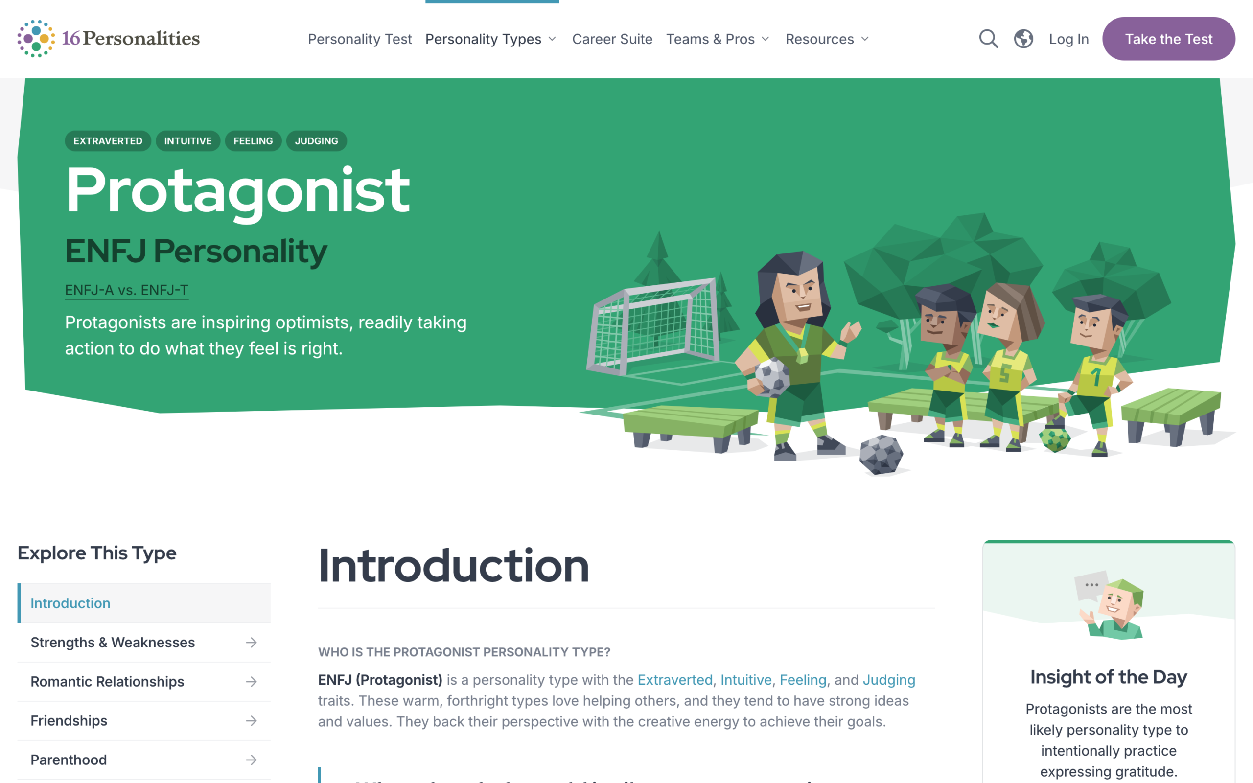
Understanding your strengths does similar work. My own strengths and personality point at the same thing from two different directions, and having both written down somewhere makes it far easier to explain what you’re actually good at when someone asks.
Health, honesty, relationships, creativity, continuous improvement, in that orderThe 16 Personalities description frames it well: ENFJs are inspiring optimists who feel called to do the right thing, even when it’s hard.
Discover the market rate to determine your number
Have an updated resume on hand at all times too, so you’re always ready to send it the moment a recruiter calls or emails, rather than scrambling to bring it up to date first. It’s doing the same job as your portfolio, just in a different format, so give it the same care and keep it tight.
Have a dollar number in mind before anyone asks for it. Whenever I get a call from a recruiter, I ask what the market rate looks like for my experience, so when someone tries to lowball me later, I’ve got actual data to push back with. This has saved me more than once moving between contracting and in-house work too. Coming back to contracting after time away, I’ll say it straight: I’ve been out of the contracting world for a while, so based on my skills and experience, what does the current market rate look like right now? Asking directly, rather than guessing or underselling myself out of nerves, has never once worked against me.
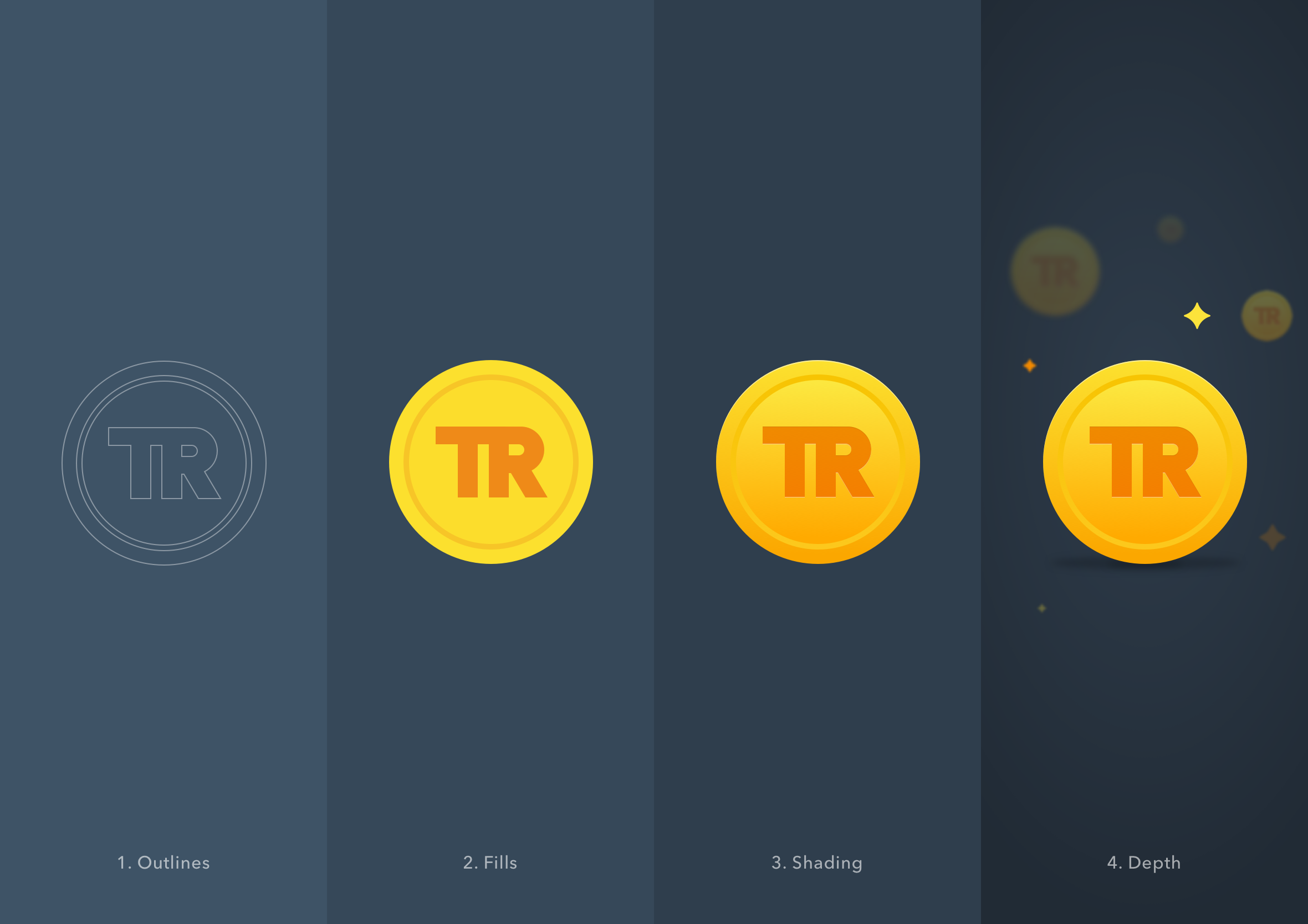
Designed to feel like a collectible coin, the kind of thing that makes you want to earn more
They’ll usually ask how I landed on that number. When I say it’s based on the market rate from recent conversations with recruiters, that changes the conversation. If a client comes back with a lower number based on what they “feel” is fair, I point out that feel isn’t a metric, it’s qualitative, market rate is quantitative. Sometimes market rate works in my favour, other times not so much, but either way it’s the number I’ll defend. If their offer sits below it, I’ll politely suggest the client needs to reset their expectations on price, or consider hiring a junior or mid-weight designer if that’s closer to their budget.
Researching live roles does more than tell you your rate though. It shows you the gaps, the skills or experience keeping you from the jobs you actually want, and that becomes your plan for what to focus on next. Sometimes the market’s tough enough that you just need the work, and that’s completely fine. Money isn’t the only thing on the cards at the negotiating table either. I’ve taken pay cuts to work on projects that were more exciting or provided the opportunity to learn some new skills. I treated them almost like a paid internship or training course.
Other aspects to consider or ask about, a four-day week, flexible hours, training, these are all part of the package and worth weighing up, and how much any of it matters depends on your situation and where you’re at right now. Short-term contracts combined with side projects are a genuine win-win, keeping money coming in while you upskill in parallel, rather than simply waiting for things to improve.
You’ve defeated the final boss, now unlock chaos mode
This isn’t a “buy my course” article. There’s no funnel, no upsell waiting at the end, just what’s actually worked for me across almost 20 years of doing this. It’s a choose your own adventure instead. Some of it will land for you straight away. Some of it won’t fit at all, and that’s exactly how it should be, since your situation, your strengths, and your starting point are all different from mine.
If you take one thing from this, let it be the process, not the specifics. Find what helps you improve, stick with it long enough to see results, then keep adjusting as you go. The tools will change. The advice will age. The habit of actually doing the work won’t.
That’s really why this exists in the first place. I never got more than a line or two back from the designers I emailed all those years ago, and I’ve tried to make sure this turned out to be more useful than that.
Go create, design, build an idea you’ve been thinking about for a while. Lean into chaos mode.