How a search for a turntable stand turned into a lesson in design thinking, prototyping, and communicating ideas clearly enough for other people to build them.
The album responsible for a chain of events unfolding decades later
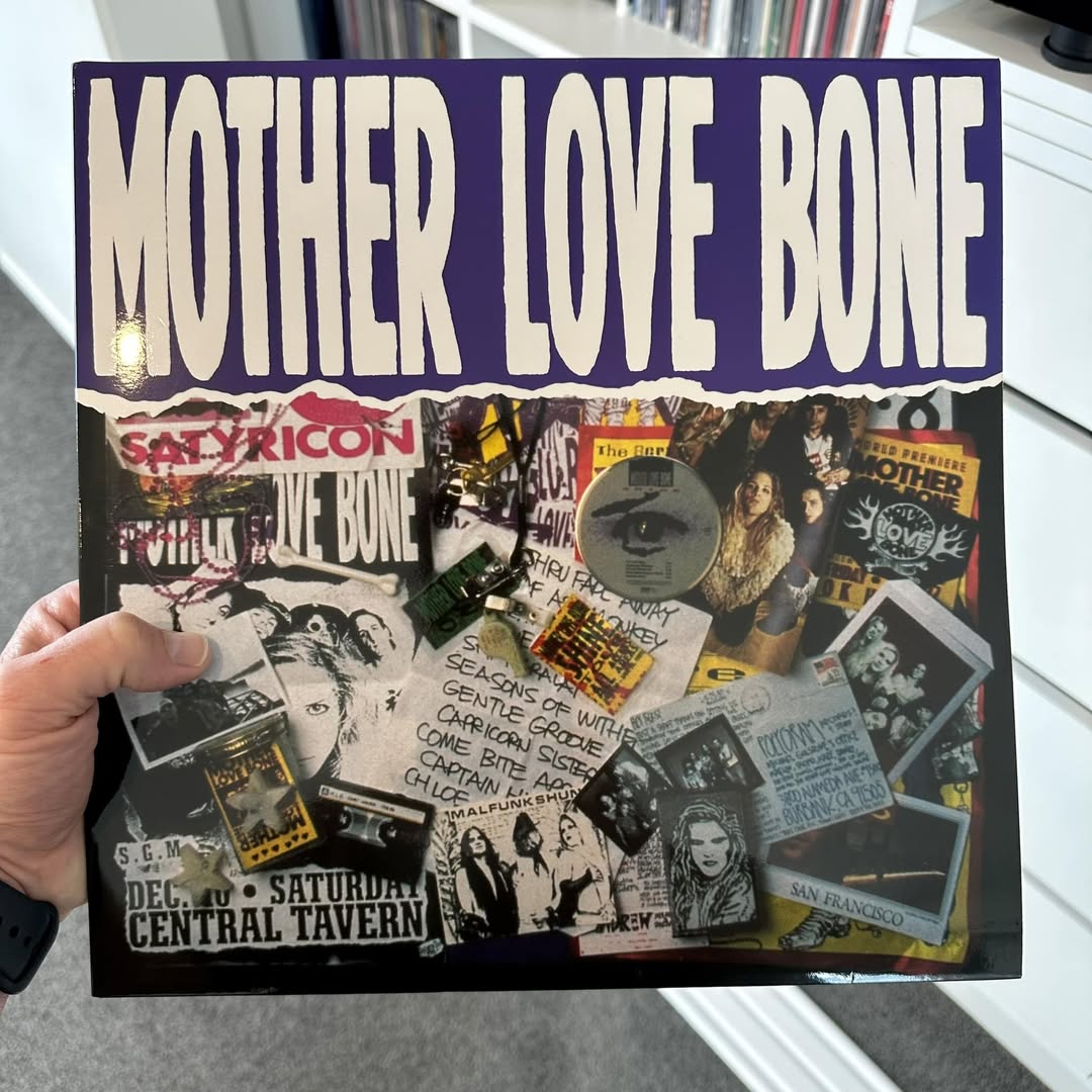
My first introduction to TOOL was after their third studio release, Ænima, in 1996. Writing assignments in high school with this album playing in the background would place me into a state of flow as I typed away, and then without warning drag me right back into the present. I still consider it a masterpiece and it continues to have the same effect on me today. I have been a MASSIVE fan ever since the first listen.
I’ve been fortunate enough to see them perform live three times, with plans to see TOOL’s frontman Maynard James Keenan perform with his other two bands later in the year. Yes, he’s in three bands: TOOL, A Perfect Circle and Puscifer.
The album that started it all.
So there I was, in my early twenties, sitting on my bedroom floor with my desktop computer, one of those beige boxes with a CRT monitor, browsing eBay on a dial-up internet connection, when I stumbled across something that caught my attention. Looking at the auction confirmation email I still have, I sent a money order in July 2002 to buy the vinyl for USD $56, roughly NZD $160. Not concerned in the slightest by the fact that I didn’t own a turntable, or had anywhere to put one. The same person who didn’t even own a computer desk.
Over the next few weeks, I became hooked on the rush of scouring eBay, bidding, winning, narrowly losing auctions by a few dollars, and occasionally paying way too much. My bank account was heading toward disaster, but in no time at all, I’d successfully acquired TOOL’s entire back catalogue.
And then nothing. Without anything to play them on, they sat in storage, untouched for twenty years.
New house, Black Friday sales, zero excuses
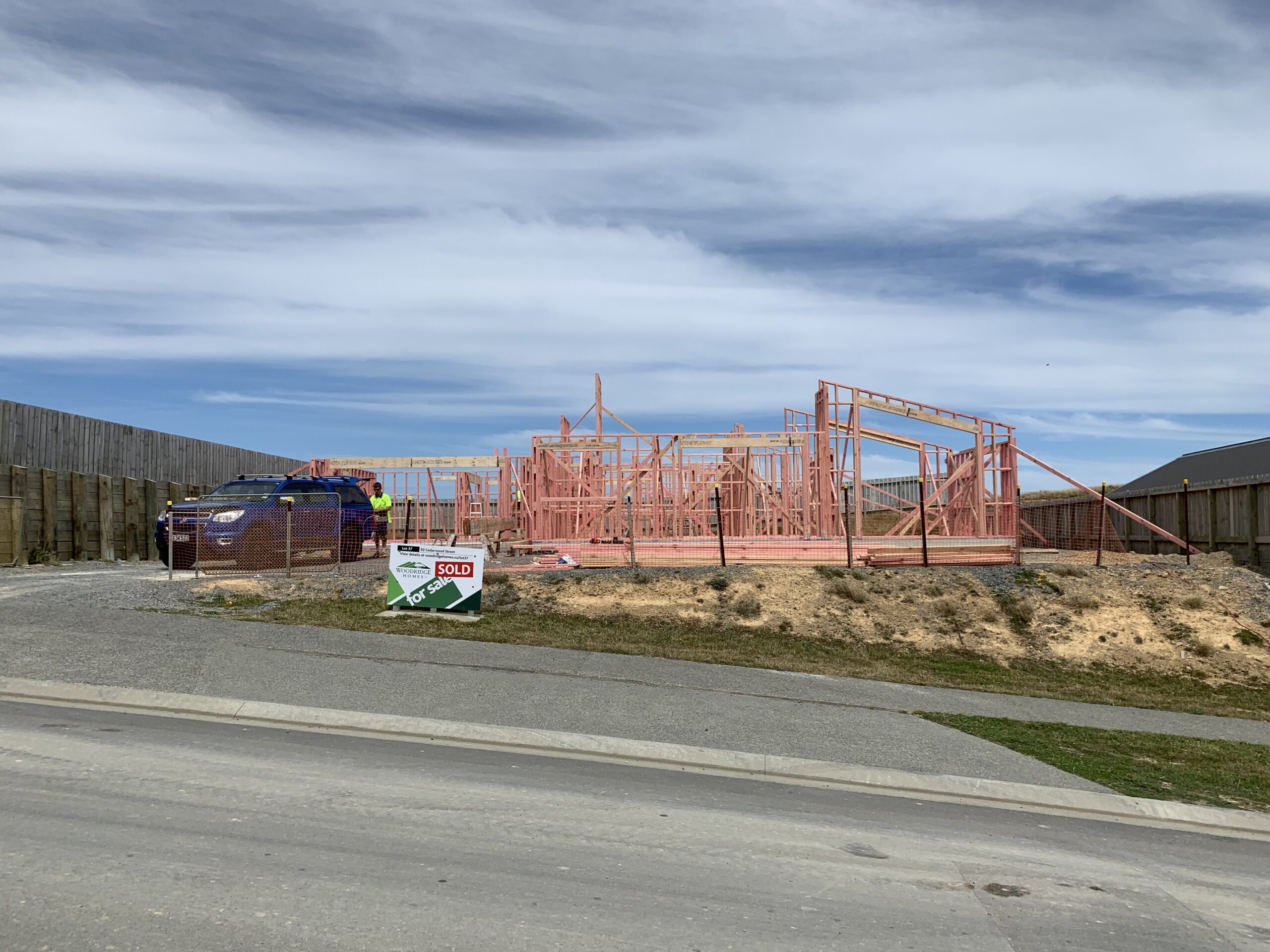
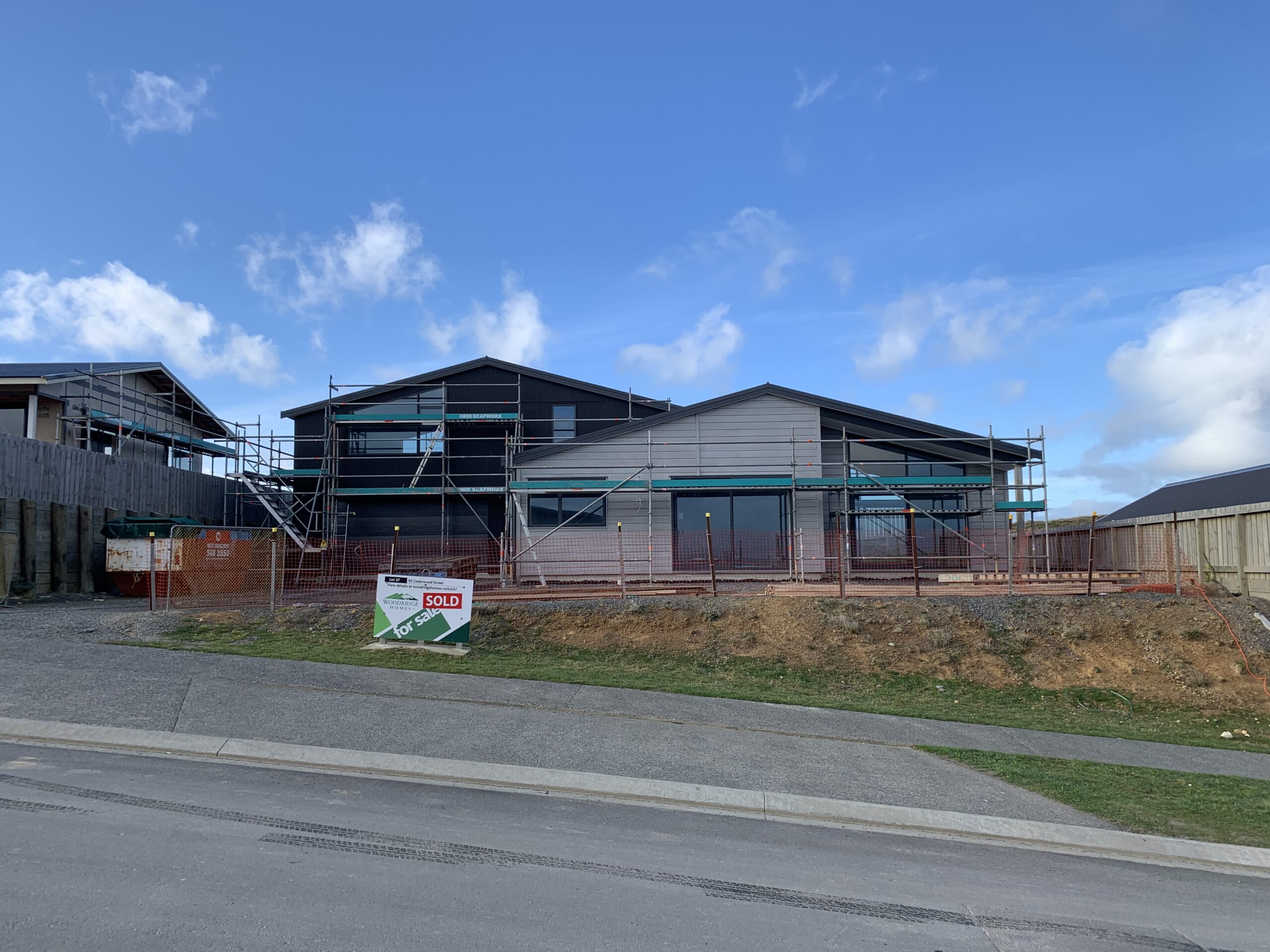
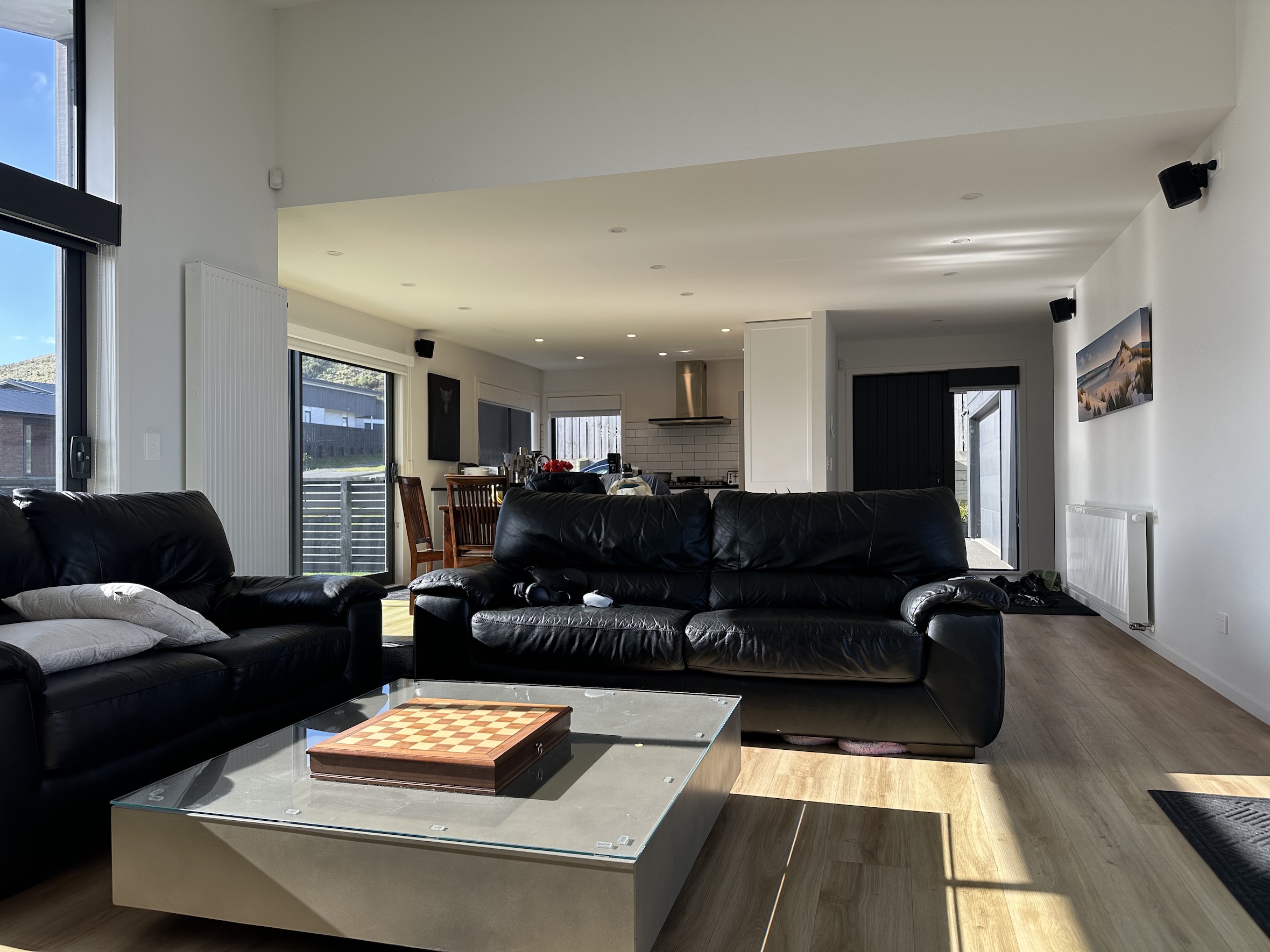
Fast forward to the end of 2020 and we had just moved into a brand new house. Our last place was around 80 square metres, with Ali and I, two kids, a dog, and a pandemic raging outside. We were starting to feel the squeeze. Our bedroom now doubled as an office, complete with a double bed and two desks pushed hard up against the walls. Startup dorm vibes, minus the fun parts.
The new house meant more space and no longer living on top of each other. More importantly, it meant setting the house up with intention. Having experienced life in a small house during the pandemic, we now had the chance to purposely design each space with a clear purpose and a clear separation between work and life. Rooms with a reason.
The new house getting built over several months in 2020.
It was around this time I discovered Discogs, similar to eBay it’s an online marketplace and database dedicated to physical music. With overseas trips to Bali cancelled and more time on my hands, my vinyl collection grew at an alarming rate, now approaching 500. Rediscovering albums I’d forgotten about or hadn’t listened to in years, or simply hadn’t fully appreciated when they were first released. Rabbit hole after rabbit hole of bands, collaborations, side projects, new genres. Countless avenues to explore.
The new house also meant we had a little more space and could finally buy a turntable to listen to the album I’d bought off eBay all those years ago. Now was the time to take it out of the original shrink wrap and give it a spin.
Pro-Ject Debut Carbon Evo: a crowd favourite for good reason
I didn’t know the first thing about turntables, so again I spoke to a few people and read reviews. I found Reddit to be a great source of unfiltered reviews rather than paid reviews. I settled on the Pro-Ject Debut Carbon Evo which was getting great reviews and seemed like a great all-rounder for the price.
I didn’t know anything about turntables at the time so went with this based on all the positive reviews.
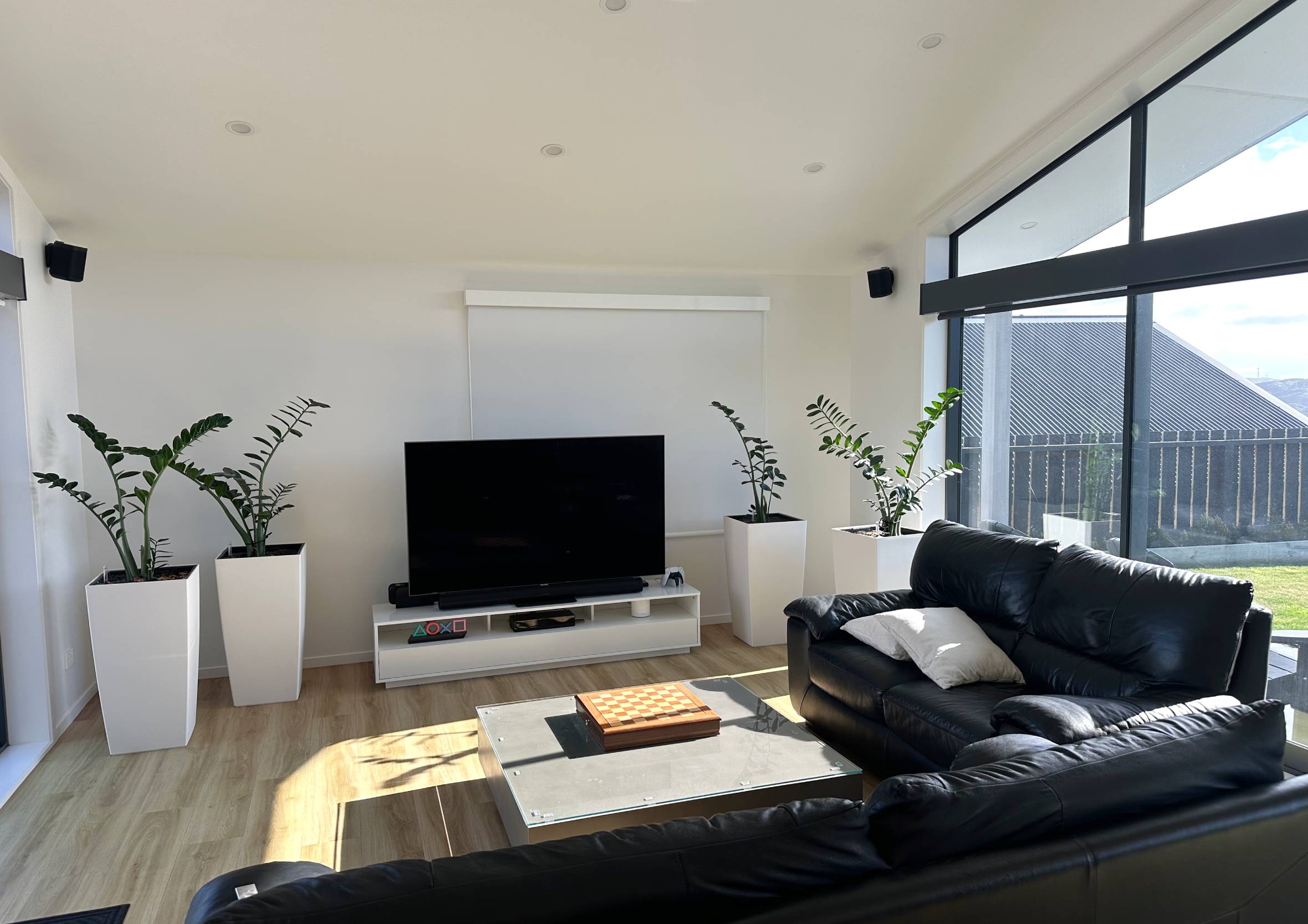
Small kids and direct sunlight
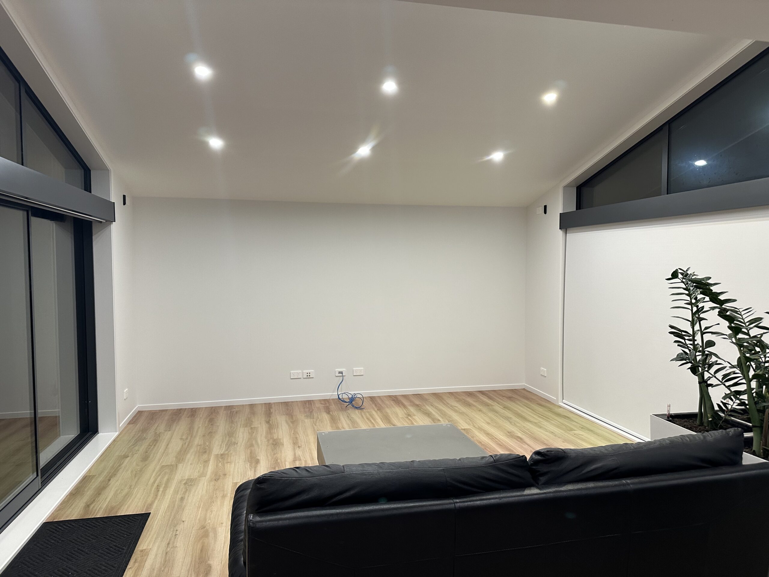
Our lounge has floor-to-ceiling ranch sliders on both sides, which we love, and gets amazing all-day sun. We didn’t realise how much sun until we moved in. With small kids around and direct sun all day through the ranch sliders, the turntable needed protecting, so we moved it upstairs to the office.
Nowhere to put the turntable where it wasn’t directly in the sun or at risk of being bumped by kids.
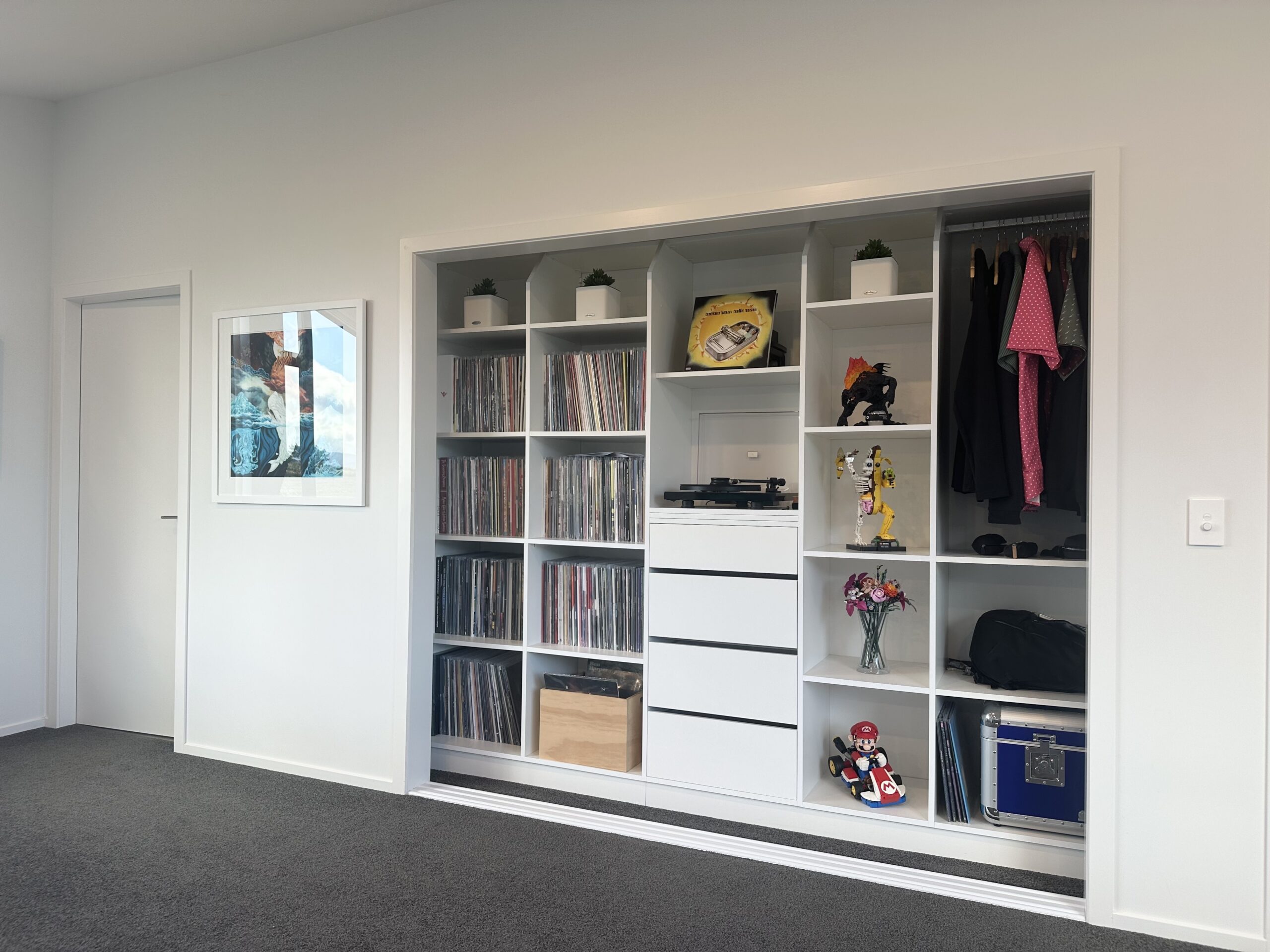
Wait… you put the turntable where?
From there the doors were removed from the wardrobe and turned into a makeshift listening room at best. It works, but it was always a wardrobe with good intentions rather than a space actually designed for listening. The one real advantage: keeping the turntable out of direct sunlight.
Direct sunlight in the lounge wasn’t going to work, so the upstairs wardrobe became a makeshift listening room.
From wardrobe to lounge, we had five problems to solve
Here’s what I needed to pull things off, our design non-negotiables:
Stable surface
A slide-out tray would have been the simplest solution, but turntables need a rock-solid and vibration-free platform. This was off the table from the outset.
Sun protection
The lounge gets direct sun all day through the ranch sliders. The turntable and vinyl collection needed shielding.
Lids that don’t block the TV
Any lid that opened upward and stayed there would get in the way every single time.
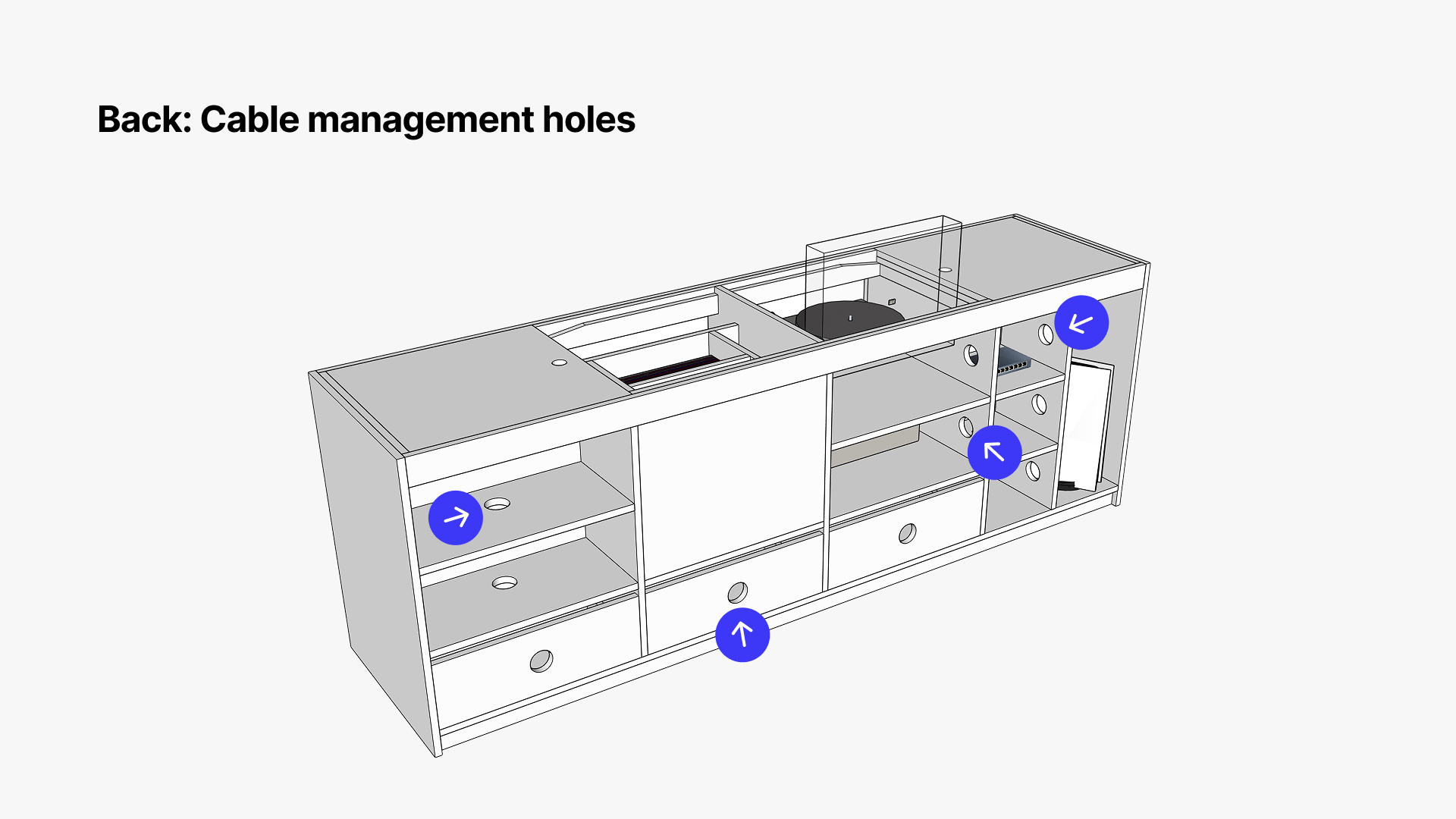
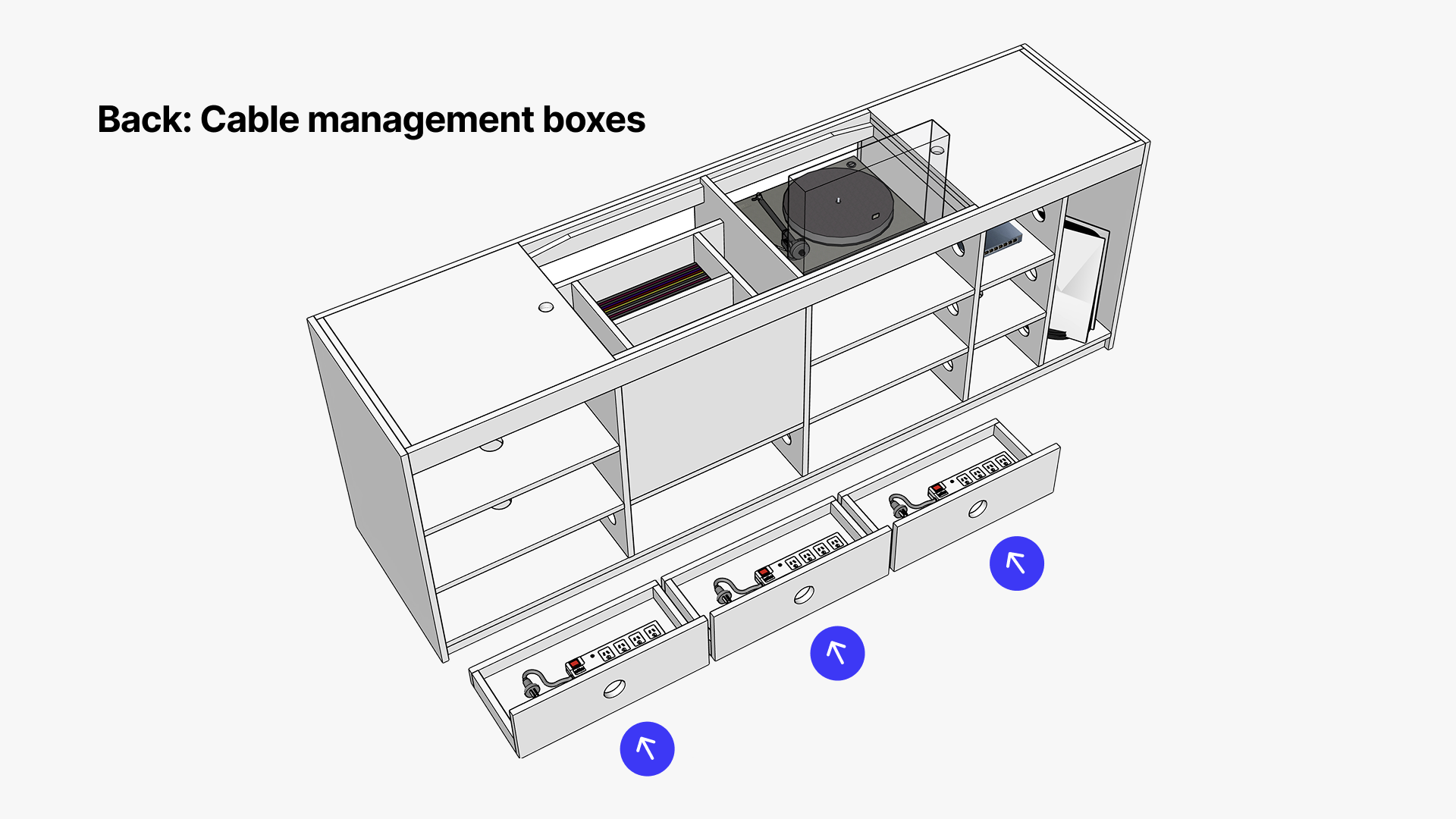
Cable management
All cables, data connections, and power boards needed to be completely hidden from view. Calm. Out of sight, out of mind.
Turntable power access
The on/off switch is underneath the deck, so easy access is a must.
Go online, compare options, add to cart. How hard can it be, right?
Famous last words, I have a habit of underestimating how long things actually take. I genuinely thought this would take an afternoon. A few searches online, compare a few options, add to cart, constantly checking for tracking updates until it arrives, done and dusted.
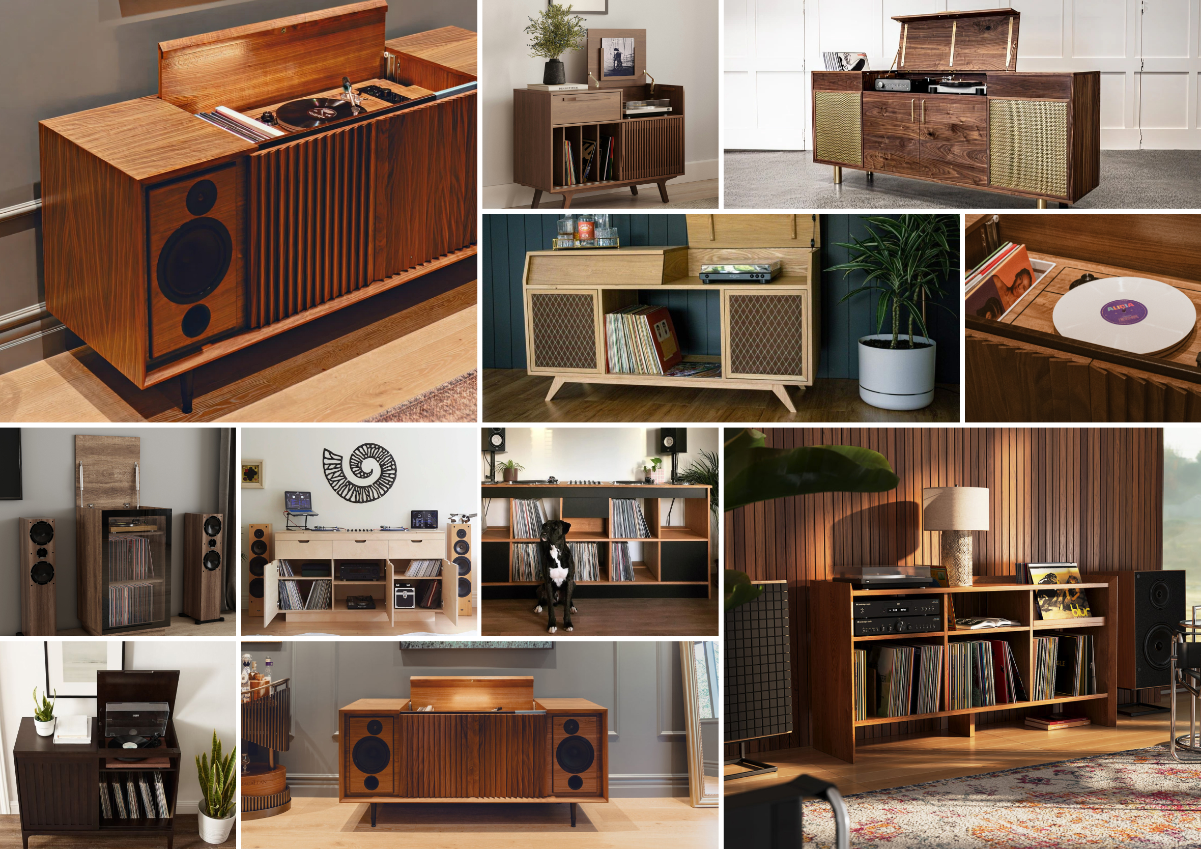
Nearly every entertainment unit out there is designed around TVs and gaming console setups. Not Hi-Fi audio
I searched Google, Trade Me, Pinterest, Instagram, large and small furniture retailers, boutique design stores, and walked around countless charity shops. Thousands of options. Here’s the thing though: nearly every entertainment unit out there is designed around TVs and gaming console setups. Not Hi-Fi audio. Technically and functionally fine. Completely wrong for our space.
Inspiration collage: Beautiful hi-fi setups exist, none of them solved all five constraints at once.
Going with a custom build
I should be upfront, I have no cabinet-making or joinery experience whatsoever. Zero. The more I searched, the more I became aware nothing came close to hitting all five constraints. Going custom wasn’t a luxury. It was the only way to get exactly what we needed without purchasing something that added barriers instead of removing friction and enhancing the experience.
As a UX designer I spend my days thinking about how things work and where interactions fall down. These compromises would have taken away from the experience. That was the moment things changed.
I should be upfront, I have no cabinet-making or joinery experience whatsoever. Zero.
Before committing to anything I wanted to understand what was actually possible. As a good friend once put it, “when it comes to DIY, Rich, you’re either a doer or a payer. You, my friend, are a payer.”
So I leaned into what I do know. Making sense of things and solving problems. I partnered with AI to brainstorm and sense-check ideas, built out a Pinterest mood board of minimalist furniture, hidden storage, sliding doors, and spent time understanding what had already been tried and where there might be gaps where I could play.
Over time the collecting of notes and ideas started to feel less like browsing and more like a real design brief taking shape.
When it comes to DIY, Rich, you’re either a doer or a payer. You, my friend, are a payer
Actual quote from a good friend of mine. Nevertheless I started sketching ideas.
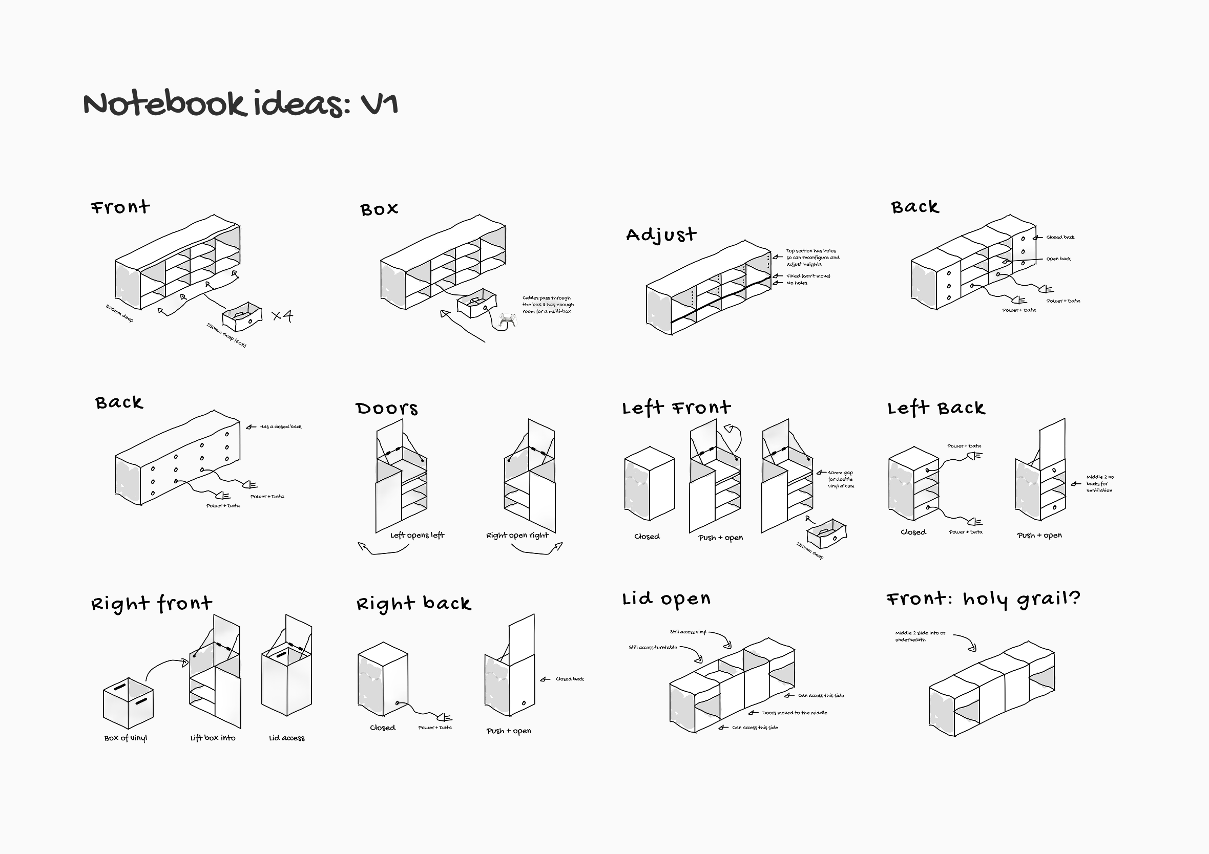
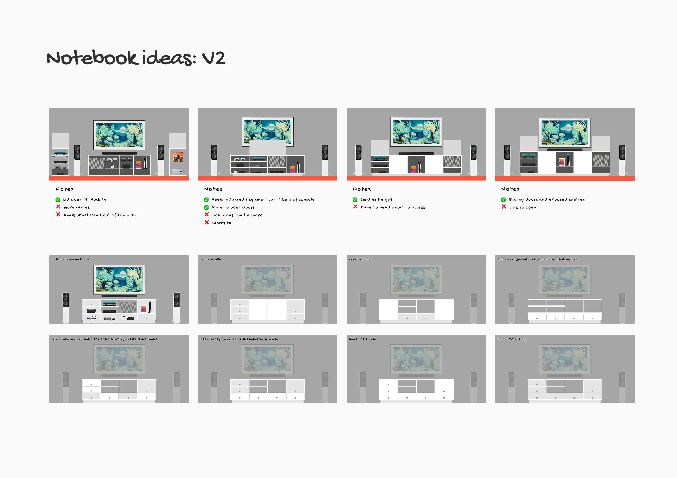
Version one of my thinking basically mirrored what already existed out in the world already. Lids that open and stay up, cable boxes, familiar structures. I was still working around the constraint of the window behind the TV, which forced the design into shapes that always looked a bit awkward. Minor tweaks to an existing solution rather than rethinking it. Functional, but always feeling like a compromise and coming up short. Version two was a continuation, with every piece of equipment measured and placed to scale to get a better sense of where things should go.
Version 1: Lids that open and stay up, cable boxes, familiar shapes. Reworking what already exists with no real advantage.Version 2: 2D Figma designs with every piece of equipment measured and placed to scale, sent to the first furniture maker.
The TV went on the wall, so the window had to go
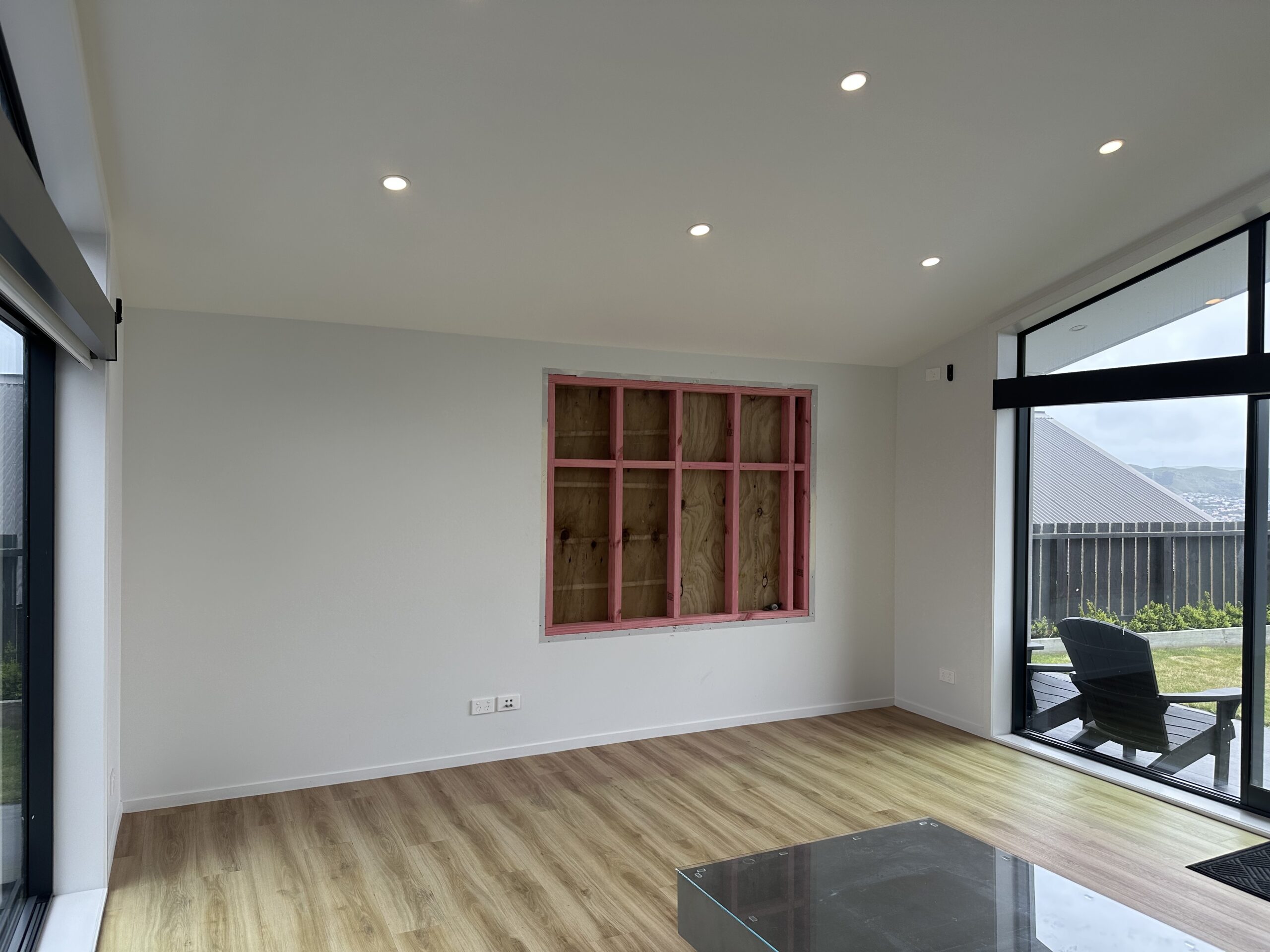
Then version two changed everything. And the whole project changed into hyper speed. Or hyper focus in my case. When I started measuring the actual components, I realised that introducing a turntable with top-deck access meant the TV could no longer sit on top of the unit. It had to come off entirely. And if it was going on the wall, the awkward window directly behind it had to go. We’d also had this window located awkwardly behind the TV that we never used, curtains always closed. After a few years we thought, why not remove the window, mount the TV on the wall, and move everything downstairs properly. Dedicated spaces, clear purpose.
The real shift came when we decided to remove the window altogether and mount the TV properly on the wall. Builders and painters/plasterers came in. Window completely gone and now we were staring at a blank canvas. That decision freed the design from a constraint that had been quietly limiting every idea I’d had up to that point.
The space and awkward window we decided to remove.
What does gardening have to do with entertainment units?
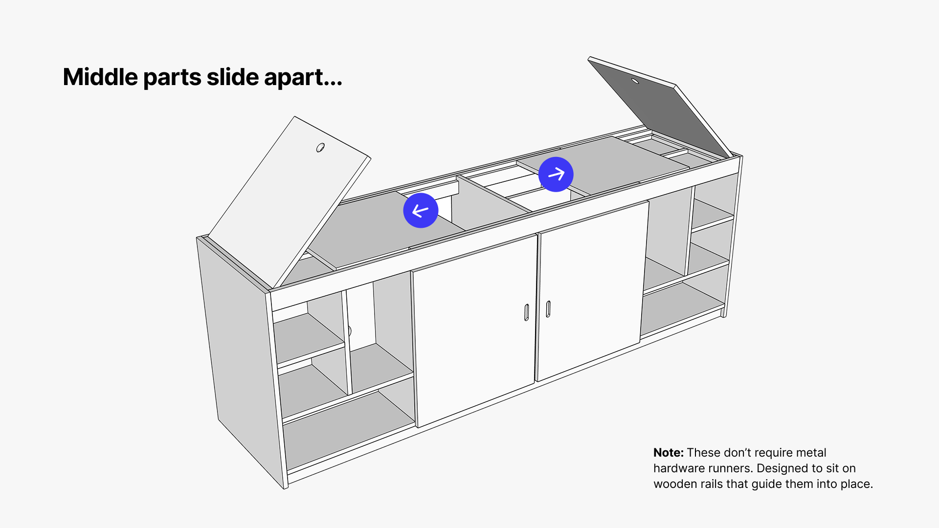
Around the same time, looking at extendable dining tables led me to the term “sliding table tops,” something I’d never thought about before. The problem with most sliding tops is they extend outward and create an uneven surface. That wasn’t what I wanted.
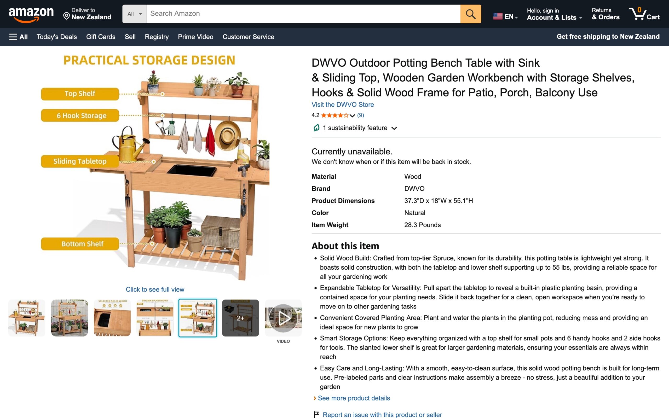
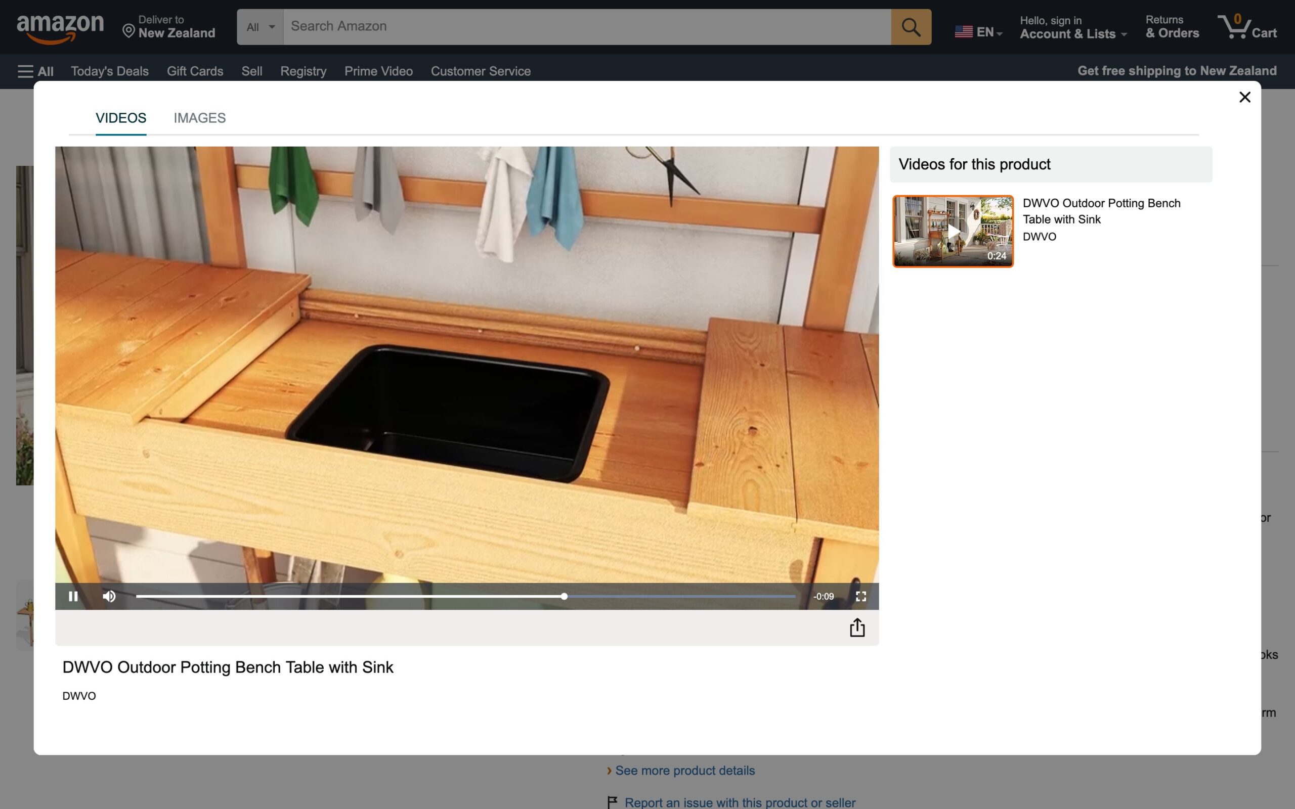
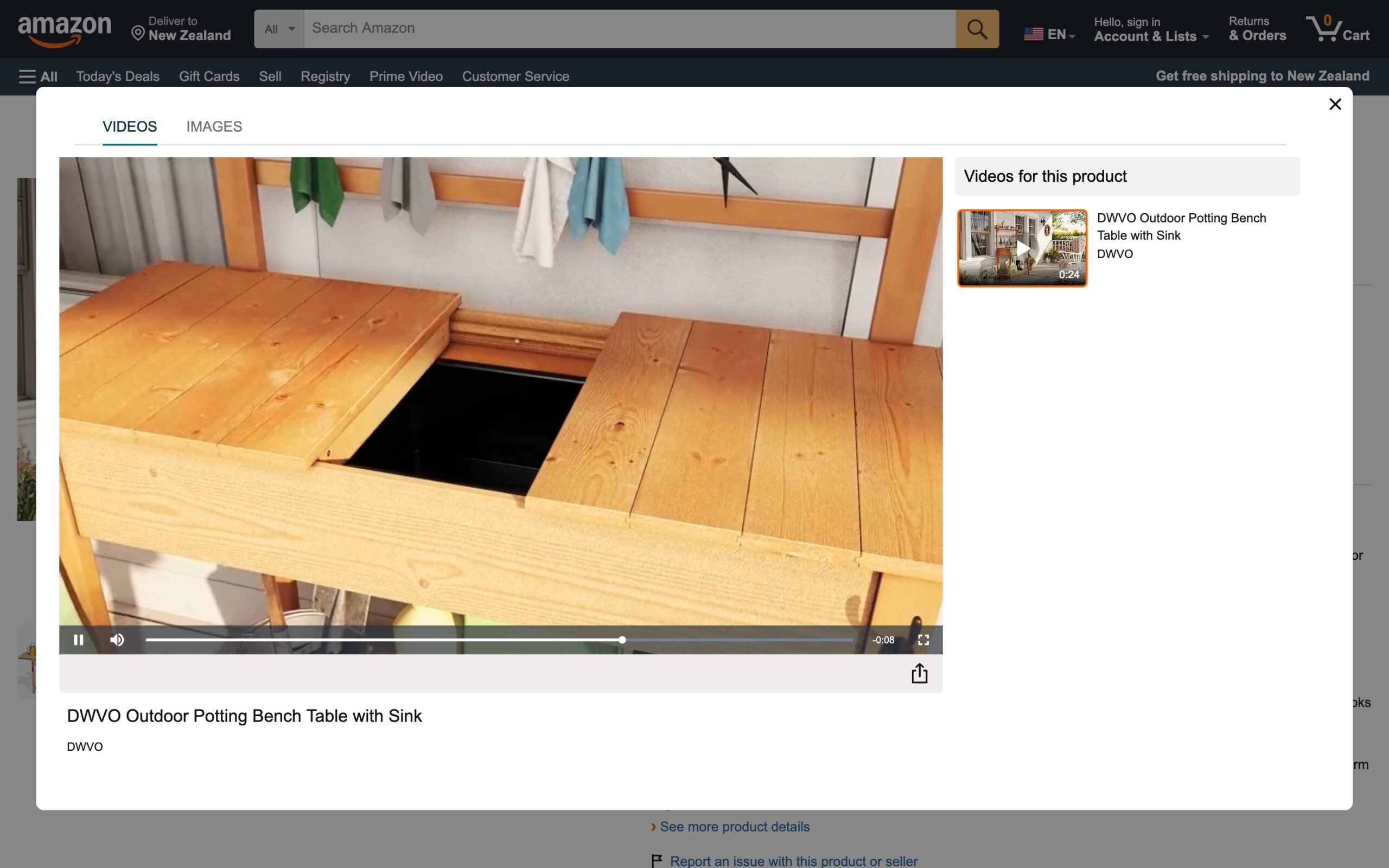
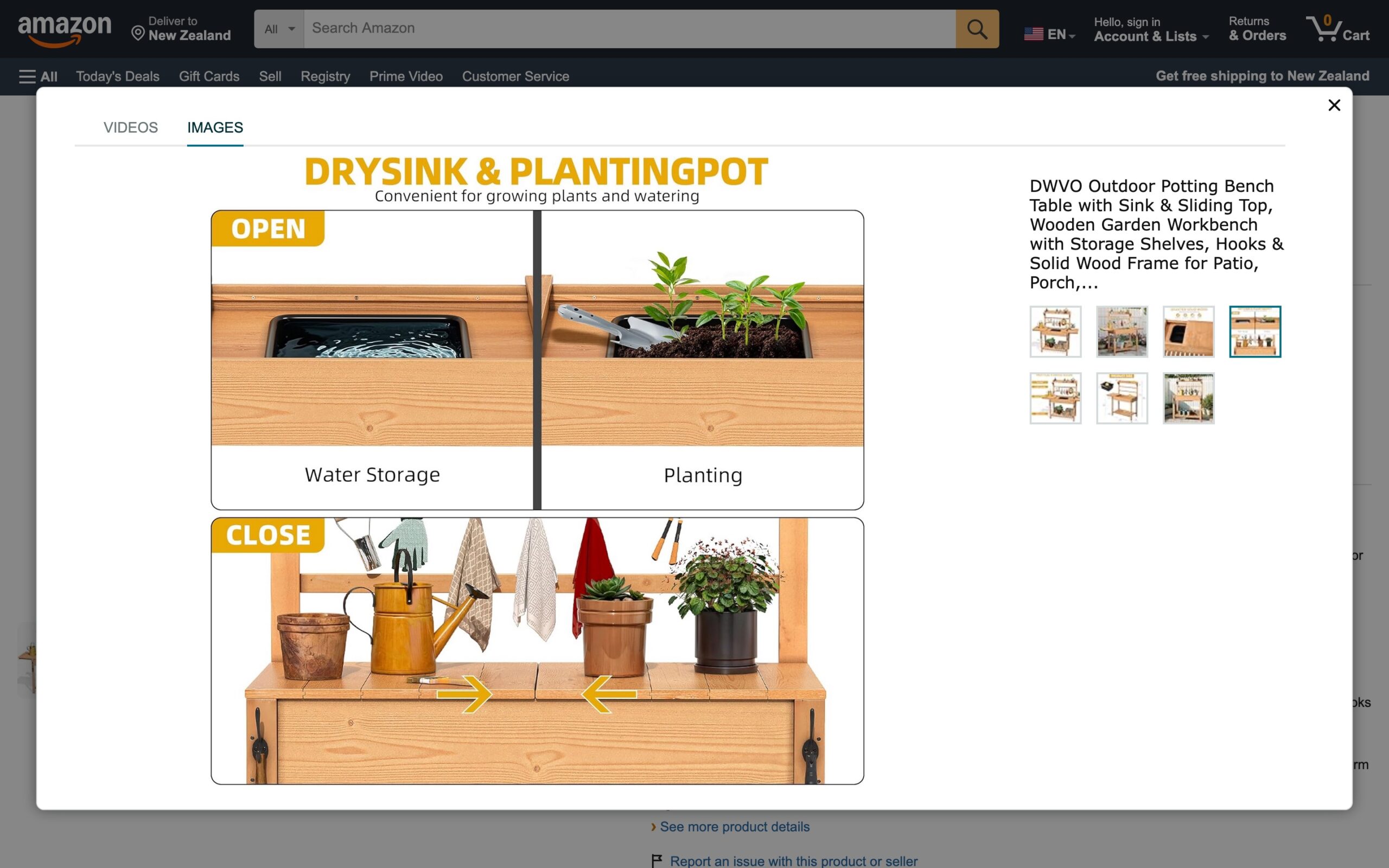
Then I found this. On Amazon. In the gardening section of all places.
A workbench designed for planting. But it had exactly the mechanism I’d been trying to describe: a top that slides sideways to reveal storage underneath, with the surface staying completely flush and level the whole time.
A garden potting bench. The answer was hiding in the last place I would have looked.
That was the moment the sliding tabletop concept became real. Not a lid that opens upward and stays there. Not panels you lift off and have to find somewhere to put while you dig out a vinyl. A surface that moves sideways, quietly and cleanly, always even, revealing what’s underneath only when you want it. Able to close again to protect everything from the sun. This was it.
It reminded me of Toyota’s Poka-yoke philosophy which translates to “inadvertent error prevention” where objects are designed so you can’t use them incorrectly. To achieve “vibrant clarity” in its approach to quality, the Poka-yoke method is broken down into highly visible, simple, and elegant designs that remove the cognitive burden, for example, a seatbelt only plugs in one way.
The right interaction is baked directly into the object’s DNA. That’s exactly the kind of thinking I wanted in this piece of furniture. The idea existed, it just hadn’t been applied to an entertainment unit before as far as I could tell.
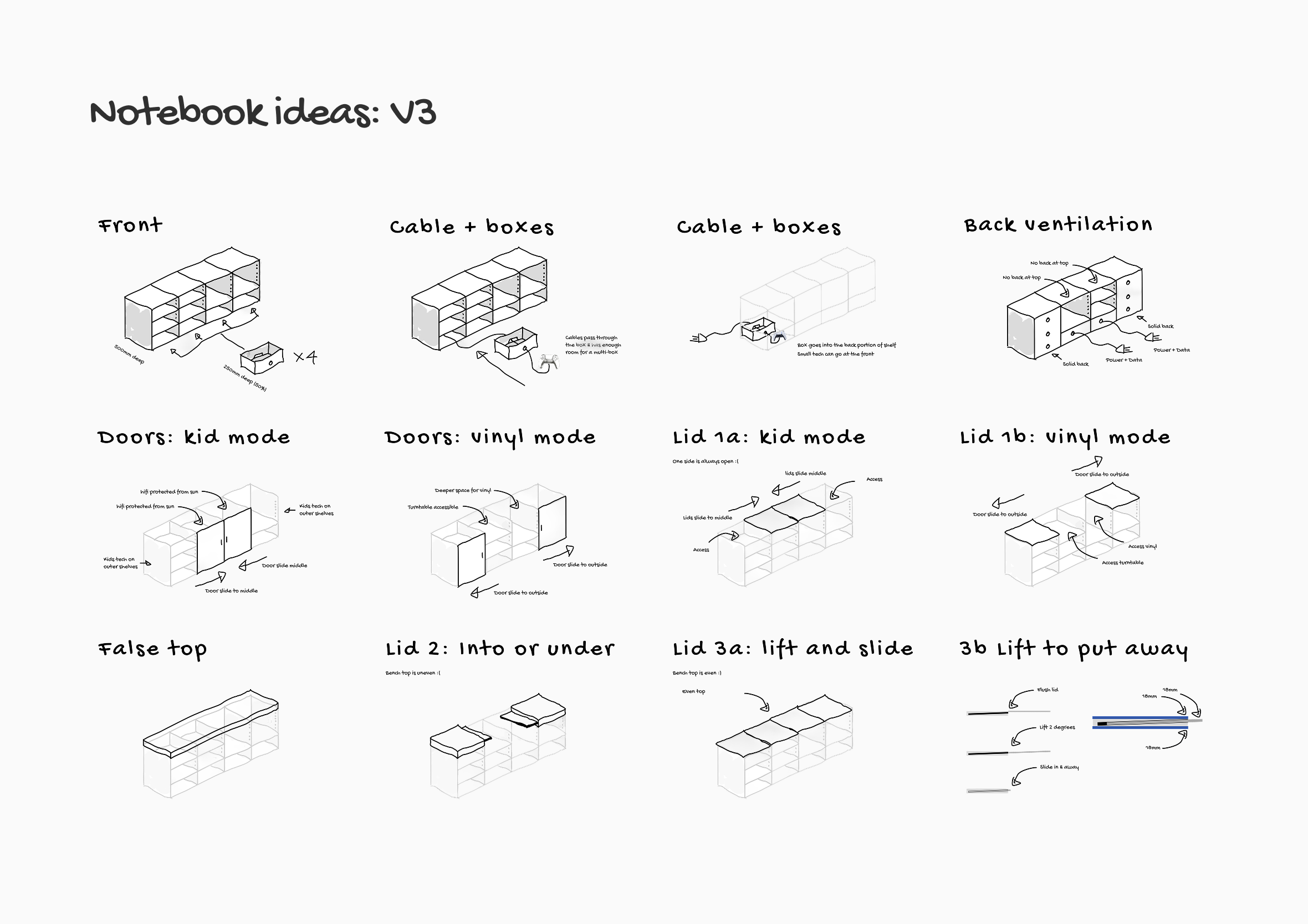
Version 3: The sliding tabletop ideas starts taking shape. The window constraint is gone and the thinking opens up with it.Version 4: A poor attempt at showing the tabletop mechanism in 3D using Figma. Close, but not quite there yet.
Nobody got it. Not fully, not yet…
With a concept clear enough to share, I emailed a furniture maker. Rough sketches, images as a visual reference, website links, then 2D Figma designs with all the equipment placed to scale, then a video walkthrough, and in-person meetings.
Confused faces. Emails saying it was outside the scope of what they do.
I had to ask myself a hard question: Was this a bad idea?
How could they not get it? The emails were thorough? The sketches were clear? The Figma files had every piece of equipment placed to scale. I’d walked people through it in person, on screen, on video.
Sitting with it honestly for a while, I had to ask myself a hard question: Was this a bad idea? I had no practical building skills and didn’t know the first thing about furniture making. What if the mechanism that worked so clearly in my head simply fell apart in the real world?
After almost twenty years of designing digital products, I’ve learned that when something isn’t landing it usually comes down to one of two things: I haven’t set the scene well enough, or I’m missing a vital piece of the puzzle. The furniture maker wasn’t wrong to be cautious with what they’d been shown. I hadn’t given them enough information in a format that made sense to them. That was on me.
Build it first, explain it second. From digital to physical design
The hardest part wasn’t designing the idea. It was helping other people see it
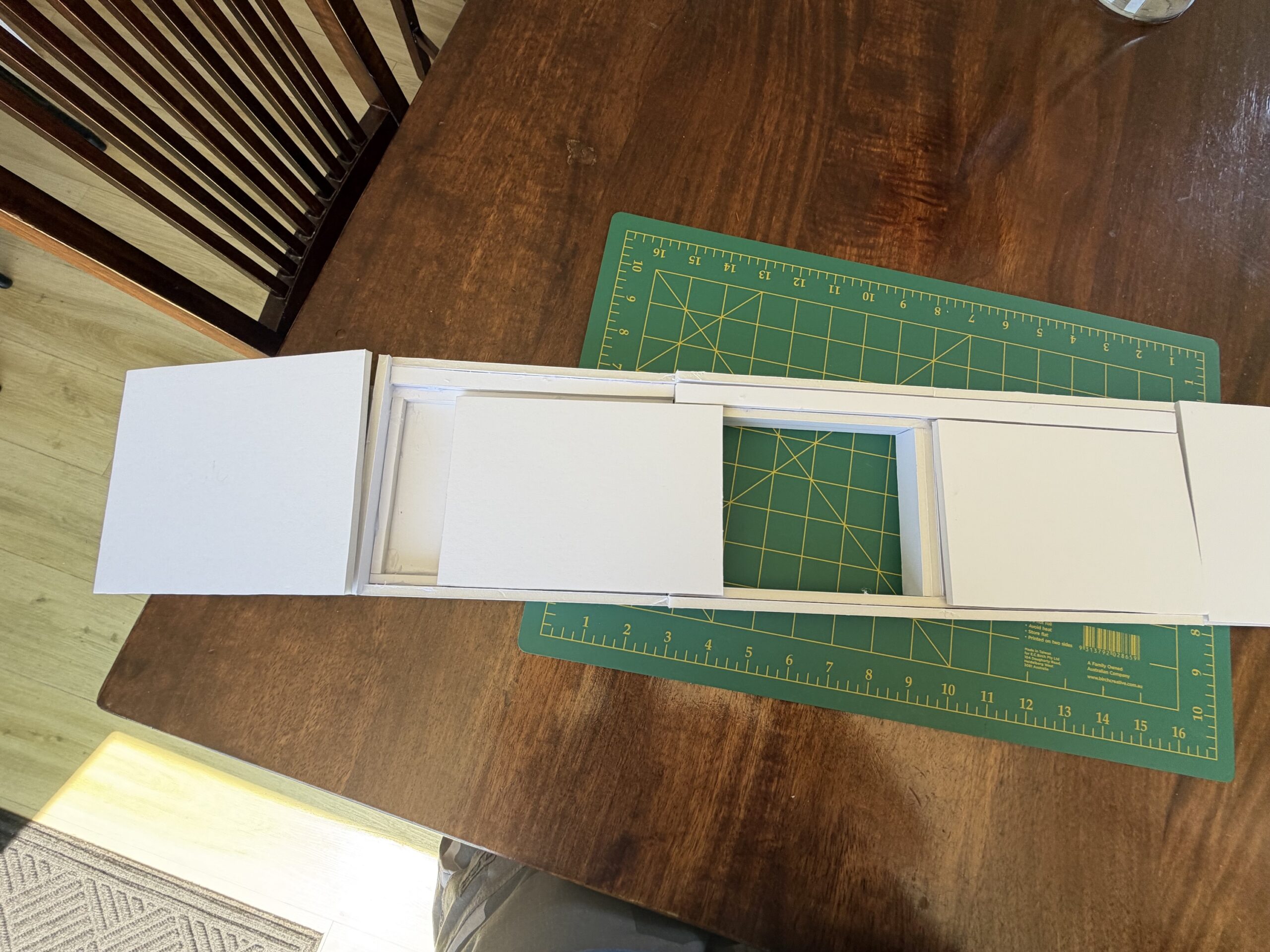
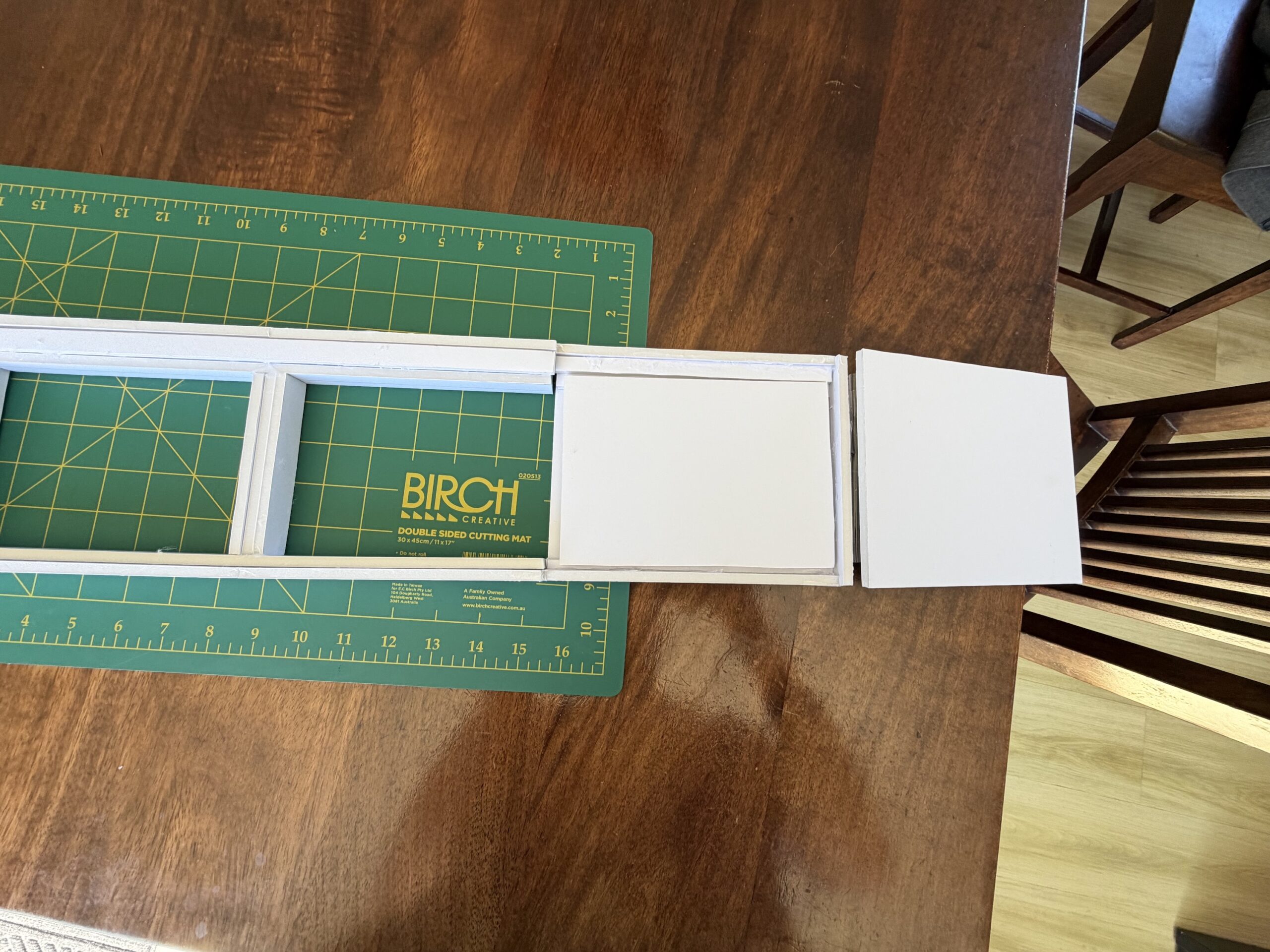
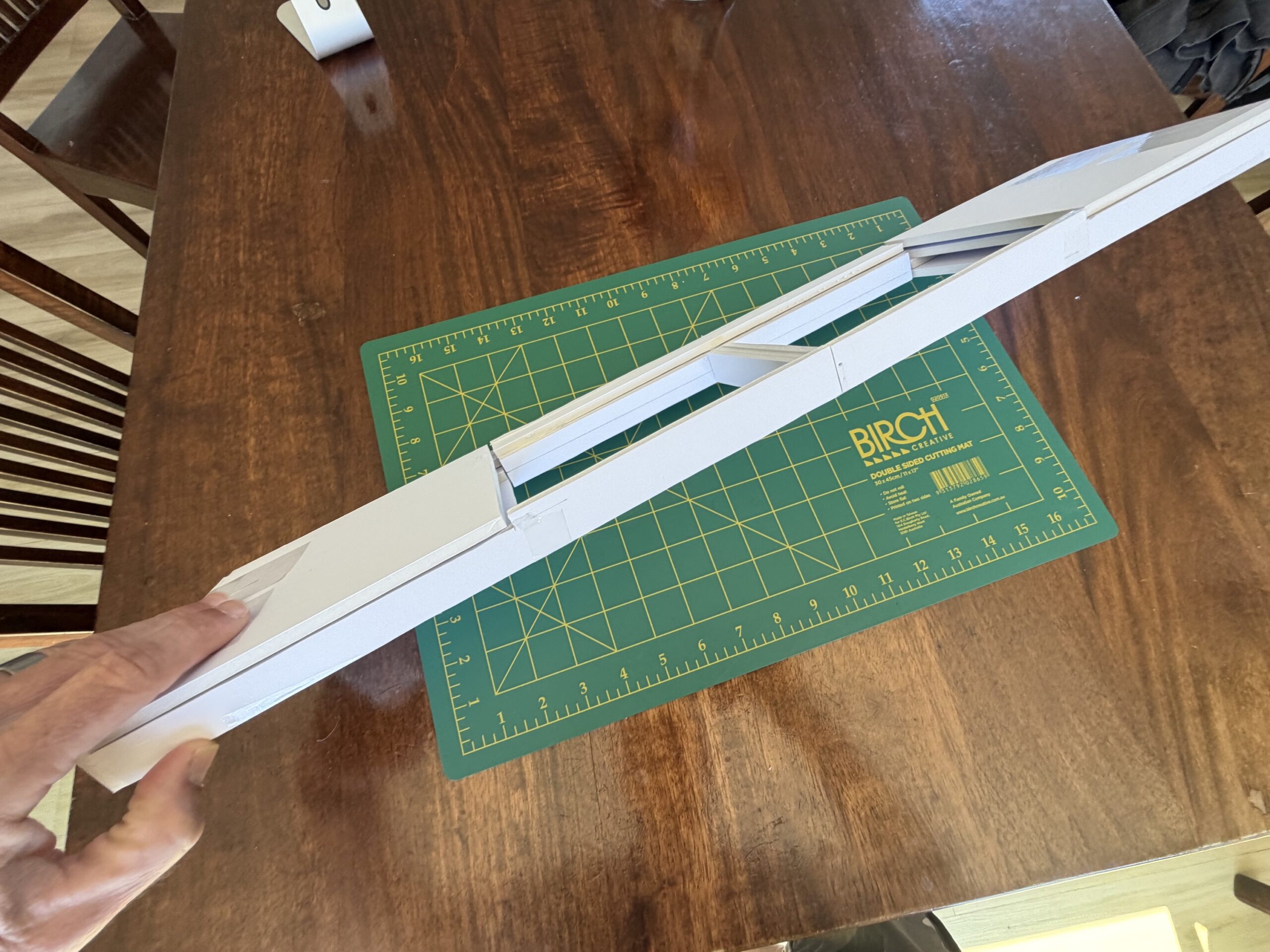
Rather than trying to explain the mechanism again with words and flat 2D drawings, I decided to validate the idea in the most direct and tangible way possible. By building it myself. Out of foamcore.
My thinking going in was simple: if it works, great. If it doesn’t, also great. I just genuinely wanted to know either way.
This was version three of the project, and easily the most fun.
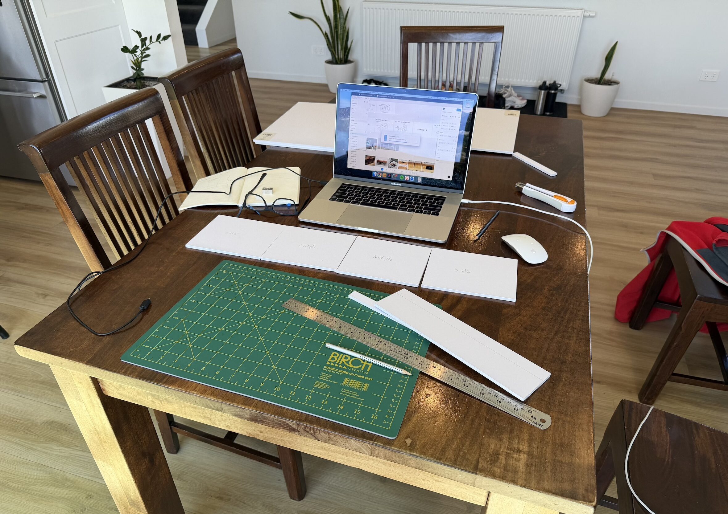
Foamcore is the lightweight board architects use to build scale models. You can find it at most craft stores. I bought a green cutting mat, a craft knife, tape, a glue gun, a metal ruler, and got to work at the kitchen table watching YouTube tutorials and doing more maths than I’d attempted since high school.
Watching YouTube tutorials online to try and build a working prototype.
Well and truly in the deep end of the industrial design world. But so much fun working with a physical medium.
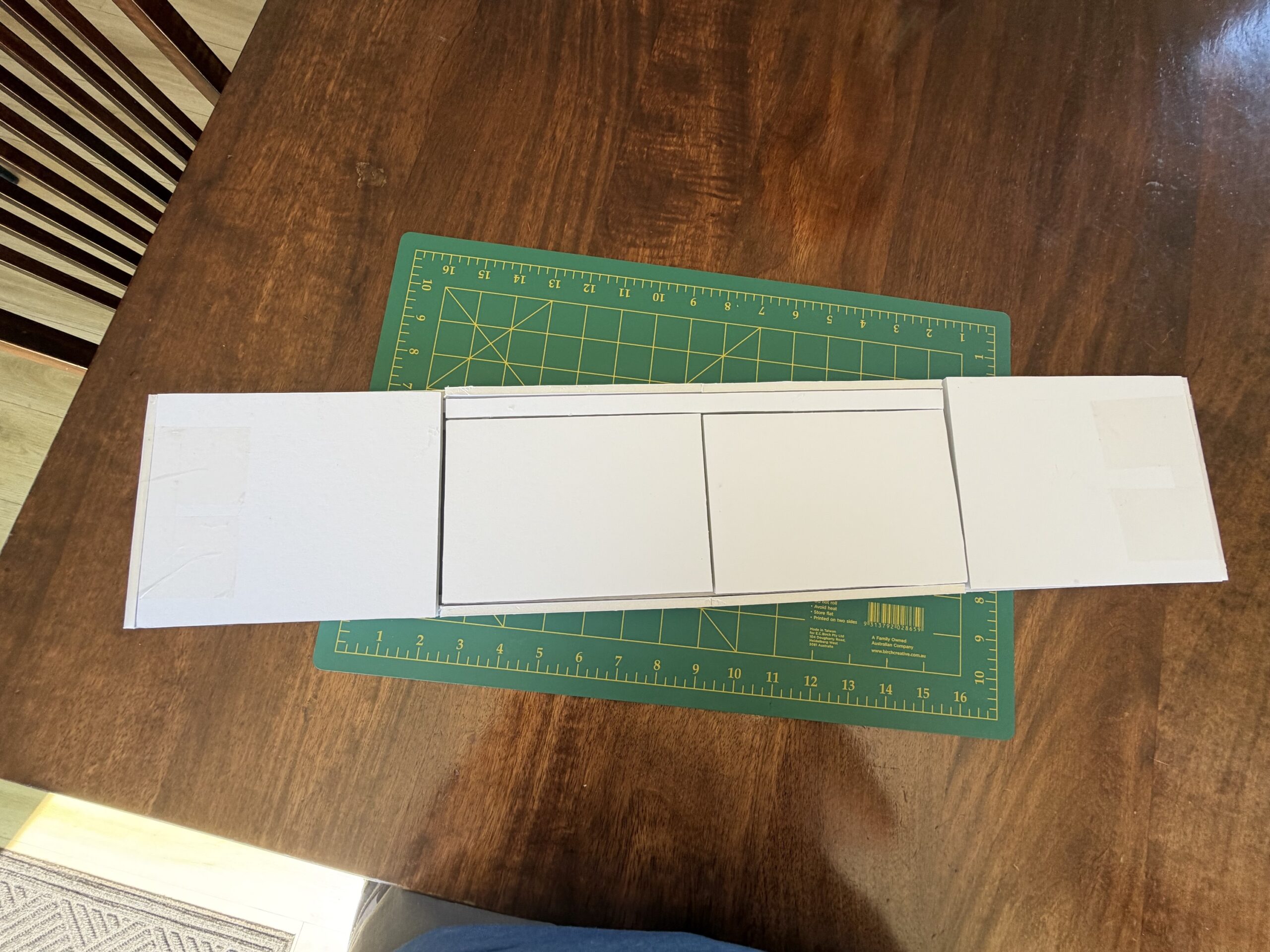
I built the model at a ratio of 5mm board to represent 18mm plywood, to keep proportions honest at scale. Given that maths is not a superpower of mine, the classic “measure twice, cut once” became more of a “measure twice, cut once, remeasure, recut, tape back together, add some glue, close enough” kind of process.
The foamcore model wasn’t about precision. It was about making the idea real enough to react to
Not pretty or precise, yet extremely useful.
The prototype was never about precision or winning design awards. It honestly looked like a child’s art project and I was totally fine with that. It was a communication tool, not a finished product. A way to validate whether the mechanism worked when your hands were actually doing the movement, not just when it looked right on a screen.
What it taught me that no drawing ever could: proportions that looked fine in Figma looked comically oversized as a foam model sitting on the kitchen table. The reach distance to the turntable with the top slid open matters more than you’d expect. Small adjustments to depth and height completely change how natural the whole thing feels to use.
Sometimes you need to show, not tell
It validated the core idea. The sliding tabletop mechanism worked in the real world. And for the first time I had something physical I could hold up and say: this is exactly what I had in mind.
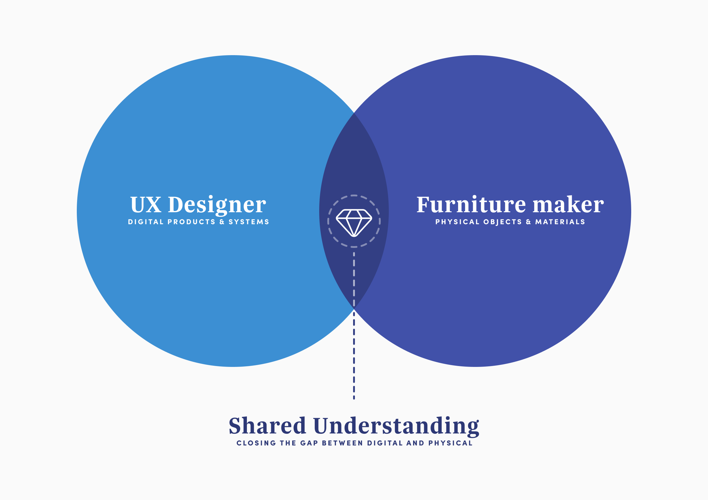
This is something I carry through into my UX work too. The real power is in the ‘overlap’, having enough knowledge of another domain to explain what you want and understand and respect the constraints and concerns coming back from the other side. A shared understanding.
Learned SketchUp: 3D maths in every direction
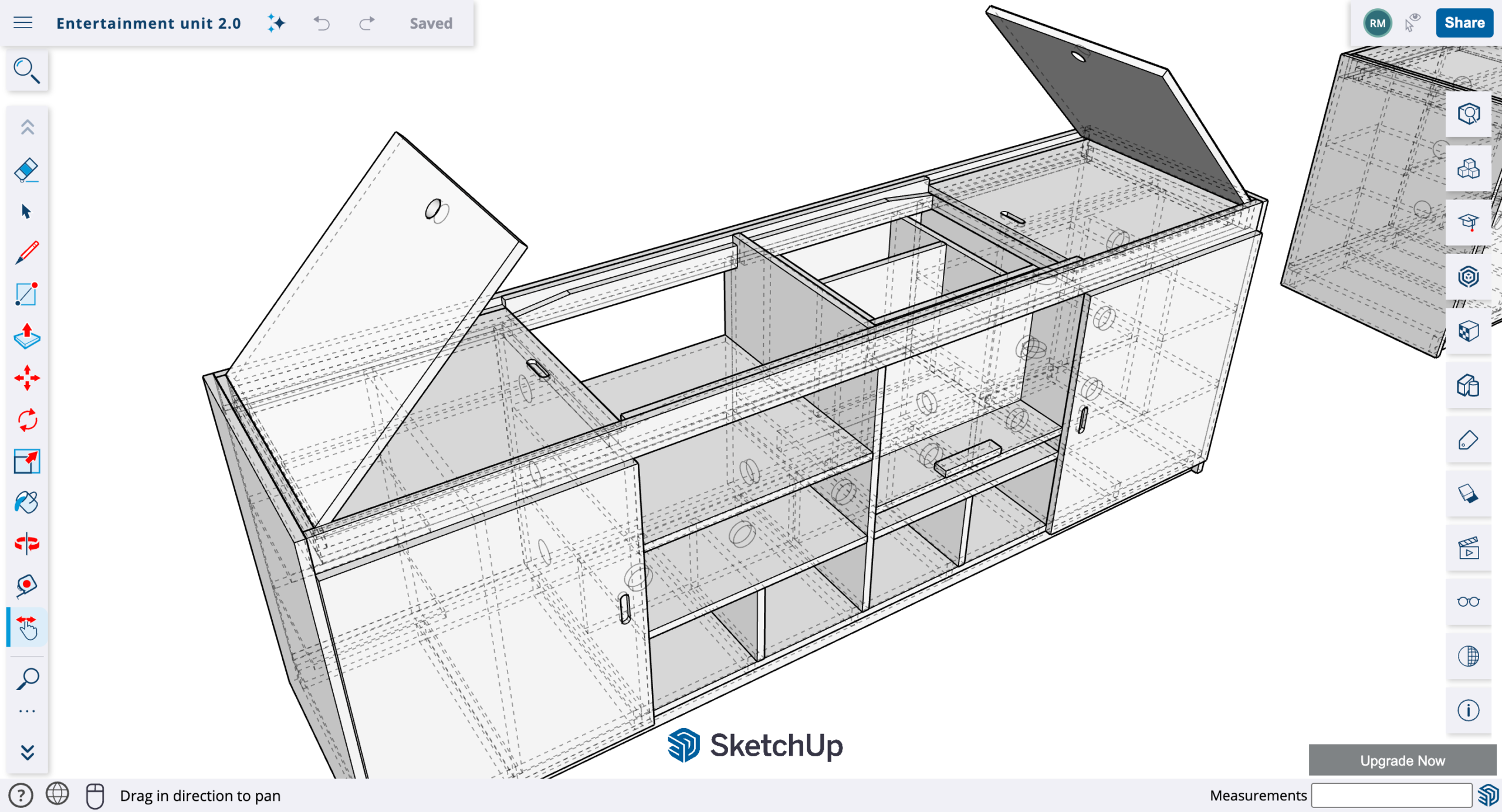
With a working foam model in hand, the next step was producing drawings good enough for a furniture maker to actually work from. Real dimensions, real clearances, real views from every angle. So I decided to teach myself SketchUp.
I actually thought this was going to be the easy part.
SketchUp is widely used by home renovators, interior designers, and joinery workshops. It’s the 3D modelling tool of choice for many cabinet makers because it produces the kind of technical drawings that go directly to the workshop floor. I’d used it briefly before. This project gave me the right reason to fully commit.
Here’s the thing about SketchUp though: alongside spelling being my kryptonite, maths and my brain don’t often see eye to eye. Working in 3D puts maths in every direction you look, literally and by its very nature. Switching between different axes, understanding what a change in one plane does to everything connected to it, trying to reproduce on screen something I could already see clearly in my head. It took a while to stop fighting it.
What made things finally click was being anchored to a real-world project I was already fully invested in. Not following a generic tutorial about how to model a random object. That context and motivation made all the difference.
3D modelling broke my brain for a while. Then slowly, piece by piece, it started to fit together
One thing that genuinely delighted me once I found my footing: SketchUp uses reusable components that work almost identically to components in a UI design system. Build a shelf or door panel once, turn it into a component, and place it wherever it’s needed across the whole model. Update the original and every instance updates automatically, consistent and scalable, exactly like a Figma component library. Any UX designer who’s built one will feel immediately at home in SketchUp. The thinking transfers completely, even if the axes take a while to stop being confusing.
Design in progress of the entertainment unit made in SketchUp.
The model let me verify dimensions impossible to check in foam, test clearances, understand exactly how the sliding mechanism sat in relation to the inner lids, and produce front, back, and side views with doors on and off. Everything a furniture maker would need before committing to a single piece of timber.
Five problems, one solution
Every decision throughout this project had to pass through five constraints. Nothing got through unless it solved at least one of them.
To refresh your memory the five problems to solve:
Stable surface
Sun protection
Lids that don’t block the TV
Cable management
Turntable power access
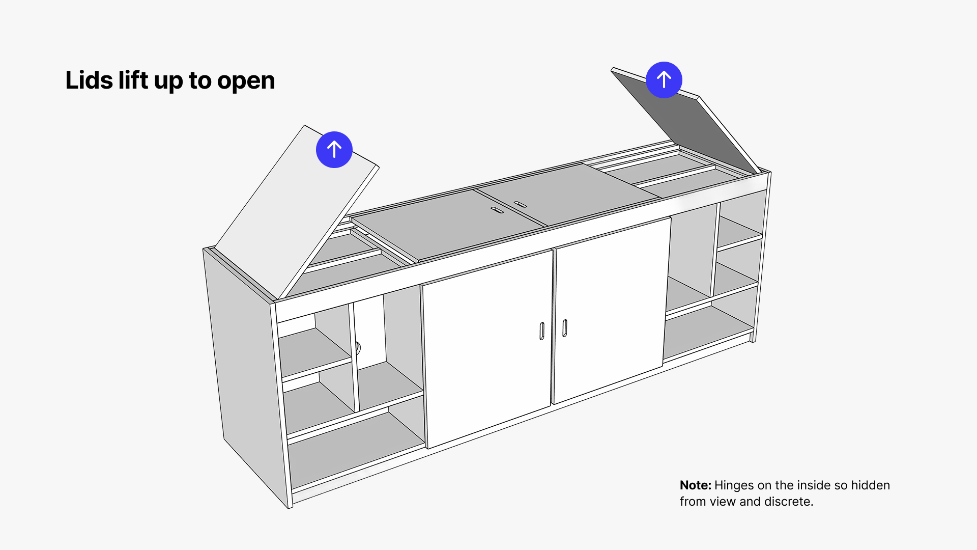
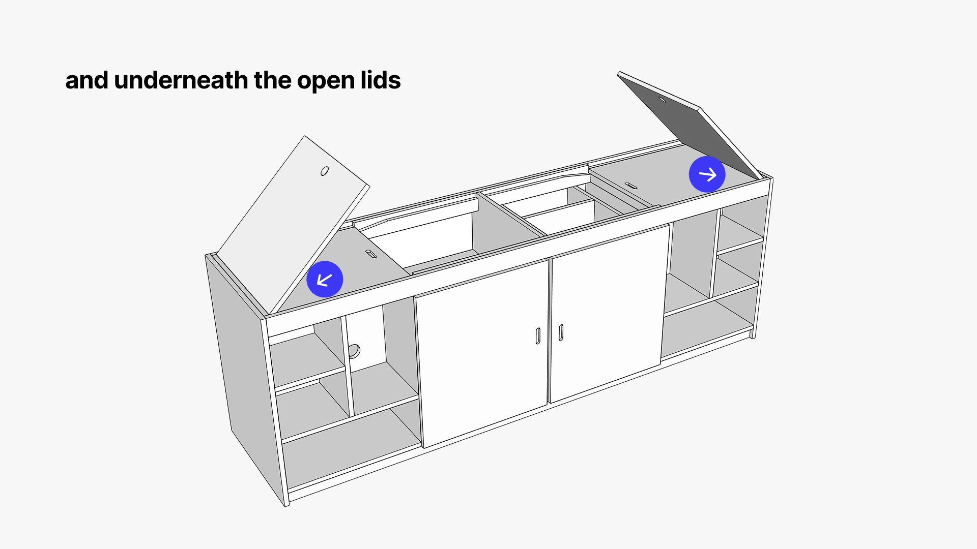
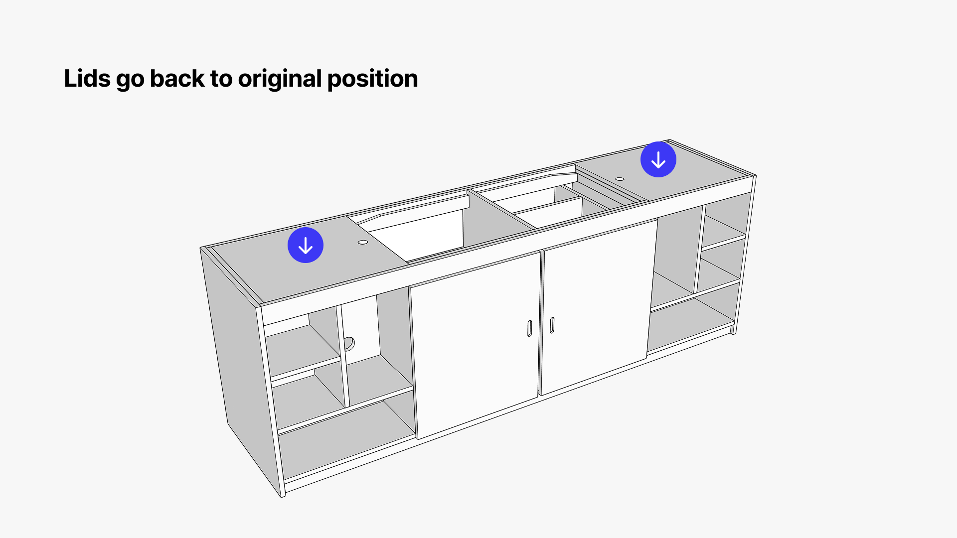
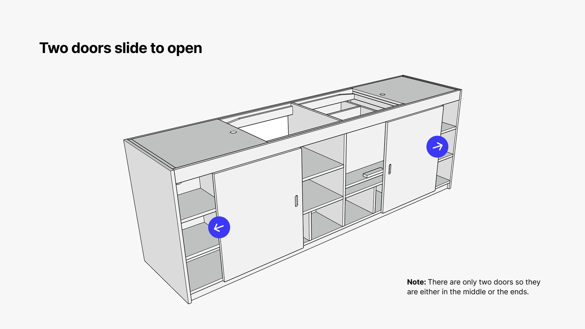
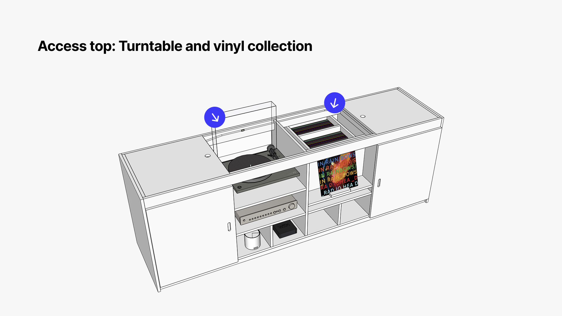
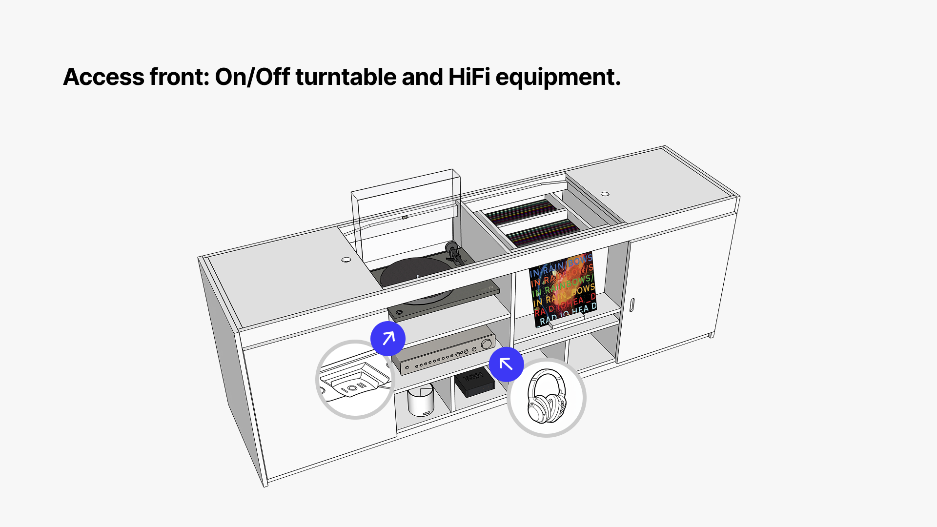
The sliding tabletop mechanism solved all five. Surface closed: protected from sun, everything hidden. Surface open: inner lids fold flat keeping the TV completely clear, full access to the turntable and power switch below. Cables in a dedicated section underneath. The turntable never moves. Elegant and functional.
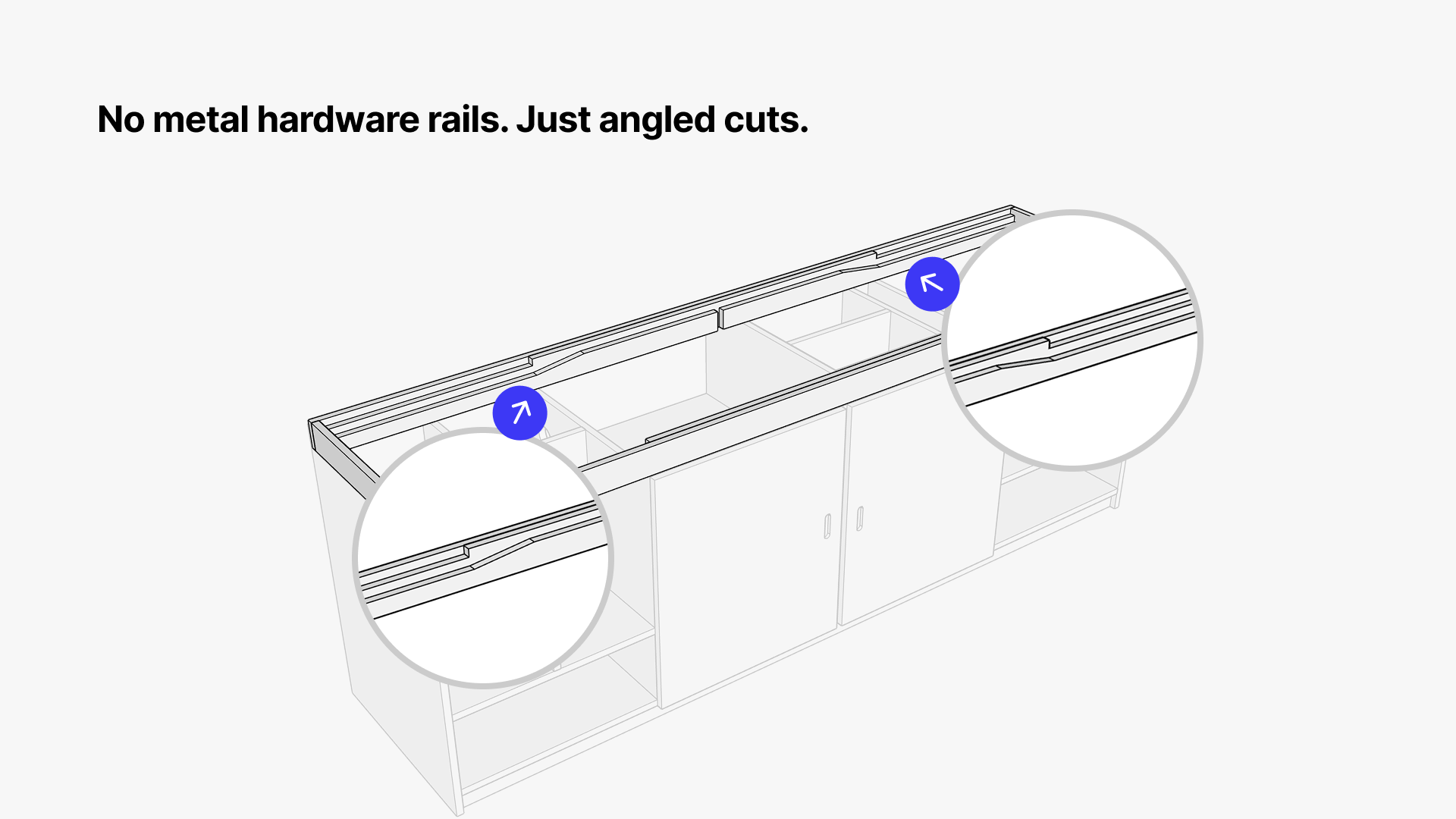
How the sliding tabletop mechanism works
This is the part that was hardest to explain in words and easiest to show in 3D. If done correctly it’s actually just four hinges. No rails, no complex hardware. Geometry and gravity doing the work.
Six steps. Four hinges. No rails, no complex hardware. Geometry and gravity doing all the work.
A sliding false top covers the middle section. When closed: completely flat surface, no visible hardware, no indication anything moves at all. Slide the top across: two inner lids lift up, full access to the turntable and vinyl below. Hinges sit on the inside. Always flush. Always level.
That garden potting bench was the inspiration. This is the holy grail I’d been chasing. Good design often looks simple because all the complexity has already been removed.
That garden potting bench was the inspiration. This is the holy grail I’d been chasing. Good design often looks simple because all the complexity has already been removed
Sell the dream, not just the idea
With a validated prototype and proper 3D drawings, there was still one problem left: communication.
When a design isn’t landing, it’s usually because the context is missing. You can explain a mechanism perfectly and still lose people, because they’re trying to evaluate a solution before they’ve felt the problem.
I took inspiration from Richard “Dice” Allardice who is a natural storyteller. He always sets the scene upfront before he gets to the point, establishing context that makes the solution feel obvious in hindsight. I’d been doing the opposite the whole time: jumping straight to the solution and expecting people to work backwards.
Being dyslexic means words alone have never been my strongest tool. Visual storytelling is. So I put together a proper slide deck.
Slides from the final deck, annotated 3D views showing turntable access, hi-fi equipment, and cable management.
The deck walks through the space, the five constraints, the mechanism step by step, annotated 3D views, and a short video of the whole thing in motion. The goal wasn’t to impress anyone. It was to give someone the same ‘a-ha’ moment I’d had standing over the kitchen table with a foamcore model in my hands. To make the idea impossible to misunderstand.
When people could see the thinking laid out clearly, the conversation changed completely.
The goal wasn’t to become a furniture maker. It was to close the gap enough to have better conversations.
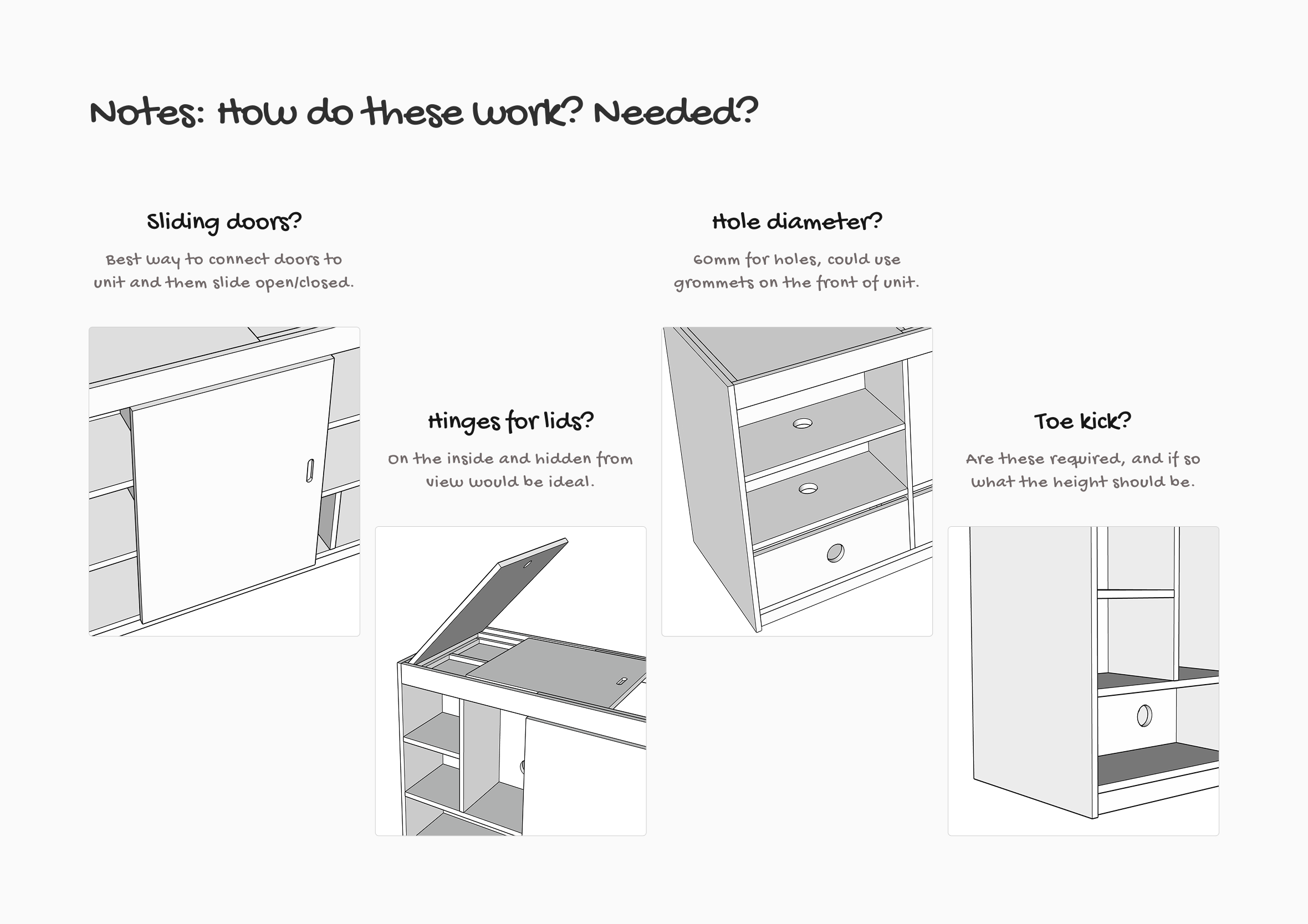
Where I needed expert help
Knowing the limits of your own knowledge is a design skill. There were four things I couldn’t confidently work out on my own: the best way to attach the sliding doors so they’d move cleanly, how to fit the lid hinges on the inside so they’d stay completely hidden from view, the right hole diameter for cable pass-throughs (60mm, with the option of grommets on the front face), and whether a toe kick was structurally required and if so, at what height. These were the questions that needed someone who actually builds things for a living.
Knowing the limits of my own knowledge is a design skill. Getting experts to weigh in to provide recommendations and industry standards.
When you find people who get it
The conversation was different this time. Not because the idea had changed, but because of how I was presenting it. The deck gave the right people everything they needed to understand the design, ask smart questions, push back on things that wouldn’t work in practice, and flag constraints I hadn’t considered. Working together instead of talking past each other.
That shift, from being completely misunderstood to genuinely working together, was one of the most satisfying moments of the whole project.
We’re currently working through the final details together. This is the part where you trust the process.
What I took from all of it
Good ideas aren’t self-explanatory. The clearer something is in your own head, the easier it is to assume everyone else can see it too. They can’t. Your job isn’t just to have the idea. It’s to build the context that makes the idea land for someone who isn’t you.
That applies to furniture. It applies to digital products. It applies to any design work where you need to bring other people with you.
Good ideas aren’t self-explanatory. The clearer something is in your own head, the easier it is to assume everyone else can see it too.
Learning is also faster when the stakes are real. I didn’t learn SketchUp by following tutorials. I learned it because I needed it to solve something I genuinely cared about. That’s been true of every tool I’ve picked up that’s actually stuck.
And sometimes the answer to a design problem is sitting somewhere completely unexpected.
Like a garden workbench on Amazon.
Designed around how we live and interact in the space
Somewhere in the research phase it became clear that this project wasn’t really about furniture. It was about how music lives in a space, and how music serves as a soundtrack to your life. It always had been, I guess.
Streaming has made listening frictionless, which sounds like a good thing until you notice how disposable it makes music feel. No decision making, no commitment, no physical object in your hands. Tap a playlist and forget about it.
Vinyl slows the process down. It asks you to be present
Album artwork and liner notes add to the experience, offering more to explore and get lost in.
Vinyl is the opposite. You choose an album, drop the needle, read the sleeve, and you’re in it for that side. With Spotify I’d find myself jumping between songs, albums, and genres mid-track, never actually listening to anything the way the artist intended it. A good album tells a story with a beginning, a middle, and an end. Vinyl removes the distraction and temptation of always having your phone close by. Vinyl slows the process down. It asks you to be present.
Designing furniture around that kind of intentional use meant every decision had to serve how the space feels to be in, not just how it looks in a photo on Instagram.
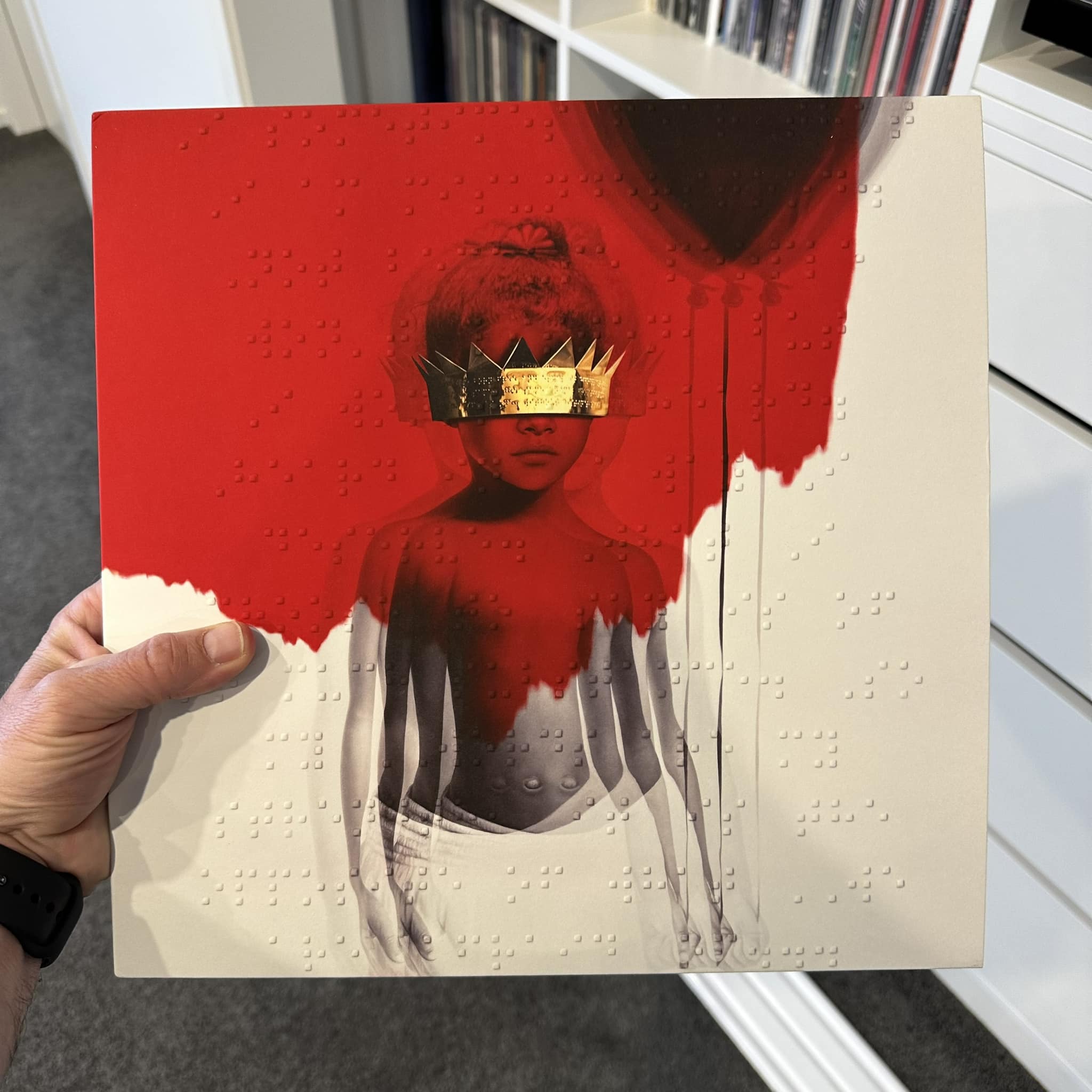
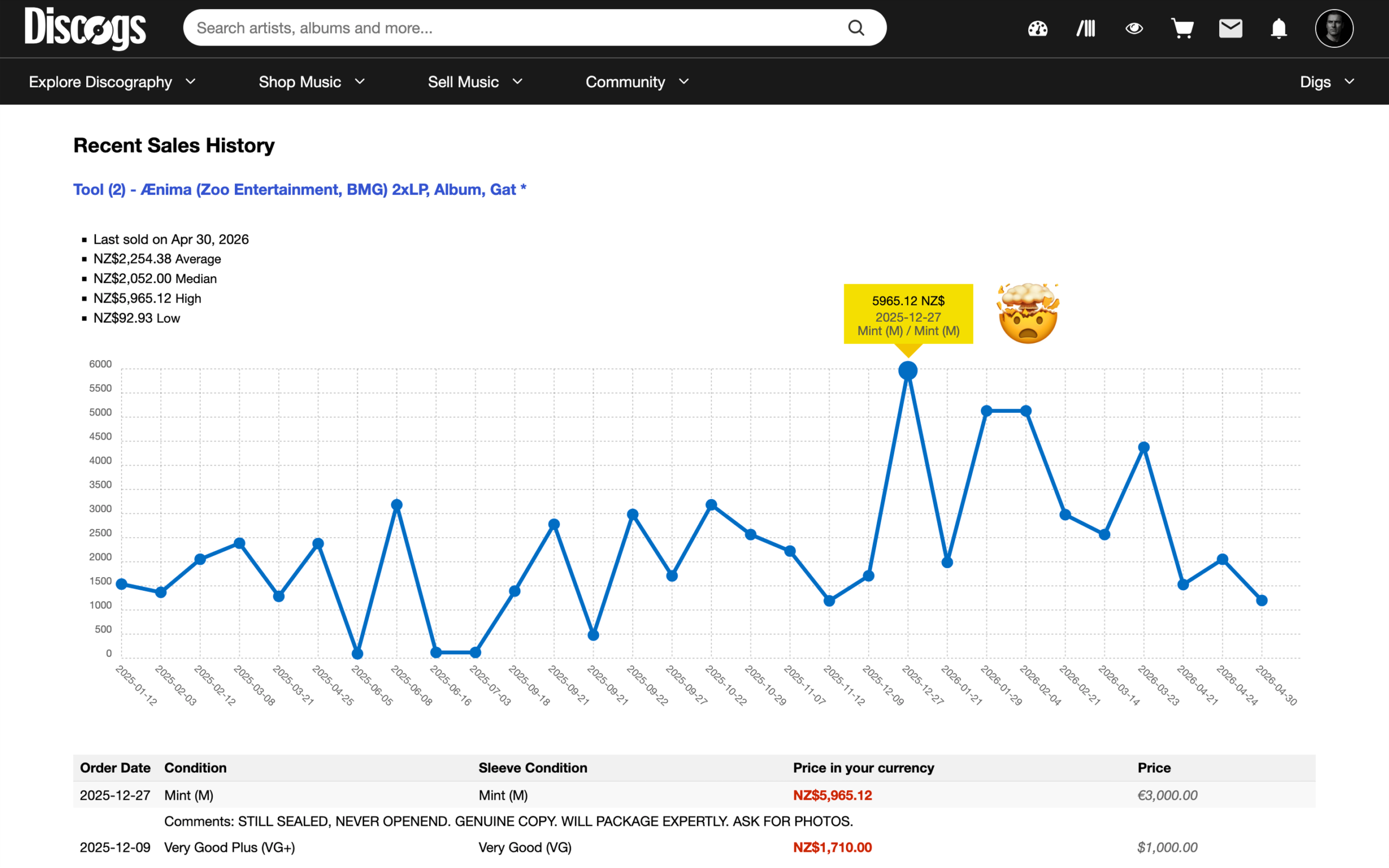
From $162 to $5,965: twenty-three years later
My OG first pressing that I paid $162 in 2002 sold for an eye-watering $5,965 in 2025
As part of writing this article I went on Discogs to look around and just noticed my OG first pressing that I paid $162 in 2002 sold for an eye-watering $5,965 in 2025. I never bought it as an investment though so have no regrets opening it to hear it.
Worth every cent. Want more questionable financial advice? Don’t forget to like, share, and subscribe for updates haha
Never bought it as an investment though so have no regrets opening it to hear it.
Where the pieces go next
What stuck with me most wasn’t the sliding mechanism or the SketchUp components, it was how much the whole process mirrored the way I already work. Set the scene, build the shared context, then let the right people push back with real expertise. Furniture just happened to be the material this time.
That’s the same thinking behind building a design system, where getting everyone working from the same reusable pieces matters just as much as the pieces themselves.
The entertainment unit was never really just about storing equipment. It became a way to design a space around music, rituals, and the things we actually want more of in daily life.
The build is still coming. When it does, I’ll be sure to provide an update!