Small collection of logo design & brand identity projects
Logo design isn't my primary service, but it's something I genuinely enjoy doing. Over the years I've taken on the occasional branding project alongside my core UX/UI work, plus a few personal ones just for the fun of it.
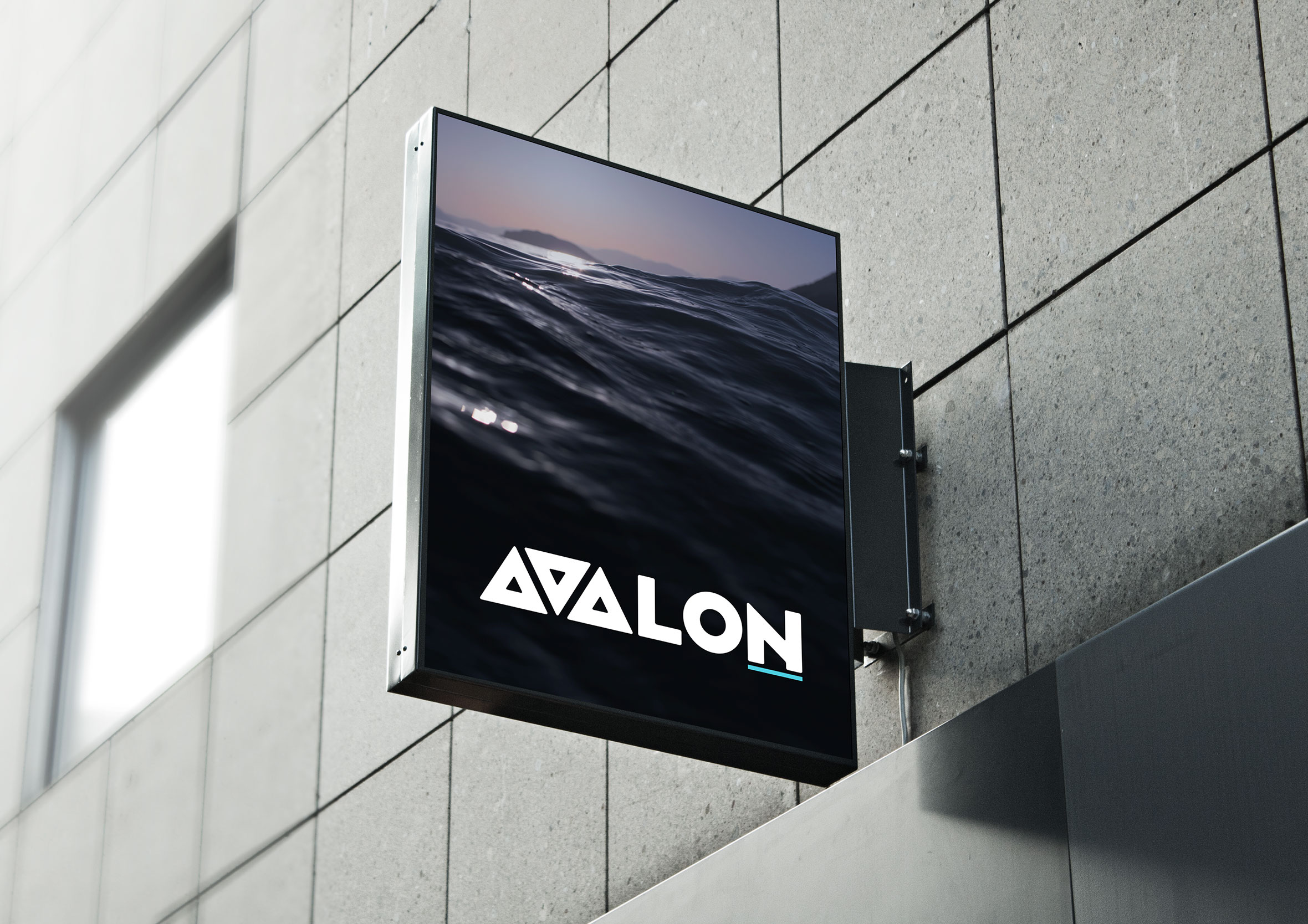
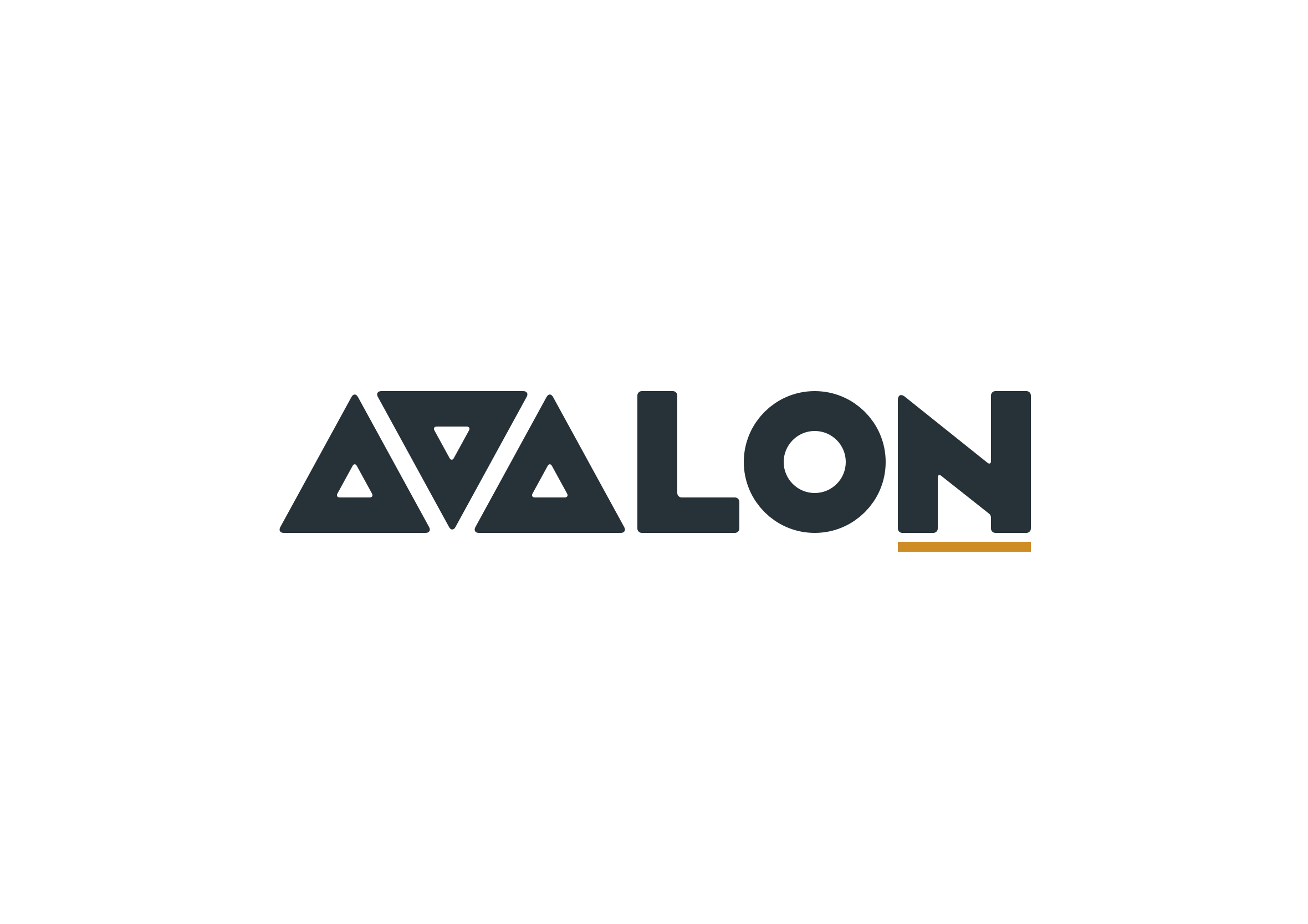
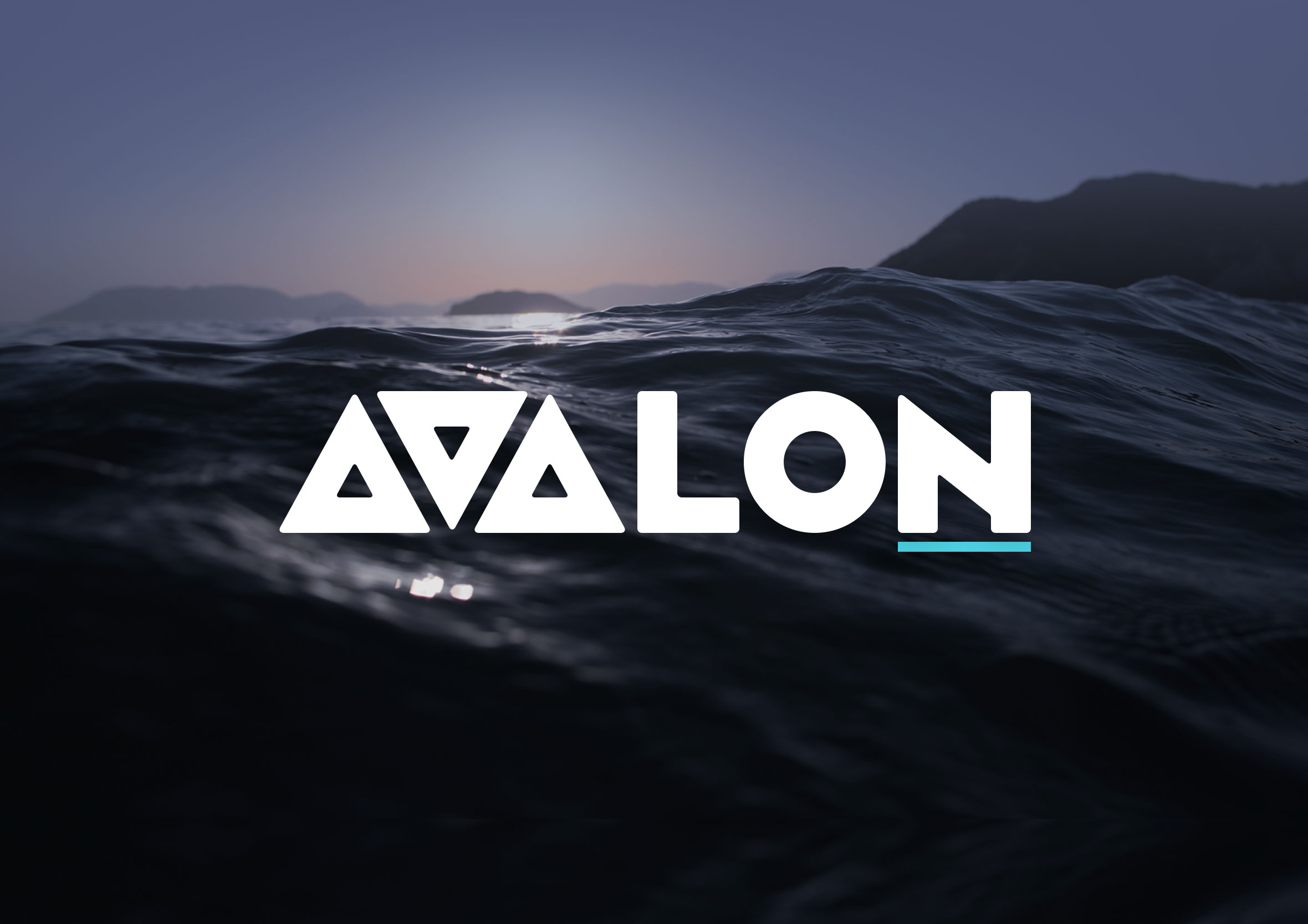
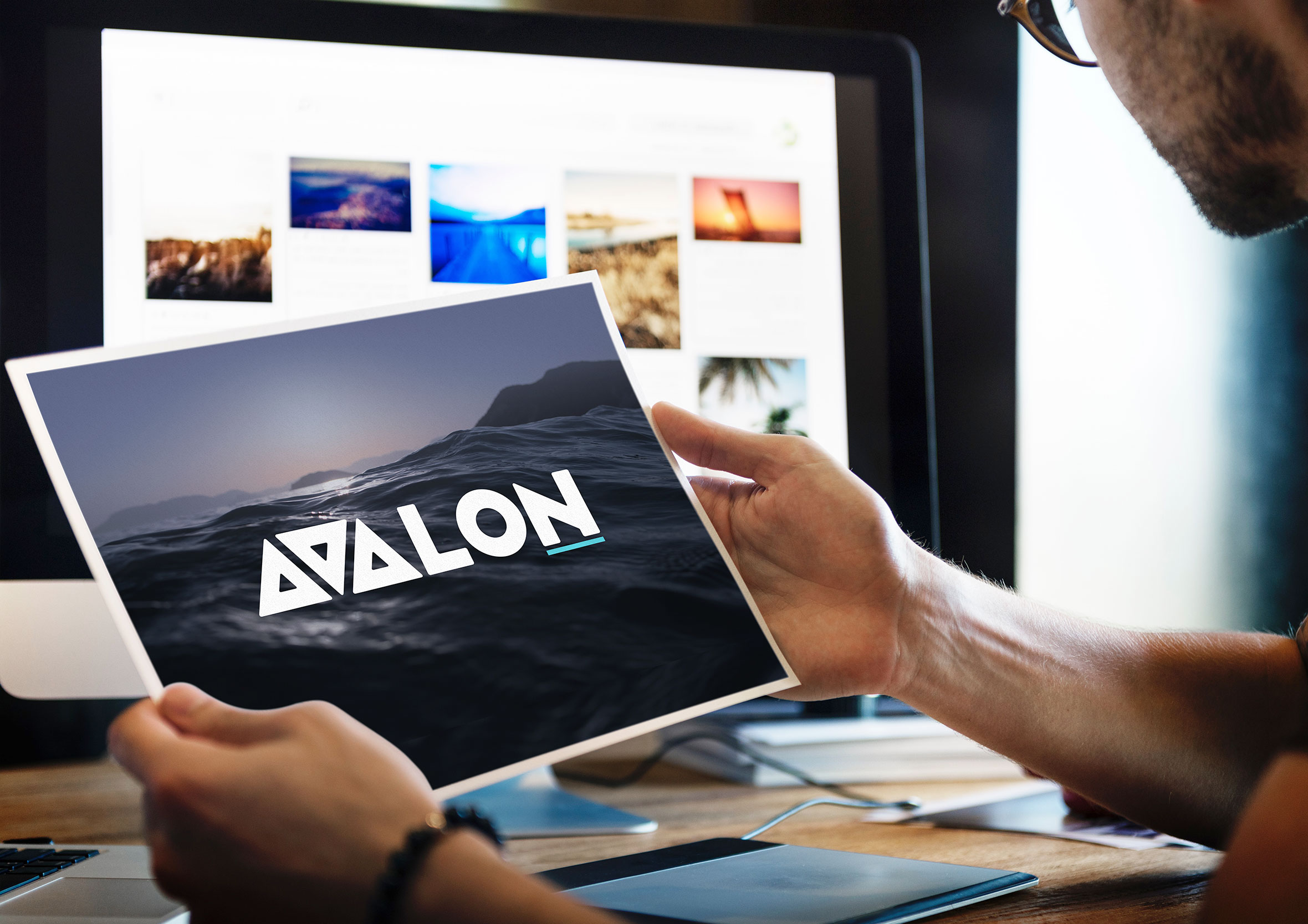
Avalon Consulting
Avalon Consulting is a Wellington-based strategy and advisory firm. For the logo I used a modified version of the typography side project I’d designed a few years earlier, adapting it into a clean geometric wordmark. What I like most about this one is the way the “A” and “V” interact. The shared diagonal feels intentional without being forced. A small orange underline adds a touch of warmth to an otherwise dark, structured mark.
P&T Painting
P&T Painting is a local interior and exterior painting company based in Wellington, with a strong reputation built largely on word of mouth. The brief was to create something professional and trustworthy without being generic. I landed on a hexagonal badge mark using a bold “PT” monogram. The shape gives it a sense of solidity and craftsmanship, and works well across signage, uniforms, and digital.
Australian Ropes Course Builders logo
ARCB is a Melbourne-based company that builds adventure and ropes courses. The design challenge was to find a way to embed meaning into the letterforms themselves. I used a modified version of the Handelbar font as the base and made the letters flow continuously, like a length of rope. The diamond inside the “C” acts as a bolt holding everything together. It’s one of those logos where the concept and the form are the same thing, which always feels satisfying.
We love to chat
We Love to Chat is an online customer support chatbot that helps businesses handle common queries automatically, freeing up support staff for more complex work. The logo needed to feel friendly and approachable without being too playful. A chat bubble with a heart centre was the natural direction: simple, warm, and immediately readable at any size.
Phone Backgrounds
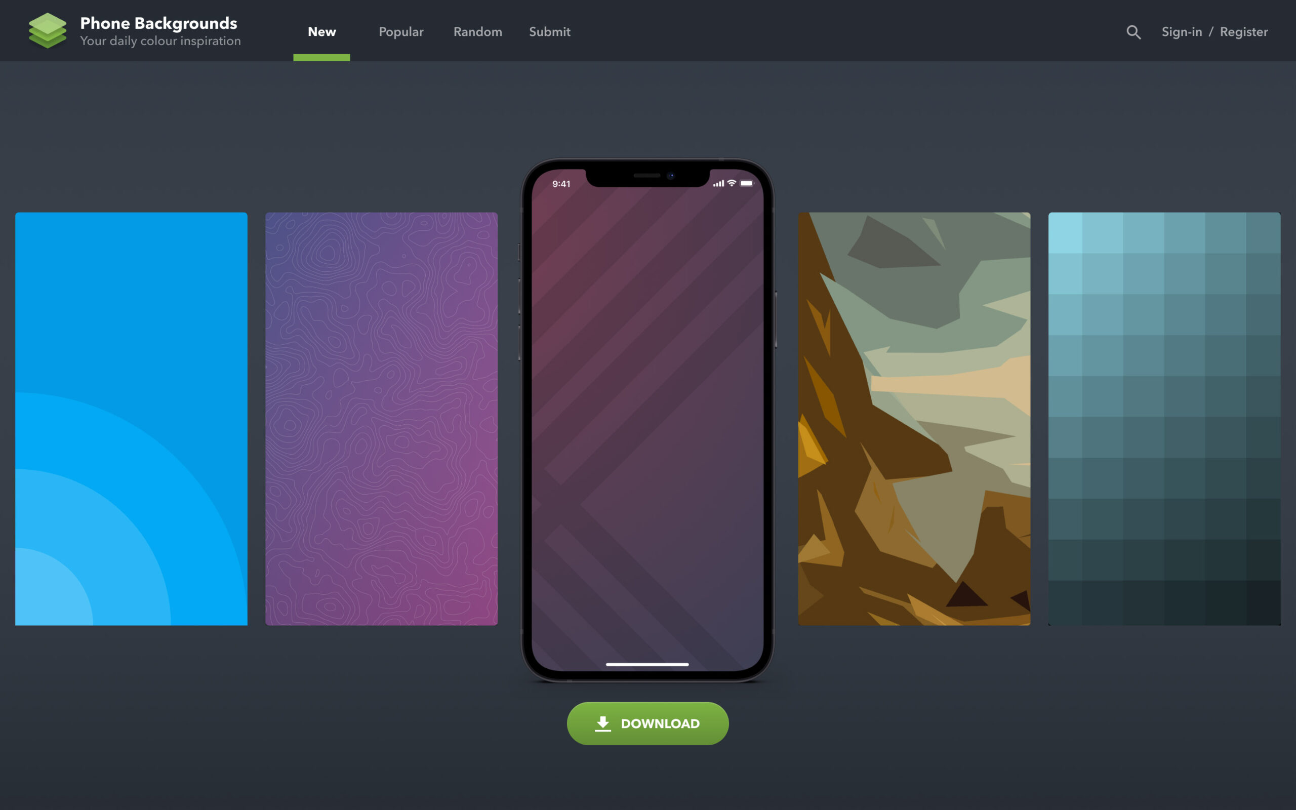
Phone Backgrounds is a free online resource for downloading, creating and sharing phone wallpaper patterns. The mark is a simple layered stack icon, representing multiple screens or layers. It reads well at small sizes and works in both light and dark contexts, which matters for an app that lives on the home screen.
Spaced logo
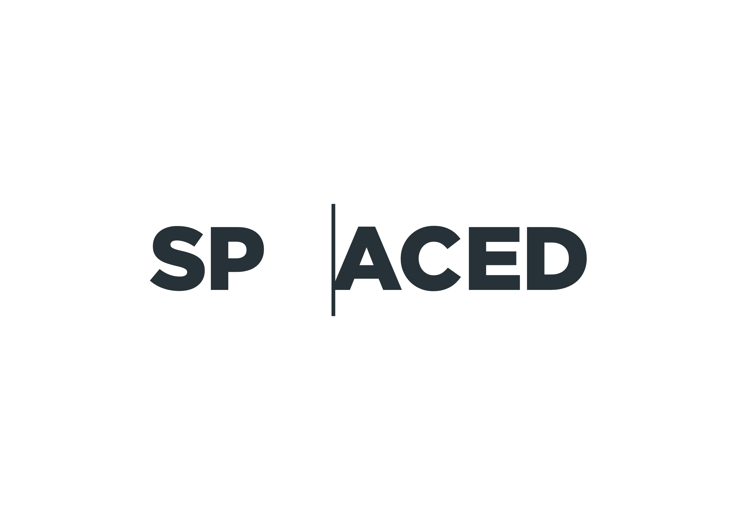
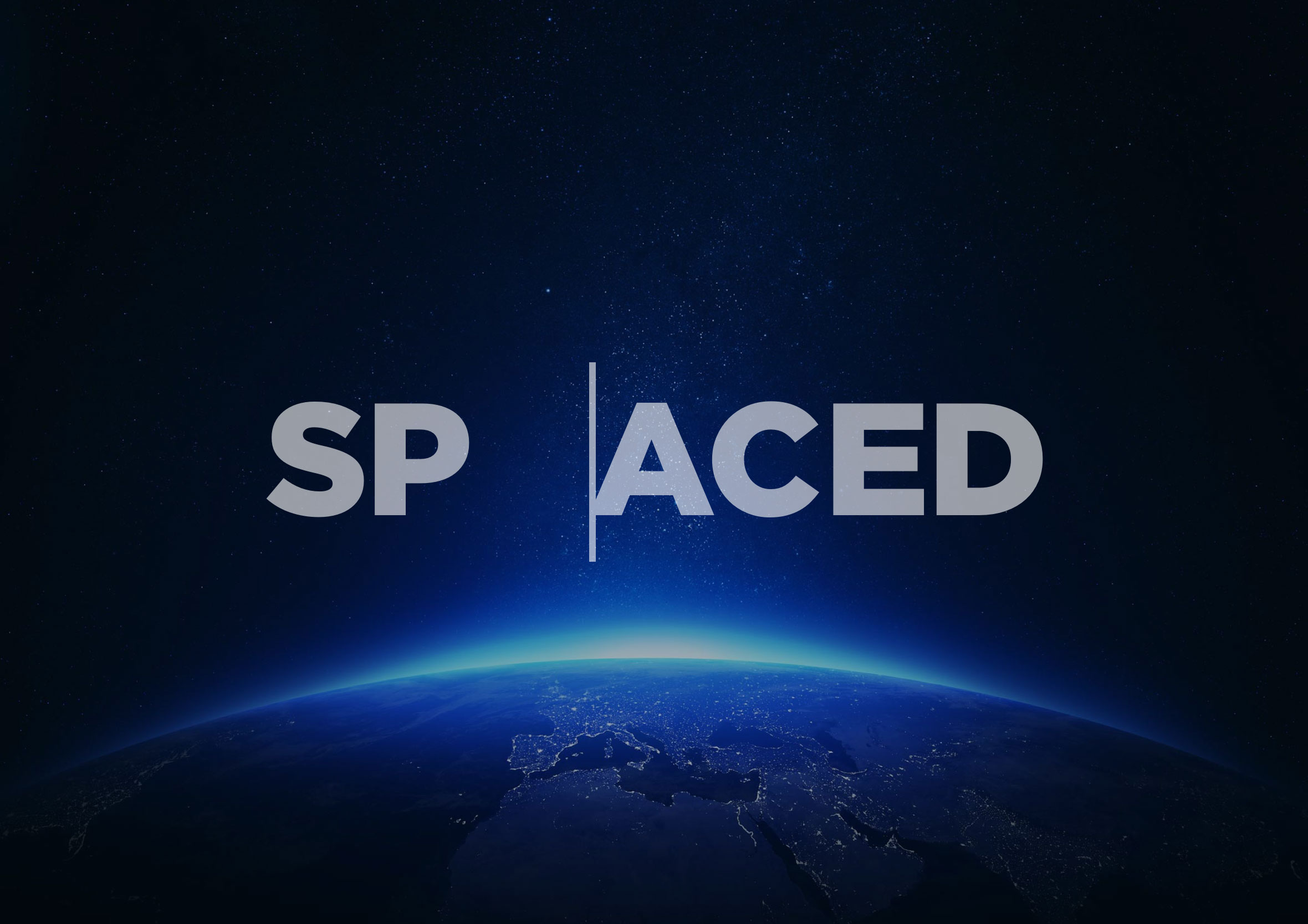
This one was for Dann Petty’s #SPACEDchallenge design competition. I wanted to create a minimal logotype where the concept was built directly into the typography. The solution was to split the word “SPACED” into “SP” and “ACED”, separated by a thin vertical rule, creating a visual gap that reflects the name. It started out as a throwaway sketch and I’m glad I pushed it further.
Grid Photography
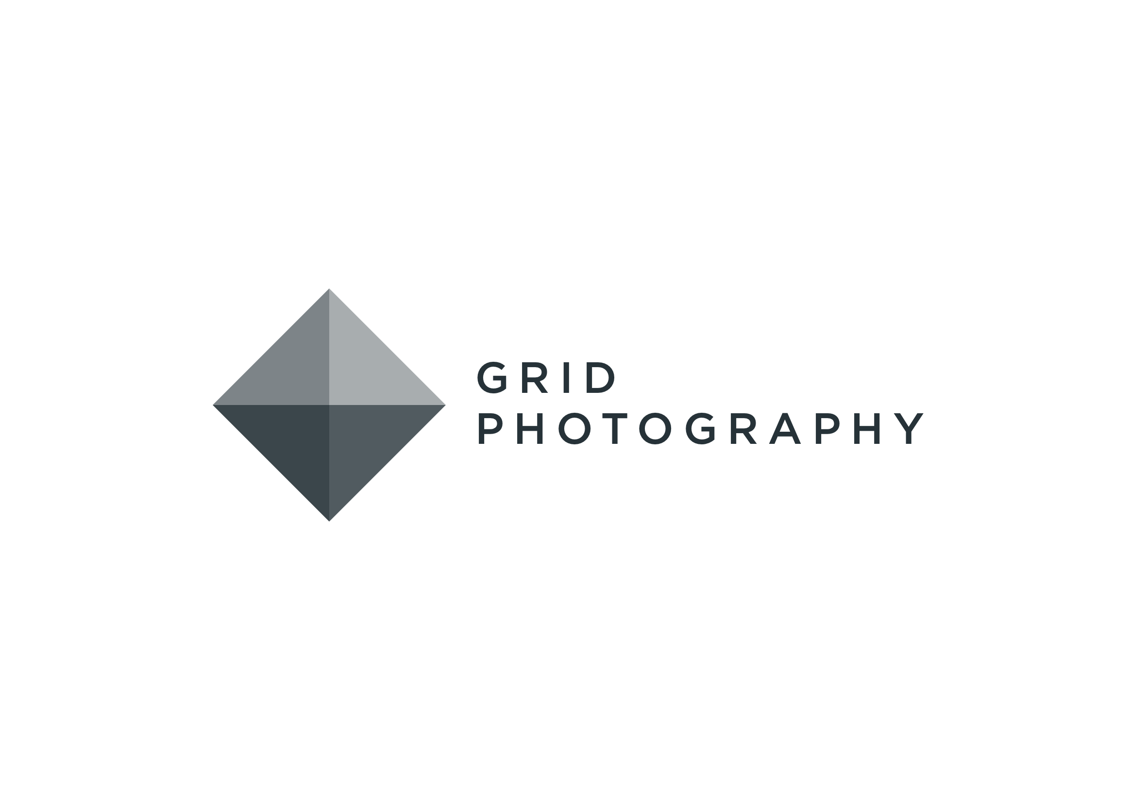
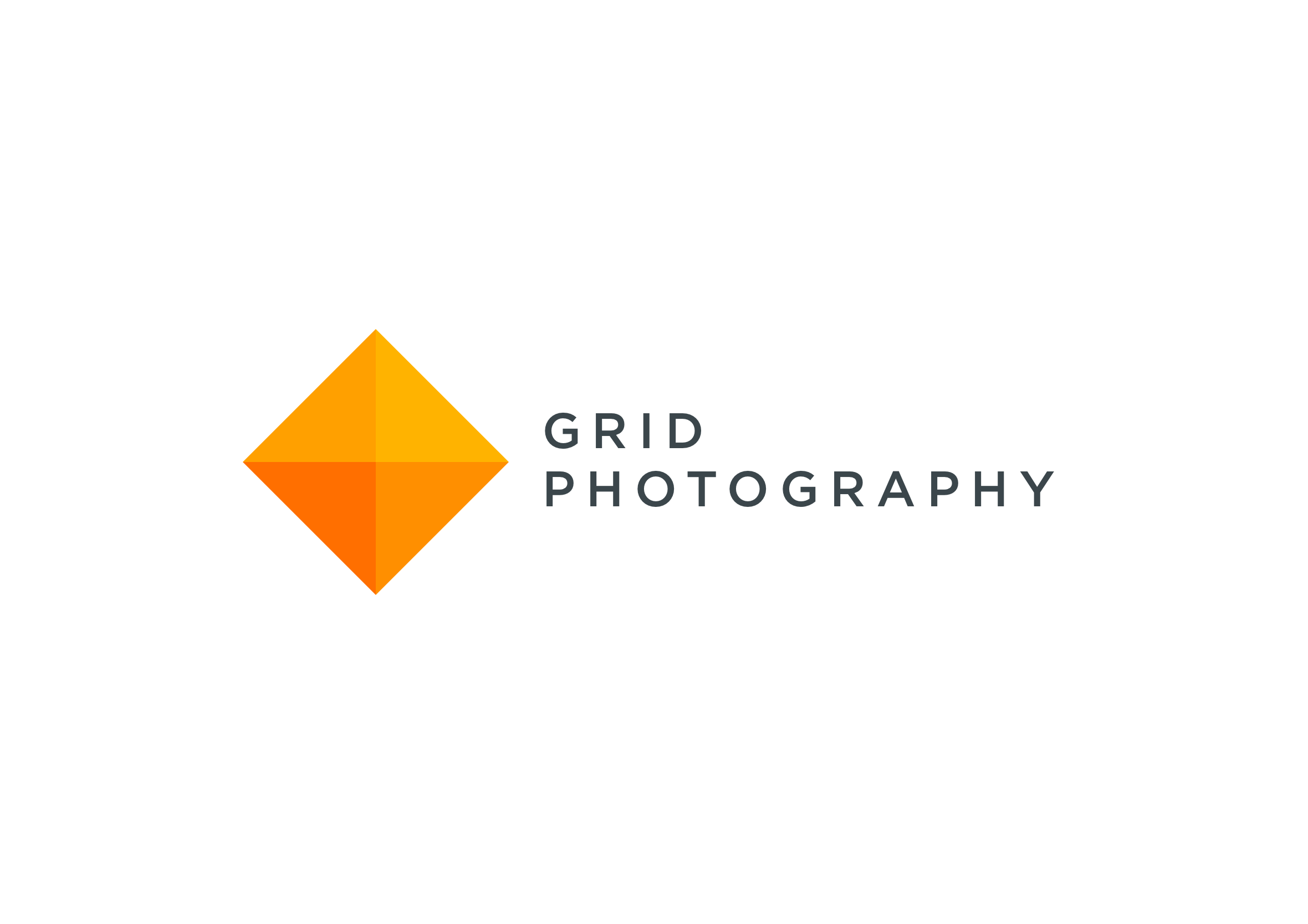
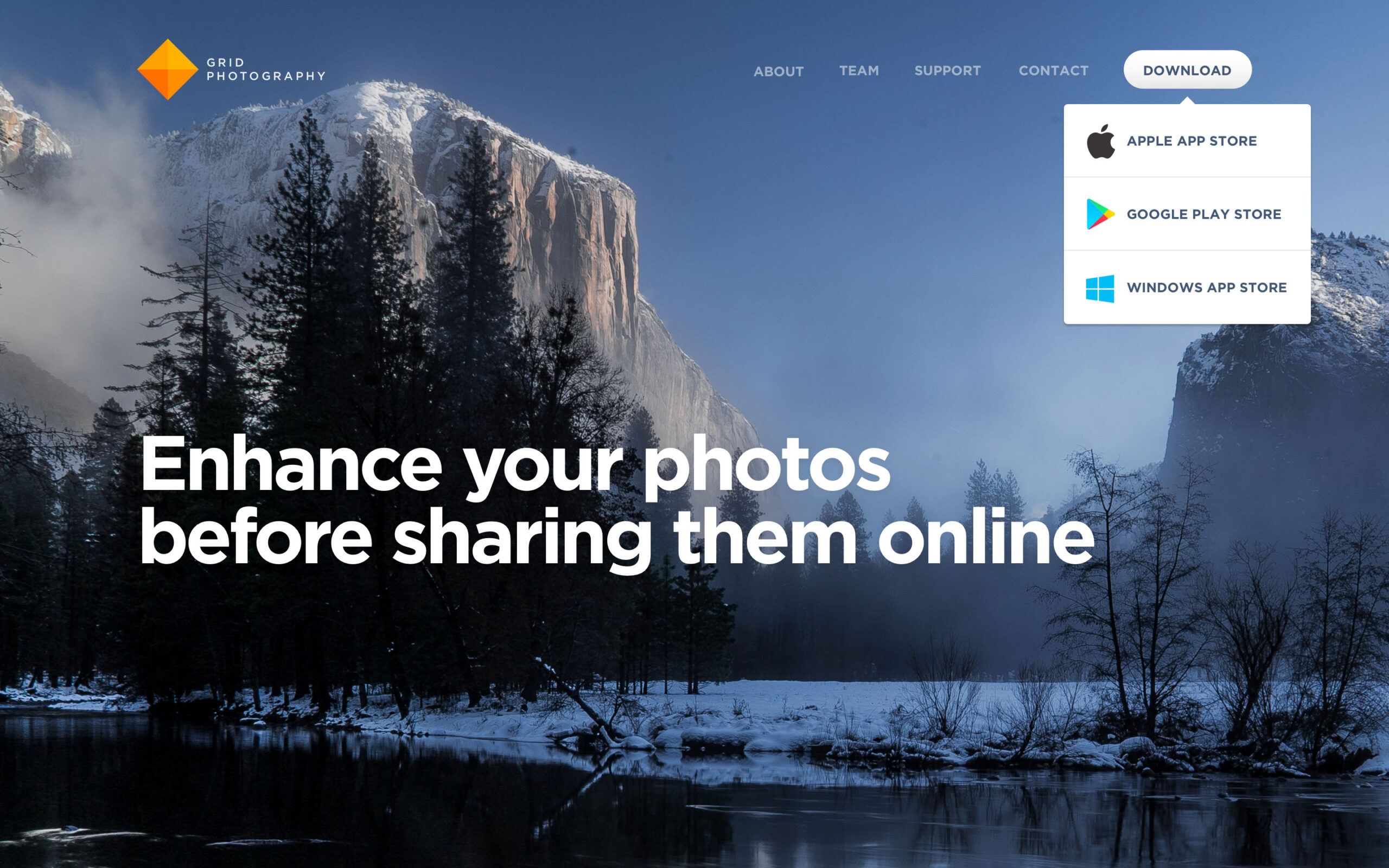
Grid Photography is a cross-platform app for iOS, Android, and Windows that helps users improve their photos before sharing them online. The logo uses a rotated square made of four triangular panels, each slightly different in tone to suggest light, depth, and layering. The geometric form ties back to the grid concept while keeping things clean and modern.
Travel Rewards
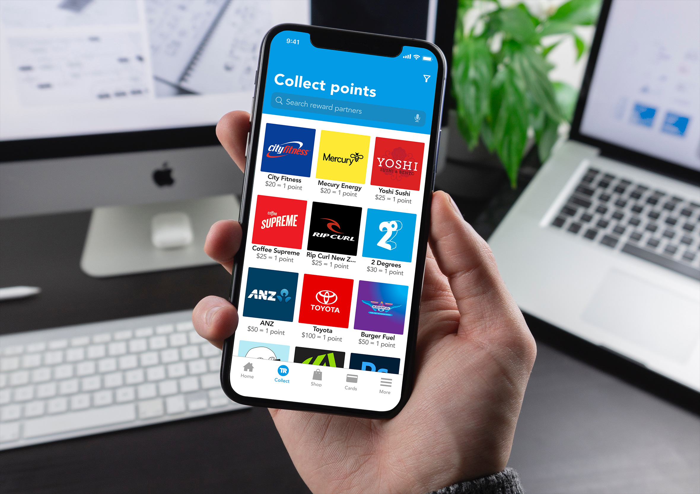
The Travel Rewards logo is an icon designed as part of a broader loyalty mobile app project. I wanted to create something that felt like a collectible coin, the kind you find in games that carries a perceived sense of value and makes people want to earn more. The circular badge with a monogram centre hits that note while staying professional enough for a fintech context.
Core Banking
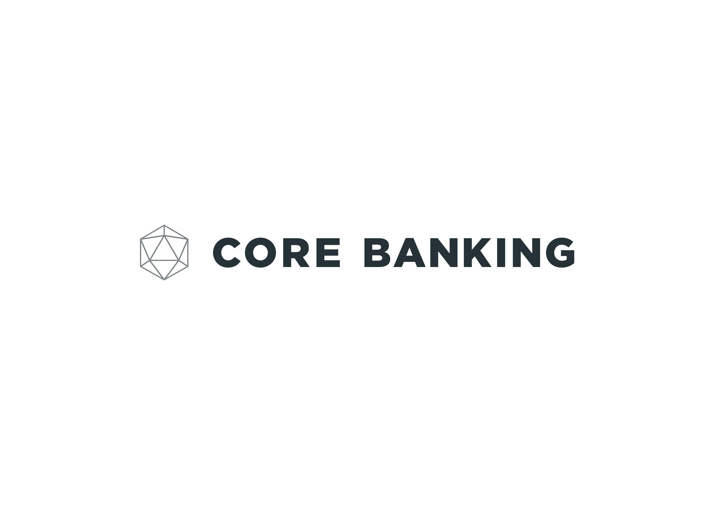
This one is connected to a broader product design project I worked on for a core banking app. I wanted a mark that felt simple on the surface, revealing more detail on closer inspection. Core banking covers balances, transfers, payments, and cards: the everyday financial interactions people have. The logo reflects that layered complexity beneath a clean exterior.
Tupperwhere, the silly logo I designed for fun
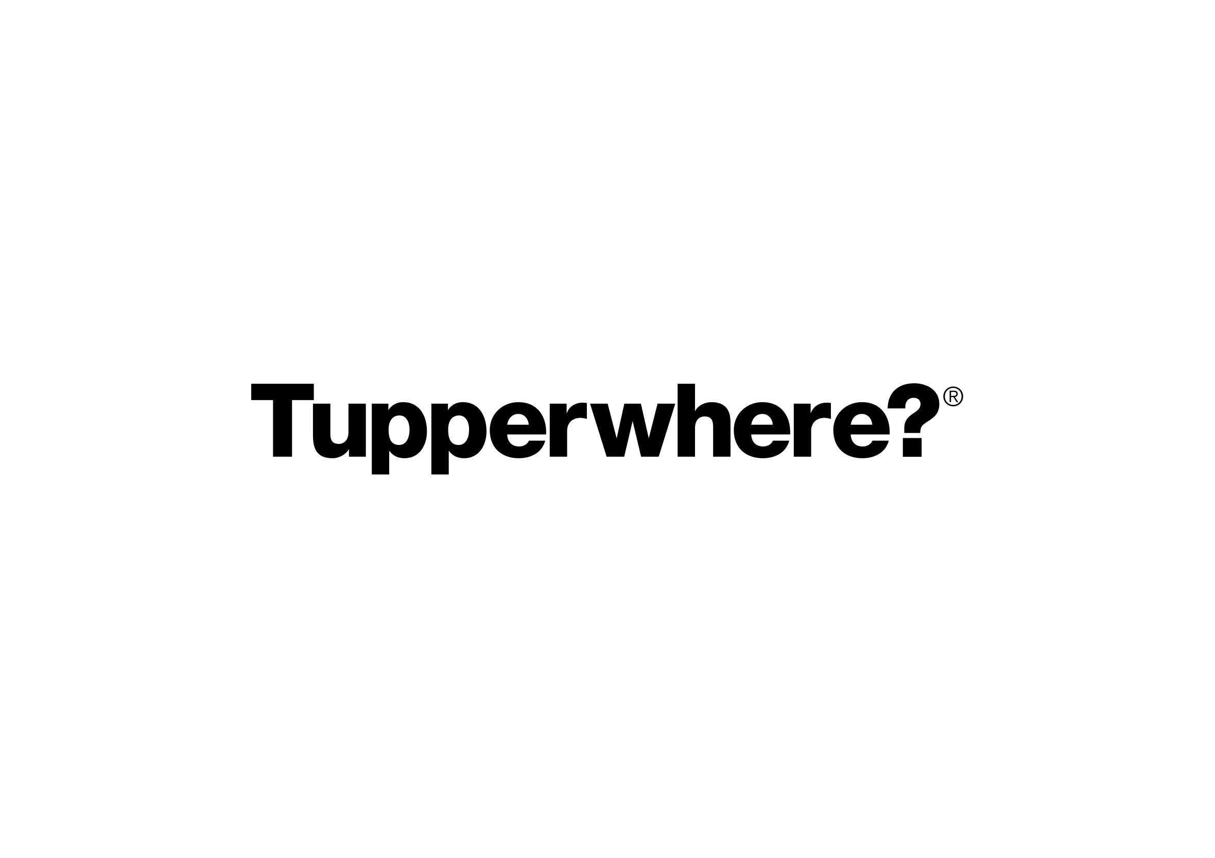
Not every logo needs a brief, a client, or a reason. Tupperwhere® started as a silly idea. I can never find a lid, so I ran with it. A Tupperware parody with nowhere to be. Sometimes the best creative work happens when there’s nothing at stake.
Looking for a logo designer?
Logo design isn’t a service I offer these days. There are designers who specialise in branding and identity, and they’re far more qualified than I am to take on that kind of work. If you’re looking for a recommendation, feel free to get in touch and I’d be happy to point you in the right direction.
More than a logo
Looking back over these designs, there’s a real mix of companies and industries. A local painting company, a ropes course builder, a concept travel app, and one logo I created purely to make myself laugh. That range is exactly why I still take on the odd branding project. It exercises a different creative muscle to UX/UI work, though it scratches the same itch of solving a problem with as few pieces as possible.
A couple of these projects went well beyond a logo. The Travel Rewards mark became the foundation for a complete behavioural design, and the layered Core Banking symbol evolved into a full minimal design.
That crossover is one of my favourite parts of the process. A good logo can influence everything that follows, from the visual language through to the overall user experience. If you’d like to see how those ideas evolve into complete digital products, my consumer product design includes the full case studies.