

Core Banking: Streamlined mobile banking app
Everyday banking, distilled to four things people actually use: balances, transfers, payments and cards. Speed over everything, a calm, transparent mobile banking app stripped back to what people open it for, nothing less.
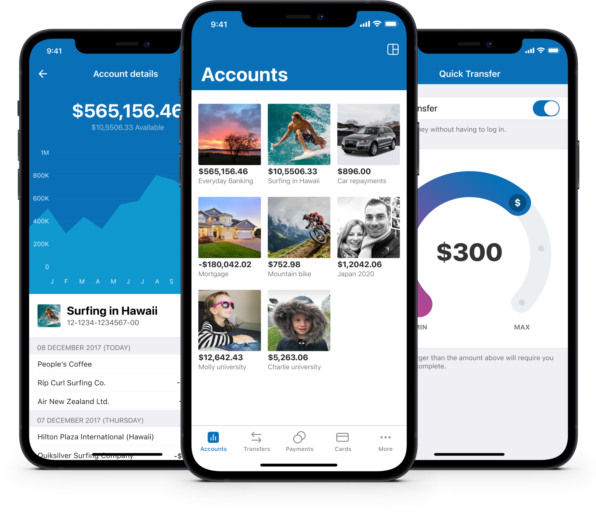
Streamlined mobile banking app, reimagined from the ground up
At its heart, Core Banking is a streamlined mobile banking app built around one idea: everything you need daily and nothing you don’t. Every banking app on the market seemed to be chasing the same goal, more features, more screens, more reasons to open the app. Core Banking went the other way, starting from a blank page and asking what actually earns a place in an everyday banking experience, then cutting everything else without sentiment. It was designed from the ground up to be super fast, stripping out anything not needed for everyday banking.
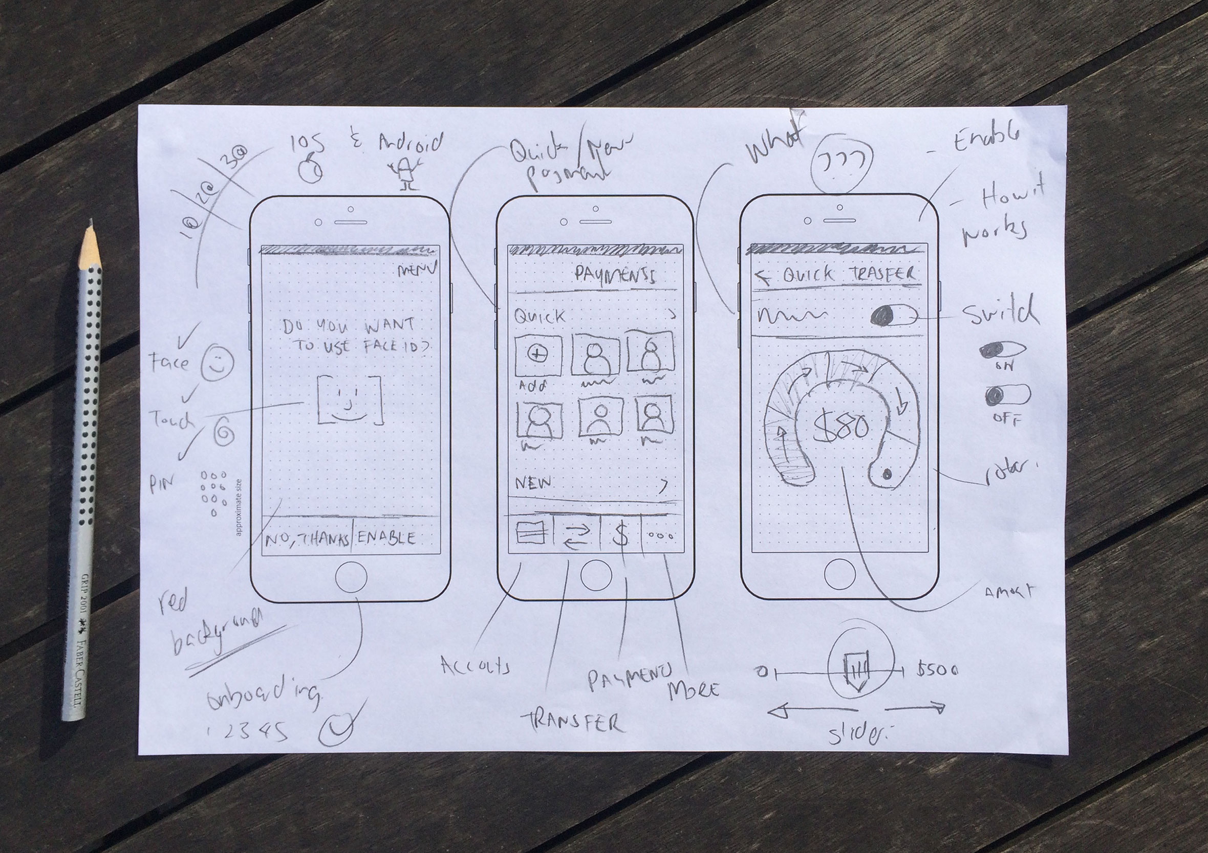
Concepts, brainstorming and sketching
When beginning a project and capturing ideas, I prefer to go low-fidelity and sketch with pen and paper to generate as many concepts as possible, exploring high-level ideas before investing too much time in the design phase. From there I’ll either produce wireframes or jump straight into prototyping to validate ideas and assumptions.
Wireframes, user flows and prototyping
Once I have a few concepts I want to push further and test, I’ll create simple wireframes to see how the screens interact and help inform user flows. From there, I build out interactive prototypes to click through and test the flow properly before any real screens get designed.

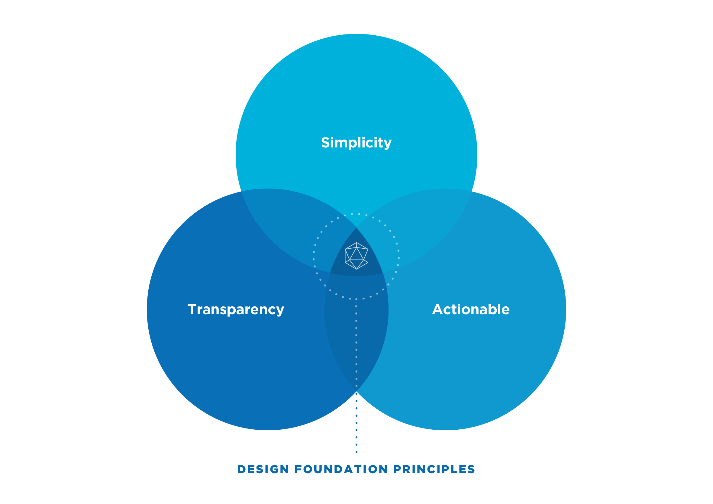
Simplicity, transparency and actionable next steps
At the beginning of the project, we agreed on three basic design principles to act as our north star when designing the user experience. We wanted the app to be easy to use, transparent (clear information on fees and interest rates), and to improve people’s financial literacy by making them feel informed and empowered about their personal finances. We also held ourselves to a simple rule: no dead ends. Every flow, however it played out, had to end with a clear next step or suggestion, never a screen that just left you wondering what to do next.
Each screen meticulously designed and validated
Every screen was built to work like a mini dashboard. Whatever you’re looking at, an account balance, a transaction, a savings goal, the information you need to make a decision or track your progress is right there, not buried behind another tap. No digging, no second-guessing where something lives, just a quick glance and you’re back to your day. Every screen was tested with real users before it shipped, not just reviewed internally, so what looks simple here actually held up when someone was trying to get something done.

Go to the people, usability testing and user interviews
Regular usability testing cycles were completed throughout the project. Most were done in the office using question and task-based scenarios to get customer insights and validate assumptions and concepts. To validate smaller design decisions, we headed out with a digital prototype, a short list of questions and chocolate to carry out guerrilla testing on the streets of Wellington, New Zealand.

180+ screens for both iOS and Android customers
Over 180 unique screens were designed for the Core Banking mobile app, and that was just for iOS! Additional screens were then adapted for Android users.

Safe, secure and streamlined access to your banking data
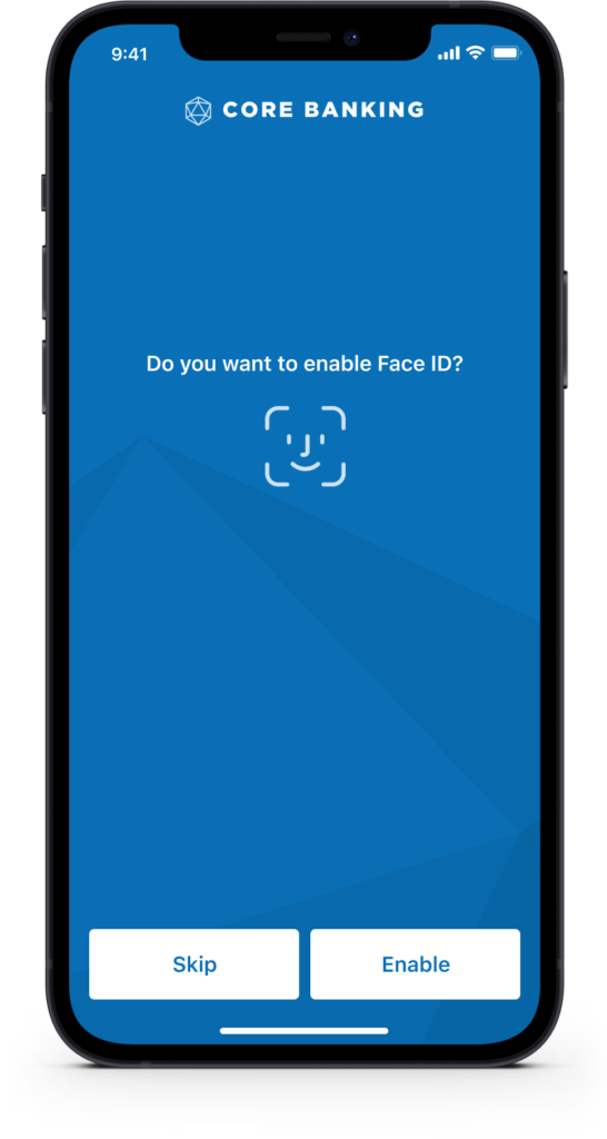
Getting into your banking app shouldn’t feel like a security risk or a hassle. We included support for Face ID and Touch ID (biometrics) and PIN, safer than a password and faster too, with a fallback to username and password if you need it.

Customise layouts and personalise with photos
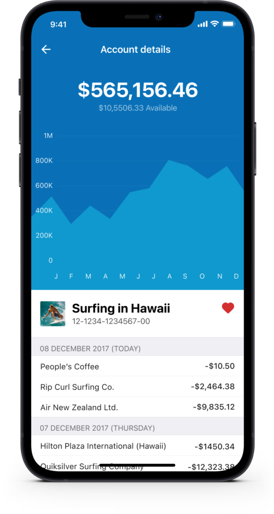
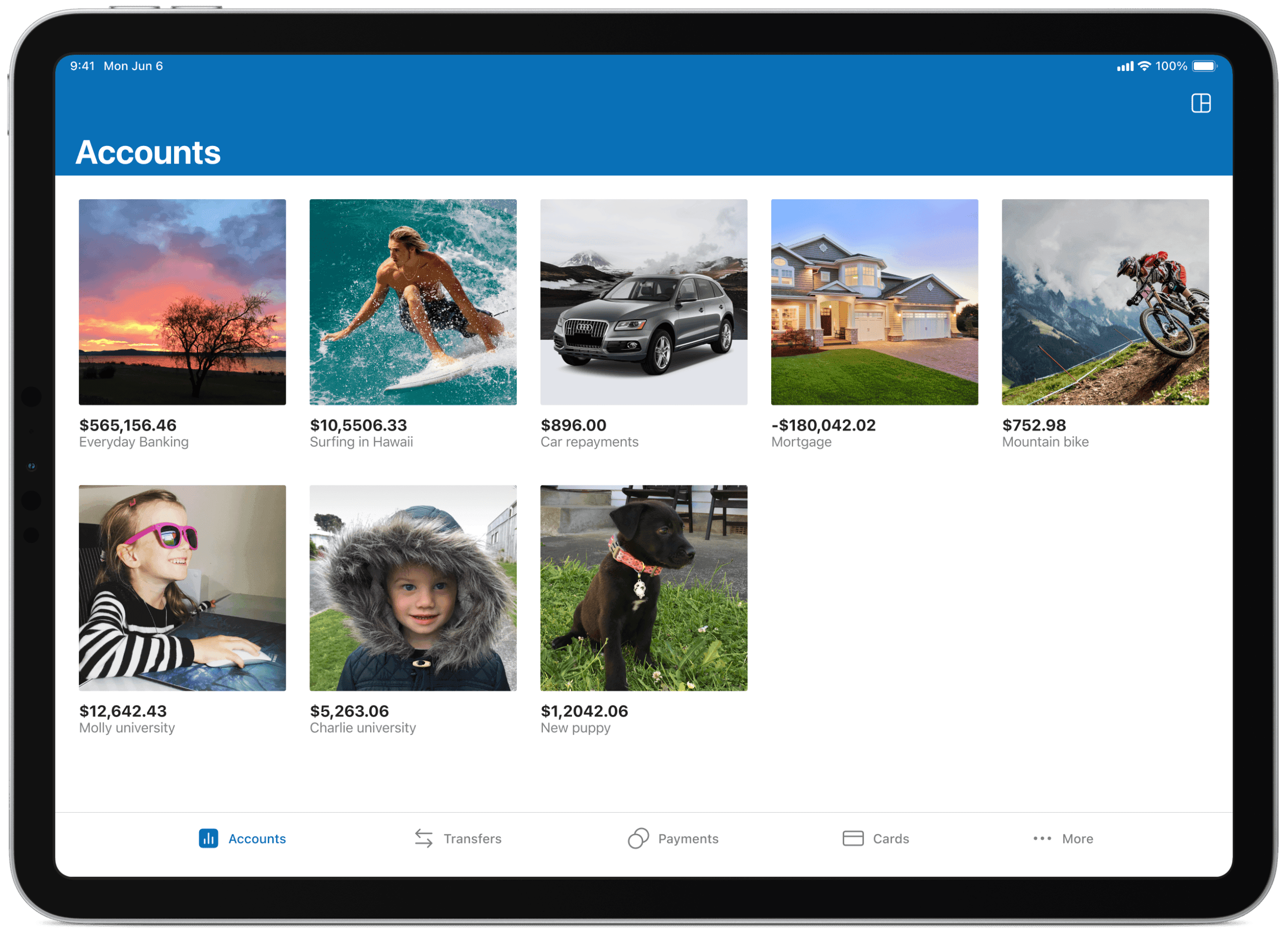
By giving users the ability to customise certain aspects of the app, we hand them a little more control over the information they’d like to see. Options include the ability to reorder accounts, change the view, choose whether to display both balances and available balances, and set a personal photo against each account or savings goal to make it feel like theirs.


Let the numbers tell the real story
We looked at large imagery (goals and moods), data visualisation and the ability to pin accounts you use most frequently so they’re easier to find and interact with. Graphs give a great indication of how well you’re tracking, and imagery is a constant reminder of the financial goals people are working towards.

Power-ups with budgets
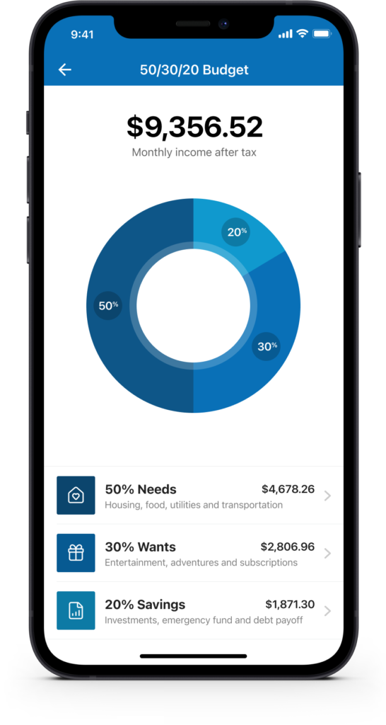
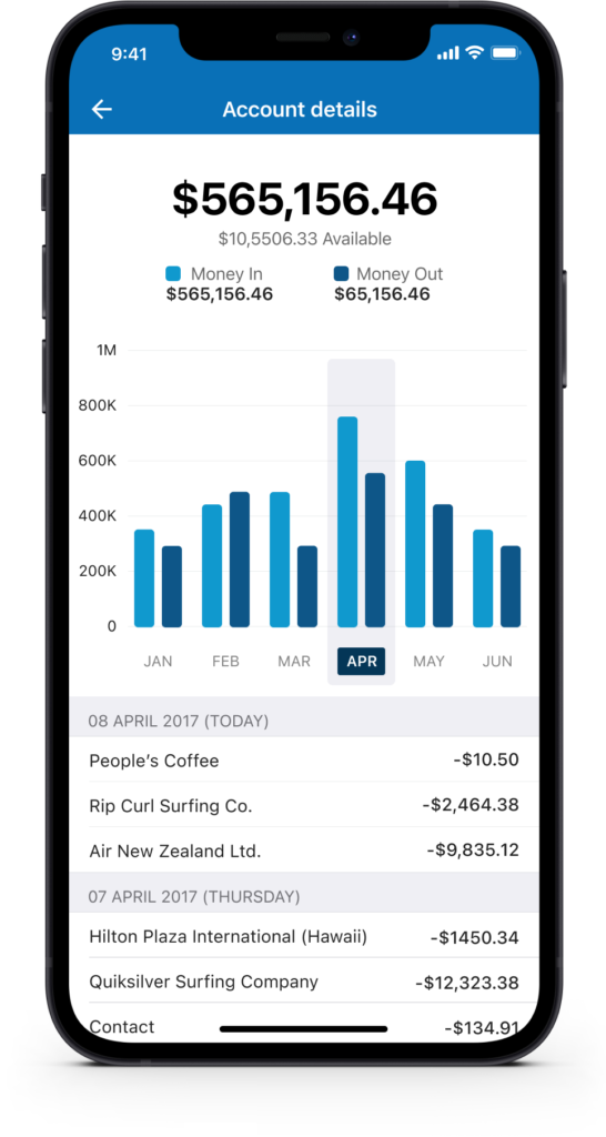
Knowing where your money goes is just as important as managing it. The account detail view breaks down spending month by month with a clear bar chart and a dated transaction list below. The 50/30/20 budget tool automatically splits take-home income into needs, wants and savings, a framework popularised by Elizabeth Warren in her book “All Your Worth”, giving users a practical structure without needing any financial expertise. Small as it sounds, that one shift, seeing exactly where thirty seconds of budgeting gets you, is what turns budgeting from a chore into something closer to a quick win. The same behavioural design thinking shows up in Travel Rewards, where a visible points balance does the same job of making progress feel real.
Quick transfer and multiple transfers on the fly
Users can quickly transfer money between accounts without having to log in if they choose. They can also complete multiple transfers (bulk transfers) from one account in a single go.


Payments and manage people and cards
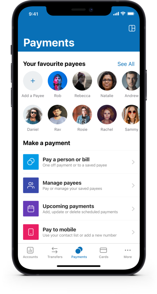
During user research, we discovered that most people pay a handful of payees on a regular basis. We surfaced favourite payees to speed up this process in the form of “Quick Payees.” We also gave people the ability to manage their cards in the event they misplace their wallet or have it stolen.
Card control and visual transaction history
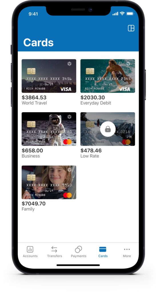
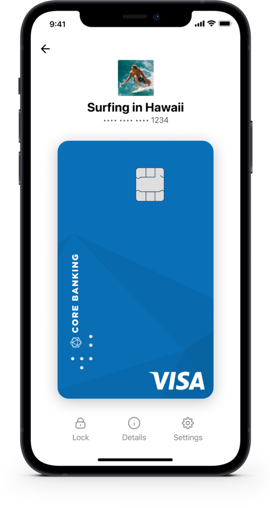
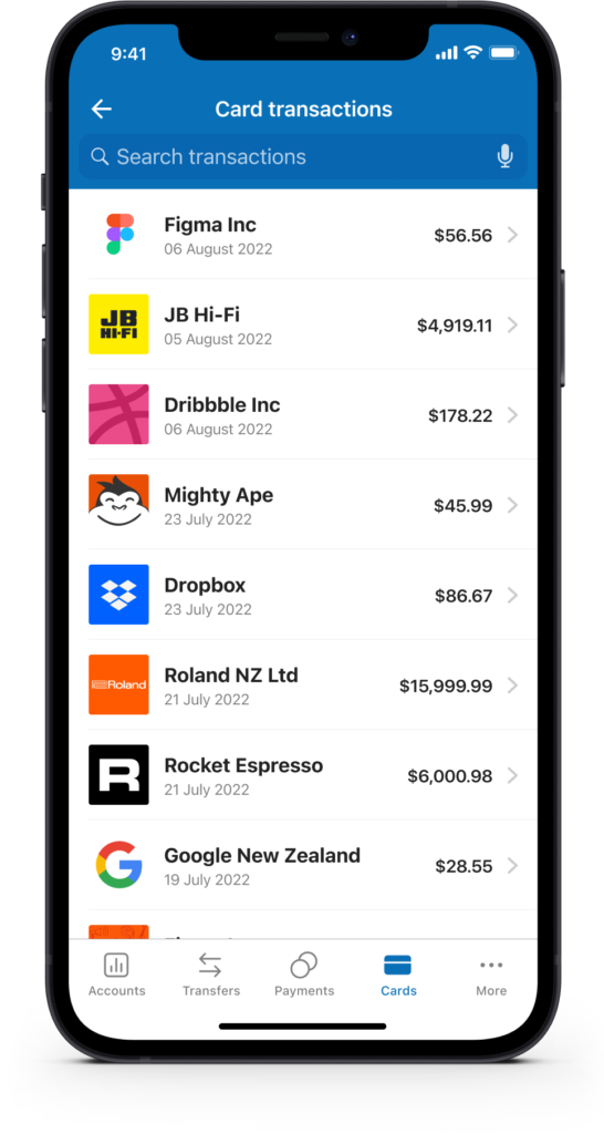
You’re in complete control of your card and finances. Every transaction shows up as a visual, categorised history rather than a plain list, so a glance is usually enough to spot anything unusual. You can also show and hide account balances and limits, lock and unlock cards, and use other card controls to help prevent fraud or manage a misplaced card.
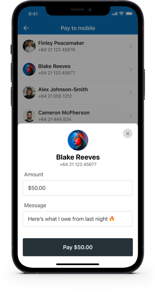
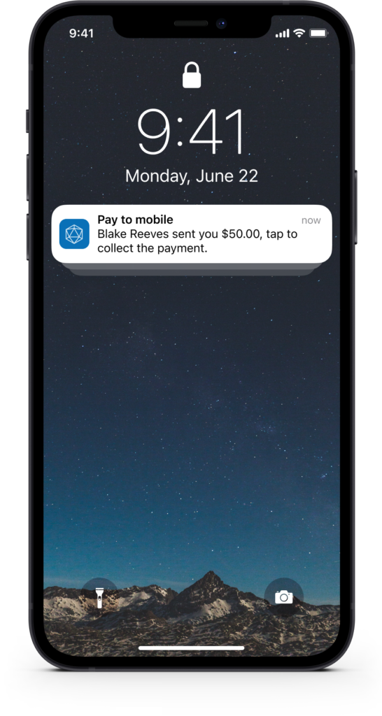
Easily send money using just a mobile number
Send money directly to a mobile number for the recipient to collect. This removes the need to know someone’s bank account details and lets you include a personalised message too.
Customer feedback and metrics
Every decision on this project came back to the same question: what does the customer actually need right now? To stay close to that, we made a habit of asking for feedback right after someone interacted with a feature, rather than weeks later in a generic survey. It’s a great way to validate whether a feature actually solved the problem, and a natural way to find willing participants for future usability testing too.


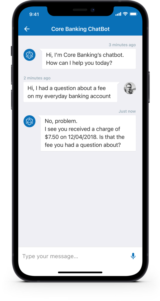
Financial advisor in your pocket
The ability to self-serve and get answers to frequently asked questions, with context around their activity, helps reduce calls and emails to the bank and gets people the answers they need faster. Enabling the iOS widget also lets users check balances with a quick swipe to reveal the widgets screen.

Prefer a bigger screen? We’ve got you covered
Sometimes banking is just easier on a larger screen. The design system adjusts automatically and scales proportionally to accommodate people who prefer to get things done on their iPad, in whatever orientation they’re holding it. Landscape or portrait, it adjusts to how you want to work.
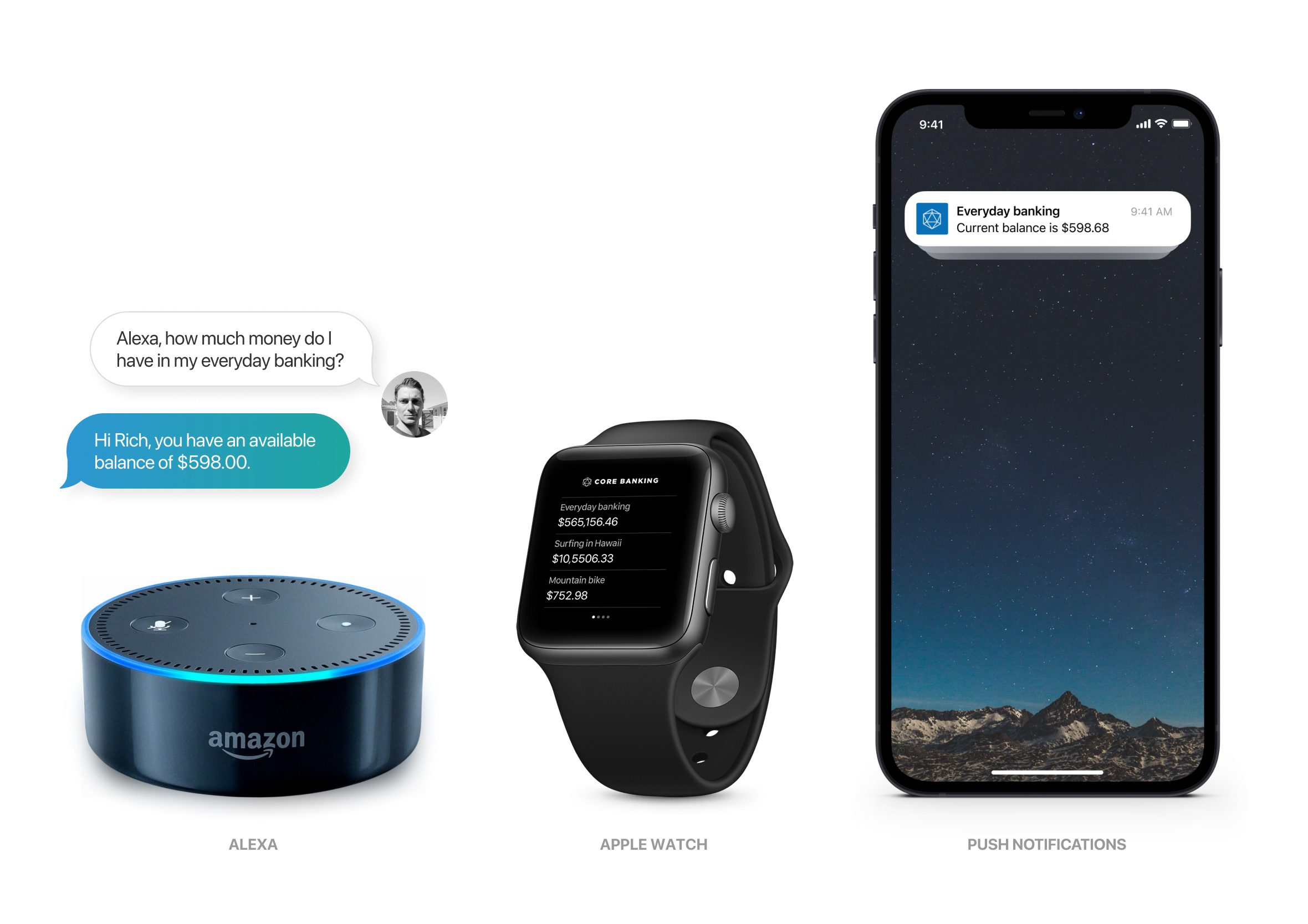
Did I get paid? How much money do I have left?
Analytics showed that 80% of app activity is simply people checking their balance to make sure they have enough money. I challenged myself to come up with as many concepts as possible to make that repetitive task faster and less painful. There are some clear concerns around privacy and legal considerations that would need to be worked through, though it was a great exercise to experiment with.
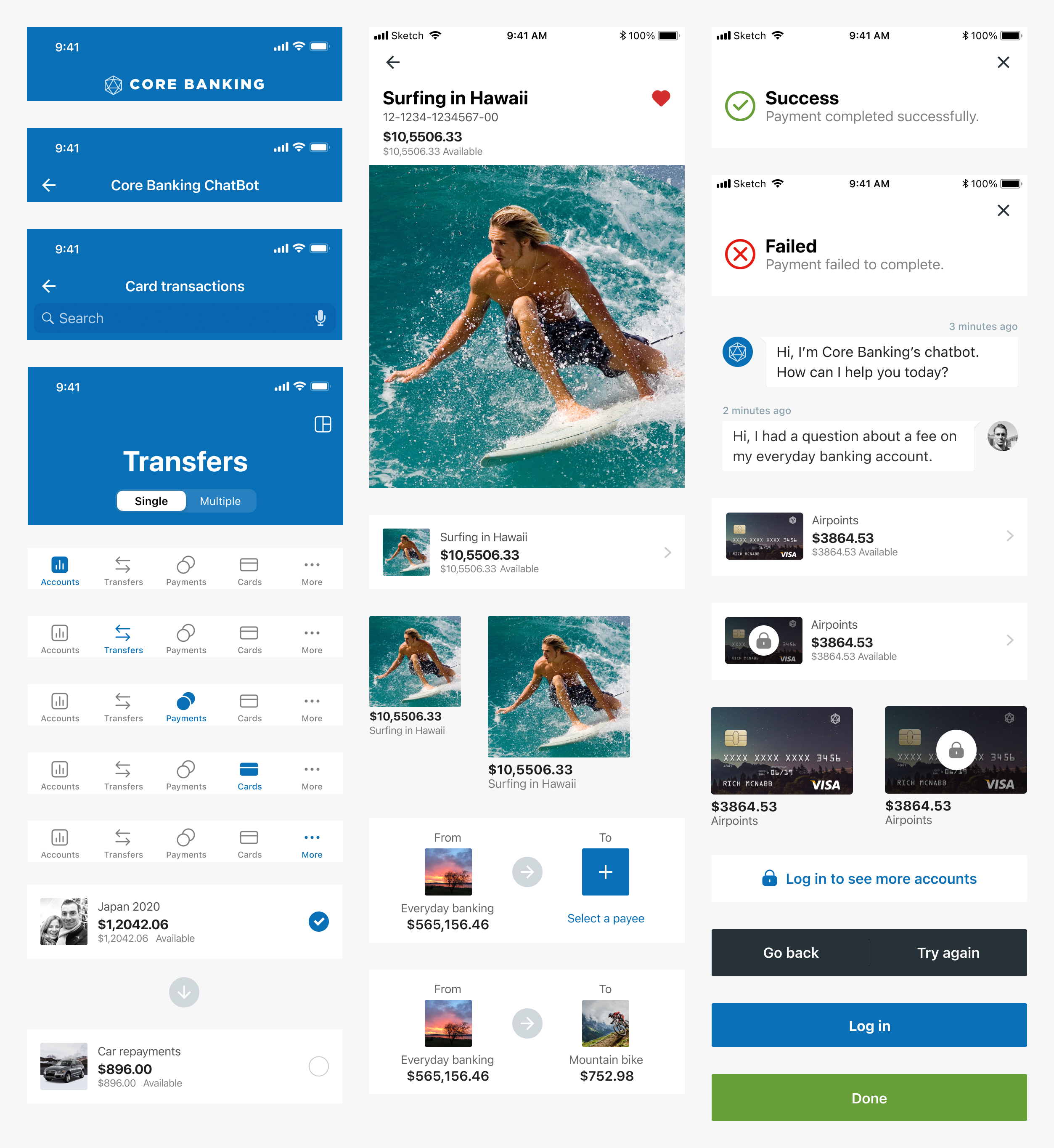
Design system and pattern library
Every user interface component was designed using the “Atomic Design” approach recommended by Brad Frost. Elements are reusable to speed up both design and delivery, ensuring fast turnaround times and getting updates into the hands of users sooner.
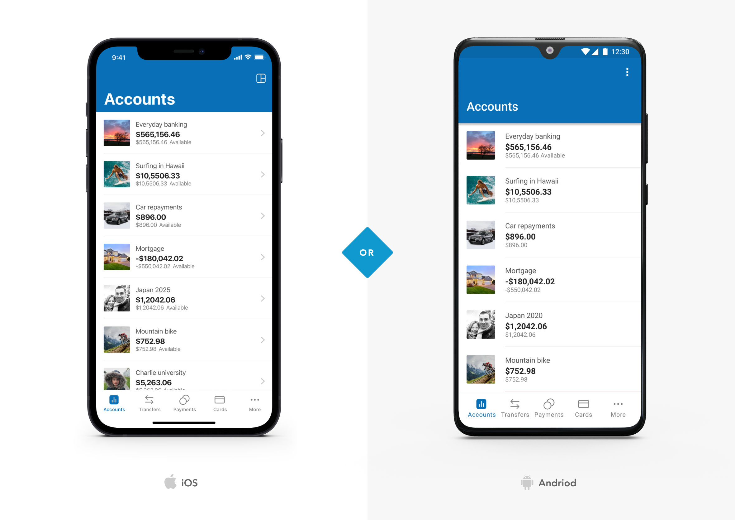
Designed in harmony and play to each platform’s strengths
Throughout the design process I was constantly thinking about how the app would look and work across the wider ecosystem, covering iOS, Android and web. The core UI would remain consistent, though we’d play to the strengths of each platform to make it feel native and cohesive.
The Harley Davidson “Chopper” approach to banking
There’s an old motorcycle culture built entirely around one obsession: speed above everything else. Choppers from the 1950s and 60s got stripped down to almost nothing, fenders gone, mirrors gone, even the front brake pulled off entirely, anything that added weight without adding speed got cut, no matter how important it looked on paper. Core Banking got built with that same ruthlessness.
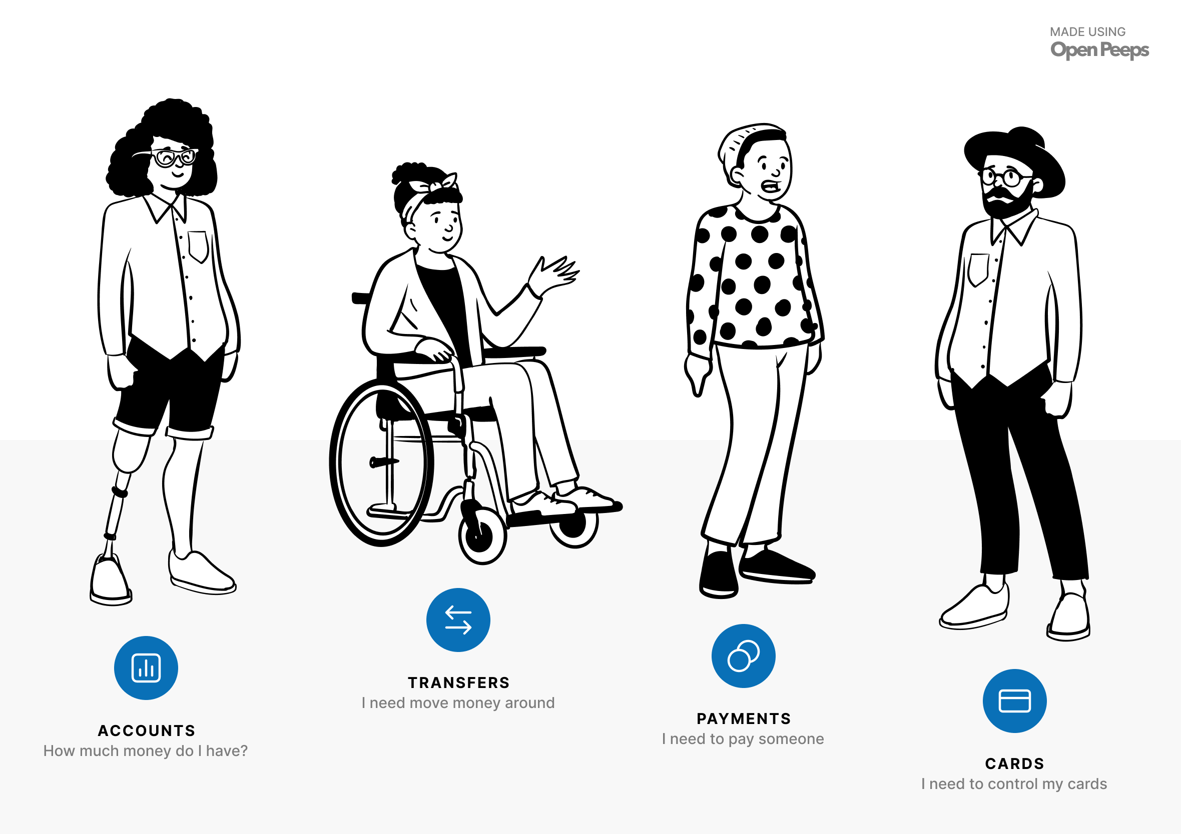
Every feature had to justify its place against four questions people actually ask about their money daily. How much do I have? That’s Accounts. Need to move money around? That’s Transfers. Need to pay a bill or someone you owe? That’s Payments. I need to control my cards, that’s Cards. Mortgages, despite how significant they are, didn’t make the cut. Important, yes, though not something anyone’s opening a banking app to check on a random Wednesday.


What that discipline looked like in practice
This wasn’t just a nice idea we talked about once in a pitch deck, it became our actual design brief. Whenever another department came to us wanting a new feature added, the question was always the same: does this align with one of the four pillars? If yes, we’d genuinely look into it. If not, it was noise, and it didn’t get past that conversation. Before launch, I created a series of mockups for the marketing team to use across email, Facebook and Twitter, to help promote the new app and drive early adoption.
That same pursuit of speed carried into how it was actually built. Every interaction was tuned to feel instant, and the app was built using purely native iOS and Android components rather than a cross-platform framework, which meant faster build times and a set of accessibility benefits that came built in, not bolted on after the fact.

No-one wants to lose hours inside a banking app. What people actually want is something short, focused and, strange as it sounds for something built around money, emotional and empowering. So we tried to get out of the way and let people get on with their day. If part of that meant getting a little better with money along the way, even better, transparency was built in from the start specifically to help improve people’s financial literacy, not just their balance.
That same instinct, cutting until only the essential remains, shows up again in StrategyBlocks, where a genuinely complex onboarding flow needed the same kind of restraint to feel simple for a first-time user.
