Design process behind creating two geometric typefaces
Two free geometric fonts built 30 minutes at a time. One inspired by modular Lego-like shapes, the other by Herbert Bayer's 1925 universal typeface, both released free to download, use, and adapt for personal or commercial work.
Download and use however you wish
Both fonts are available as free downloads for personal and commercial use. If you do something interesting with them, I’d love to see it.
Built in 30 minute bursts, without overthinking it
This started after reading an article by David Wehmeyer called One Year of Design. The idea was simple: spend at least 30 minutes a day creating something, and let consistency do the heavy lifting over time.
That idea stuck with me, so I adapted it into my own version called 30 Minutes to Mars. A simple rule: 30 minutes at a time, no pressure to finish anything in one sitting. That constraint ended up shaping everything.
What started as a small side project gradually turned into two geometric typefaces, each following the same rule while going in slightly different directions.
Typography had been something I’d wanted to spend more time on for a while, alongside other typography side projects. A full typeface always felt like a big lift, breaking it into small sessions made it feel more approachable though.
I didn’t plan for it to become two fonts. That’s just how it unfolded.
30 Minutes to Mars font
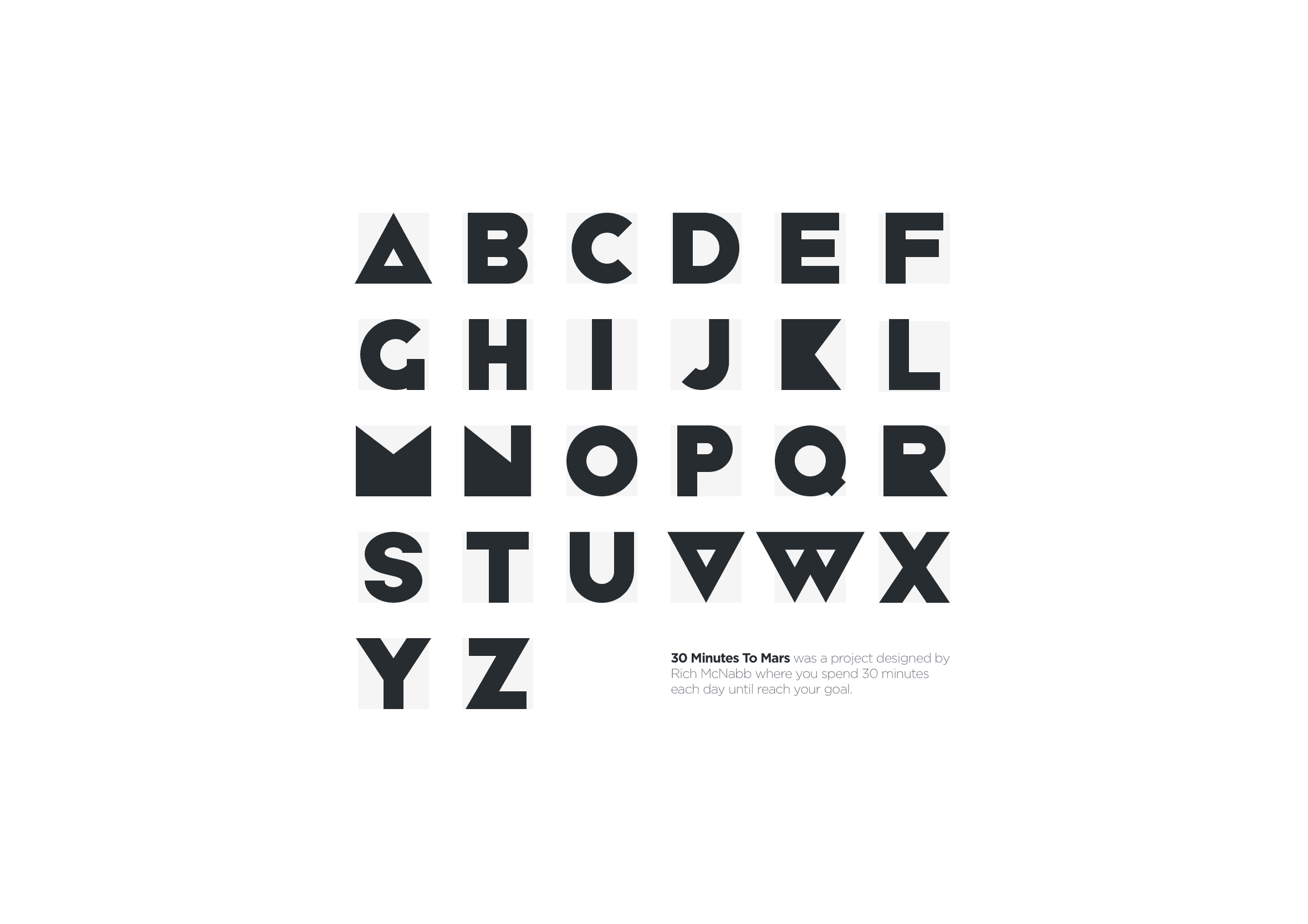
The first font started with a simple constraint.
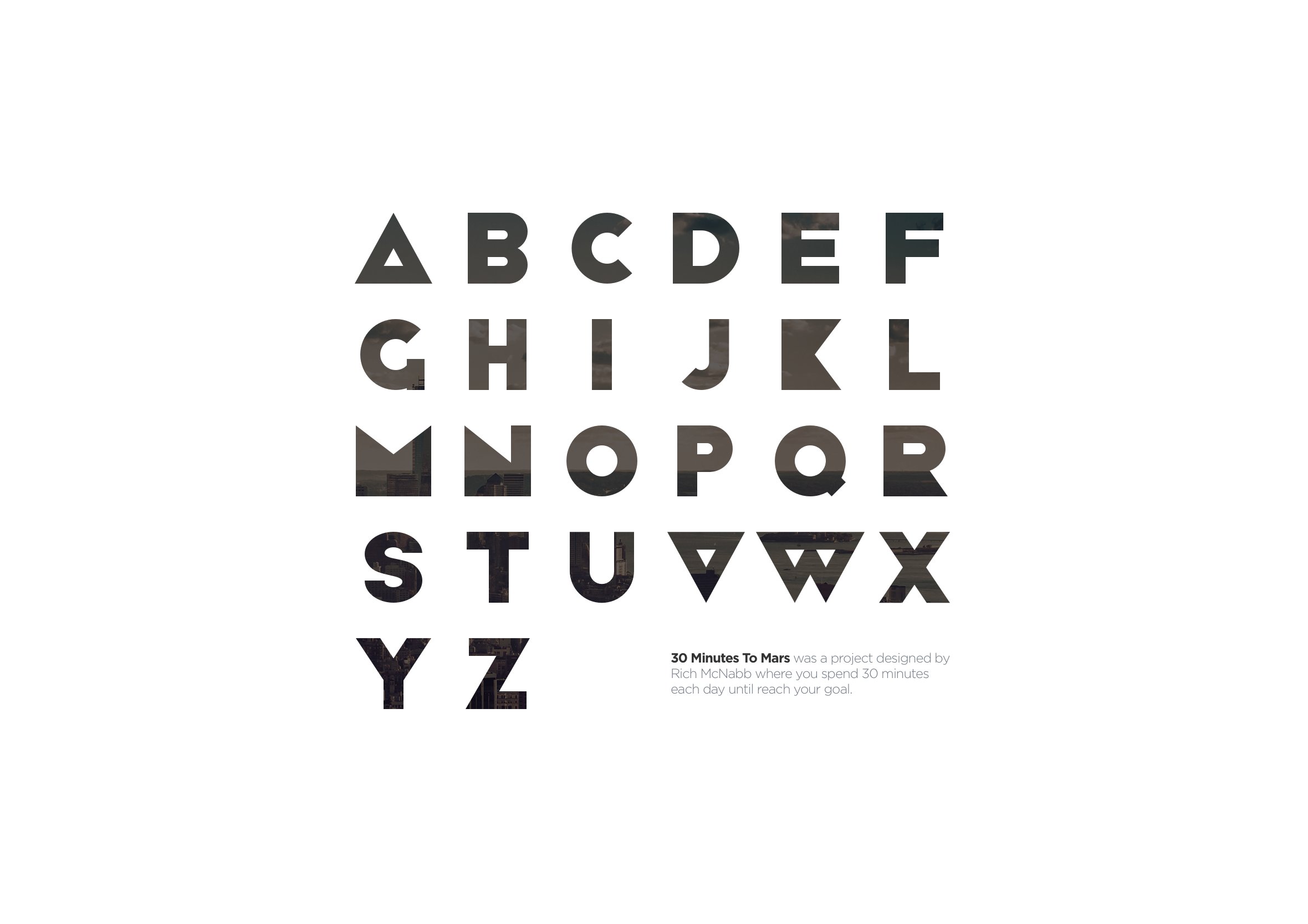
Every letter had to be built from the same set of geometric shapes, assembled like Lego pieces. A consistent bounding box kept everything locked to the same grid, which gave the system structure even as the forms became more complex.
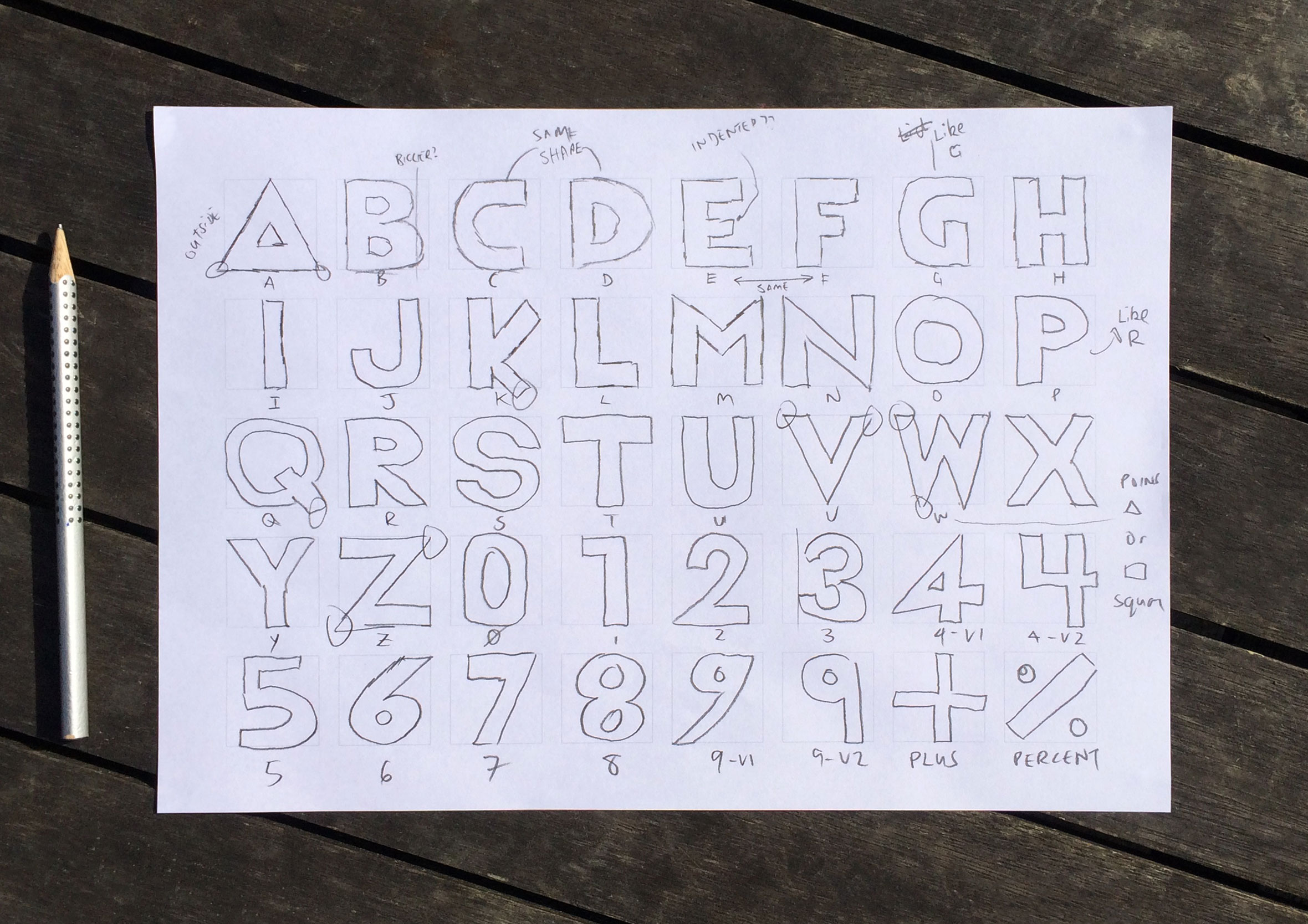
Early on, I spent a lot of time sketching by hand. Working through each letter, redrawing, testing different constructions, and slowly finding something that balanced structure with legibility.
Those sketches became the foundation for the whole system.
Once the base alphabet was working, I started exploring what else it could do.
Pushing the system through variation
Instead of redesigning the font, I tried keeping the same rules and just changing how they were applied.
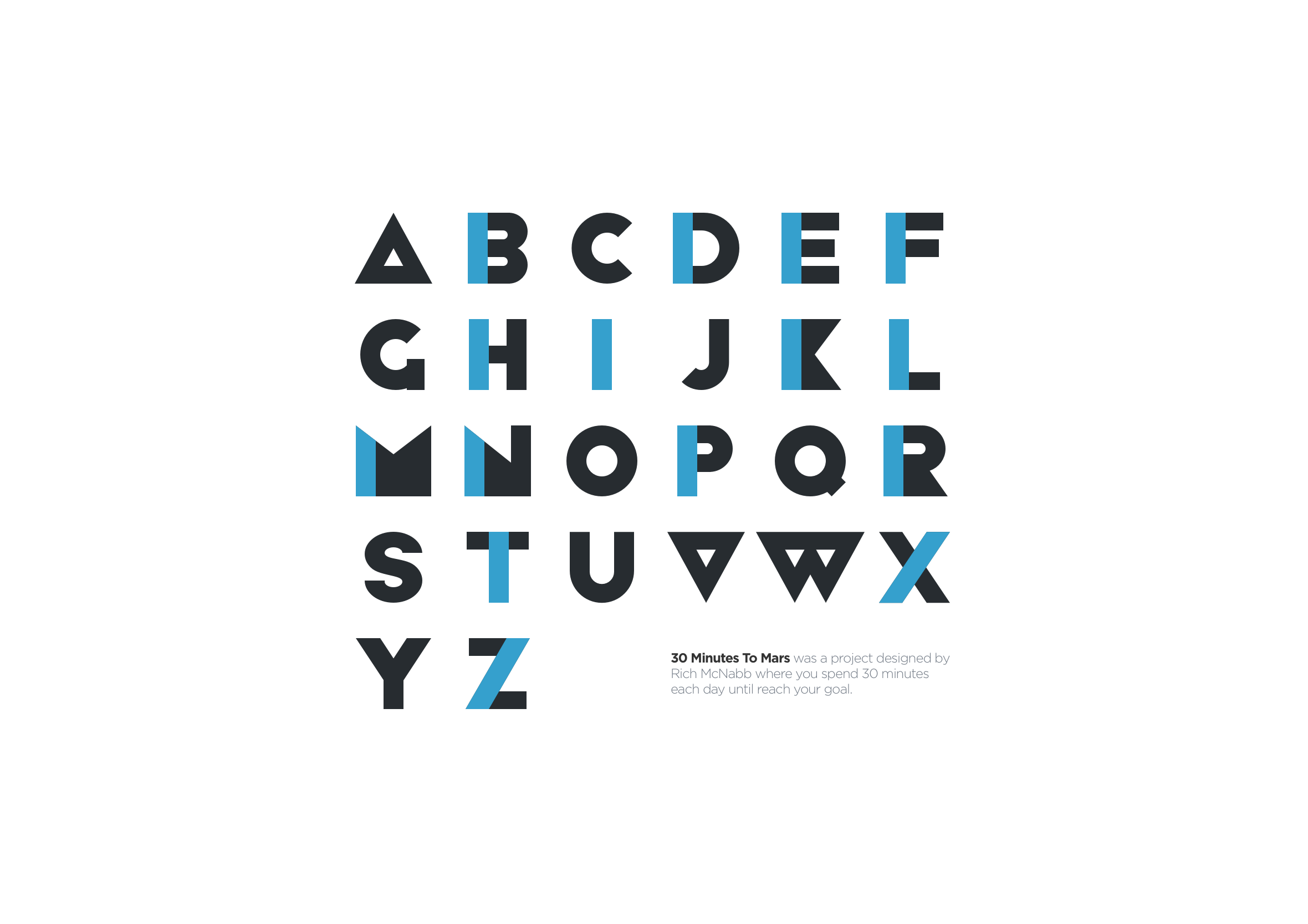
First iteration: Pulled the shapes apart slightly so the geometry had more space. Same structure, different rhythm. It felt lighter straight away.
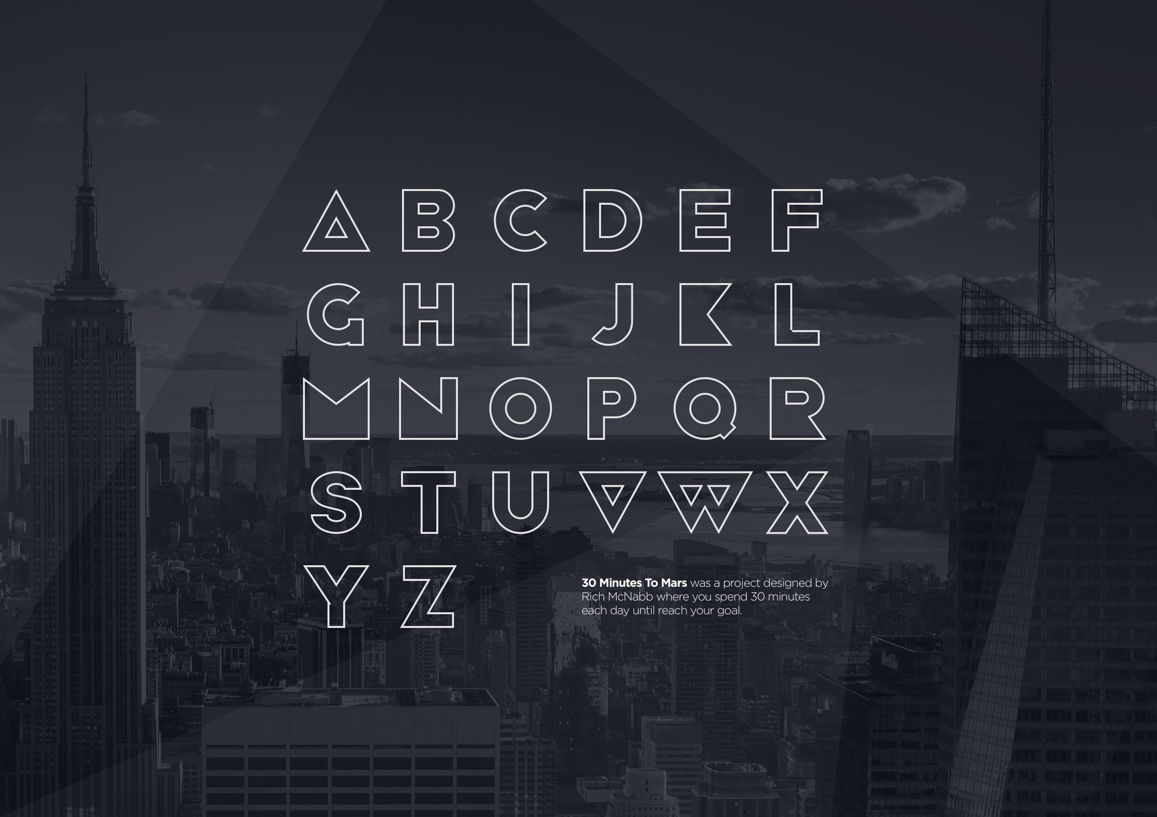
Second approach: Switched everything to outlines. That removed a lot of weight and shifted the tone into something more editorial. It also made me realise how much of the character lives in thickness.
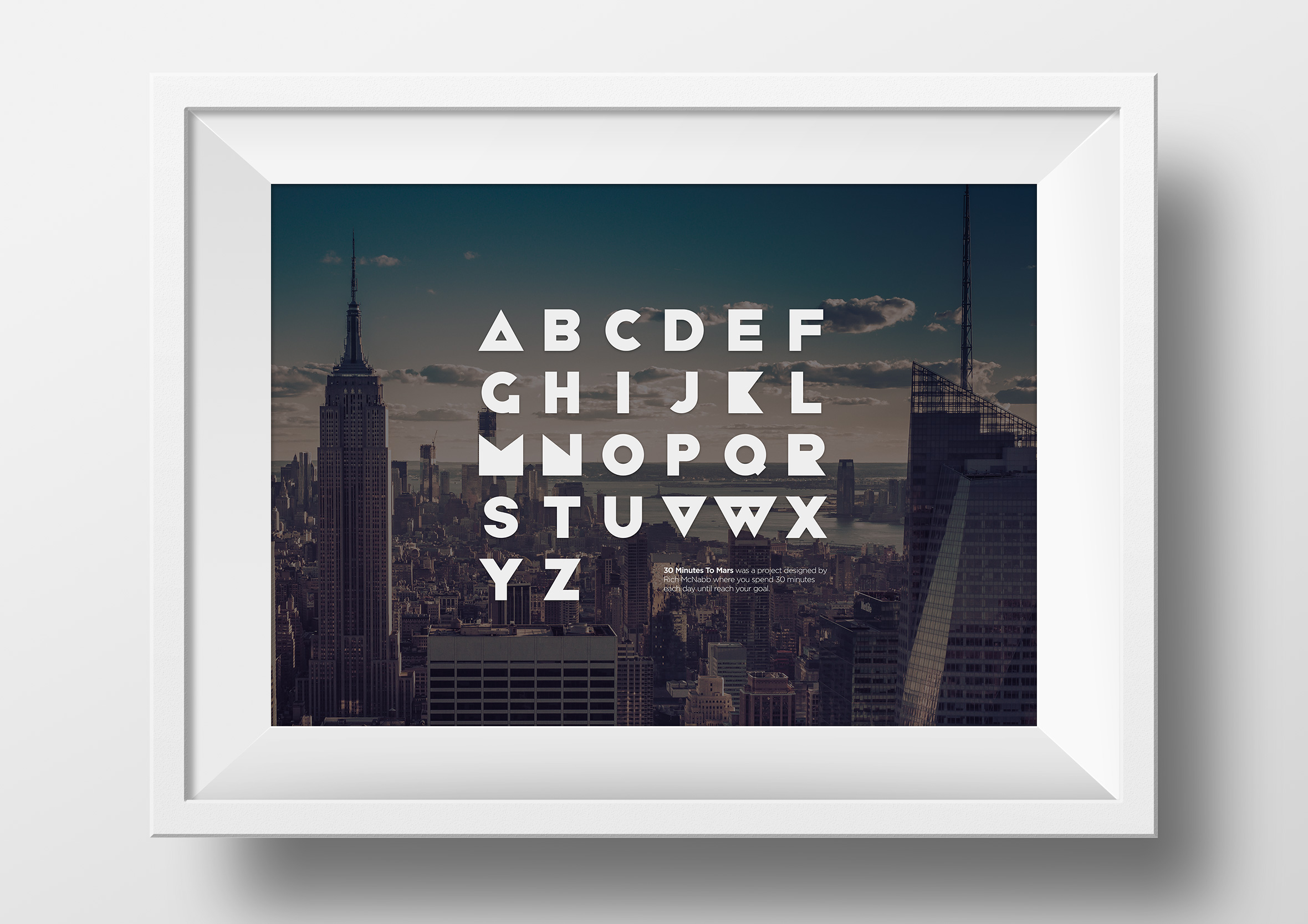
Final variation: Removed elements and introduced image masking inside the letterforms. The type stopped being just shape on a page and started interacting with whatever sat behind it.
Each variation came from the same system, just pushed in a different direction.
Rich McNabb Vector font
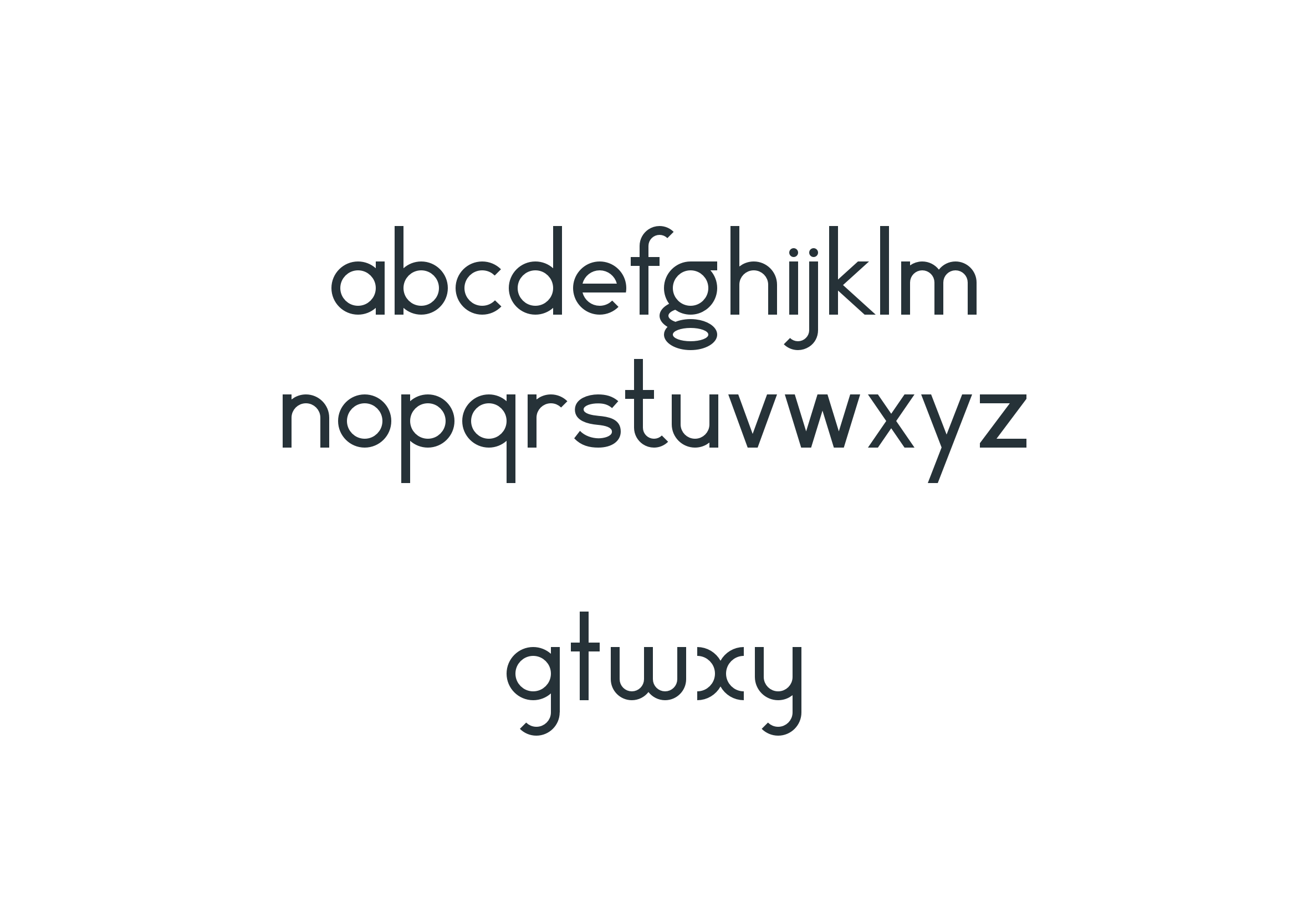
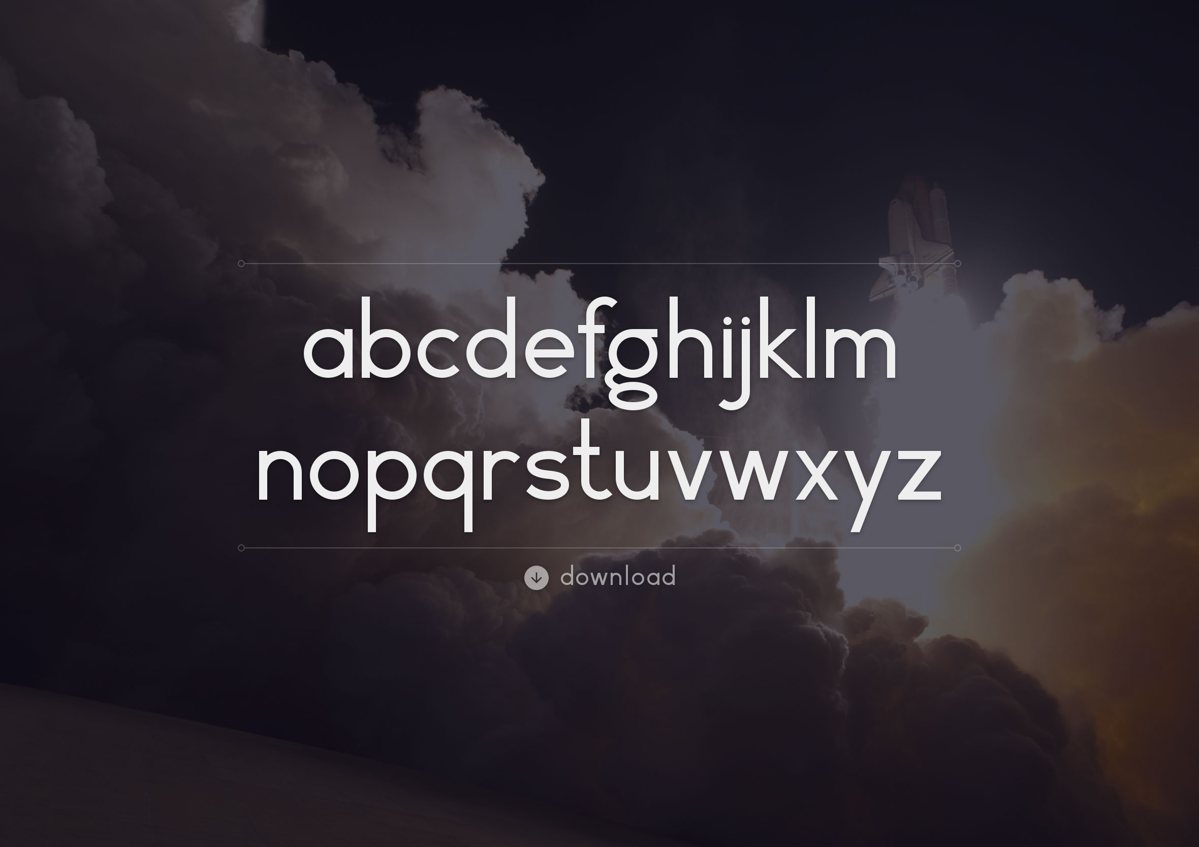
The second font came from a different starting point. I’d been looking at Herbert Bayer’s 1925 experimental universal typeface and wanted to respond to it rather than copy it directly. His approach stripped letterforms back to simple geometry, removing anything unnecessary.
My version follows that idea, softening it slightly. Less rigid, a bit more flexible, and more focused on usability. The goal was to build a basic lowercase alphabet first, then expand it over time with numerals, symbols, and alternates. Even early on, it felt like it was heading somewhere interesting.
Refining the details
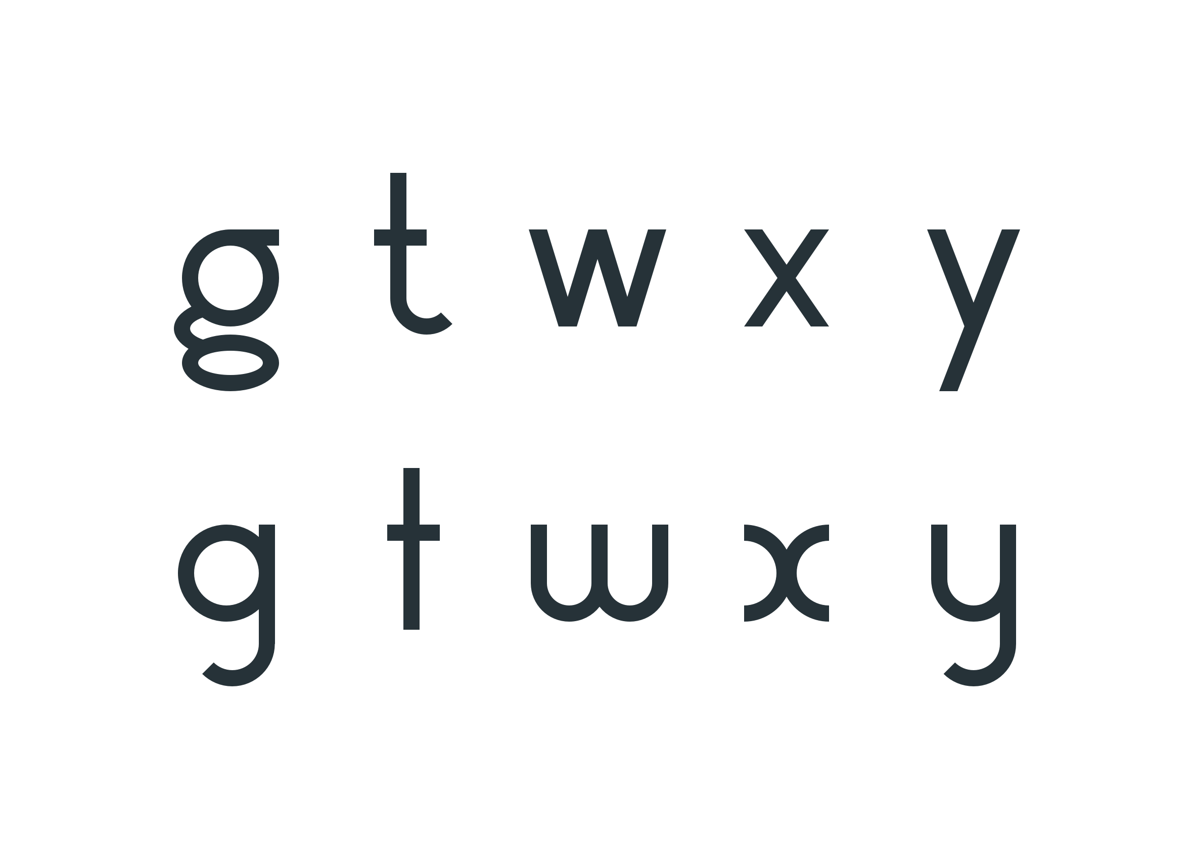
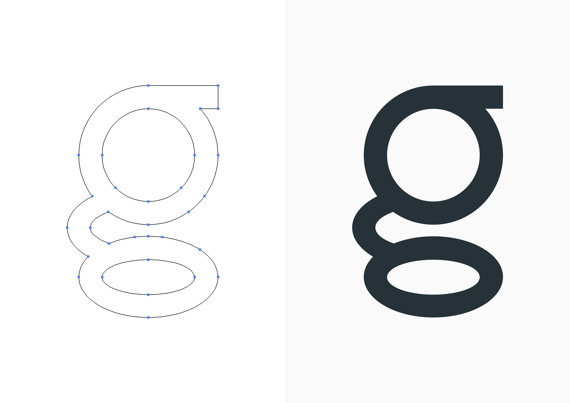
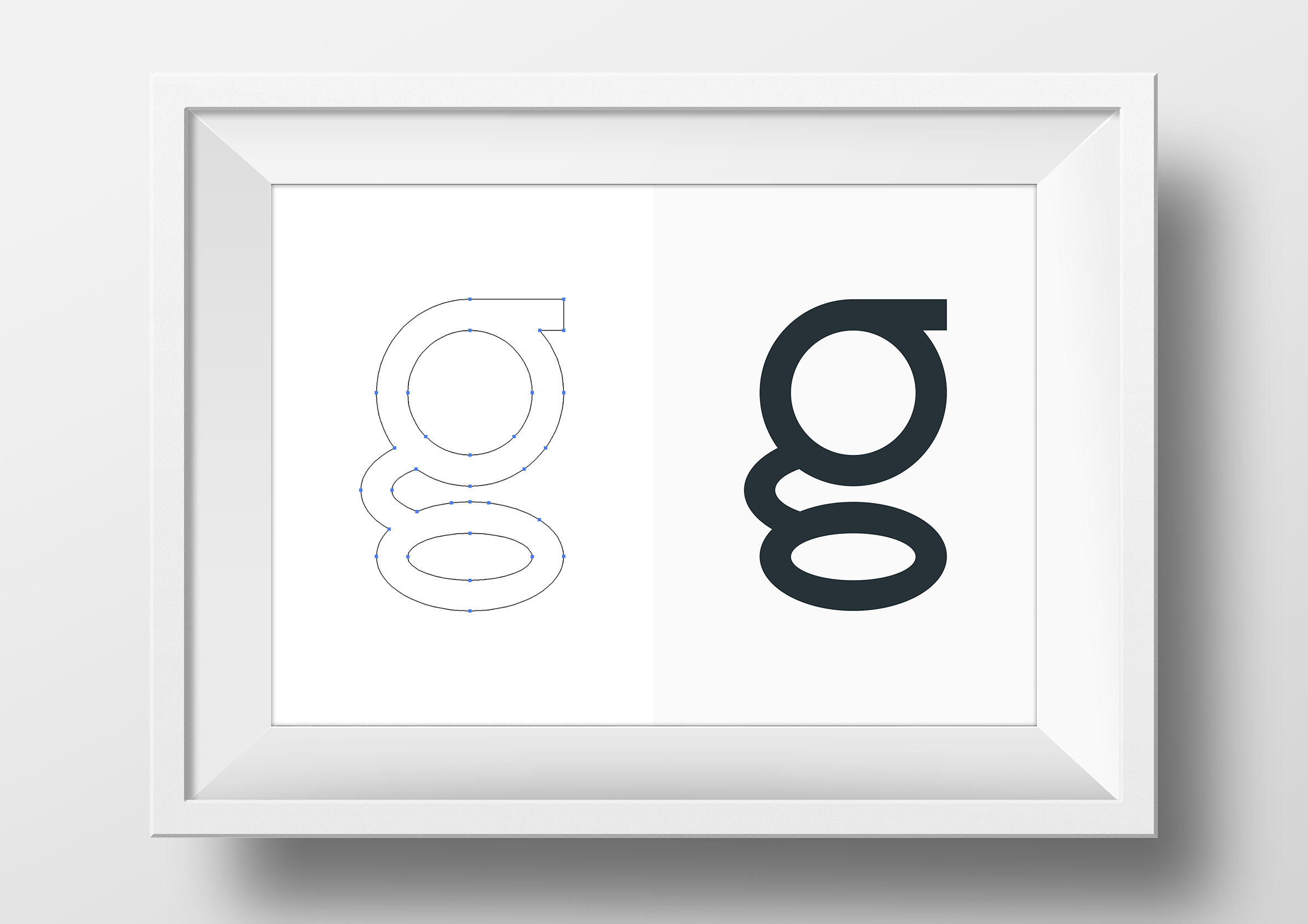
One letter took more iteration than the rest. The lowercase “g” worked structurally, it just didn’t feel quite right. It had form, not much character.
I worked through a few variations, adjusting proportions and geometry until it finally settled into something that felt resolved. Looking at the construction next to the original shows the difference clearly. It’s a small change, one that affected how the rest of the system felt.
From there, I built a set of alternates for letters like g, t, w, x, and y. These weren’t decorative additions. They were a way of testing how flexible the system could be while still holding together.
What changed across both fonts
Both typefaces came from the same constraint, they ended up in different places though. One leans into modular repetition and structure. The other is more restrained and system-led.
That same pull toward a minimal design challenge shows up whenever a tight brief forces the work down to essentials. What stood out most was how quickly the 30-minute rule removed hesitation. There wasn’t much space to overthink decisions, so things just got made. That probably shaped the work more than anything else.
What this says about how I design
What I like about this project is how unplanned it was. A simple rule turned into a system, and that system split into two directions that revealed more than I expected at the start.
It’s a reminder that constraints don’t necessarily limit what you can make. They tend to push decisions earlier than you might normally make them, which changes the outcome in subtle ways. Small pockets of time are often enough to build something much bigger than it feels like at the beginning.
That same approach shows up across my work in complex systems design, especially in systems where complexity needs to be reduced into something clearer and more usable. It’s the same thinking behind a data dense visualisation I designed, where dense technical data had to be reduced into something a technician could read at a glance. It made that way of working harder to ignore.