Design websites & apps with a 4px/8px baseline grid
How I use a 4px/8px baseline grid alongside a traditional typographic scale to create consistent, well-structured layouts across both web and mobile design, without second-guessing spacing decisions on every single screen.
The Konami Code for grids
Up, up, down, down, left, right, left, right, B, A. If you grew up gaming, that sequence probably still lives somewhere in your fingers. The Konami Code started life in 1986, tucked into a NES game called Gradius by a developer named Kazuhisa Hashimoto, who added it during testing because the game was brutally hard and he got sick of dying during his own playtests. It was supposed to be removed before launch. It never was, and a year later, Contra used the same code to hand out 30 lives, cementing it into gaming history for good.
Grids have been used in game design and graphic design for years.
It was never meant to be obvious, that was the whole point. Baseline grids are a bit like that for me. They’re hiding in plain sight on every screen you look at, and once you know the code, they level up everything else you design.
A few years ago, I was researching layouts and grid structures when I came across an article by Pierre Marly at Teehan+Lax, Designing Faster with a Baseline Grid. I’d never even heard the term “baseline grid” before that. Pierre’s thinking stuck with me in a way I didn’t expect, and years later, along with a few other principles I’ve picked up since, it’s still at the core of my UX/UI design process. Here’s my approach.
Responsive breakpoints and 4px and 8px baseline grids for mobile and desktop.
Traditional typographic scale
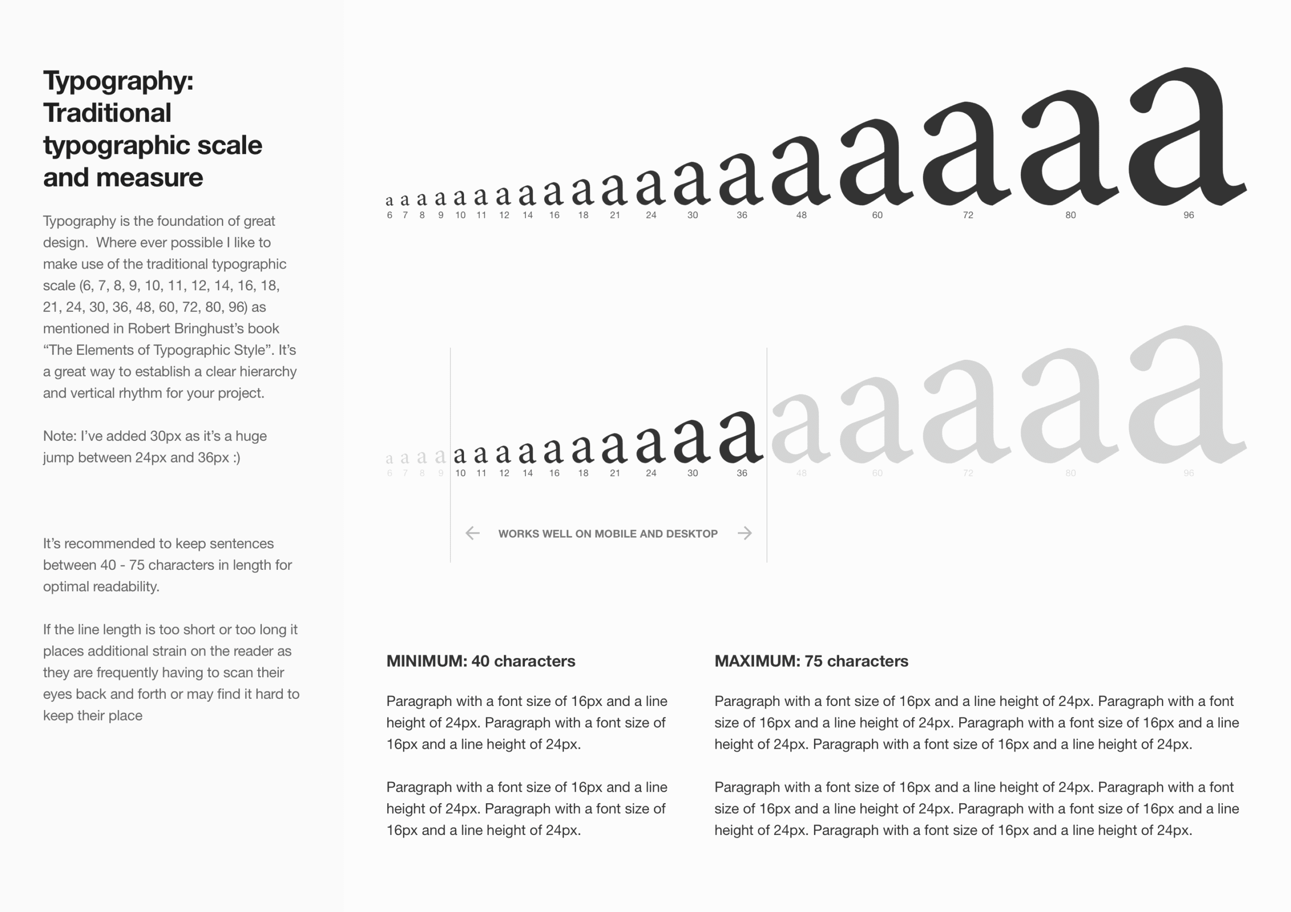
Typography is the foundation of great design. Where possible, I like to use the traditional typographic scale (6, 7, 8, 9, 10, 11, 12, 14, 16, 18, 21, 24, 30, 36, 48, 60, 72, 80, 96) as mentioned in Robert Bringhurst’s book, The Elements of Typographic Style.
It’s a great way to establish a clear hierarchy and vertical rhythm in your work. Note: I’ve added 30px in there myself, since the jump straight from 24px to 36px always felt too big 🙂
Typographic scale from 6px to 96px, with 30px added between 24px and 36px.Works seamlessly for both mobile and web based platforms.
Why I default to a 4px or 8px grid
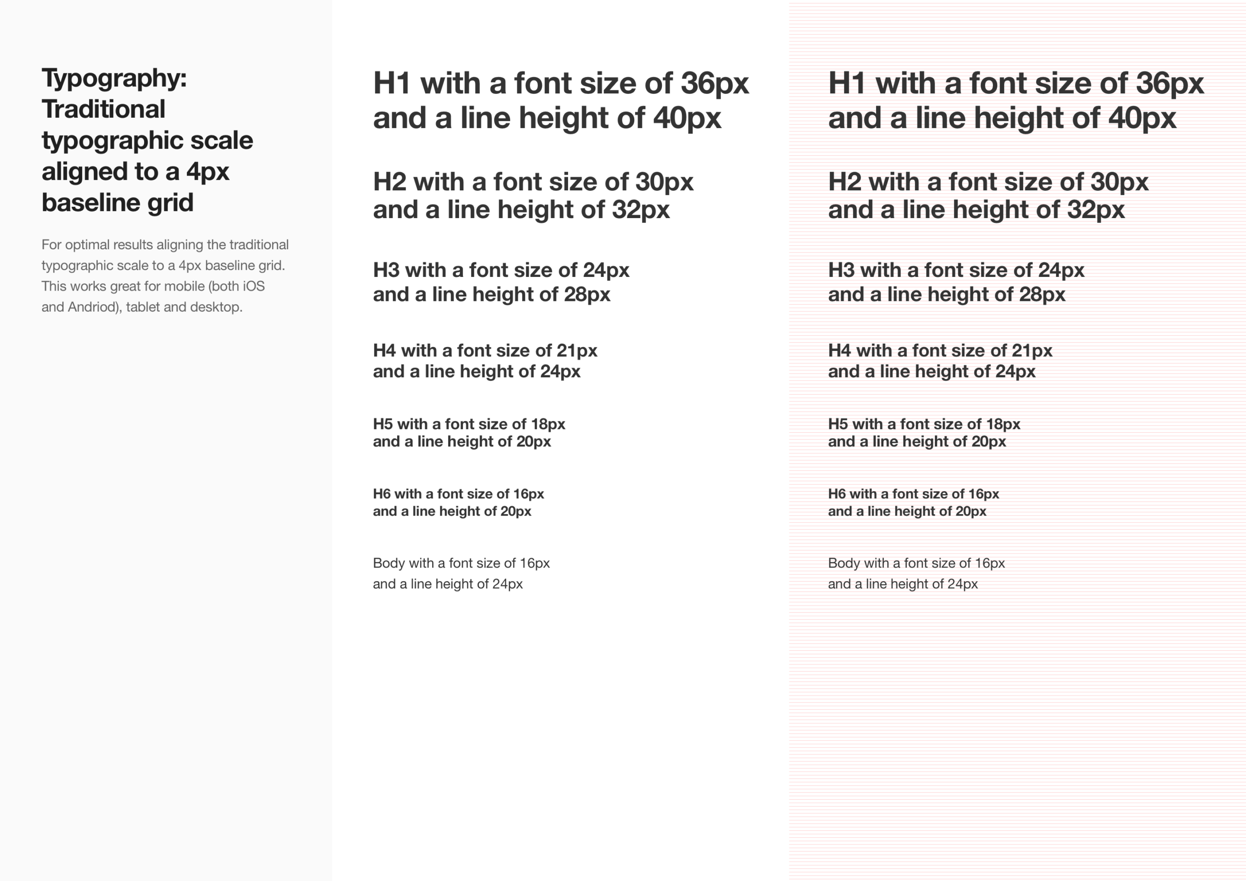
A 4px baseline grid gives me the consistency and flexibility to design for both web and mobile without rethinking measurements every time. Padding, margins, line height, if it’s a multiple of 4, it goes in. Nothing ends up looking arbitrary, and nothing feels slightly off between screens.
It also means that when a design moves from phone to tablet to desktop, I’m scaling a system I already trust rather than guessing at new numbers each time. It’s boring in the best possible way. Once it’s set, I don’t have to think about it again, which is exactly the point.
4px baseline grid gives me the consistency and flexibility to design for both web and mobile.Grids, columns, spacings, alignment all working together behind the scenes.
Why line length matters more than you’d think
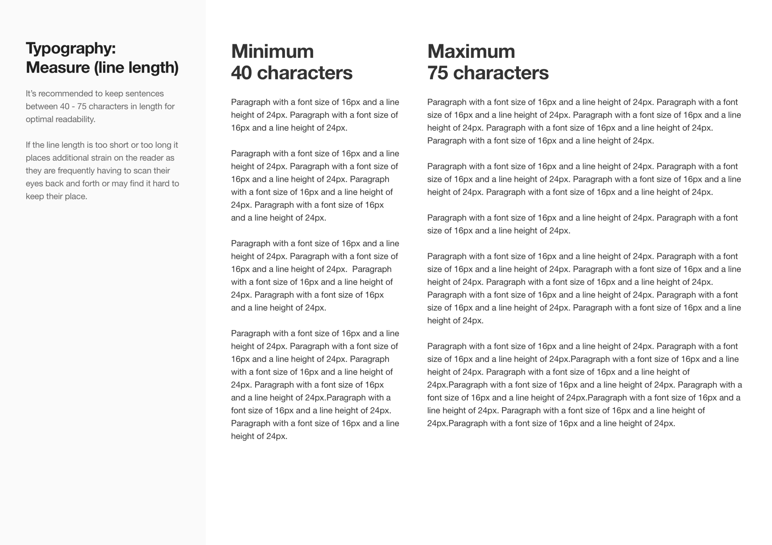
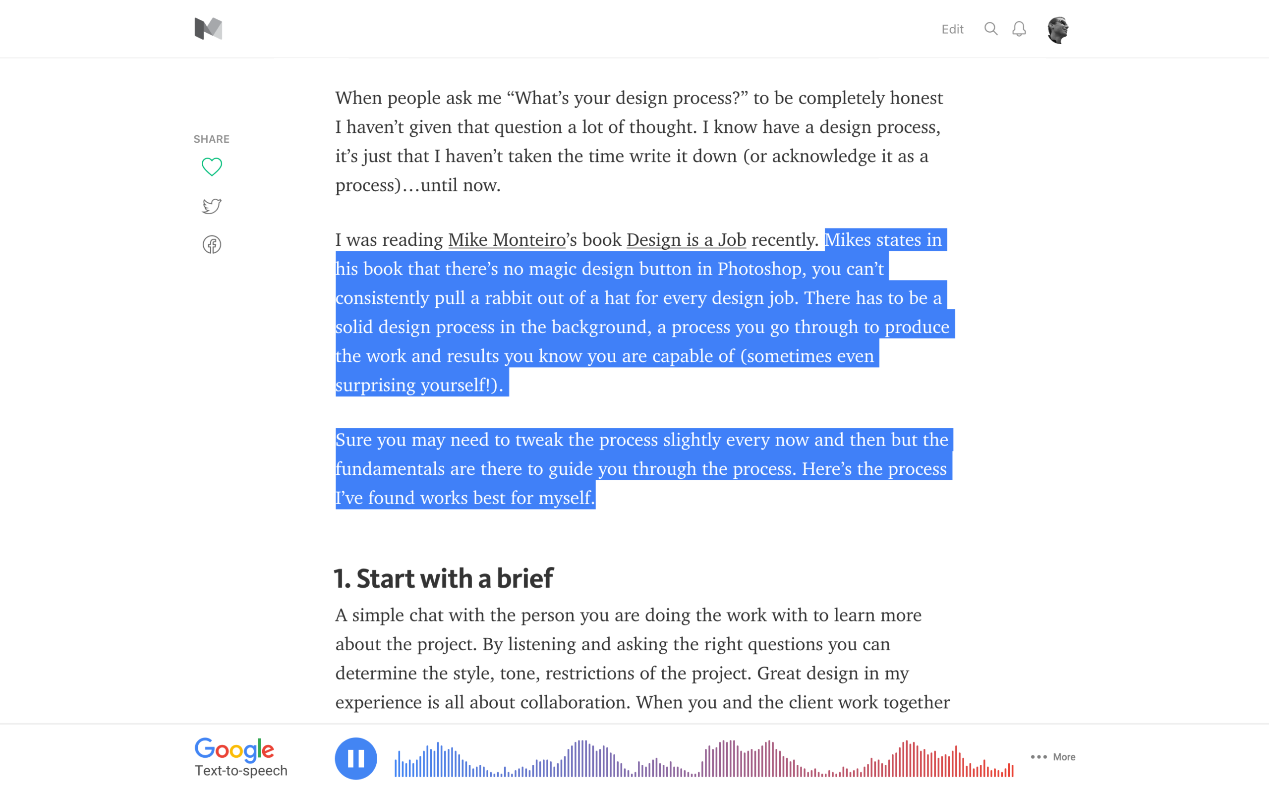
Measure is just a fancy typography term for how long a line of text is, and it has a surprisingly big effect on how easy something is to read. Too short, and your eyes jump back to the start of the next line so often that it breaks your rhythm. Too long, and you lose your place halfway through, drifting onto the wrong line when you glance back up.
Somewhere in between, usually 50 to 75 characters per line, is the sweet spot where your eyes can settle into a rhythm and just read, instead of working to find their place.
Measure, or how long a line of text is, impacts readability.Narrow columns for text improve the reading experience.
Consistency only matters when you stop noticing it
The real value of a grid system isn’t the structure itself. It’s how much easier it makes everything else. Once spacing becomes consistent, you’re not constantly adjusting things, nudging a button two pixels left or wondering why a card feels slightly off. That decision gets made once, at the grid level, and then it’s done.
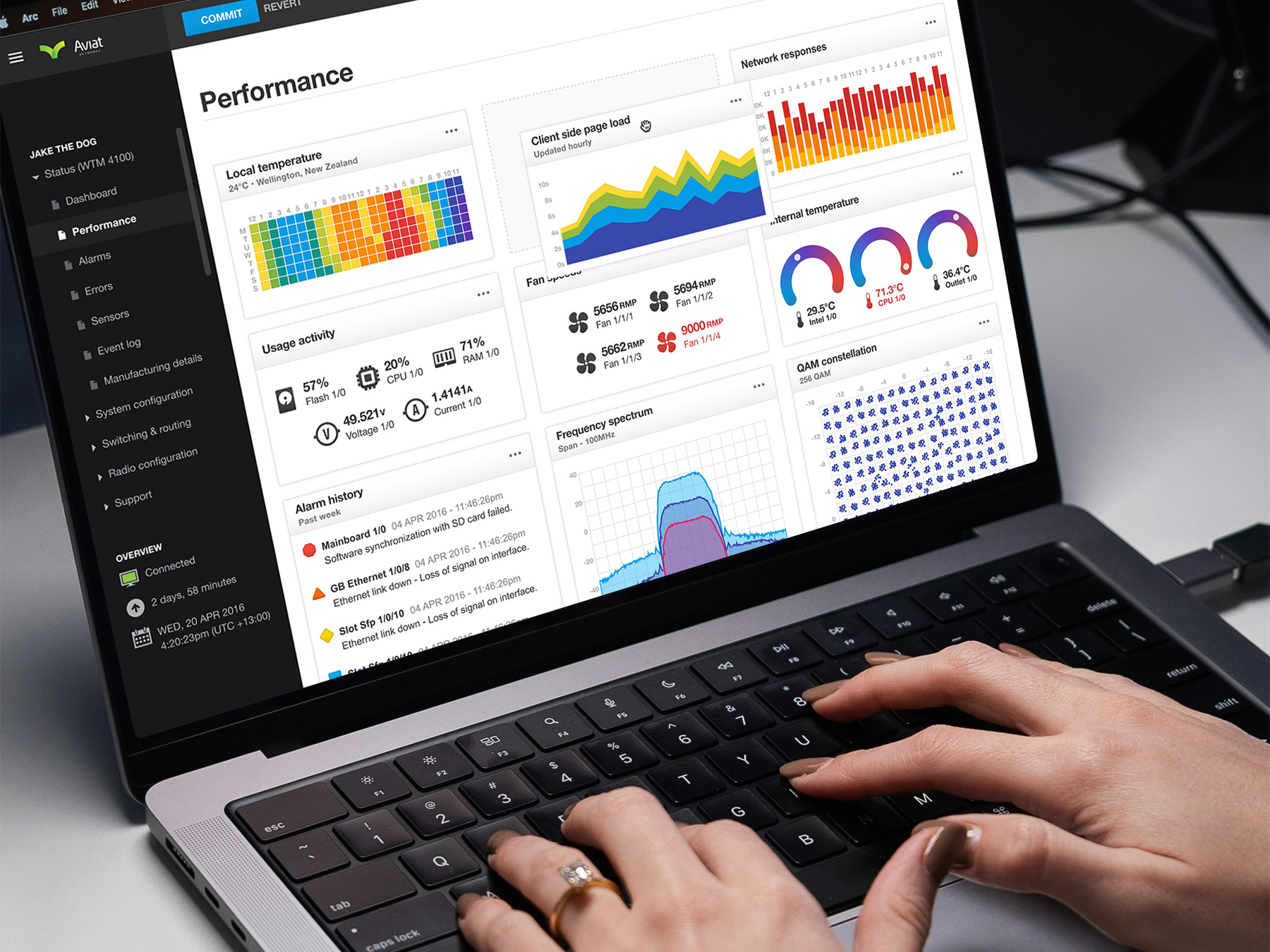
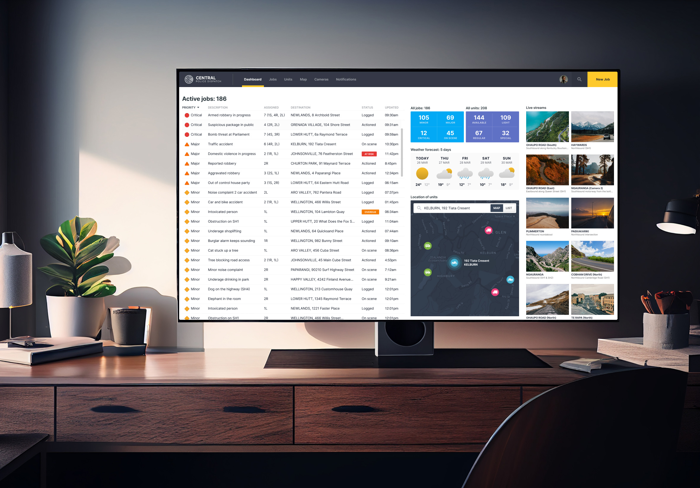
Central Police Dispatch emergency dashboard showing dense information and layout options.
What’s left is the interesting part. You get to spend your time on hierarchy, flow, and how the interface actually reads, instead of relitigating spacing on every screen. It’s a small trade that pays off more the bigger and more complex a product gets.
This kind of thinking shows up in my dashboard UX design work, where consistent spacing helped data-dense dashboards feel like they had room to breathe. It also carries through into productivity business apps too, where dozens of active jobs and statuses had to sit calmly on one screen without competing for attention. When there’s a lot of information competing for space, a solid grid is often the only thing holding it together. It really is the cheat code nobody tells you about.