

Aviat Networks: Wireless networking dashboard
Dense technical data, distilled. A dashboard for configuring and monitoring radio router network hardware, covering port management, GPS and VLANs, without drowning technicians in noise, alerts or a confusing interface.
Mind maps and rapid sketching
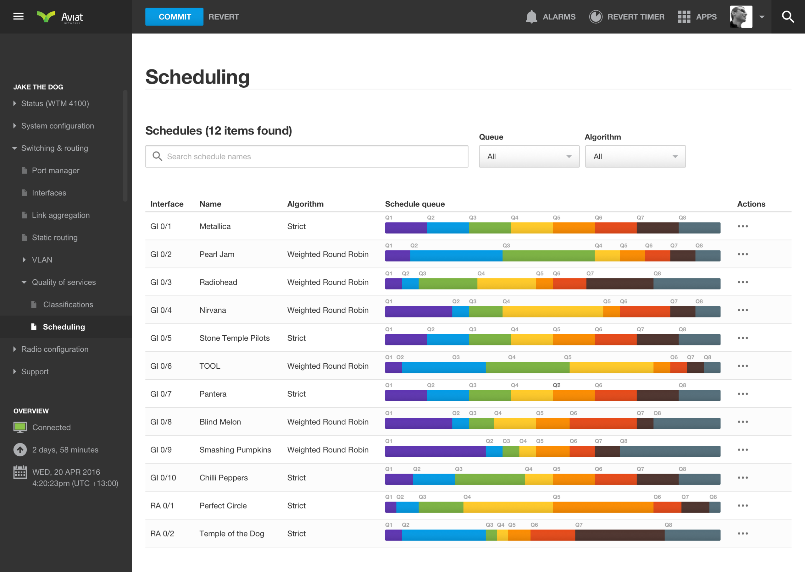
Aviat Networks is a dashboard for configuring and monitoring radio router network hardware, covering port management, GPS and VLANs, without drowning technicians in noise, alerts or a confusing interface. I had a few ideas I wanted to quickly explore and see how they might be incorporated into the final design. A mind map helped me capture concepts, layouts and ideas to explore in more detail later. Because networking is such a complex domain, I also made notes to develop a deeper understanding of how certain principles could be presented more clearly.

Information architecture: mapping every screen and flow
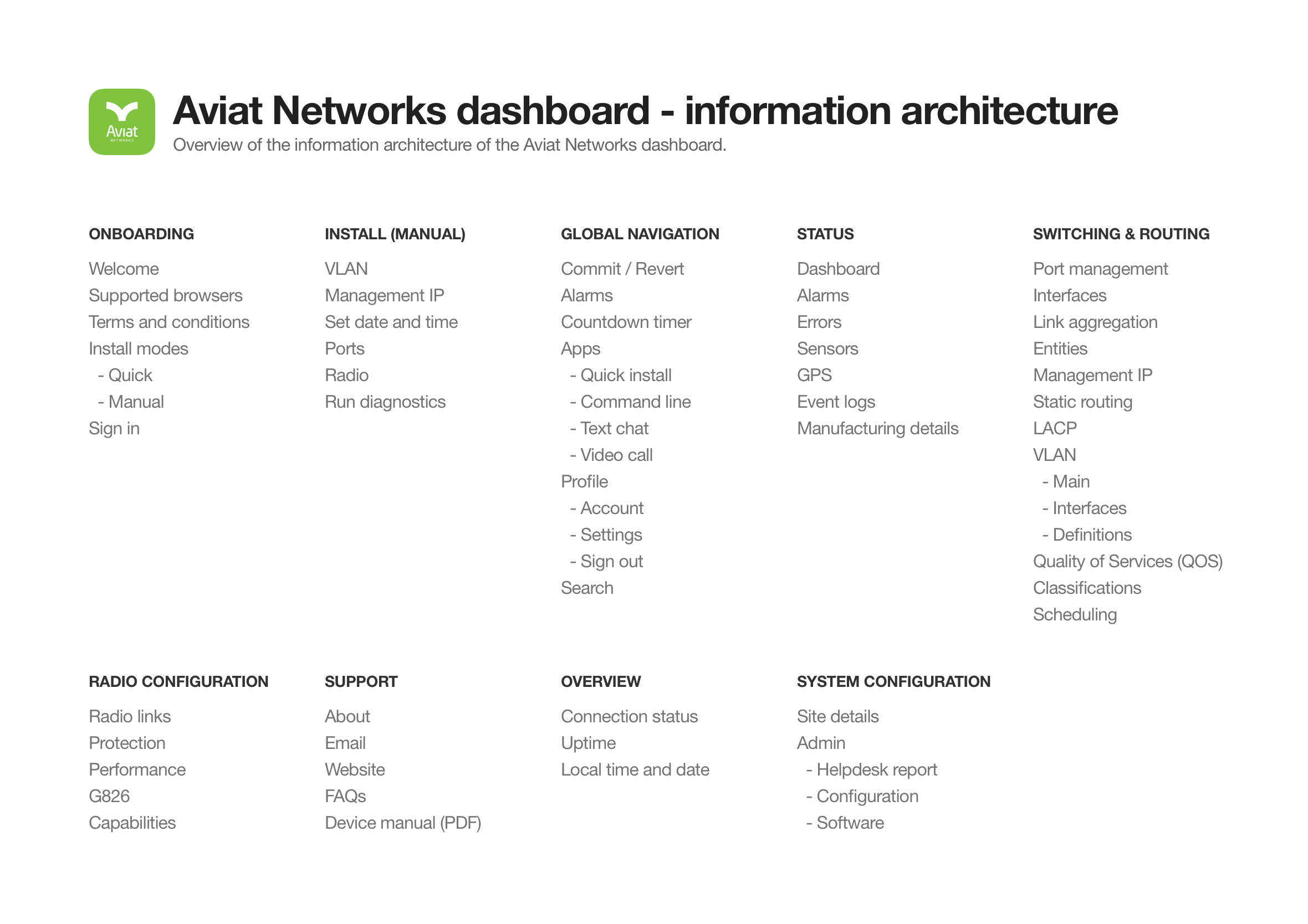
I worked closely with the Aviat Networks technicians to develop an information architecture that made sense logically and matched how they approached installations and troubleshooting. We quickly found the IA was quite complex and that people sometimes had difficulty finding the right screen. By implementing predictive search (shown further down the page) we were able to give technicians a faster way to find what they needed.
Wireframes shared early to move fast with developers
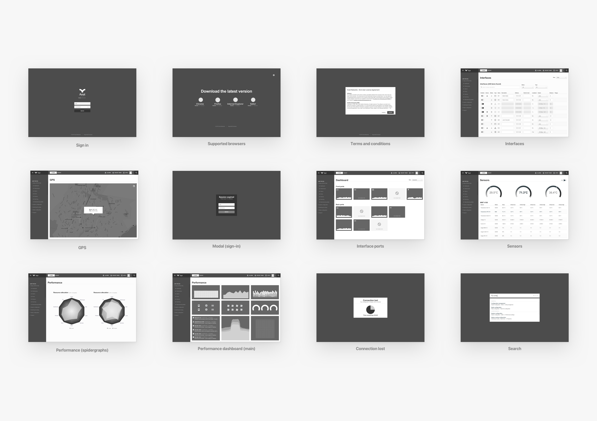
Wireframes were created and shared with the wider group to get feedback and deepen our collective understanding of the user journey. The beauty of this low-fidelity approach is you can collaborate with the developers and work agile without getting caught up and wasting time on the smaller details ahead of time. While the developers are coding up the basic structure and framework you can start providing them with final visuals screen by screen. A continuous design and development loop.
Minimal sign-in screen
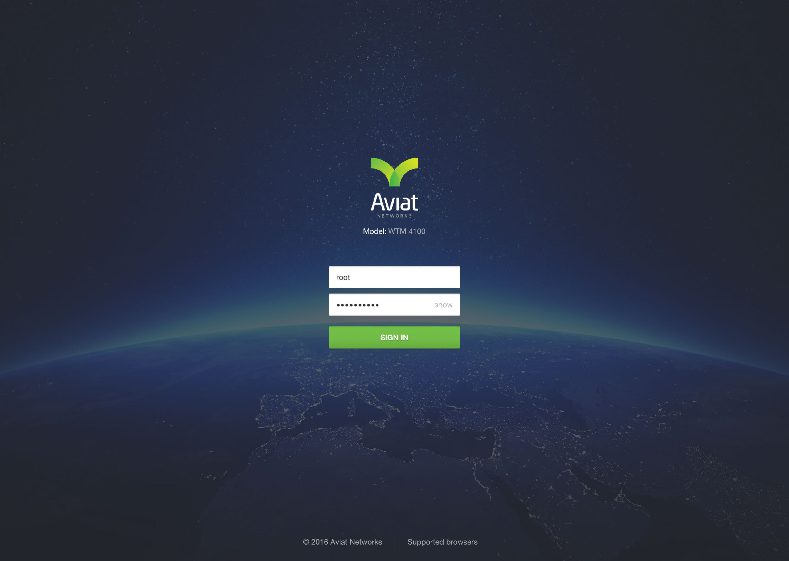
Technicians connect to network devices via an IP address using a standard web browser. They’re presented with a clutter-free interface to enter their admin credentials and start configuring the device.
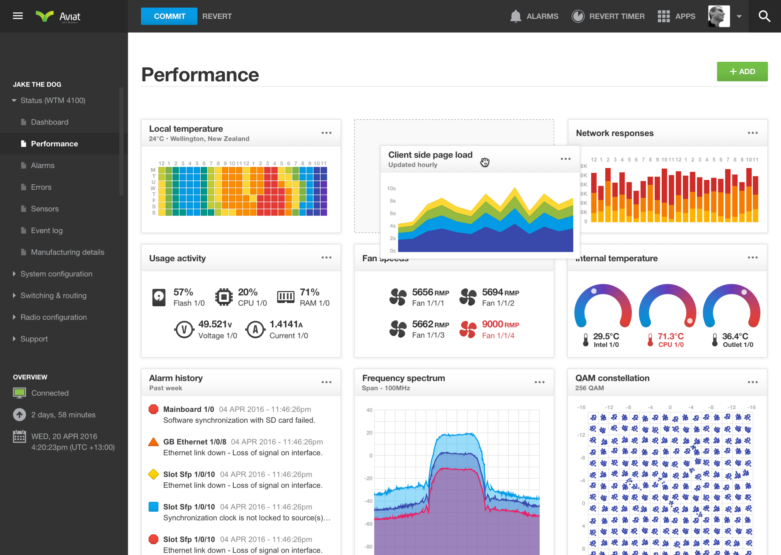
Custom performance dashboard
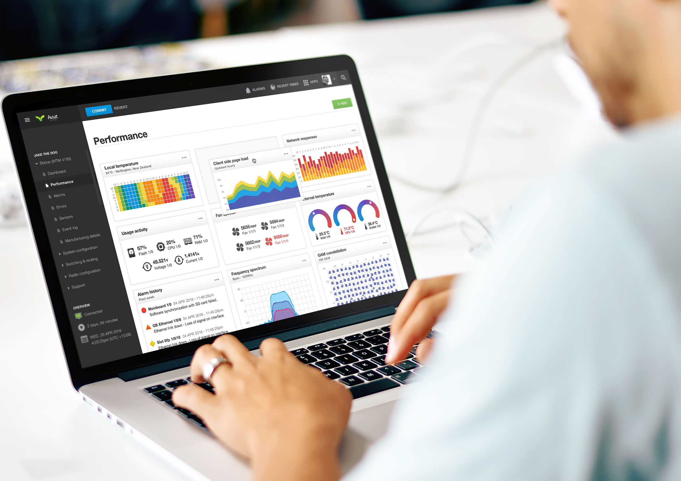
Choose the individual widgets you’d like to see and drag and drop them to arrange the performance dashboard layout to suit your workflow. Widgets can easily be toggled on or off depending on what you need access to.
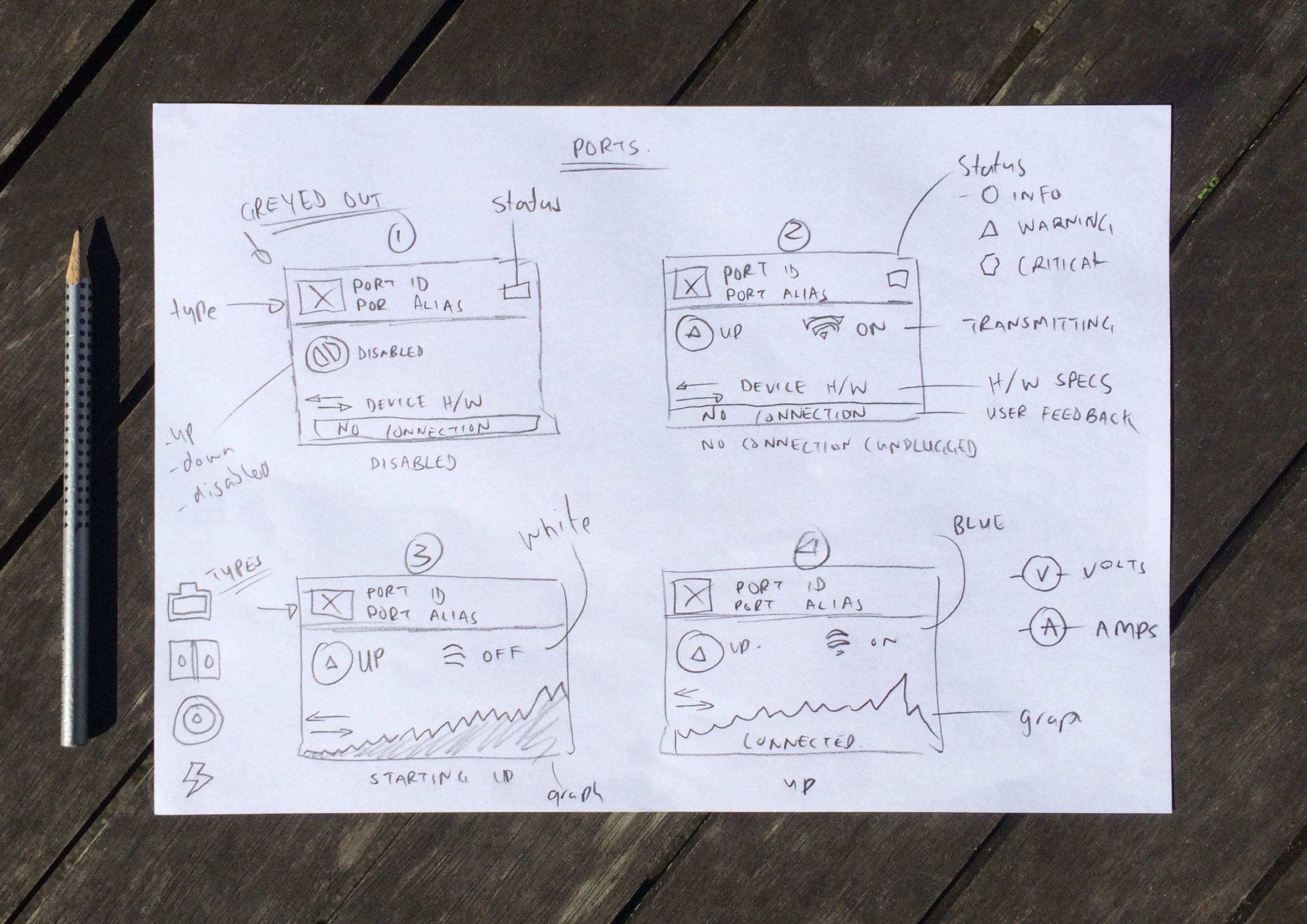
Network ports dashboard
Get an overview of all your network ports, how well they’re performing and whether they have any alarms or connection issues. Icons, text and colour work together to make it easy to tell the state of each port at a glance, so you know exactly where to start troubleshooting.


Configure network ports with tooltips as you hover and learn
From the Interfaces screen, they can see the status of each port and its port type, making it easy to troubleshoot performance issues and spot any incorrect settings or alarms that could be affecting network traffic.

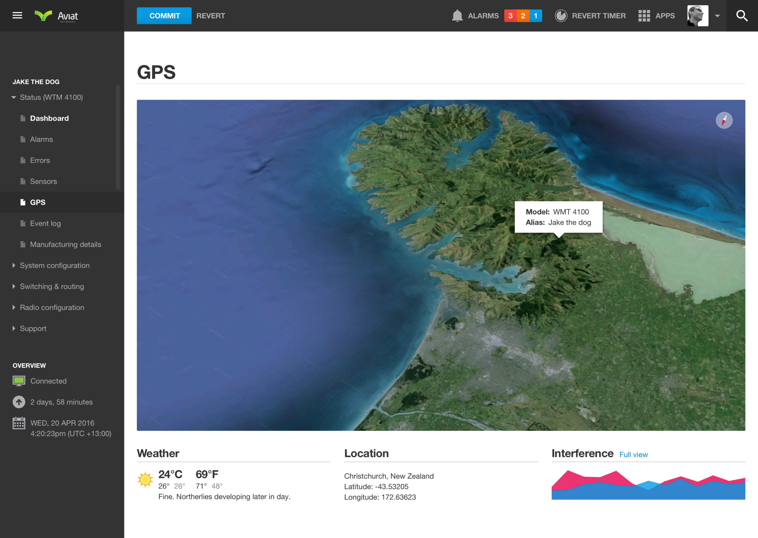
GPS-enabled wifi routers
Wifi routers with built-in GPS allow technicians to locate networking devices via latitude and longitude coordinates. They can also check weather conditions in the surrounding area, which can sometimes have a major impact on radio signal quality.
Creating a new Virtual Local Area Network (VLAN)
The dashboard lets technicians quickly create a VLAN, assign network ports and configure settings to get their network up and running as fast as possible. If items can’t be configured due to networking constraints, clear feedback is provided along with alternative solutions.

Built-in hardware sensors
Monitor the performance of built-in hardware components including temperature, hard drive capacity, CPU usage, available memory and fan speeds.

Weighting traffic types for Quality of Service (QoS)
Configure and weight different types of network traffic to make sure it’s optimised for the technician’s needs. Higher-priority traffic types take precedence to improve overall network performance.
Simple loading animation was a fun exploration
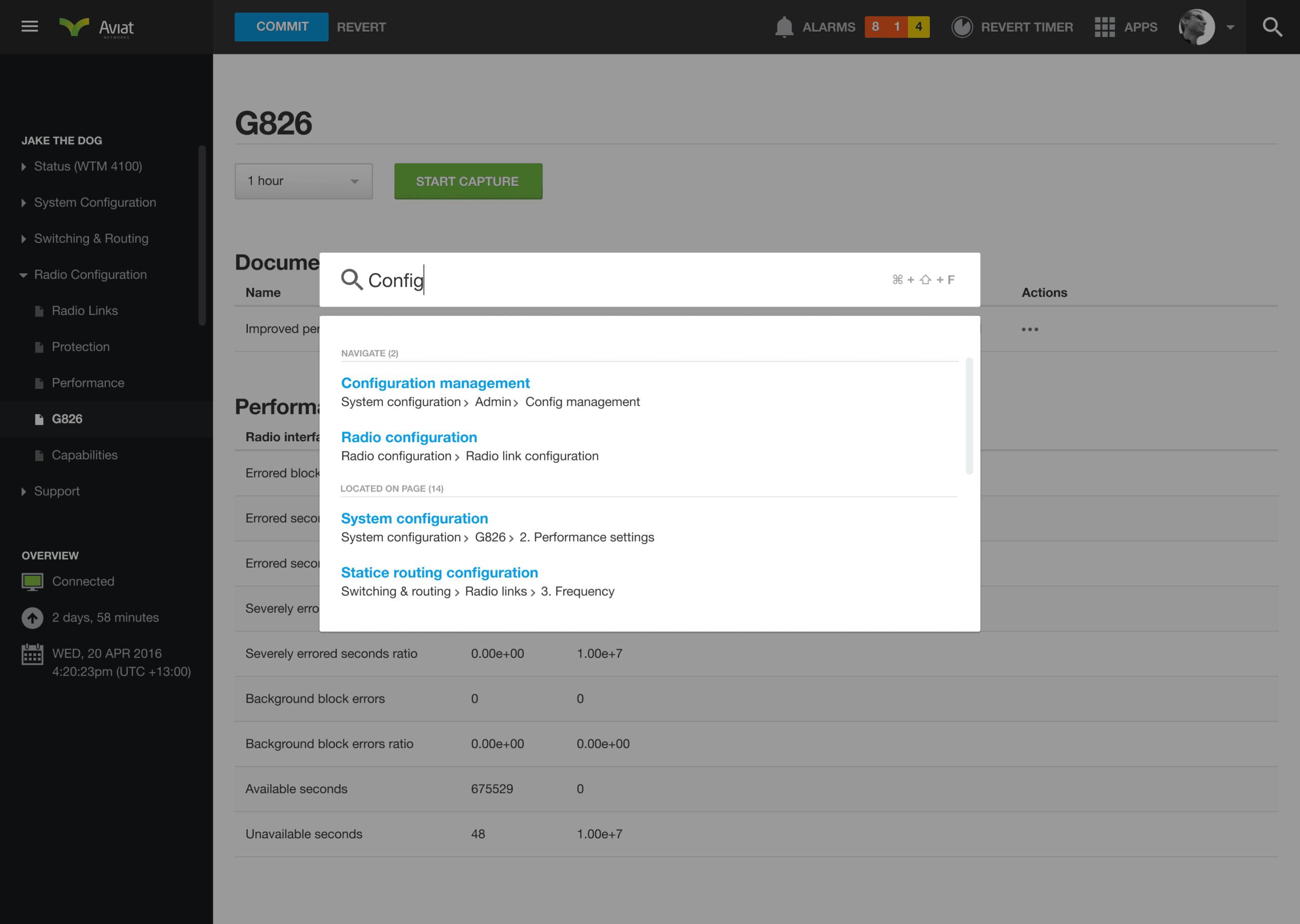
Technicians can search the entire dashboard by clicking the search button in the toolbar or using shortcut keys. The 48-frame sequence was created to show activity when exact timeframes couldn’t be calculated.

When mission impossible starts feeling like you might pull it off
This was a great role, largely because of how genuinely complex it was. There were about 10 of us on the team, front-end developers and hardware developers both, and I came on board as the lead designer. During our daily stand-ups, no one in the room knew everything about networking, it’s too deep a subject for any one person to hold all of it. There was plenty of overlap, and collectively the team understood it properly, though individually everyone had gaps.
What I loved was taking those genuinely complex interactions and making them intuitive, for people who’d been working with networking hardware for years and for people brand new to the industry, offering help exactly when it was needed and knowing when to step back and let someone get on with the task.
That’s the part of this work I keep coming back to, taking something complex and finding the simple, elegant version hiding inside it. Core Banking’s approach to minimal consumer banking started from the same instinct, and so did ACC’s complex government work, gnarly the moment you look too closely, until you ask enough questions and it all starts making sense.