#Systems thinking
Architectural frameworks, complex feedback loops, and holistic problem-solving, the kind of shift that turns a tangled, chaotic Figma process into a genuine three-part system you can actually rely on, project to project.


Architectural frameworks, complex feedback loops, and holistic problem-solving, the kind of shift that turns a tangled, chaotic Figma process into a genuine three-part system you can actually rely on, project to project.

Relax, this isn't a "buy my course" article, I promise you. No funnel, no upsell waiting at the end, just what's genuinely worked for me across almost 20 years of working as a UX/UI designer. Just what I wish someone had told me earlier on.

Scrolling Facebook, I noticed something: mostly ads, barely a friend in sight. What followed was months fighting a phone addiction, iPods, dumb phones, screen time settings, before one small NFC device actually broke the habit for good.

How one direct piece of feedback from a content designer turned my tangled, chaotic Figma files into a genuine three-part system, chaos, calm and clarity, one I still rely on for every project. A shift that changed how every project since.
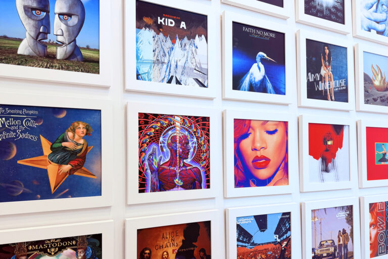
A year and a half in the making: 50 album covers, custom framing, and a four-metre gallery wall built from scratch in my stairwell. Here's how the whole thing actually came together, one frame and one wall bracket at a time.

How a search for a simple turntable stand turned into a genuine lesson in design thinking, prototyping, and communicating ideas clearly enough for someone else to actually go and build them. A prototype first, the real thing came after.

The backstory, hidden details and the designers behind 50 of the most interesting and iconic album covers ever made, chosen and ranked one by one, covering decades of music, art direction and graphic design history from record sleeves.

Whenever I meet people about new roles, they ask me to explain my process. This university paper is where I first properly wrote it down, a week-by-week UX breakdown designing a police dispatch dashboard from brief to prototype.

How I use a 4px/8px baseline grid alongside a traditional typographic scale to create consistent, well-structured layouts across both web and mobile design, without second-guessing spacing decisions on every single screen.