Designing a police dispatch dashboard: User Experience (INFO 246) university paper
A week-by-week breakdown of the UX process I followed for my User Experience paper at Victoria University, designing a police dispatch dashboard from brief through to prototype.
I completed a User Experience paper at Victoria University. Whenever I meet with people about new roles they always ask me to explain my process. My process changes based on the project and new ideas I want to try. Here’s the process I followed to complete the paper.
Week 1: Reading and note taking
Read the course recommended text books:
UX Book (I don’t recommend this book, it is extremely dull and hard to extract information from)
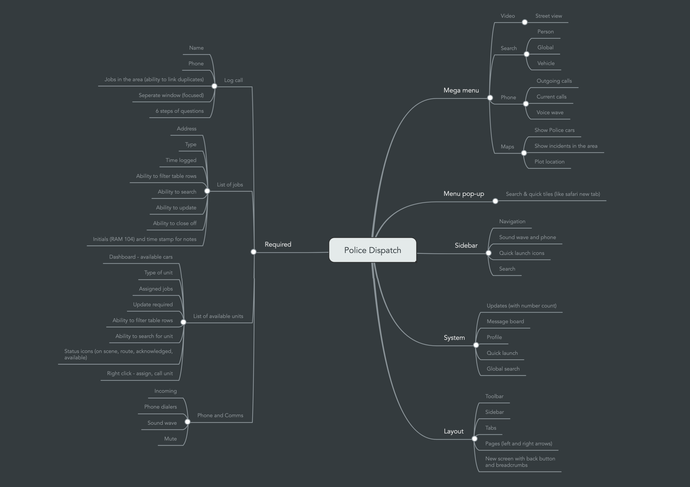
Week 3: Contextual inquiries, wireframes and mind maps
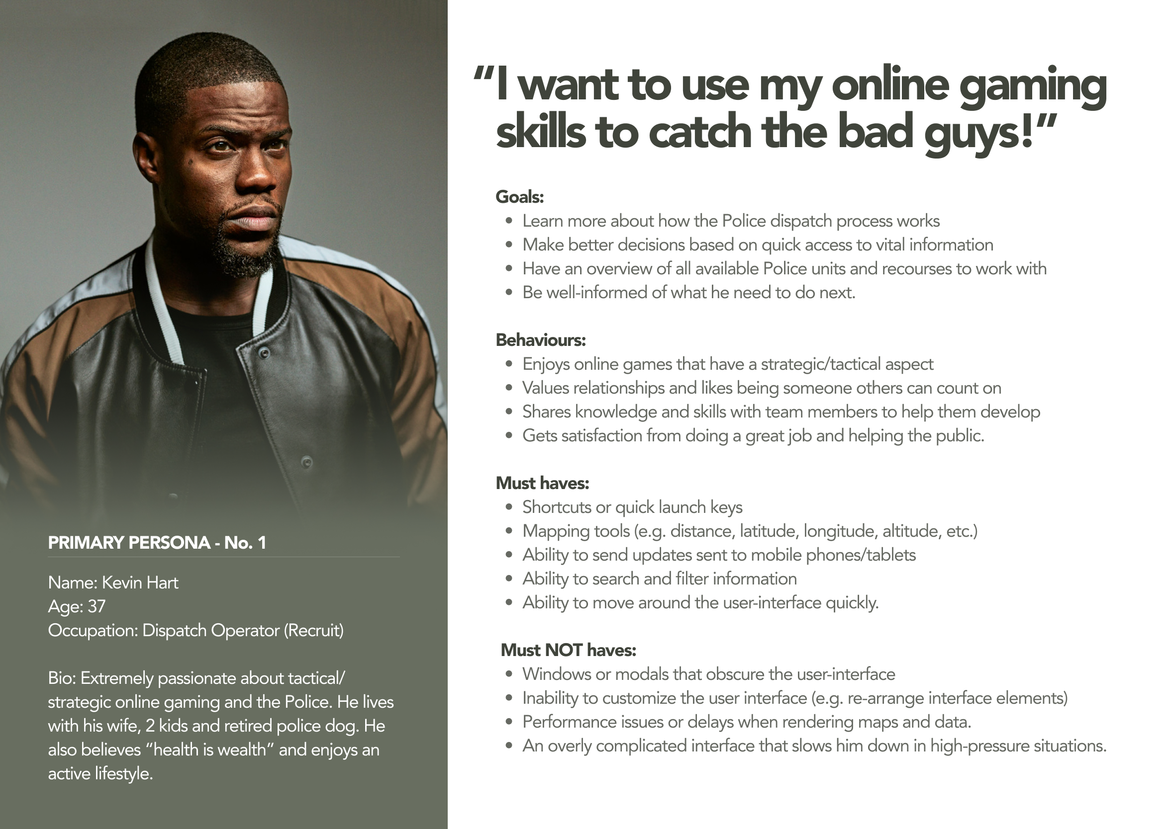
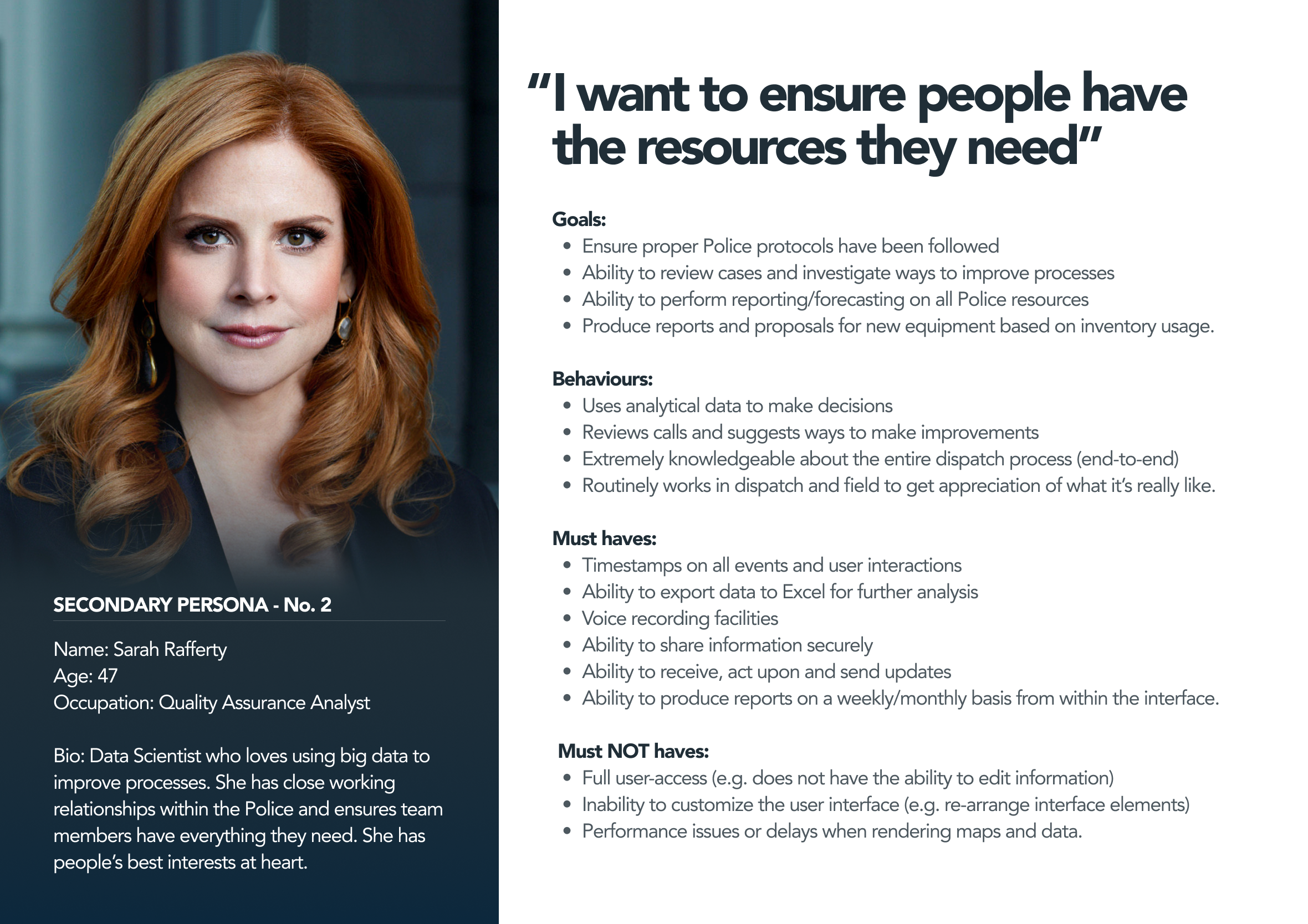
Made notes based on my visit to the Police Head Office
Created a mind map using MindMeister to gather and organise all my ideas
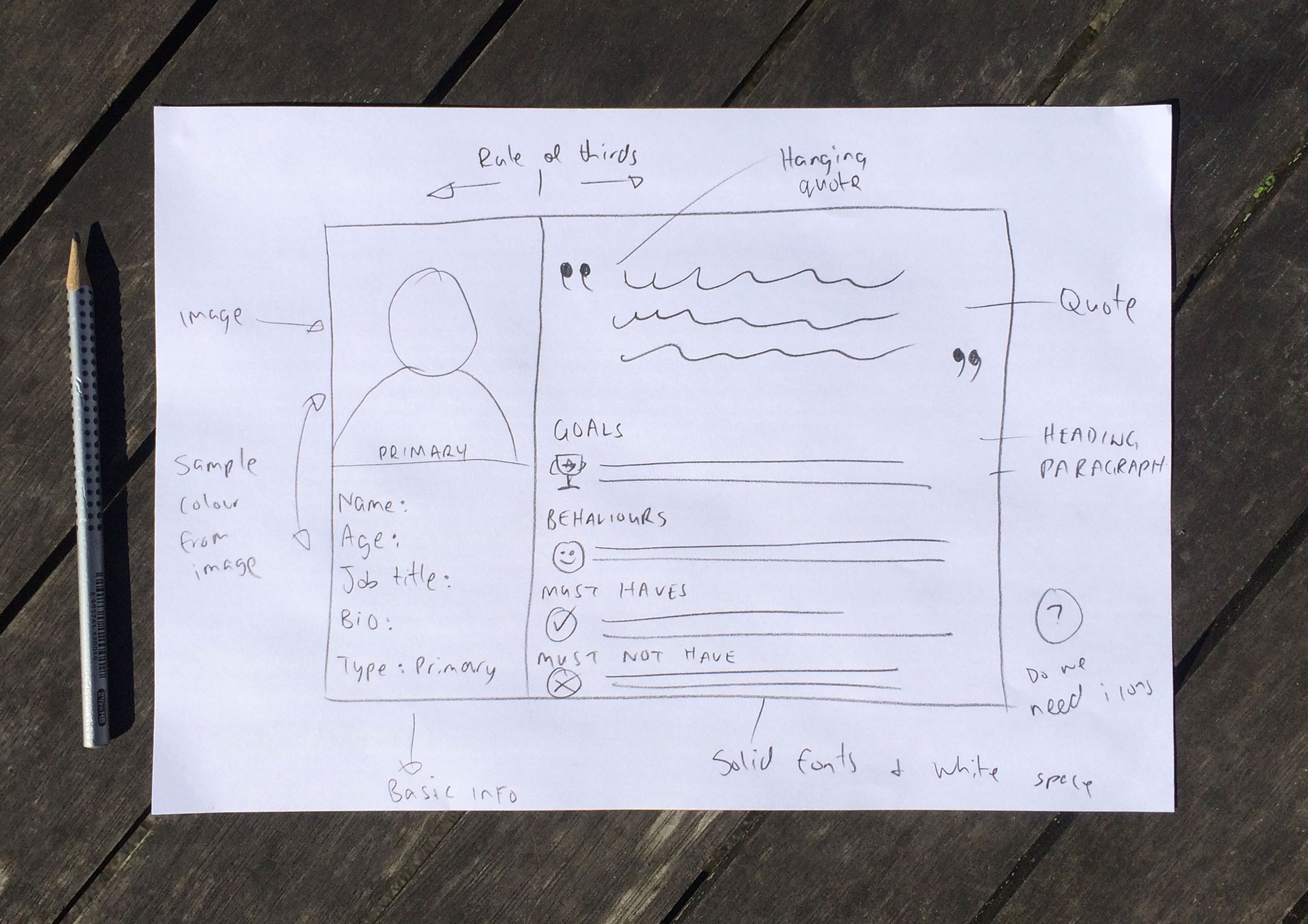
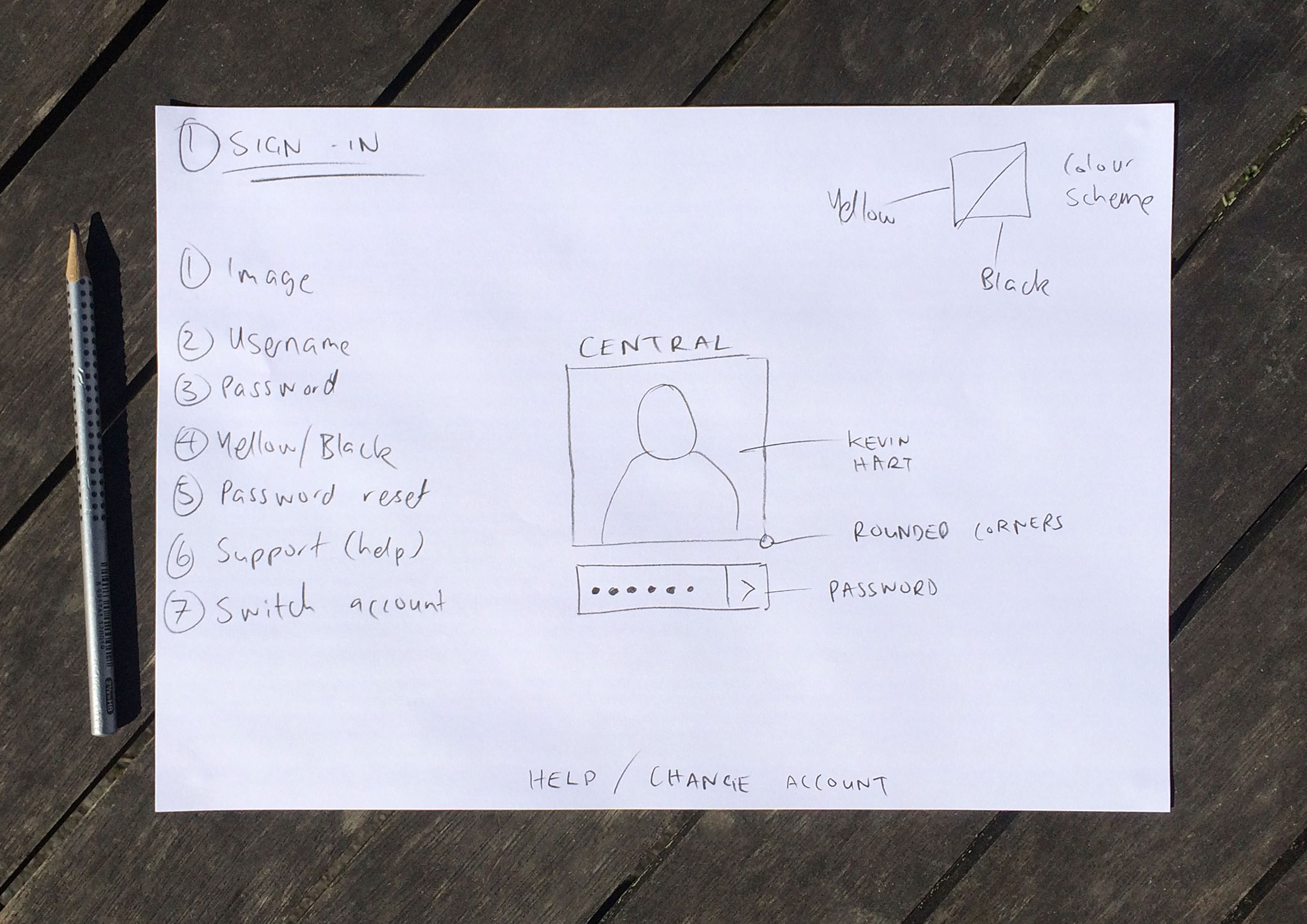
Sketched out ideas for the rough wireframes and detailed what UI elements are required within the interface
Completed some workshops on how to use Evolus Pencil a low-fidelity wireframe tool
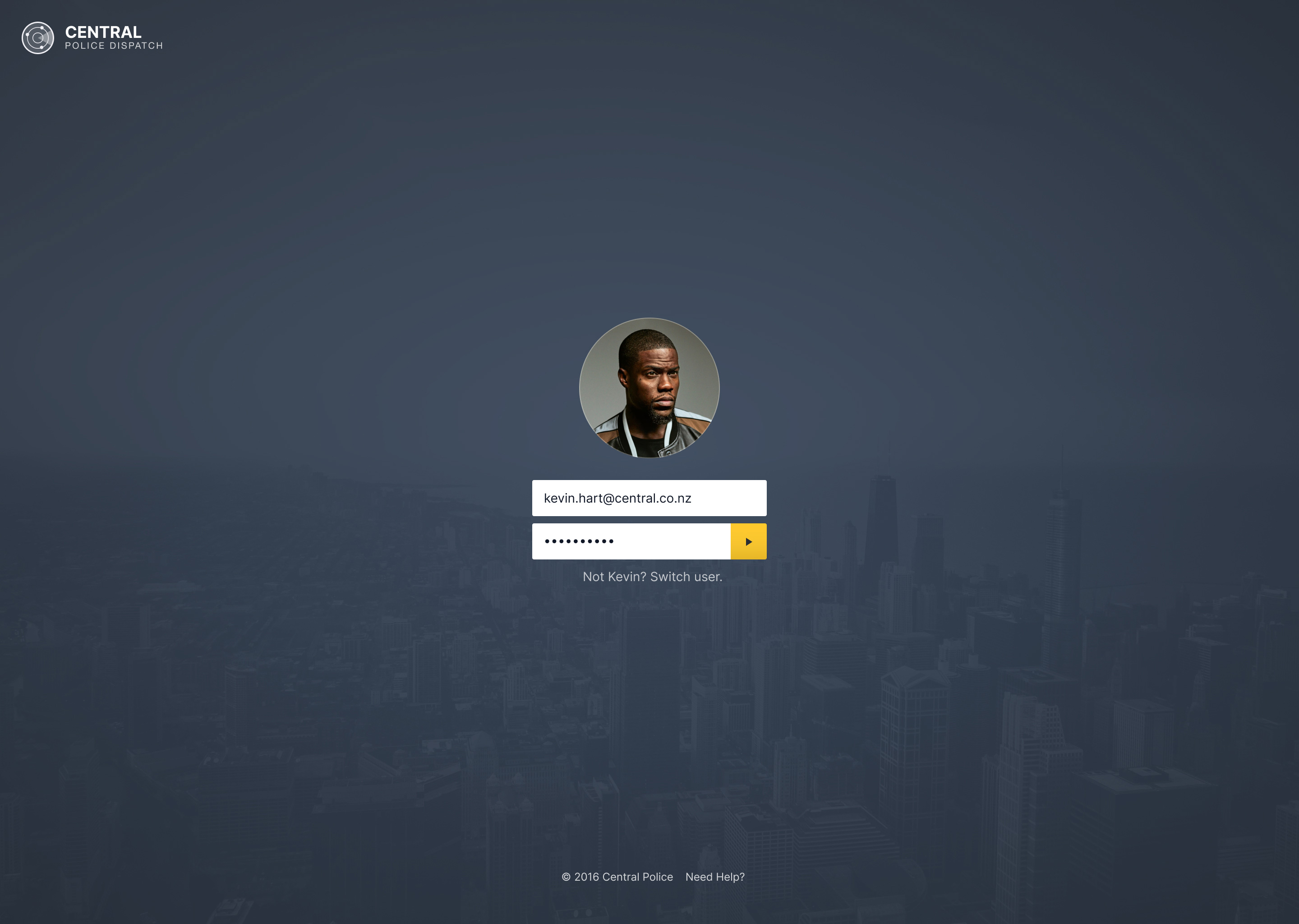
Designed a simple sign-in screen
Interviewed a Police constable about the call handling process from their end
Week 4: Sketching rough concepts and low-fidelity wireframes
Sketching and wireframing of 2 x concepts
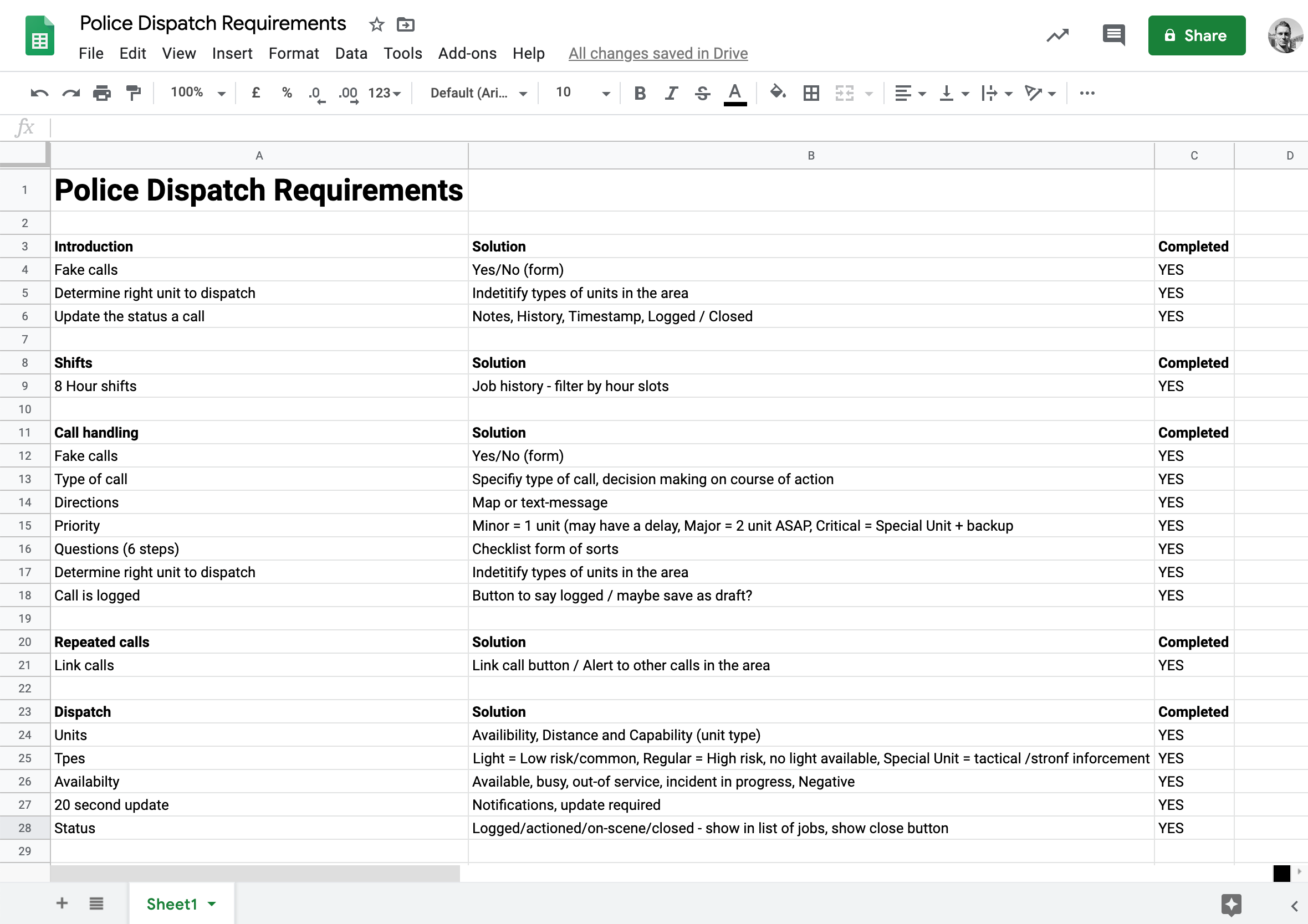
Re-wrote the design brief into a user-requirement spreadsheet ensure elements don’t get over looked
Week 5: Design and prototyping
Finished the two wireframe concepts
Completed some workshops to better understand affordances
Designed a logo, the navigation and grid structure
Studied for the test and made notes
Various iteration on the design of the dashboard.
Week 6: Study and design
Went through the course book again and made study notes.
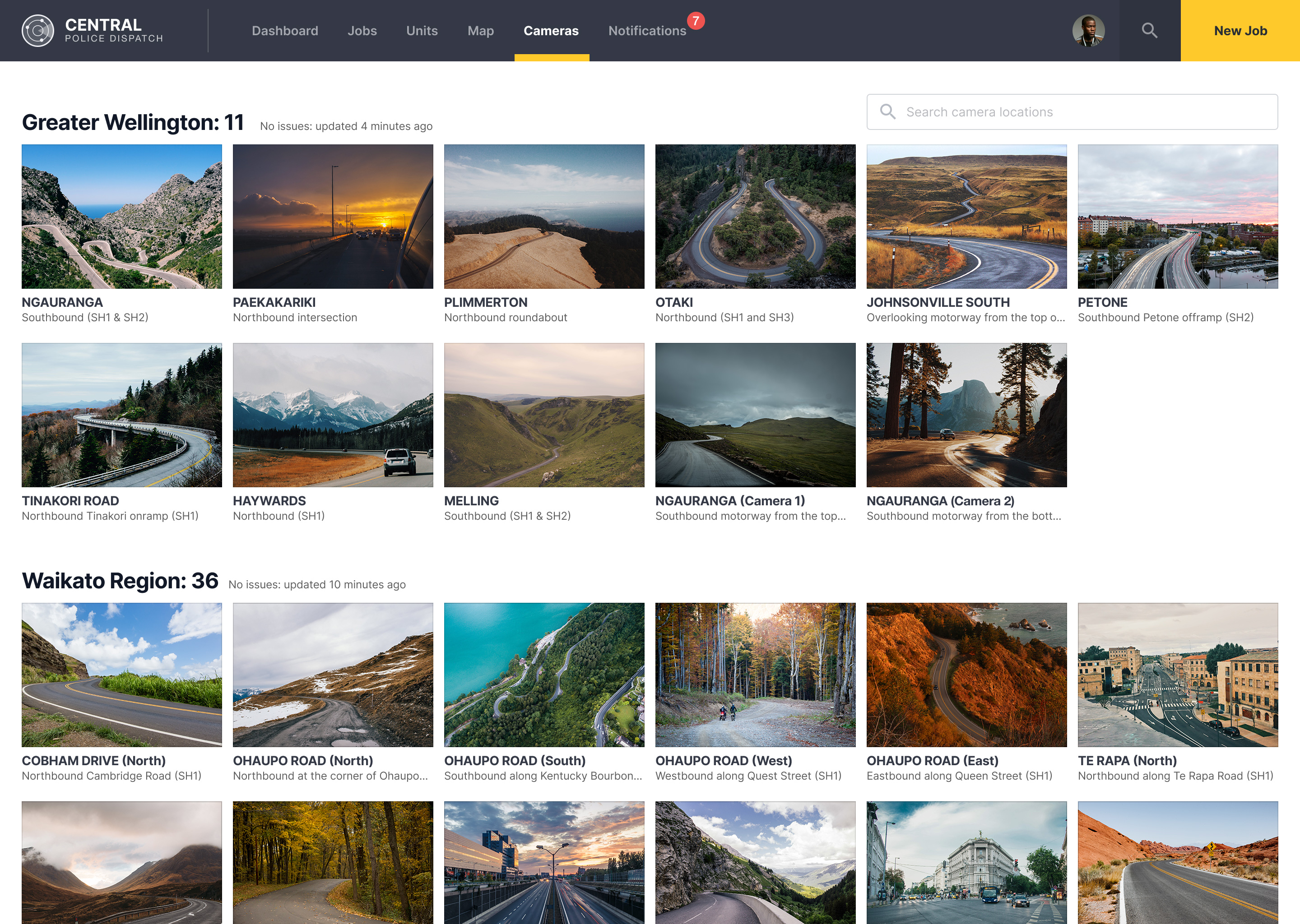
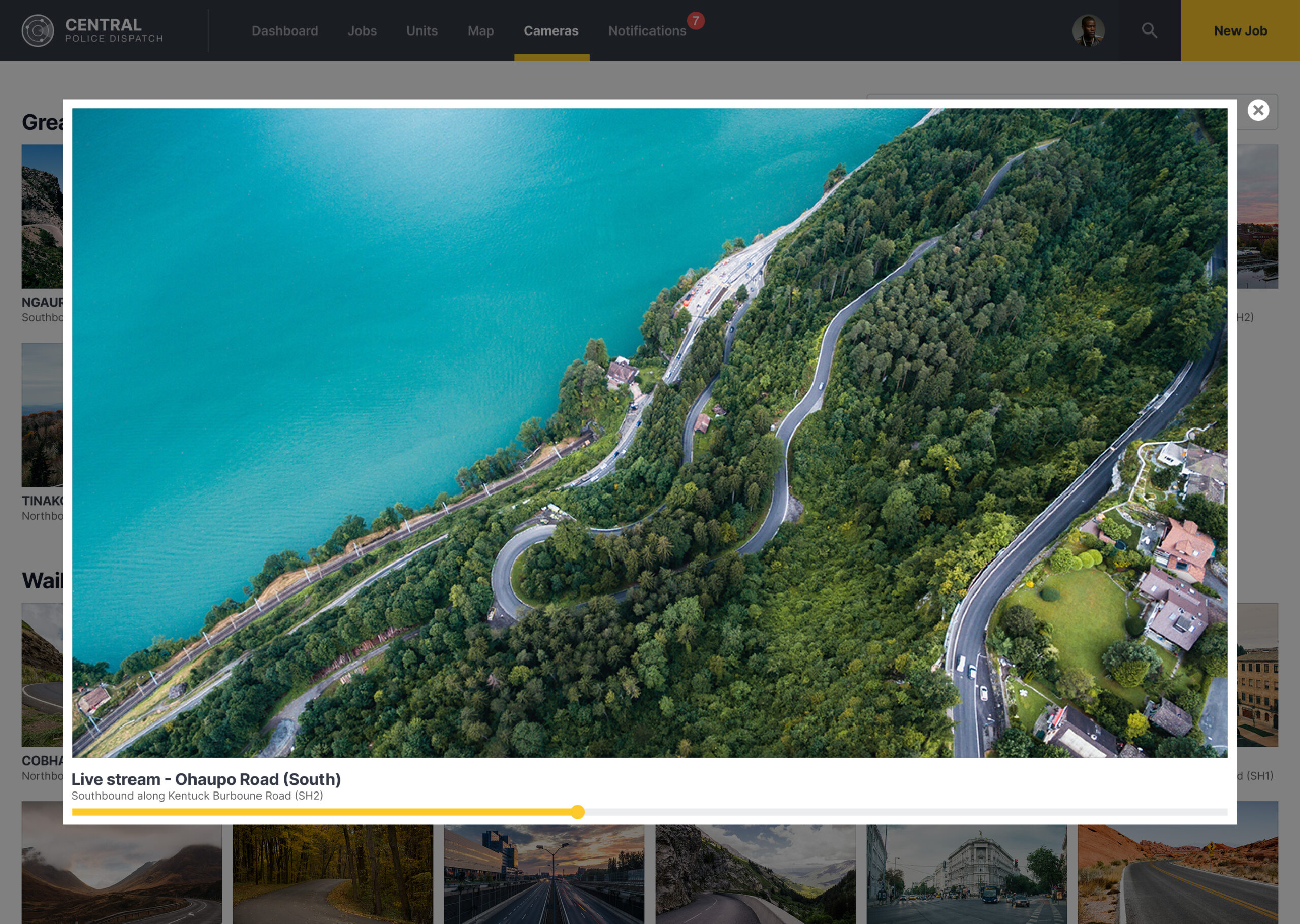
Found some time to work on the camera screens
Week 7: Design and prototype
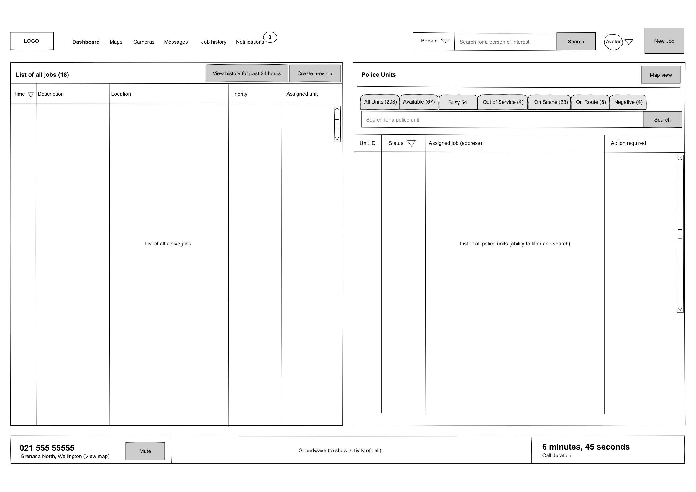
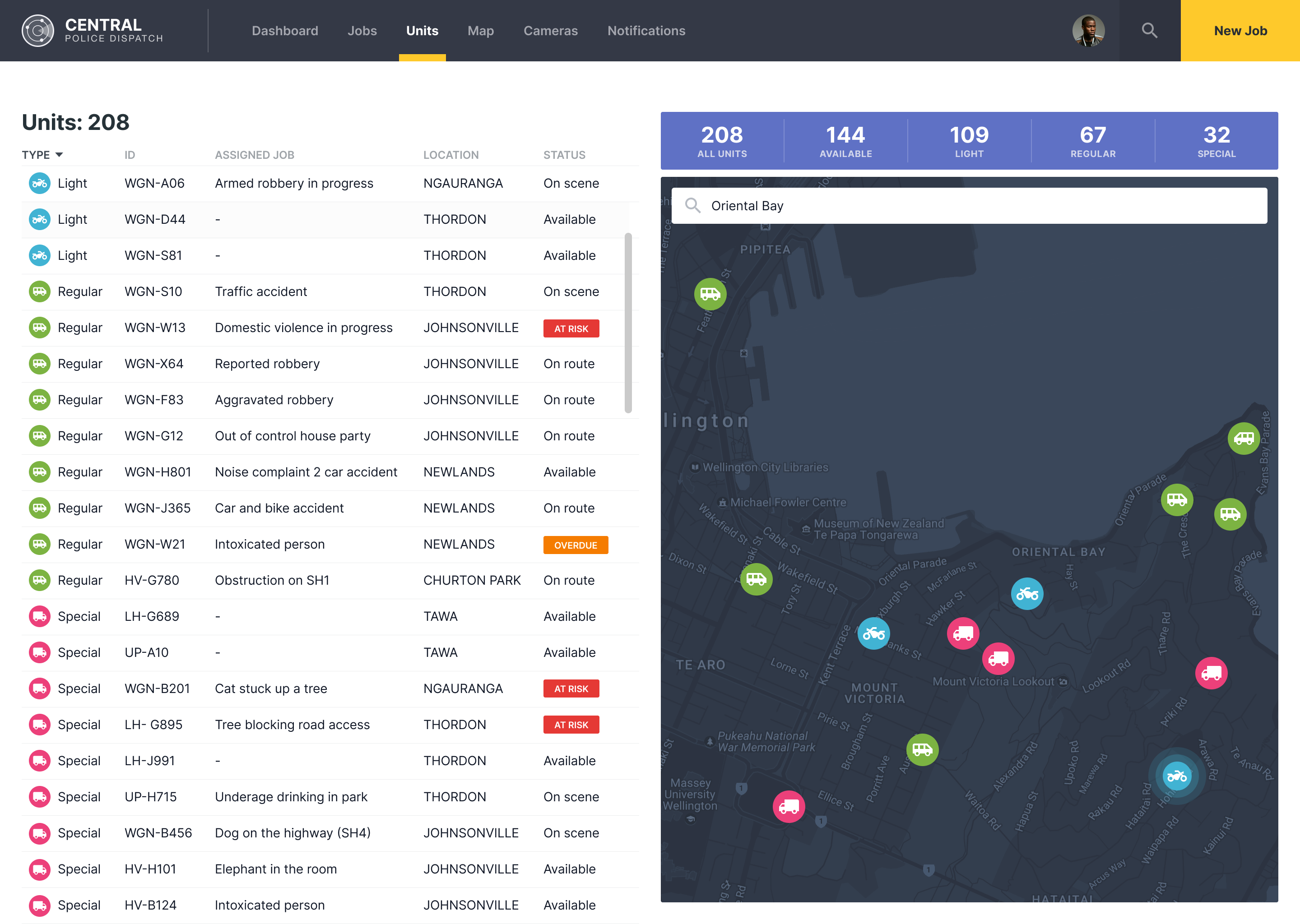
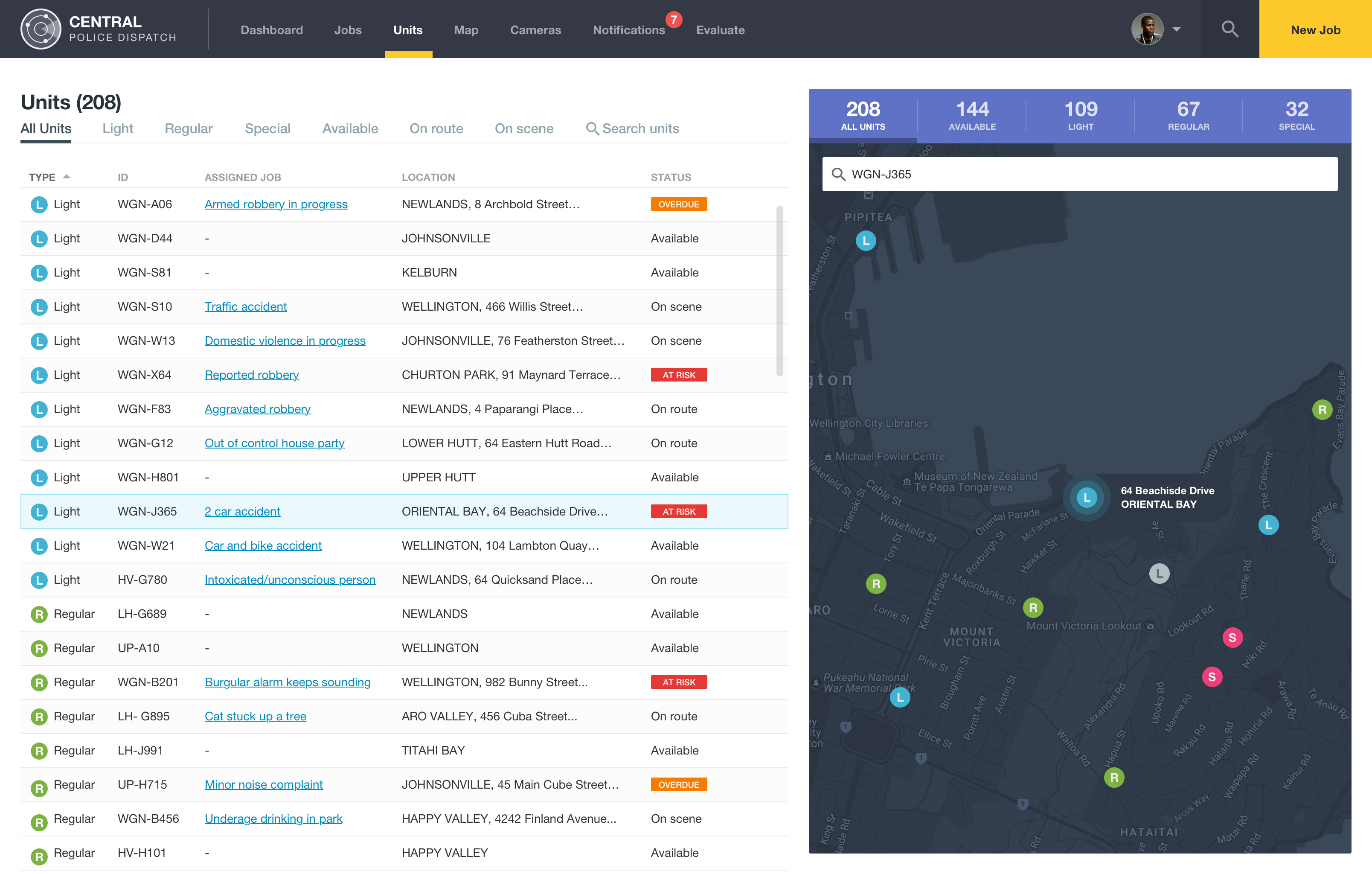
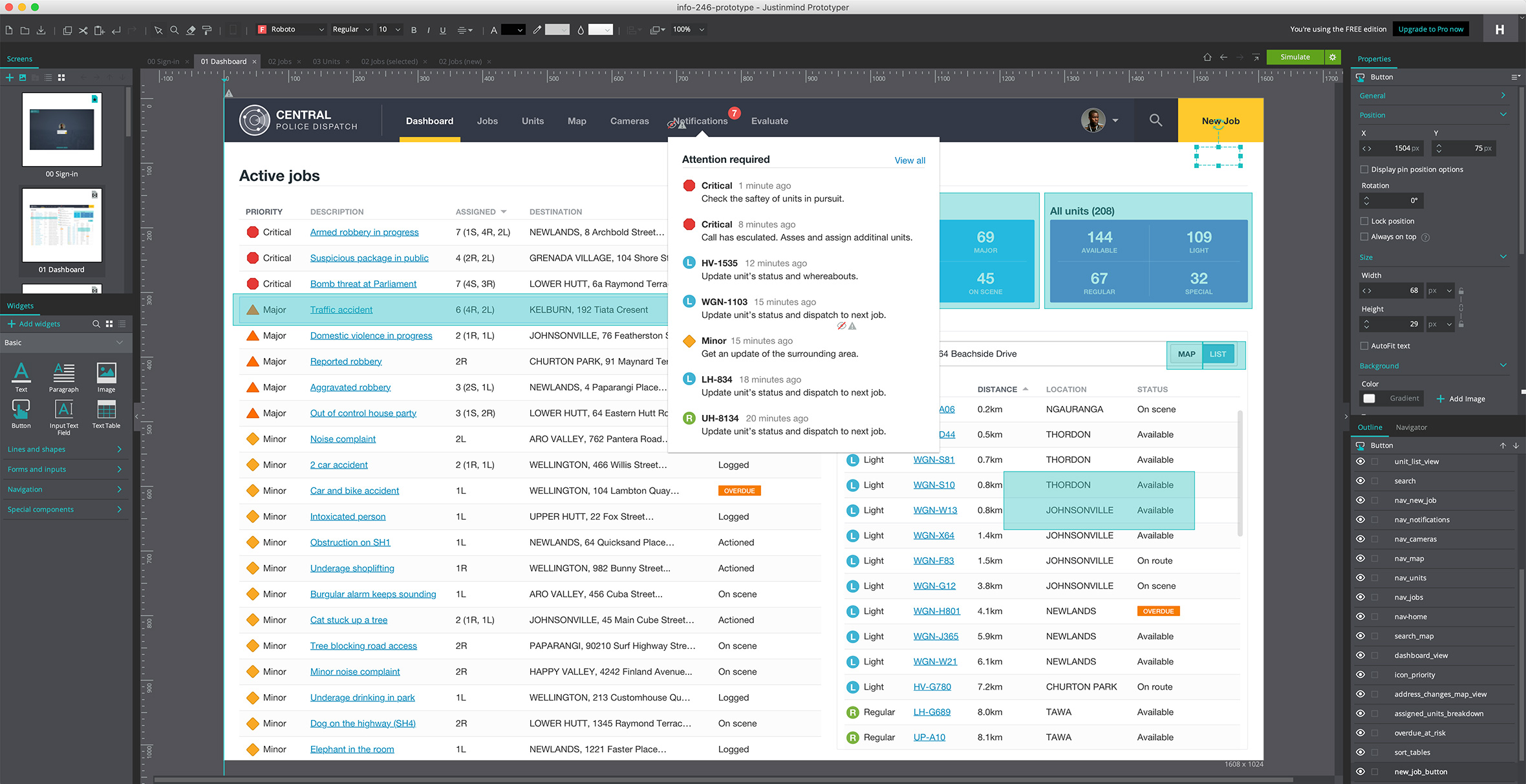
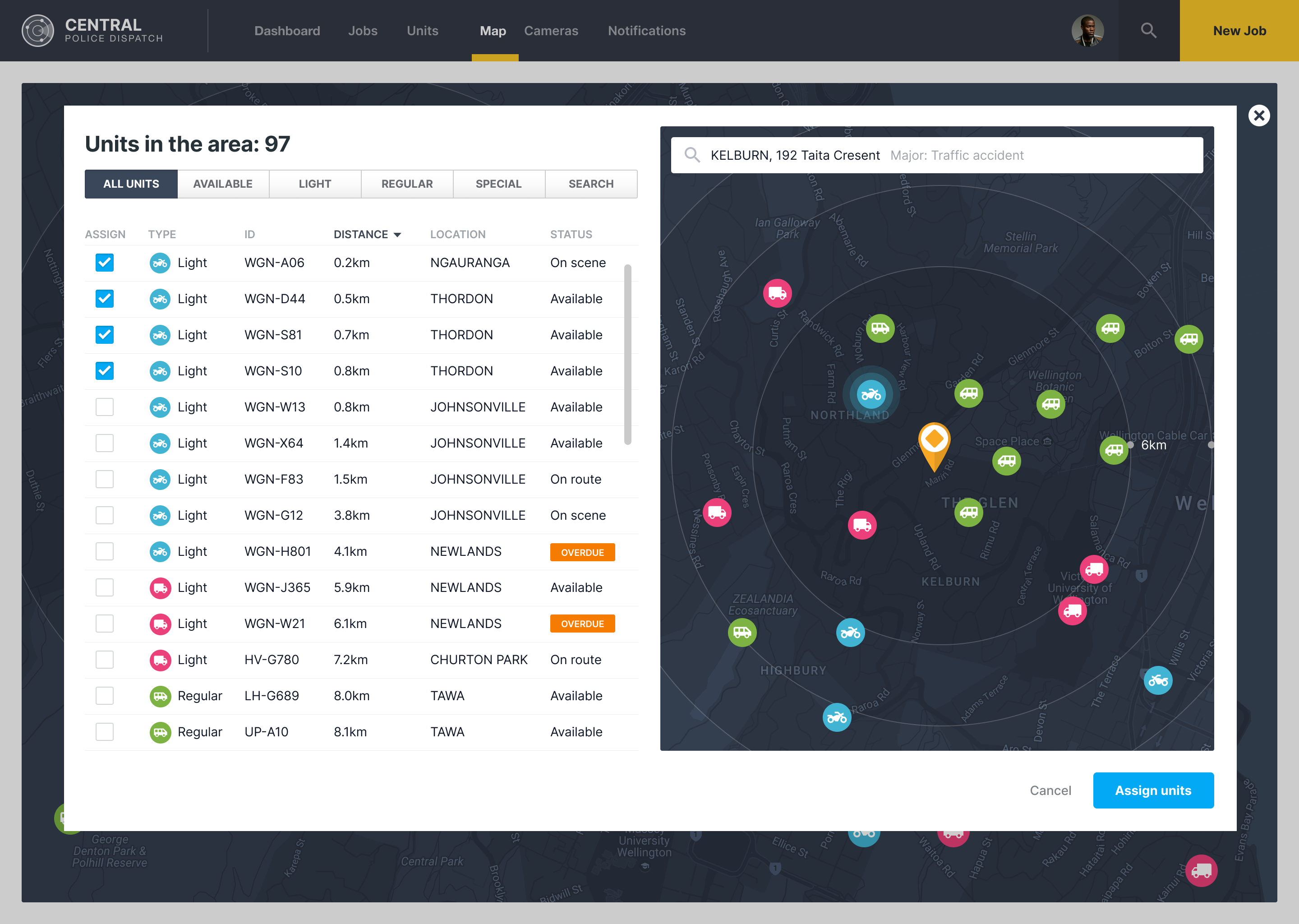
Take a look at the dedicated Jobs and Units page
Completed some workshops on how to use the prototyping tool, Justinmind
Week 8: Iterative design and prototyping
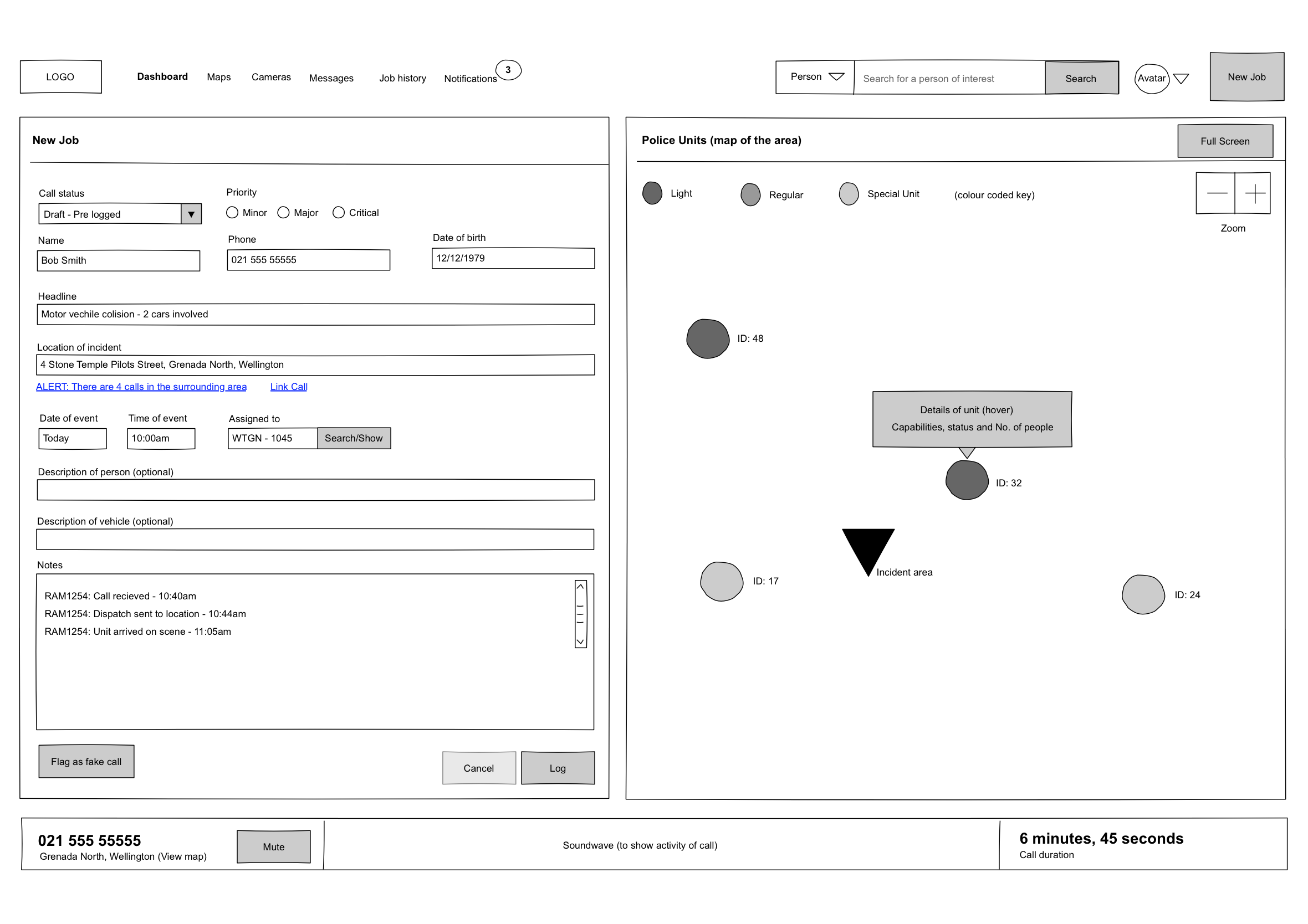
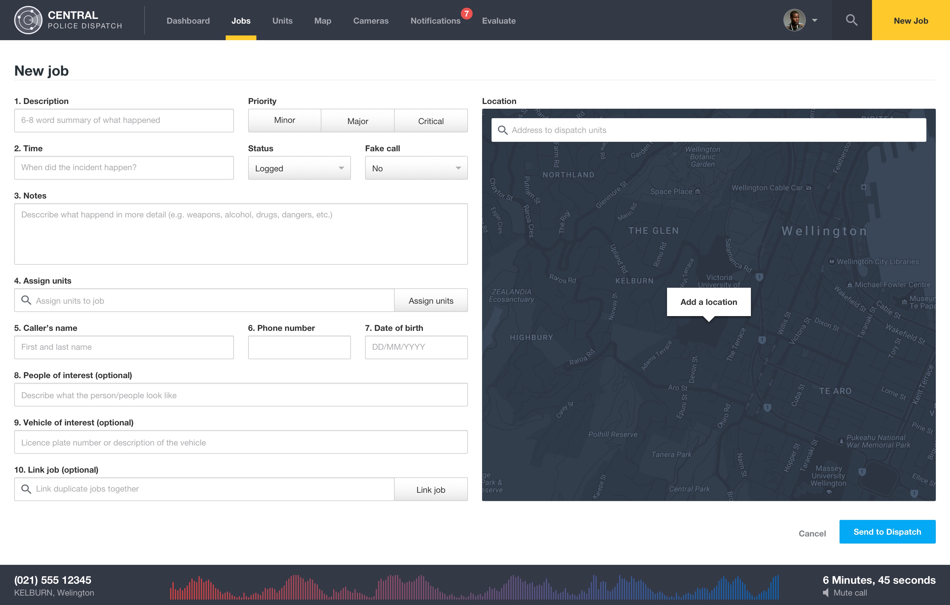
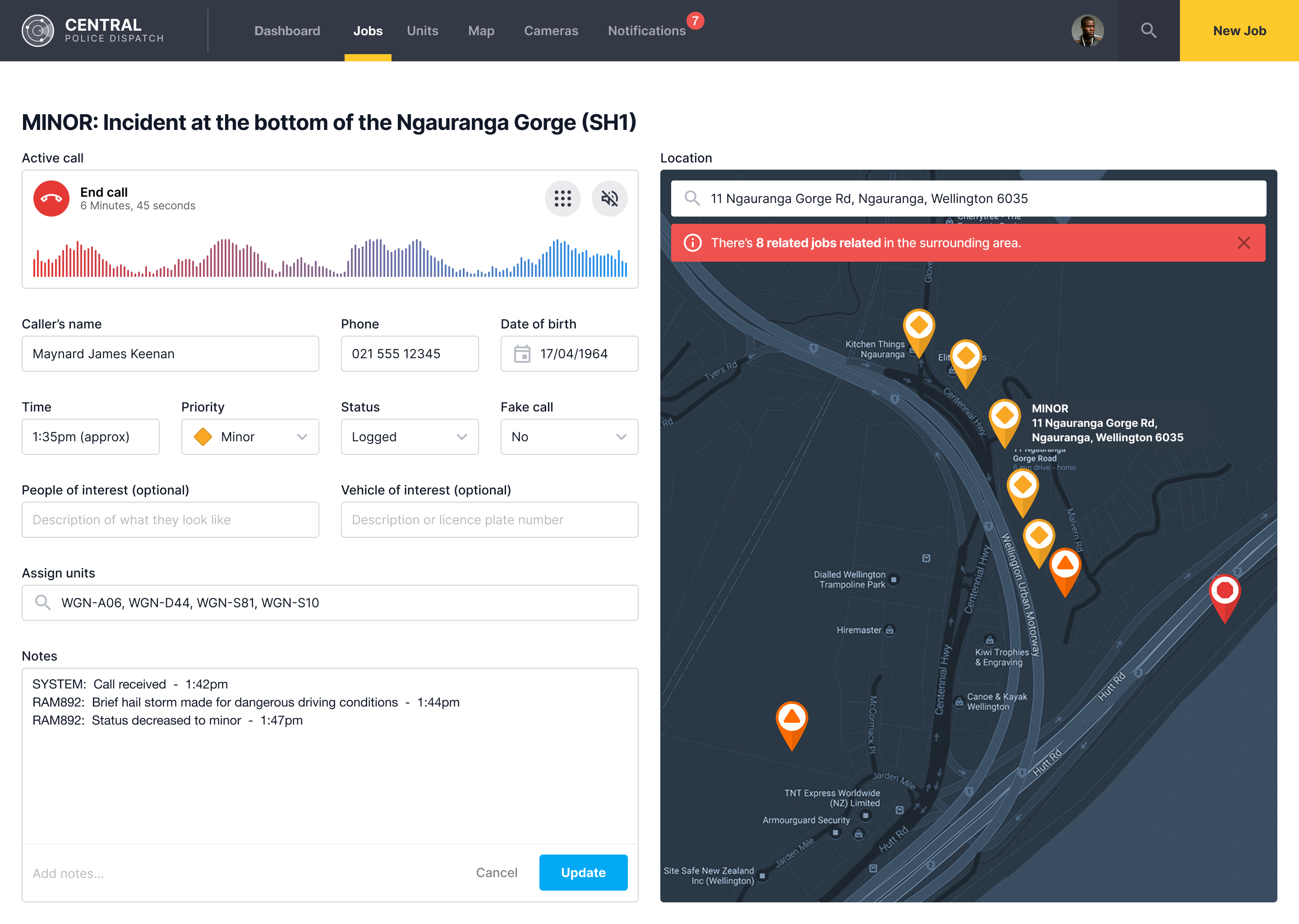
Re-visited the new job page and completed the various interactions and alerts
Built a prototype to view test out the navigation and user flows
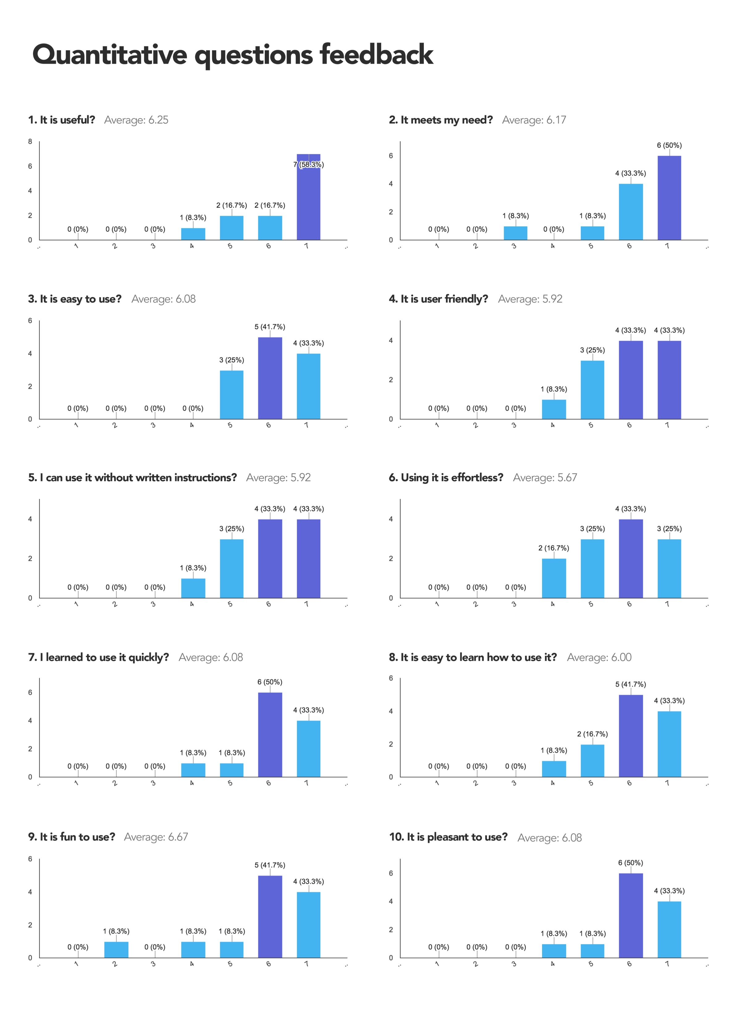
Week 9: User evaluation and fine-tuning
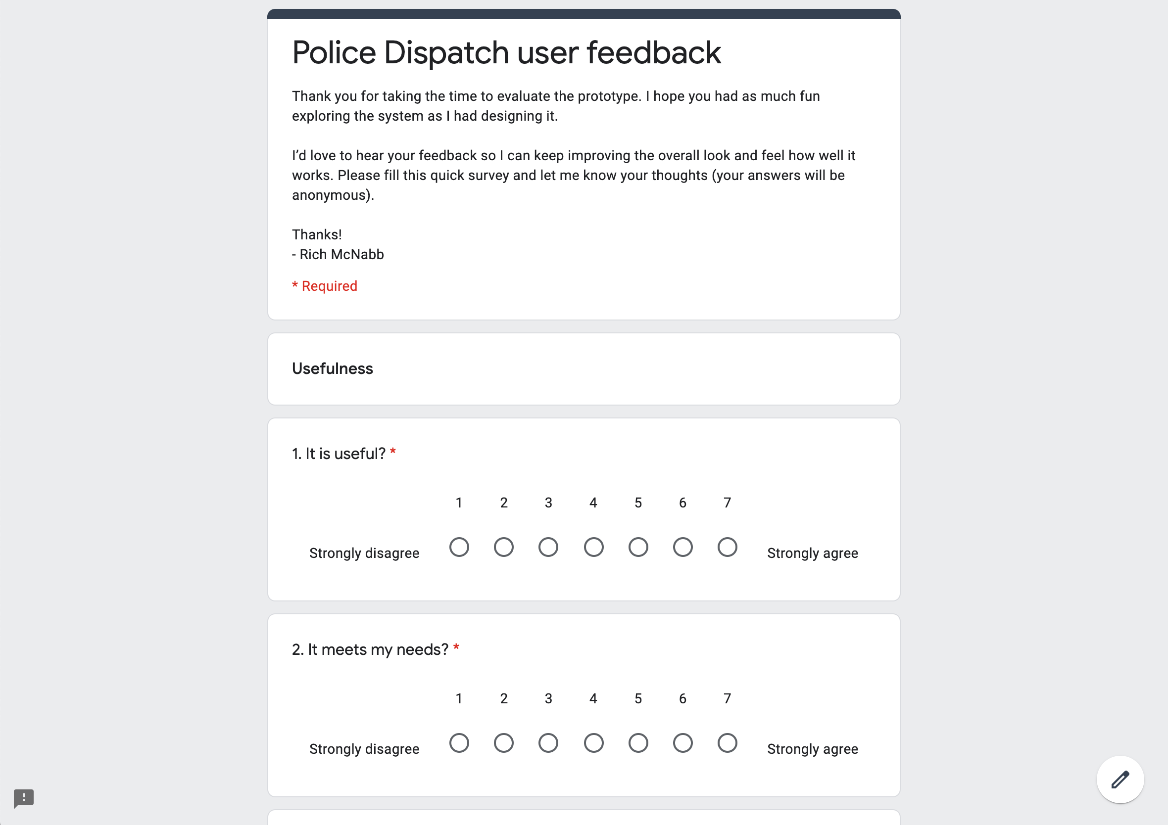
Created a user-evaluation form using Google Form to gain insight and to use to improve the finished product.
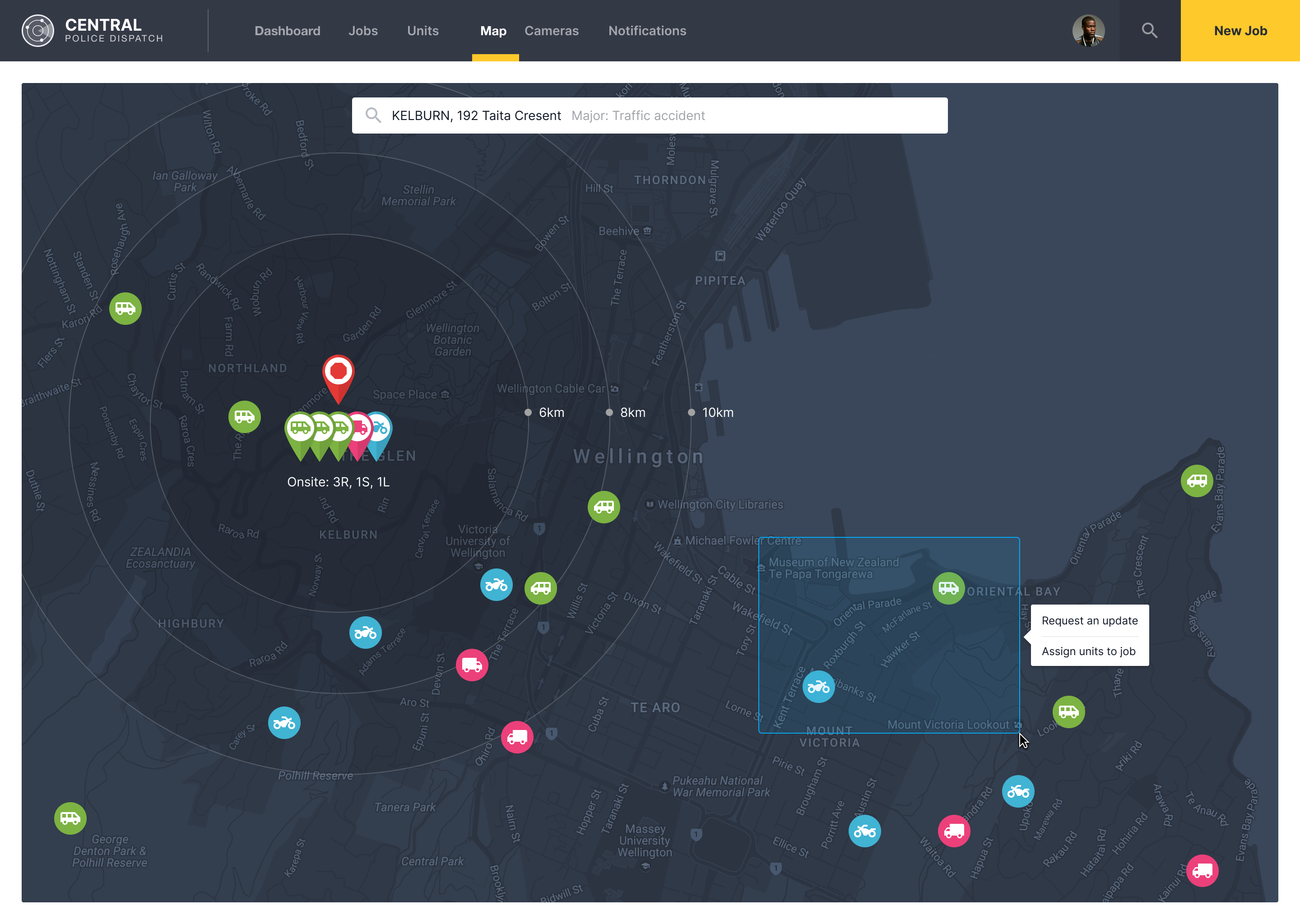
Experimented with a light and dark version of the map page
Week 10: Peer evaluation, user feedback and reporting
We evaluate each other prototypes and provide feedback on how their prototype could be improved further.
Created an evaluation report based on the feedback outlining what will be fixed to improve the prototype.
Studying for the final test.
Week 11: Improving the prototype
Went through the prototype and look at how I could improve the interactions to make it clearer how the end product would function.
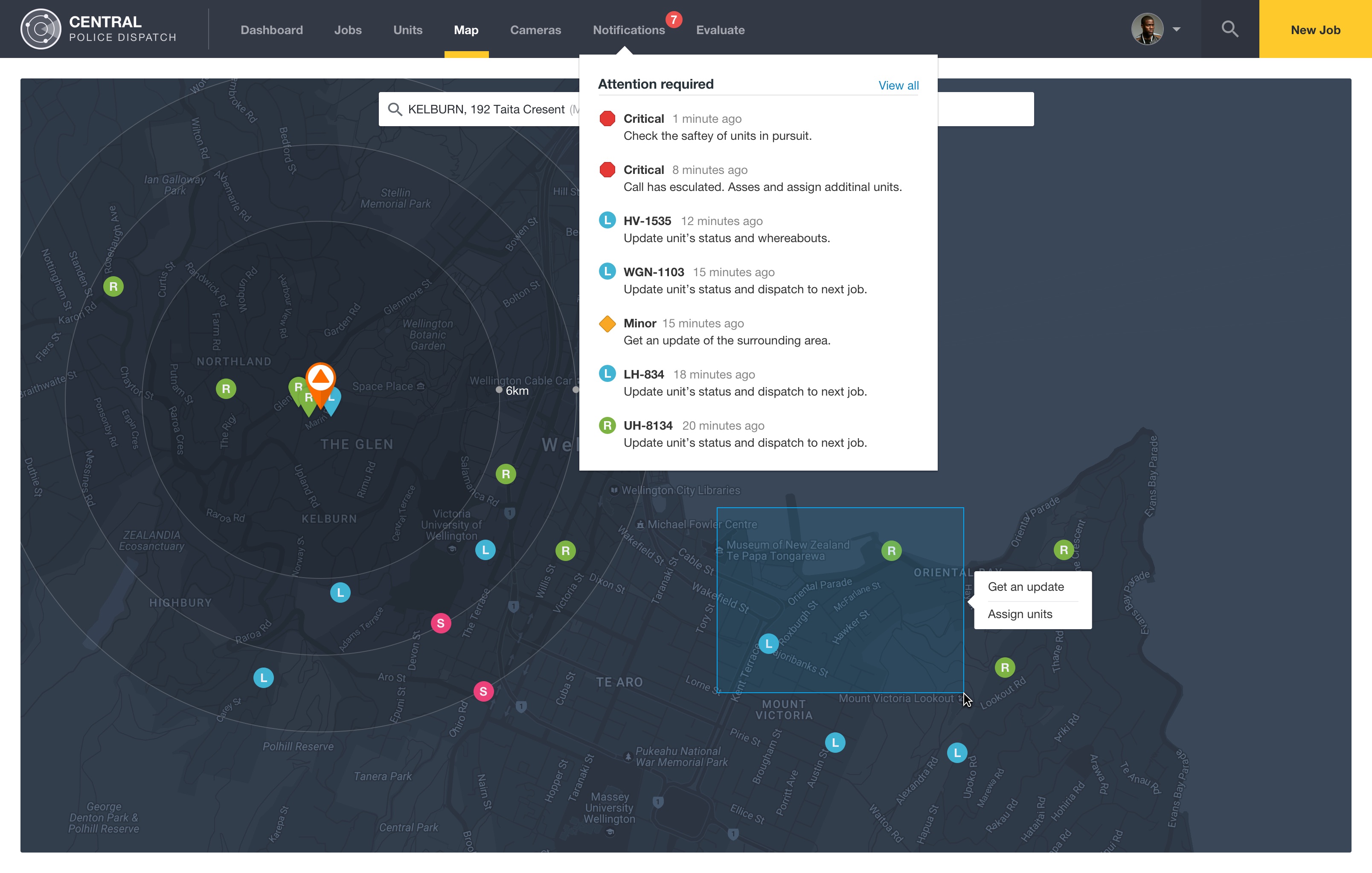
Improved the map icons for units that were “on-scene”
Implemented the notifications drop-down.
Week 12: Tying up loose ends
Studied for the final test.
Continued to polish the UI/UX of the prototype.
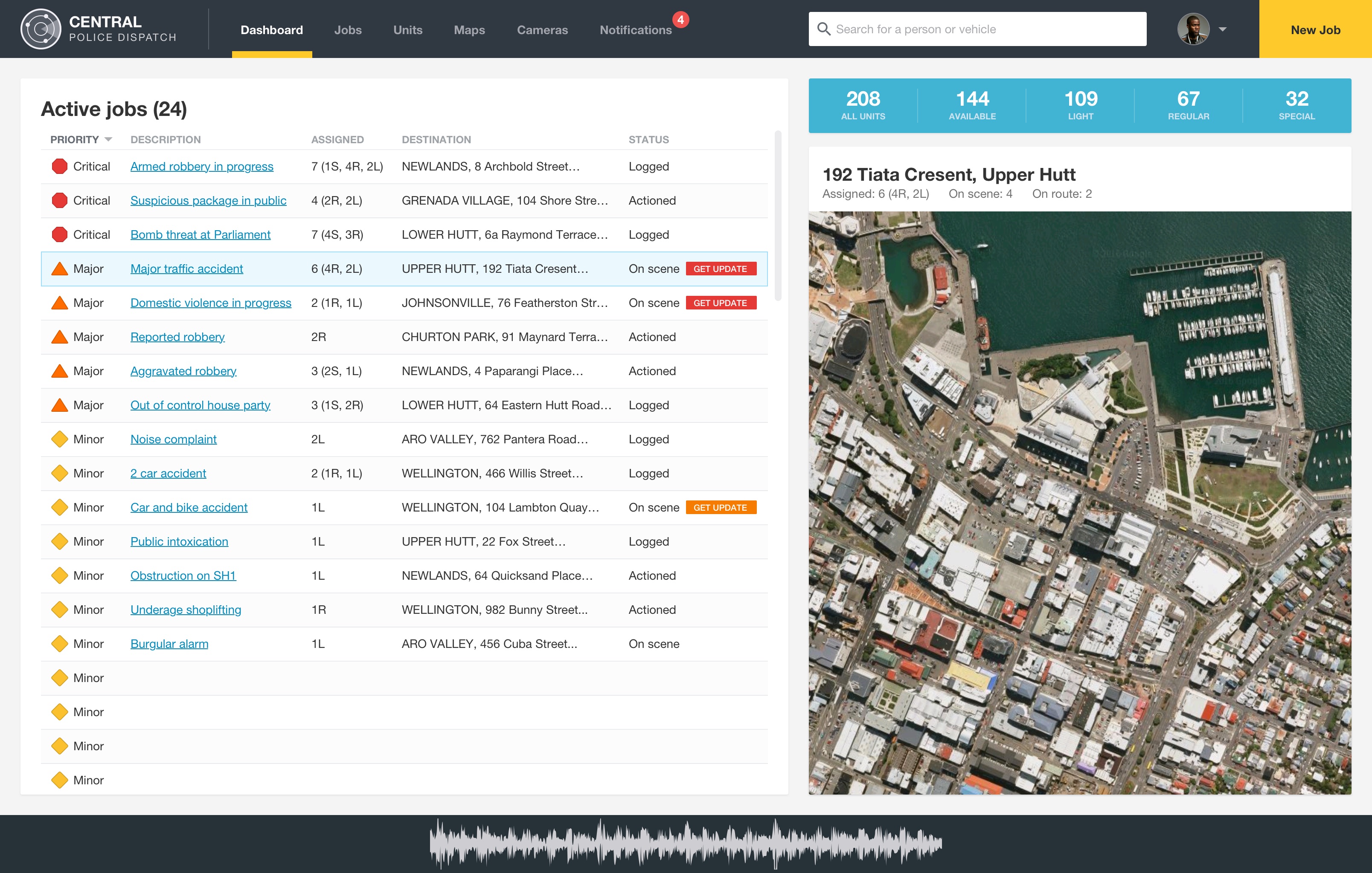
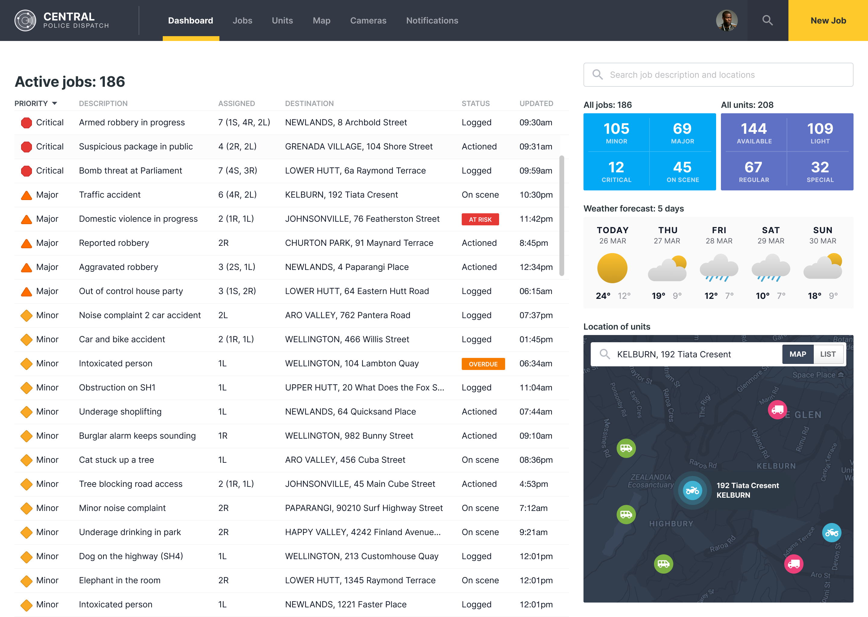
Designing for clarity under pressure
Police dispatch work doesn’t leave space for interpretation. When everything is urgent, the design has to do one thing well: surface the right information instantly, without adding friction or doubt.
What stood out most in this project was how quickly complexity turns into noise when too much competes for attention. The real design challenge wasn’t structure or layout, it was restraint. Deciding what should disappear so the important parts could stand forward without effort.
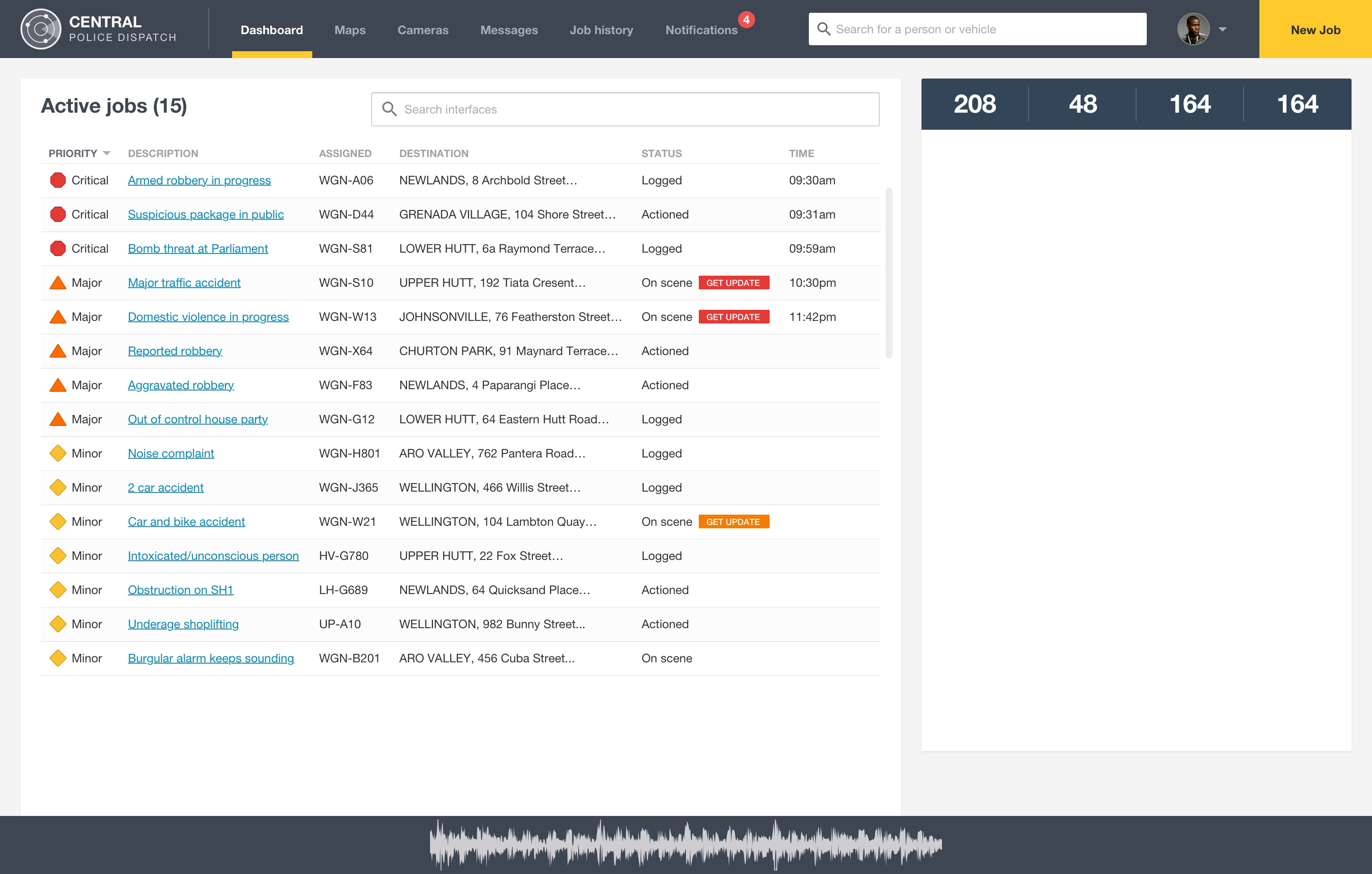
This kind of thinking shows up across my work in complex dashboards and design systems, where clarity and hierarchy directly affect how people make decisions in real time. I explored the same problem more recently on the Central Police Dispatch emergency dashboard, where the stakes were even higher and the margin for confusion was even smaller.
It’s a reminder that in high-pressure systems, good design isn’t about making things more complete. It’s about making them easier to see.