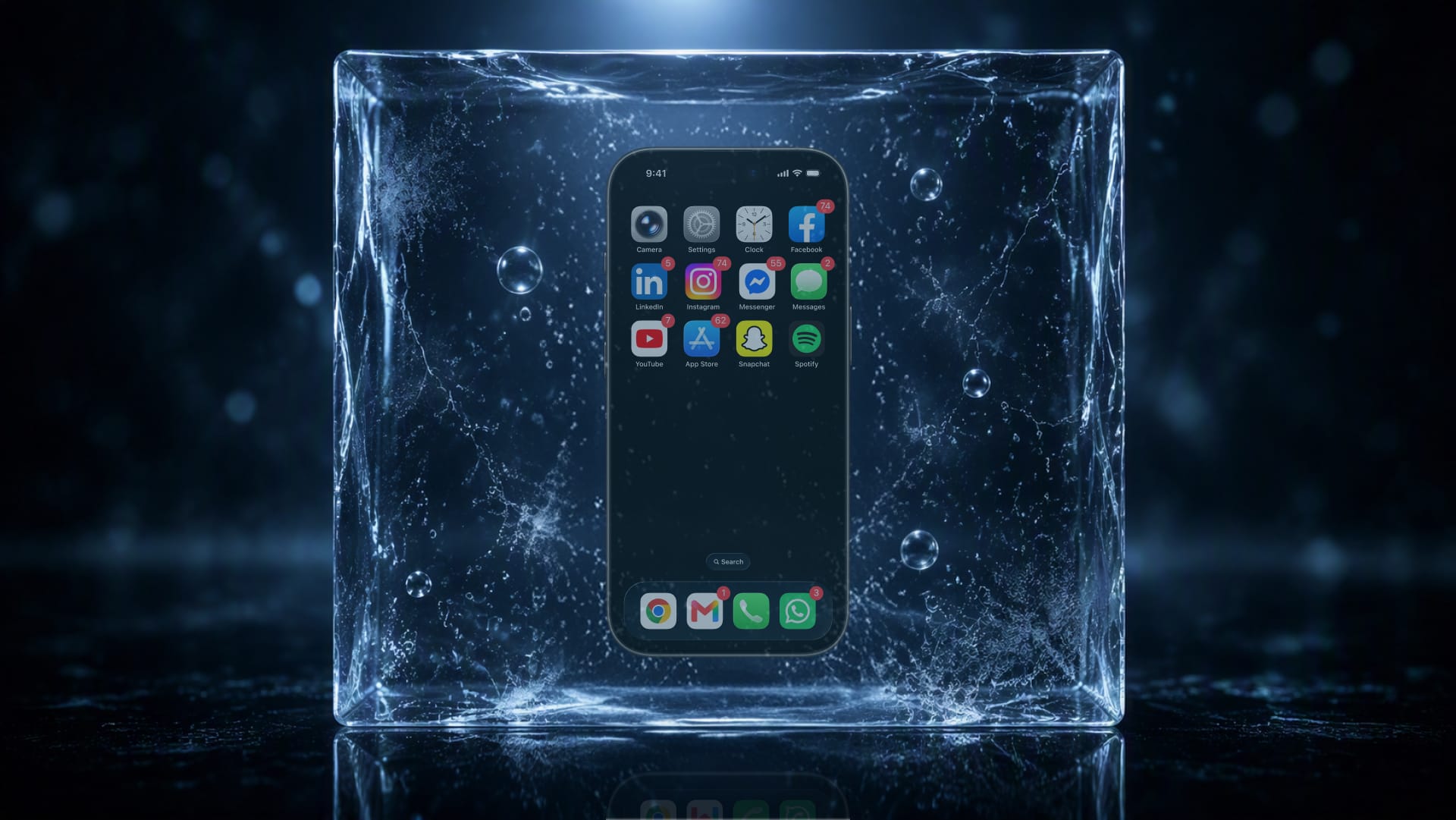
Fighting the system and breaking my phone addiction
Scrolling Facebook, I noticed something: mostly ads, barely a friend in sight. What followed was months fighting a phone addiction, iPods, dumb phones, screen time settings, before one small NFC device actually broke the habit for good.
When I noticed my feed had stopped being about my friends
I was scrolling Facebook the way I have a thousand times before, and then I noticed a change which hadn’t registered until right now. Advertisement, promoted posts, suggested groups, all designed, or more aptly disguised, to blend in with the rest of the content so they go unnoticed. Barely a single update from an actual friend or page I follow.
To test my theory I kept scrolling, and it turned out every third or fourth card was something I’d actually chosen myself. The more time I spent on the app, the further the distance grew between me and the content I cared about, until there was hardly anything left that I found interesting or useful on the platform.
Give Facebook a break for a while, and that gap between content I cared about would shrink again. Almost every post or every second post feeling like mine once more. However, keep using it and scrolling, and the gap would open right back up. Rinse and repeat.
Somewhere along the way, and it’s hard to put a finger on exactly when, too slow to notice a difference day to day. Impossible to miss once you look back. The feed stopped being about the people or interests I cared about. It became about whatever kept my eyes on the screen the longest, whether or not I could have told you what I’d just read or seen for the past half hour. That’s not by accident. That’s by design.
“Enshittification” the term created by author Cory Doctorow
Writer Cory Doctorow coined a word for it in 2022: Enshittification. Platforms start out with purpose. They solve a real problem, they’re useful, fun to actually use, then slowly lean away from serving you and skew toward extracting value from you instead.
Facebook in the early days was groundbreaking, connecting with friends and family scattered across the world, seeing what they were actually up to. Now it is ads disguised as content, promoted posts elbowing past the people you followed it for in the first place.
Instagram followed the same arc. It started as Burbn, a cluttered check-in app, before its founders noticed the one thing people actually cared about was photos. Filters existed for a real reason back then, phone cameras in 2010 took genuinely bad photos, and a filter was the fastest way to make a blurry, badly lit shot look intentional. It launched in October 2010 and passed a million users within ten weeks.
Uber’s origin story is really about availability, not cost. In 2008, founders Travis Kalanick and Garrett Camp got stranded in the Paris snow, unable to find a single cab. The irony is that when Uber actually launched in 2010, it wasn’t cheaper than a taxi, it ran about 1.5 times the price, a black-car service before it was ever a budget one.
Airbnb started the same way, out of necessity rather than ambition. In 2007, Brian Chesky and Joe Gebbia couldn’t cover rent on their San Francisco apartment. A design conference had every hotel in the city booked out, so they bought three air mattresses and charged $80 a night. That was the whole business plan, until it wasn’t.
Uber Eats came later, built in six weeks out of Uber’s own ride-hailing tech stack, launched in 2014 under the name UberFRESH before anyone had settled on what it should actually be called. All four arrived solving something real, and slowly morphed into exactly what they’d set out to replace, only worse.
Hooked, Indistractable, Nudge: illusion and escape
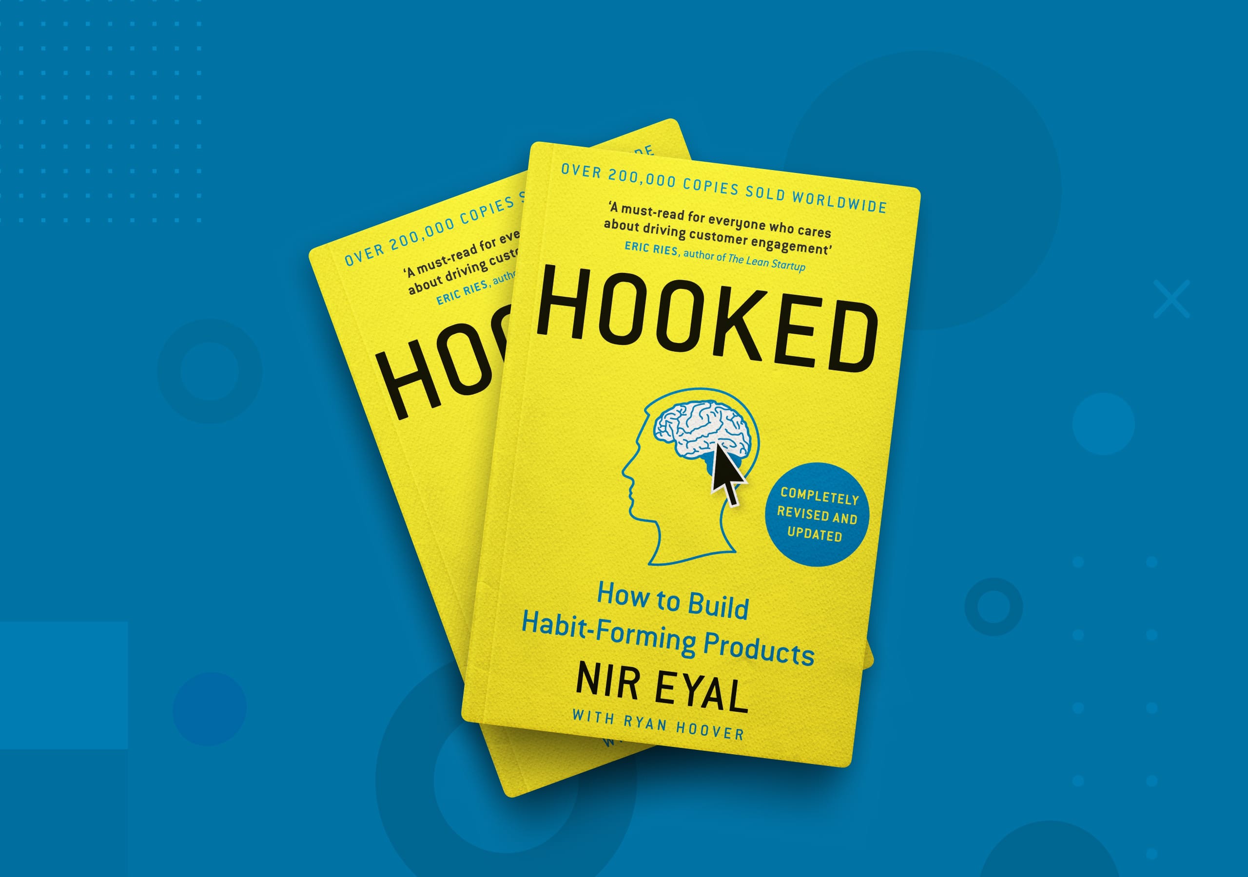
Three books come up in conversation and map onto this almost perfectly. “Hooked” by Nir Eyal lays out, step by step, how to build products people cannot stop using.
Nir Eyal’s bestselling book, Hooked: How to Build Habit-Forming Products.
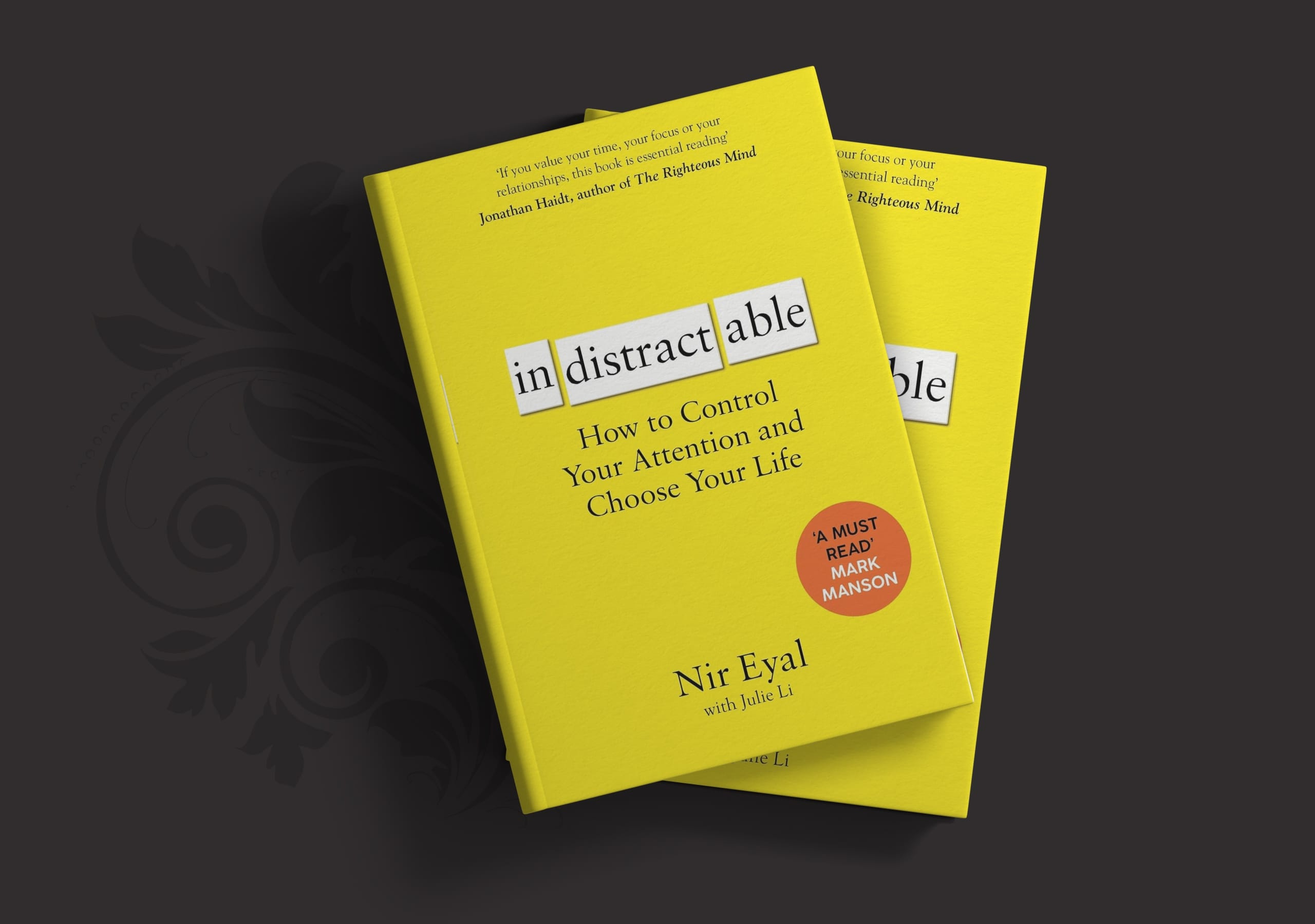
Nir then went on to write “Indistractable”, which is essentially him doing a 180, telling everyone how to fight the very system he taught the industry to build. There is an unsettling humour to this. The same person setting the trap and then showing you the trapdoor to freedom.
Book cover of Indistractable by Nir Eyal with Julie Li.
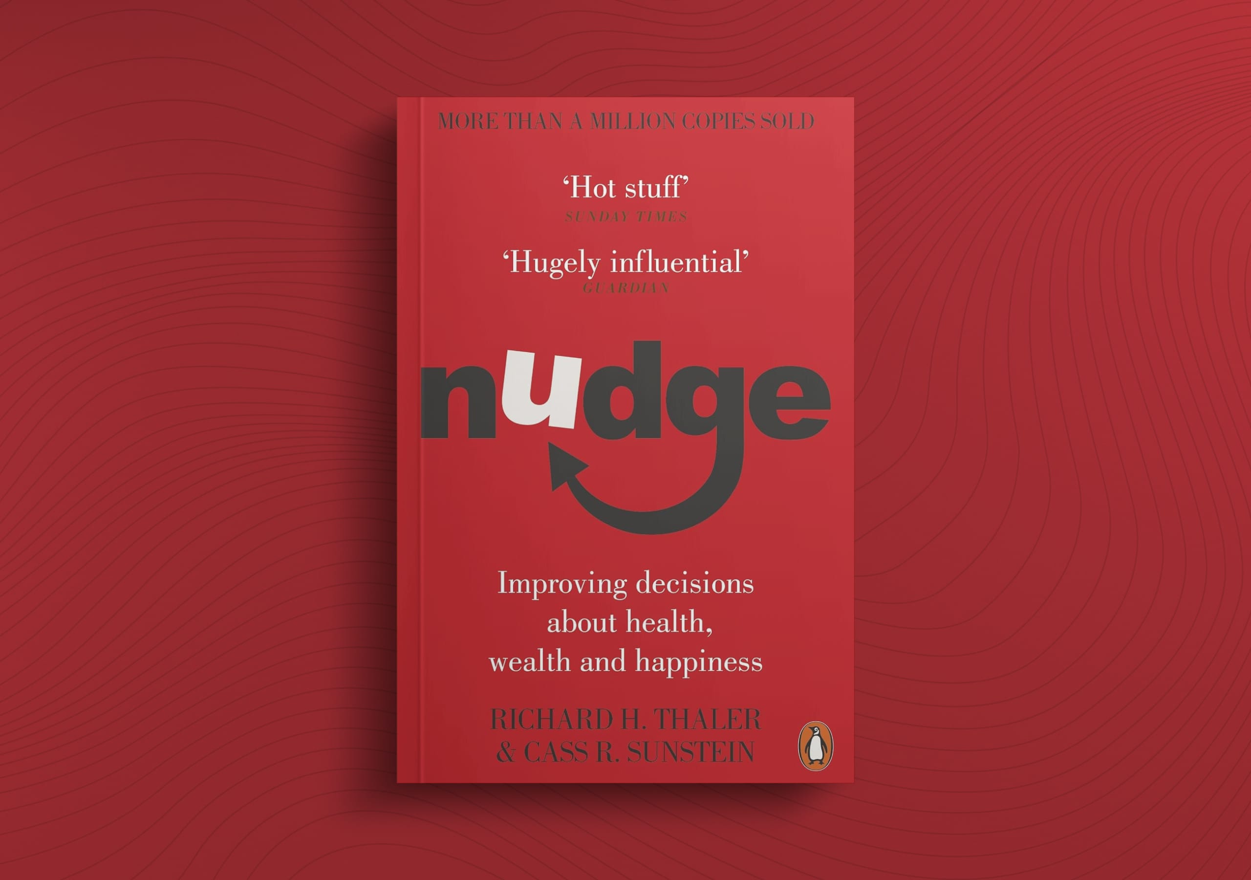
Then there is “Nudge”, by Richard Thaler and Cass Sunstein, about choice architecture, how the way options are presented quietly steers the decisions we make.
Read all three back to back and the picture becomes clear. This isn’t about a lack of willpower. It is about a lack of guardrails embedded into the platform’s DNA.
Book cover of Nudge by Richard H. Thaler and Cass R. Sunstein.
I’ve worked with behavioural design myself, on the other side of it though, nudging people toward their own interests, not mine. Helper text that actually explains a concept. Being upfront about pricing and fees so there are no surprises later.
Products and platforms are designed to hook you
This is a business model, not a coincidence.
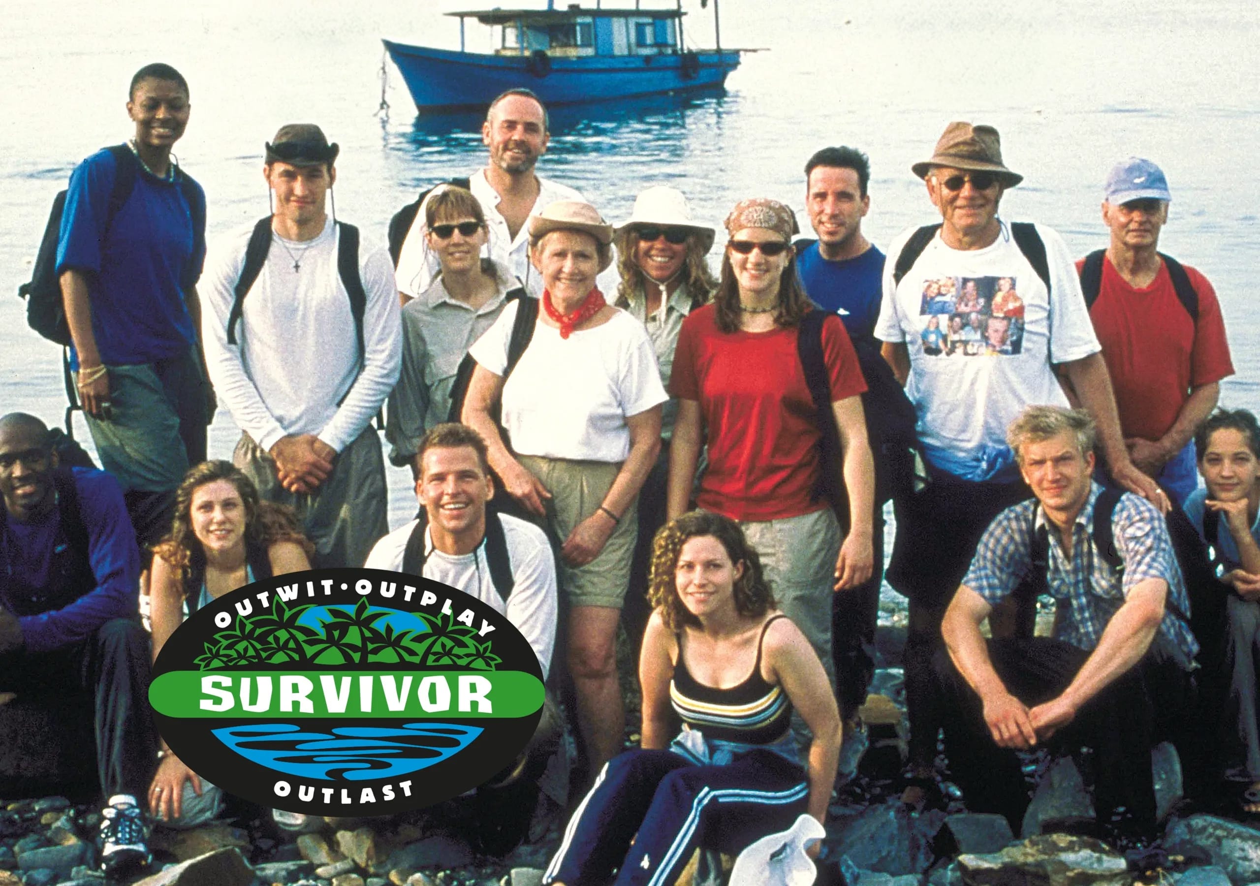
Survivor is a great example. It premiered on CBS on May 31, 2000, and became a massive hit that launched the modern era of “unscripted” reality television. Once networks realised unscripted content was cheap to make and addictive to watch, the market flooded with it, essentially the fast food of entertainment. Perfectly executed then duplicated and diluted since.
The original cast of Survivor: Borneo, unknowingly kicking off two decades of unscripted television you couldn’t look away from.
Survivor spawned countless shows chasing the same formula, because it worked. You can lose an hour, sometimes two, before coming to from a daze to ask yourself, “Rich, what are you doing with your life?”
Like Facebook, Google makes most of its money from ad revenue. Between 70% and 80% of Google’s total income comes from selling ad space on Search, YouTube, and Google Network partner sites.
Search for something specific on Google and half the results produce advertisements which have nothing to do with what you actually typed. The answer you actually want gets buried under the product someone paid to put in front of you.
Type in a search term and you will often scroll past sponsored results, shopping carousels, “people also ask” and AI overview boxes before you reach anything resembling the answer you were actually after.
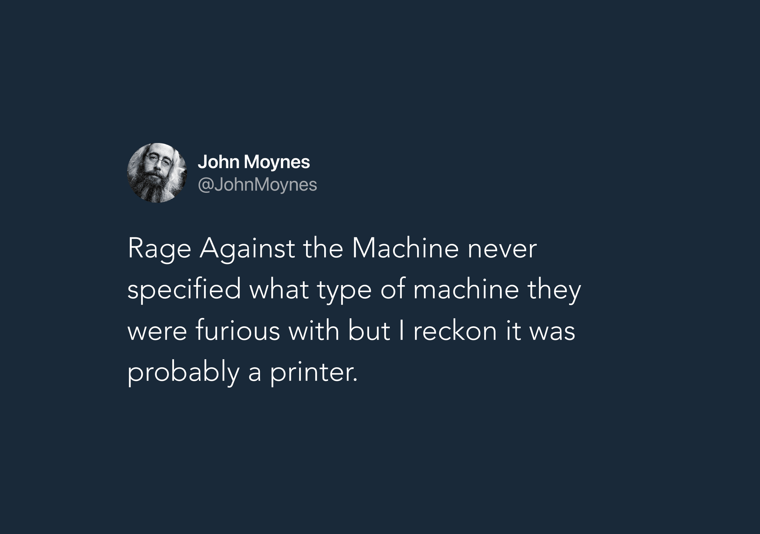
Printers are no exception. HP has spent the better part of a decade pushing firmware updates, some disguised as routine security patches, that quietly detect and block third-party or refilled ink cartridges. The printer doesn’t break, it just refuses to print until you buy HP’s own, considerably more expensive ink.
John Moynes landing the joke: Rage Against the Machine never said which machine.
It’s happened often enough to generate a string of class action lawsuits: a $1.5 million USD settlement in 2018, another suit in 2024 seeking $5 million USD, and fresh cases still being filed in 2026.
HP’s own CEO, Enrique Lores, more or less confirmed the whole strategy out loud, telling the World Economic Forum in 2024, “We lose money on the hardware, we make money on the supplies.” Which is a very polished way of saying the printer was never really the product. You were.
This isn’t a new idea. Back in 2010, Andrew Lewis put it bluntly: “If you are not paying for it, you’re not the customer; you’re the product being sold.”
This is not guesswork on the platforms’ part. Deliberate research sits behind it, out of Stanford’s Persuasive Technology Lab, studying exactly how to make a product impossible to put down. The same systems thinking shapes infinite scroll, autoplay, and notification badges. Once you know the mechanism, every ‘just one more scroll’ interaction has a purpose behind it.
Dumb phone, iPod or MP3 player seemed like the obvious answer
Once I understood the system was rigged, I embarked on researching ways to tilt the odds in my favour. Each new avenue produced a number of exciting, promising leads, which ultimately ended in a dead end, sending me off to explore the next option. Each one solved one problem elegantly while quietly introducing new ones, until the pros were outnumbered by the cons. Death by a thousand paper cuts, where the compromises and trade-offs just didn’t stack up.
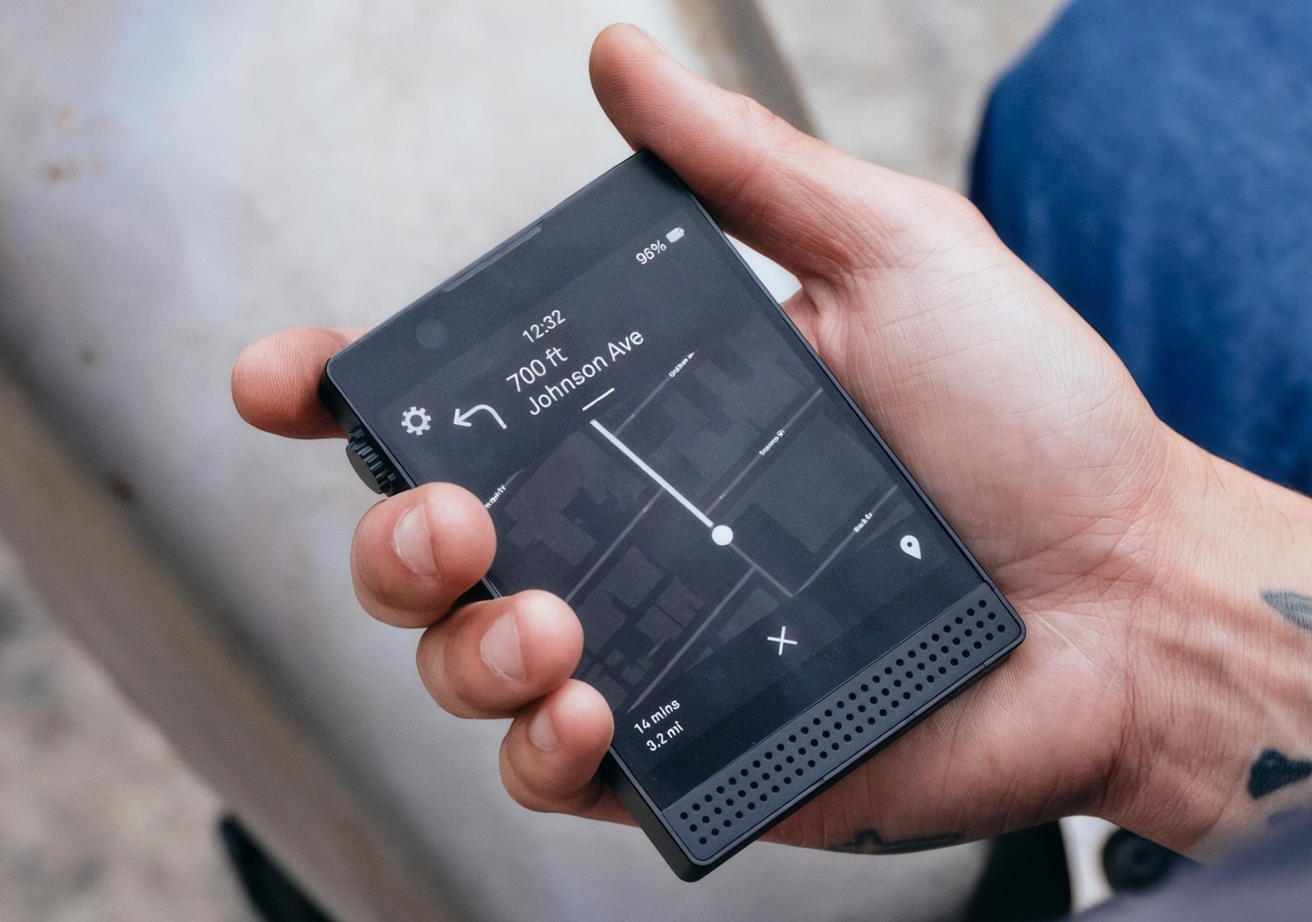
The Light Phone 3 held in hand, showing its minimalist monochrome interface designed for distraction-free mobile use.
Modern dumb phones looked promising until I checked what they actually run. Limited support for Spotify, same goes for WhatsApp. Going old school felt like a massive step back, access to music and messaging wasn’t guaranteed. A solution that asks you to abandon everything you actually use day to day isn’t one you’re going to stick with for long.
Two phones seemed like the obvious workaround, until I actually tried living with it. Charging two devices, sim swapping depending on what I was doing, working out which phone needed to come with me for which activity. It solved nothing, it just added a second thing to manage, and a second thing to forget to charge.
When I saw the tagline “Match your music player to your Rolex” I knew I was in the wrong place.
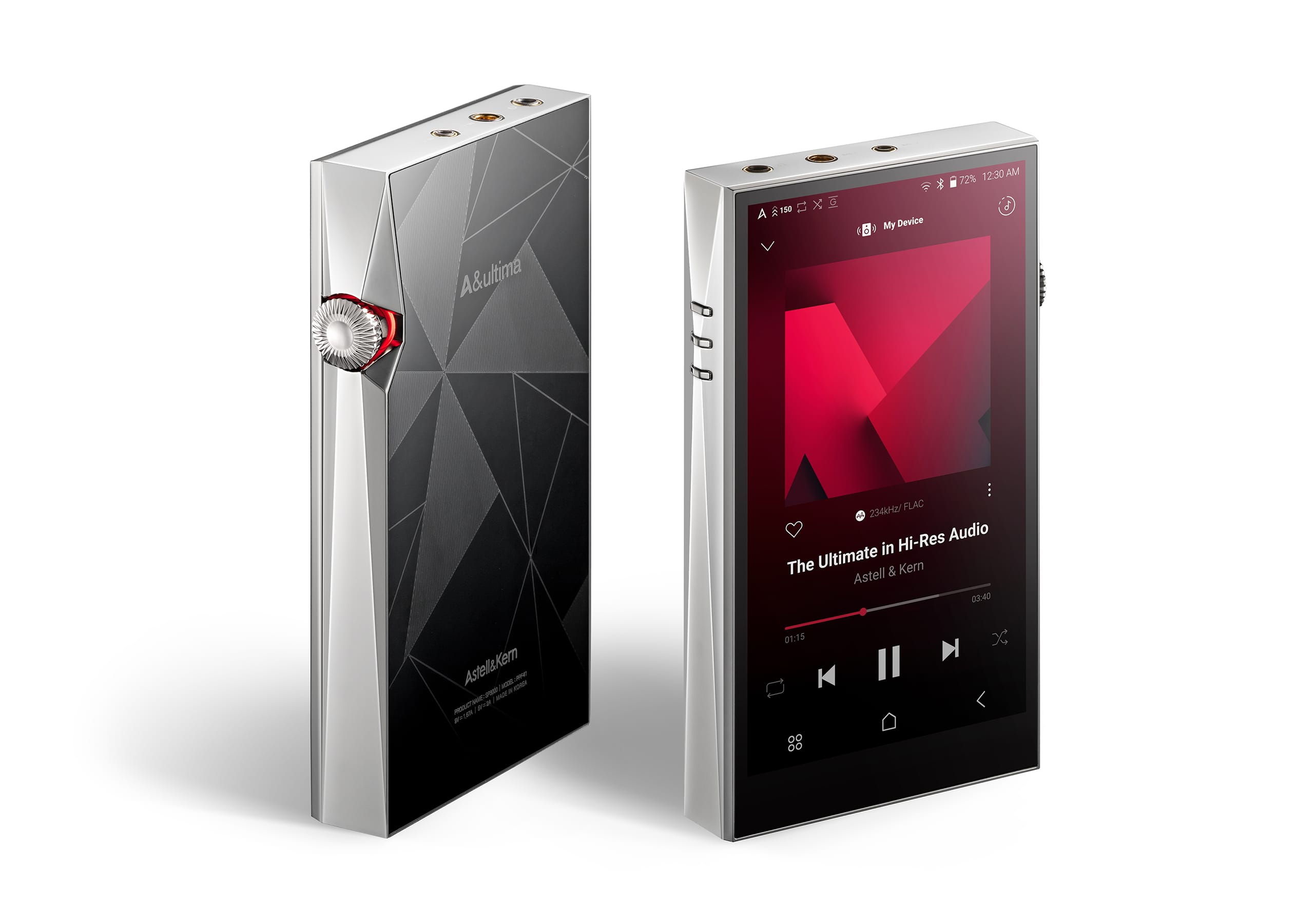
Dedicated MP3 players were the next idea, and that one died fast once I saw the prices for the high-end ones, or the mixed reviews for the mid-tier ones. Anywhere from $800 to just over NZD $4,000 for the Astell & Kern A&ultima SP3000, to listen to music and nothing else. No camera, no other daily functionality, designed to do one thing amazingly well and nothing else, that’s a lot to spend solving one small piece of a much bigger problem.
I’m not opposed to spending that kind of cash, yet I’d have to rationalise it with a milestone or celebration, a big promotion at work, a significant birthday, something to justify the expense. If I had $4,000 burning a hole in my pocket, I’d most likely choose something else instead.
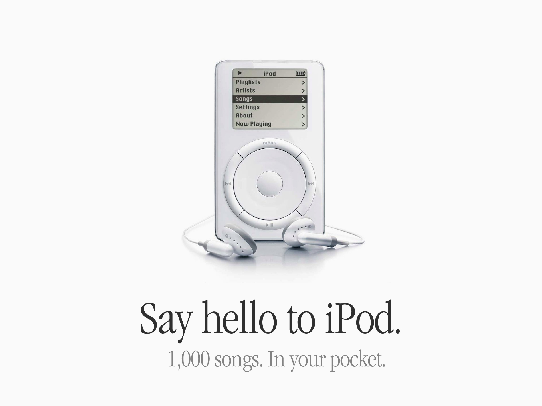
Groundbreaking technology when it was released.
Lastly, I looked at iPods, until I remembered Apple discontinued the whole line back in 2022. You can find secondhand ones online, and the iPod Touch has wifi and a full browser anyway, so it was never really a separate device. It was basically a diet coke iPhone, which is probably why Apple pulled the plug eventually. Opening the browser tab instead of the music app becomes second nature fast, and the whole idea collapses in on itself.
One rule that stuck, and systems that were too easy to override
No phones in the bedrooms.
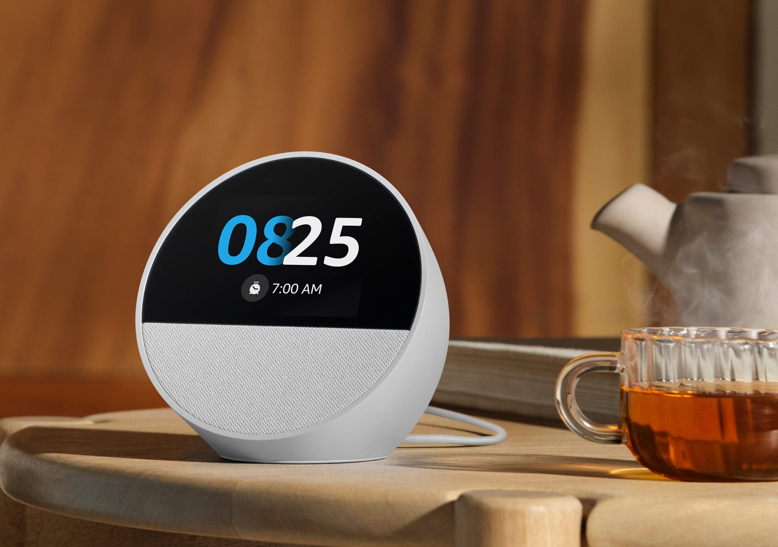
We replaced this tech with Alexa clocks instead, since we just needed alarm clocks that could recover from the rare occasions of a power cut in the middle of the night, so it isn’t flashing 00:00 while you’re late for work.
A stray notification doesn’t wake either of us in the middle of the night if the phone is not in the room. Or if you do wake, it removes the unconscious instinct to reach for your phone and browse the web to help you get back to sleep, which is a fool’s errand, as you know.
I know, trading one device with microphone for another. Just needed an alarm clock.
We set up a dedicated charging station in the hallway closet, out of sight, out of mind, and most importantly, out of arm’s reach.
The “No phones in the bedroom” rule has been in place for years, and it stuck. The only exception is when the kids are at sleepovers and we need the phone close by, just in case.
An early concept I designed suffered the same fate that would later become Screen Time.
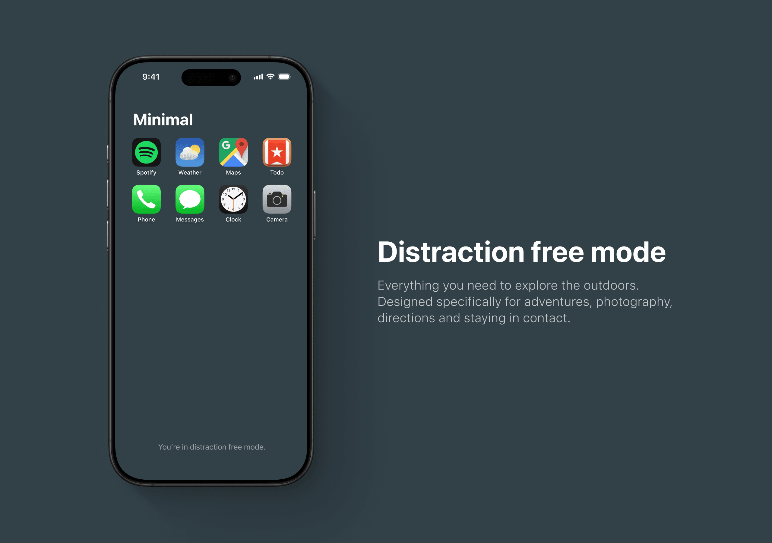
The next one didn’t. I tried designing my own version of a dumb phone, stripping my actual iPhone back to a dozen apps, trying to recreate the simplicity of an old Nokia with just enough modern stuff layered in, maps, music, camera. It was a decent idea on paper. In practice, the phone was still the phone, same screen, same notifications waiting one swipe away, same everything else still installed underneath.
Easy to override: Like a corrupt boxing referee, two taps and you’re out.
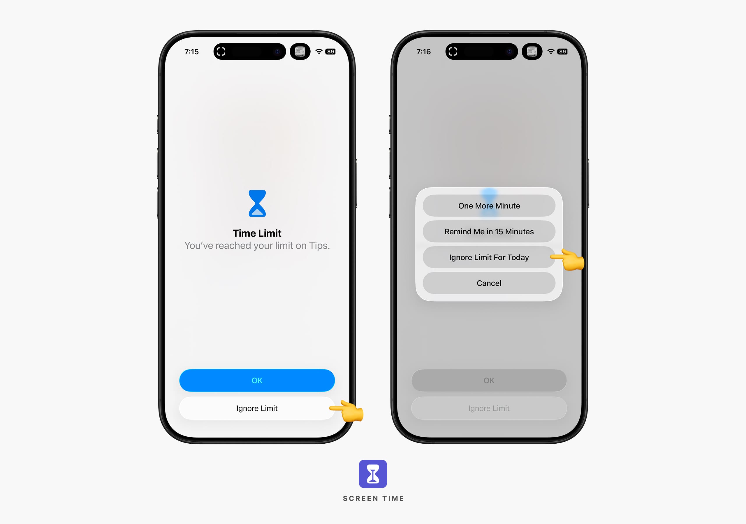
That toggle on/off idea is essentially what Screen Time settings have become today. Notifications turned off for certain apps, scheduled downtime, app limits, the whole screen switched to greyscale to make it duller to look at. Here’s the realisation you come to quickly after proudly configuring all those settings: they are built directly into the exact device they are supposed to be protecting you from. Overriding them takes exactly one tap, one you can always justify to yourself.
I know because I did it, over and over. “One More Minute”, I’d tell myself tapping the button. Then I’d tap the “Remind Me in 15 Minutes”. Then the “Ignore Limit For Today” quietly became the default action, every single day.
Small cheats snowball into big cheats as you continue to lie to yourself, right back where you started.
Introducing Brick: the NFC device that broke my phone addiction
Disclaimer: This isn’t a paid article or product placement
There’s no sponsored ads, no discount code, just something that actually worked for me.
Near-field communication, or NFC, is the same short-range wireless tech your hotel key card or tap-to-pay card uses. Hold two NFC-enabled devices within a few centimetres of each other and they exchange a tiny burst of data, no wifi, no Bluetooth pairing, no app permission screen.
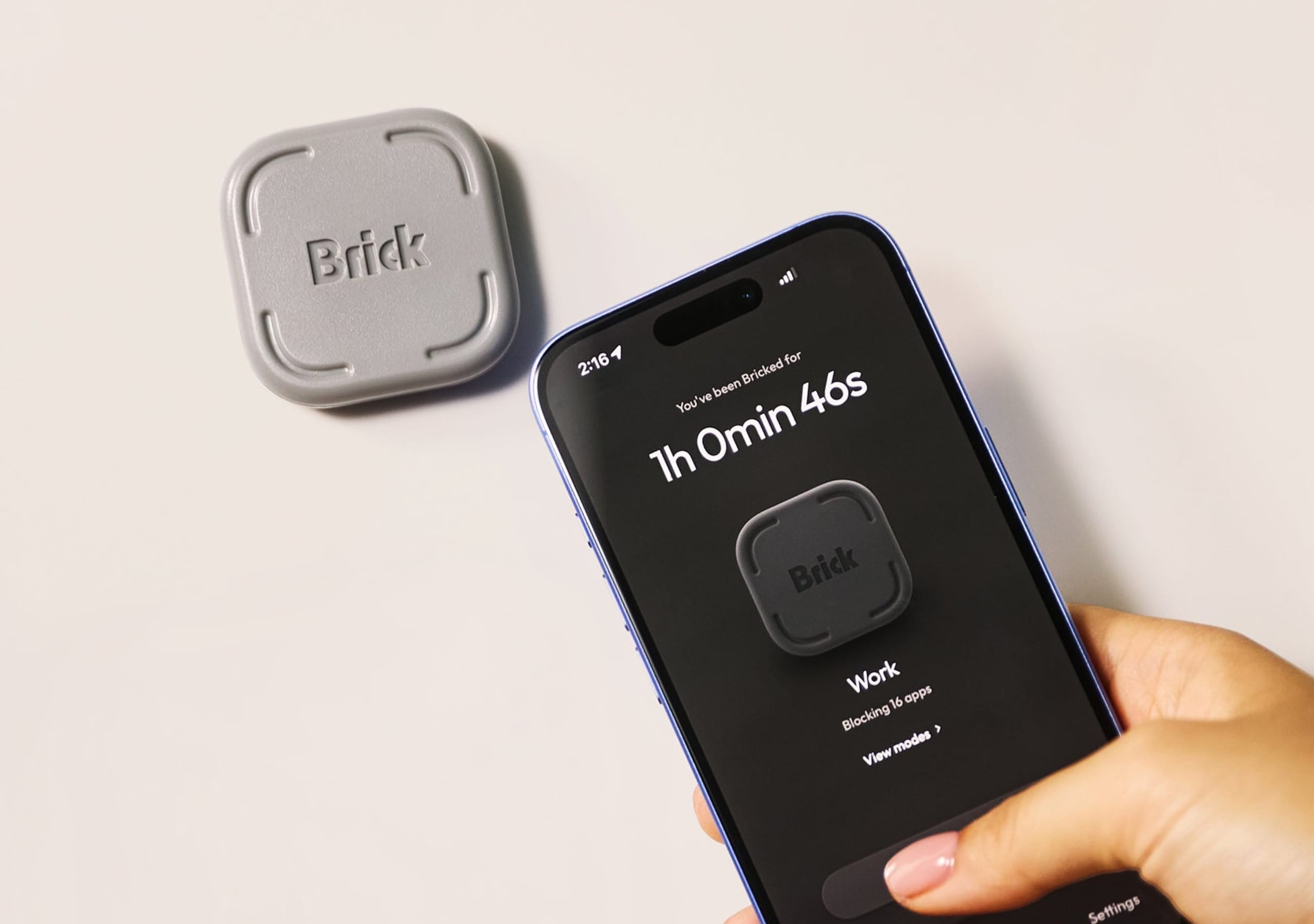
Then I found Brick, a small NFC device with no battery and no charging cables, just a physical tap to activate. Choose which apps you want blocked, tap your phone against the Brick, and they’re disabled until you tap it again.
A hand holding a smartphone showing an active Brick session alongside the physical Brick device.
That’s the whole mechanism: tap it, and your phone and the Brick have their own private handshake that has nothing to do with the internet.
No subscription either, just a one-time cost, which mattered to me after years of software that keeps asking for more and delivering less. The whole thing works in three steps:
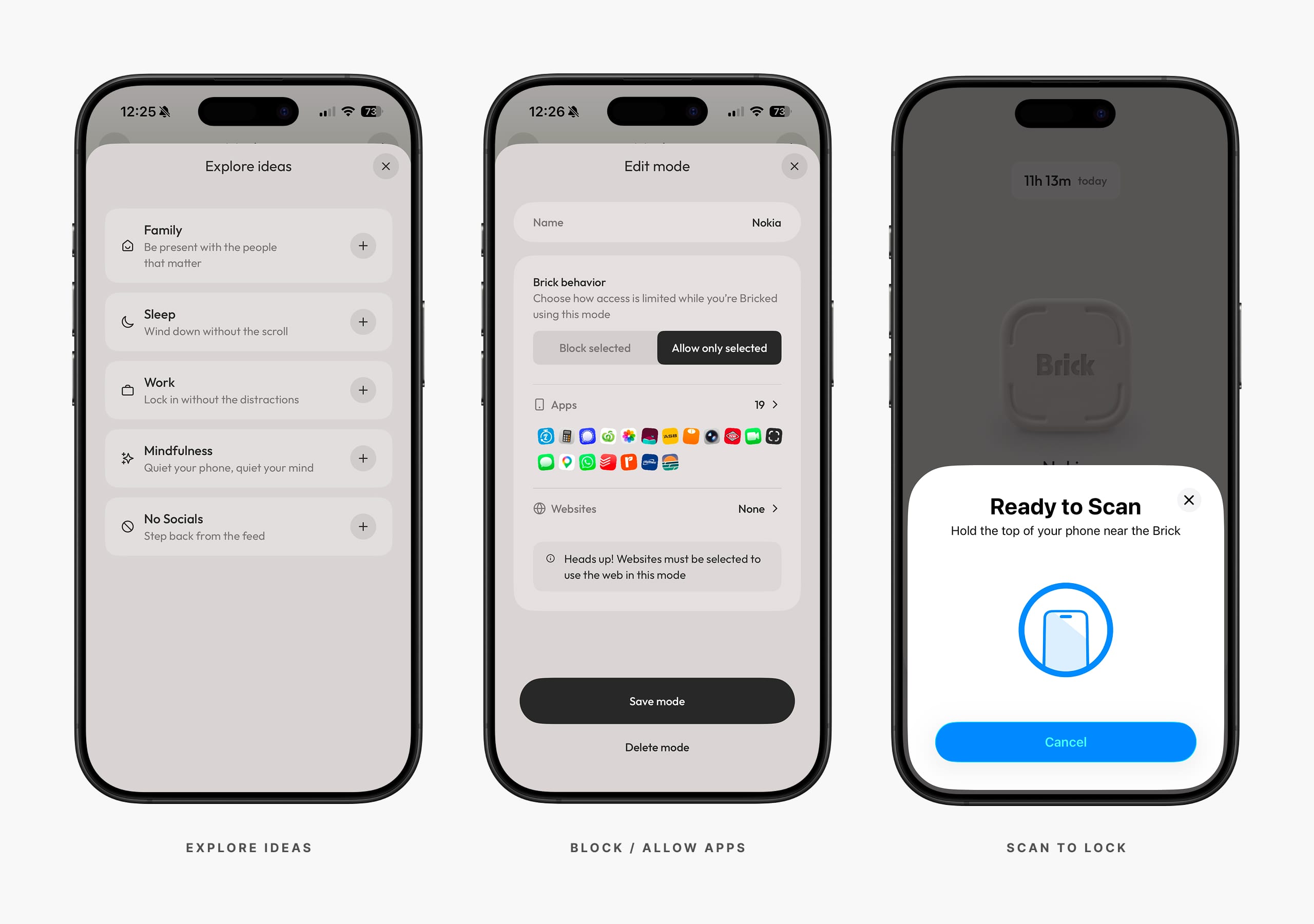
Choose what to block
Select the apps or websites you want to block, or flip it and choose the few you want to keep, everything else locks. Blocking both apps and websites means you can’t dodge it by opening the mobile site in your browser instead.
Tap to activate
Hold your phone against the Brick device. The blocked apps are still there, just disabled, so you can easily tell you’re in “Bricked” mode.
Tap to unbrick
Same motion as above, just in reverse. Hold the phone against the Brick device to get access back to the apps you need, or to switch to another mode.
No free rides, if you want out you need to tap the device to unlock.
I found Brick through a Facebook ad. Read that again. The modern equivalent of “As Seen On TV” and it was advertising the exact device meant to help me use Facebook less. I watched a handful of reviews first, decided it was worth the slightly higher price given there was no ongoing fee, and bought two, one for me and one for my wife, Ali.
It’s not willpower, it’s friction, distance, and simplicity
I’ve got three modes set up on my phone: no socials, Nokia mode, and workouts. Brick also comes with a few defaults built in to help you get started.
One week in, and something has actually shifted. Brick has scheduling built in. The part that matters is the physical tap. You cannot swipe past a Brick the way you swipe past a screen time warning, and you cannot argue yourself into “just five more minutes” when the app is not there at all. That small bit of friction, having to physically get up, find the Brick, and tap your phone against it, is enough to break the automatic reach.
A few things add up to make it work as well as it does:
No charging cables
Nothing to plug in, nothing to lose. Tap it against your phone and it just works.
No power or batteries
Runs on the tiny burst of power your phone sends it. Never needs switching on.
No monthly subscriptions
One-time cost. No recurring fee, no app asking for more every few weeks.
No swapping devices
Still just one phone. No second device to charge, carry, or forget.
Simple interactions
One tap locks it, one tap unlocks it. No menus, no settings to dig through.
Custom modes
Set up different modes for different parts of your day, work, workouts, or fully offline.
Physical friction
Separate settings and device, something real standing between you and the app.
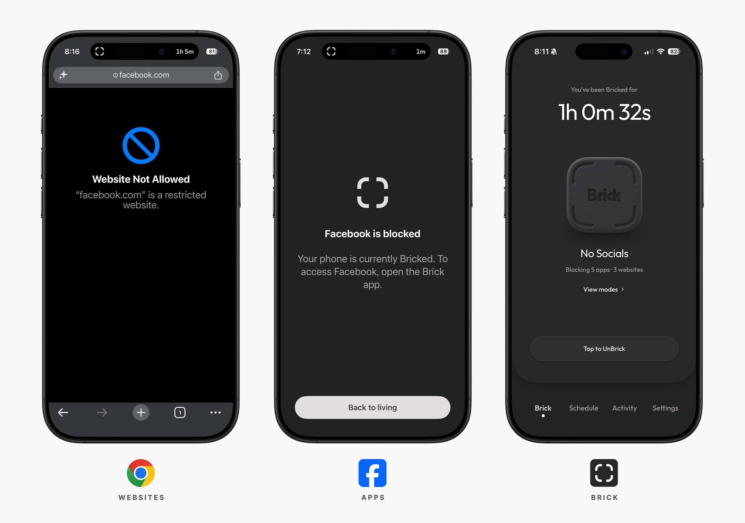
Open a blocked app and you get a plain black screen: “Facebook is blocked. Your phone is currently Bricked. To access Facebook, open the Brick app.” This is just enough friction to stretch time and flag the interaction while you’re instinctively and reactively grabbing for your phone, enough to catch yourself before autopilot takes over.
No overrides, no negotiating, no making deals with the devil. No big wall of text, no buttons offering various time increments this time. Just a lone button underneath: “Back to living,” acting as a digital bouncer at the door, simply telling you: “Name’s not on the list.”
No free rides, if you want out you need to tap the device to unlock.
If I want to check social media now, I do it on my iMac. Not having it on my phone removes the problem at the root. The phone is not sitting in my pocket, pushing and pulling me with its persistent presence all day, because the thing I would check is not on it anymore.
I still catch myself opening Facebook out of habit some mornings, thumb already moving before my brain’s caught up, and instead of the feed, I get that plain black screen telling me it’s blocked. Now it’s more a case of “Oh yeah, let me check that later on,” and I get on with my day.
The software settings lived on the same device, like having the padlock and the key attached to each other, which is exactly why this approach never worked. Every override is one tap away, on the same screen, in the same pocket. Physical separation does not give you that option, and that is the whole point.
Simple, separate, and single device. Just one phone, doing what a phone is supposed to do.
Surfing is the ultimate offline mode, phone in the glovebox
The whole system is built around one idea: a platform disguised as a community, where you are the product. Always in your pocket, always online, always connected. Always just one notification away from no longer being present or in the moment.
The opposite is true when surfing. My main focus becomes not dying.
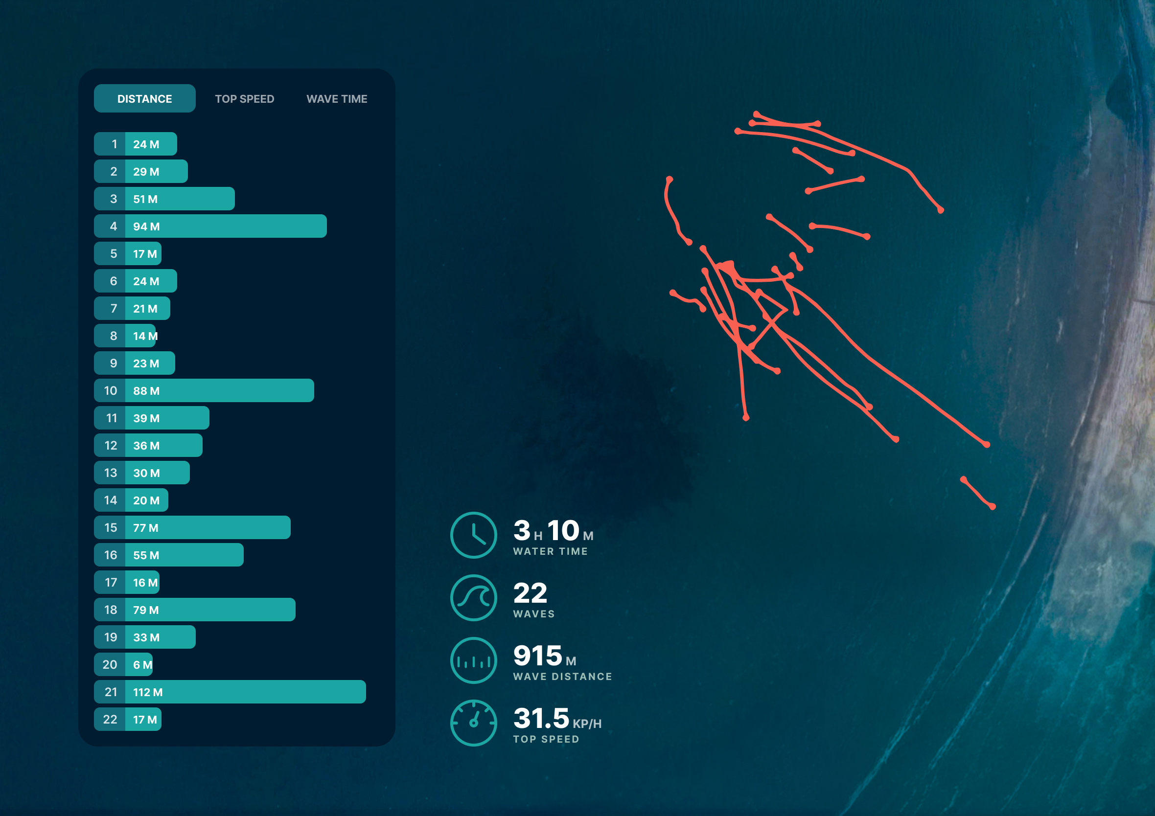
One session, 3 hours 10 minutes in the water, twenty-two waves, all of it tracked and mapped, a Dawn Patrol-style breakdown of a single morning out.
My phone is locked away in the glovebox. All I have on me is my Apple Watch, tracking the session and the time as part of my surf workout routine, nothing else. No notifications, no feed, no ads pretending to be content. Just me and the ocean, keeping an eye on the incoming waves and on the time, in case I need to get back for my first meeting of the day.
There’s a real term for the anxiety most people feel being phone-less: nomophobia, fear of being without your mobile.
I don’t feel it out there, phone locked in the glovebox. I feel the opposite. The one place I am uncontactable and off the grid is the place I feel most calm and connected.