

SimpleTimer: Stopwatch & countdown timer app
It started with a hair product’s packaging and ended as SimpleTimer, a minimal stopwatch and timer app stripped back to nothing but circles and simplicity, from early concept sketches through to its own landing page.
Inspiration can come from anywhere or a physical object
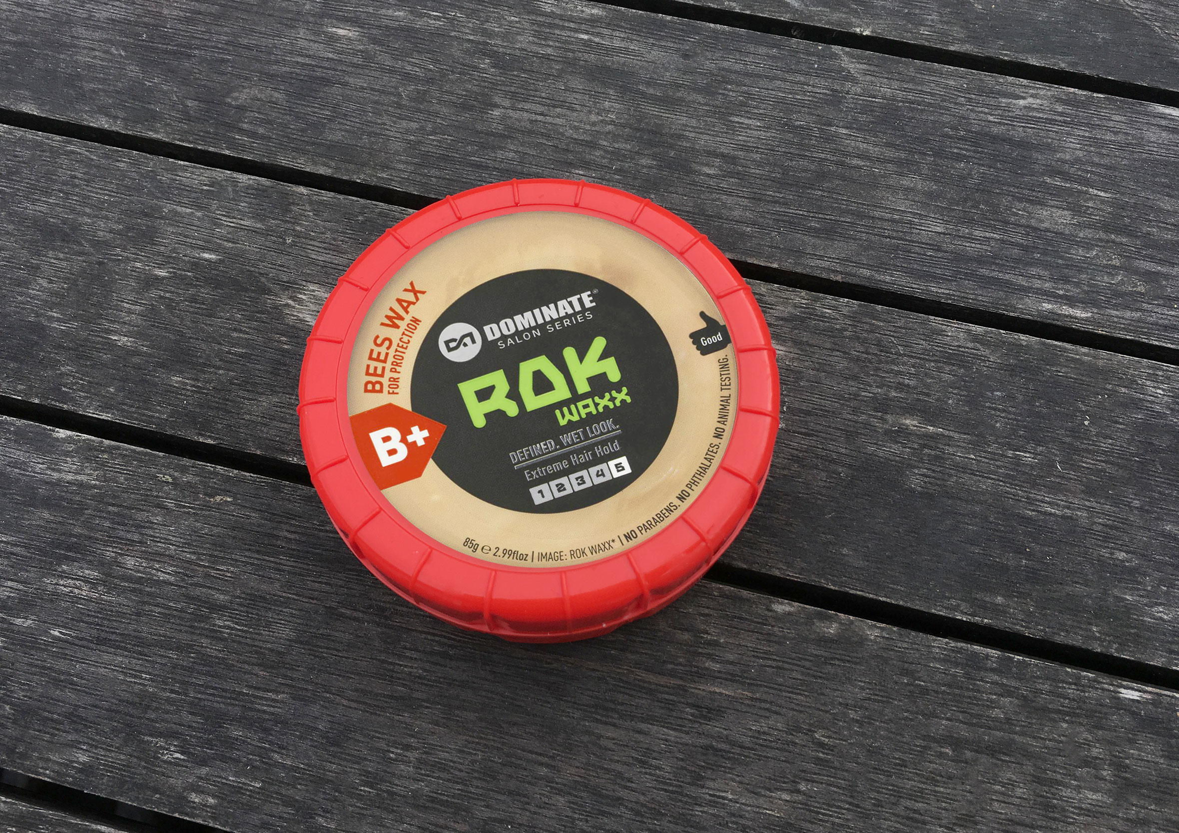
SimpleTimer is a minimal stopwatch and timer app, no account required, nothing to configure, just rotate a dial and go. This one started with a search that went nowhere. Every timer app I found online was either overly complex or wanted me to create an account just to set a countdown. After striking out, I noticed the lid of a hair product sitting nearby and thought I could use that shape as inspiration and a starting point.
10-minute sketches, then refine the strongest one
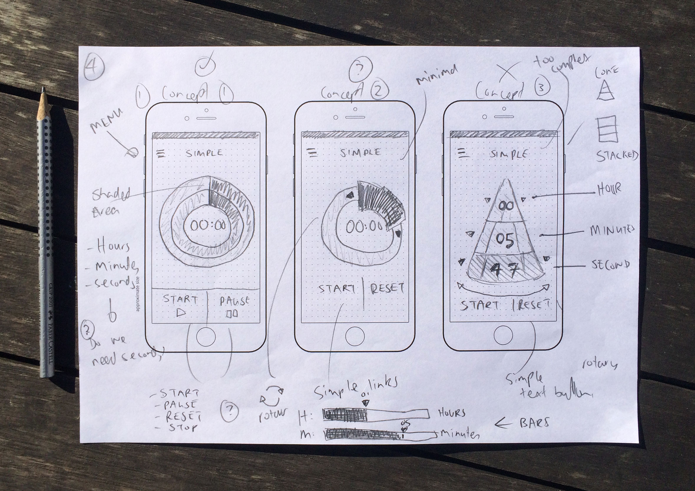
I challenged myself to come up with as many different concepts and variations within 10 minutes. From there I refined a few and chose the design I thought had the most potential to push further.
A simple idea I’d been thinking about doing for a while
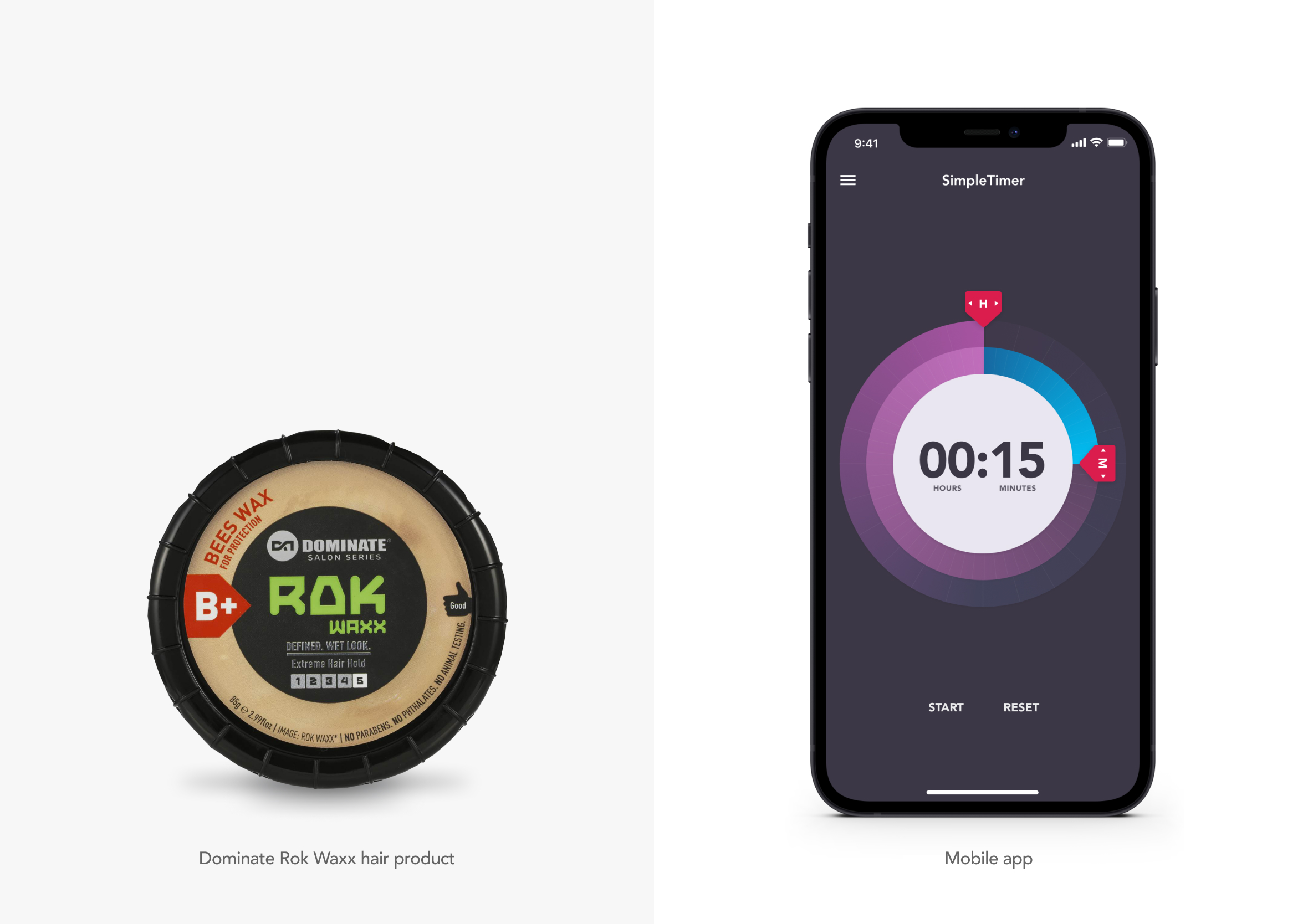
When I first had the idea to use elements from the hair product design I had no idea how it would turn out. By timeboxing yourself to 30 minutes to test an idea, you can explore different directions without wasting too much time.
Design with the absolute minimum
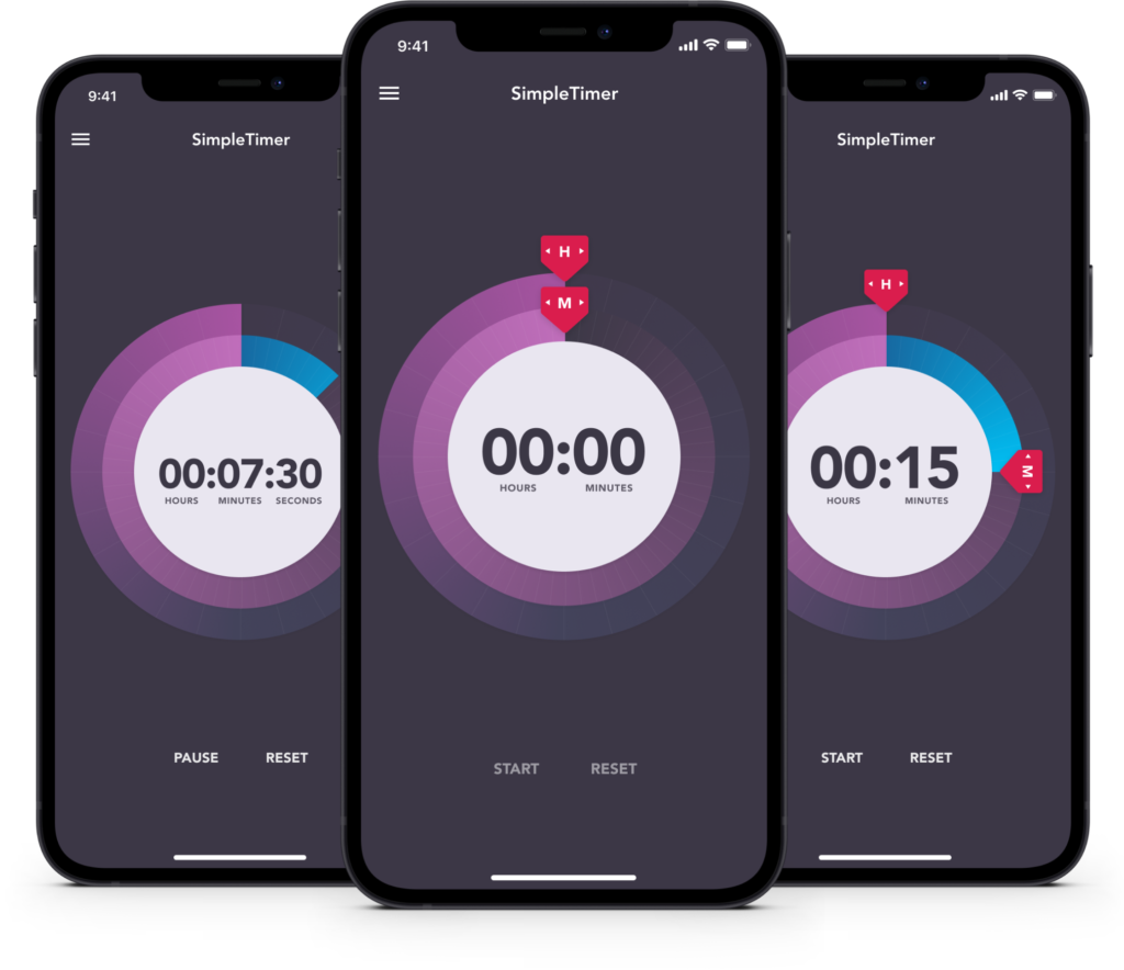
I was looking through the App Store for a simple timer, though couldn’t find anything that did exactly what I wanted, so I decided to design one myself. On this screen you rotate the hour and minute sliders to where you want them and press start. Simple.
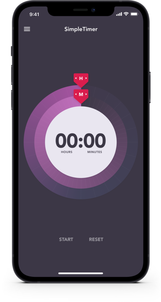
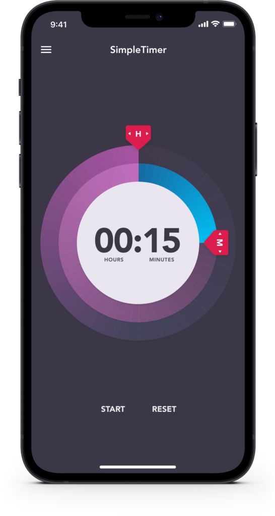
Jenga Design: Removing all unnecessary UI elements
When the timer is running, the hour and minute sliders disappear as they are no longer needed and to prevent accidental interaction. Minimal design is challenging, you have to keep asking yourself “Is this element really needed?”
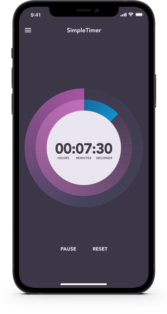
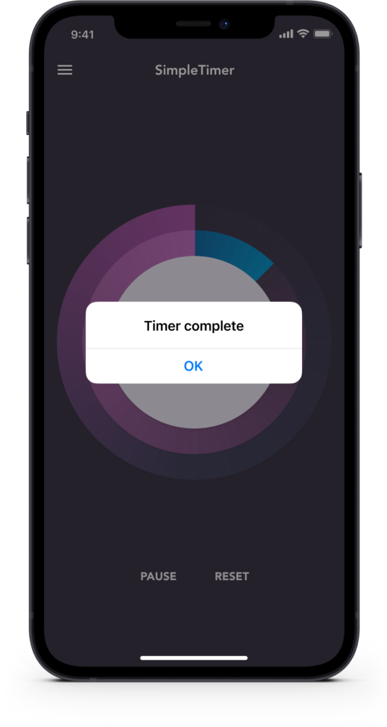
Continuing the simple theme with a minimal website
I created a single webpage to help promote the app and hopefully increase downloads. No logo, no navigation, no footer. Just the app.
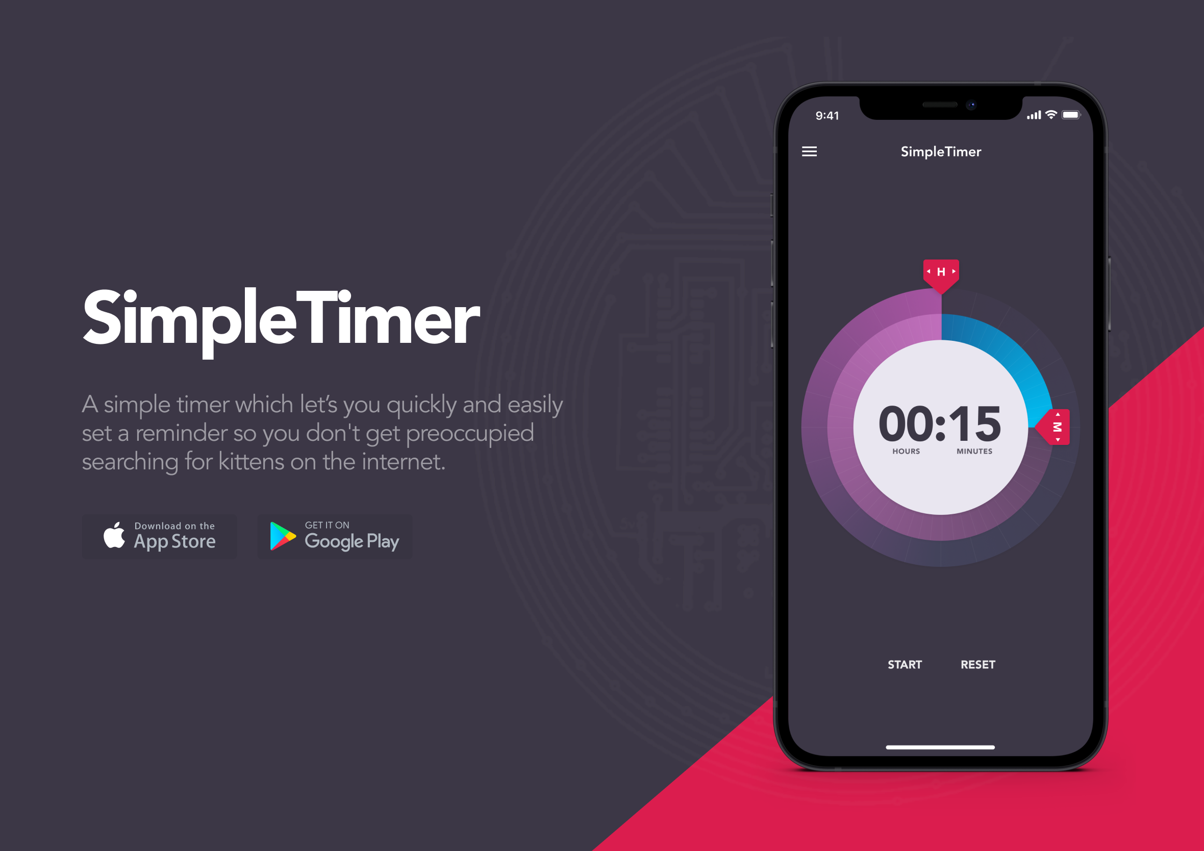
What staying simple actually took
Staying this simple took more discipline than it looks like from the outside. Every screen ships with a small pull toward adding one more setting, one more option, in case someone somewhere wants it. This one just didn’t get that treatment.

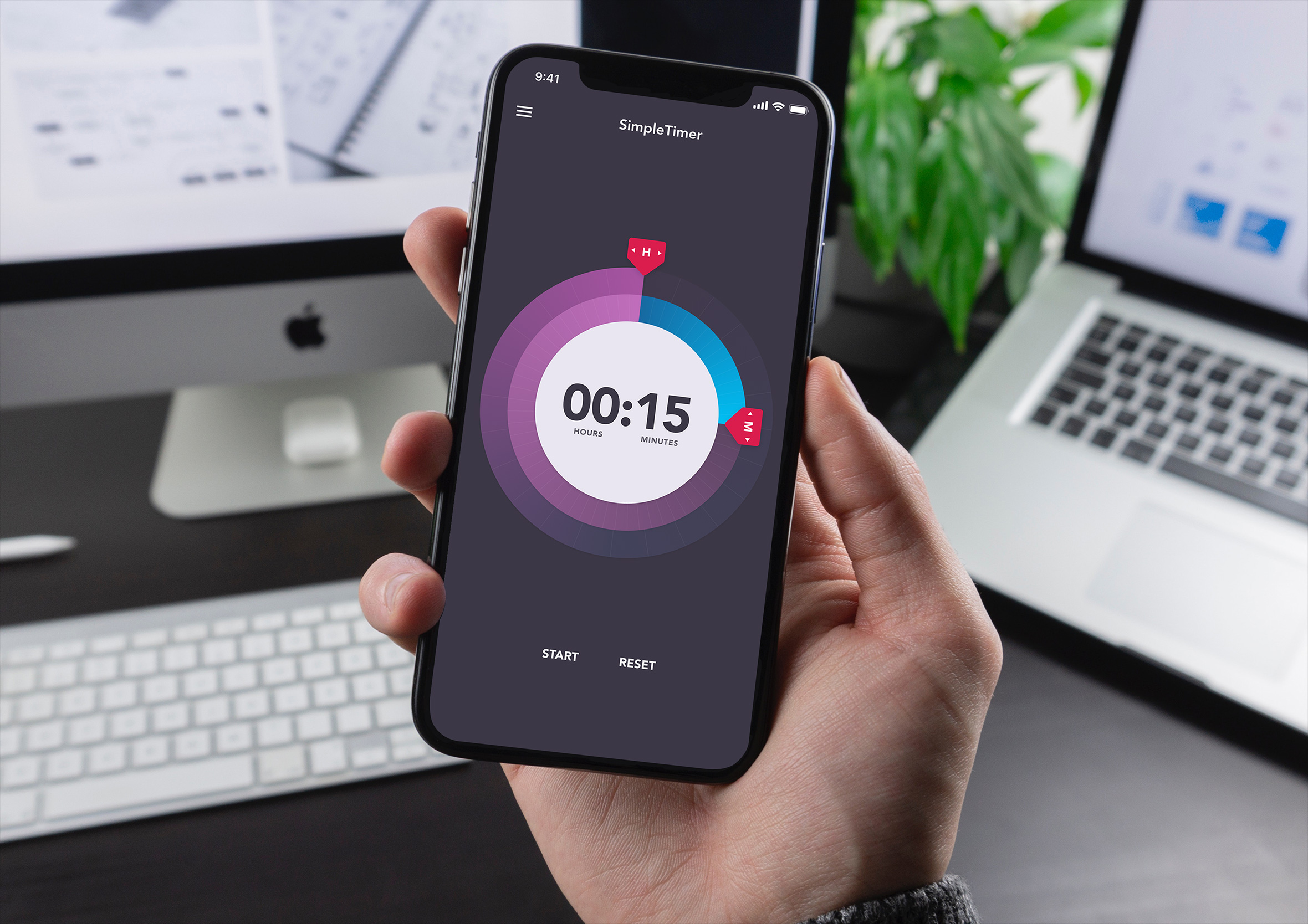
The sliders disappearing the moment the timer starts is probably the clearest example. Nothing left on screen that isn’t doing something right now. The Jenga metaphor holds up well here too, pull a piece, see if it still stands, and if it does, that piece probably didn’t need to be there in the first place.
That same instinct shaped PaperCraft too, a self-initiated origami app followed all the way through without ever really needing to be, just because it was worth seeing where it landed.