How I rebuilt my UX/UI portfolio from the ground up, and what I learned
Six weeks of nights and weekends, hundreds of AI prompts, and one very old PHP-patched website. Here's everything I learned rebuilding my UX/UI portfolio from the ground up on WordPress.
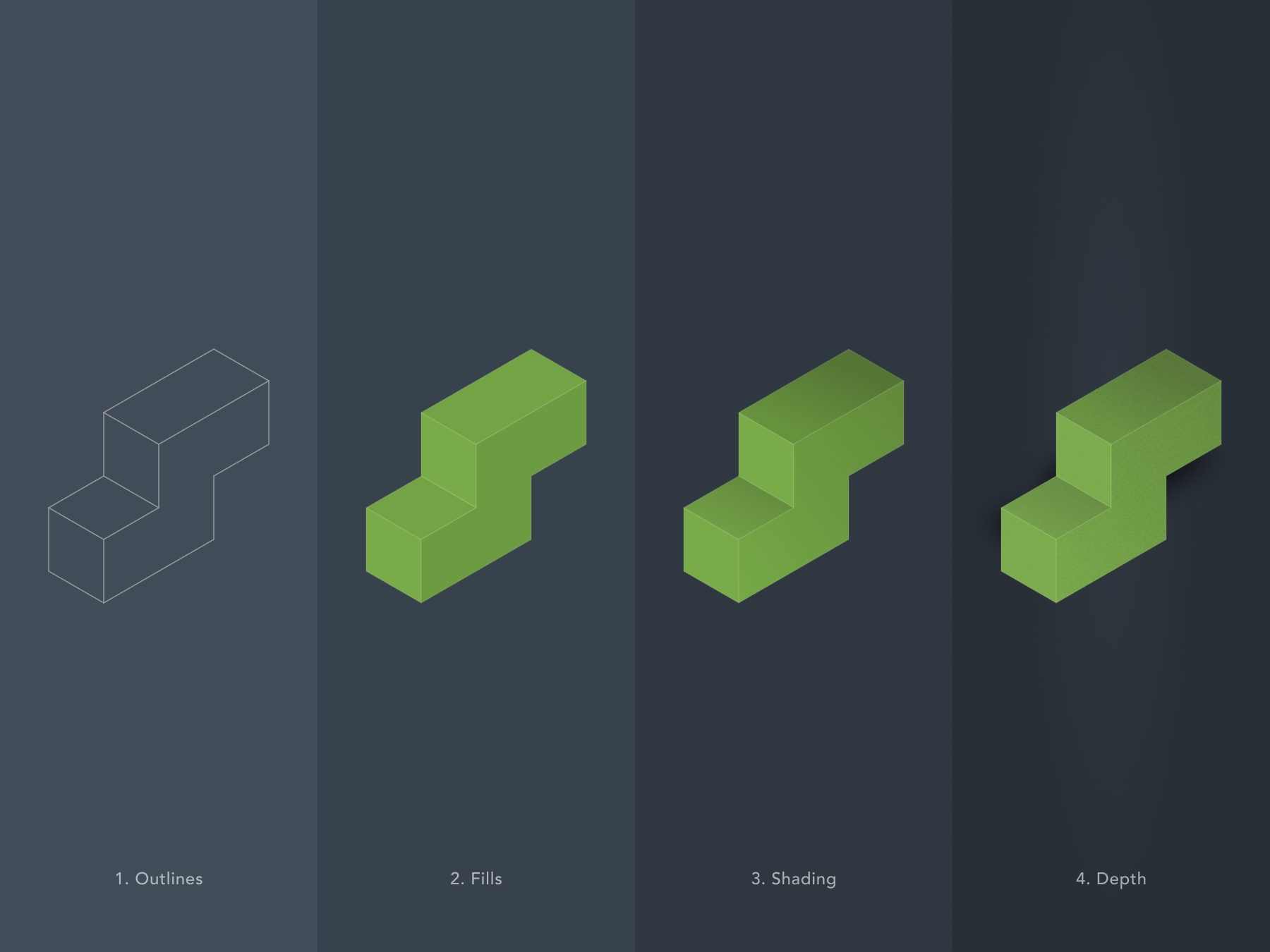
I should be upfront, this is very much a no-code/low-code build. Almost everything was done in the builder, with some minor CSS tweaks to get things just right. I’m a visual person so find code breaks my brain.
Getting started
I just launched a new version of my website earlier this week. My last one was a custom WordPress theme I built out of necessity, simply because I couldn’t find anything I liked at the time. As a designer, I wanted an emphasis on large typography and photography, and nothing I found really hit the mark.
The one I built was at least 10 years old and held together by some poorly written PHP code I’d hacked together over the years. I’m surprised it held up as well as it did, but I knew I was on borrowed time. It was starting to show that it wasn’t built by a professional.
This time I got my hands dirty, cloning databases, updating DNS records, adding 301 redirects, and plenty of other things I’ve either forgotten or had no real business being involved in in the first place.
From the start I knew I had a few options:
Have someone do it for me
Follow tutorials, or
Or use AI to teach me how so I can learn how things hang together.
I went with the third option. There were countless mistakes and lessons along the way, but I loved the constant theme of encountering a problem and finding a solution. So if you want to see what six weeks of working nights and weekends looks like, with hundreds of prompts, questions, and screenshots fired off to claude.ai, you’re in the right place.
Coding in the dark (aka having no clue what I was doing)
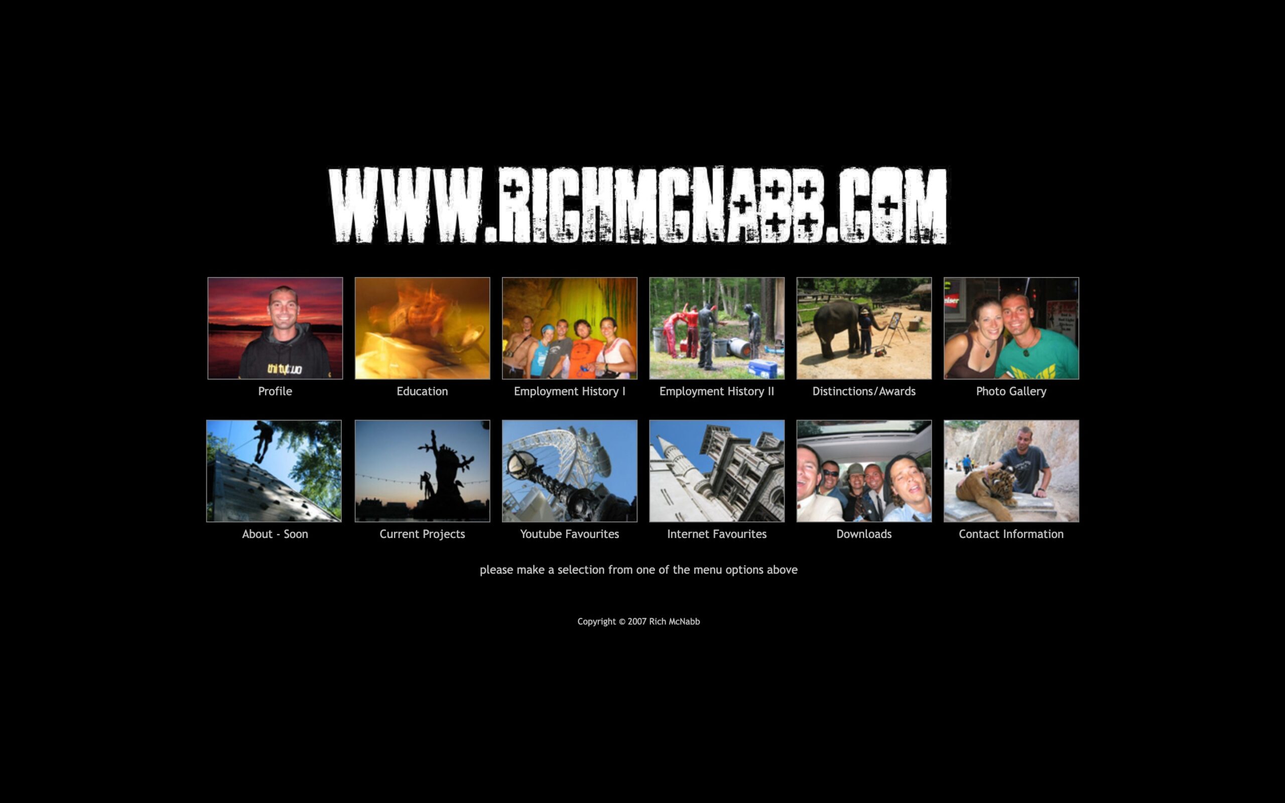
When I first launched my website in 2007 it was a handful of static HTML pages that worked well and served their purpose for what I needed at the time. More importantly, I had an online portfolio I could update and share with people.
As the site grew, I knew this approach wouldn’t last or scale when I started to add more pages. Updates were done using a combination of find and replace and manual copy/paste. Things got overlooked, outdated and out of hand in no time.
At my first real design job, the company had a website built on Silverstripe that they wanted me to redesign. Silverstripe seemed geared towards seasoned developers, with limited functionality unless you were comfortable getting stuck into the code. It also had a smaller development community, so finding answers sometimes took days instead of hours. I eventually I figured it out and got it up and running, but the site was pretty basic and lacked functionality that are ubiquitous today, like search, contact forms, and responsive layouts for mobile.
Fast forward a few years. Whenever there was a problem with my code or a plugin, it took me forever to find a solution to then copy and paste with crossed fingers, without really understanding if I’d actually fixed anything. Or worse, made more work for myself later on.
CSS, the underlying styling language behind every website, had exploded in recent years. All the hacks and workarounds I’d cobbled together could now be handled more elegantly with native styles. The web had moved on. My code hadn’t.
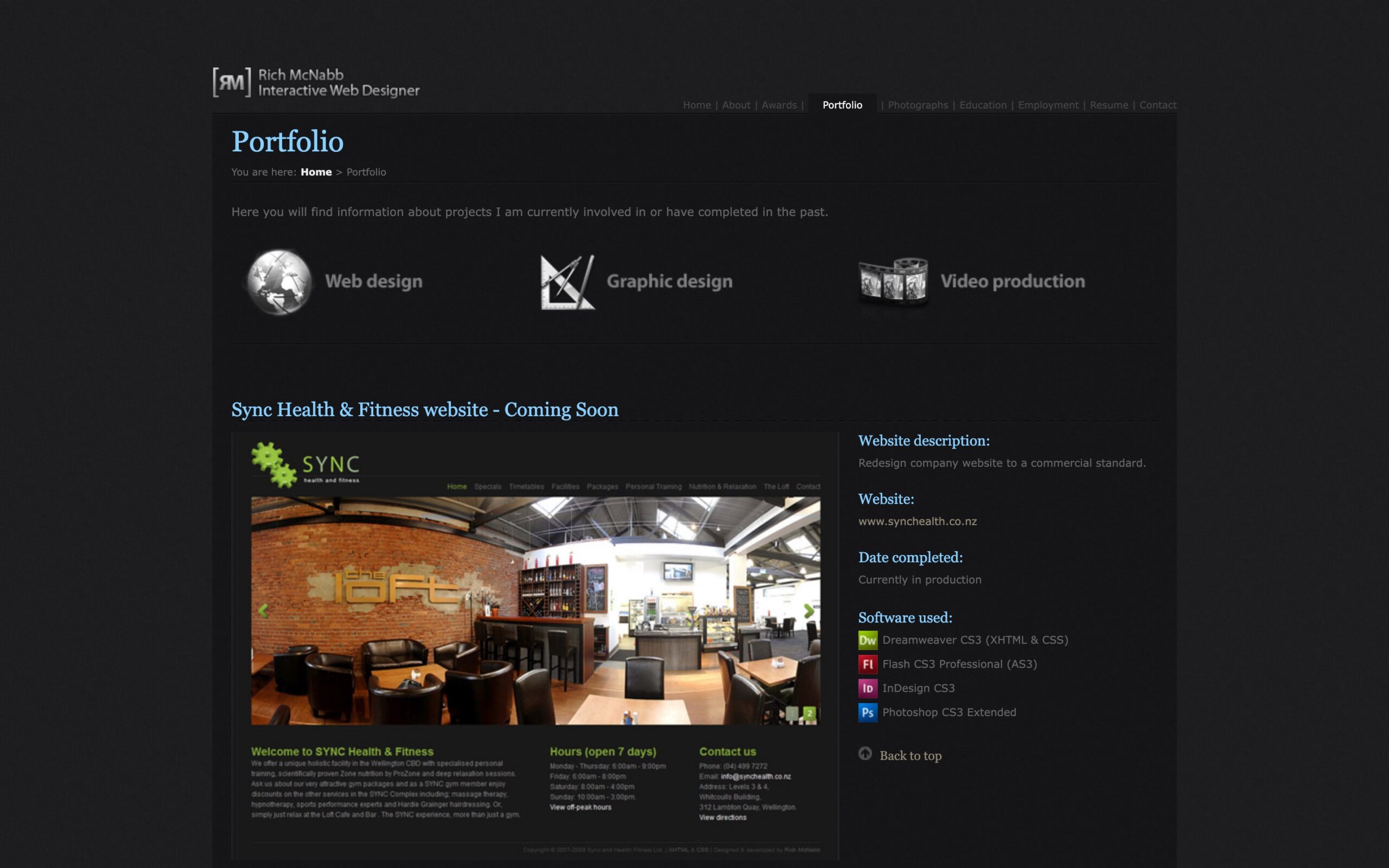
I decided to move from Silverstripe onto WordPress, which felt like a much better fit for what I needed day-to-day. A huge plugin ecosystem meant you could easily extend functionality without touching code, and the community was massive, so answers were minutes away rather than days.
What really sealed it was client work. I designed and built three websites for the company I was working at, all on WordPress, and something clicked. I went from copy/pasting solutions I didn’t understand to actually feeling confident in the platform. Once I trusted it enough to handle client sites, moving my own website across to WordPress felt like the obvious next step. And I never looked back. Until recently.
No code, no cry: searching for a modern website builder
Fast forward to 2026. I’d been using WordPress for years, but building from scratch felt like the ideal time to take a look at what else was out there. I spoke to a few designers, did some research online, and tried to figure out what my options were. When I first converted my portfolio to WordPress, drag-and-drop website builders barely existed. That’s no longer the case. All four platforms below are subscription-based with free trials or free plans available. Here’s how they stacked up:
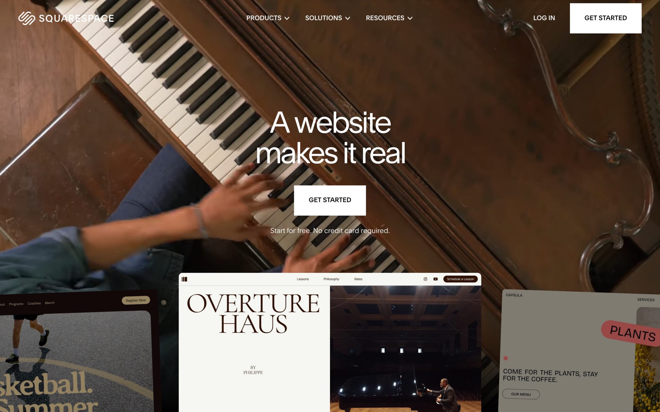
Squarespace: Highly polished
Squarespace is the go-to for designers who want something that looks great without a lot of headaches. Clean templates, excellent typography, and a design system that’s consistent and well thought out.
Great photography and editorial layouts
Solid blogging with basic e-commerce functionality
Restricted design freedom and customisation compared to Wix or Webflow
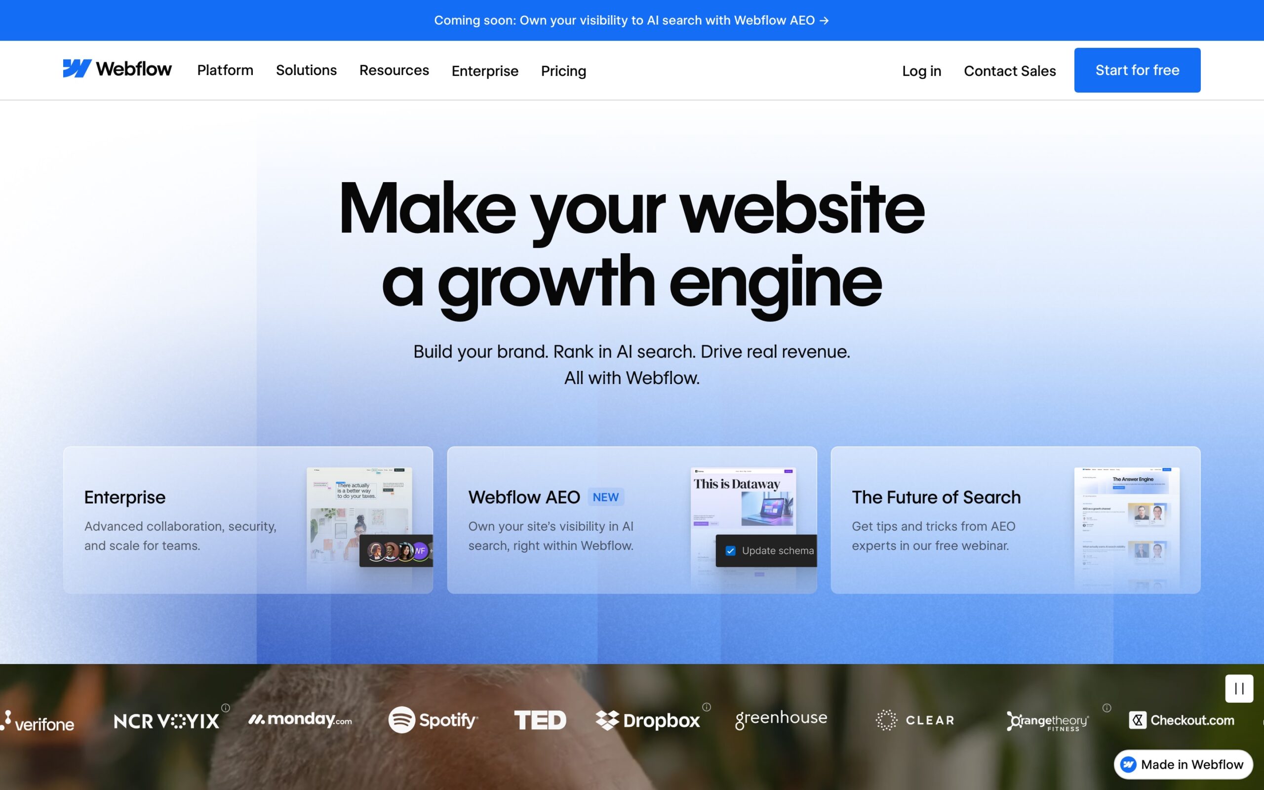
Webflow: Design freedom
Webflow feels a lot like you’re designing in Figma. Greater control over layouts, interactions, and CMS content, making it ideal for detailed portfolio case studies.
Full visual control without writing code
Steeper learning curve and not as beginner-friendly as the rest
Rewards the time you invest with a level of control the others can’t match
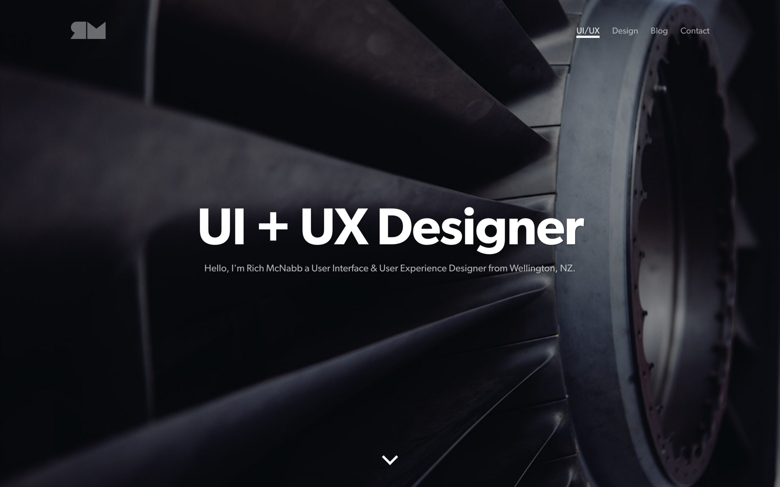
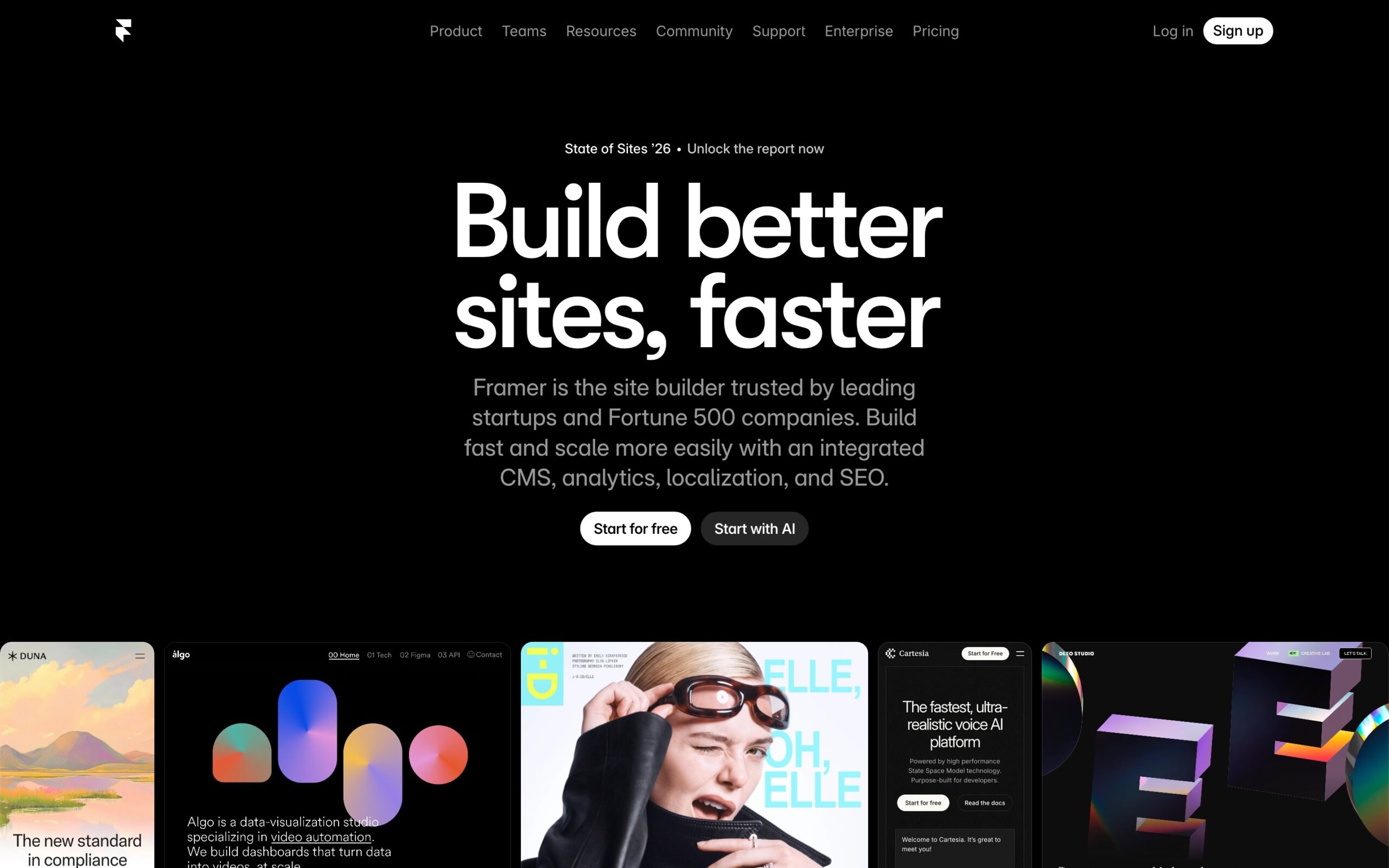
Framer: Super modern and fast-growing
Framer is the new kid on the block (NKOTB) and it’s moving at pace. AI-assisted building, Figma integration, animations, and mobile-first layouts.
Beautiful interactions and a genuinely modern aesthetic
Smaller plugin ecosystem, though growing quickly
Best suited to UI/UX and Product Designers
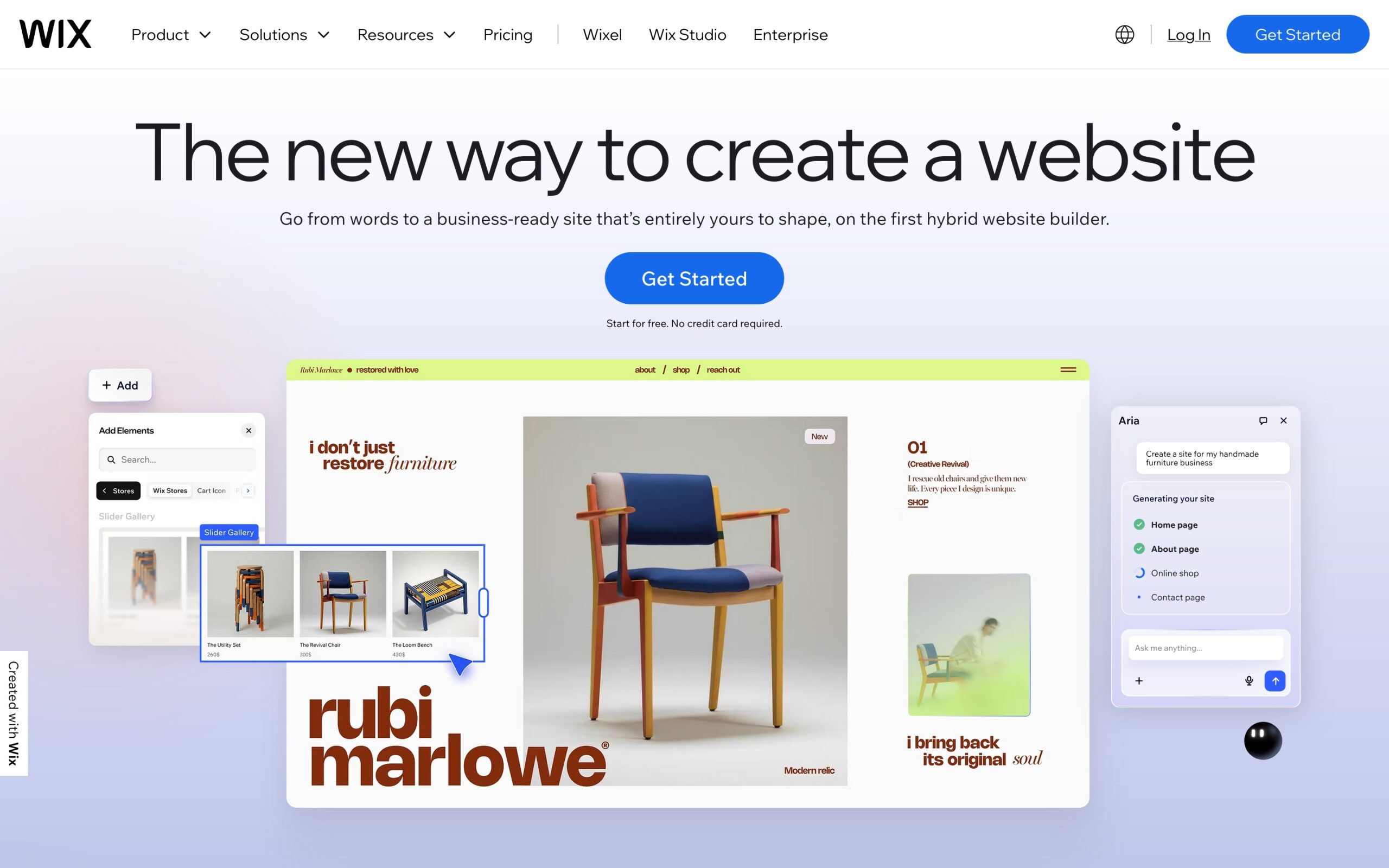
Wix: Most flexible and drag-and-drop
Wix gives you the most creative freedom of the four, with an enormous template library and impressive customisation options.
Gradual learning curve, easy to get started and very flexible
Interface can feel overwhelming
Performance can lag compared to the others
Rich, why stay with WordPress?
After going through each of these platforms, the conclusion was pretty clear: moving away from WordPress probably wouldn’t make life easier.
Webflow’s learning curve was more of a time commitment than I wanted to make. Squarespace looked attractive but the customisation felt restrictive. Wix gave flexibility, but risked becoming messy over time. And Framer, as exciting as it looked, was still evolving, with questions around CMS maturity, blogging, SEO depth, and long-term scalability.
To be fair, I never had an issue with WordPress. I just had zero interest in clunky or outdated themes, or fighting with technology every time I needed to make an update. With that decision locked in, I shifted my attention towards finding a minimal, lightweight theme, since once again, WordPress was still my platform of choice.
Finding the perfect theme takes time
With WordPress firmly locked in, the next task was finding a theme that matched the direction and aesthetic I was after. This took longer than expected, but I was determined not to be defeated this time and find something that was around 80% there then investing the time to put my mark on it to make it my own.
What I was looking for: strong typography as a core design fundamental, clean layout hierarchy, large high-quality imagery used with intent, plenty of whitespace, simple navigation, fast loading, and no code bloat. Here’s my shortlist
GeneratePress: You’re in control
Widely respected for being fast, lightweight, and developer-friendly. A genuinely excellent technical foundation.
Minimal overhead and fast straight out of the gate
Almost entirely a blank slate, requires significant effort to feel designed rather than pieced together
Better suited to developers than visual designers
Kadence: Balanced and intuitive
Strikes a good balance between flexibility and ease of use, with solid starter templates and a block-based workflow.
Good range of starter templates to get you up and running quickly
Solid technical performance under the hood
Design defaults feel like tired components without serious work
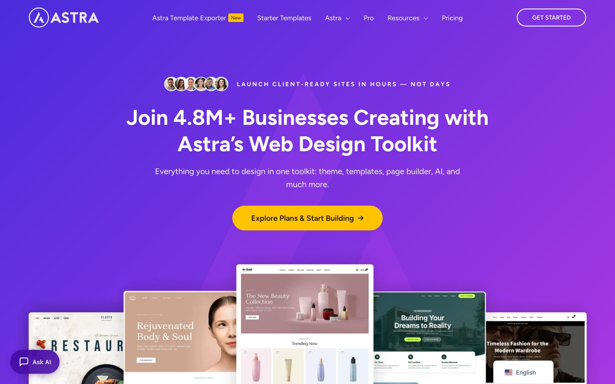
Astra: Popular, fast, and well supported
One of the most popular WordPress themes and for a good reason. Fast, well-supported, with a massive ecosystem around it.
Huge community and a wide range of plugins to extend functionality
Proven performance and reliability
Generic starting point that needs serious customisation to stand out from the crowd
Better suited to business sites than designer case studies
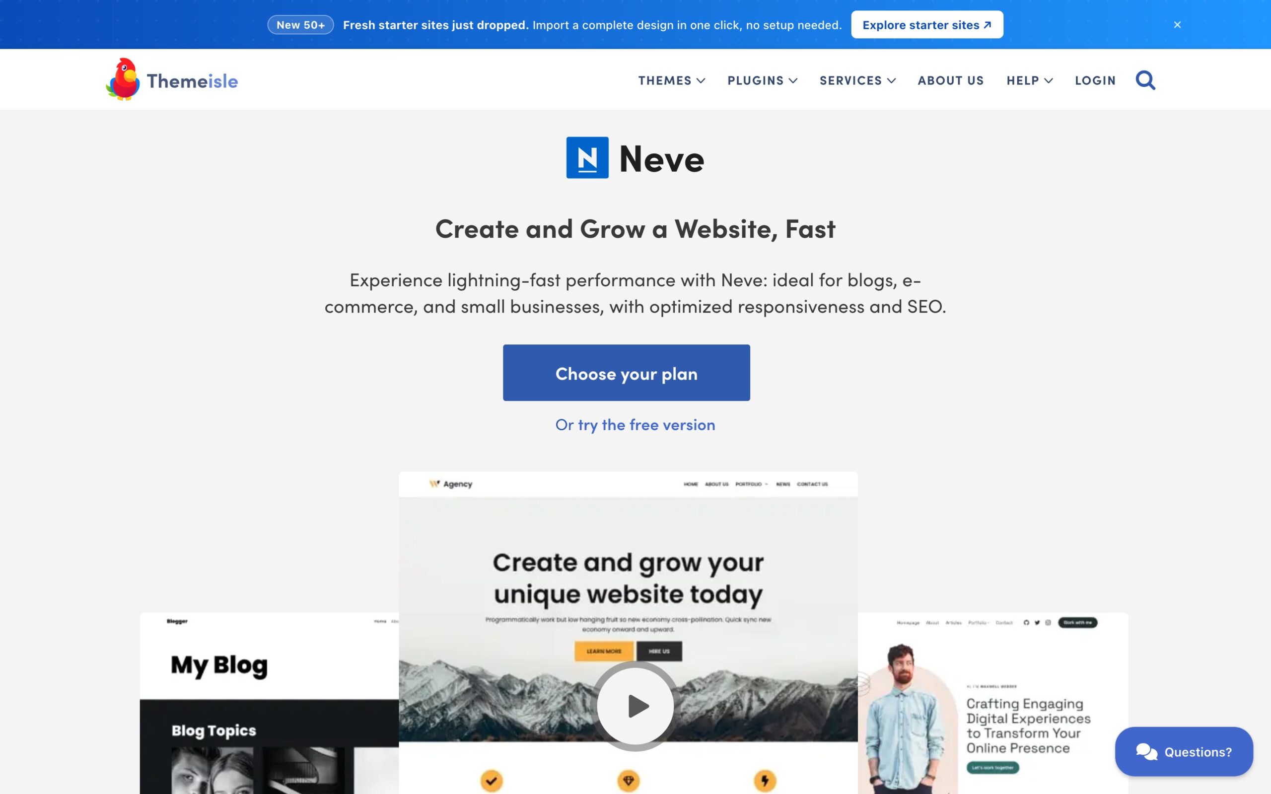
Neve: Ease of use
Beginner-friendly with a clean interface and decent defaults. Good for getting something up quickly without a steep learning curve.
Low barrier to entry and clean out of the box
Limited design personality
Less suited to an editorial style portfolio
A $100 lesson: testing the shortlist
Before committing, I needed to get hands-on. I started with Uncode, which looked great on the surface. The problem was WPBakery, the page builder bundled with it was a nightmare. Every edit felt like wading through mud and would have to wait to see changes appear. I was constantly fighting technology rather than finding my creative flow, and that friction took away all the excitement and enjoyment out of building the site.
I walked away from a $100 theme after 8 hours, but I don’t really see that as money I wasted. If anything, it gave me a much clearer picture of what I’d been missing out on an reconfirmed I was on the right track. It also made it very clear what I didn’t want. Money well spent.
You get what you pay for
The free themes on that shortlist are all genuinely excellent technically. But for a portfolio that needs to feel crafted rather than assembled, the design defaults matter along with the little details that come together for a high-end website. Free themes give you flexibility, Blocksy gave me a massive head start on all fronts.
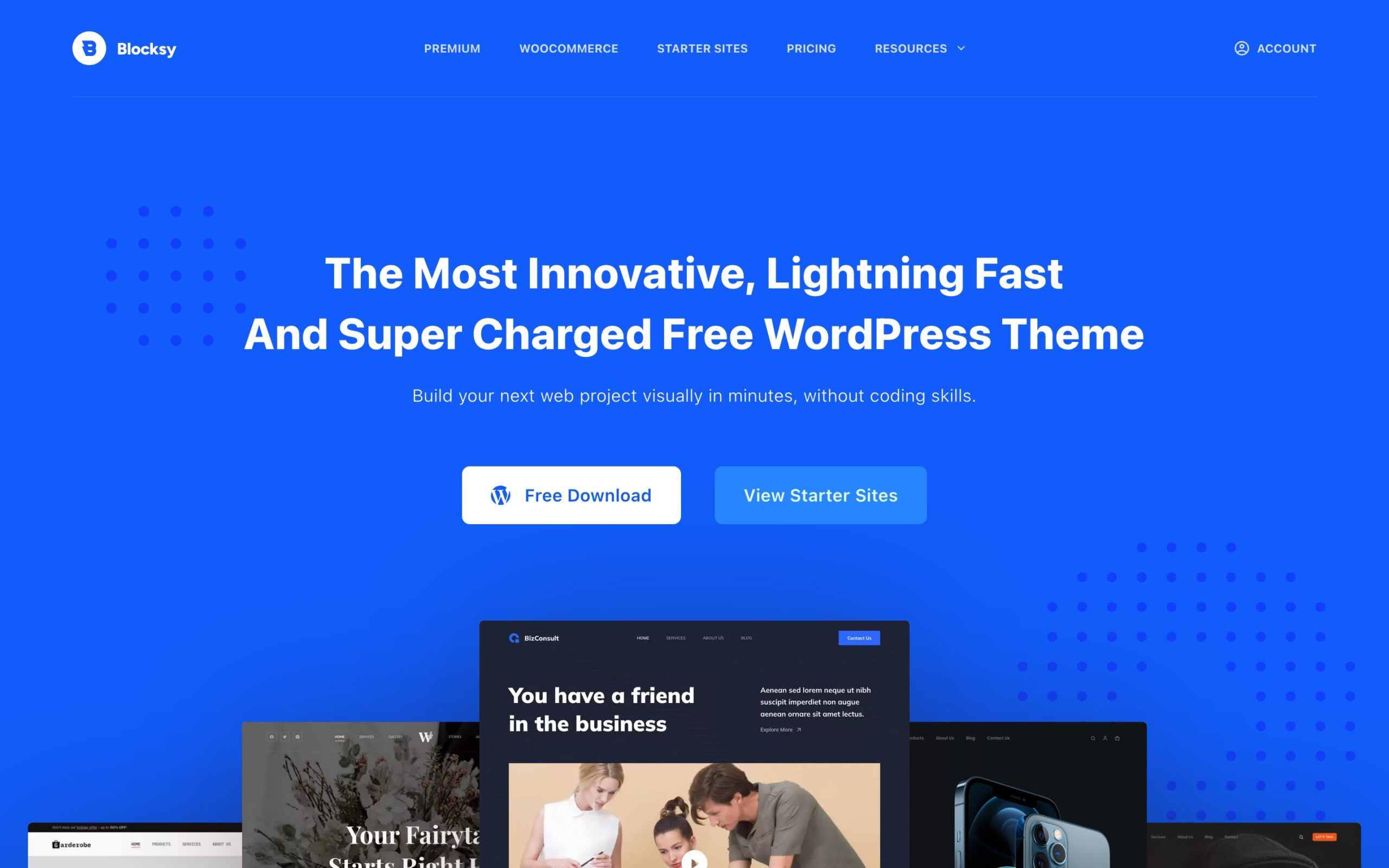
The winner: Blocksy
Blocksy hit the Goldilocks sweet spot. Modern, lightweight, and visually clean, but unlike the others it arrives with a genuine point of view. Stronger design system thinking baked in, better typography handling out of the box, cleaner spacing and layout logic, and a lot less “fight the theme” energy. This was exactly what I’d been looking for so was stoked to get to work.
The free version was more than enough to convince me it was the right call. And when it came to unlocking more advanced features, the Business Pro version was a no brainer and meant I didn’t have to build that myself and ‘would just work’ as intended. No hacks, no workarounds. Seamless.
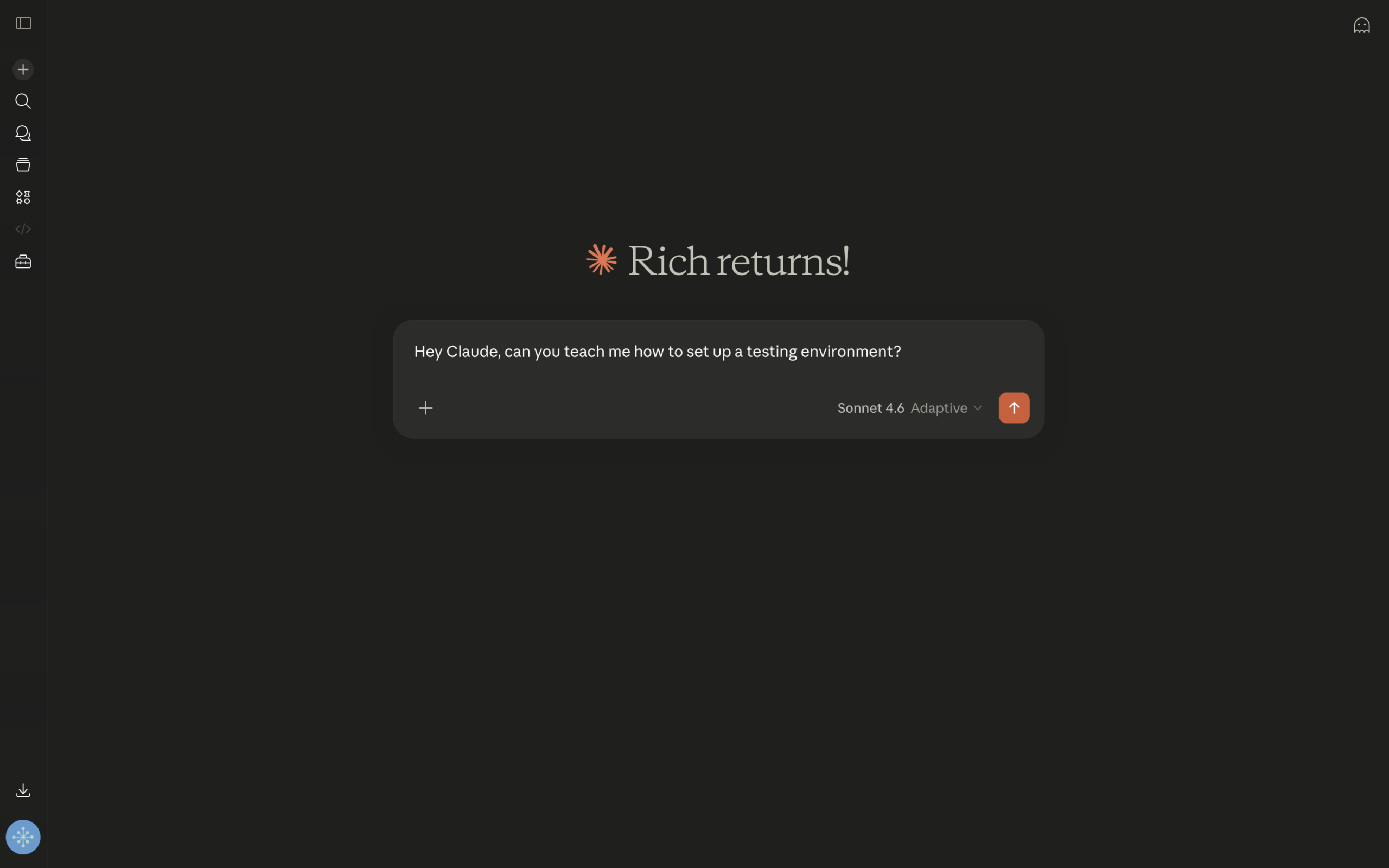
Hey Claude, can you teach me how to set up a testing environment?
In the past I used to evaluate themes directly on my live site. It’s a nightmare and not something that gives you an accurate picture of how things work. You never really put a theme through its paces because the moment something breaks you’re scrambling to revert before anything else breaks. Breaking things is part of the process.
Cloning changed everything. By working closely with claude.ai and making a copy of my website I had a safe place to play, experiment, and break things without any consequences. Working in staging meant I could pull things apart and rebuild freely, without the risk of people coming across a half-broken site.
Pro tip: Disable search engine visibility on your staging site immediately, so Google doesn’t index a half-built duplicate.
Blank canvas vs. fighting other people’s code
Demo content is useful for seeing how a theme handles layouts, but it creates more cleanup work than it saves. I looked at multiple starter sites such as Persona, Beverr, and Web Studio, and used them as inspiration rather than starting points. A great way to learn how things fit together, but there’s no substitute for a blank canvas. When things don’t work as expected, you know it’s on you to fix rather than someone else’s code, and I actually enjoy knowing it’s my problem to fix.
The one exception was importing the CSS variables from the Blocksy Persona starter site purely as a spacing and sizing reference. No demo content, no someone else’s layout, just the underlying numbers to build from. Once I understood the mental model behind Gutenberg’s Full Site Editing (FSE), building reusable components became a straightforward process.
Building from solid ground
Before touching a single template, I made myself slow down and lock in the core design decisions first. As a designer this is the stuff I genuinely enjoy, the systems thinking, the ratios, the details that quietly hold everything together.
Typeface:Inter, system-friendly, highly legible, and works at every weight
Content width: 1280px, enough room to breathe without feeling sprawling
Spacing: consistent margins and padding throughout, anchored to a 4px/8px baseline grid
Getting these locked in upfront meant every page felt cohesive from day one rather than retrofitted later. It’s the kind of thing that’s invisible when done well but immediately obvious when it isn’t. A bit like kerning; nobody notices it until it’s wrong.
Start small, build confidence
With the foundation locked in, I resisted the urge to jump straight into the complex stuff. Instead I started with the simplest pages first, just a handful of images and some text, nothing that would overwhelm me before I’d even got going. The goal was to get comfortable with the Blocksy Customizer and the Gutenberg editor, build some muscle memory, and rack up some small wins. It worked.
Once I felt confident enough to take on something more structural, I turned my attention to the portfolio. The old site used standard WordPress pages for all my case studies, no filtering, no archive, no dedicated templates. I was missing out on some of the real strengths of the platform.
The fix was switching to a portfolio Custom Post Type (CPT), which is essentially a dedicated content type in WordPress built specifically for a particular kind of content. Think of it like a separate filing system just for portfolio work, completely independent from regular pages or blog posts. Dedicated templates, category filtering by design discipline, and clean URLs. Honestly one of the best structural decisions of the whole rebuild, and something I wish I’d done years ago.
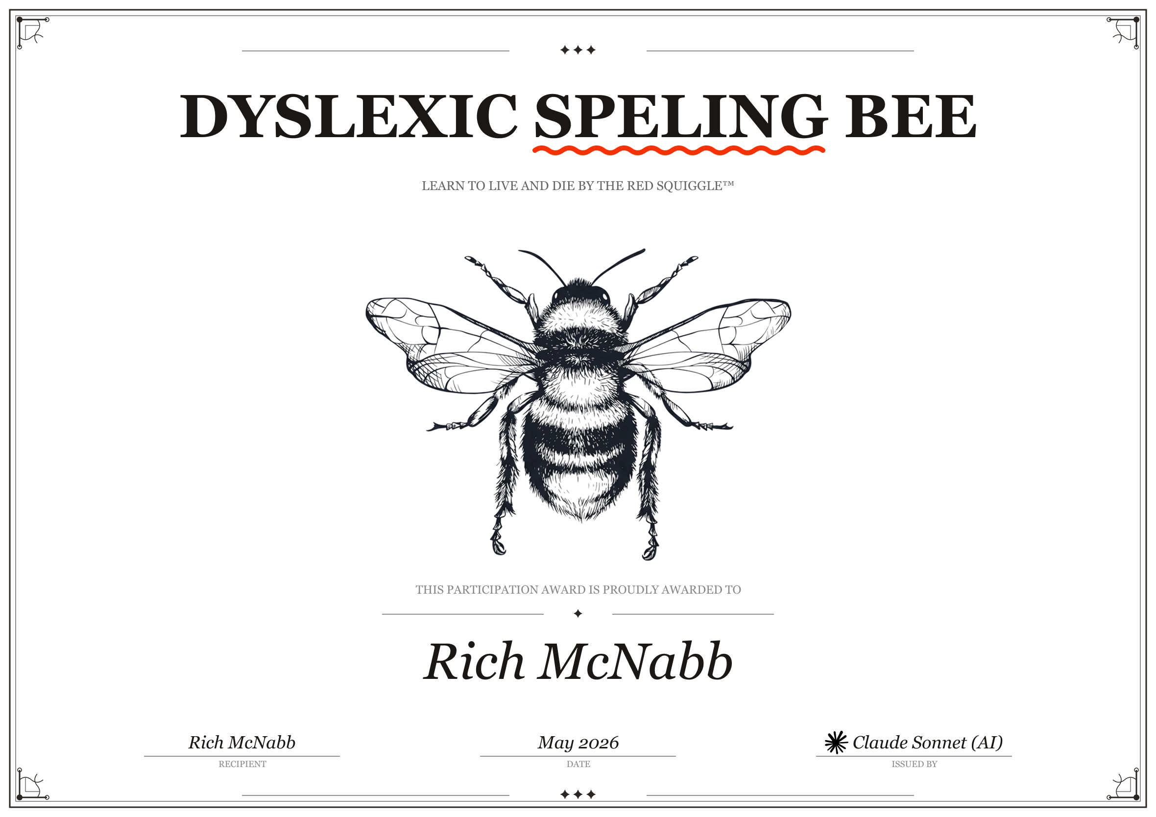
Dyslexic Speling*
I used AI to assist with a full audit of my existing content, proofreading copy, checking grammar, tone, and structure. Effectively removing two decades of spelling mistakes from my site in one go. Having Claude help me refine rather than rewrite everything from scratch meant my personality, tone and writing voice stayed intact. The words on screen are still very much mine, they just make more sense to the reader now. Win/win.
Did we catch them all? I honestly couldn’t tell you, but what I can tell you is that we cleaned up a lot.
As someone who’s dyslexic, this is the biggest thing I use AI for, alongside deep research when I’m trying to figure out something new. It levels the playing field in a way that nothing else really has.
Pro tip: AI is excellent at catching passive voice, overly long sentences, and inconsistent terminology, the things your own eyes gloss over after reading the same content a dozen times.
It’s a fine balance between funny and offensive. Hopefully I’ve landed as close to the line as possible without going over.
Working with AI: What I’d do differently from day one
Looking back, I wish I had configured this properly from the start. I didn’t know what I didn’t know I guess.
The biggest shift was giving Claude more context upfront: setting clear expectations, sharing links to documentation, being upfront about having no coding experience, and explaining my writing style and how I wanted responses structured. It’s almost like a digital contract that cuts down the back and forth and makes it clear what you’re trying to achieve.
The other thing worth knowing is when to push back. AI will sometimes jump straight to a solution without first checking if there’s a simpler approach. Getting comfortable with questioning that, and asking “is there a way to do this without adding more custom code?” saved me a lot of unnecessary complexity.
Plugins to unlock functionality: less is more
We all have things we’re happy to learn and things we’d rather outsource. When I was running my own design business I loved managing every aspect, from meeting clients, designing, iterating, and collaborating with developers and testers. Doing my own taxes was a different story. I had no desire to teach myself, and even less desire to face the consequences of getting it wrong, so I hired an accountant.
The same logic applied here. I had no interest in teaching myself JavaScript or PHP. I tried JavaScript once and, as a visual learner, I could never really see how everything connected. Reading code, following loops, working out why something wasn’t behaving or WAS behaving, it just didn’t click. And I was never going to use it often enough to ever get good at it. Every time I did anything it always felt like I was starting from the beginning again.
So I kept the plugin stack lean. A bloated plugin list slows your site down and creates security risk. My final list:
Yoast SEO: helps people who are interested in what you do find the website
Blocksy Companion: unlocks the Pro features I knew I needed from the start
Redirection: manages 301 redirects post-migration so old links don’t just disappear and go to “Page not found” screens
LiteSpeed Cache: keeps the site fast and performant
Launching the new website
This was the exciting part and the moment of truth. Six weeks of nights and weekends all coming down to this. Equal parts exciting and nerve-wracking.
I used to work in tech support, so I fully expected this to be a long night. Because I had made so many fundamental changes, navigation, theme, converting pages to posts, renaming and restructuring content, a simple ‘push changes live’ would almost certainly have broken more than it fixed.
So instead I took a more deliberate approach:
Backed up the current live site using Namecheap’s cPanel tools and FileZilla to do a sidewise backup
Deleted the live site
Cloned the staging site across to live
Verified everything worked, links, layout, no funky styles.
It went seamlessly. I was genuinely shocked and I was expecting a looooooong night ahead.
With 20 years of links scattered across the internet, restructuring a site means a lot of those links now point to nowhere. I wanted to get on top of that quickly and bring visitors back on track.
Redirects are essential when URLs change, and they will change when you restructure a site. I used the Redirection plugin to manage everything in one place. The basic idea is simple: this link used to live here, it now over here. It tells Google and other search engines that content has permanently moved and where to find it. Better for visitors, better for SEO, better all round.
Once the redirects were in place I submitted the site to Google Search Console to get things updated from their end.
Cleaning up and putting the house back in order
A few days after launch, once the dust and my nerves had settled, I removed the staging site after making a final backup. Don’t rush this step. Wait a few days before pulling staging down, just in case you need to refer back to something. Always back up first.
What I’d do differently
Like most things, once it was done I wished I’d done it sooner.
Cache was a constant source of confusion early on. I’d make a change, preview the site, and nothing would happen. I was never sure if the change hadn’t worked or if the site was broken. Once I got into the habit of flushing the cache and hard refreshing after every change, troubleshooting got a lot easier.
A better plan upfront would have helped too. With ADHD and dyslexia I was jumping between half-finished things constantly, notes on paper, emails to myself, ideas going nowhere. Moving everything into Todoist was a game changer. No more fear of forgetting something important or losing a good idea.
Building websites is fun, but it’s also a ton of work, more than I had bargained for at the start. Having my own portfolio as the project kept me motivated throughout, because the stakes were high. That said, I don’t think I’m cut out to do this as my day job.
The combination of a solid theme, a proper design system, clean content architecture, and a careful migration made this rebuild significantly smoother than anything I’d attempted before. WordPress and Blocksy turned out to be the perfect foundation, giving me everything I needed without requiring me to build or maintain it all myself.
Rebuilding a portfolio as a working designer is an act of self-investment. It’s easy to put it off when client work is busy, but your portfolio is always working on your behalf. Or it isn’t.
If you’re thinking about a rebuild, the biggest piece of advice I can give is this: don’t rush the foundation. Right platform. Right theme. The decisions you make in the first week will either pay dividends or create headaches for the next few years.