

Cloud Control: Weather forecasting widget
A personal side project pushed further than a widget usually goes. Configurable layouts, a live data preview and a companion Apple Watch face, all built over weekends just to see how far a simple weather widget could go.
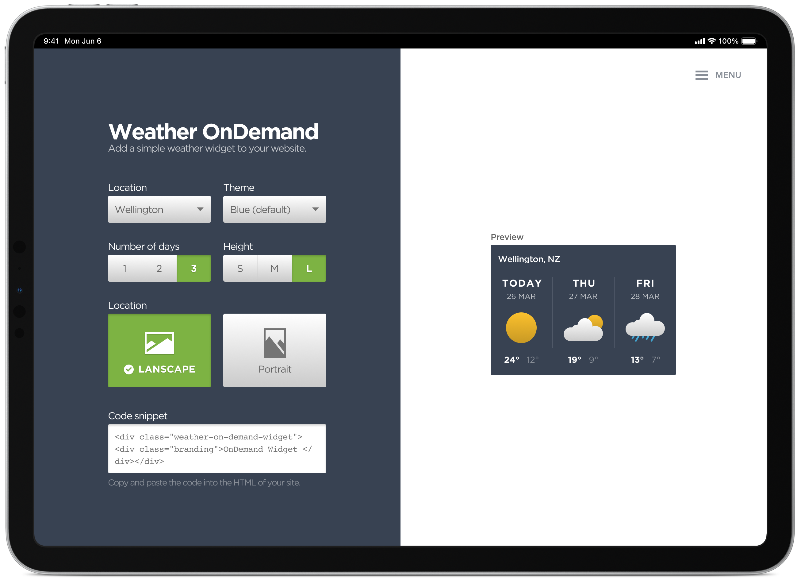
Mind maps, concepts and sketching various layout options
Weather OnDemand is a self-initiated, configurable weather widget, build your own layout and colour theme, then copy a code snippet straight into your site. I had a few different ideas I wanted to try and incorporate into the final design. A mind map helped me quickly capture concepts, layouts and ideas to explore in more detail later in the process.
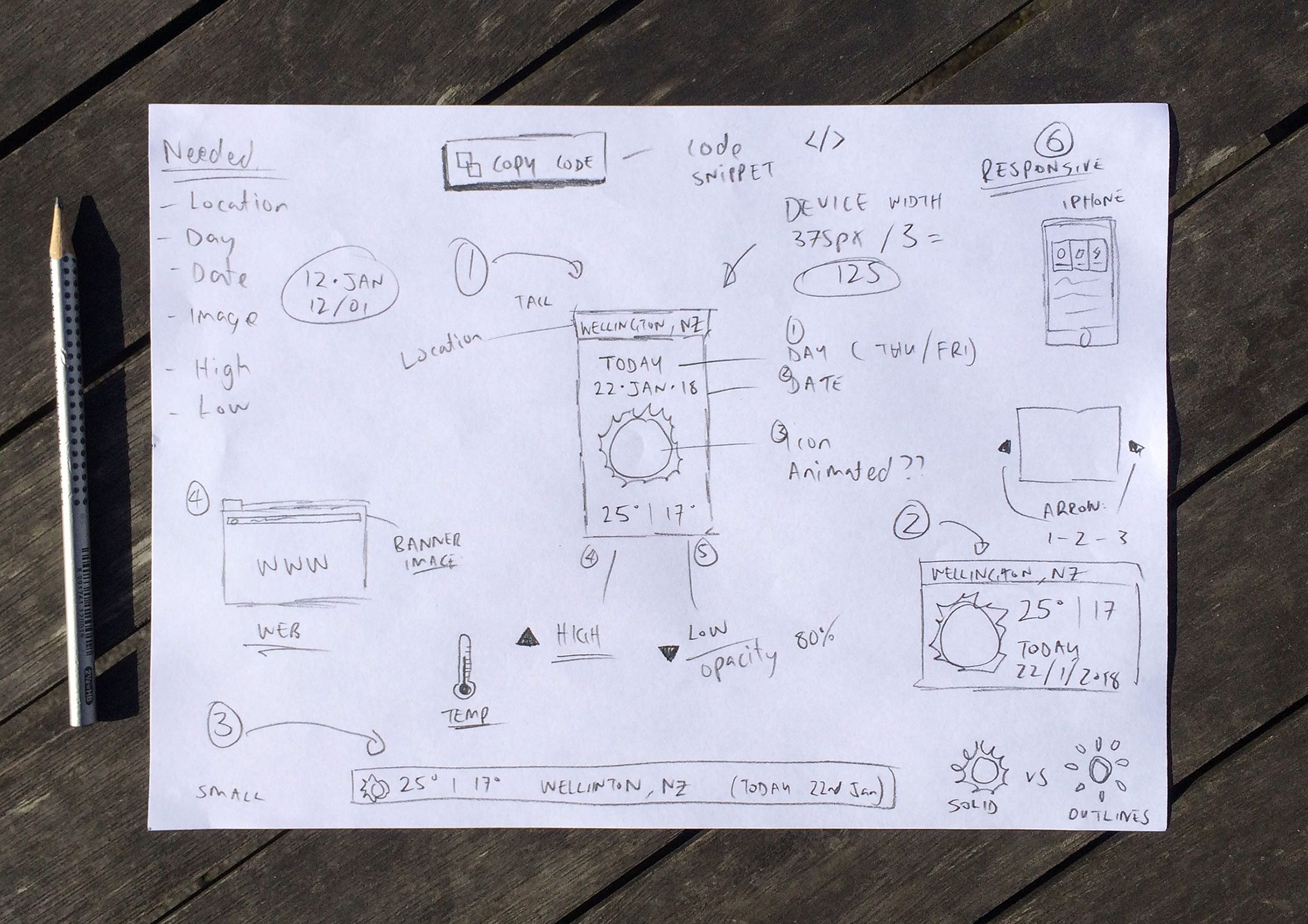
Configure your widget with live previews and copy the code
The simple dashboard allows you to configure various colour and layout options to easily adjust the look and feel of the widget. This generates a code snippet which you can then copy and paste into the HTML of your site.
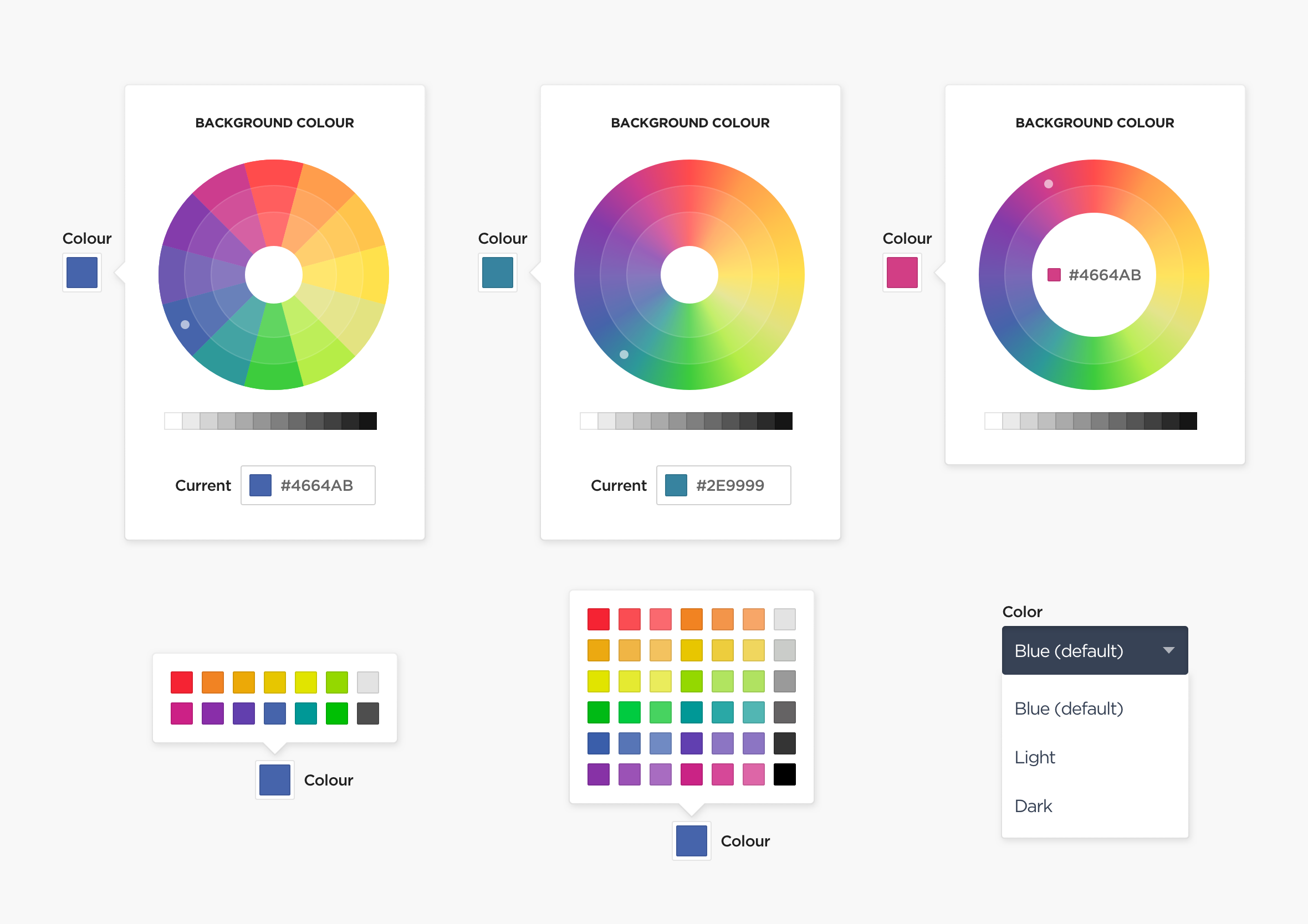
Predefined colour themes to avoid 90s MySpace aesthetics
I experimented with various colour selection options, though in the end settled on predefined colour themes to avoid people creating colour schemes that looked like something from a 90s MySpace page.
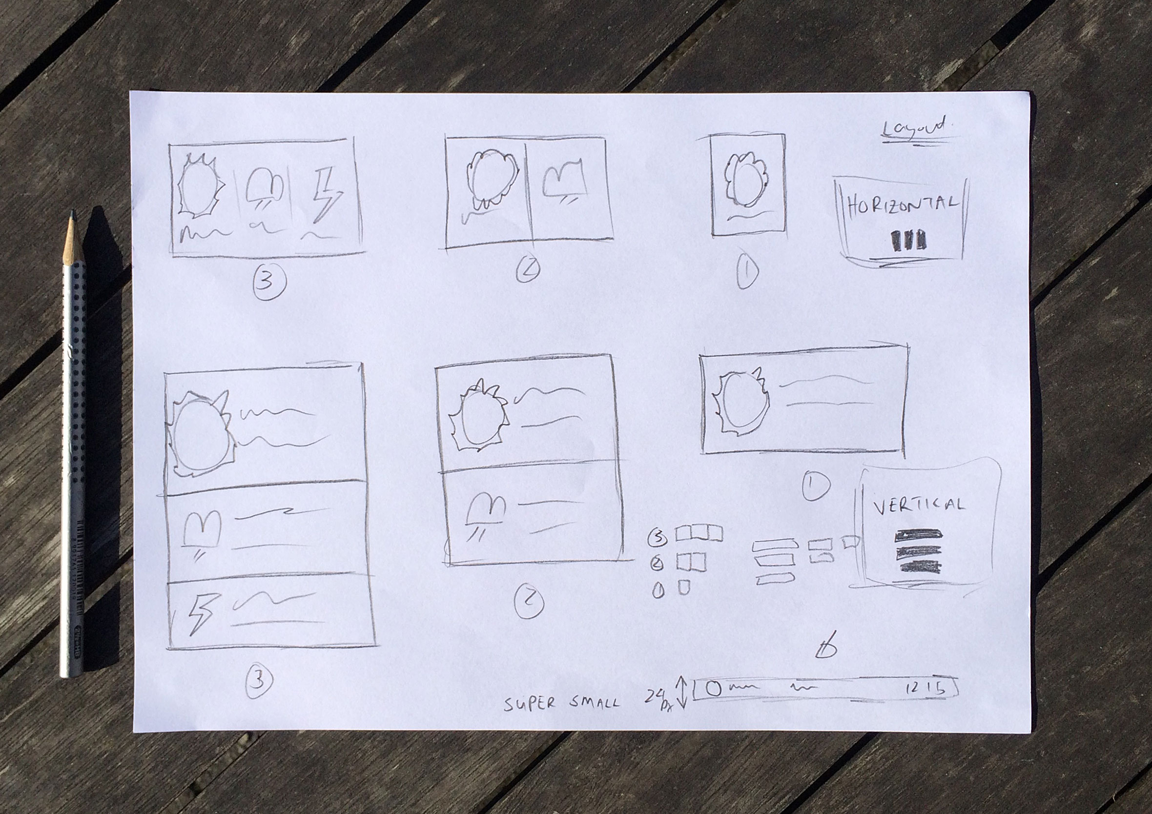
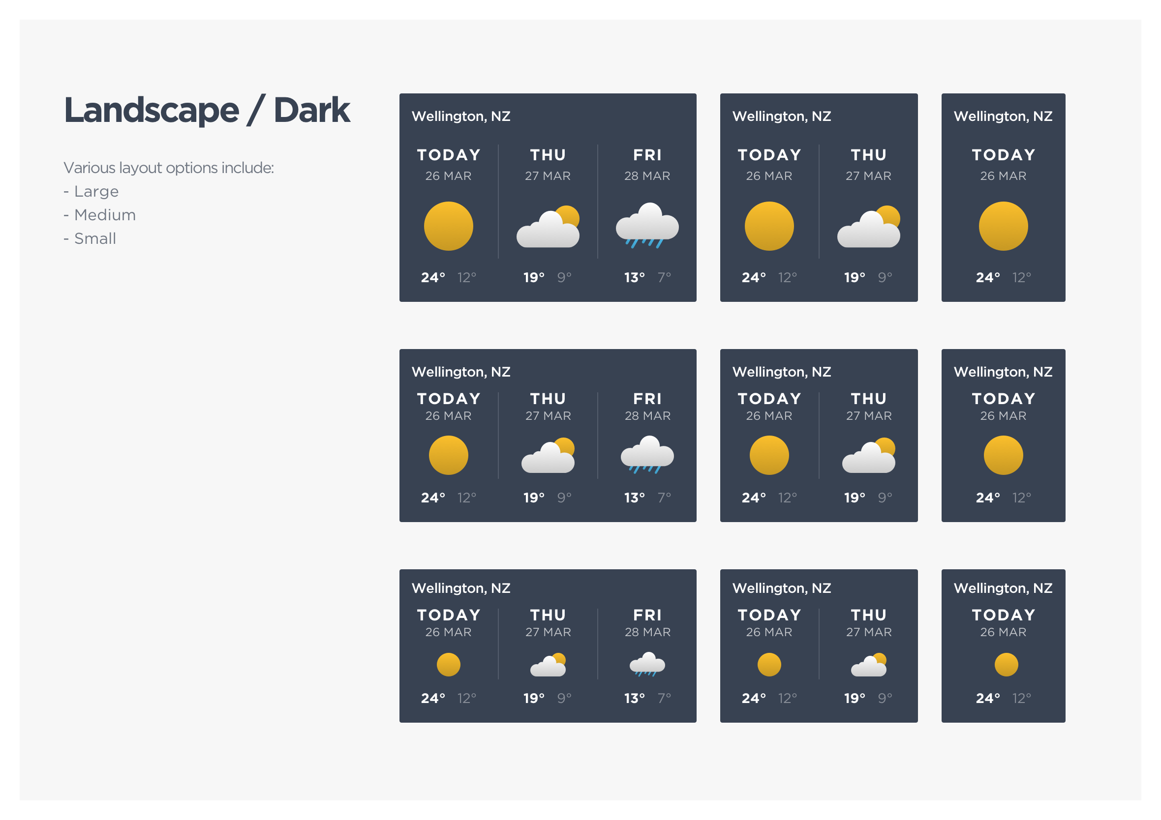
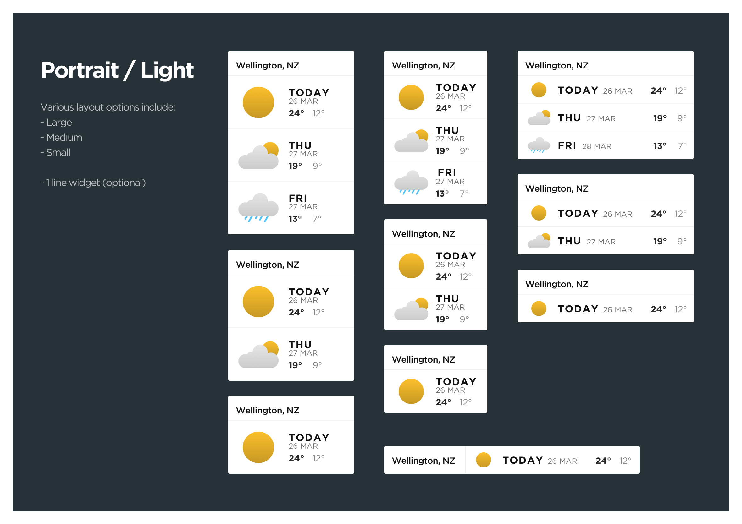
Exploring different layout options for responsive web design
Here are a few of the weather widget layout options. A live preview is always visible during the creation process so you can find the right colour palette and layout for your website.
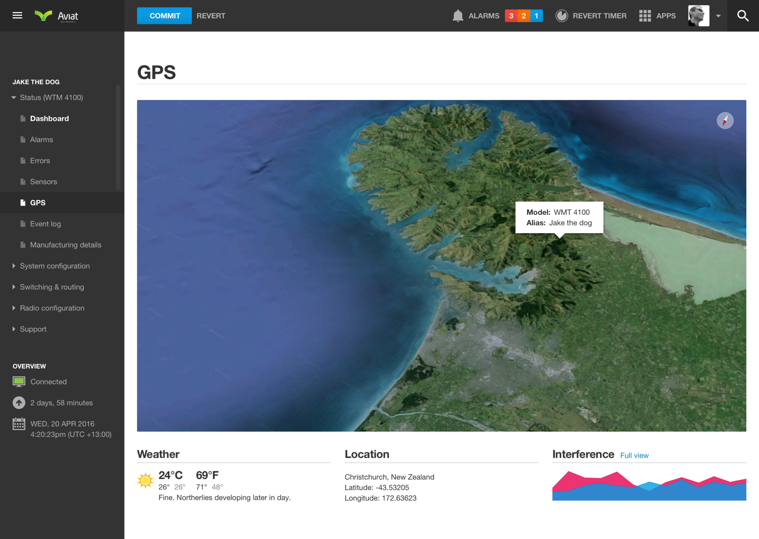
Live conditions inside the Aviat Networks GPS view
The same widget also shows live conditions inside the GPS view of the data dense dashboard, giving field technicians weather context alongside device location without needing a separate app. Radio equipment is sensitive to the elements, so pairing the two together meant technicians could get a feel for conditions before heading out to a site, not just after they’d arrived.
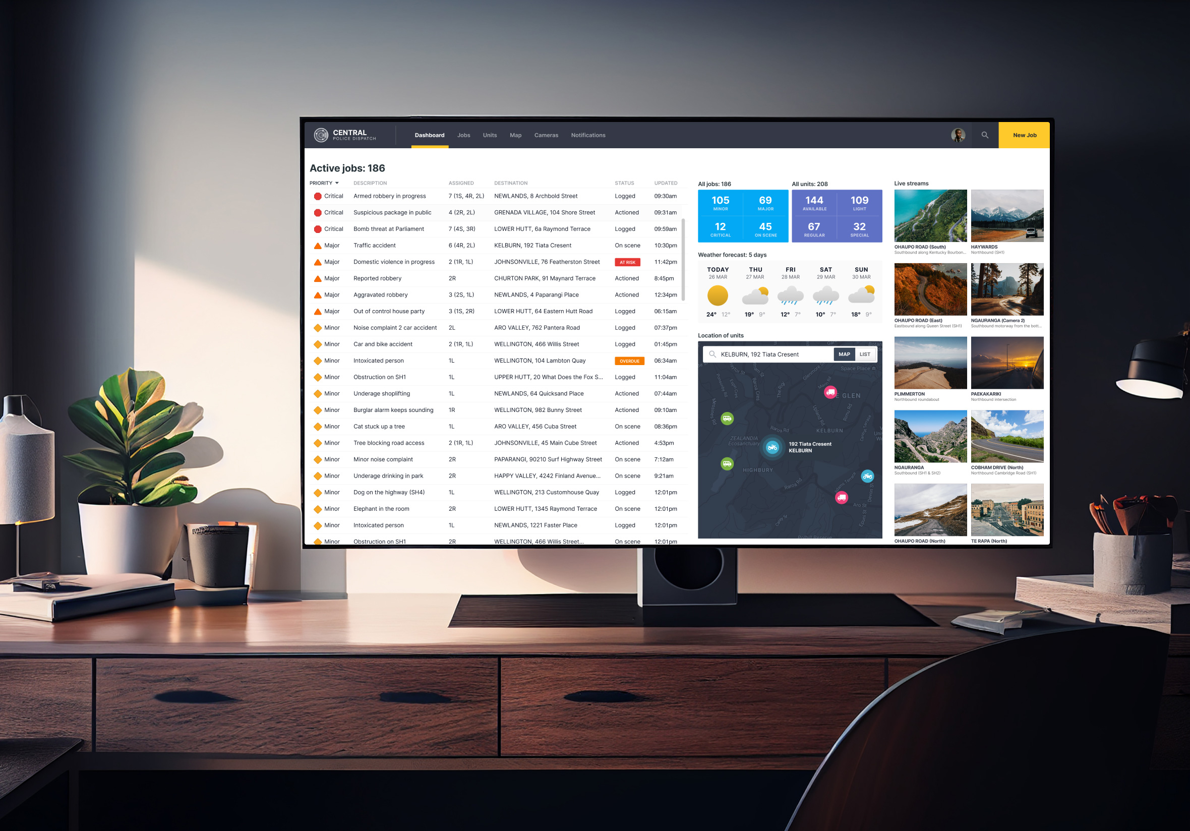
Weather conditions in the Central Police Dispatch dashboard
It runs on the big screen build of productivity government work too, giving dispatch teams a quick weather read alongside live jobs and unit status. Conditions on the ground change how a job gets handled, so having that context sitting right there on the main screen means dispatch doesn’t have to go looking for it mid-call.
Minimal design implemented in the MPI travel app
Travellers planning a Wellington visit inside the consumer onboarding app can check the forecast for that location without leaving the app. It’s a small addition, though it turns a customs and travel app into something worth opening again after landing, not just something people use once at the border and forget about.
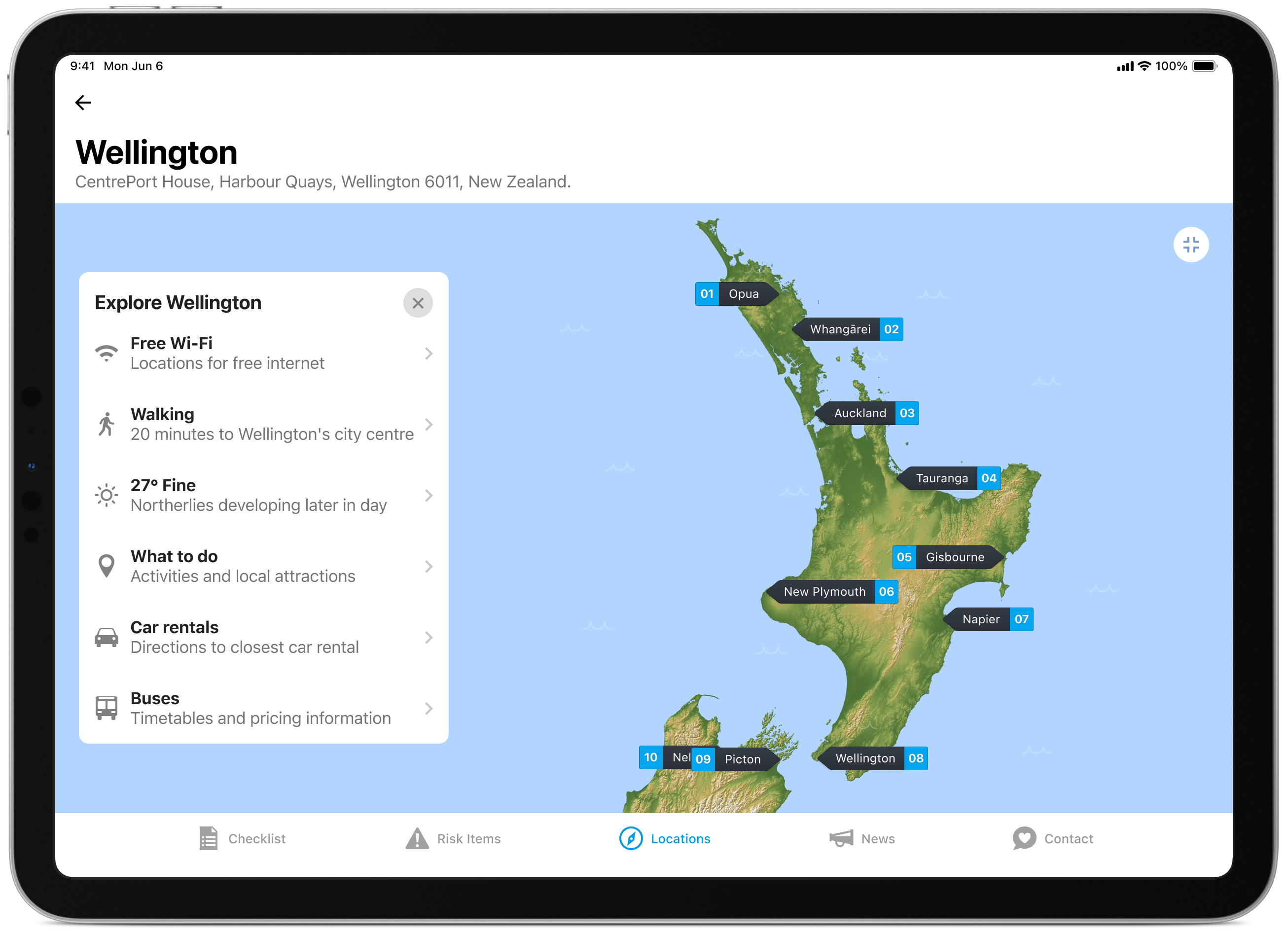
A tour through the Daily UI “100 Day Design Challenge”
This one also made an appearance during the design systems challenge, where I mocked it up across a few different devices: Apple Watch, a surf conditions app, a browser, and a plain mobile screen, just to see how it’d hold up outside a single context.
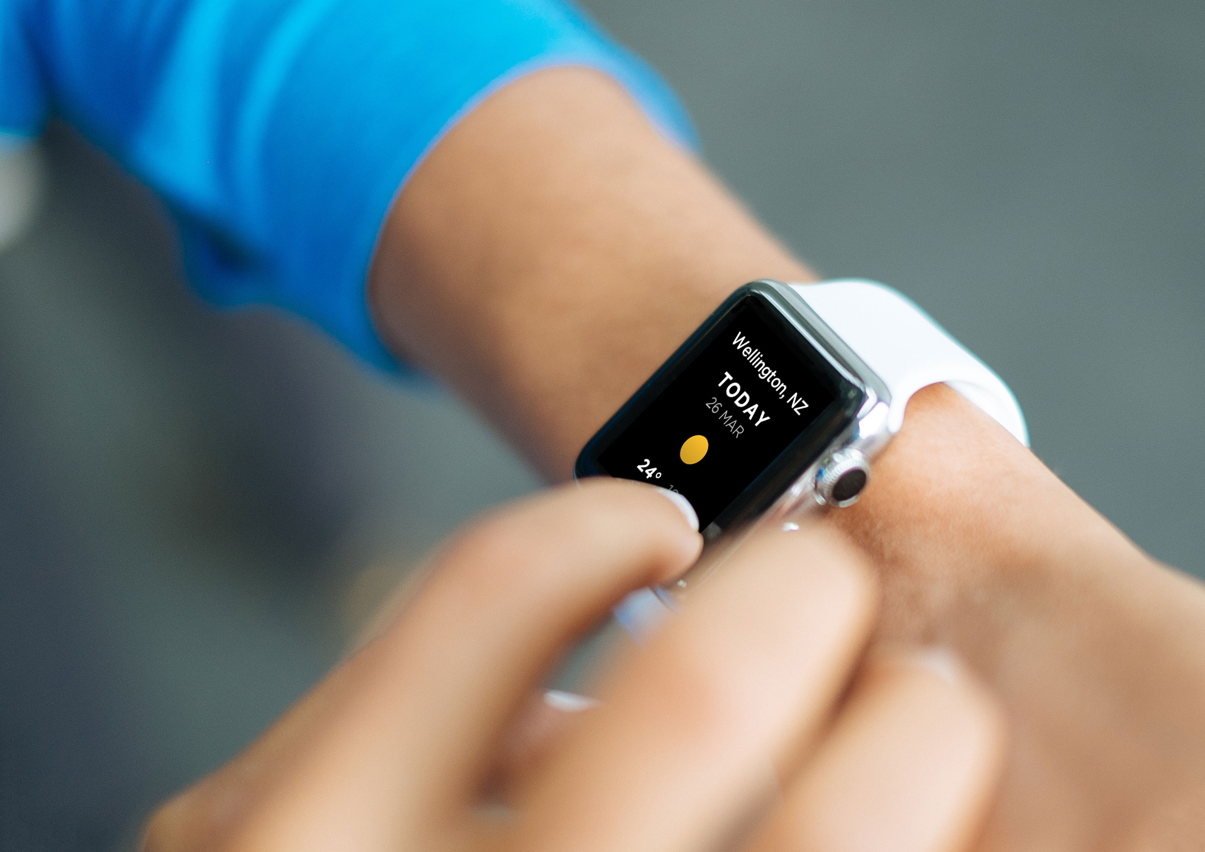
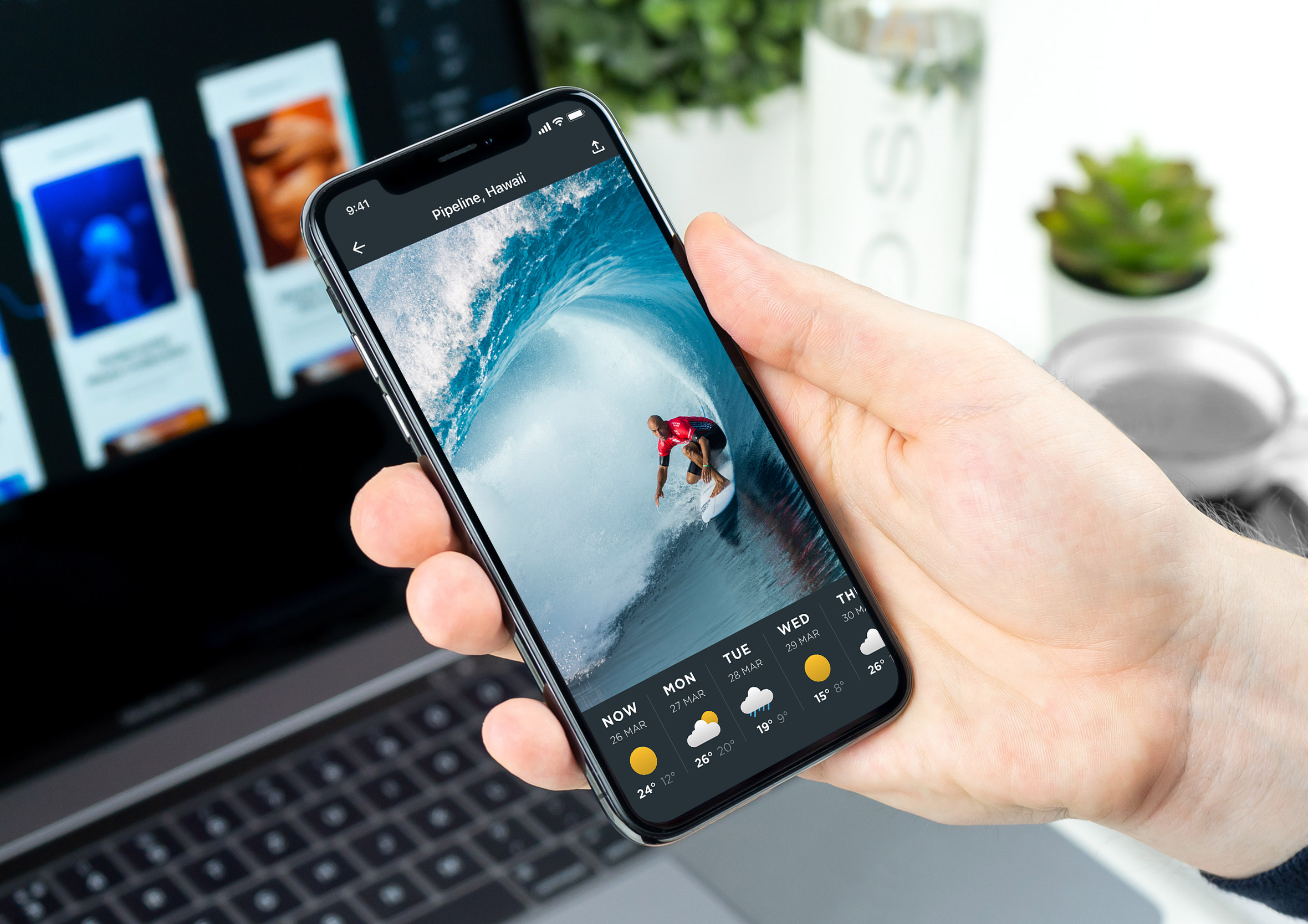
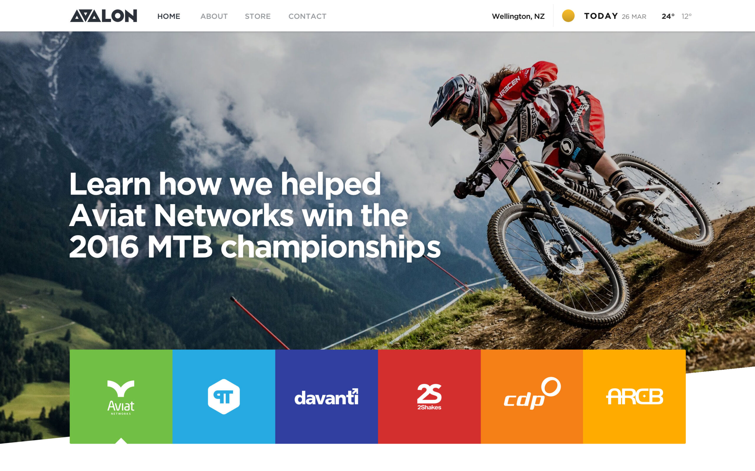
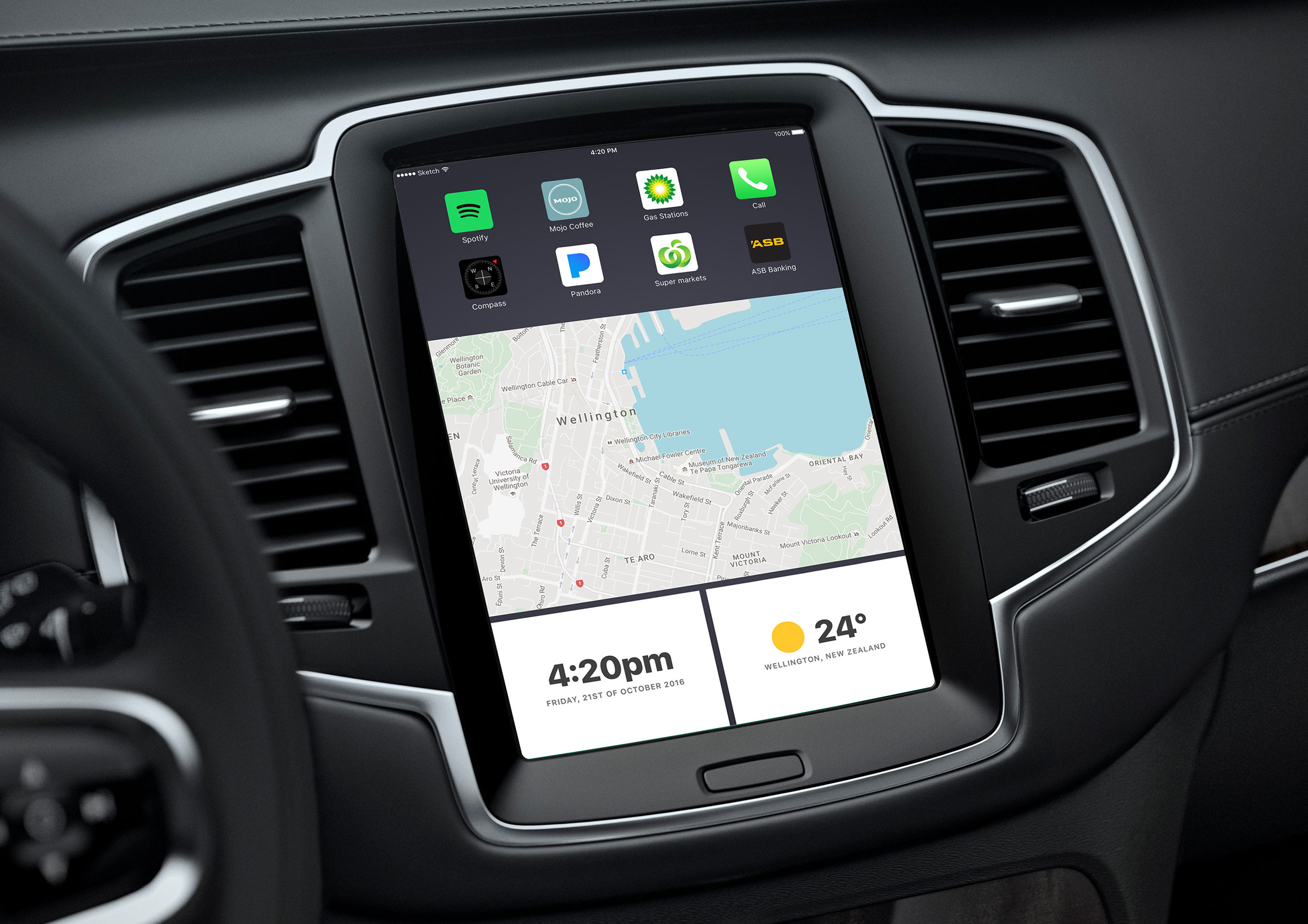
The Swiss army knife of widgets
Looking back at how many places this widget actually ended up, I’m honestly a little surprised myself. A dashboard GPS view, an emergency dispatch screen, a customs app, four different mockups in a design challenge, none of that was planned when I first started sketching mind maps.
I think it came down to the layout options themselves, rows or stacked columns, minimal or more detailed, built with every size and context in mind from the start rather than retrofitted later. That’s probably what made it the Swiss army knife of the whole design system, something that could sit comfortably in a mobile app or a large dashboard without looking out of place in either.That same flexible, multi-purpose thinking runs through a lot of my work history, not just this one widget.