

ACC: Health & safety risk assessment app
Field research over guesswork. Site visits, user interviews and field testing shaped this risk assessment app, changing how construction workers report hazards and stay safe on noisy, dusty, low-light job sites across New Zealand.
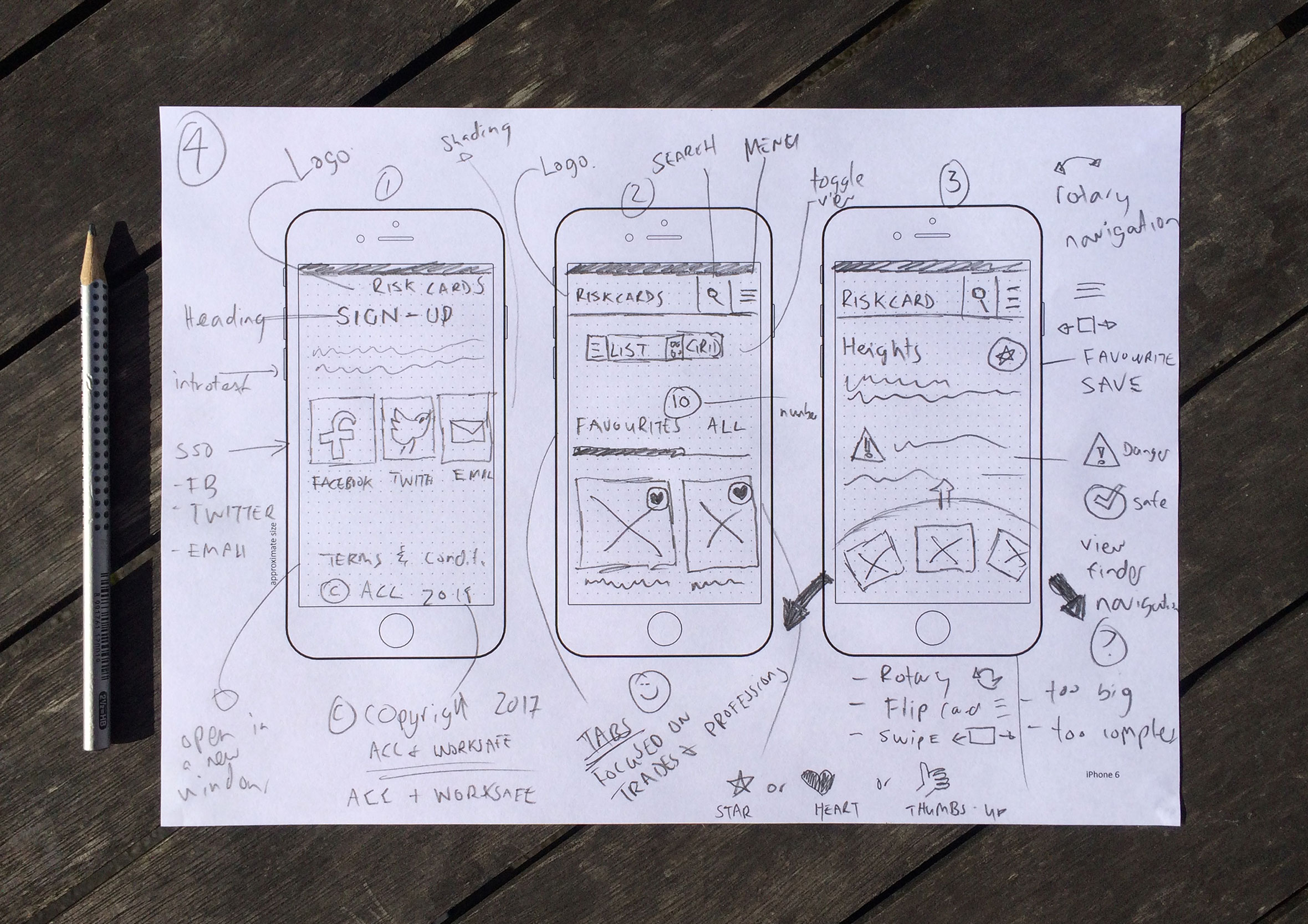
Capturing ideas and concepts before opening any software
ACC is a health and safety risk assessment app for New Zealand construction workers, built to work in the actual conditions of a job site: noisy, dusty, low light, and nobody’s got a spare hand for a fiddly interface. When capturing ideas I prefer to go low-fidelity and sketch on paper to generate as many concepts as possible. From there I’ll either produce wireframes or jump straight into design and rapid prototyping to validate ideas and assumptions.
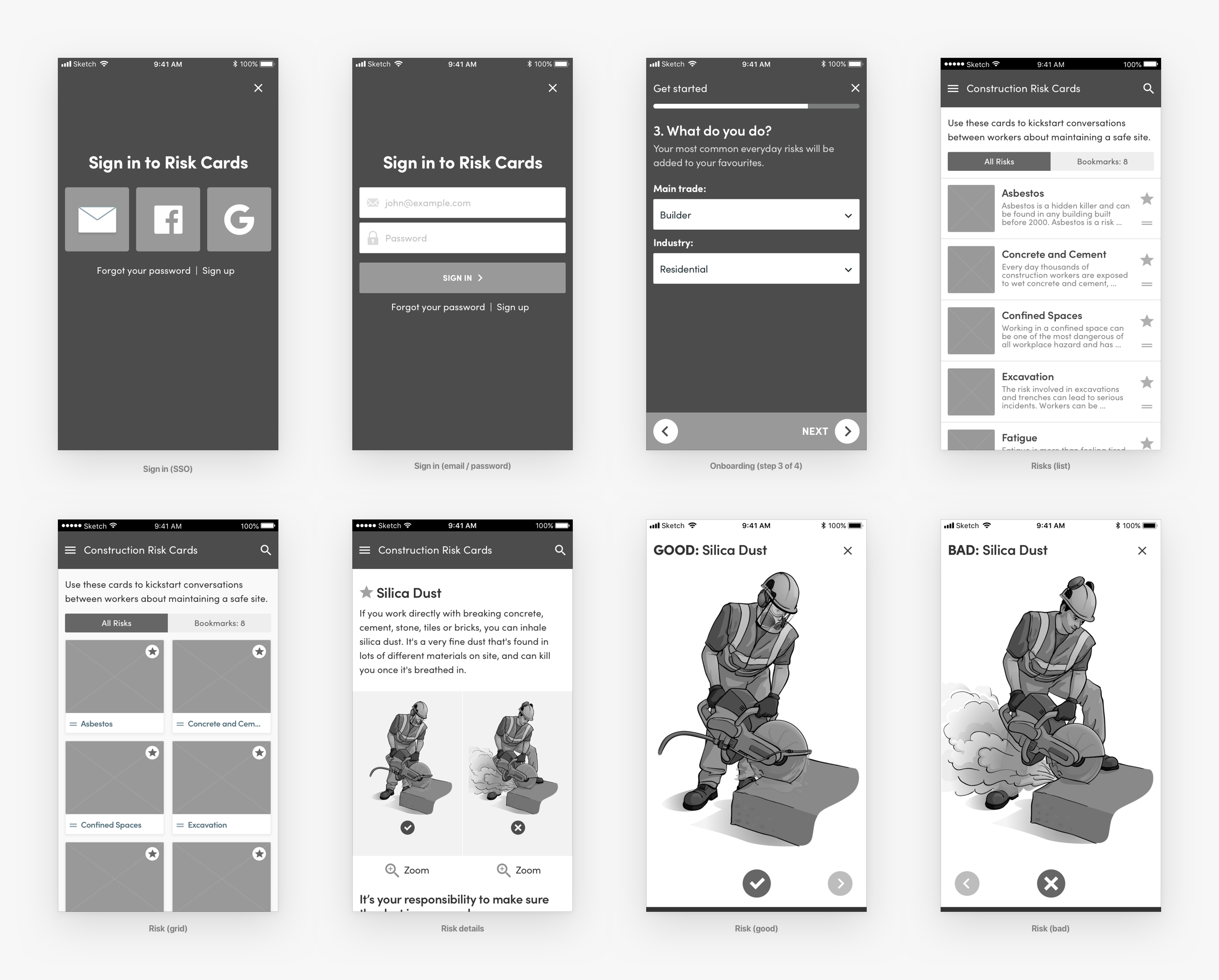
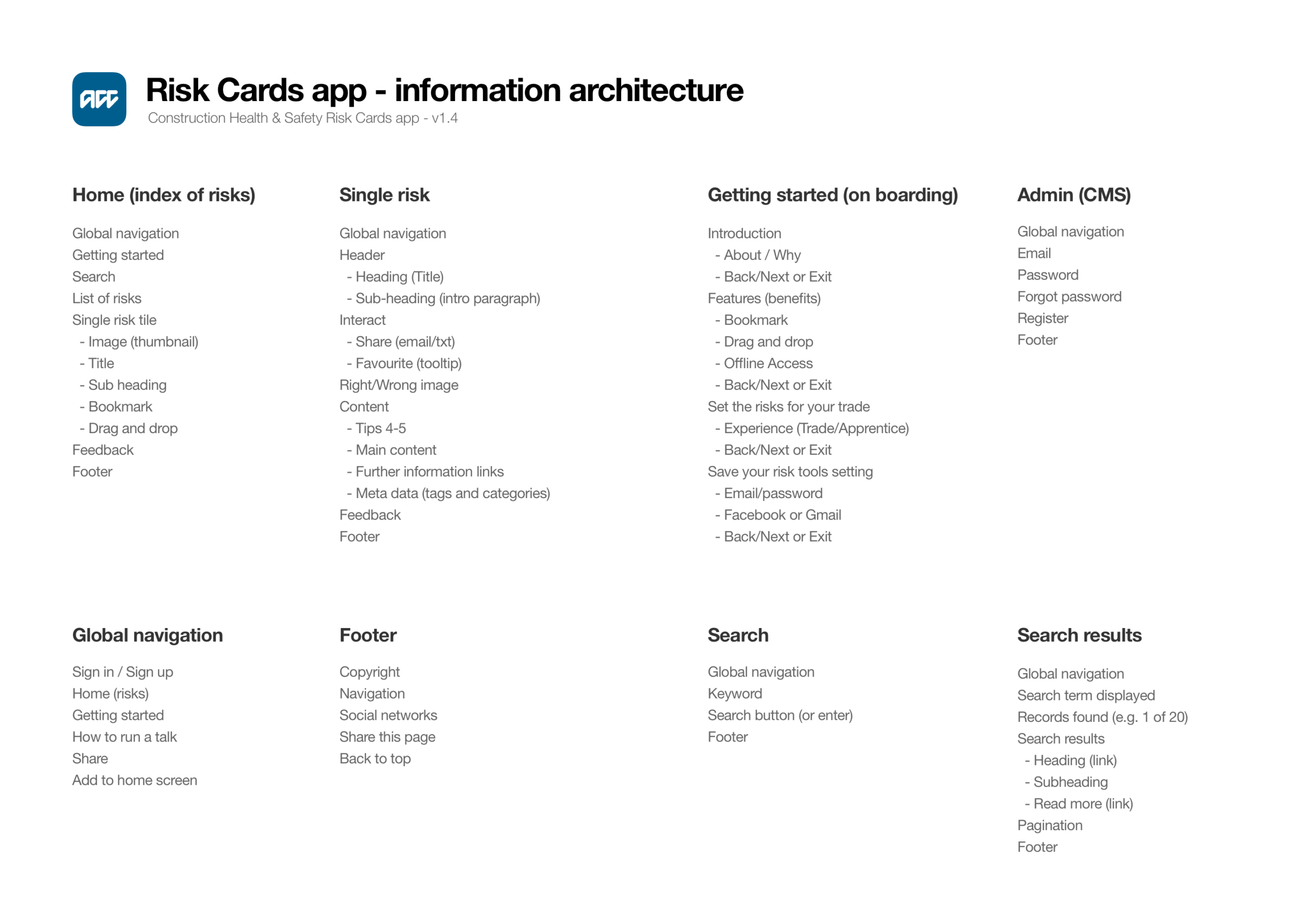
Wireframes and information architecture to map out flows
In the initial stages of the project, basic wireframes were created to give consideration to structure, individual page elements, user-flows, etc. It also helps by ensuring the information architecture is accurate and the right content is on the right screen.
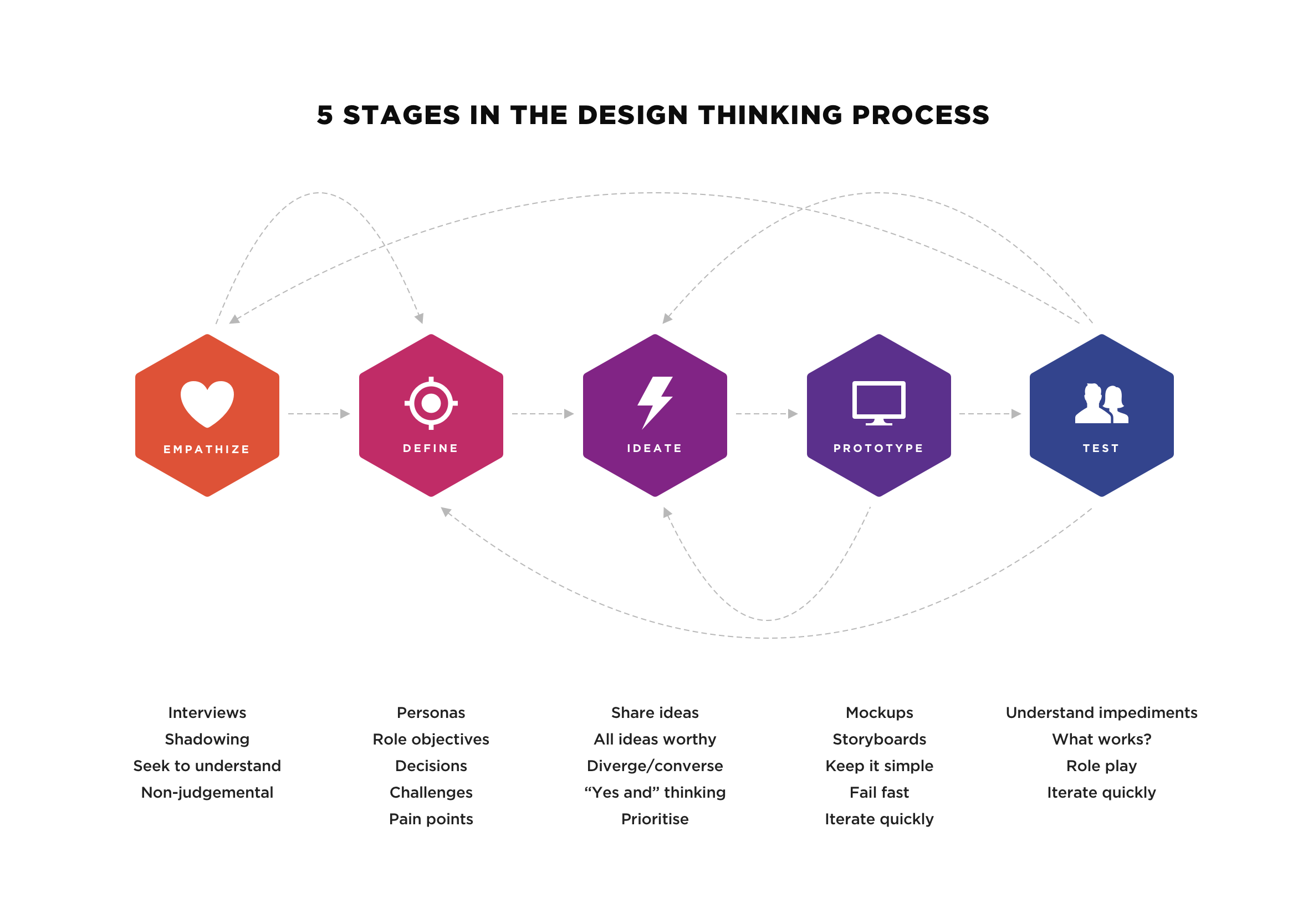
Stanford’s five stages of design thinking
Stanford d.school’s five stages, empathize, define, ideate, prototype and test, was the framework I leaned on for this project. It’s usually the easiest one to explain to a stakeholder who’s never heard the term “user research” in their life, and none of the five stages are strictly one-way either, I looped back to empathize more than once when testing threw up something I didn’t expect.
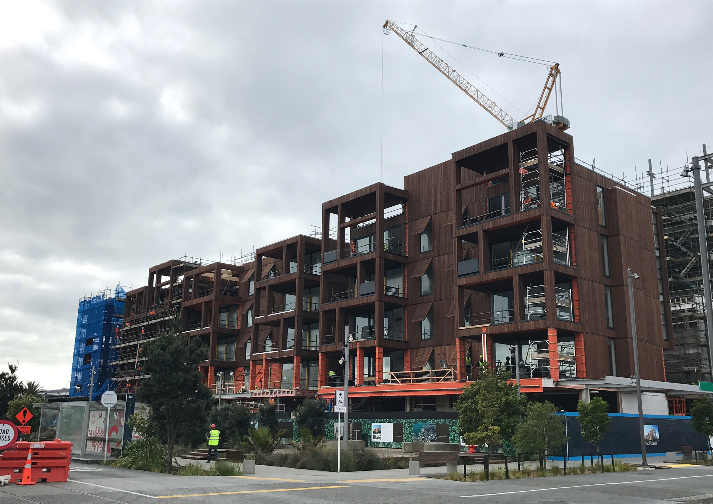
Experiencing the conditions firsthand with site observations
As part of the discovery phase, we visited a number of construction sites to observe the working environment and spoke with people who would be using the app. The insights we gathered from user feedback and being in the trenches was the app needed to perform well in a fast-paced, noisy, dusty, dangerous and low light environment.
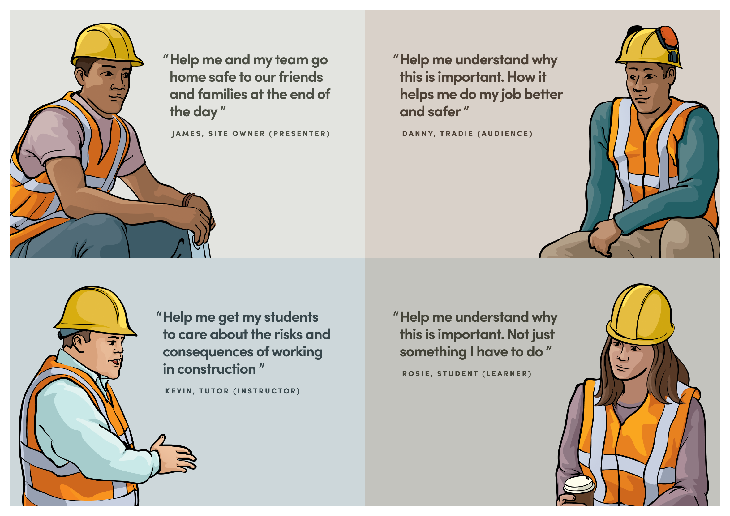
In-person user interviews and usability testing
During our user interviews, we found the Risk Cards fell into two main groups (or personas). The “Presenter/Tutor” would use it to share knowledge and give relevant updates to their crew. And the “Work/Audience” would receive the information and would have a chance to ask questions or have a group discussion.
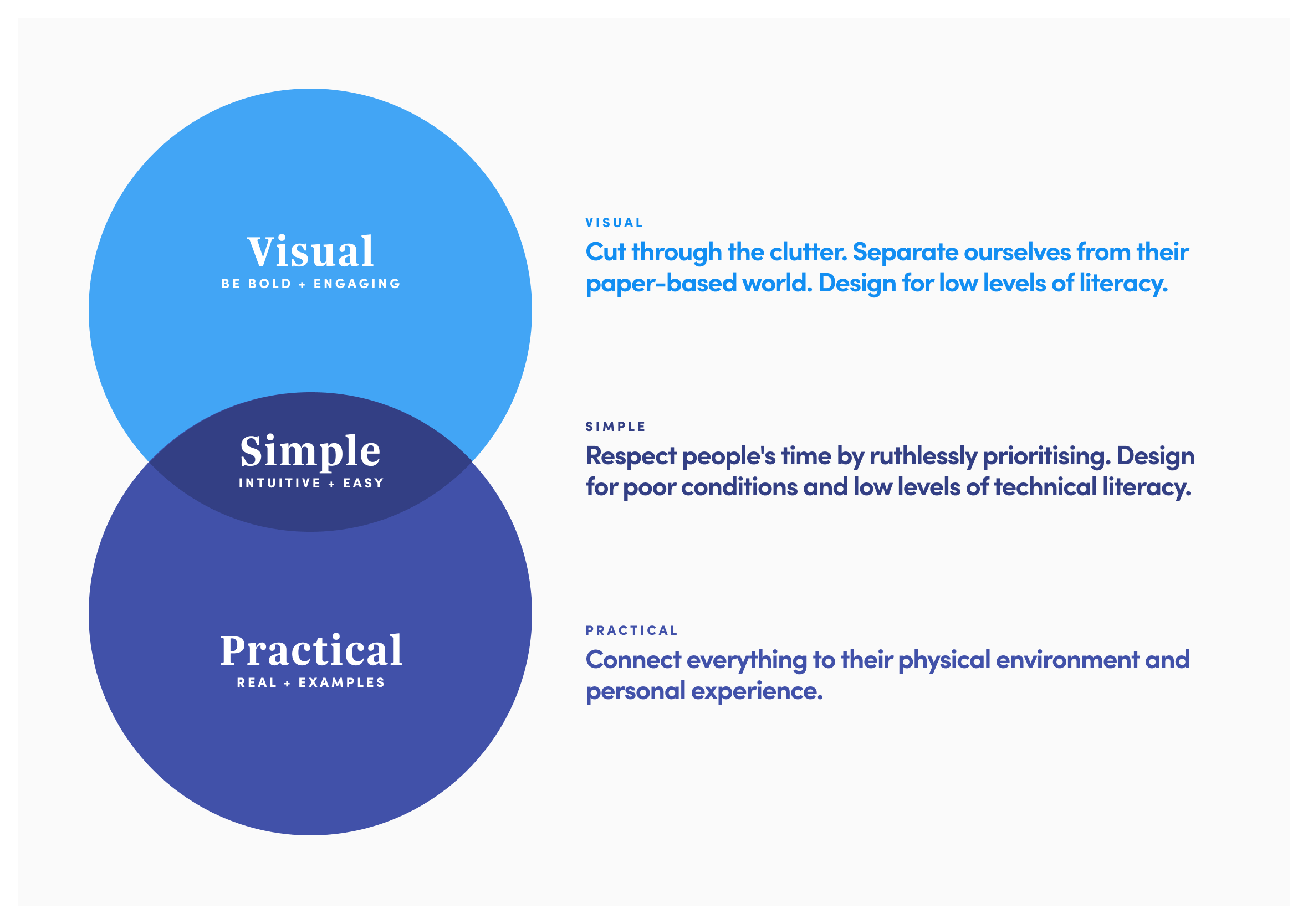
Visual, simple and practical: design principles we adhered to
At the beginning of the project, we agreed on three basic design principles to check every screen and flow against: visual, simple and practical. It mattered more than usual here, since a lot of the people using the app on site had English as a second language. Visual meant leaning on diagrams, iconography and colour rather than blocks of text. Simple meant stripping the interface back to what people needed in the moment, nothing more. Practical meant plain, concise language, no jargon, so instructions landed the same way whether someone had been on the tools for twenty years or two weeks.
Minimal landing screen and intuitive app navigation
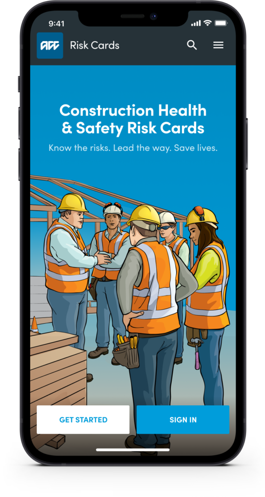
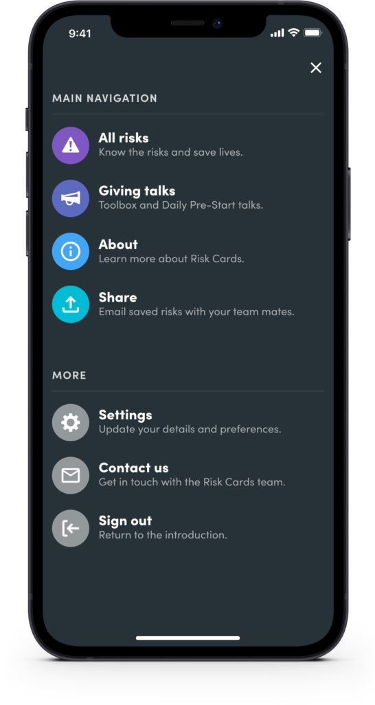
By separating the sign-in and registration process it makes it easier for users to start using the app. It also removes clutter and unwanted user interface elements from the screen. Navigation is separated into primary and secondary action so people can quickly find what they’re looking for. Credit: Illustrations produced by Ocean Design.
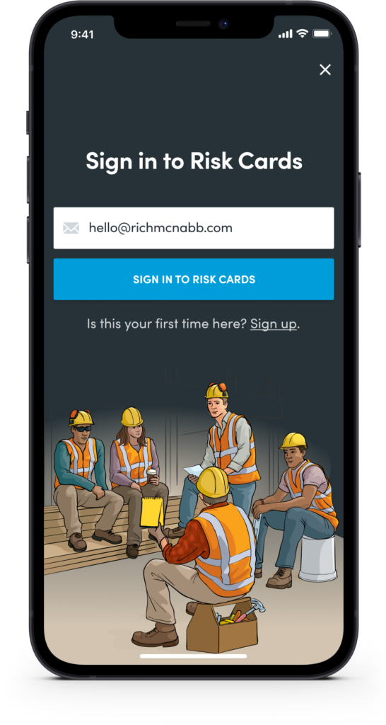
Sign-in concepts we tested onsite with construction workers
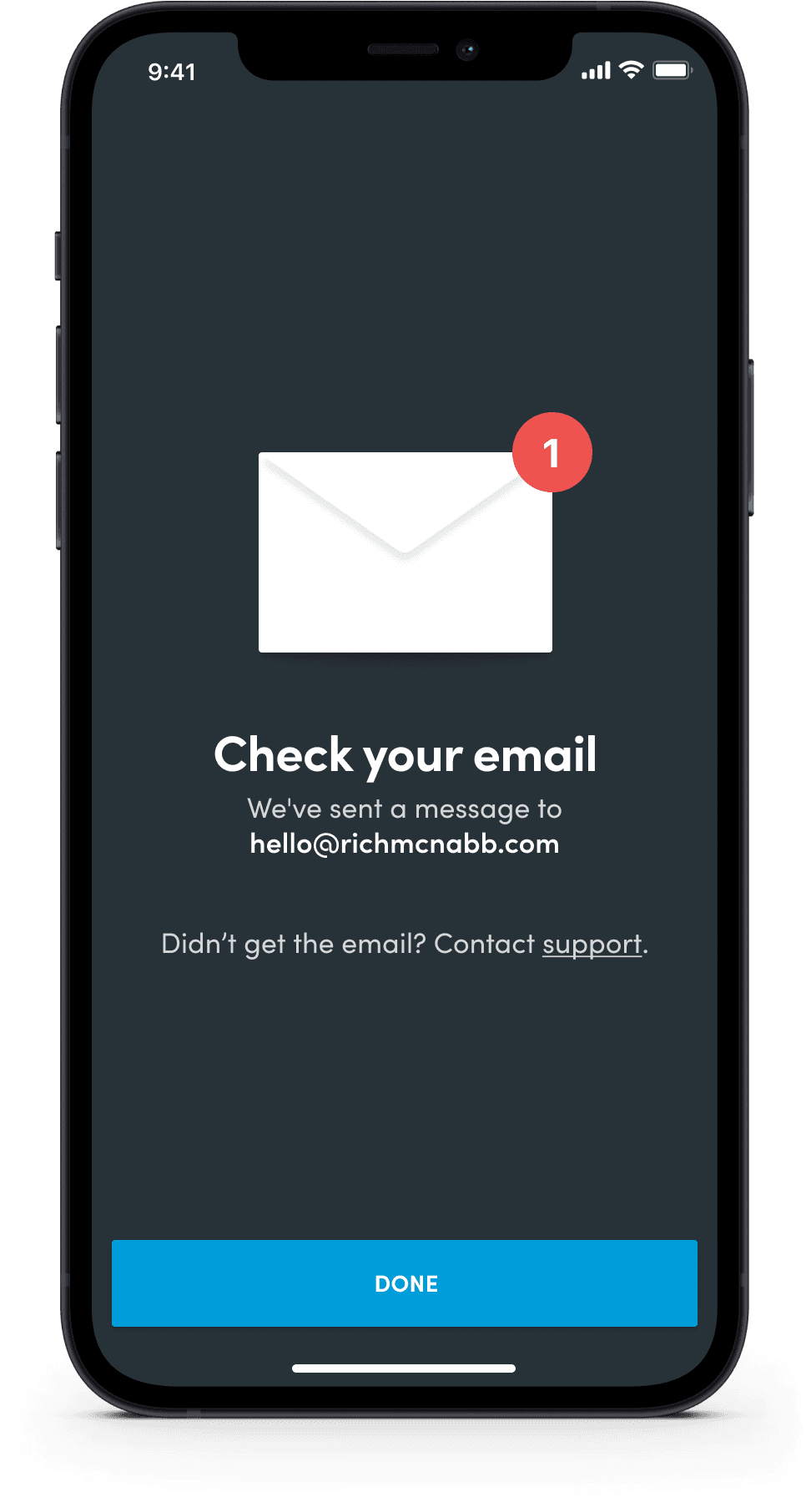
During usability testing, I tried out a number of sign-in methods: Single Sign-On (SSO), email and password, and email with a verification link. Simplicity and removing privacy concerns meant email with a verification code was the preferred option.

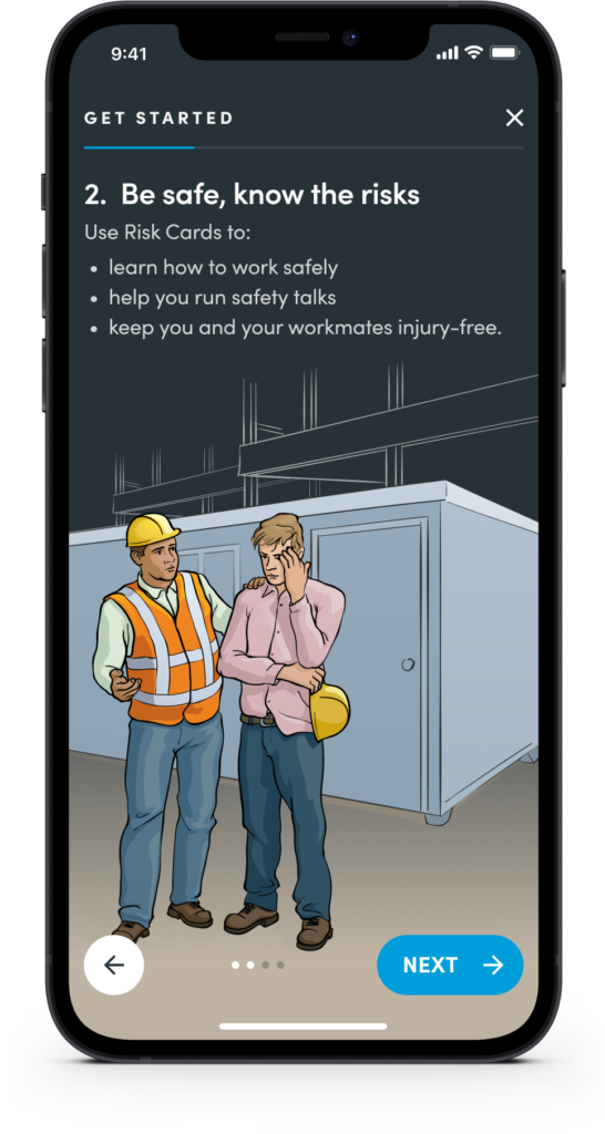
3-step onboarding built around your trade to remove clutter
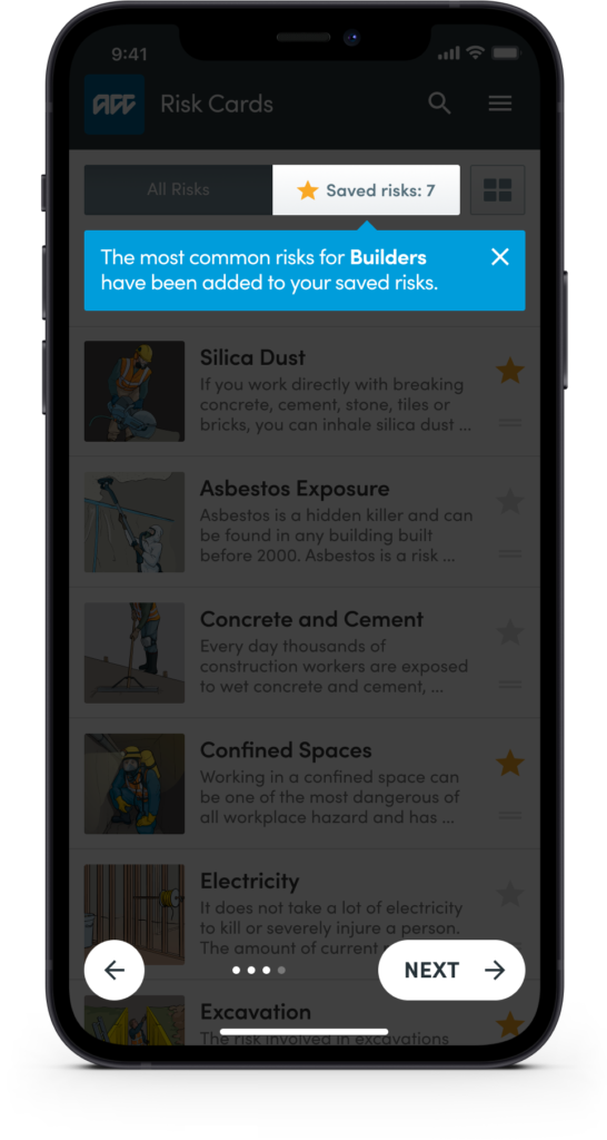
To help people get up and running as quickly as possible there’s a 3 step onboarding process. By telling us a little bit about themselves we recommend the most common risks associated with their trade.
Choose a grid or list view of the cards specific to your trade
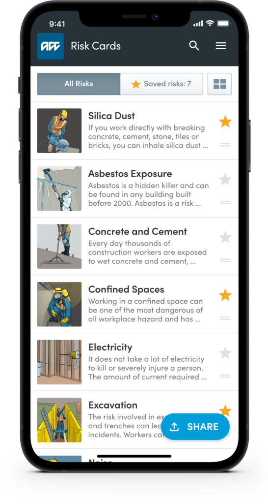
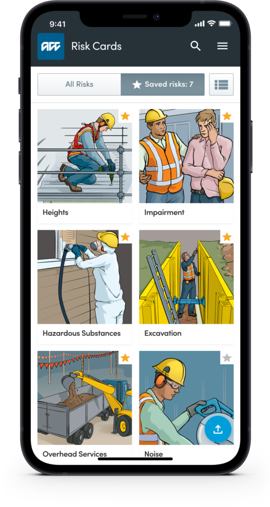
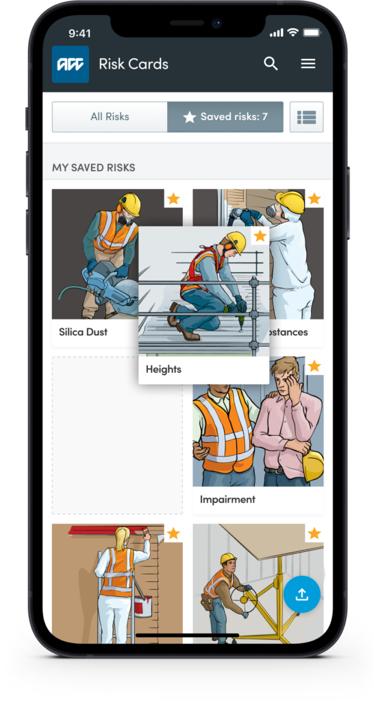
Because the view of all the risks (and the risks themselves) is the workhorse of the product I designed a couple of variations of this view. The most popular concepts were “List” and “Grid”. During the user testing session, it became pretty clear there was a need to give people the ability to choose the layout that worked best for them.
Individual risks, presented in digestible chunks of information
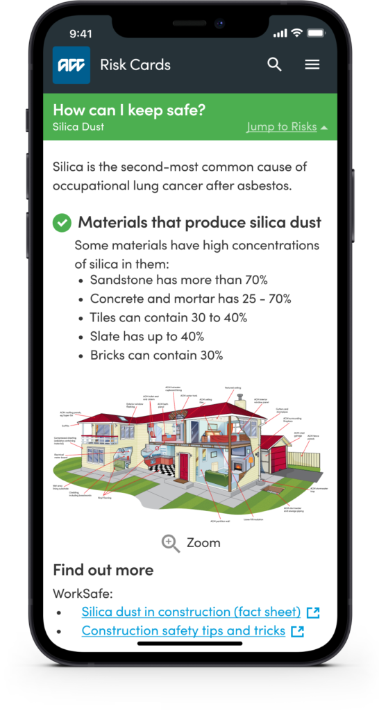
Individual health and safety risks are concise and present the facts in easily digestible chunks of valuable information. Structured in a tip-based approach for easier recall and to allow for people delivering the information to others easily in a group environment with confidence.

Drag and drop to prioritise what risk card you need for the job
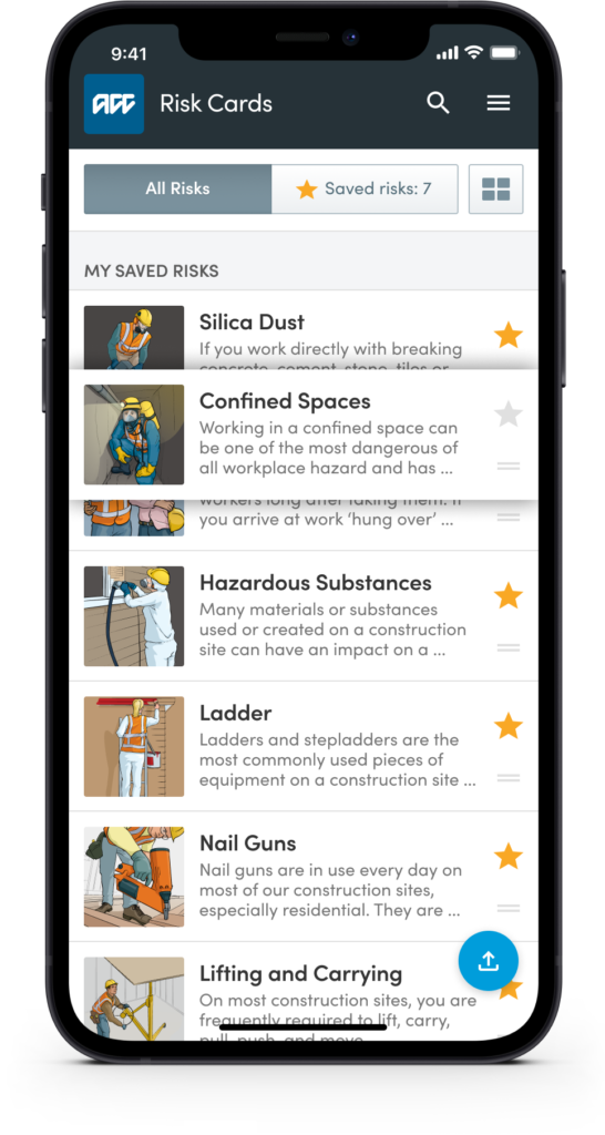
To provide people with more control (and the ability to customise risks in an order that makes sense to the way they prefer to work) we introduced the ability to drag and drop risks to help prioritise them on screen. When you combine drag and drop with the ability to hide/show relevant content you have a highly personalised and uncluttered reference tool.
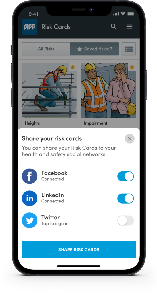
Sharing and feedback with your team and with ACC to improve
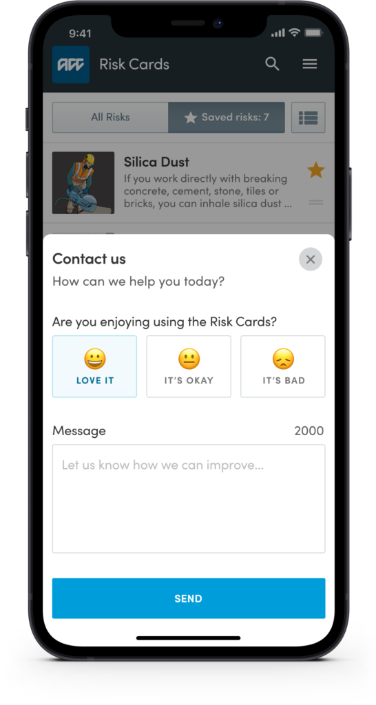
To validate your assumptions and to measure how well (or poorly) you solved a customer problem you should always ask for feedback, ideally after they’ve interacted with a feature. This is an excellent way to request feedback and potentially a great way to recruit participants for usability testing.
Clear user feedback loops to know a task has been completed
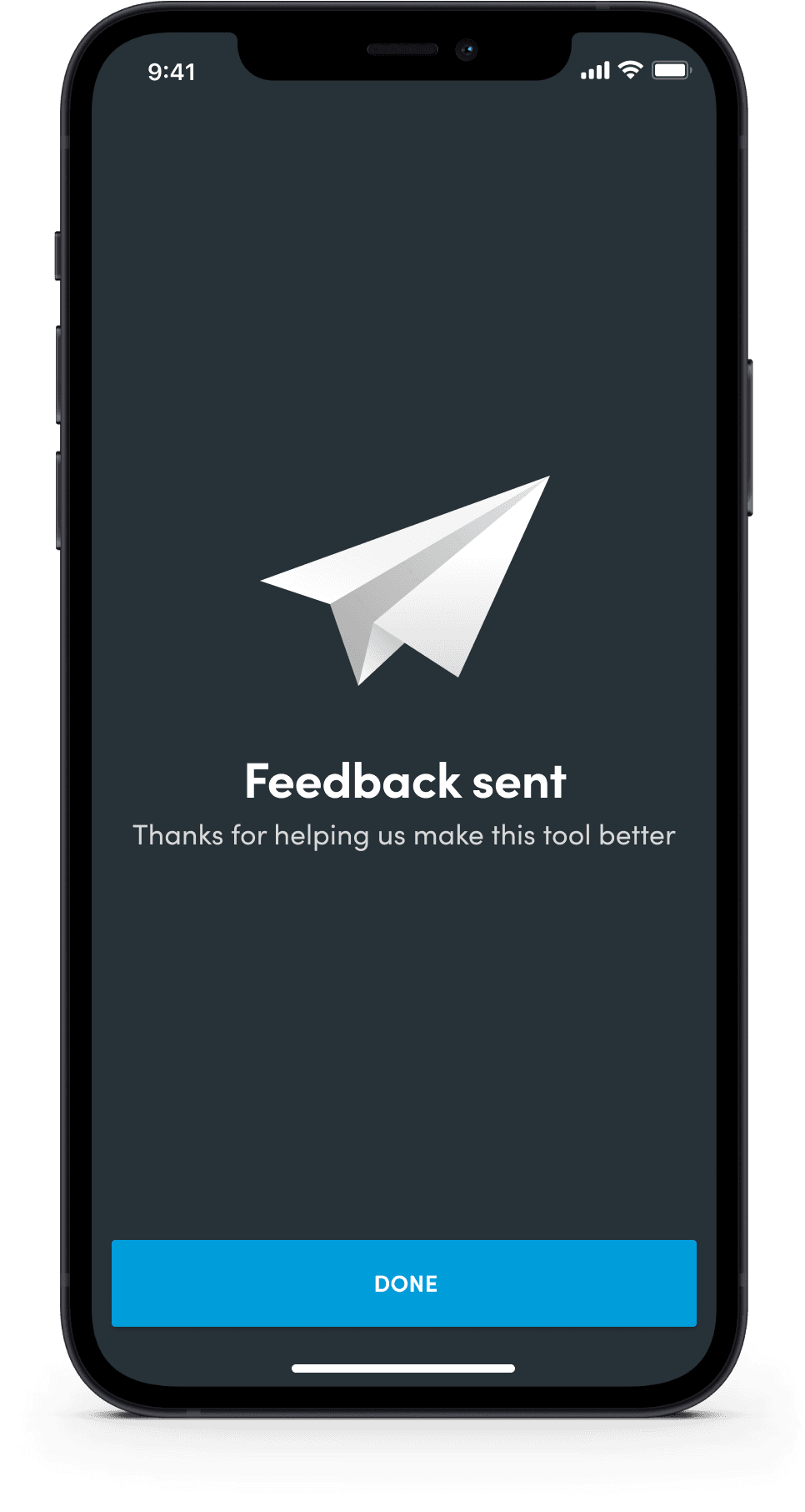
Clear and concise user feedback is provided to make people aware something has worked, or the steps they need to take to correct an issue. Great user interfaces should have a “no dead-ends” philosophy and provide options on what next steps the person could take.
Designing for dusty, loud and low light construction environments
Most apps get designed for someone sitting still, in decent light, with both hands free. This one couldn’t assume any of that. Construction sites are loud, dusty, badly lit half the time, and whoever’s using this has probably got gloves on and thirty seconds to spare, not a quiet moment to read fine print.
That’s why the “no dead ends” rule mattered as much as it did. Every screen needed a clear next step, because nobody on a site is going to stop and figure out where they went wrong, they’ll just give up and go back to a paper form instead.
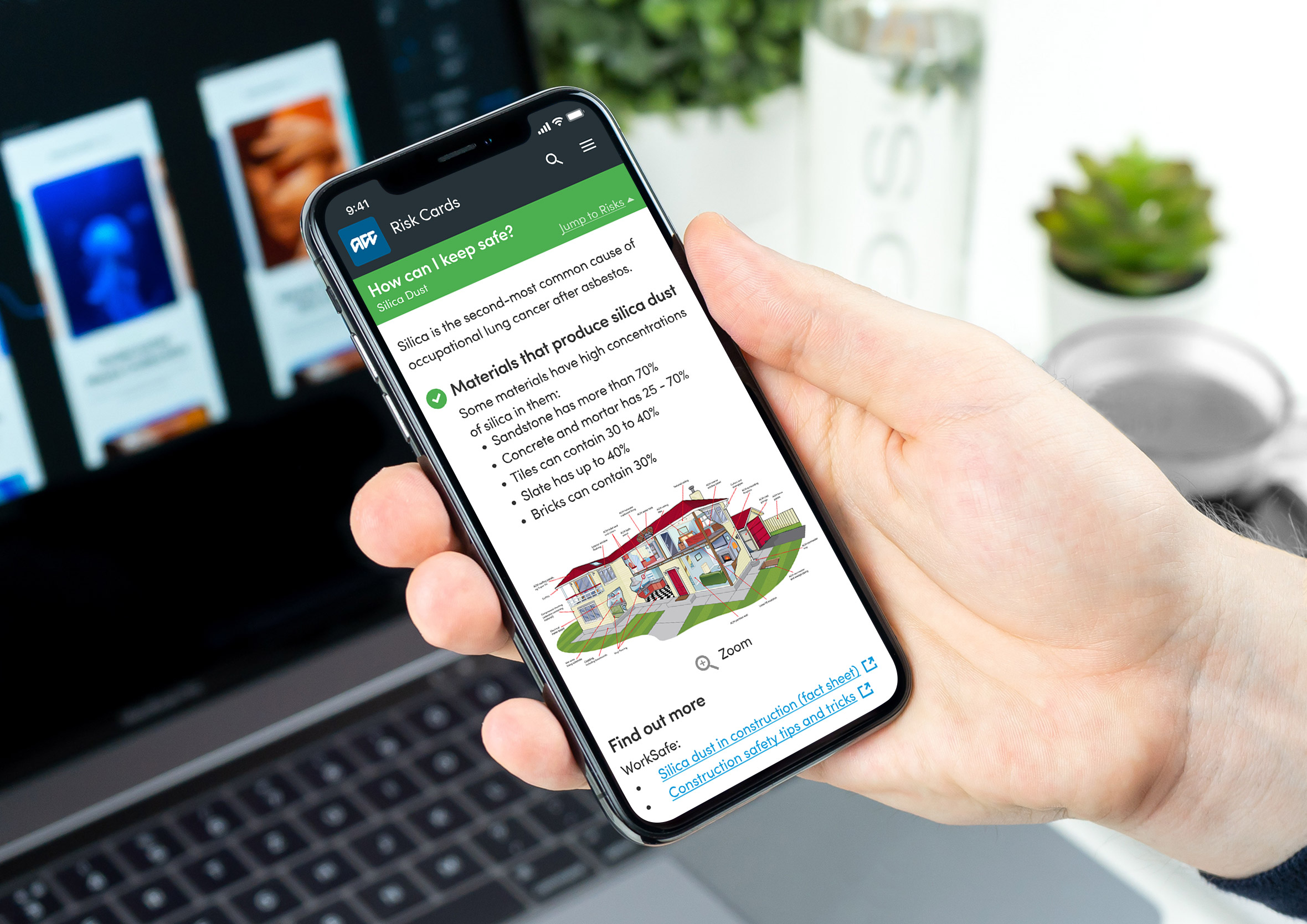
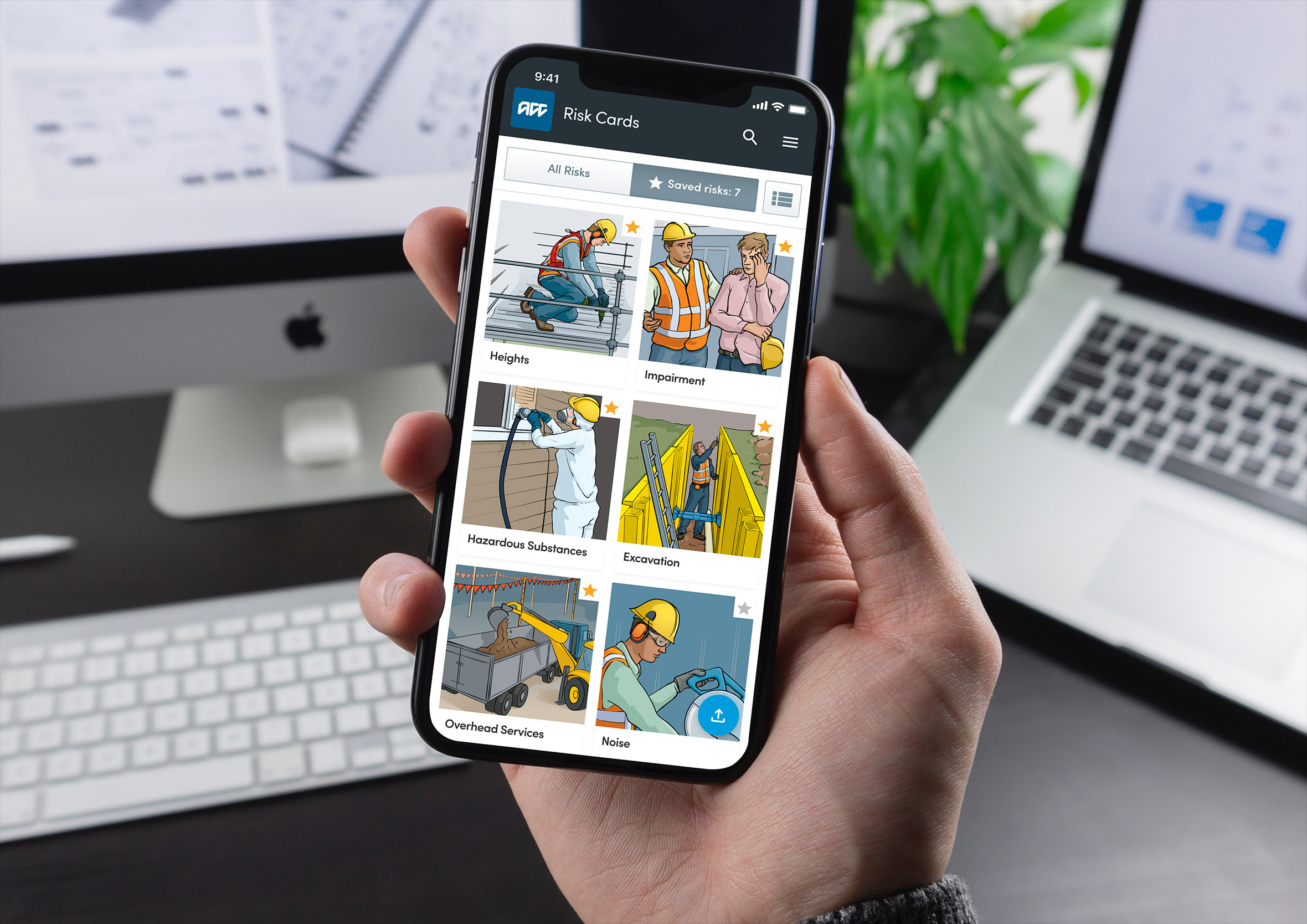
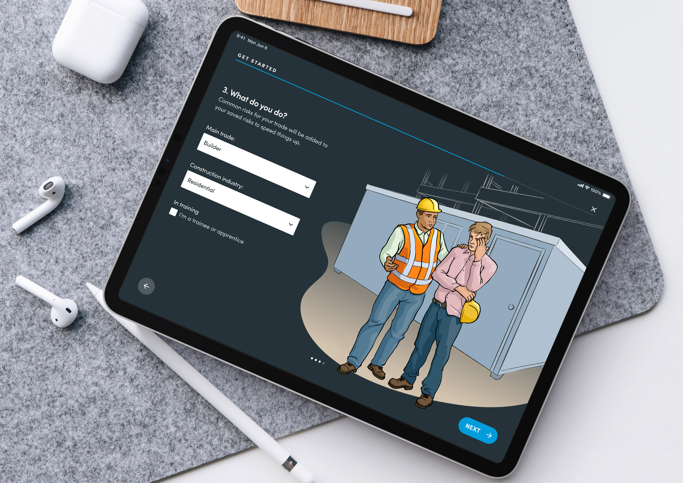
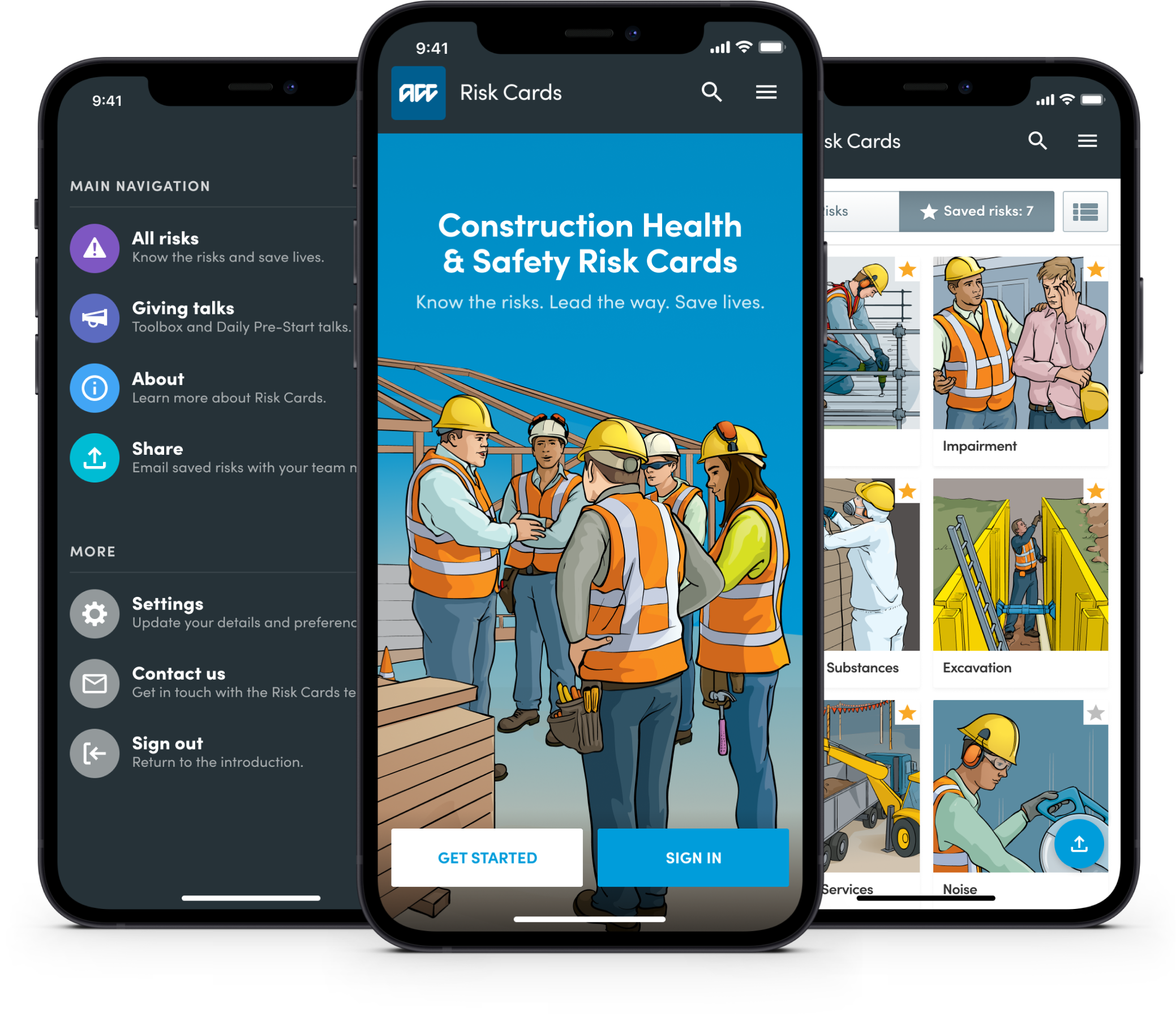
Before launch I created a series of mockups for the marketing team to use across email, Facebook and Twitter to help promote the new app and drive early adoption.
The same instinct, designing for where people actually are rather than where it’s convenient to assume they are, carries into HazardCo’s complex onboarding work too, a different app built for the same fast-paced, unpredictable and constantly changing work environment.