• Written by Rich McNabb • Proofread & Edited by Claude AI
50 best album covers: The most interesting and iconic artwork
The backstory, hidden details and the designers behind some of the most interesting and iconic album covers ever made.
• Written by Rich McNabb • Proofread & Edited by Claude AI
The backstory, hidden details and the designers behind some of the most interesting and iconic album covers ever made.
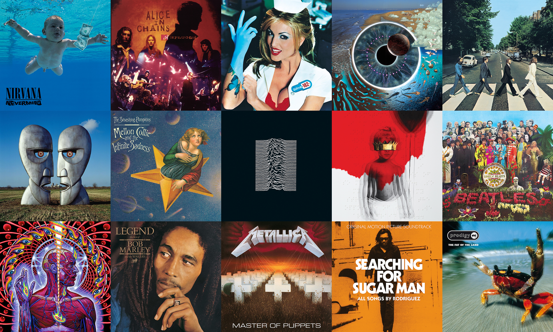
Image credit:
Every album on this list had to earn its place. It had to be well designed or visually interesting, whether that’s sculpture, graphic design or photography. It had to work both as a standalone piece and as part of the wider collection on the wall. It had to tell a story, invoke an emotion, or remind you of a time and place. And it had to be something both my wife and I agreed on, which was harder than it sounds.
During the research phase I kept running into the same thing. I’d find an album I wanted to listen to, copy the name, jump over to Spotify, paste to search for it, and hope I’d landed on the right version. Over and over again.
So every album on this list has a Spotify player embedded right below the artwork. Kind of like those old CD listening stations in record stores, where you could put the headphones on and hear the album before you bought it. Images, words, and music. Read the backstory behind each cover, admire the artwork, and listen to the album all in the one place, no jumping between tabs or apps. It felt like the logical connection, and adds another dimension.
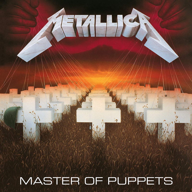
Metallica
From concept, colour palette, symbolism and execution, this album cover absolutely nails it. Painted by the legendary commercial illustrator Don Brautigam from a rough sketch by James Hetfield, the rows of white crosses stretching into a blood-red horizon represent addiction as a form of control, reducing people to helpless puppets on strings. The forced perspective keeps pulling your eye deeper into the scene, and little details like the military helmet and tangled wires reward you the longer you stare at it. It feels massive, oppressive and strangely beautiful all at the same time.
Even more incredible, it became the first thrash metal album certified eight times platinum in the US without any mainstream radio play or MTV support. Cliff Burton, the band’s beloved bassist, tragically died in a tour bus accident in Sweden just months after its release. He never truly got to see the massive cultural legacy this artwork and the music inside would build across the globe.
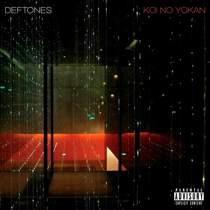
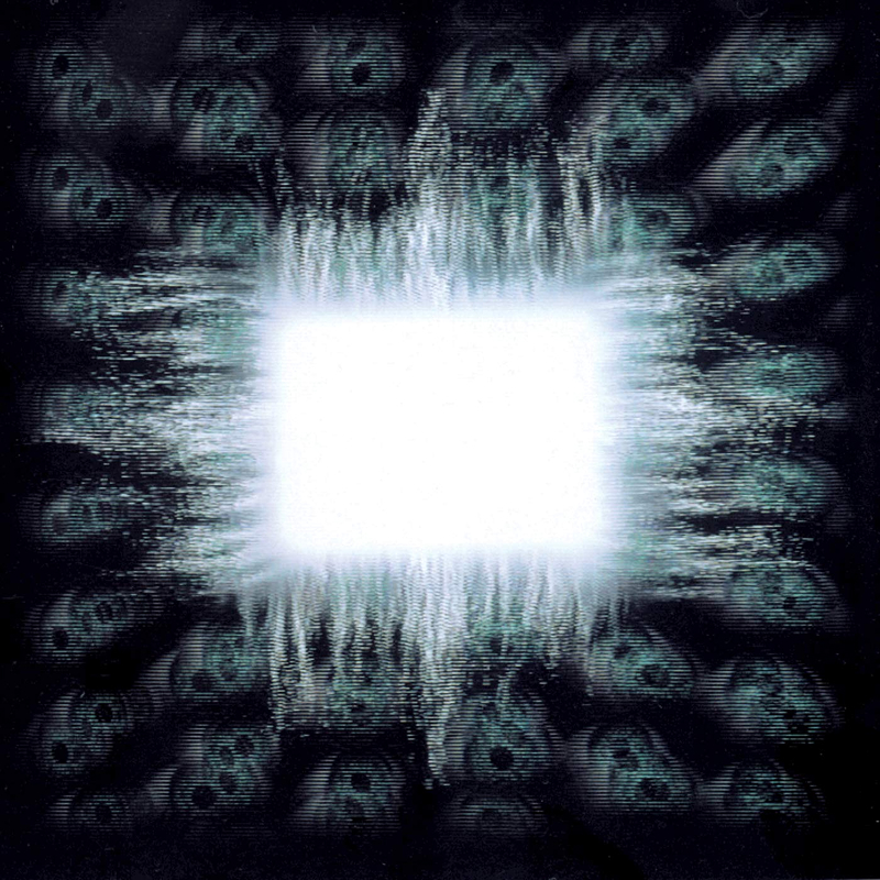
DEFTONES
The cover features a brilliant photograph by 13th Witness, also known as Timothy McGurr, who happens to be the son of legendary graffiti pioneer Futura 2000. Under the creative direction of Frank Maddocks, he captured the stunning light rods inside the Infinity Mirrored Room at The Opposite House hotel in Beijing, designed by Japanese architect Kengo Kuma. The lines, reflections and impossible perspectives pull you inward while never quite letting you settle, creating this strange mix of beauty and uncertainty. It feels futuristic, intimate and slightly disorienting all at once, almost like standing right inside someone’s subconscious.
In Japanese, there’s a beautiful phrase for that exact emotional tension: 恋の予感 (Koi no Yokan). It does not mean love at first sight, but rather the quiet certainty that love is inevitable down the road. The album was written while founding bassist Chi Cheng was still in a coma following a devastating car accident in 2008. He passed away in 2013, never getting to hear the finished masterpiece he helped inspire.
Mastadon
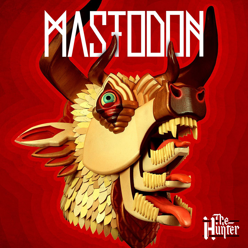
At first glance this looks like a digital illustration, but it is actually a real, hand-built wood sculpture titled Sad Demon Oath by artist AJ Fosik. The multi-horned, multi-mouthed creature feels equal parts folk art, mythology and nightmare fuel, packed with tiny details and layered textures that reward a closer look. It perfectly matches the album’s raw, back-to-basics energy. This choice was a massive shift for the band, marking the first time they stepped away from painter Paul Romano, who had crafted all of their previous visual worlds.
The record was dedicated to guitarist Brent Hinds’ brother Brad, who died in a hunting accident while the album was being written, which gives the album title an entirely different weight once you know the story behind it. You can actually watch the sculpture being meticulously built in the official “Black Tongue” music video. Once you see that physical process, the cover becomes even more impressive.
Killswitch Engage
The artwork leans heavily into themes of rebirth, transformation, and inner conflict, with the ornate bird and serpent imagery feeling almost mythological in the way it twists around itself. The symmetry, detail, and muted colour palette give the artwork a dark elegance that perfectly fits the music. This was a massive moment for the band because it was their second album after original vocalist Jesse Leach returned following a long absence due to vocal strain. While Disarm the Descent was the initial comeback, Incarnate was the record that fully re-established them creatively.
Jesse actually revealed that the concept was born from a vivid nightmare he had of a man being pulled apart by two snakes and two cranes. Band bassist and visual mastermind Mike D’Antonio took that dark vision, and along with illustrator Indra Nugroho, sculpted it into this emblem-like masterpiece. A subtle touch I love is the claw clamping around the snake, providing just enough hope to suggest the possibility of escape and resilience. The precise, intricate style makes it feel centuries old, balancing brutal imagery with timeless grace.

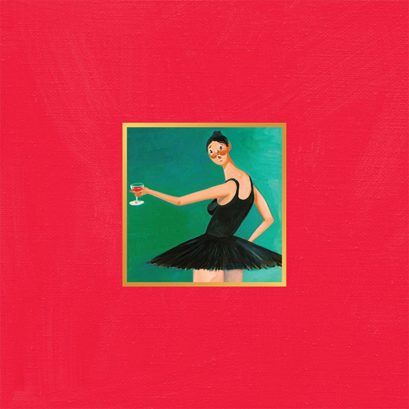
Taylor Swift
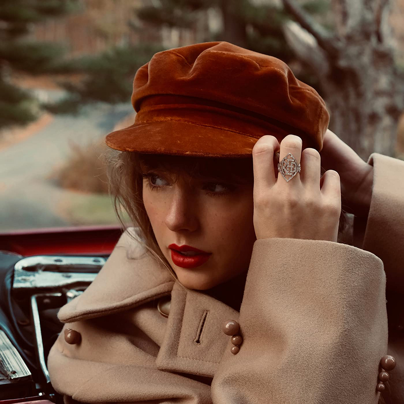
Everything about this cover feels carefully restrained. The soft focus, oversized hat and muted autumn palette give it this timeless 70s-inspired look that perfectly mirrors the album’s mix of heartbreak, nostalgia and emotional chaos. It’s subtle, but incredibly well art directed by photographer Sarah Barlow, who captured that striking shadow falling across Taylor’s face.
This original version of Red later became central to Taylor Swift’s battle over ownership of her master recordings, leading to the massive re-recorded release Red (Taylor’s Version) in 2021. The expanded version included the now legendary 10-minute cut of “All Too Well,” which managed to feel even more devastating the longer it became. The hands adjusting the hat perfectly suggest someone straightening themselves out after a battle or preparing for the next adventure. Maybe it’s both, and that’s exactly the kind of timeless feeling they were going for.
Bob Marley and the Wailers
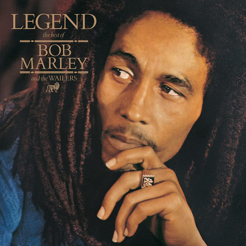
Released three years after Bob Marley’s death, Legend feels less like a compilation and more like a single complete statement. The cover portrait by Dennis Morris captures Marley in a way that feels calm, spiritual and almost timeless, helped by the warm grain and deep contrast of the photograph. Morris also happened to photograph the Sex Pistols during the same era, which feels bizarre considering how completely different those worlds were.
I absolutely love how Bob is looking over his shoulder, deeply immersed and captivated. There is no obvious emotion, reaction or expression, just someone completely present in the moment while also lost deep in thought.
Legend went on to become the best-selling reggae album ever released, but it never really feels like a greatest hits record. It feels more like an entire worldview distilled onto one sleeve.
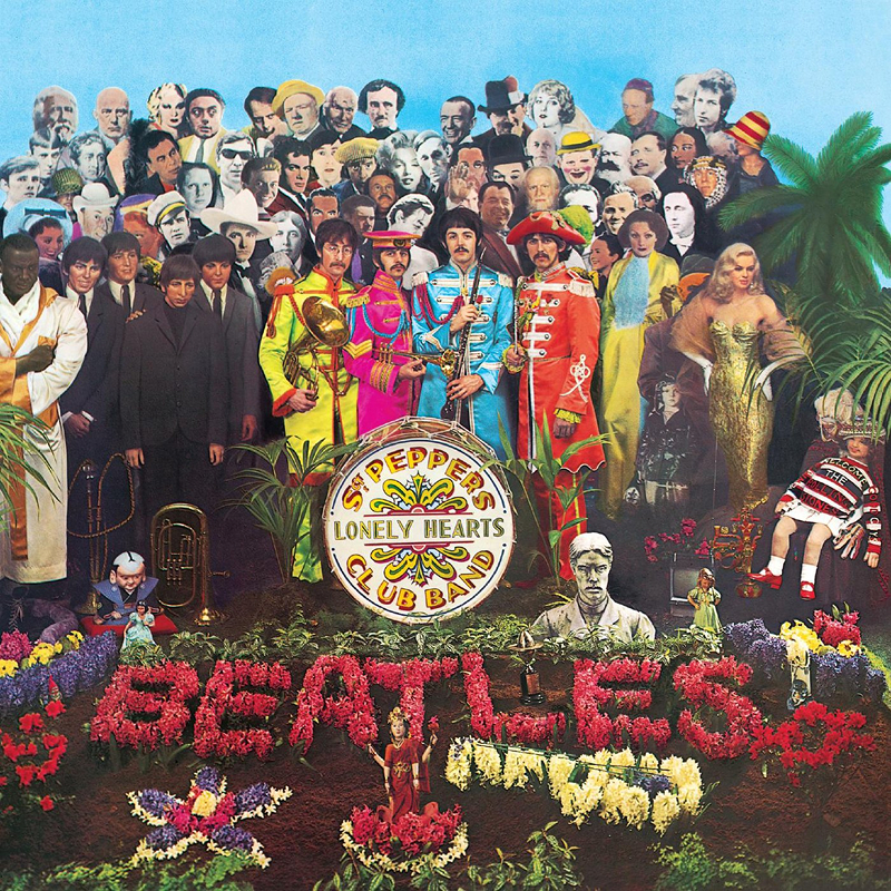
The Beatles
Designed by Peter Blake and Jann Haworth, the Sgt. Pepper cover completely changed expectations of what album artwork could be. Instead of a simple band portrait, The Beatles surrounded themselves with over 70 cultural figures including Marilyn Monroe, Karl Marx and Edgar Allan Poe, creating something that felt more like an art installation than a record sleeve.
The band, true to form, even pushed to include Hitler and Jesus, both of which were quickly vetoed. It was also the first major album to print full lyrics on the back cover, which feels completely normal now but was genuinely revolutionary at the time. The entire production reportedly cost around £2,868, an absolutely staggering amount in 1967 and roughly 100 times the cost of a standard album cover.
Rodriguez
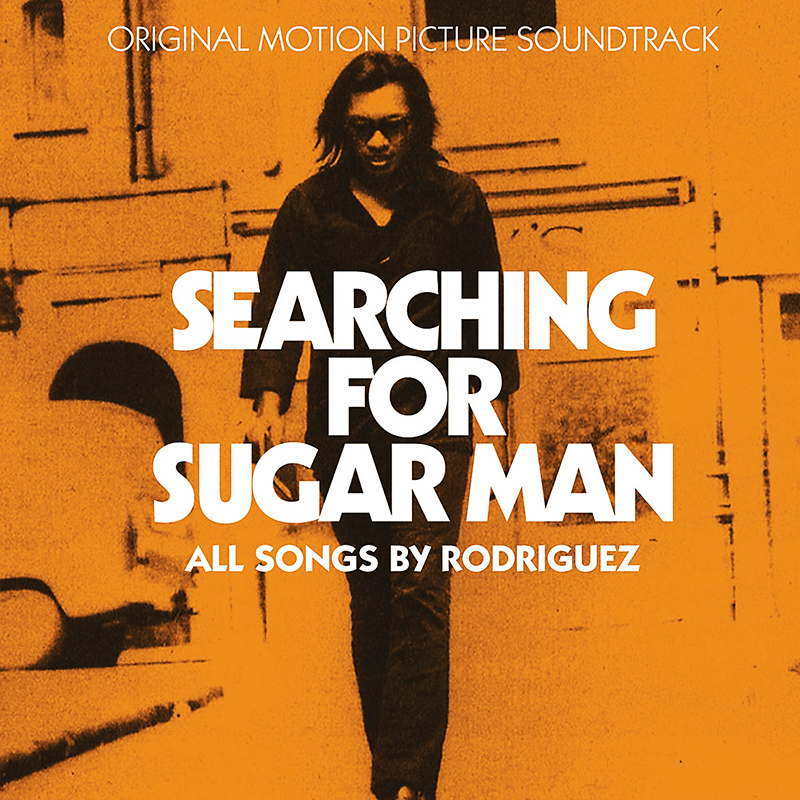
Rodriguez released two albums in the early 1970s before quietly disappearing from public life in the US. What he did not know was that halfway across the world, particularly in South Africa, he had become an icon, reportedly outselling artists like The Rolling Stones during apartheid-era censorship. Without giving too much away, he never knew that nearly everyone in South Africa had a copy of Cold Fact. Due to what sadly seemed to be fairly standard music industry practice at the time, he also received little to no royalties from the album’s success.
Meanwhile, he was back home in Detroit working demolition jobs completely unaware of his influence. The Oscar-winning documentary Searching for Sugar Man tells that story better than I ever could. The soundtrack’s simple cover, featuring Anis Priti’s iconic silhouette of Rodriguez walking down a winter street, matches the mystery perfectly. I was lucky enough to see him perform in New Zealand in 2013, and it still feels surreal thinking about it now. Highly recommended album and documentary. Both are incredible.
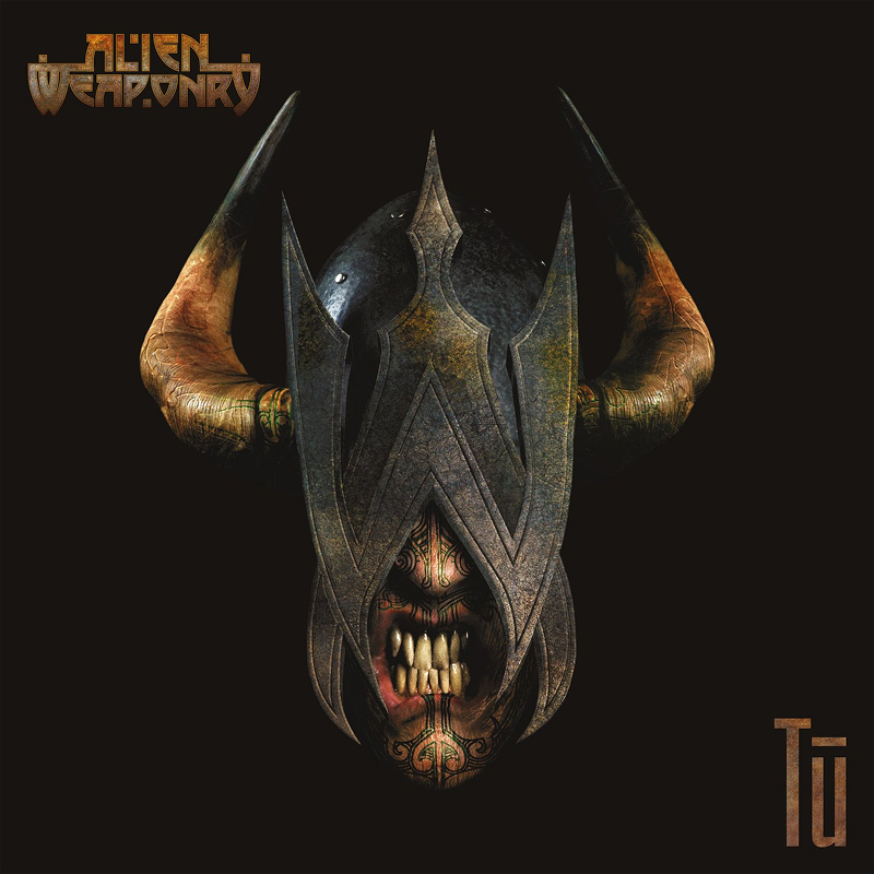
Alien Weaponry
Alien Weaponry were still teenagers when this debut album dropped, which makes the whole thing even more impressive. Hailing from Waipu in Northland, the band built their sound around thrash metal fused with Te Reo Māori, becoming one of the first internationally recognised metal bands to perform predominantly in an indigenous language.///The title Tū references Tūmatauenga, the Māori god of war and humanity, and the artwork carries that same feeling of ancestry, conflict and cultural identity running through the record itself. Brothers Henry and Lewis de Jong learned Te Reo specifically to reconnect with and honour their grandfather’s heritage. The texture, colour and depth of the central figure on the cover, referred to as Tū and designed by local designer Barny Bewick, is beautifully detailed and represents the Māori, Celtic, French and Scandinavian heritage of the band members. If you want a sense of just how powerful this all became, watch the documentary Rū Ana Te Whenua: Alien Weaponry Shake Europe. It is an incredible watch, especially when they take the stage at Wacken Open Air, the world’s biggest metal festival.
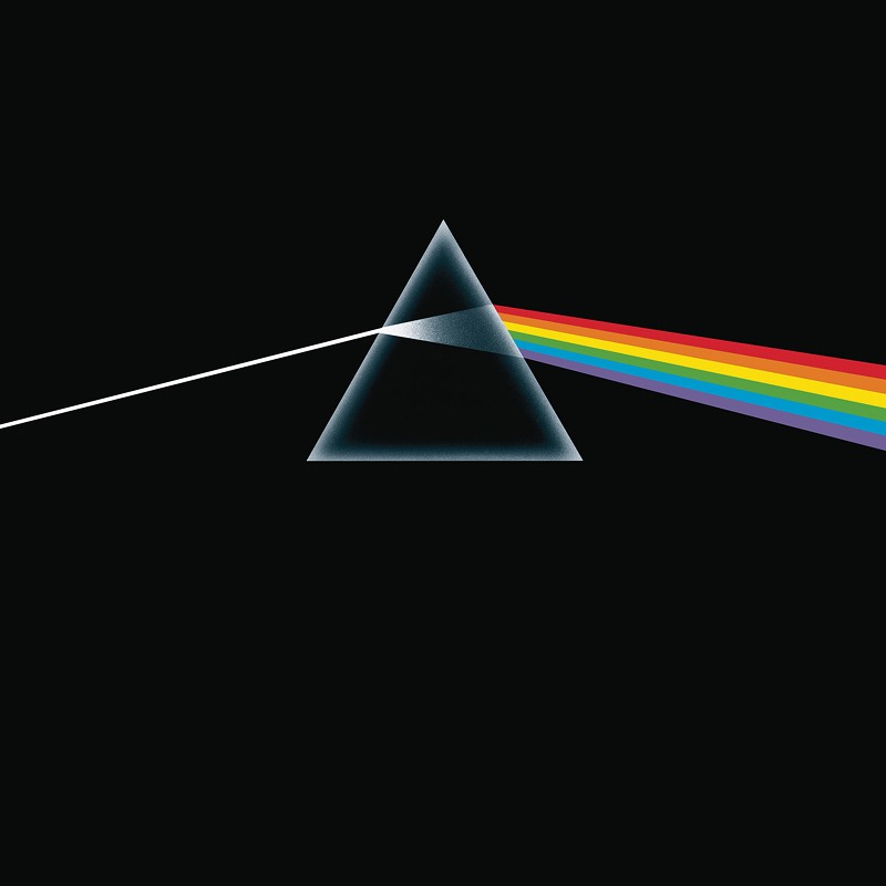
Pink Floyd
Few album covers are as instantly recognisable as this one. Designed by Storm Thorgerson and Aubrey Powell of Hipgnosis, the prism splitting white light into a spectrum became one of the most iconic pieces of graphic design ever attached to music. The band specifically asked for something clean, bold and completely free of band photos, which was still fairly unusual in the early 70s. What makes it brilliant is the restraint: one shape, one beam of light, and endless meaning. It feels scientific, cosmic and strangely human all at once.
The album went on to spend an almost unbelievable 741 consecutive weeks on the Billboard 200. Even the famous heartbeat opening wasn’t an actual heart recording, but a heavily processed bass drum designed to feel organic and alive. This is a masterclass in graphic design and still looks incredible more than 50 years later. It was incredibly minimal for the time and must have looked strangely out of place in record stores, which only added to its intrigue. On a personal note, “Money” always reminds me of my art teacher back in high school who would put music on while we quietly worked away in class.
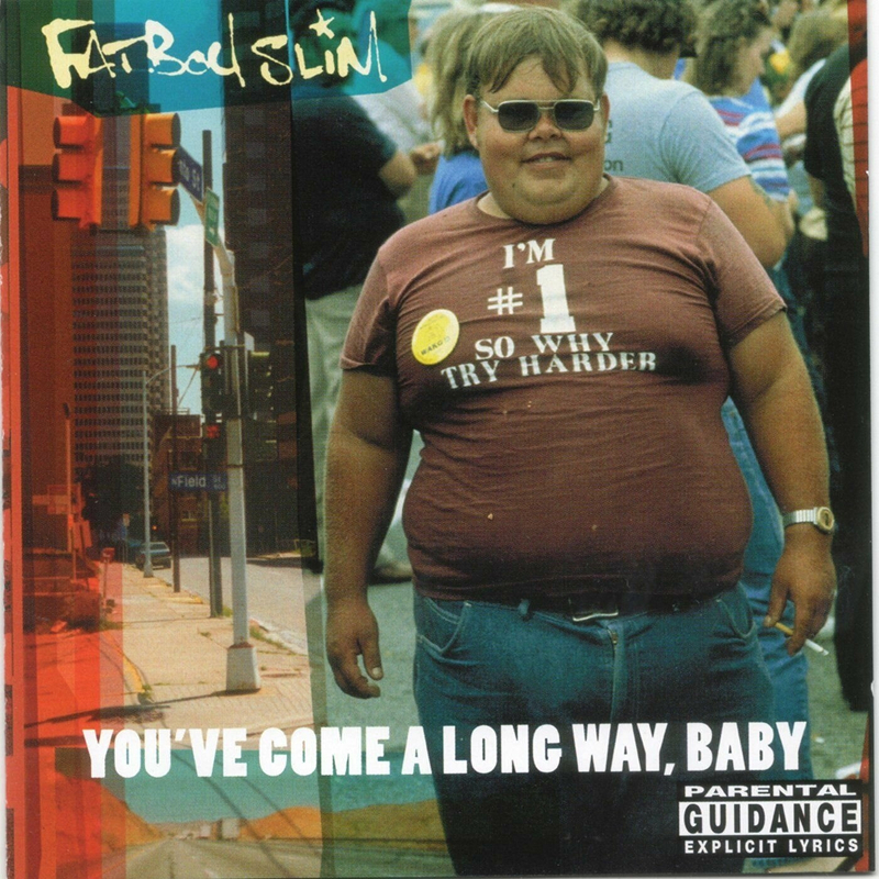
Fatboy Slim
To this day, we still have no idea who the man in the photo is. Despite the album becoming a global phenomenon, the man himself has never been publicly identified or come forward. Even recently, Fatboy Slim, whose real name is Norman Cook, made another attempt to find him, figuring that with how connected the world is now, someone would know. Yet, nearly 30 years after the album dropped, he remains one of music’s great unsolved mysteries.
Designed by Red Design, the artwork uses a stock photograph taken at the 1983 Fat People’s Festival in Danville, Virginia, sourced from the Rex Features photo library. I absolutely love the confidence and energy of this photo, and how perfectly it complements the album. From the sunglasses and huge smile to the shirt reading “I’m #1 so why try harder,” cigarette in hand, he walks around like a time traveller completely unaffected by everything happening around him. There is an aura that says, “I’ve got life all figured out,” and if he explained it to you, the answer would probably be surprisingly simple. It is equal parts authentic and effortlessly cool. The album title itself was derived from a slogan used by Virginia Slims cigarettes.
Chevelle
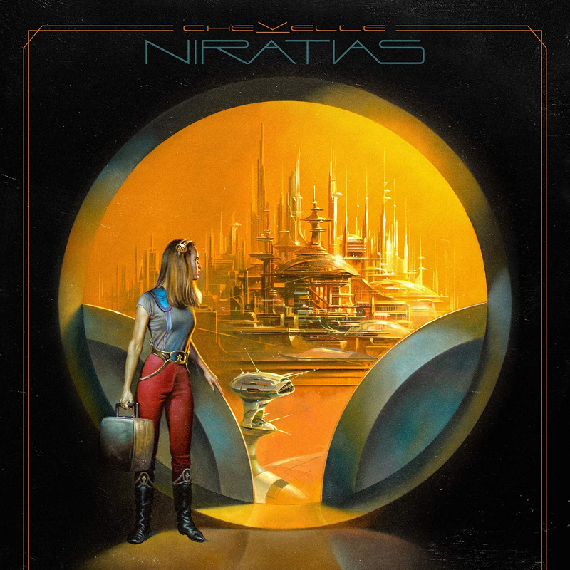
NIRATIAS stands for “Nothing Is Real And This Is A Simulation,” which already tells you exactly where this album is heading. Written during the COVID-19 pandemic when reality itself felt increasingly surreal, the title captured the mood of the time perfectly. The artwork was created by legendary fantasy illustrator Boris Vallejo and feels vast, lonely and strangely cinematic, filled with deep space, impossible scale and that quiet feeling of existential isolation. It mirrors the album’s themes of paranoia, fractured reality and simulation theory almost perfectly.
A great use of shape and colour directs your eye across the image, and it has that classic 1960s sci-fi vibe where buildings in the distance have this futuristic glow. At the same time, small details like the woman’s luggage and clothing suggest she might actually be travelling from the past. There are no laser guns or futuristic weapons hinting at war, but looking out through the portal, this feels like somewhere she has escaped to, or perhaps somewhere she is returning to after a long journey.
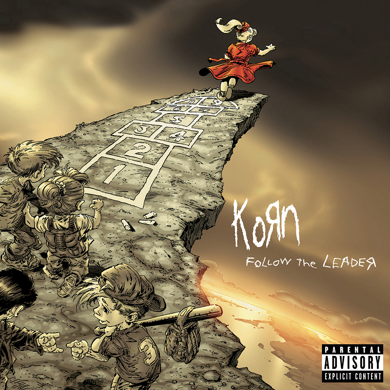
Korn
The artwork was a collaboration between comic book legends Todd McFarlane, Greg Capullo and Brian Haberlin, which explains why it feels closer to a dark graphic novel than a traditional album cover. What started as a rough sketch from a friend of Jonathan Davis evolved into one of the most unsettling images of the late 90s: a girl in a red dress playing hopscotch toward the edge of a cliff while a line of children in muted colours blindly follows behind her. The bright colours and playground imagery make it even creepier, and the connection between artwork and music runs deeper than most people realise. In the Grammy-winning “Freak on a Leash” video, also directed by McFarlane, that same girl finally steps off the cliff and a bullet tears from the animated world into live-action reality.
Interestingly, bassist Fieldy actually came up with the title as a cheeky, arrogant dig at all the copycat bands trying to steal their sound at the time. It backfired in the best way possible because the album became an absolute global juggernaut, debuting at number one on the Billboard 200 and permanently defining the nu-metal era.
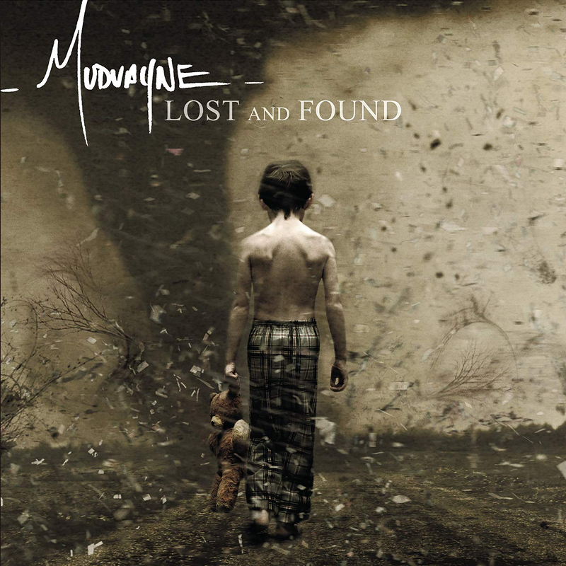
Mudvayne
Before this album, Mudvayne members went by alien stage names and wore heavy, erratic makeup during live shows and music videos. Lost and Found marked the moment they stripped all of that away, choosing to step out from behind the personas and present themselves completely raw. The artwork, shot by photographer Nitin Vadukul with art direction by Aimée Macauley, complements this massive shift perfectly.
The small child carrying a cherished possession while calmly walking toward what looks like an approaching tornado feels both brave and deeply unsettling. Muted colours, leaves, branches and debris circle through the air around the child as they continue walking directly into the unknown.
It serves as a beautiful metaphor for the music inside. Songs like “Happy?” and “Fall into Sleep” deal heavily with themes of isolation, vulnerability and facing down emotional storms. By placing this quiet, determined figure right in the centre of the chaos, the cover captures the exact heart of the album, finding a sense of identity and peace right in the middle of a self-destructive world.
The Clash
Photographer Pennie Smith captured bassist Paul Simonon smashing his Fender Precision Bass during a show at the Palladium in New York. The image is chaotic, blurry and full of movement, which is exactly why it works so well. Smith originally disliked the shot because it was slightly out of focus, but that imperfection is what gives it so much raw energy.
The typography and colour palette directly reference Elvis Presley’s 1956 debut album, linking punk rebellion back to the birth of rock and roll itself. Very few album covers capture a moment and its energy this perfectly. You can almost hear the noise and chaos just by looking at it.
Beastie Boys
Designed by longtime Beastie Boys collaborator Bill McMullen, the cover shows the band crammed inside a giant sardine tin drifting through space toward the sun. It’s ridiculous, slightly claustrophobic and completely perfect for the Beastie Boys. The whole thing feels like a visual representation of their music: messy, playful, chaotic and impossible to categorise properly. Even the typography and metallic packaging leaned heavily into the retro sci-fi aesthetic. It’s one of those covers that manages to look both cheap and incredibly well designed at the same time.
The combination of Ad-Rock laughing together with Mike D while MCA looks completely terrified always makes me smile. Same situation, completely different reactions. It almost makes you ask why they are inside a giant sardine tin before immediately catching yourself with the realisation that it is simply because they are the Beastie Boys.

Pixies
Designed by Vaughan Oliver of 23 Envelope, the Doolittle artwork perfectly captures the Pixies’ strange balance between beauty, religion, surrealism and outright weirdness. The monkey, halo and muted earth-tone palette feel symbolic without ever fully explaining themselves, which makes the whole thing even more memorable. Like a lot of Vaughan Oliver’s work, it feels textured, layered and slightly uncomfortable in a way that pulls you back for another look.
The album was almost titled Whore, something the label immediately rejected. Kurt Cobain later cited Doolittle as one of Nirvana’s biggest influences, particularly the quiet-loud dynamic that would later define “Smells Like Teen Spirit.”
I’ve seen the Pixies twice now and I’m always impressed by how effortlessly they perform. No theatrics, no overplaying, just incredibly seasoned musicians who have been doing this for so long that everything feels almost instinctive.
Nirvana
The anatomical angel on the cover was designed by Robert Fisher and perfectly reflects the album’s themes of vulnerability, decay and exposure. Arms at her sides and head lowered, the figure feels completely exposed, almost like she has nothing left to hide. The contrast between the realistic anatomical body and the more stylised wings feels like a deliberate design decision, perhaps to maintain the album’s softer colour palette, though part of me thinks realistic feathered wings may have made the image even more unsettling.
Everything about In Utero feels intentionally uncomfortable, like Nirvana trying to tear down everything, including the public’s perception of the band itself. After the success of Nevermind, which some within the underground punk scene viewed as selling out, Kurt Cobain deliberately wanted something harsher, stranger and more confrontational. Producer Steve Albini was brought in specifically to capture a raw, live feeling rather than another polished, radio-friendly record. Even the back cover, filled with medical imagery and collaged doll parts, unsettled retailers enough that some refused to stock it entirely, showing that the perfect balance of clinical, human and strangely approachable could still genuinely shake up the mainstream.
Queen
The giant robot on the cover was illustrated by legendary sci-fi artist Frank Kelly Freas and adapted from one of his earlier magazine paintings created for Astounding Science Fiction in the 1950s. There’s something strangely emotional about the image despite its massive scale. The robot looks almost horrified by what it has done, holding the lifeless members of Queen in its hand with blood across its fingers. It seems concerned and confused, almost searching for answers without fully understanding that it may actually be responsible, and those human facial features and soft brown eyes make the whole thing even more unsettling.
The band members were massive fans of his work and personally tracked him down to ask if he would alter his original painting, replacing the single dead man in the robot’s hand with the bodies of each of the band members.
The original painting accompanied a short story called “The Gulf Between,” which ends with the chilling line: “A MACHINE DOES NOT CARE”. Freas even painted a tiny reflection of himself into the robot’s eye. It is dramatic, theatrical and slightly absurd, which makes it completely perfect for Queen.
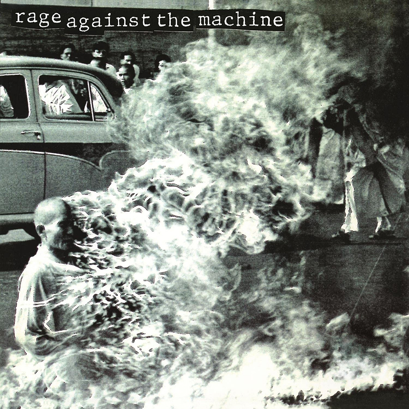
Rage Against the Machine
Few album covers are as confronting or impossible to forget as this one. The photograph shows Vietnamese Buddhist monk Thích Quảng Đức calmly burning himself alive in Saigon in 1963 to protest the persecution of Buddhists. Captured by photographer Malcolm Browne, the image later won both the World Press Photo of the Year and a Pulitzer Prize.
Rage Against the Machine made the deliberate decision to leave the cover completely untouched. No logo, no band name and no album title, just the image speaking entirely for itself. It is uncomfortable, political and impossible to separate from the music inside, conveying both an almost impossible sense of calm externally while simultaneously representing unimaginable rage internally.
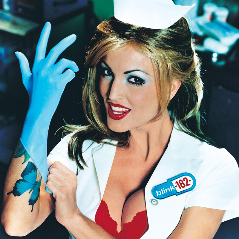
Blink-182
The cover features adult film actress Janine Lindemulder dressed as a nurse, leaning fully into Blink-182’s immature, chaotic and deliberately offensive sense of humour that defined the late 90s pop-punk scene. Even the title itself is a joke, a play on “Enemy of the State,” which tells you pretty quickly not to take any of this too seriously. What I have always liked, though, is how clean and simple the composition actually is. White background, strong contrast, minimal colour palette and one central figure keep it feeling loud without becoming visually cluttered. That balance between polished design and complete stupidity became Blink-182’s entire identity during this era.
The original 1999 album featured the nurse wearing a hat with a Red Cross emblem, but the American Red Cross later requested the symbol be removed because the emblem is legally protected under the Geneva Conventions. It is a hilarious bit of punk-rock trivia that their silly nurse cover accidentally caused an international humanitarian law dispute.
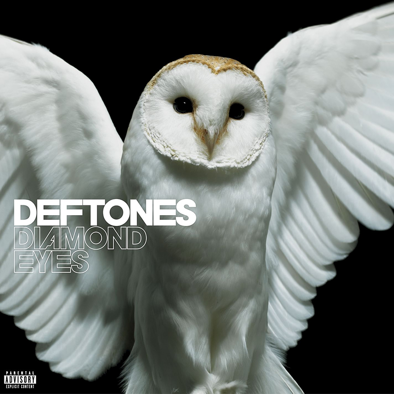
DEFTONES
This album almost never happened. Deftones had nearly completed an entirely different record called Eros before bassist Chi Cheng was left in a coma following a car accident in 2008. Rather than trying to finish it, the band walked away completely and started over from scratch, making Diamond Eyes a way of processing grief, uncertainty and survival.
The barn owl on the cover feels calm, watchful and strangely intimate. Those huge black eyes are the obvious connection to the album title, but there is also something deeper there, almost as if the animal can see directly into your soul. Owls often symbolise wisdom, death or transition depending on the culture, which makes the image feel even heavier once you know what the band had been through. It stands as one of the most quietly beautiful and emotionally loaded covers in their entire catalogue.
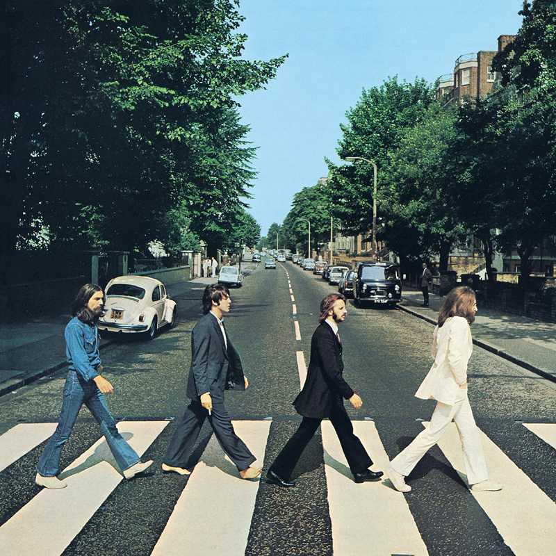
The Beatles
Photographer Iain Macmillan had barely ten minutes to capture the now legendary crossing shot while standing on a stepladder in the middle of Abbey Road as police briefly stopped traffic around him. On paper it is an incredibly simple image of four people walking across a zebra crossing, yet it became one of the most recognisable photographs in music history.
Paul McCartney walking barefoot while holding a cigarette helped fuel the infamous “Paul is dead” conspiracy theory, where fans became convinced he had secretly died and been replaced by a lookalike. Theories spiralled completely out of control, with people analysing everything from footsteps to licence plates searching for hidden clues.
The Beatles unintentionally turned one ordinary London street into a permanent global tourist attraction. It almost feels accidental in the best possible way, proving that a simple idea, perfectly executed, can outlast almost anything.
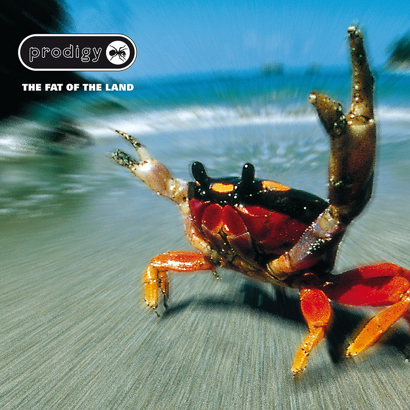
The Prodigy
The album features a stock photograph of a Halloween crab captured in Costa Rica by photographer Duncan McEwan. Designer Alex Jenkins then used Photoshop to heavily manipulate the image to make it feel far more aggressive, boosting the saturation and blurring the background to create the illusion that the crab is charging directly toward you while throwing up a defiant two-finger salute.
It is a ridiculous concept, yet it is completely iconic. What makes it work is how strangely hostile the image feels despite being nothing more than a brightly coloured crab on a beach. It captures the exact energy of the album itself, which is loud, chaotic, unpredictable and slightly dangerous. The crab chose violence, and honestly, so did The Prodigy.
For me, this album has peak high school vibes. It was in most people’s gloveboxes and became an absolute staple at house parties, appealing to a massive, diverse crowd. It is just one of those records that gets you completely pumped the second it starts.
Pink Floyd
Created by Storm Thorgerson, the Pulse artwork continues Pink Floyd’s long tradition of turning album packaging itself into part of the physical experience. The concept is deceptively simple, featuring a single blinking red pulse of light representing life, rhythm and continuity.
What made the original release legendary was the packaging itself. Embedded into the spine of the CD case was a real red LED light that blinked continuously day and night, designed to keep beating on record store shelves for months on end. It felt futuristic, hypnotic and slightly magical at the time, and even now, owners of original copies still occasionally check whether their little red heartbeat is still alive.
Before smartphones and modern tech became ubiquitous, this felt genuinely groundbreaking. I can’t help but think this packaging may have inspired TOOL, whose album layouts have become completely legendary. Spearheaded by guitarist Adam Jones and artist Alex Grey, their elaborate, interactive designs use everything from 3D stereoscopic lenses and optical illusions to built-in rechargeable HD screens to enhance the tactile experience. It turns the physical album into a genuine piece of art.
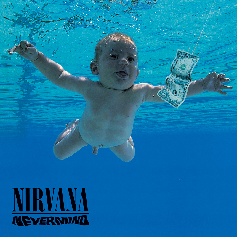
Nirvana
The baby on the cover is Spencer Elden, photographed underwater at just four months old in a local swimming pool in Pasadena, California. His parents were paid $200 for the shoot, unknowingly becoming part of one of the most recognisable album covers ever created.
The concept itself is brutally simple, showing a baby instinctively chasing money before even understanding what money is. That dollar bill hanging from the fish hook turned what could have been a harmless underwater photo into something satirical, uncomfortable and weirdly timeless. Decades later, people still debate whether the image represents capitalism, innocence being corrupted or simply Nirvana trolling everyone at once. It is probably all three.
The warped Nevermind typography is a beautifully restrained and elegant touch, mirroring the ripples in the water. Shot by photographer Kirk Weddle and art directed by Robert Fisher, it perfectly matches a band that was about to turn the entire music industry upside down.
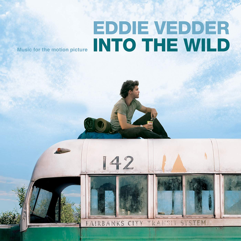
Eddie Vedder
Sean Penn approached Eddie Vedder to create the soundtrack for Into the Wild, his film adaptation of Jon Krakauer’s book about Christopher McCandless, the young man who abandoned modern life to disappear into the Alaskan wilderness. Vedder connected so deeply with the story that he reportedly wrote most of the material in just a few weeks.
The cover is actually an authentic self-portrait that Christopher McCandless took himself, sitting outside the abandoned transit bus that became his final shelter. It perfectly captures the exact same feeling running through the entire record, representing isolation, freedom, uncertainty and the romantic idea of disappearing completely from society.
There is something beautiful about how small and temporary everything feels in the image, which mirrors the story itself once you know how it ends. The soundtrack and story feel completely inseparable. It is inspiring, emotive and quietly heartbreaking.
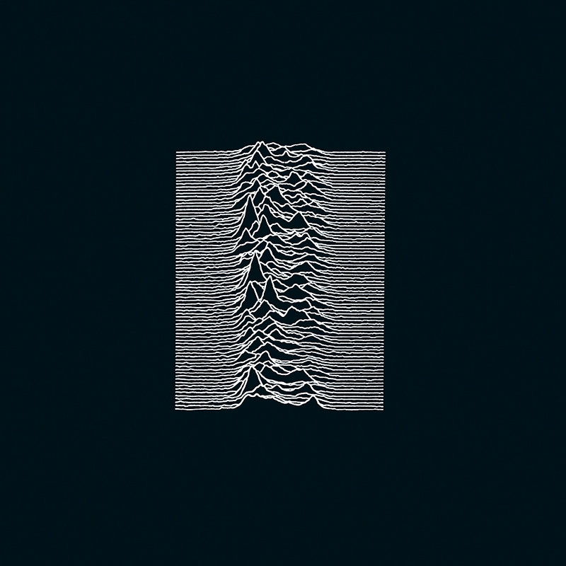
Joy Division
The cover image is actually a scientific data visualisation showing radio pulses from the first pulsar ever discovered, sourced from the Cambridge Encyclopaedia of Astronomy. Designer Peter Saville made one deceptively simple decision that completely transformed the image, inverting it from black lines on white to glowing white lines against black.
That single choice instantly transformed cold scientific information into something mysterious, emotional and strangely human, turning data waves into a jagged mountain terrain. It feels cosmic, lonely and infinite all at once. The band never placed themselves on the cover either, meaning there are no photos or performance shots, just the image itself.
I can only imagine Peter Saville’s excitement after making that small change, whether it was intentional or accidental. Decades later, it remains one of the most recognisable pieces of graphic design ever attached to music.
TOOL
Created by artist Cam de Leon alongside TOOL guitarist Adam Jones, the Ænima artwork physically shifts and morphs as you move it thanks to its lenticular printing technique. That constantly changing image perfectly suits an album obsessed with perception, spirituality, ego death and psychological cleansing.
Even the title is classic TOOL, merging the psychological concept of the soul with a medical cleansing, turning spiritual growth into something uncomfortable, messy and slightly disgusting. The album is heavily dedicated to comedian and philosopher Bill Hicks, whose influence appears throughout both the artwork and music. Inside the booklet, Hicks is portrayed almost like a spiritual healer treating a twisted patient beneath the words “Another Dead Hero.” Nothing about this album wants to leave you comfortable, visually or emotionally.
This was when the original bassist Paul D’Amour left and was replaced by Justin Chancellor, formerly from the band Peach. He turned the audition down at first out of total fear and intimidation, only calling back after his brother Jim caught the tube to his flat and yelled at him for being out of his mind to pass it up. Because he wasn’t part of the original line-up, Justin always comes across as a massive TOOL fan who is lucky enough to play in the band, and I absolutely love that energy.
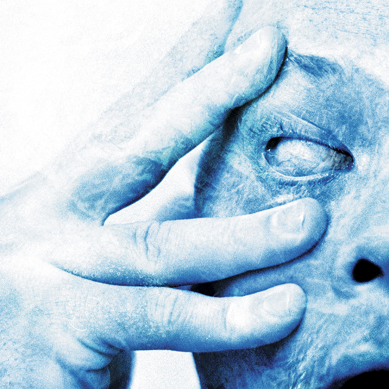
Porcupine Tree
In Absentia marked a major shift for Porcupine Tree, pushing further into darker and heavier territory after Steven Wilson became fascinated by documentaries exploring serial killers and psychological detachment. The artwork created by Danish photographer, filmmaker and visual artist Lasse Hoile perfectly reflects the album’s cold emotional distance and psychological unease.
The extreme close-up of the eye feels clinical, invasive and deeply uncomfortable, especially paired with the cold blue colour palette Wilson deliberately chose to evoke emotional detachment. Honestly, this cover was what first pulled me toward the album. It immediately reminded me of the strange, unsettling visual world of TOOL’s “Stinkfist” video, which felt like exactly the kind of territory I wanted to explore further.
Sometimes album artwork really does become the gateway into entirely different musical worlds. Through this album I eventually discovered Steven Wilson’s wider catalogue, alongside bands like Riverside and Opeth.
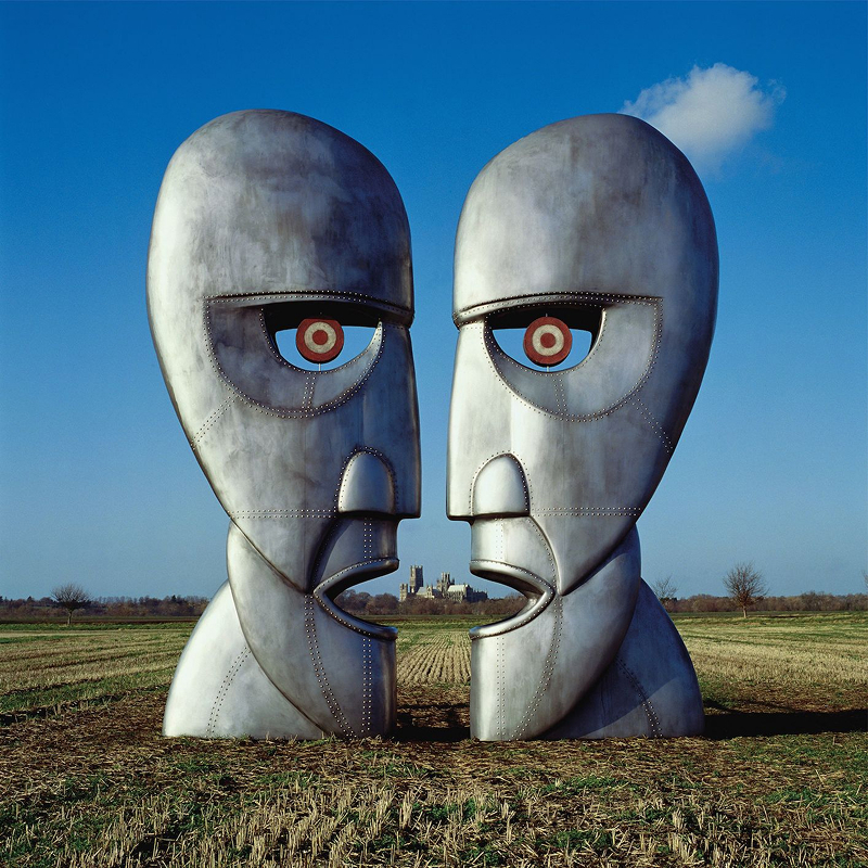
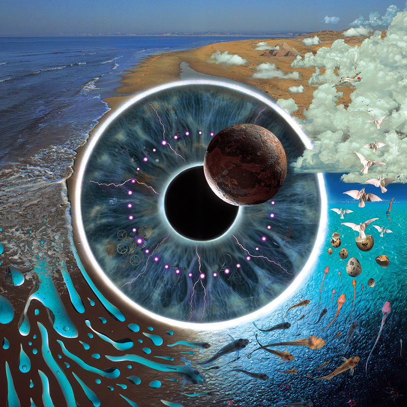
Pink Floyd
The two monumental metal heads on the cover were designed by Storm Thorgerson from drawings by Keith Breeden, and photographed in a field near Ely, Cambridgeshire by photographer Tony May. At first glance they simply appear to be facing one another, but the real brilliance of the design reveals itself when you notice the negative space between them forms a third hidden face staring directly back at you.
It’s an incredibly clever visual metaphor for communication itself, the invisible space between two people where meaning can either connect or completely break down. If you look closely between the mouths, you can even spot the distant silhouette of Ely Cathedral framed perfectly in the background. The outline of the two heads could even be interpreted as a heart shape, which is now the first thing I see whenever looking at it.
From the metal textures, rivets holding the structure together, red bullseye targets and placement within the open field, everything adds to the scale and importance of the sculpture. Even the single cloud against the blue sky reinforces how restrained and minimal the composition really is, feeling strangely haunting and cinematic all at once. This marks the fourth Pink Floyd album in our top 50, which tells you everything about how important visual storytelling was to the band and the immersive worlds they created around their music.
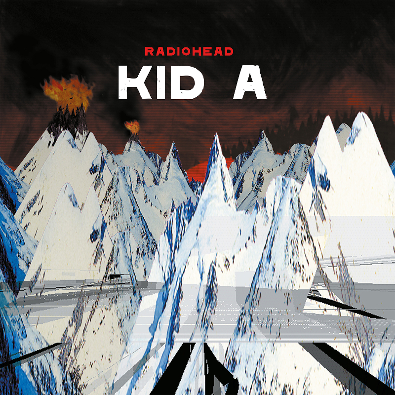
Radiohead
The artwork for Kid A was created by Stanley Donwood alongside Thom Yorke and feels less like a traditional album cover and more like a warning signal broadcast from a collapsing digital world. The exaggerated jagged mountain ranges, flames bursting from the peaks, icy textures and burning red skies create a violent clash between extreme heat and freezing isolation. Bright oranges and reds push against cold greys and deep blues, making the whole thing feel emotionally detached yet strangely volatile at the same time. It recalibrates your expectations before the music even begins because this definitely isn’t OK Computer 2.0.
Small details make the artwork even more unsettling. The evenly spaced horizontal lines across the crimson sky resemble screen interference, while the sharp angles and scattered white dots feel almost like dead pixels on a damaged monitor. Even the direction of the smoke and flames suggests an environment that’s hostile and barely survivable.
You can draw parallels between Nevermind and OK Computer here. Both Nirvana and Radiohead responded to massive commercial success by deliberately dismantling expectations and refusing to repeat themselves creatively. Kid A feels like Radiohead telling everyone that this isn’t the destination, they are only just getting started, and there might be some uncomfortable detours ahead so you had better buckle up.
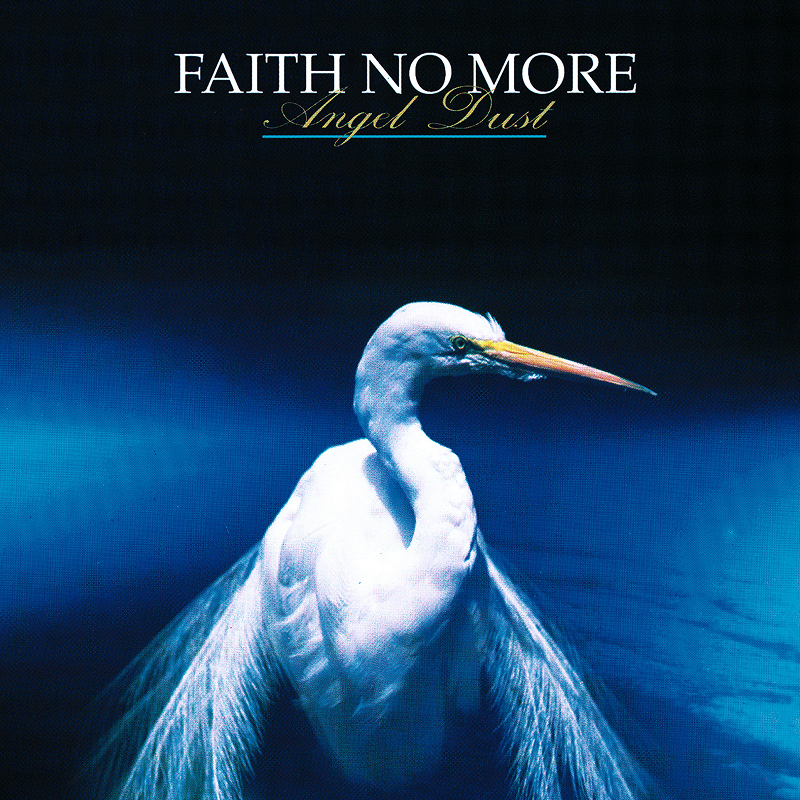
Faith No More
The title Angel Dust perfectly captures the contradiction at the centre of this album, using beautiful sounding words attached to something genuinely destructive. The cover mirrors that same tension, featuring Werner Krutein’s photograph of a graceful white egret standing calmly against deep blue skies, while underneath sits one of the strangest and most unpredictable rock albums of the 1990s.
Faith No More deliberately pushed against every expectation here. Elegant melodies suddenly collapse into chaos, heavy riffs disappear into lounge music and Mike Patton sounds like he’s shape-shifting between entirely different personalities from one moment to the next. Even the artwork feels deceptively peaceful considering how psychologically unhinged parts of the record become.
Staring at the textured image and muted art direction, it’s almost impossible to guess what the album actually sounds like. It could just as easily belong to a nature documentary or religious pamphlet, which only adds to its mystique. The longer you spend with Angel Dust, the harder it becomes to categorise, which feels exactly like the point.
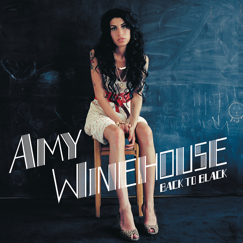
Amy Winehouse
I completely missed the hype around this album when it first came out. It wasn’t until years later, after constantly seeing it appear in conversations about iconic modern records, that I finally sat down and properly listened to it, and once I did, it immediately made sense.
Everything about the artwork feels timeless. Amy Winehouse’s towering beehive hairstyle, heavy eyeliner and restrained black palette channel 1960s girl-group aesthetics without slipping into cheap nostalgia. It feels elegant, vulnerable and quietly tragic before you even press play, and even the typography contributes to that sense of class and restraint.
Small body language details, like her feet pointing inward and the way she clasps her hands together, suggest someone trying to project confidence while still feeling deeply uncomfortable in their own skin. There’s something vulnerable and honest about that tension, especially when viewed through the lens of someone still trying to figure themselves out in their twenties.
What makes the album even heavier in hindsight is knowing how much of it came directly from Winehouse’s relationship struggles and self-destructive behaviour. There’s a sadness running through both the music and visuals that feels impossible to separate now. Even the partially erased chalkboard background photographed by Mischa Richter adds to the atmosphere, almost encouraging you to search for hidden meanings that may or may not actually be there.
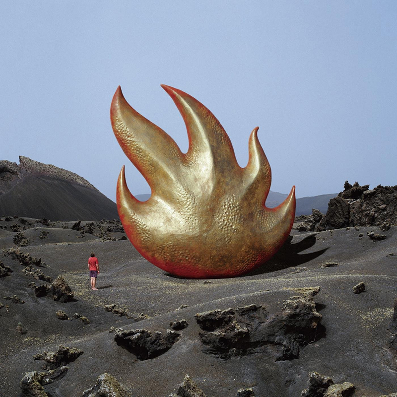
Audioslave
Another brilliant Storm Thorgerson design, the Audioslave cover features a giant flame-like sculpture rising from an empty volcanic landscape. It feels mysterious, cinematic and strangely ancient, almost like a forgotten monument from another civilisation.
Storm described the sculpture as symbolising how the members of Soundgarden and Rage Against the Machine continued on through an entirely new band. It represents two completely different musical identities merging into one thing that really shouldn’t work, and yet absolutely does.
There’s also something fitting about placing this enormous structure in the middle of nowhere, making it isolated, imposing and impossible to ignore, exactly like the music itself. It reminds me a little of the monolith from Stanley Kubrick’s 2001: A Space Odyssey, where this mysterious object suddenly appears and completely changes the atmosphere around it.
The lone figure standing beneath the sculpture adds massively to the sense of scale. Even the decision to dress him in ordinary clothes rather than something futuristic makes the object feel more unsettling, as though this impossible structure photographed by Rupert Truman exists right here on Earth rather than in some distant sci-fi universe.
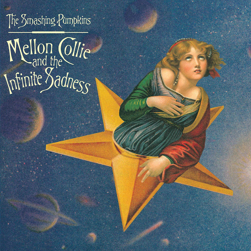
The Smashing Pumpkins
The artwork for Mellon Collie and the Infinite Sadness feels like a dream pulled from another century. Created by illustrator John Craig, the floating woman riding a star through deep blue skies combines Renaissance painting, collage work and art nouveau styling into something nostalgic, surreal and strangely timeless all at once.
Billy Corgan described the album as the Smashing Pumpkins’ attempt at creating a “Sgt. Pepper’s for the 90s,” which makes perfect sense once you experience how massive and ambitious the whole thing is. It is grand, emotional and unapologetically excessive in the best possible way. There is also a sadness built into the artwork that becomes more noticeable with age, looking beautiful, theatrical and slightly melancholic, like it already knows the moment cannot last forever.
This quote from Billy in the liner notes of the Mellon Collie box set has always stuck with me: “This was the best time in the band by far. I think that’s one of the great tragedies in our story, that when we finally did find the right balance internally we enjoyed our greatest success. What’s sad about that is we were never able to recapture that again.”
This is another album that instantly transports me back to high school. I can still picture the classroom, sunlight streaming through the windows while we all sat around talking as “Bullet with Butterfly Wings” blasted through the distorted common room speakers.
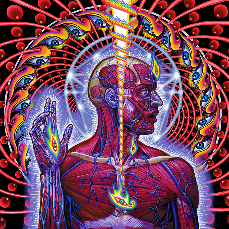
TOOL
Created by visionary artist Alex Grey, the Lateralus artwork transforms the human body into something transparent, spiritual and almost cosmic. Layers of muscle, nerves, anatomy and energy stack over one another like you are looking at consciousness itself rather than a physical person. It perfectly matches an album obsessed with self-awareness, evolution and pushing beyond ordinary perception.
The deeper you go into this album, the more hidden structure you start finding. The title track famously uses patterns inspired by the Fibonacci sequence, a mathematical ratio constantly found throughout nature. Fans later discovered an alternative track order called “The Holy Gift” that completely changes the emotional flow of the album, something TOOL have never officially confirmed or denied.
Few bands have treated album packaging and physical presentation with this much ambition. Everything about Lateralus feels designed to be explored rather than simply consumed. For me, this album finally clicked into place with Fear Inoculum in 2019, where some of the same themes continued and expanded further, almost like finally deciphering an ongoing puzzle.
This is also the album I play driving to the beach for cold winter surf sessions before work. Music, freezing water, hot coffee waiting in a Yeti cup afterwards, it has become part of the ritual now. The beach is basically two TOOL songs away.
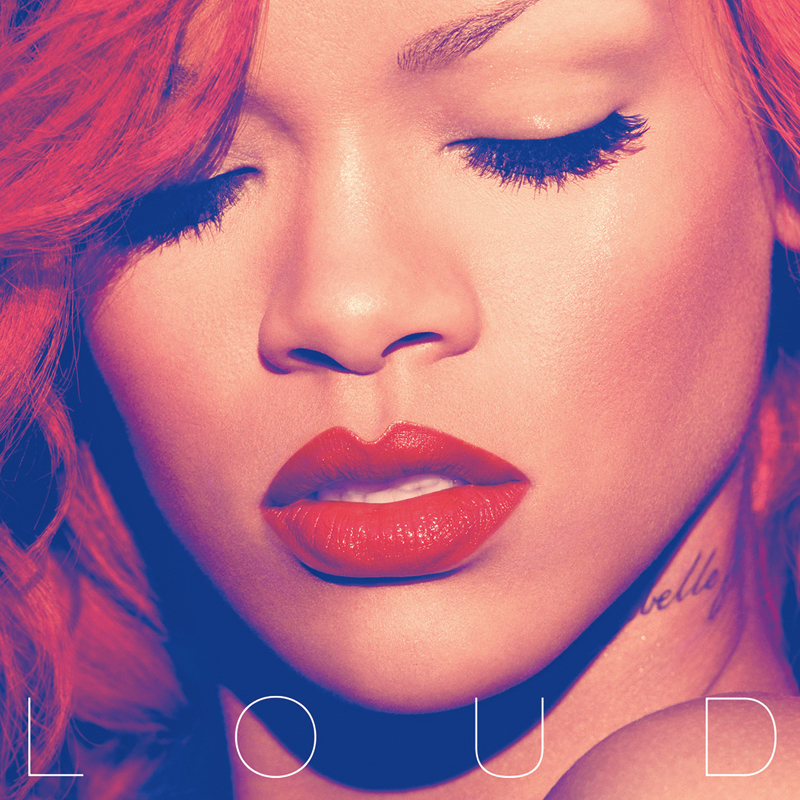
Rihanna
I absolutely love the colour treatment on this cover. Shot by fashion photographer Camilla Åkrans, the tight crop, vivid red hair and soft lighting create something confident, glamorous and impossible to ignore. It quickly became one of Rihanna’s defining visual eras.
What makes the artwork especially interesting is how dramatically it contrasts with the darker and more guarded tone of Rated R before it. Loud deliberately shifts back toward celebration, confidence and unapologetic pop energy after a much heavier and more personal chapter in her life.
The whole thing feels polished without becoming sterile. Bold without trying too hard, which describes Rihanna’s entire presence during this era. Her expression almost feels like the quiet moment before stepping on stage, calm, composed and fully aware of exactly who she is.
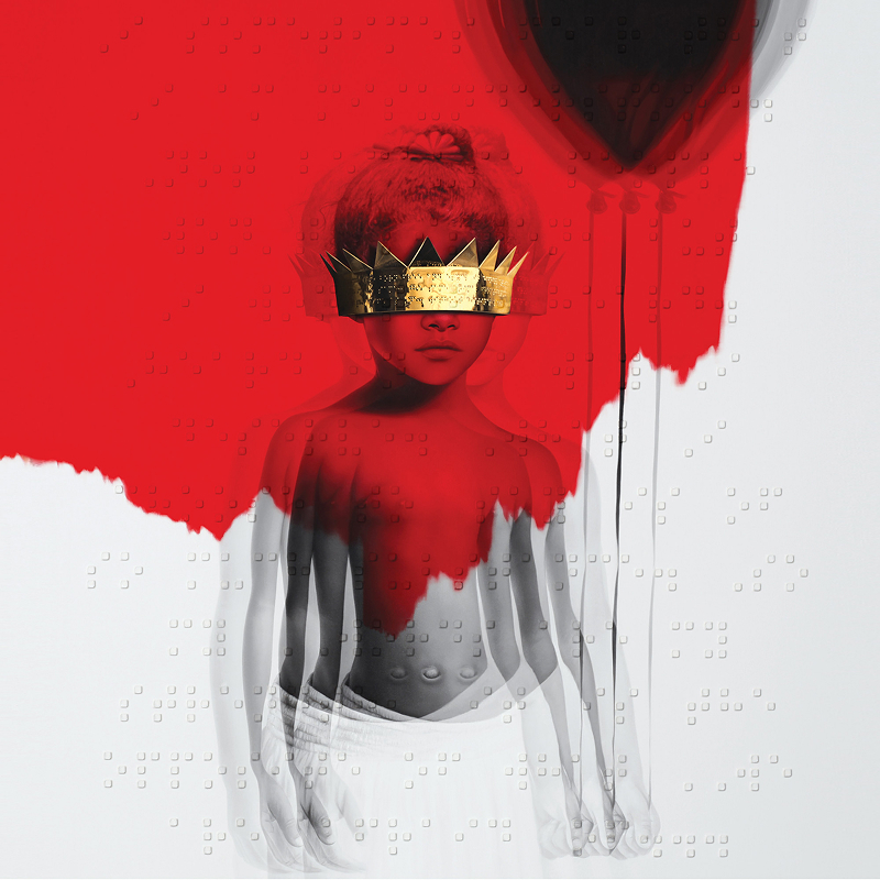
Rihanna
The cover for Anti was created by artist Roy Nachum and features a young version of Rihanna holding a balloon while wearing a gold crown that obscures her eyes. Hidden throughout the artwork is braille poetry written by Chloe Mitchell, adding another layer of meaning around perception, identity and vulnerability.
What I love most about this cover is how imperfect it feels compared to traditional polished pop artwork. The thick paint textures, scratched surfaces and obscured eyes create something far more emotional and human, feeling personal rather than manufactured. The overlapping layers of deep red paint and soft-focus imagery create this strange tension between clarity and distortion, as though the artwork itself is intentionally hiding pieces of the person underneath.
Even the release itself was unconventional. Samsung reportedly paid millions to distribute the album digitally through Tidal, briefly making Anti free before its official worldwide launch.
Kanye West
The artwork for My Beautiful Dark Twisted Fantasy was created by artist George Condo, who painted multiple covers for the project using his deliberately distorted and psychologically unsettling style. The original artwork depicting Kanye West being straddled by a phoenix figure immediately sparked controversy and was reportedly banned by several major retailers in the US.
That controversy perfectly matched the album itself, excessive, chaotic, self-destructive and wildly overindulgent. Even visually the project constantly swings between beauty, ego, fantasy and emotional collapse, art imitating life in real time.
What makes the artwork especially compelling is how intentionally uncomfortable it feels. Faces distort, expressions twist unnaturally and nothing ever feels fully stable or trustworthy. Condo’s paintings look simultaneously classical and broken apart, which mirrors the emotional state Kanye seemed trapped inside during the making of the album.
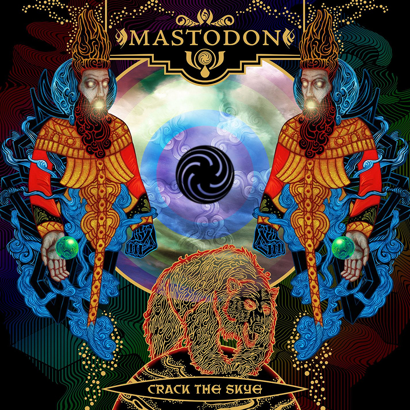
Mastodon
Crack the Skye is a full-blown concept album about astral projection, Rasputin, wormholes and a paraplegic boy whose soul becomes lost travelling through different spiritual planes. Written down, the whole concept sounds completely ridiculous, yet Mastodon make it feel emotionally grounded and deeply human rather than collapsing under the weight of its own ambition.
The artwork by long-time collaborator Paul Romano feels enormous in scale and loaded with symbolism. The glowing blue figure, celestial imagery and layered surrealism all feed directly into the album’s themes of spirituality, grief and transcendence. The longer you stare at it, the more hidden details begin revealing themselves, making it feel less like an album cover and more like a gateway into the strange world Mastodon built around the record.
Most importantly, the album is anchored in genuine emotional weight. Drummer Brann Dailor has spoken openly about the album being a tribute to his sister Skye, who died by suicide at the age of 14. The title itself becomes both a narrative element and a beautiful memorial. Beneath all the progressive metal complexity sits something deeply personal about grief, loss and the hope of reconnecting with someone beyond death.
Alice in Chains
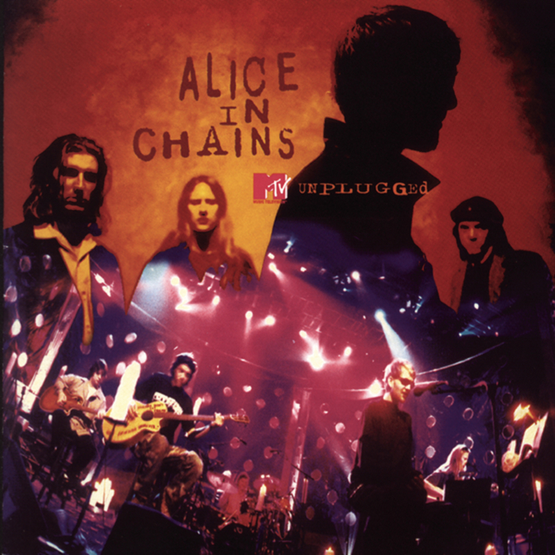
Alice in Chains’ MTV Unplugged performance already carried enormous emotional weight before the band even played a single note. The band hadn’t performed together in more than two years due to Layne Staley struggling heavily with addiction, and while Staley was visibly frail, his vocals remained breathtakingly powerful.
Guitarist Jerry Cantrell was also extremely ill during the performance. While the hot dog food poisoning story became famous among fans, it was later revealed to be more of a cover story protecting a completely exhausted musician trying to push through the show. At the last minute, Staley requested giant lava lamps be placed around the set, but the production crew didn’t realise they needed hours to properly heat up. If you watch the footage closely, the wax inside is barely moving, an accidental mistake that added perfectly to the frozen, eerie atmosphere of the performance.
MTV had meticulously programmed the stage lighting around the planned setlist, but when Layne arrived with bright pink hair it completely disrupted the visual design. The production team quickly shifted the backdrop and ambient lighting tones to match his hair colour, creating a hauntingly unified aesthetic design. From the moment Jerry begins playing and the crowd erupts as the band slowly joins him on stage, you can feel this is going to be something special, and then Layne walks out and flawlessly delivers the opening line to “Nutshell,” cementing one of the greatest MTV Unplugged performances ever recorded.
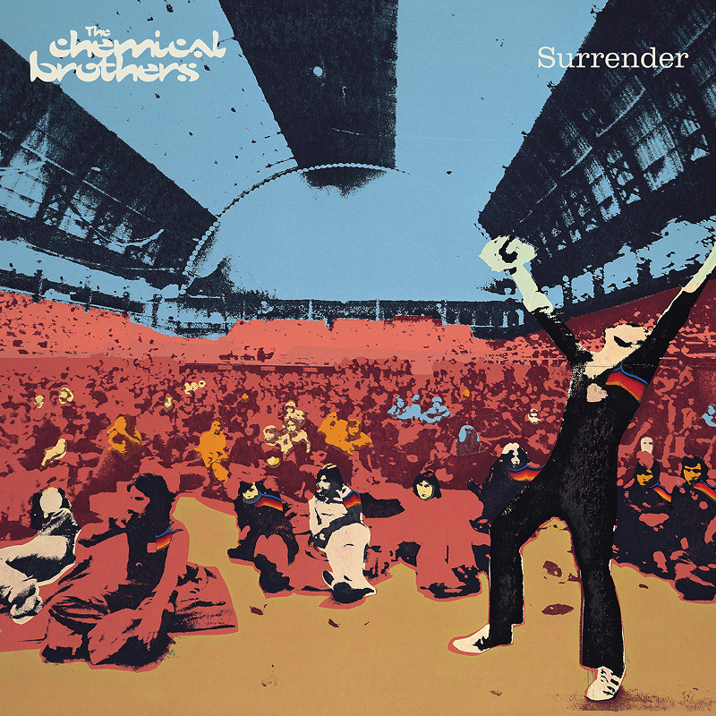
The Chemical Brothers
The artwork for Surrender feels like a direct love letter to late-60s psychedelic design. Created by designer Julian House, the cover combines soft gradients, retro illustration and warm colour tones into something instantly nostalgic without ever feeling trapped in the past.
The dancing figure on the cover was actually a real person known simply as “Jesus,” a legendary UK concertgoer famous for his euphoric dancing at gigs throughout the 60s, 70s and 80s. Once you know that, the image becomes even more joyful and human. Everything about the artwork captures warmth, movement and that hazy sensation of memories, lights and music all blurring together late into the night. Even the faded textures and typography feel carefully designed to recreate that dreamlike atmosphere.
The Chemical Brothers
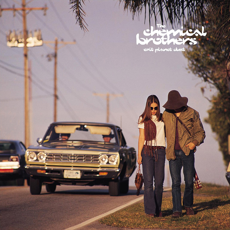
The cover for Exit Planet Dust uses a horizontally flipped stock photograph of hitchhikers taken in the late 1960s, immediately giving it this strange sense of movement and timelessness. Instead of leaning into futuristic CGI or stereotypical electronic music visuals, art directors Negativespace and the band deliberately chose something softer, warmer and more dreamlike.
That decision helped the artwork age incredibly well. The dusty colours, faded photography and open-road atmosphere feel cinematic rather than tied to a specific era of technology. It almost feels like the opening frame of a road trip film where you have no idea where things are heading yet.
The album itself also marked a major turning point for the duo. Originally performing as The Dust Brothers, they were forced to change names after legal pressure from the American production team who had worked with the Beastie Boys. Exit Planet Dust ultimately became both a debut album and the beginning of an entirely new identity.
David Bowie
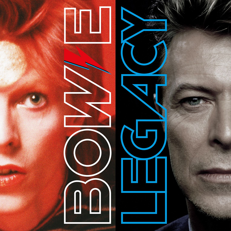
Legacy feels less like a traditional greatest hits album and more like a reminder of just how enormous David Bowie’s creative reach really was. Few artists reinvented themselves as successfully, or as often, as Bowie managed to across five different decades.
The artwork reflects that same confidence through restraint. The stark white typography against the black background, combined with Bowie’s profile silhouette captured by photographer Peter Gabriel (right hand side), feels elegant, timeless and instantly recognisable without needing anything elaborate. Released shortly after his death in 2016, the cover almost feels more like a memorial piece than a commercial compilation.
The tracklist quietly tells Bowie’s story through collaboration as well, with Queen, Mick Jagger, Trent Reznor and Nile Rodgers all appearing across different eras, showing how naturally Bowie moved between completely different musical worlds while still sounding unmistakably like himself. For me, Bowie’s eyes add another layer entirely, showing this strange intensity from someone who has genuinely lived through every reinvention and creative shift contained within the music itself.
Ben Harper
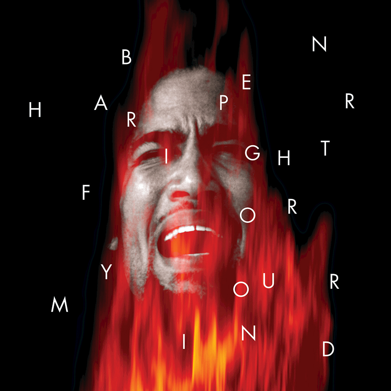
The cover for Fight for Your Mind immediately grabs your attention. Ben Harper’s face appears engulfed in flames while military roundels from various African nations and Jamaica surround him, each corresponding to tracks from the album itself. It feels politically charged, confrontational and deeply personal all at once, shaped perfectly by photographer Jeff Bender and designer Tom Dolan.
What makes the artwork especially compelling is how naturally it reflects the music inside. Harper effortlessly blends blues, folk, reggae and protest music together in a way that never feels forced or performative, and the entire album carries a strong sense of social awareness without becoming preachy. There’s also something timeless about the black-and-white photography and warm colour treatment of the flames. The grain, lighting and textures give everything a raw honesty that still feels incredibly human decades later, and quietly powerful is probably the best way to describe both the artwork and the record itself.
The White Stripes
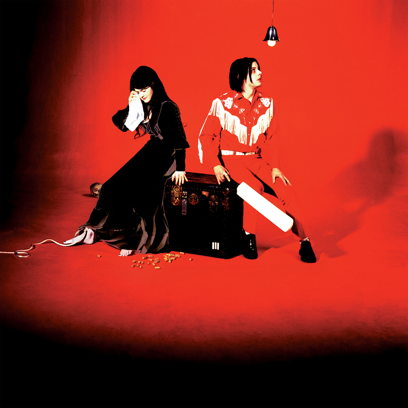
Recorded entirely using vintage analogue equipment at Toe Rag Studios in London, Elephant feels obsessed with texture before you even hear a single note. Everything about the artwork continues The White Stripes’ strict visual identity built around red, white and black, a palette they treated almost like a complete visual language.
The cover, shot by Patrick Pantano under Jack White’s creative direction, feels chaotic yet carefully controlled. Jack and Meg White sit surrounded by ornate furniture, tangled objects and heavy shadows, creating this strange collision between elegance, mystery and garage-rock rawness. It feels theatrical without losing the looseness that made the band so exciting in the first place.
The irony is that despite all the vintage recording techniques and stripped-back philosophy, Elephant ended up producing one of the most recognisable riffs in modern music with “Seven Nation Army,” a song that completely escaped indie rock and became part of global culture.
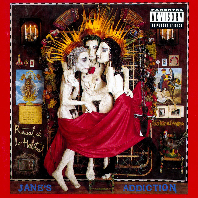
Jane’s Addiction
The cover sculpture for Ritual de lo Habitual was created by frontman Perry Farrell and immediately sparked controversy due to its nudity, leading several major retailers to refuse to stock the album. Rather than backing down, Jane’s Addiction responded by releasing an alternative cover featuring nothing more than the text of the First Amendment printed in white on black. That response was arguably more rebellious than the original artwork itself.
What makes the sculpture especially interesting is how raw and handmade it feels. It isn’t polished or traditionally beautiful, feeling messy, expressive and deeply personal to match the chaotic energy running throughout the album. Photographed by Tom Recchion, it exists somewhere between art project, performance piece and total unpredictability. With nowhere for the eye to fully rest and so many strange little details to absorb, the artwork still manages to feel beautifully balanced and cohesive.
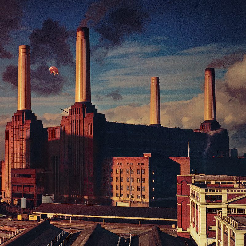
Pink Floyd
In 1976, Pink Floyd and Hipgnosis gathered at Battersea Power Station to photograph a giant inflatable pig named Algie floating between the station’s chimneys. Everything had been planned meticulously, including hiring a marksman in case the pig broke loose, but on day two, management failed to book the marksman in order to save money.
Naturally, that was the exact moment the pig escaped.
Algie snapped free from its moorings, drifted into Heathrow flight paths at around 18,000 feet, disrupted commercial flights and eventually landed in a field in Kent after reportedly terrifying a herd of cows. Ground crews initially thought pilots reporting a giant flying pig were joking, yet this complete disaster still resulted in one of the most iconic album covers ever created.
The best part is that the final artwork designed by Storm Thorgerson and Aubrey Powell is actually a composite image. After the pig was recovered from the farm, they successfully photographed it in place on day three, but the sky was too bright and sunny. To capture the dark Orwellian atmosphere of the music, Hipgnosis combined the dramatic cloudy sky from day one with the pig photographed on day three. Absolute chaos resulting in perfection feels incredibly fitting for Pink Floyd.
highly suspect
The artwork for As Above, So Below was created by collage artist Mr. Babies and immediately feels chaotic, psychedelic and impossible to fully absorb in a single glance. Vintage imagery, distorted faces and layered symbolism collide together into something nostalgic, surreal and emotionally unsettling.
The album title references the ancient Hermetic principle that what happens on a cosmic level is reflected within ourselves personally. Frontman Johnny Stevens structured the album around that exact tension between emotional highs and lows, splitting the record into two contrasting halves. The first half captures excitement, energy and reckless freedom while the second half descends into addiction, depression and emotional collapse.
The final track even loops seamlessly back into the beginning of the album, creating a cycle with no true ending. Once you understand that concept, the fragmented collage artwork starts making even more sense. This was my favourite album of 2024 and it was awesome finally seeing them live the following year.
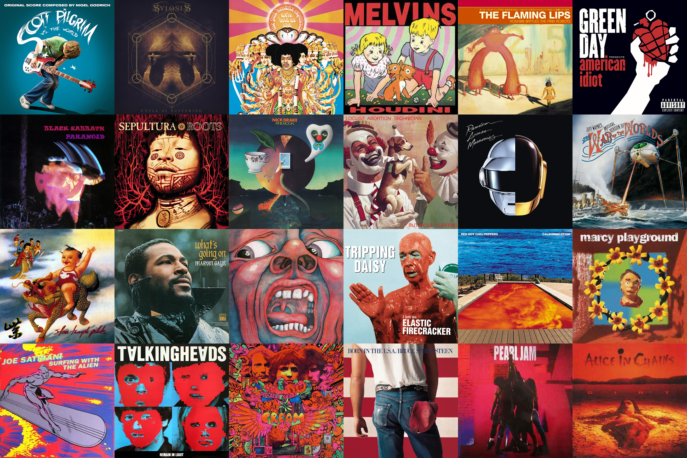
There were plenty of “what about this one?” moments along the way. Great covers that just didn’t work with the others and sadly didn’t make the cut.
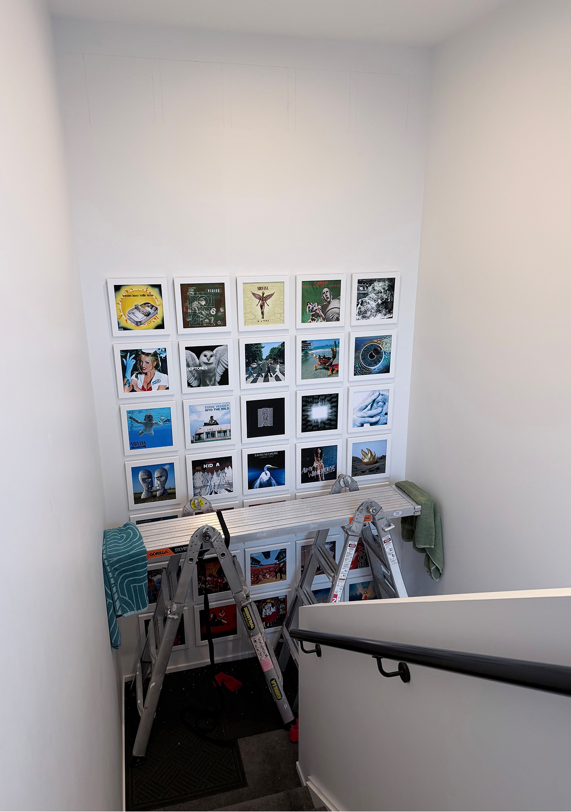
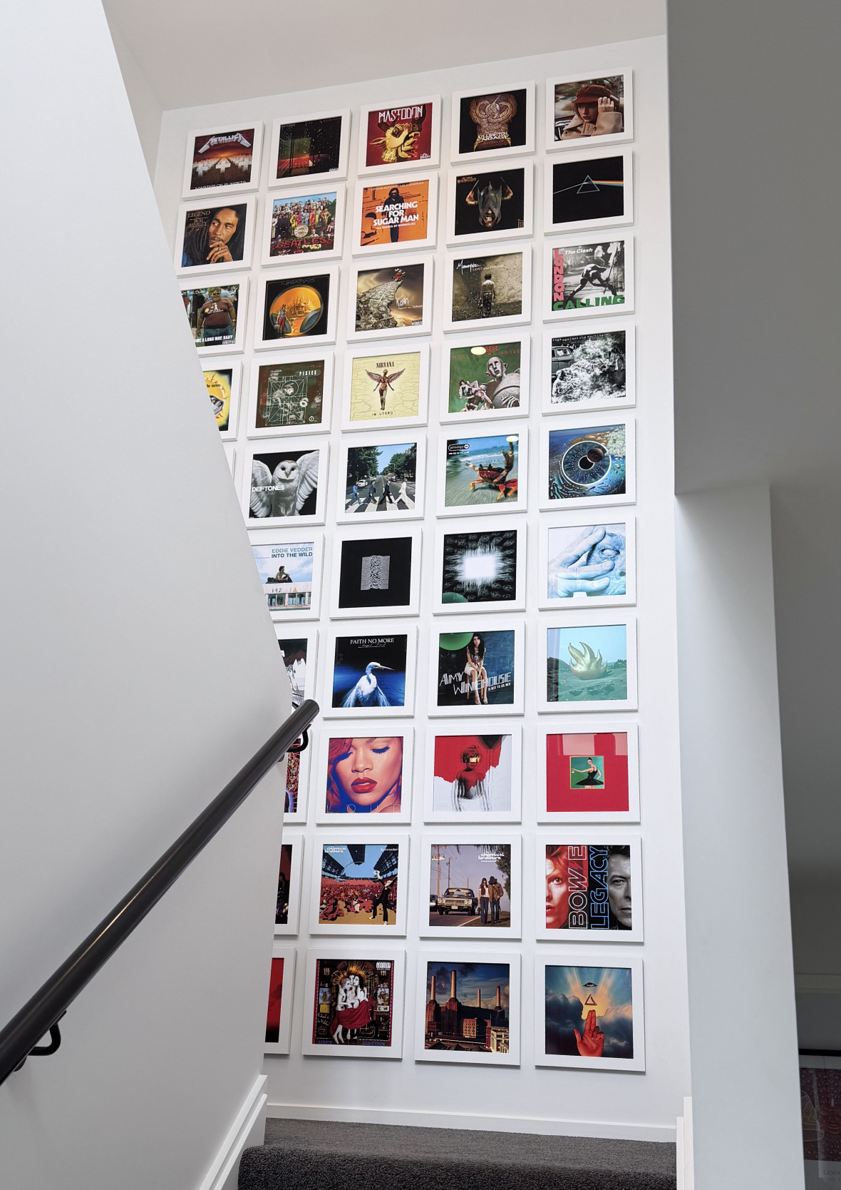
This project turned into an ambitious four-metre gallery wall in our house. What started as a simple idea took 18 months from first thought to final frame, transforming a blank stairwell wall into a gallery featuring 50 of the most interesting and iconic album covers ever created. From narrowing down the final selection to custom framing, problem-solving and hanging every frame by hand, here’s how it all came together.
Each of the 50 covers is really a small story stacked on top of the others, the kind of thing a screen can’t quite capture. Worth seeing the whole wall come together, start to finish.