• Written by Rich McNabb • Proofread & Edited by Claude AI
Designing with a 4px/8px baseline grid
How I use a 4px/8px baseline grid and the traditional typographic scale to create consistent, well-structured layouts for web and mobile design.
• Written by Rich McNabb • Proofread & Edited by Claude AI
How I use a 4px/8px baseline grid and the traditional typographic scale to create consistent, well-structured layouts for web and mobile design.

Image credit:
A few years ago I was researching layouts and grid structures when I came across a great article by Pierre Marly from Teehan+Lax: Designing Faster with a Baseline Grid.
I’ll admit that when I first read it I’d never heard the term “baseline grid” before, but that was about to change. Pierre’s thinking had a lasting effect on my approach to design. Years later, the principles I picked up (and a few others along the way) are still at the core of my design process. Here’s my approach to baseline grids.
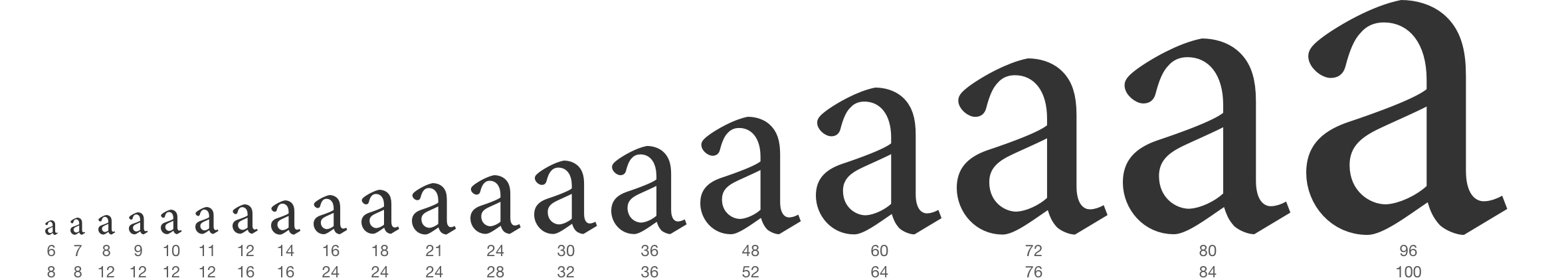
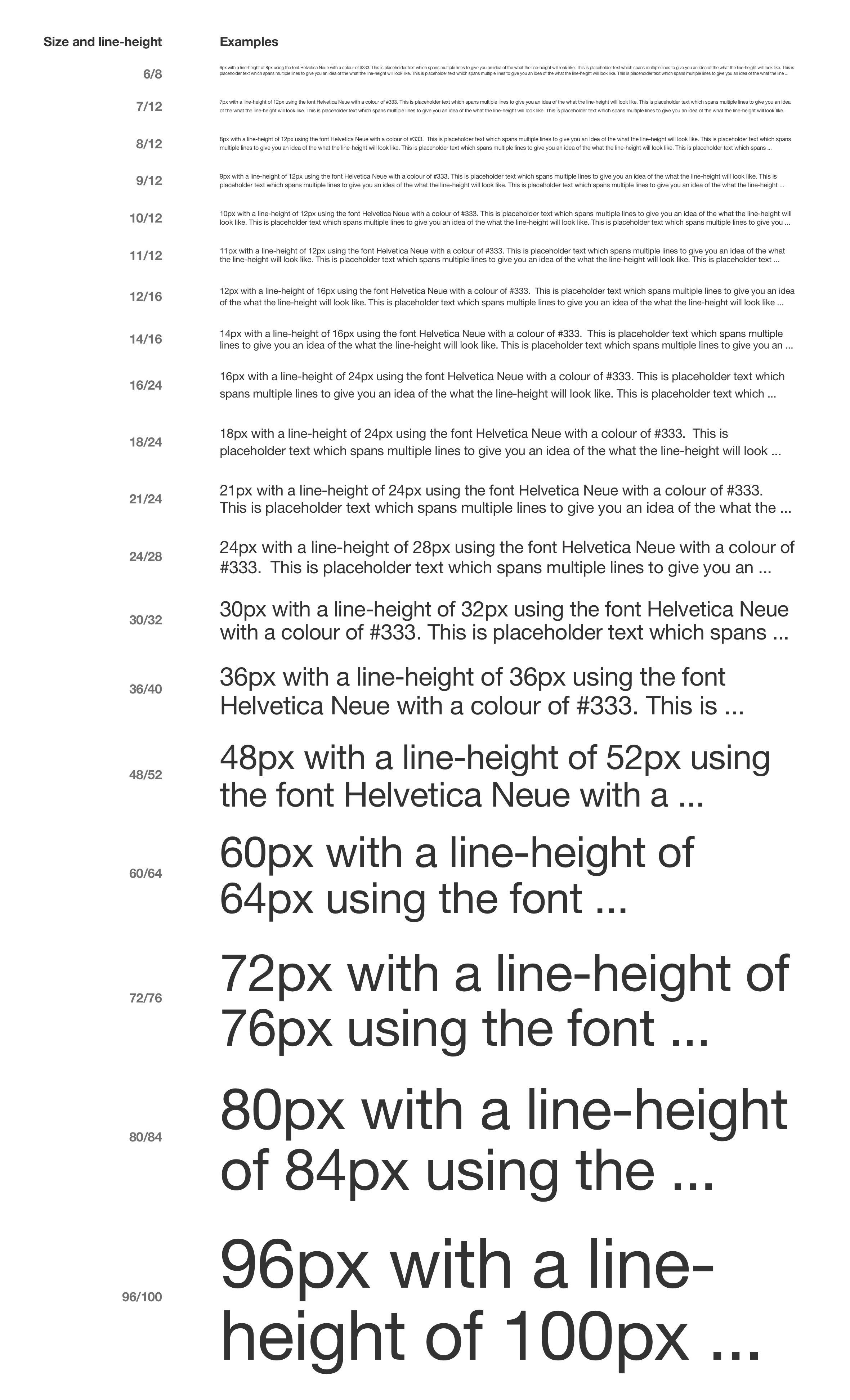
Typography is the foundation of great design. Where possible I like to use the traditional typographic scale (6, 7, 8, 9, 10, 11, 12, 14, 16, 18, 21, 24, 30, 36, 48, 60, 72, 80, 96) as mentioned in Robert Bringhurst’s book The Elements of Typographic Style. It’s a great way to establish a clear hierarchy and vertical rhythm in your work.
Note: I’ve added 30px as it’s a huge jump between 24px and 36px 🙂
A 4px baseline grid provides the consistency and flexibility to design for both web and mobile without having to rethink about different measurements.
The real value of a grid system isn’t the structure itself. It’s how much easier it makes everything else. Once spacing becomes consistent, you’re not constantly adjusting things, nudging a button two pixels left or wondering why a card feels slightly off. That decision gets made once, at the grid level, and then it’s done.
What’s left is the interesting part. You get to spend your time on hierarchy, flow, and how the interface actually reads, instead of relitigating spacing on every screen. It’s a small trade that pays off more the bigger and more complex a product gets.
This kind of thinking shows up in my radio router dashboard UX design work, where consistent spacing helped bring order to complex, data-heavy interfaces. When there’s a lot of information competing for space, a solid grid is often the only thing holding it together.