

Mero: Social marketing analytics dashboard
One question, answered fast: what’s actually working. Mero is a marketing dashboard built to track campaigns across every channel and surface the signal at a glance, built for quick decisions, not another report to read later.
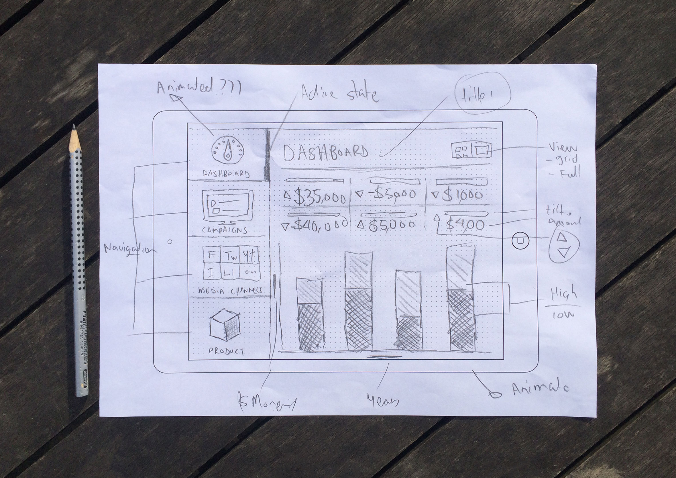
Sketching out ideas before launching any design tools
Mero is a social marketing analytics dashboard built to answer one question fast: out of everything happening across your campaigns right now, what’s actually working? After speaking with the client to better understand their business needs and goals, I like to put pencil to paper and sketch out as many ideas as I can. The point is to explore different concepts and potential approaches to solving the problem. Quantity and speed over quality.
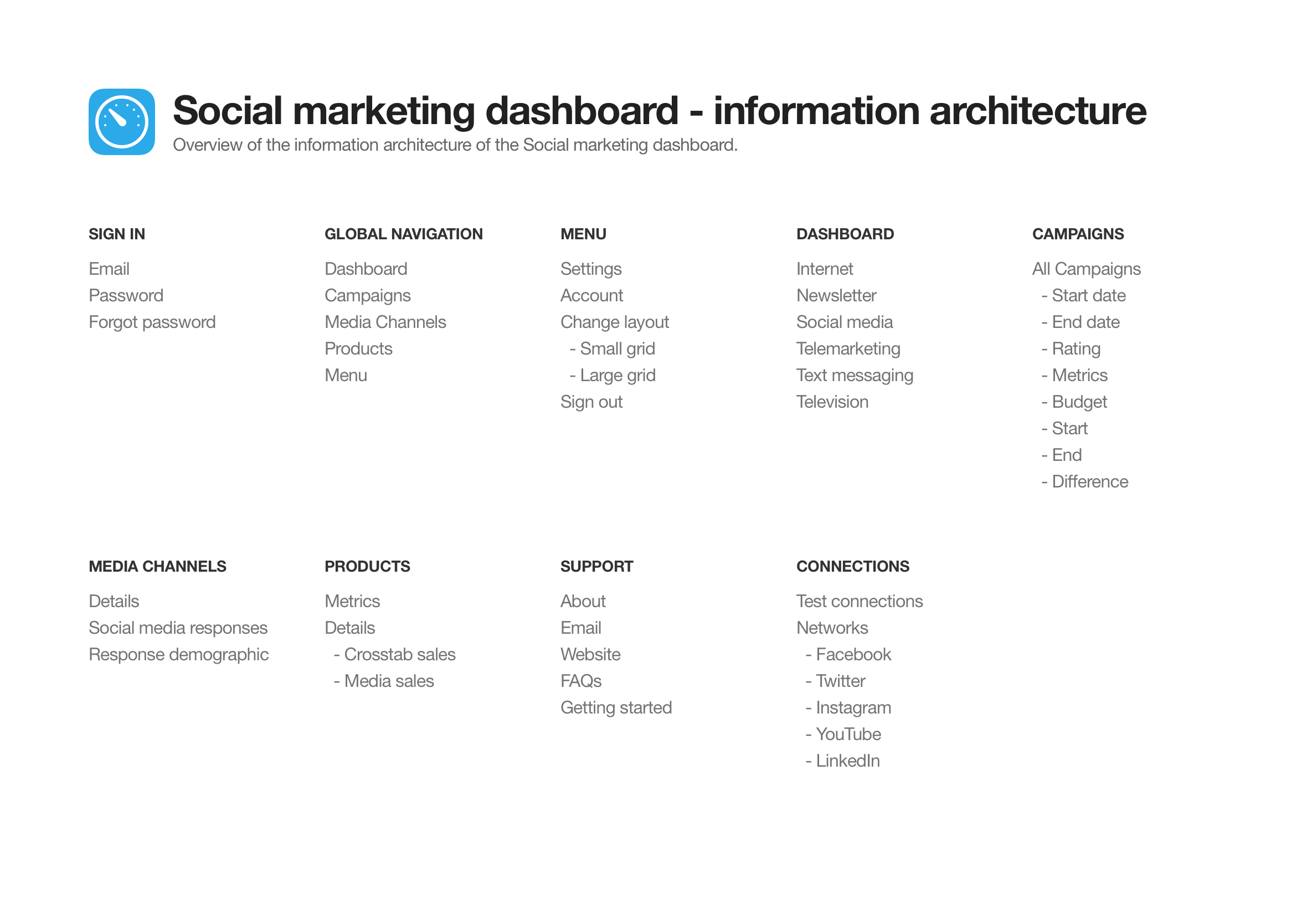
Information architecture: mapping every screen and flow
The information architecture maps out which screens are required and all the user interface elements which make up the structure of the app. By having everything in the one place it makes it easier to identify areas of improvements or gaps in the user experience.
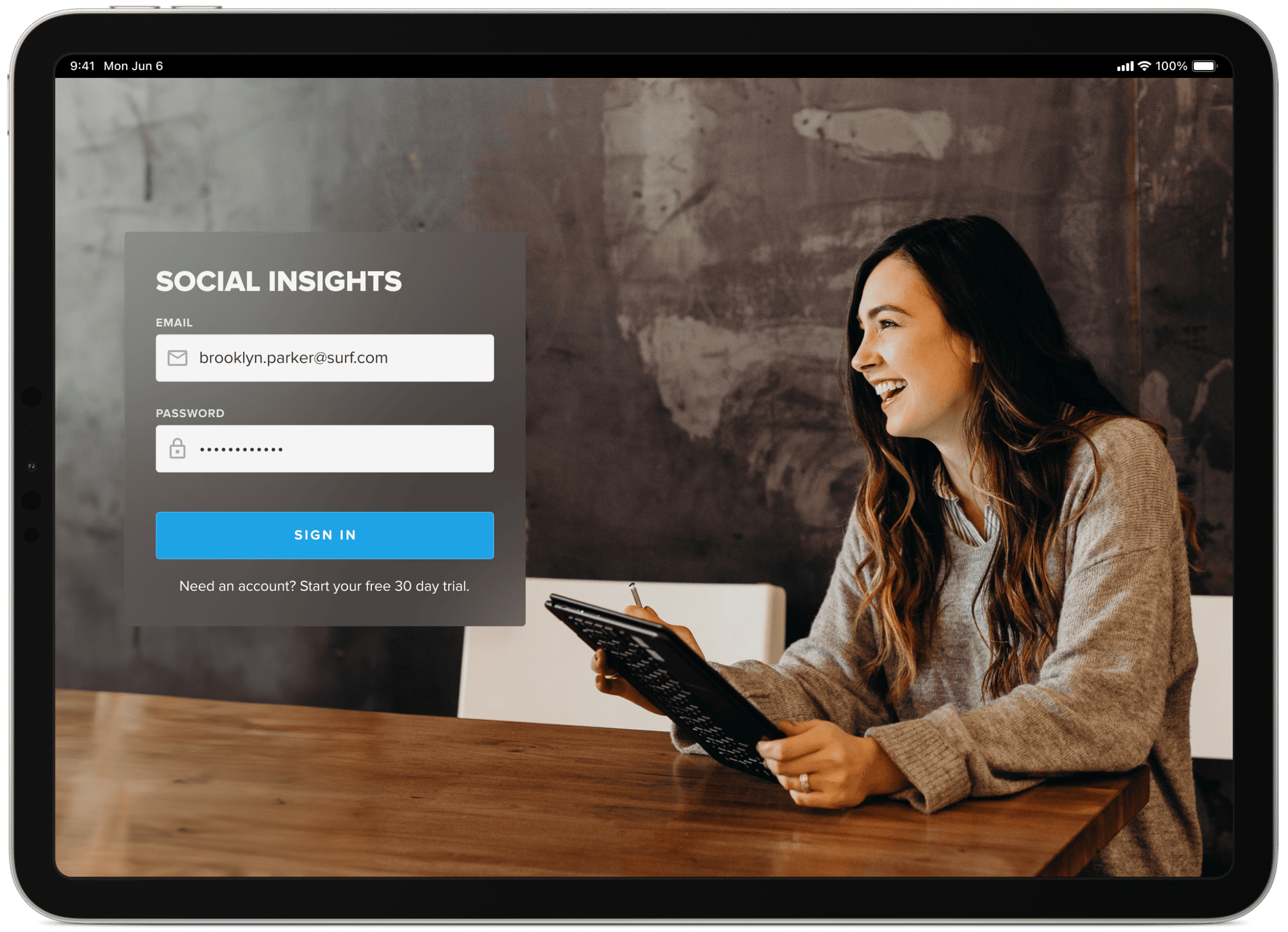
Minimal sign-in screen
Like most dashboards, you’re pulling in data from various sources and displaying the information in a visual and interesting way to make the data easy to interpret and action. With that said, you want to secure and restrict who can view your data.
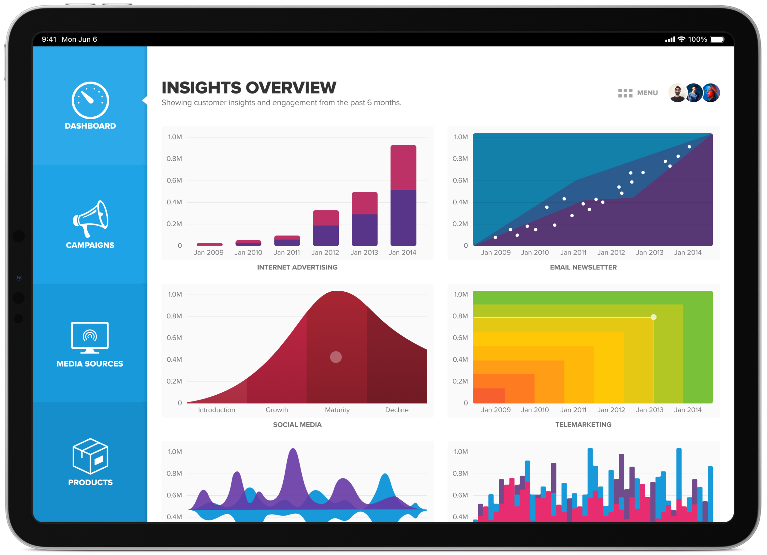
Multiple campaign graphs in a single dashboard view
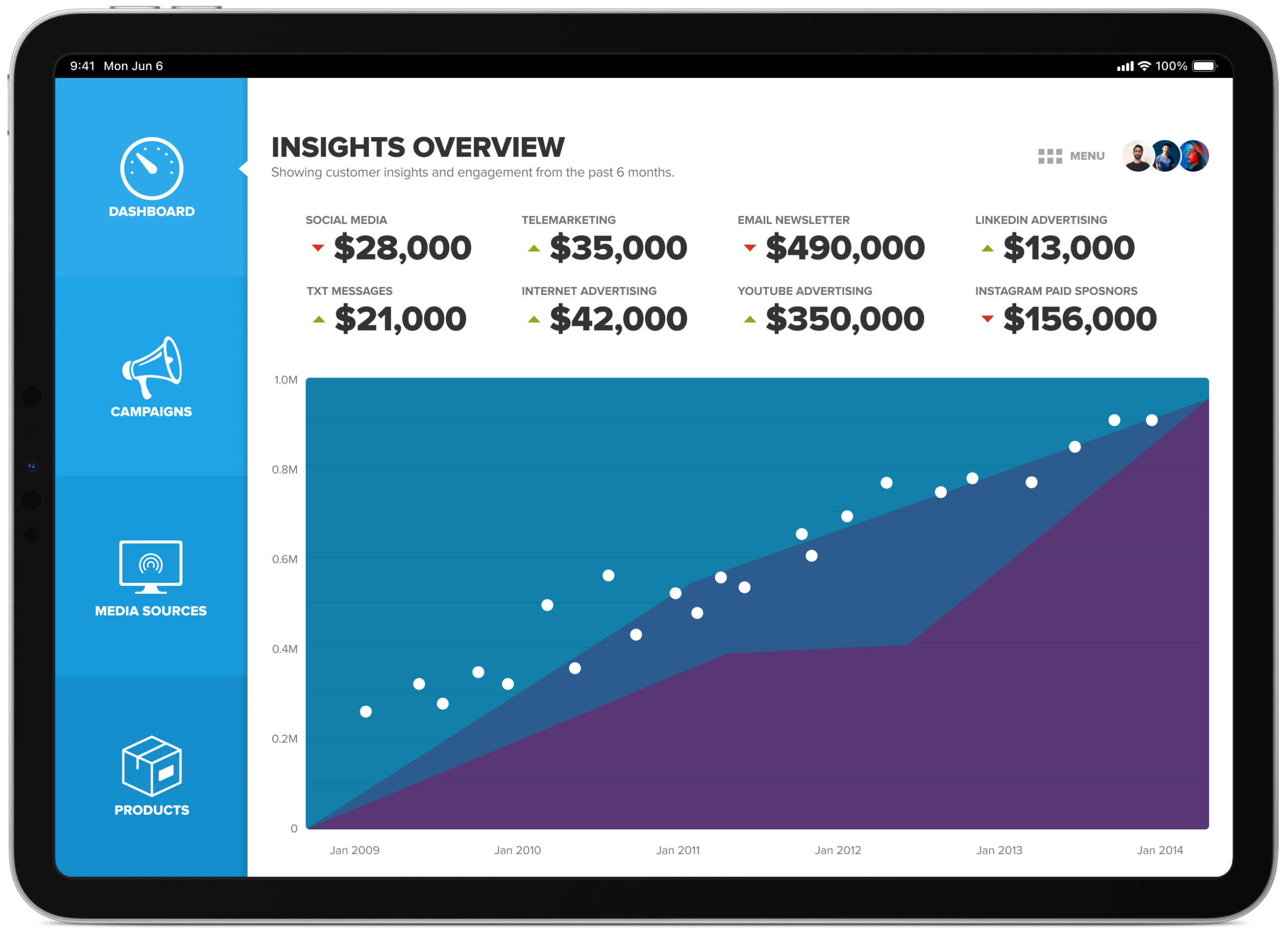
Each graph displays a miniature live preview of actual data behind that marketing campaign. When the user taps the graph thumbnail it takes them to a dedicated page and provides them with more detail and an interactive graph to help them analyse the results.
A quicker, high-level view for faster decision making
Like most dashboards, how effective they are, comes down to how quickly you can find the necessary information to help you make quick/well-informed decisions. The quick view provides data analytics to allow people to do just this at a high level with the ability to dive deeper if required.
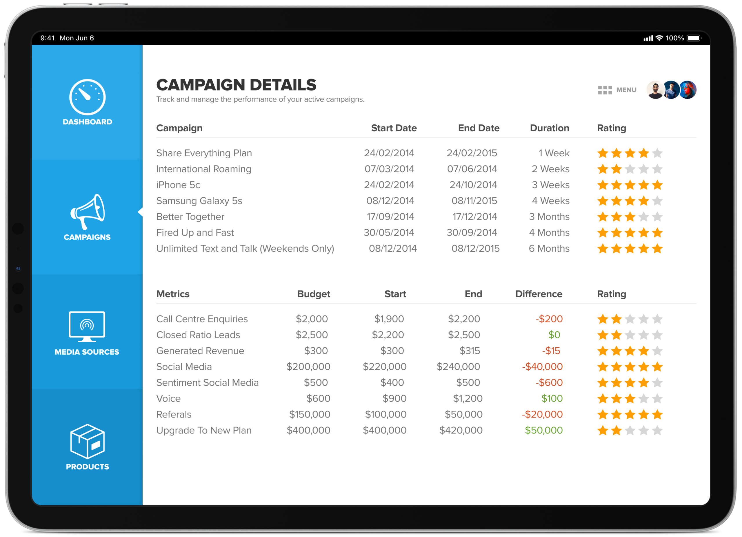
Campaign details overview
Here you can view all active campaigns and get a feel for how well they’re performing. This simplified view allows you to tap on the campaign you are most interested in to bring up more detailed information about a particular event.
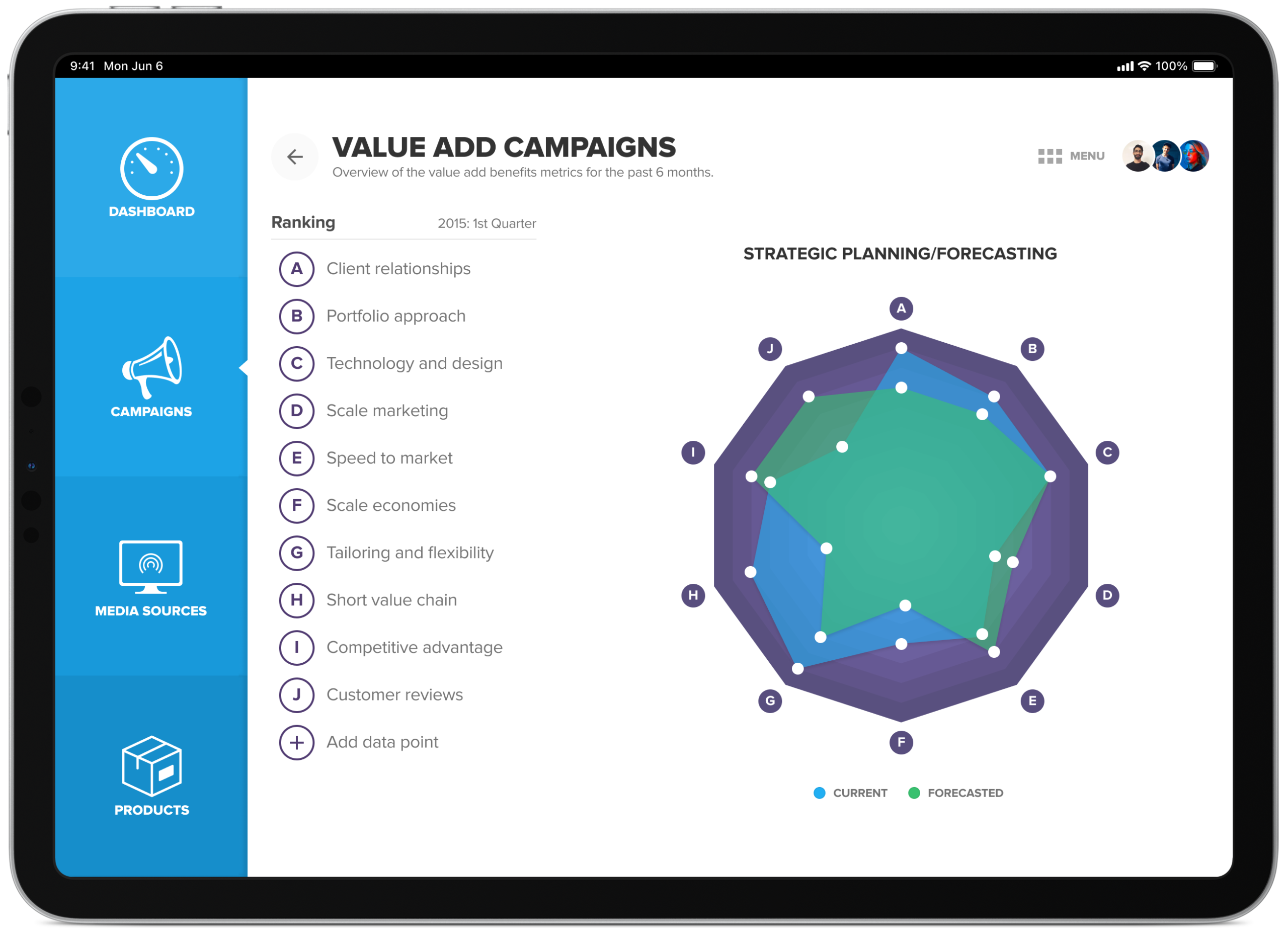
Tracking value-add campaign performance and rankings
Overview of the value add benefits metrics for the past 6 months. A spider graph ranks performance across ten dimensions, client relationships, portfolio approach, technology and design, scale marketing, speed to market, scale economies, tailoring and flexibility, short value chain, competitive advantage and customer reviews, so it’s easy to see at a glance where a campaign is strong and where it isn’t. The user can tap on the various points of the graph to bring up more information, this is true for all the graphs within this app.
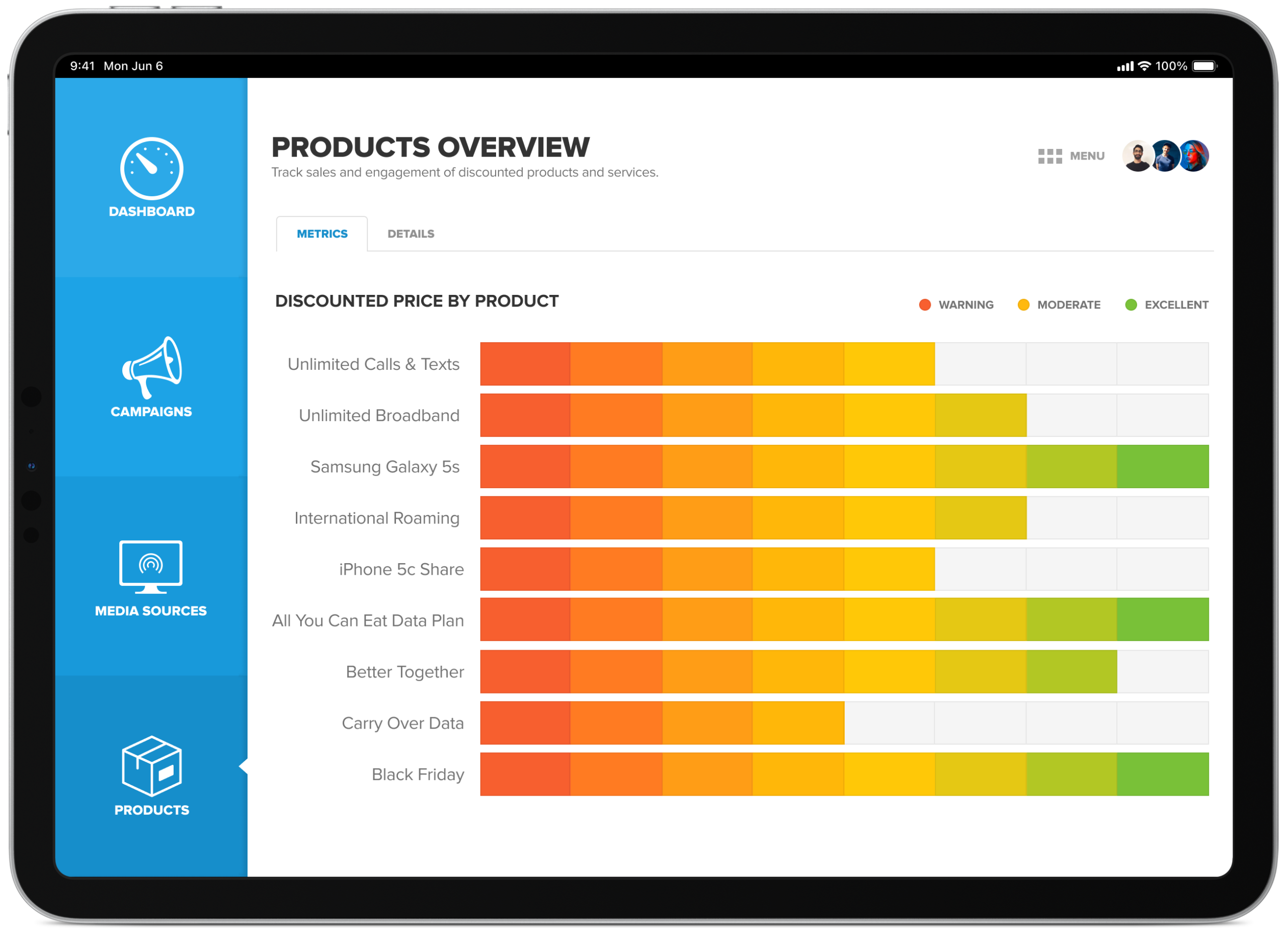
Tracking product performance after a recent promotion
An overview of how well products are tracking after the announcement of price reductions via the 6 main media channels (social media, telemarketing, newsletter, txt, internet and television).
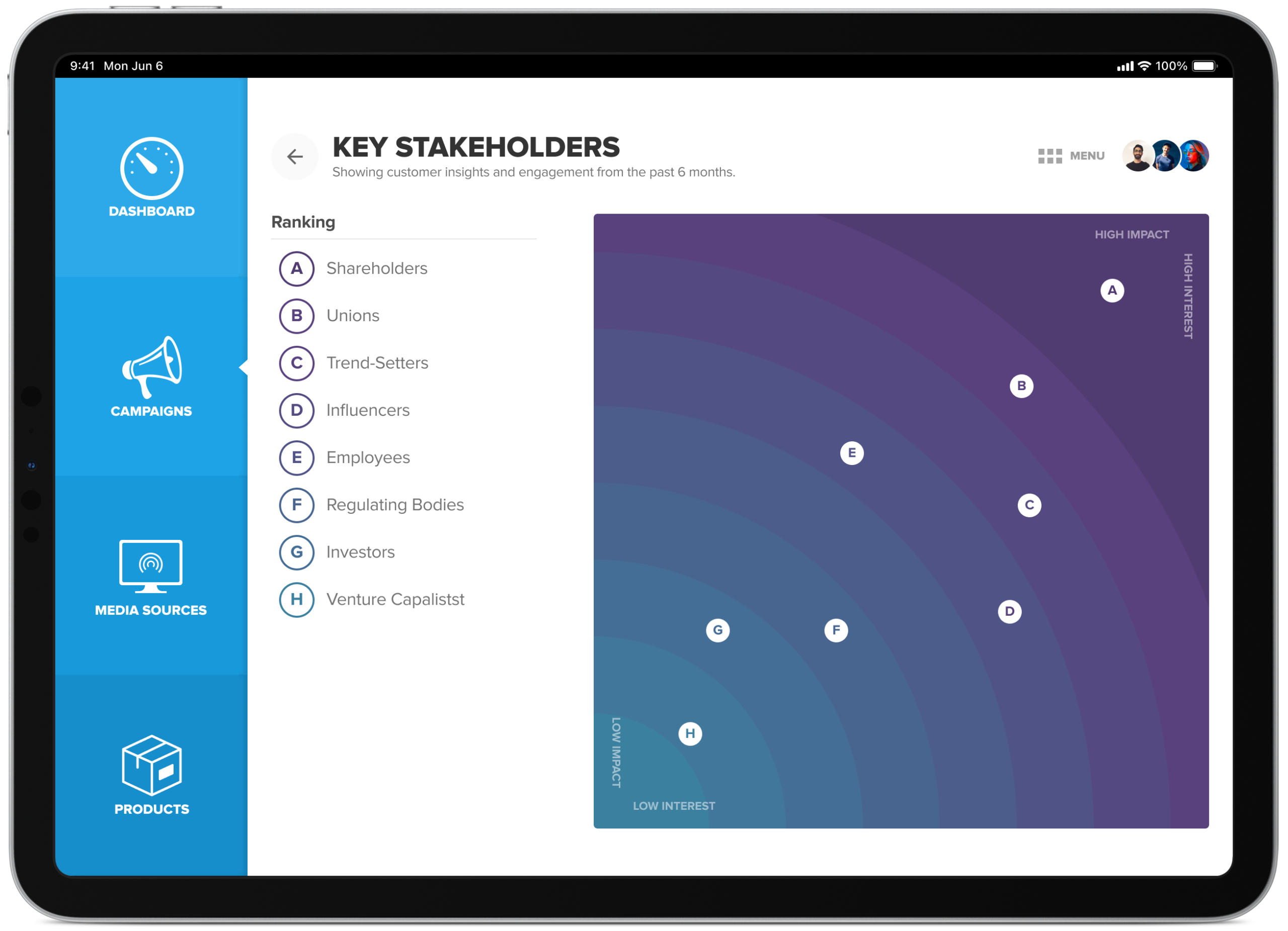
Key stakeholders overview
Based on the type of campaign you run there’s going to be a difference in who is most affected/interested in the outcomes. You can use this to your advantage to mitigate any unforeseen risks and, when necessary, raise concerns to get feedback and guidance.
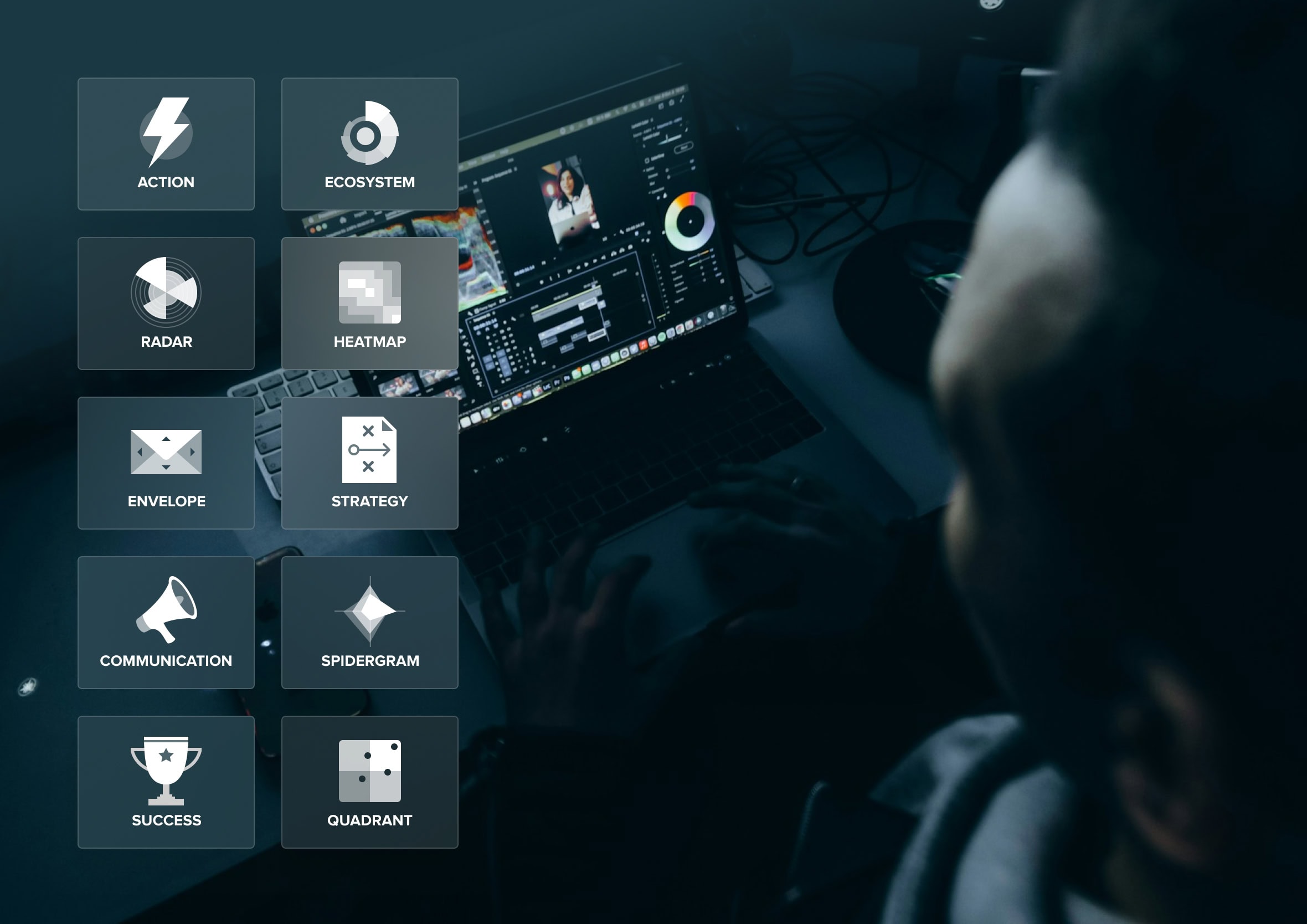
Experimenting with icons, colour and transparency
I experimented with various iconography treatments throughout the project to find ones which were memorable and easy to scan when navigating around the platform. I also played with frosted glass, translucent widgets, well before it became a mainstream design trend again, a nod back to Windows Vista’s Aero look at the time, and not far off what’s now being called Liquid Glass.

Data dressed to kill
There’s a reason a well-tailored suit gets talked about in film and fashion history alike, entire books have been written about Bond’s tailoring alone. A sharp cut doesn’t just look good, it commands attention and earns trust before anyone’s said a word. That’s roughly what we were going for with the data too, not decoration for its own sake, just enough polish that people actually wanted to look closer.
This project actually started life at CDP, early in my career, before the company became Mero. CDP worked in data warehousing, and the real challenge was never collecting the data, most companies already had more of that than they knew what to do with. It was what happened next: how do you turn a warehouse full of numbers into something a customer could actually use to tell their own story?
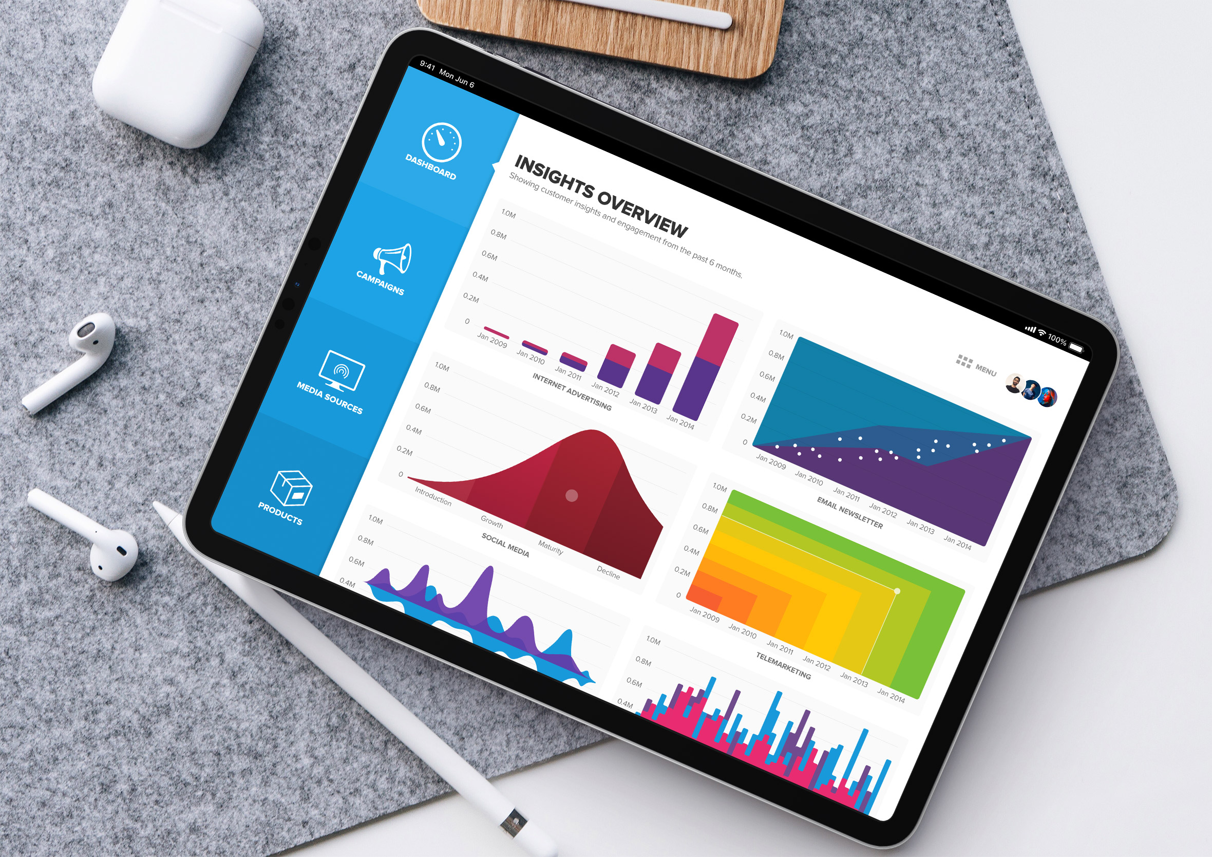
A static report answers a question once and then sits in someone’s inbox, unread. We wanted something people could properly get into, digging into a graph, tapping through to the detail behind a number, following a thread instead of just reading a summary. Or as it got put around the office at the time, the job was putting a tuxedo on the data to make it shine.
That same instinct, that raw information is only valuable once someone can actually act on it, shows up again and again across the work history that followed, long before and long after this particular project. That same team also worked on StrategyBlocks’ customer onboarding flows, the project this one’s most closely tied to, both born out of the same few years at CDP Group.