Questions I ask when interviewing & applying for UX roles
The questions I actually ask when interviewing for a UX/UI design role, plus the frameworks, from the three lenses of innovation through to the double diamond, that shape how I work once hired. Questions that reveal more than a resume ever.
The design process is messy
Some of that mess is just confusion, the answer isn’t obvious yet and won’t be for a while. Some of it is people, real humans with real limits, working alongside other real humans who don’t think exactly the way you do. And some of it is just how complicated the actual problem turns out to be once you’re properly inside it.
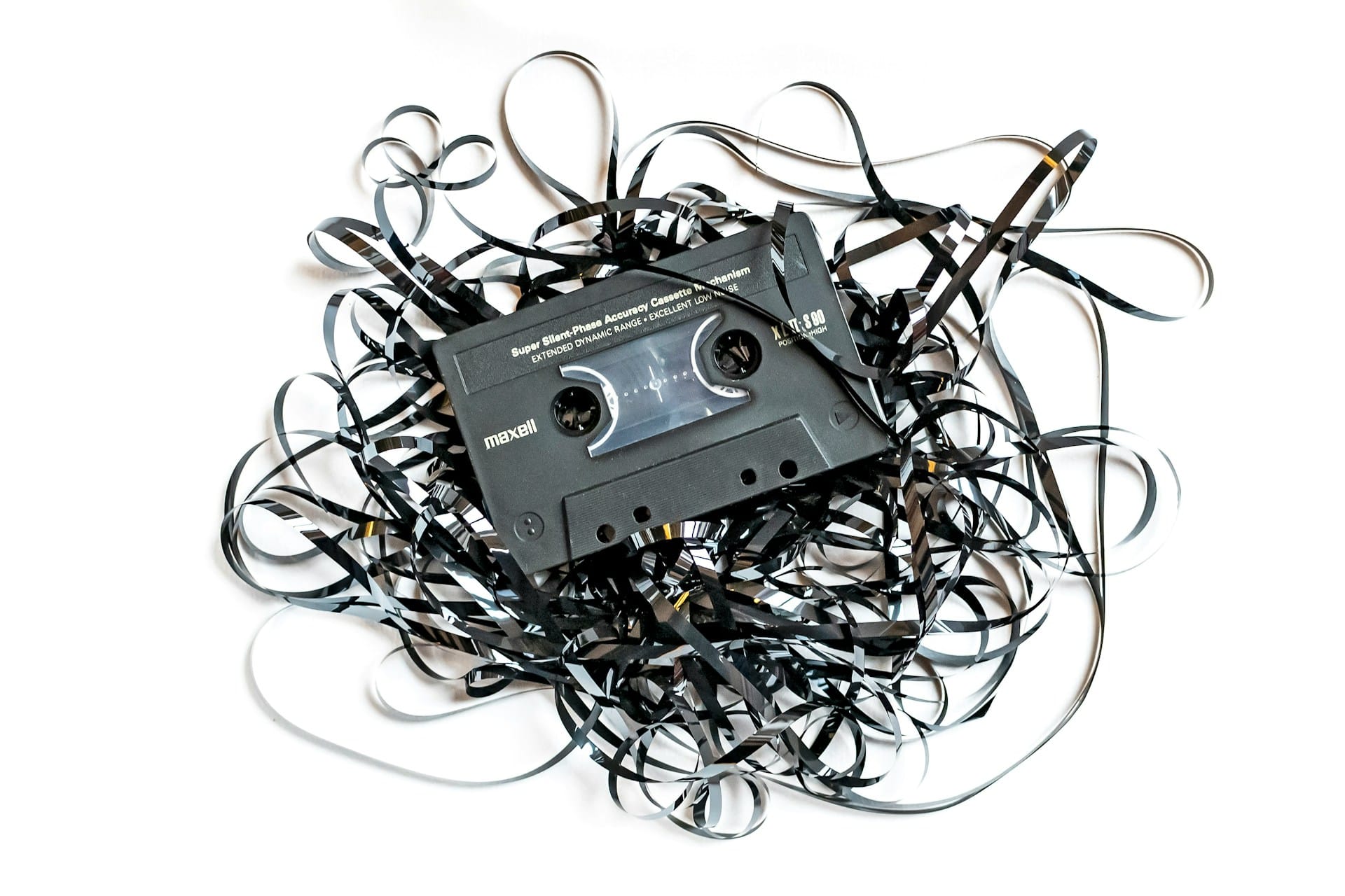
Every cassette tape looks like a disaster before someone sits down and starts winding it back in. Design work is the same. Most of it happens somewhere in the tangle, long before anything on screen looks close to finished. This article started as a simple list, the questions I ask when I’m the one being interviewed. It grew into something bigger along the way: the four things I’m listening for going in, and the four things, plus the mental models sitting underneath them, that guide how I actually work once I’ve got the job.
Chaos before the calm
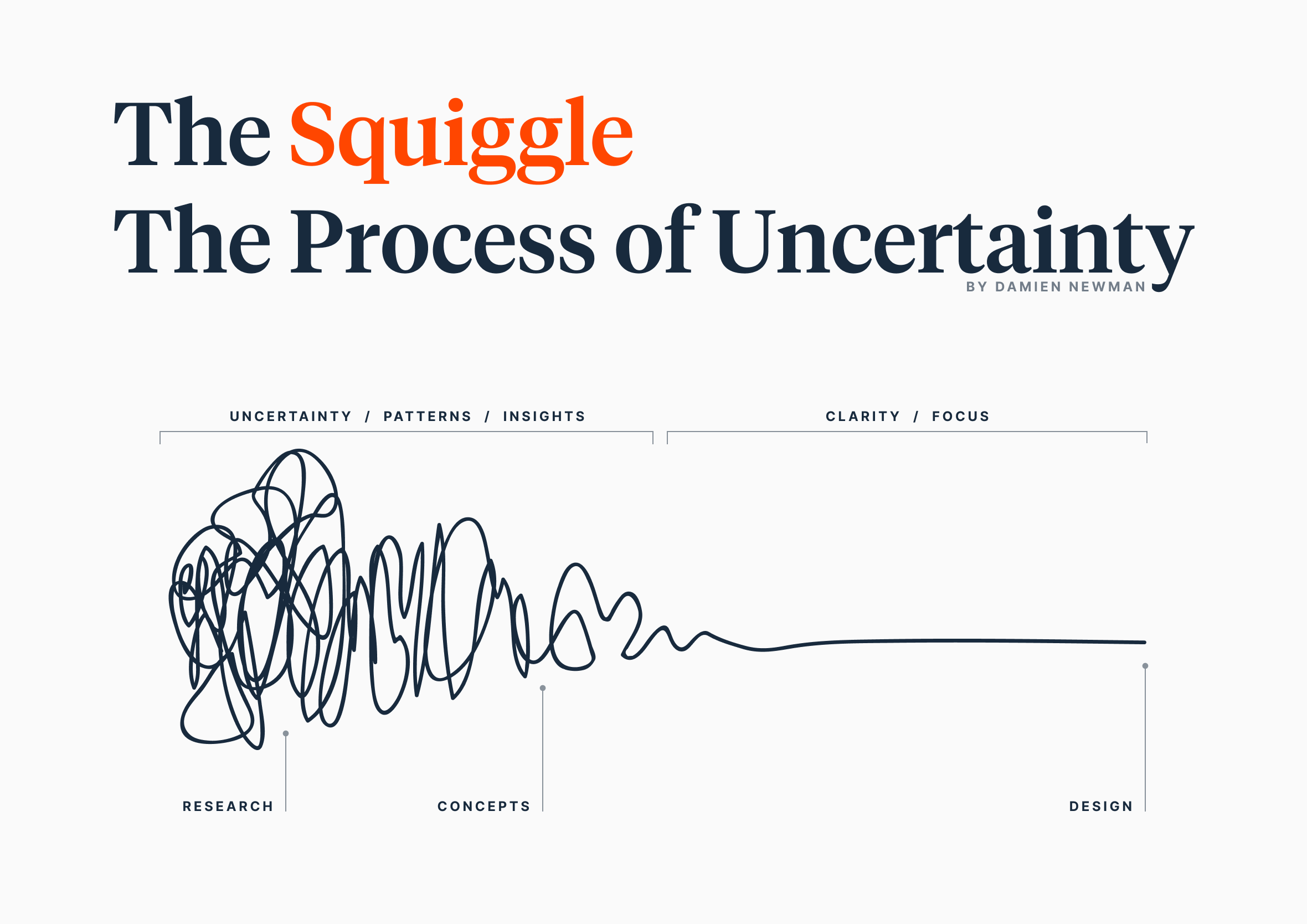
The last one I lean on isn’t really a process model at all, it’s more a picture I show people who’ve never worked with a designer before. Damien Newman’s Design Squiggle, a scribbled line that starts as total chaos and gradually settles into a single clear point, sums up what the early stage of a project actually feels like better than any diagram with neat boxes.
Newman sketched the first version while working as an illustrator and designer at Xerox Europarc in Cambridge in the early nineties, a European outpost of the famous Xerox PARC lab in Palo Alto that had already given the world the personal computer and the GUI. Their process there moved from an abstract notion, through research, to a concept, and only then to the design itself. Clients back then wanted none of that though, they only cared about the final bit, the pretty picture at the end.
Damien Newman’s “The Squiggle” or as I like to call it the chaos before the calm.
A decade later, working on a piece of complex desktop software, Newman needed to convince a client that the mess up front was worth trusting, in under thirty seconds, their limit, not his. So he sketched a handful of squiggly lines on a Wacom tablet, picked the best one, and labelled it. A few years after that, a colleague at IDEO found the sketch online and used it for the IDEO intern T-shirt design, which is when Newman decided to release it publicly under Creative Commons so anyone could use it properly, with credit.
It’s since turned up in books like Business Model Generation and Barry Katz’s Make It New, and Newman’s used it himself in client presentations everywhere from Japan to Korea.
I use it for the same reason he did. Yes, it’s a bit cheeky, a squiggly line standing in for an entire design methodology, though that’s exactly why it works. It sets the expectation that research and concept work will feel uncertain and slow before anything looks like a finished design, chaos before the calm, and that’s exactly as it should be.
4Ps: What motivates me
Over the years I’ve got clearer on what makes a role rewarding. These four things consistently show up in the work I’ve enjoyed most, and in the questions I ask when I’m exploring a new opportunity.
People
Great team culture where people have fun and create amazing work together
Projects
Projects that matter, built with collaborative teams who love seeing ideas come to life
Process
Design, technology and business working together to deliver great products
Problems
Solving real-world problems for customers while generating revenue for businesses
1. People
The best work I’ve done has always come from being around people who care about the craft, about each other and about the customer. Leadership sets the tone for all of that.
Do you have a Head of Design or someone at the executive level who advocates for the customer?
The term “Choose a boss, not a job” resonates with me. How would you describe your leadership style?
How do you reinvest in your people (e.g. training, conferences, mentoring)?
How do you support work/life balance?
What’s the size and structure of your design team?
2. Projects
I want to work on things that matter, projects with a clear purpose, where the team is invested in the outcome and proud of what they ship.
What problems are you trying to solve for your customers right now?
How do you decide which projects get prioritised?
How does the team collaborate day to day, from designers to developers to product?
What does a project look like from idea through to shipped?
How do you create space for teams to do their best work?
What’s a recent project you’re proud of, and why?
3. Process
Good process isn’t about following rules. It’s about making sure the right people are aligned, the customer’s voice is heard and the team can move with confidence.
How do you ensure you’re solving the right problems?
How is the customer’s voice brought into the decision making process?
How do you balance customer needs with business outcomes?
How do you share what you’ve learned with the wider team?
How do you prioritise between new features and foundational work?
How do you manage design and technical debt in the design system?
4. Problems
The most rewarding work sits at the intersection of real customer pain and genuine business value. I want to understand how a company thinks about both.
What’s the most significant problem your customers face right now?
How do you know when you’ve solved it?
How do you balance solving customer problems with the commercial realities of the business?
How does design get involved early enough to shape the problem, not just the solution?
What does success look like for the team when a problem is solved well?
How I like to work
The four Ps above are what I’m listening for when I’m the one being interviewed. The four Ds below are the reverse, how I actually work once I’ve got the job, and the models underneath each one are the tools I reach for to keep that work honest.
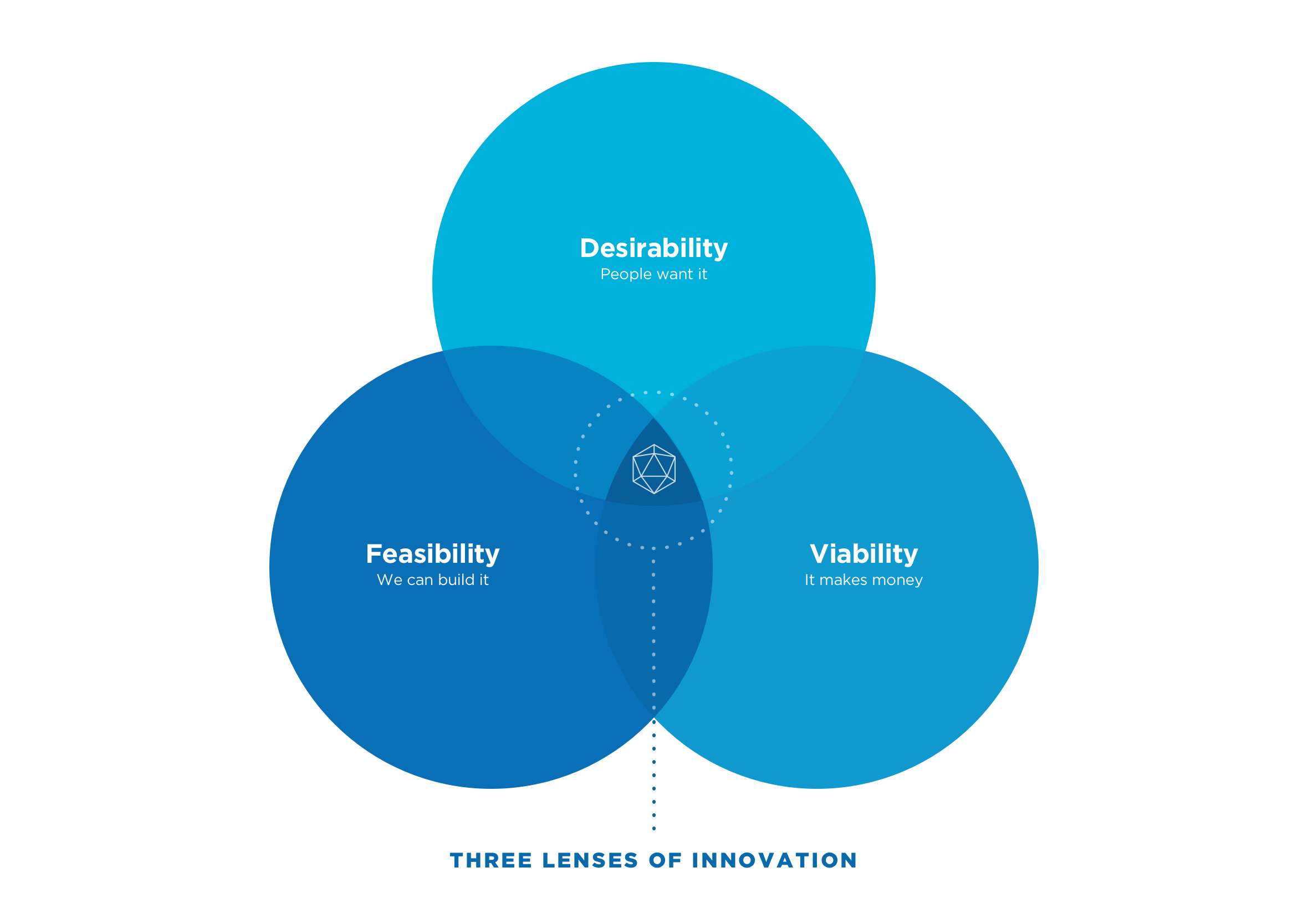
When it’s time to choose between a shiny new feature and a less glamorous foundational fix, I lean on the three lenses of innovation: desirability, feasibility and viability. Desirability asks whether people actually want it. Feasibility asks whether we can build it. Viability asks whether it makes the business money. Lose sight of any one of these and the whole decision drifts.
When deciding on what to build next, ideally the sweet spot is in the centre.
Chase viability on its own and you get a roadmap stuffed with revenue ideas that quietly lose their purpose along the way. Chase feasibility on its own and you get the tech-led, off the shelf option, easy to ship, yet it skips over what the user actually needs and rarely moves the needle for the business either. The sweet spot sits in the middle, the win, win, win where all three overlap.
On a healthy team, each lens usually has an owner: a design lead championing desirability, an engineering lead championing feasibility, and a product manager championing viability, together forming what’s known as the product trio.
4Ds: Delivering high quality
These four Ds are less a rulebook and more a set of checkpoints. Every project bends them a little, though none of the four ever really disappear. There’s no magic button in any design tool that makes a screen feel right on its own, no shortcut that swaps out a proper process for good instincts alone. What holds the four together is having something reliable to fall back on when a project gets messy, a structure I trust to produce the standard of work I know I’m capable of, sometimes even surprising myself. I’ve written up how these four phases actually play out across ten real design process steps, from the first client conversation through to shipping, if you want the fuller version.
Discover
Understanding the underlying problem and gathering deep context from users
Define
Turning insights into early sketches and user flows with the engineering team
Design
Setting up design foundations and building high-fidelity, interactive prototypes
Deliver
Running walkthroughs, championing the user, and shipping polished, accessible work
Design thinking
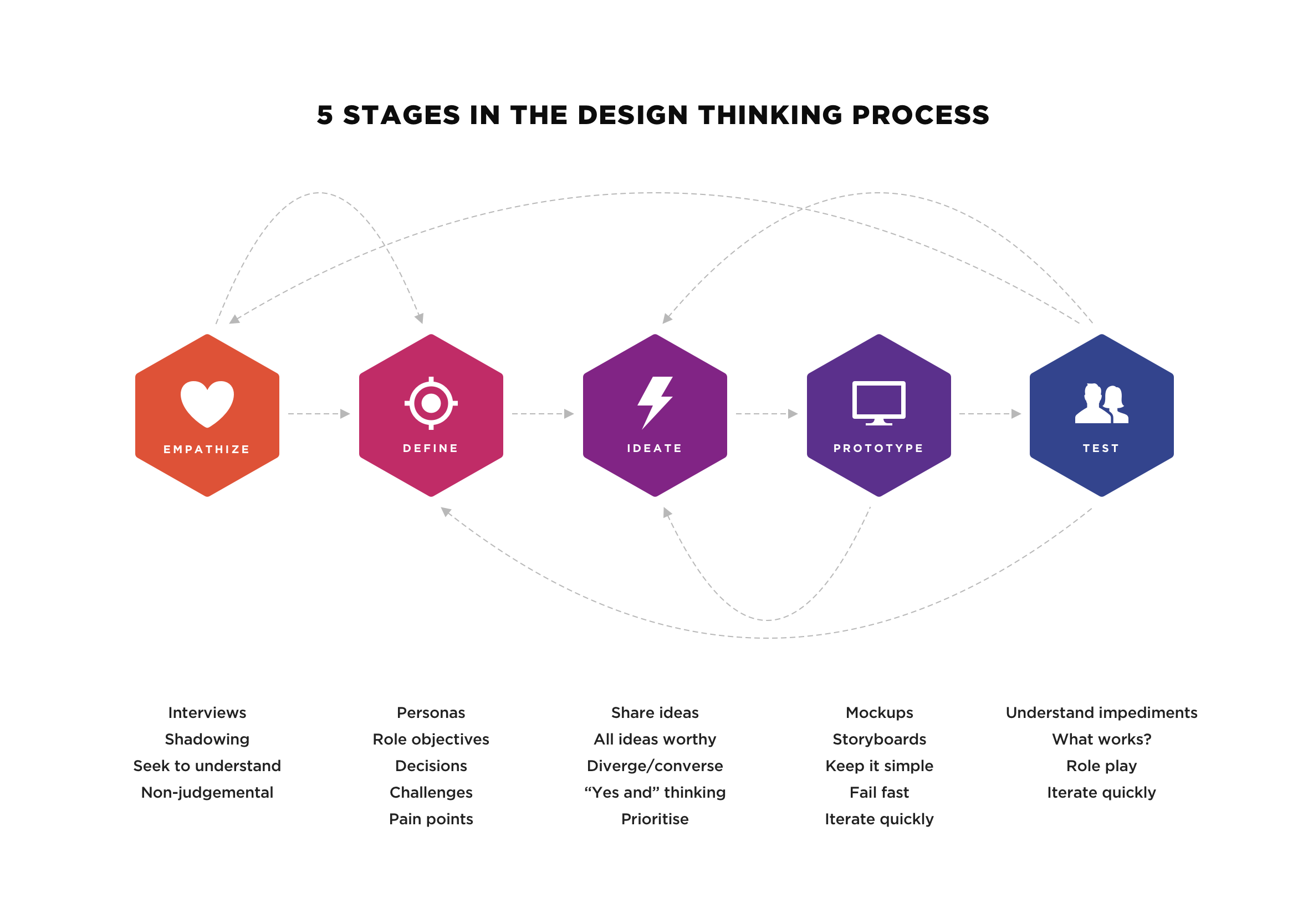
For me, Stanford d.school’s five stages of design thinking, empathize, define, ideate, prototype and test, click in a way other models don’t. It’s the same framework I used on the ACC health and safety app, and it’s usually the easiest one to explain to a stakeholder or client who’s never heard the term “user research” in their life.
Stanford d.school’s five stages of design thinking, empathize, define, ideate, prototype and test.
None of the five stages are strictly one-way either. I’ll loop back to empathize halfway through a prototype if testing throws up something I didn’t expect, and that looping is the point rather than a failure of planning. Stanford describes it as a cycle, not a checklist you tick off top to bottom.
It’s the same untangling that tape at the top of this article is getting at. Empathize and define are the mess, digging through interviews and site visits before any real shape appears. Ideate and prototype are where a shape starts to hold, usually a rough one. Test is where you find out whether you were right, and often you’re only half right, which sends you straight back to empathize again.
The double diamond
The double diamond covers similar ground, discover, define, develop and deliver, though I’ve never taken to it quite as naturally. Every version I’ve come across seems to draw the boxes differently. Sometimes it’s just problem and solution, sometimes someone’s laid the 4Ds over the top, and sometimes there’s so much annotation crammed onto the diamonds that the actual point gets lost. The official version from the Design Council keeps it plain, worth a proper look if you want the source rather than someone’s remix. Richard Eisermann, the Design Council’s former Director of Design and Innovation, wrote a good piece questioning whether it’s still fit for purpose.
The double diamond itself has a specific origin story. The Design Council built it in 2003 after Eisermann, then their Director of Design and Innovation, asked his team a simple question: how do we actually describe the design process? They landed on a shape borrowed from Hungarian-American linguist Béla Bánáthy’s work on divergent and convergent thinking, and it stuck. Government agencies like the NHS and the UK’s Government Digital Service have used it since 2005.
There’s also IDEO’s take, inspiration, ideation and implementation, three stages instead of five, which some people find easier to hold in their head. Whichever version clicks for you, they’re all circling the same idea: understand before you solve.
In practice, I reach for whichever one the room needs. Design thinking suits a team that needs to stay close to real user empathy and iterate without a rigid sequence. The double diamond suits a stakeholder-heavy project where people want to see project milestones laid out plainly before they’ll trust the process at all.
English as a second language
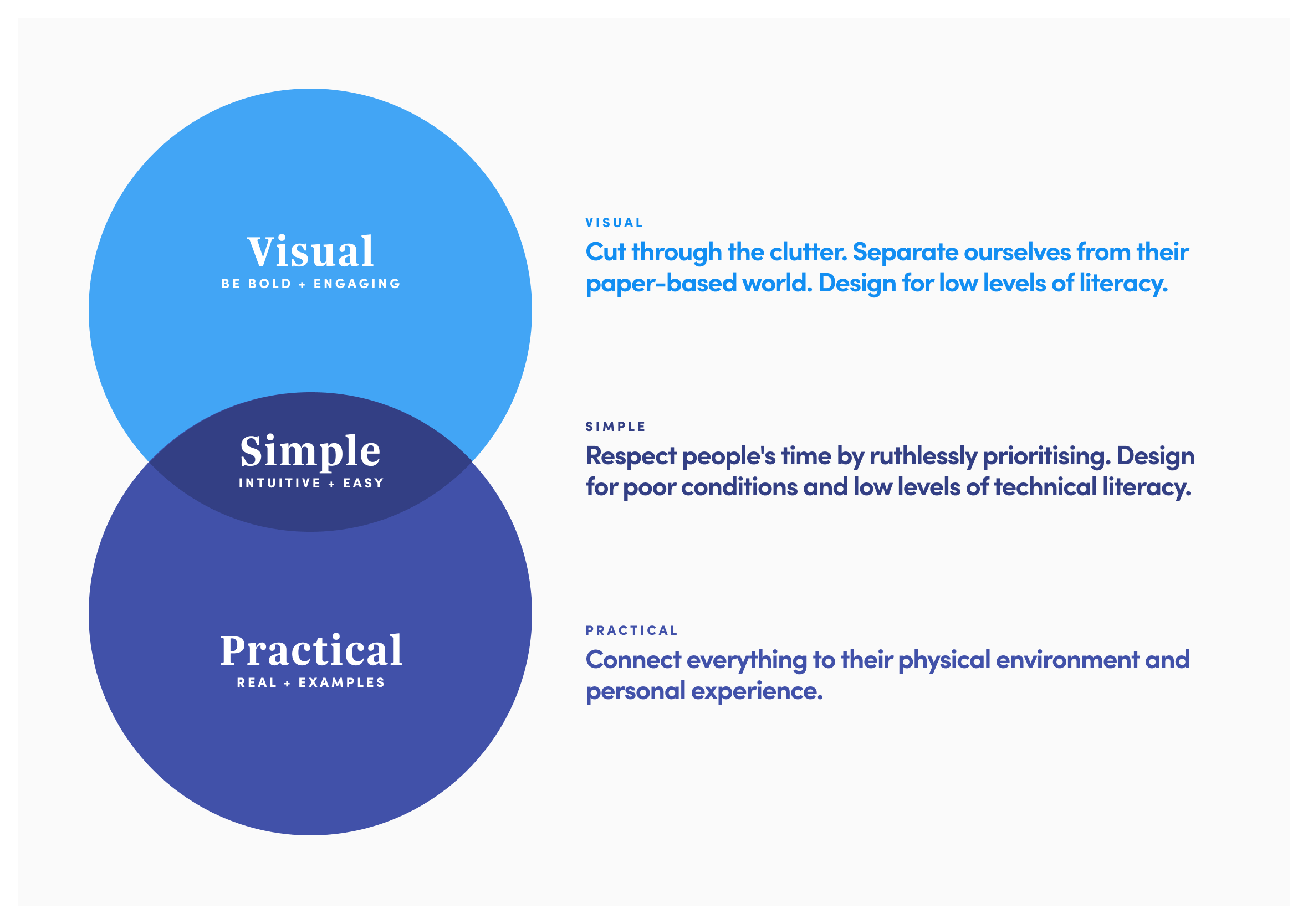
On that same ACC app, we agreed on three design principles early and used them to check every screen and flow: visual, simple and practical. It mattered more than usual here, since a lot of the people using the app on site had English as a second language (ESL).
Visual meant leaning on diagrams, iconography and colour rather than blocks of text. Simple meant stripping the interface back to what people needed in the moment, nothing more. Practical meant plain, concise language, no jargon, so instructions landed the same way whether someone had been on the tools for twenty years or two weeks.
Visual, simple and practical: designed to make sense to everyone on site, whatever their first language
Bringing it all together
The roles I’ve enjoyed most have been where all four Ps, and the four Ds that follow them, come together: people who care, work that matters, a process that respects the customer, and problems worth solving. None of that happens by accident though, it takes a set of working models to keep it aligned once the project’s actually underway.
That’s what the frameworks above are for. The three lenses keep me honest about what’s worth building next. Stanford’s design thinking, or the double diamond, or IDEO’s version, whichever fits the room, gives everyone a shared shape for the work. Visual, simple and practical keeps the outcome usable by the people who actually have to rely on it. And the squiggle, the very first thing we looked at, buys me the trust to sit in the mess for a while before rushing to a tidy answer.
Different situations call for a different one of these, though they’re all circling the same thing: people who care, doing work that matters, in a way the customer can actually feel. When those line up, the work has soul.