Core Banking: Streamlined banking app
Simplifying the everyday banking experience (balances, transfers, payments and cards) to create a minimal, transparent and informative mobile banking app.

What is Core Banking?
At its heart, Core Banking is everything you need daily and nothing you don’t. It was designed from the ground up to be super fast and to strip out anything not needed for everyday banking. Everything you need, nothing you don’t!
Concepts, brainstorming and sketching
When beginning a project and capturing ideas, I prefer to go low-fidelity and sketch with pen and paper to generate as many concepts as possible, exploring high-level ideas before investing too much time in the design phase. From there I’ll either produce wireframes or jump straight into design and rapid prototyping to validate ideas and assumptions.
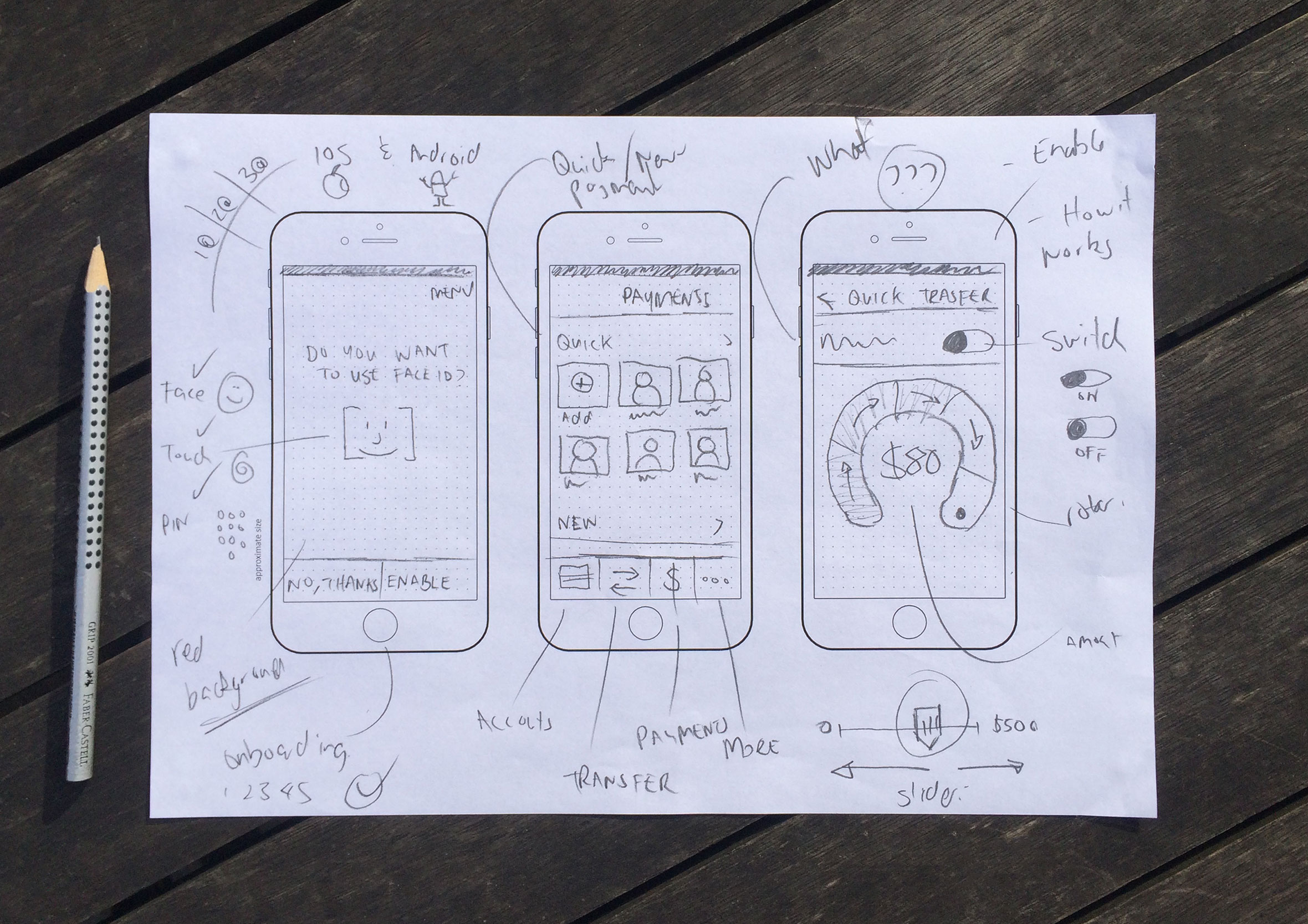
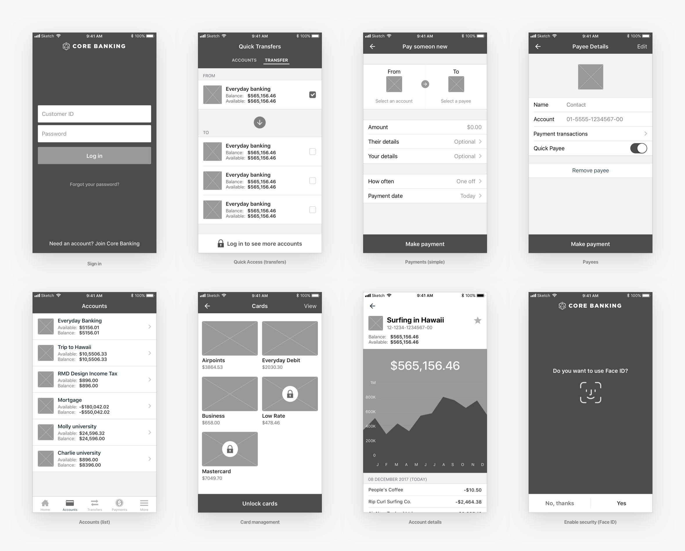
Wireframes to test user flows
Once I have a few concepts I want to push further and test, I’ll create simple wireframes to see how the screens interact and help inform user flows.
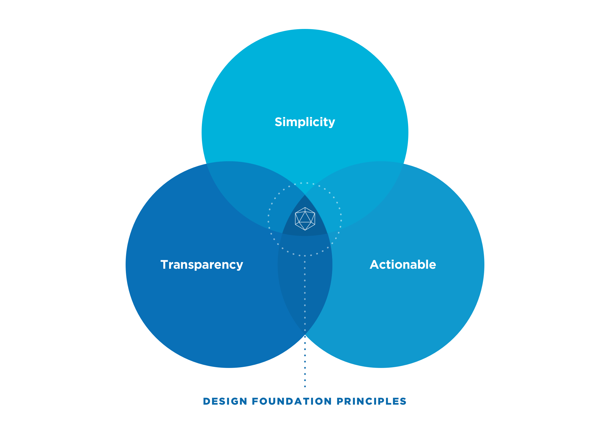
Clearly defined design principles
At the beginning of the project, we agreed on three basic design principles to act as our north star when designing the user experience. We wanted the app to be easy to use, transparent (clear information on fees and interest rates), and to improve people’s financial literacy by making them feel informed and empowered about their personal finances.
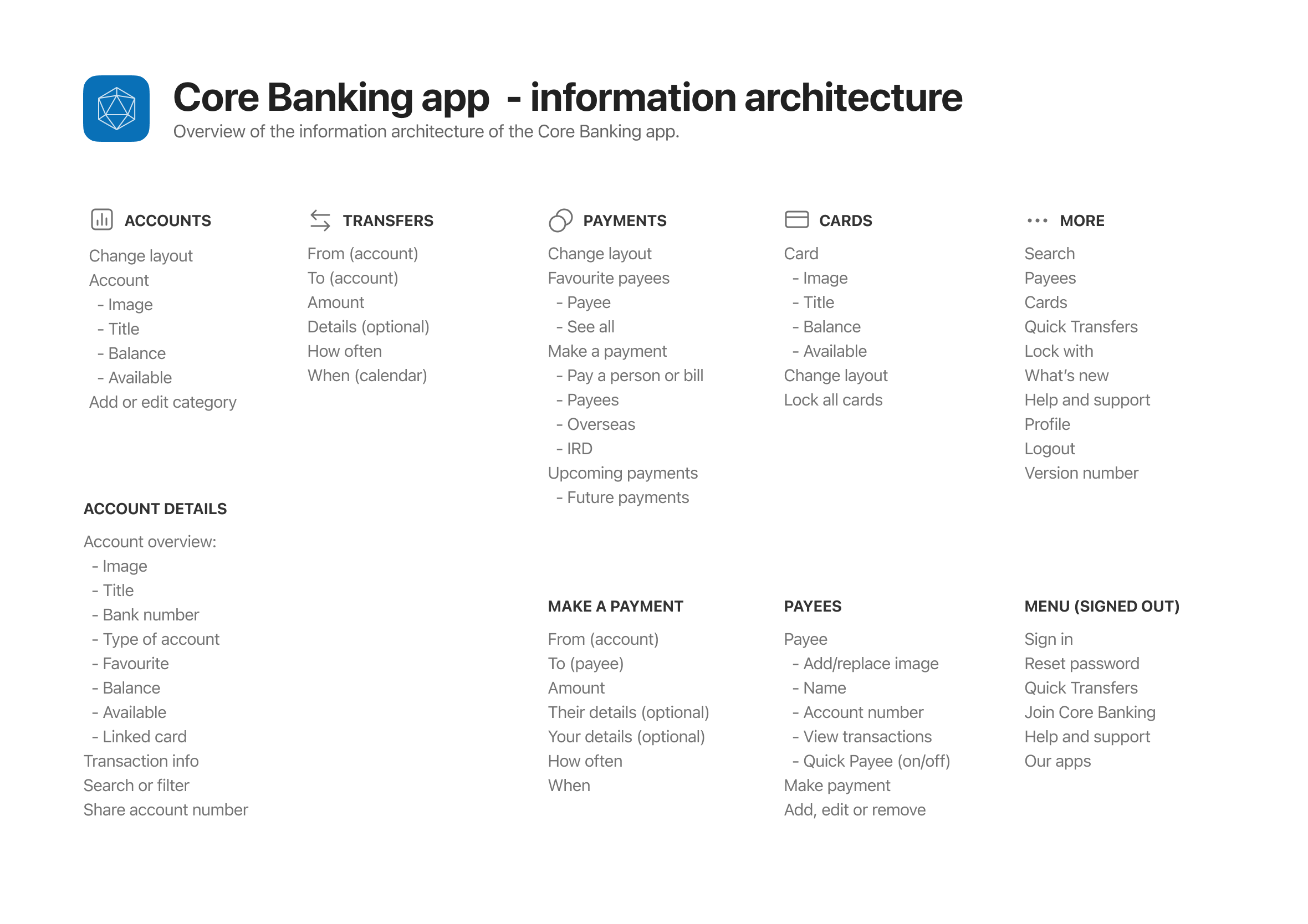
Information architecture
The information architecture maps out which screens are needed and all the user interface elements that make up the structure of the app. Having everything in one place makes it easier to identify areas for improvement or gaps in the user experience.
Usability testing and user interviews
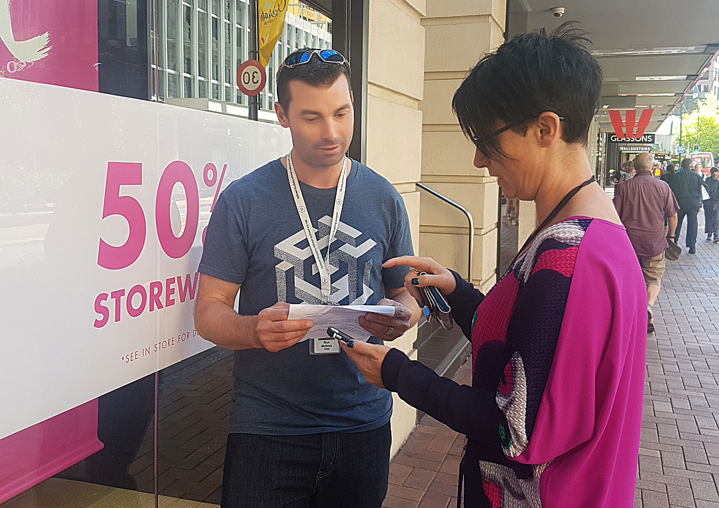
Regular usability testing cycles were completed throughout the project. Most were done in the office using question and task-based scenarios to get customer insights and validate assumptions and concepts. To validate smaller design decisions, we headed out with a digital prototype, a short list of questions and chocolate to carry out guerrilla testing on the streets of Wellington, New Zealand.
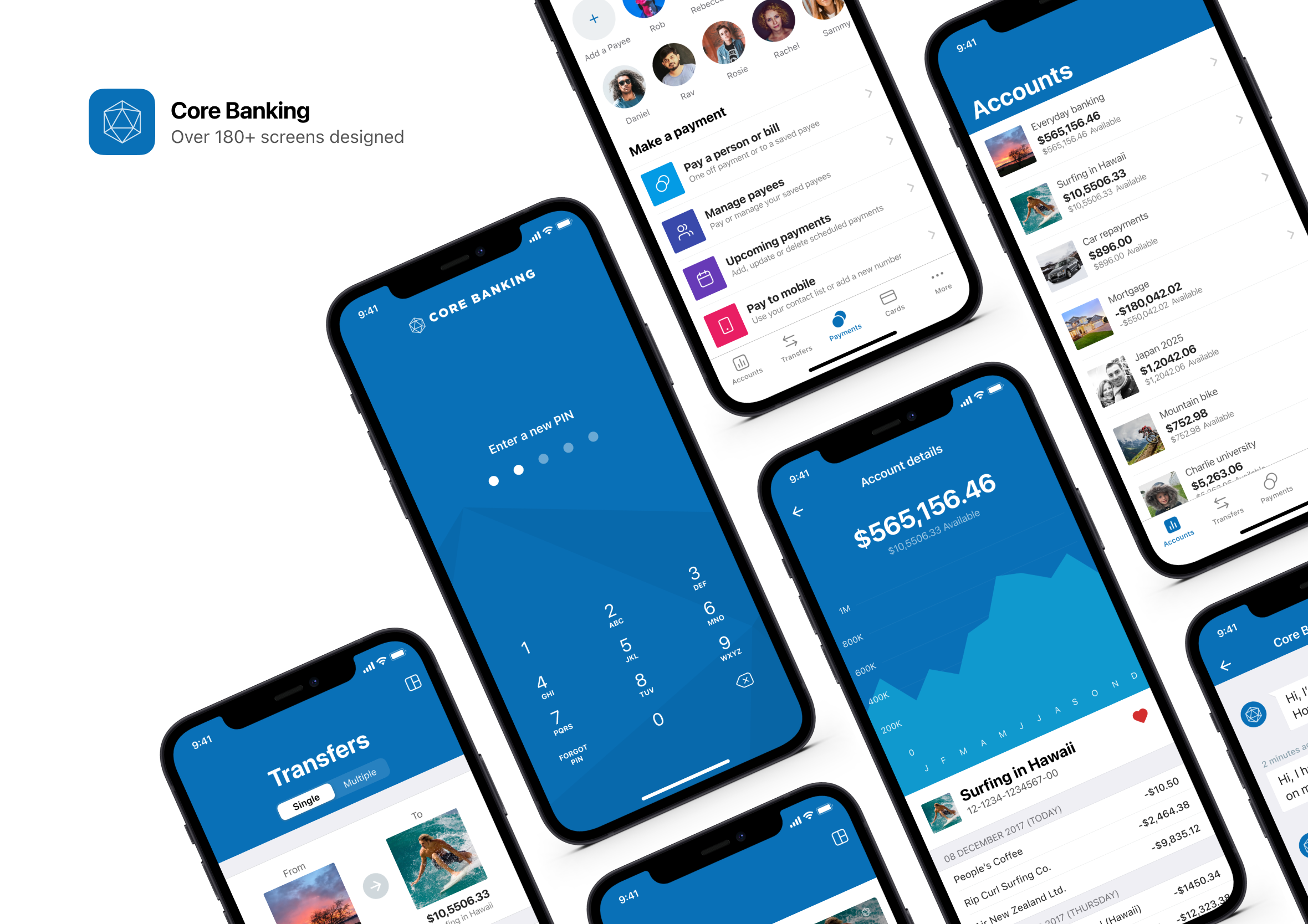
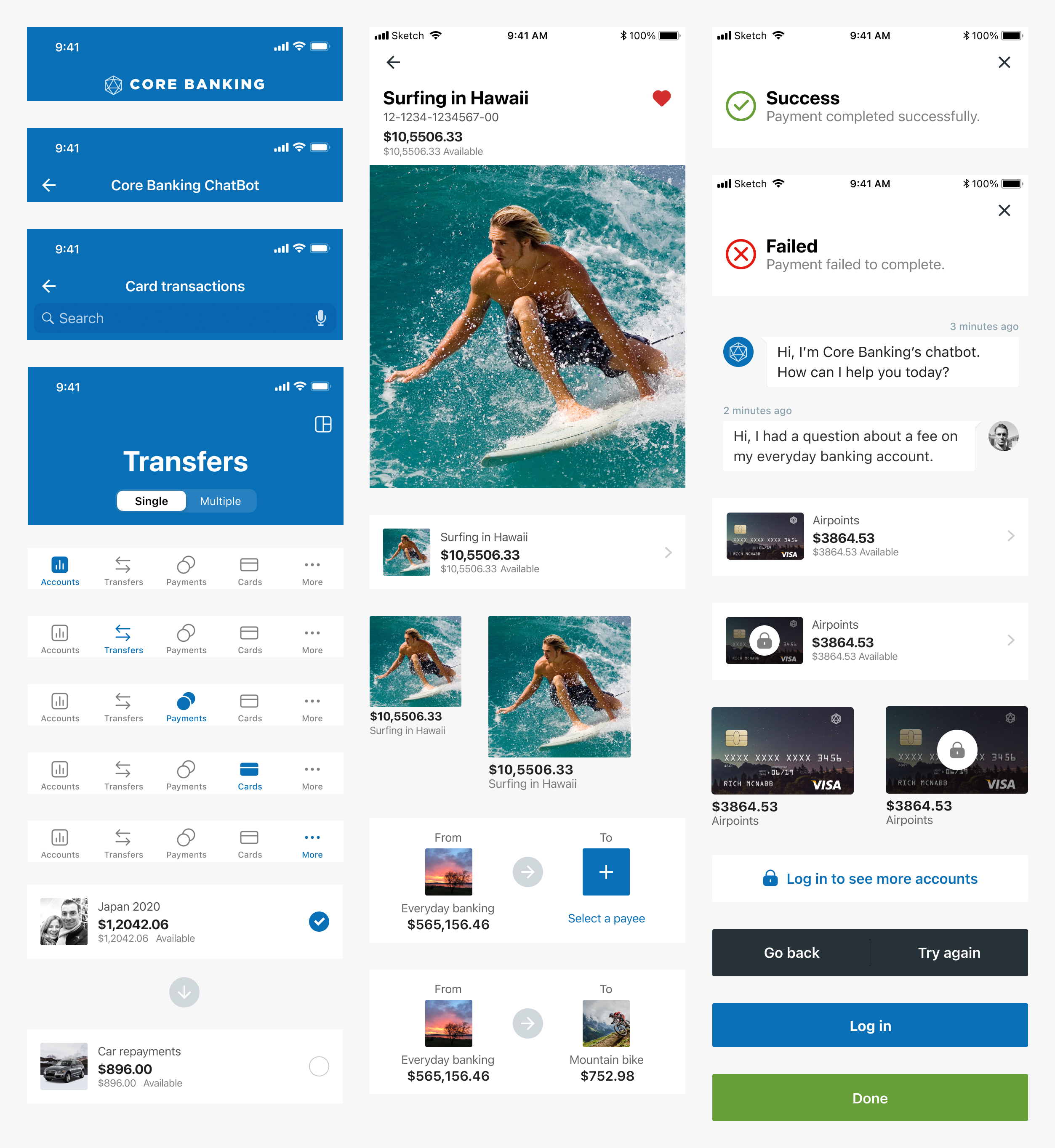
More than 180 screens
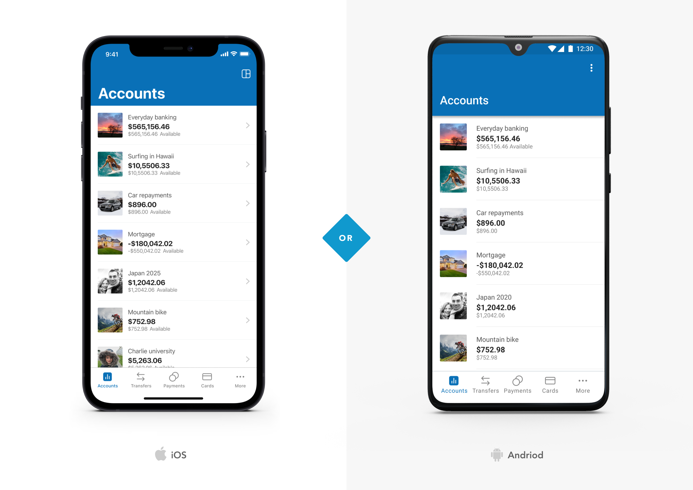
Over 180 unique screens were designed for the Core Banking mobile app, and that was just for iOS! Additional screens were then adapted for Android users.
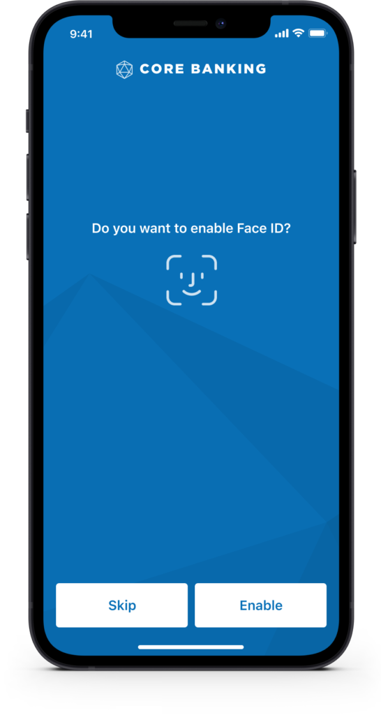
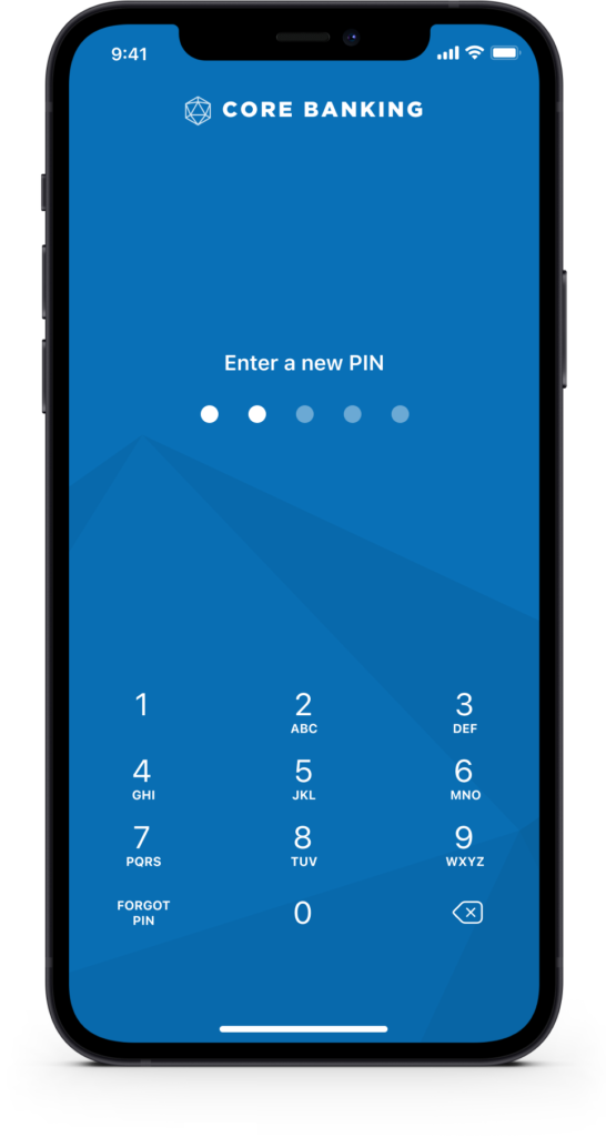
Improved speed to log in
Improving the speed at which people can log in helps them carry out quick everyday banking tasks. We included support for Face ID and Touch ID (biometrics), PIN, with a fallback to username and password.
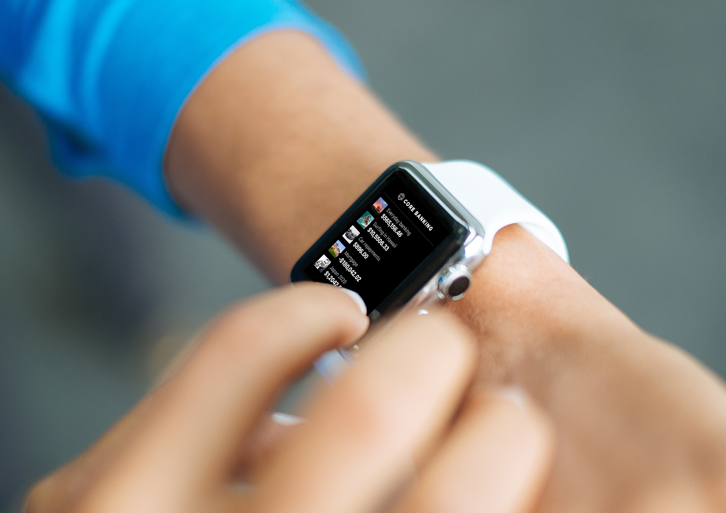
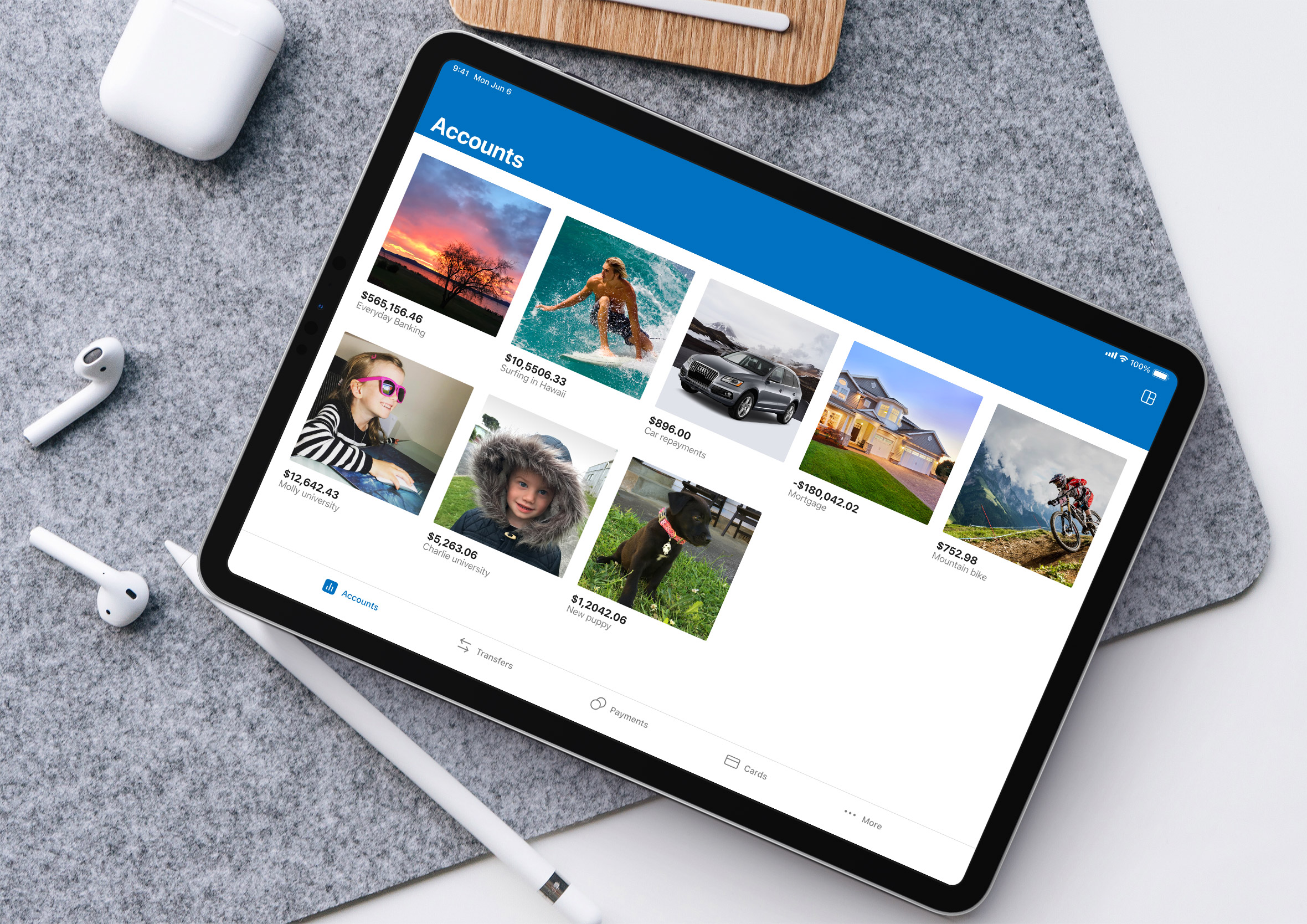
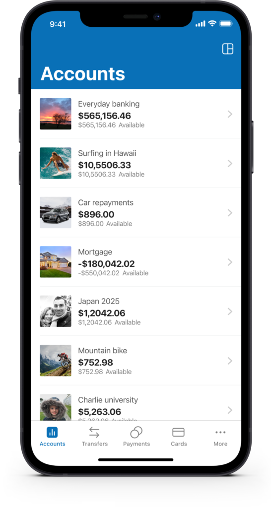
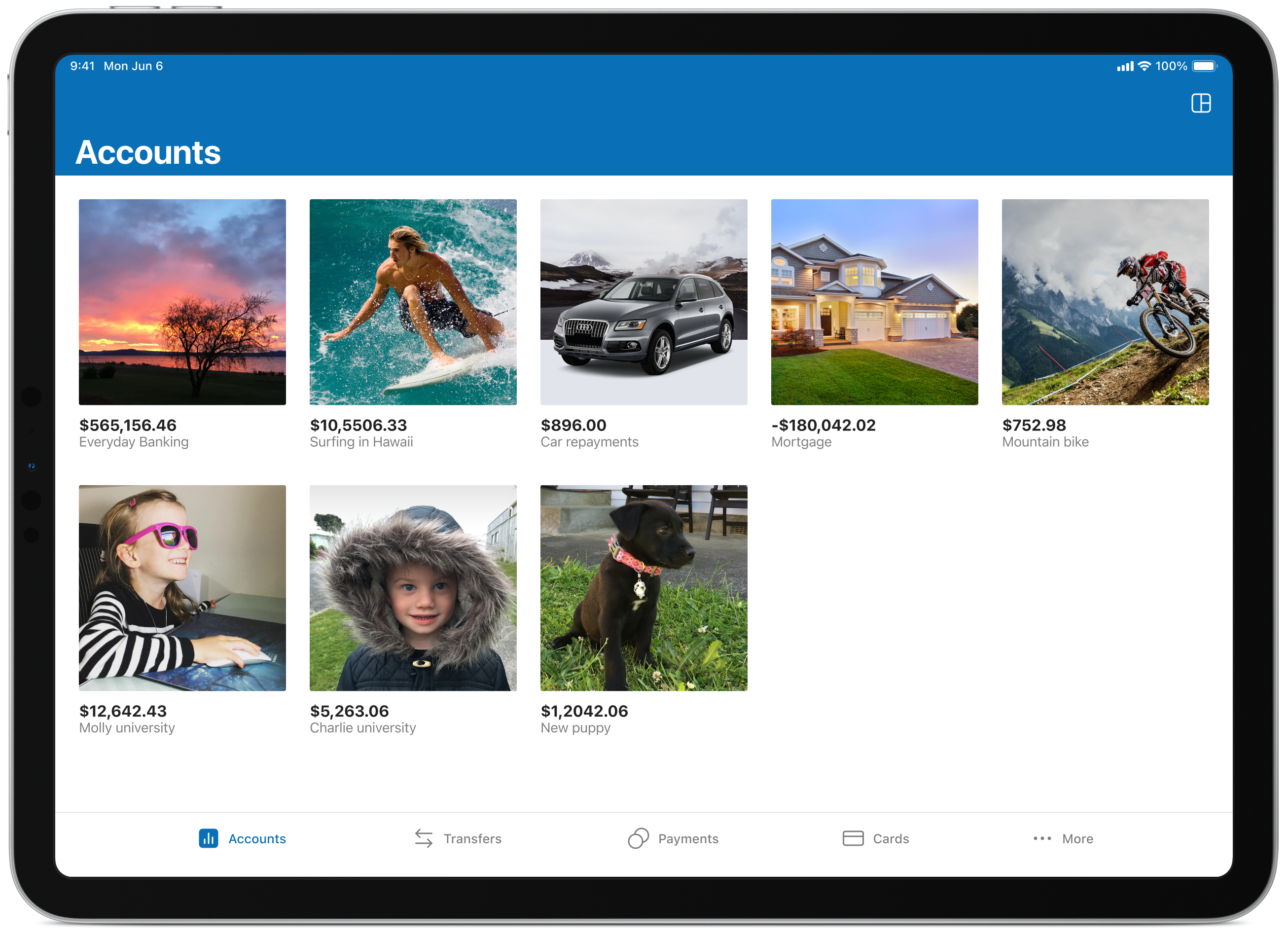
Customising the accounts view
By giving users the ability to customise certain aspects of the app, we hand them a little more control over the information they’d like to see. Options include the ability to reorder accounts, change the view, and choose whether to display both balances and available balances.
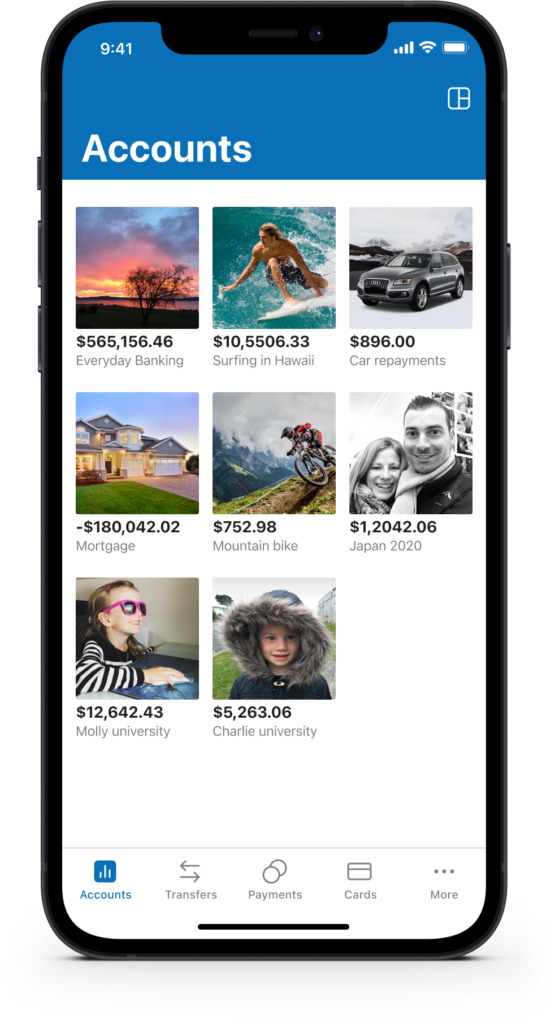
Graphs and images motivate
We looked at large imagery (goals and moods), data visualisation and the ability to pin accounts you use most frequently so they’re easier to find and interact with. Graphs give a great indication of how well you’re tracking, and imagery is a constant reminder of the financial goals people are working towards.
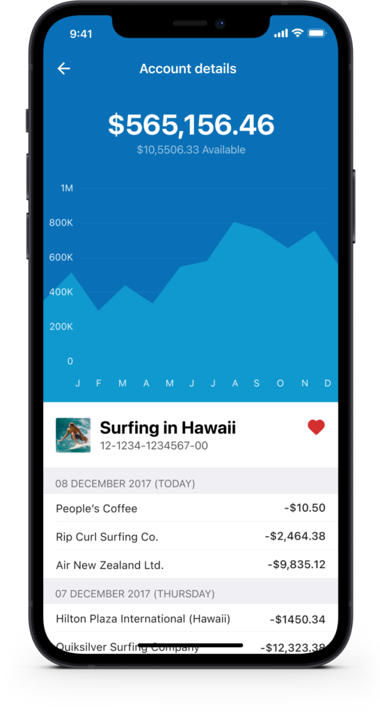
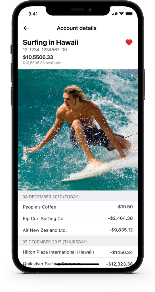
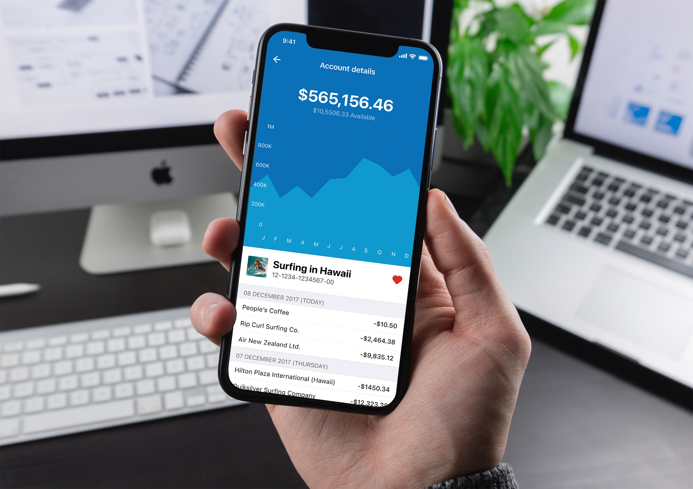
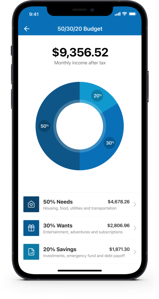
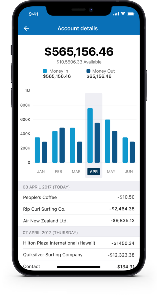
Financial insight built in
Knowing where your money goes is just as important as managing it. The account detail view breaks down spending month by month with a clear bar chart and a dated transaction list below. The 50/30/20 budget tool automatically splits take-home income into needs, wants and savings, giving users a practical framework without needing any financial expertise.
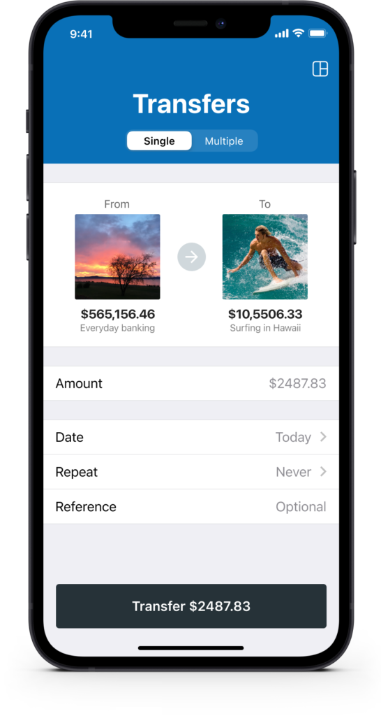
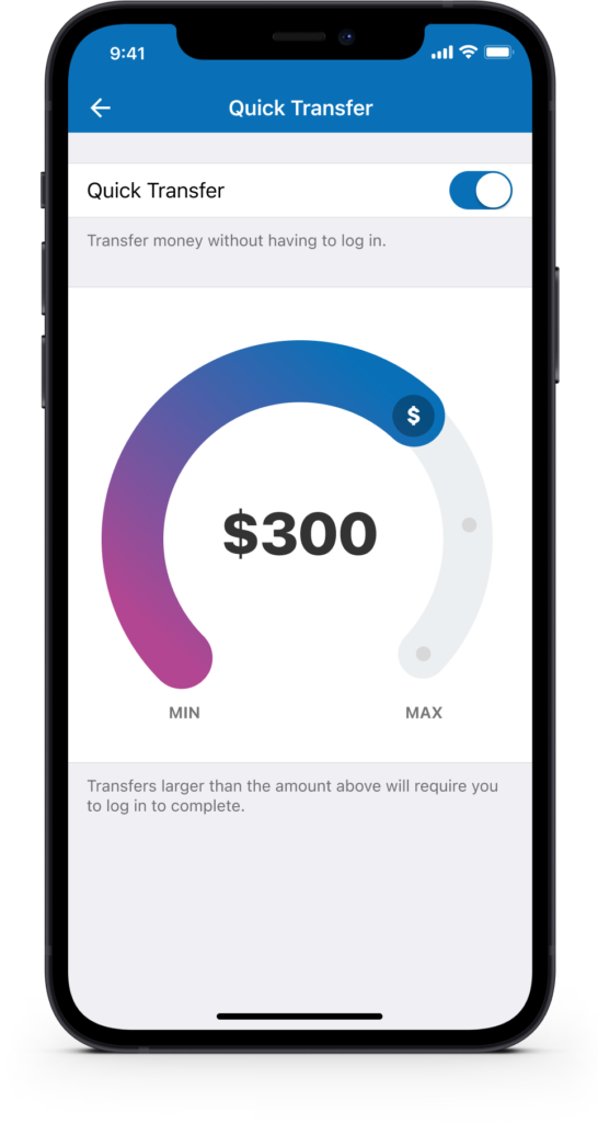
Quick transfer and multiple transfers
Users can quickly transfer money between accounts without having to log in if they choose. They can also complete multiple transfers (bulk transfers) from one account in a single go.
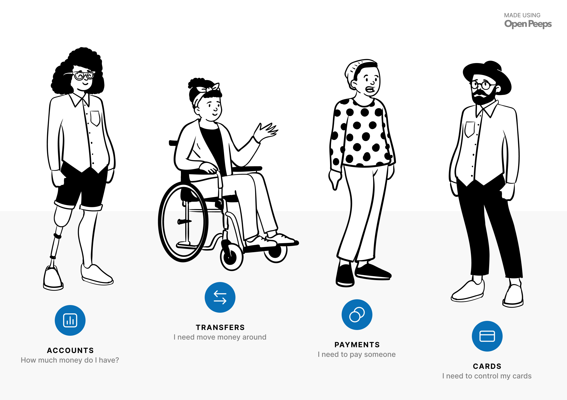
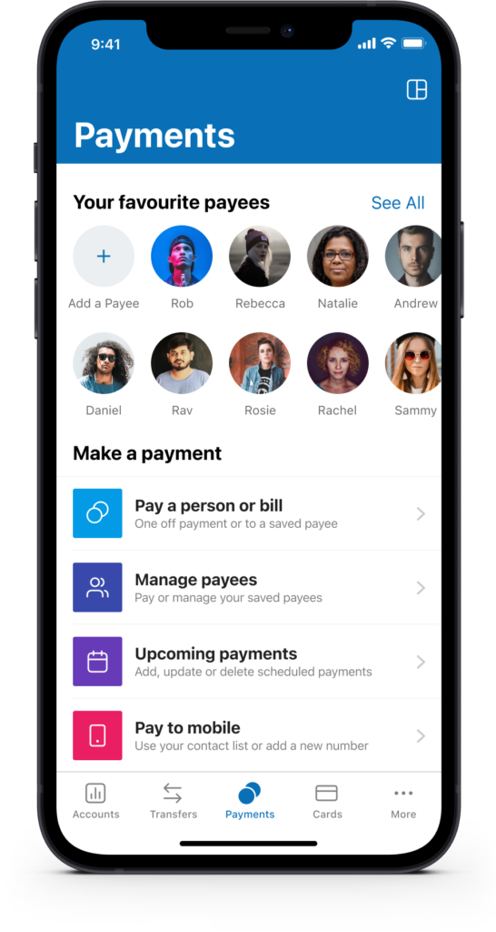
Payments and manage cards
During user research, we discovered that most people pay a handful of payees on a regular basis. We surfaced favourite payees to speed up this process in the form of “Quick Payees.” We also gave people the ability to manage their cards in the event they misplace their wallet or have it stolen.
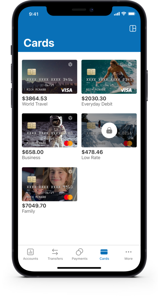
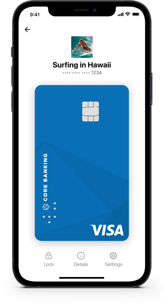
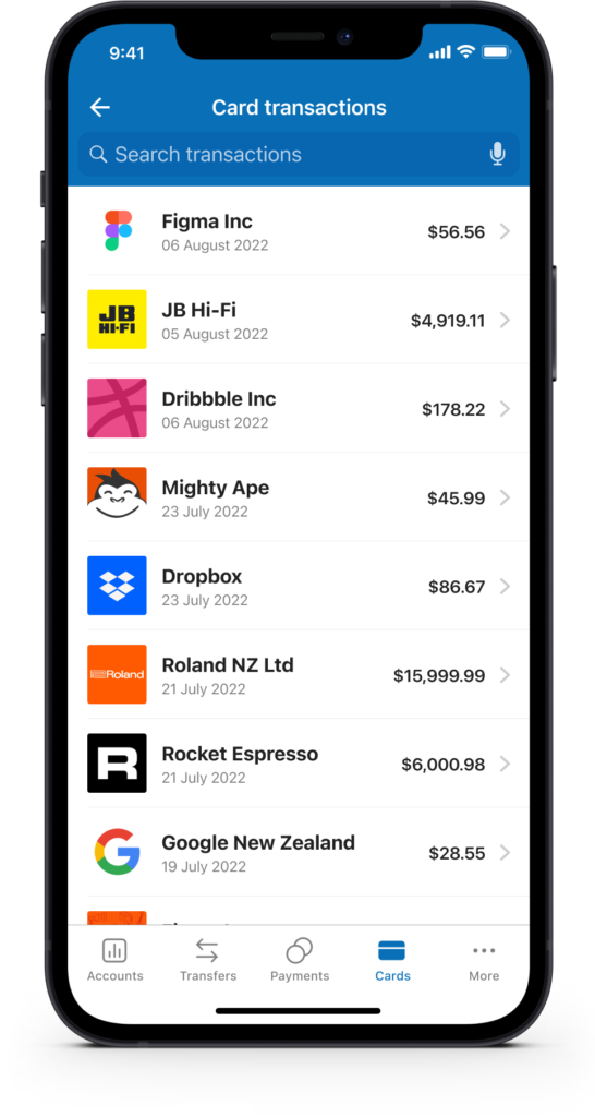
Card control and transactions
You’re in complete control of your card and finances. You can show and hide account balances and limits, lock and unlock cards, and use other card controls to help prevent fraud or manage a misplaced card.
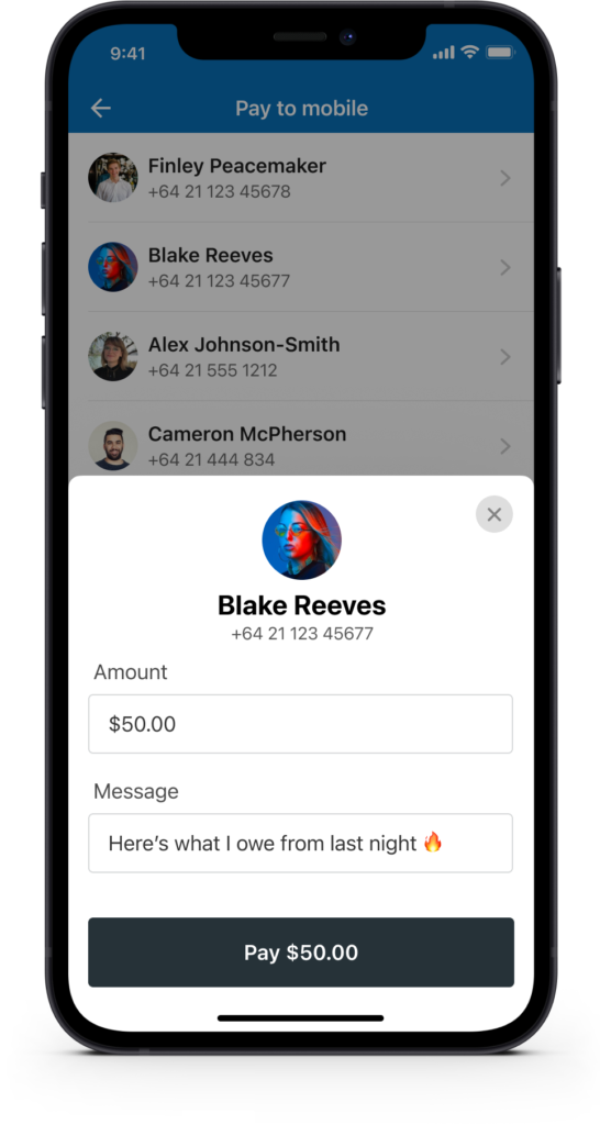
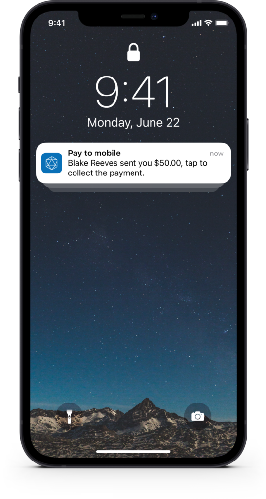
Pay to mobile
Send money directly to a mobile number for the recipient to collect. This removes the need to know someone’s bank account details and lets you include a personalised message too.
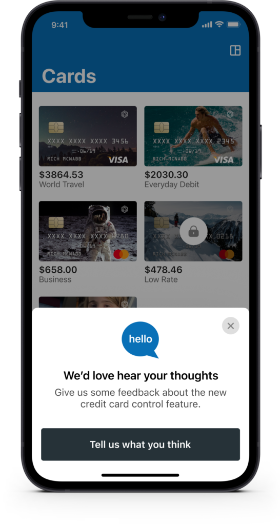
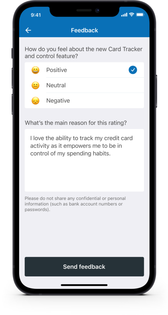
Customer feedback and metrics
To validate assumptions and measure how well (or not so well) you’ve solved a customer problem, it’s always worth asking for feedback, ideally right after they’ve interacted with a feature. It’s a great way to gather insights and potentially recruit participants for future usability testing.
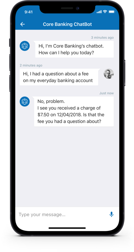
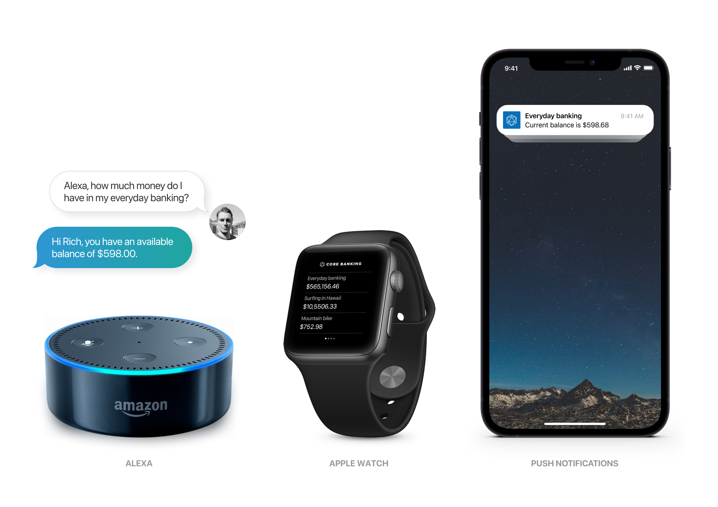
Financial advisor in your pocket
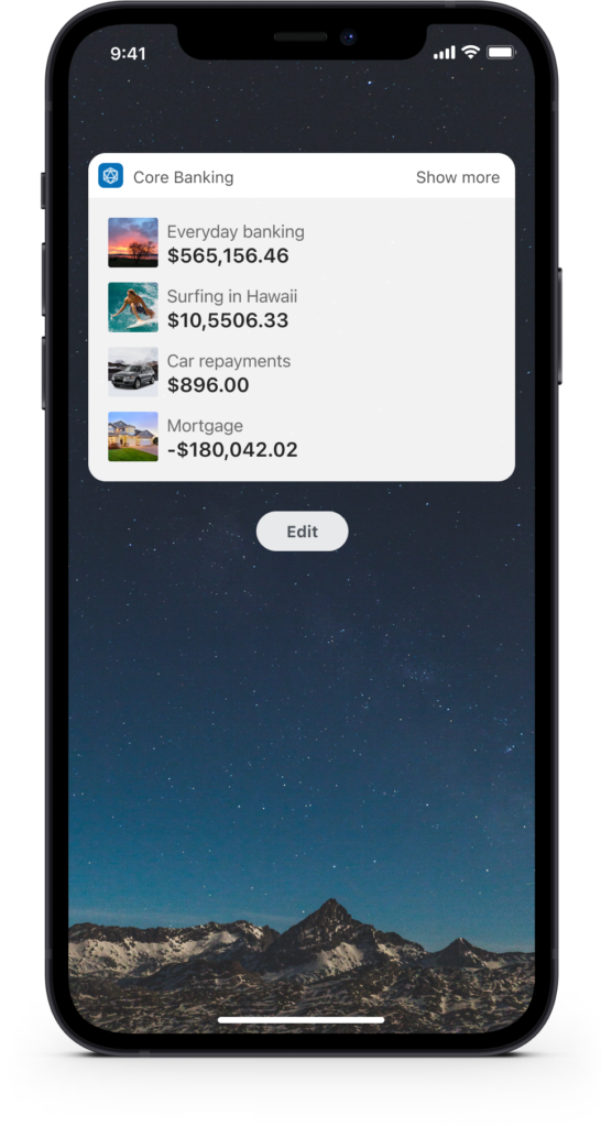
The ability to self-serve and get answers to frequently asked questions, with context around their activity, helps reduce calls and emails to the bank and gets people the answers they need faster. Enabling the iOS widget also lets users check balances with a quick swipe to reveal the widgets screen.
Yes, it’s available on tablet
Sometimes it’s just easier on a tablet. The design system stretches and scales to accommodate people who prefer to get things done on their iPad.
How much money is in my account?
Analytics showed that 80% of app activity is simply people checking their balance to make sure they have enough money. I challenged myself to come up with as many concepts as possible to make that repetitive task faster and less painful. There are some clear concerns around privacy and legal considerations that would need to be worked through, but it was a great exercise to experiment with.
Design system and pattern library
Every user interface component was designed using the Atomic Design approach recommended by Brad Frost. Elements are reusable to speed up both design and delivery, ensuring fast turnaround times and getting updates into the hands of users sooner.
iOS and Android designed in harmony
Throughout the design process I was constantly thinking about how the app would look and work across the wider ecosystem, covering iOS, Android and web. The core UI would remain consistent, but we’d play to the strengths of each platform to make it feel native and cohesive.
Final design
Before launch I created a series of mockups for the marketing team to use across email, Facebook and Twitter to help promote the new app and drive early adoption.