Mind maps, concepts and sketching
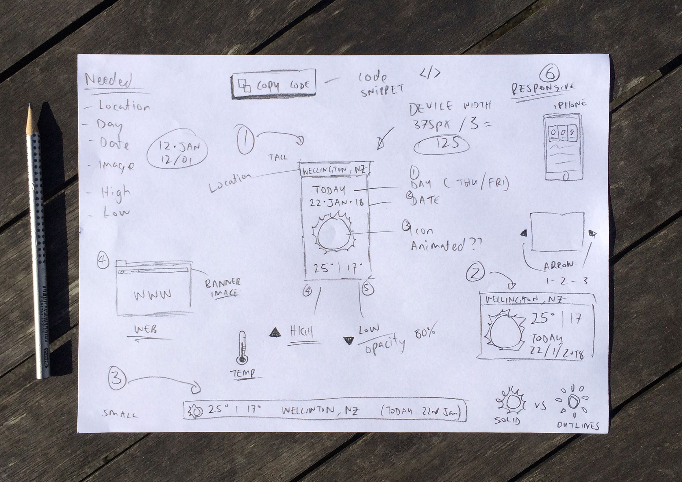
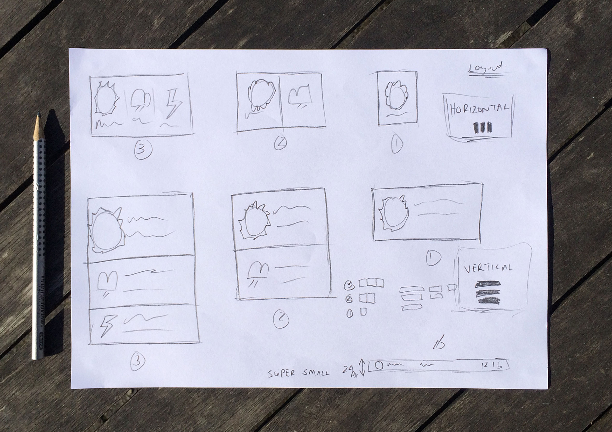
I had a few different ideas wanted to try and incorporate into the final design. By doing a mind map of ideas, concepts and layouts I was able to quickly capture them to be able to explore them in more detail later in the design process.
Create and preview
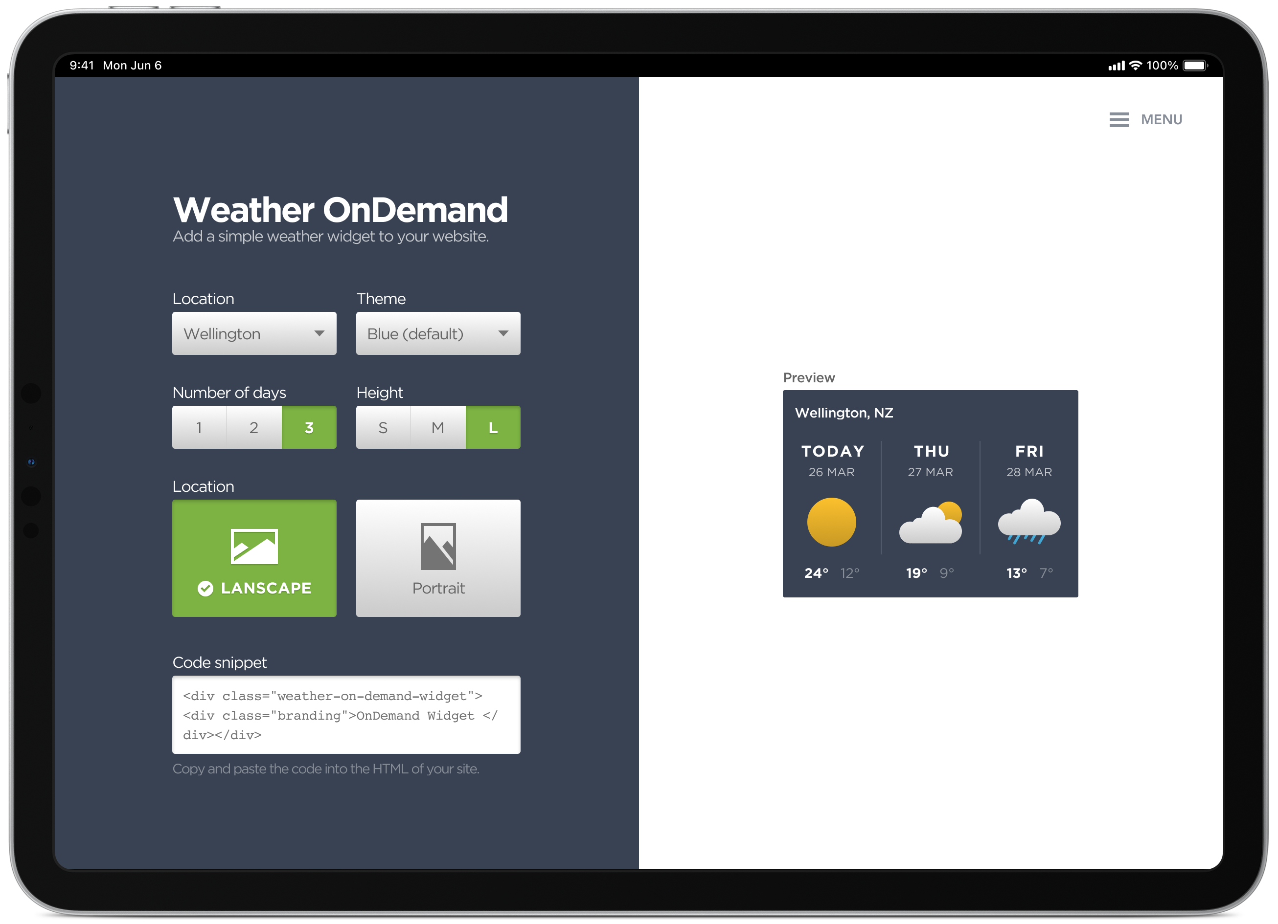
The simple dashboard allows you to configure various colour and layout options to easily adjust the look and feel of the widget. This generates a code snippet which you can then copy and paste into the HTML of your site.
Colour selection experiments
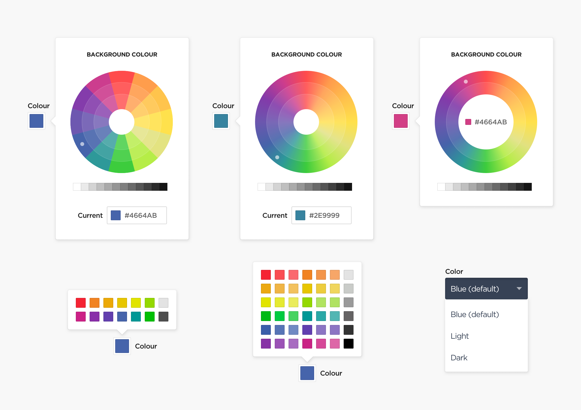
I experimented with various colour selection option but in the end, I thought the predefined colour theme would eliminate people creating colour schemes similar to that of a 90’s MySpace page.
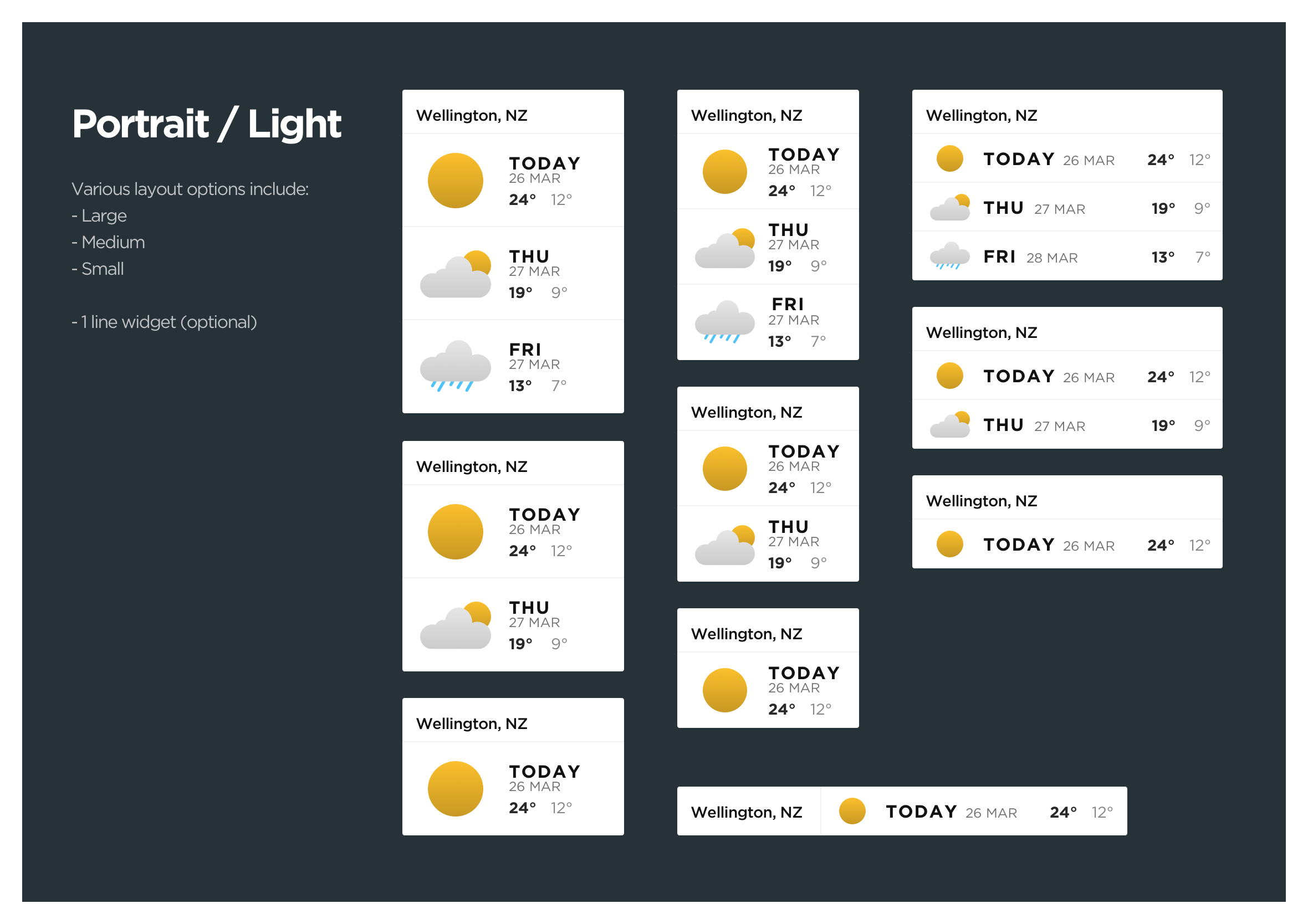
Different layout options
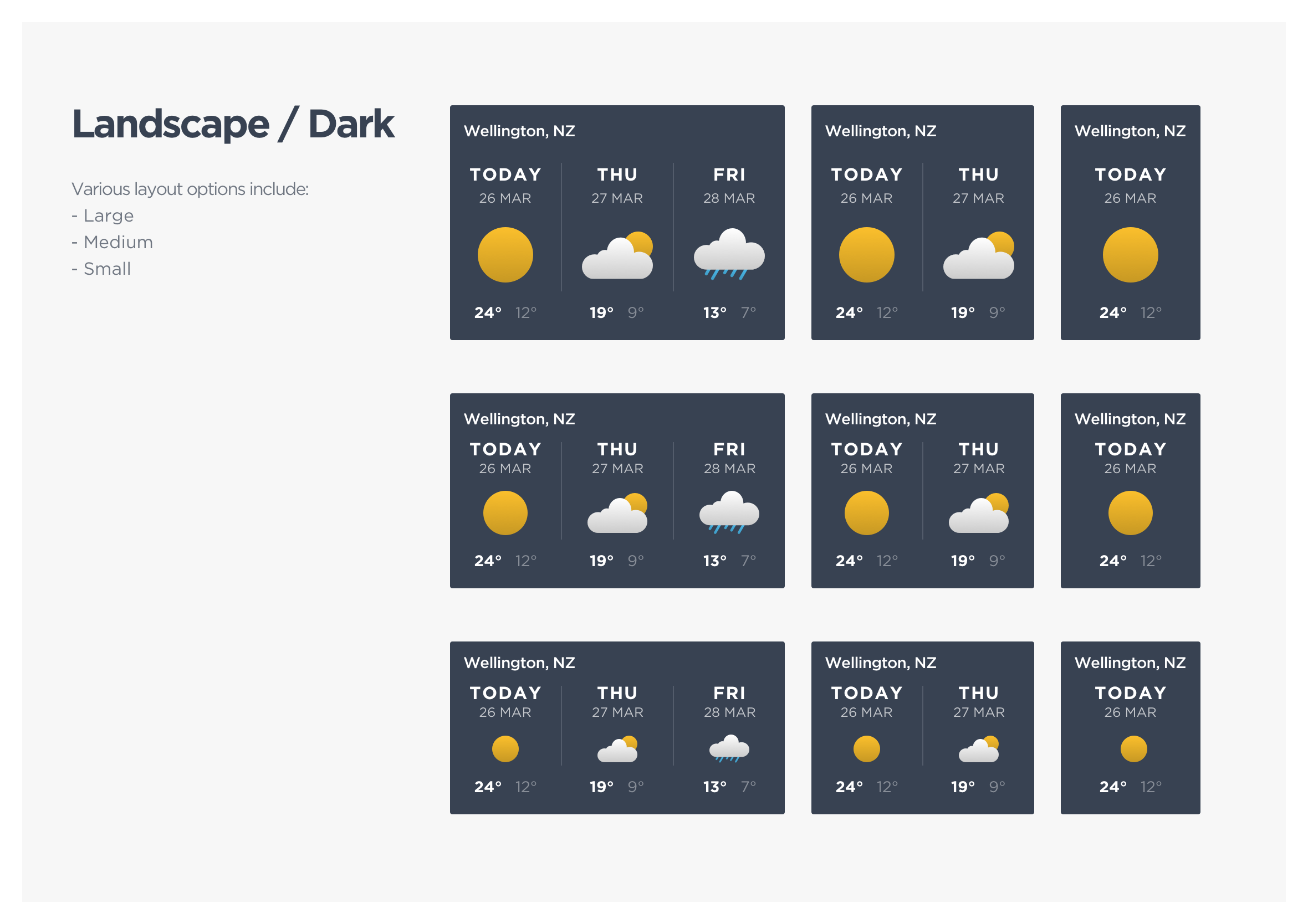
Here are just a few of some of the weather widget options. A live preview is always present during the creation process allowing you to find the desired colour palette and layout options for your website.
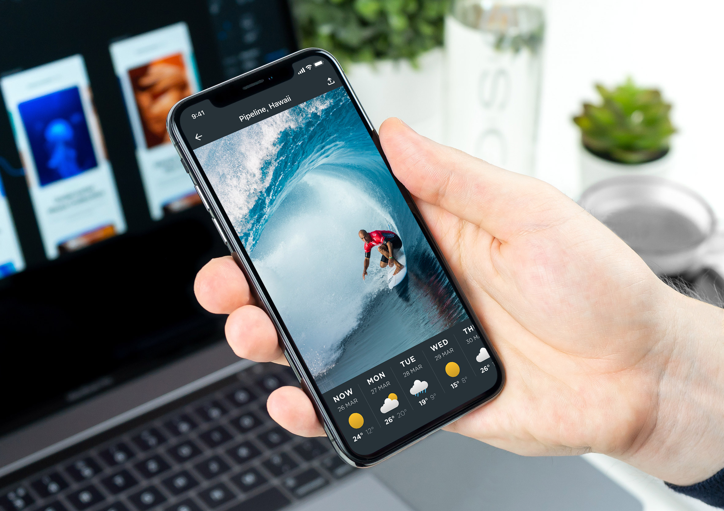
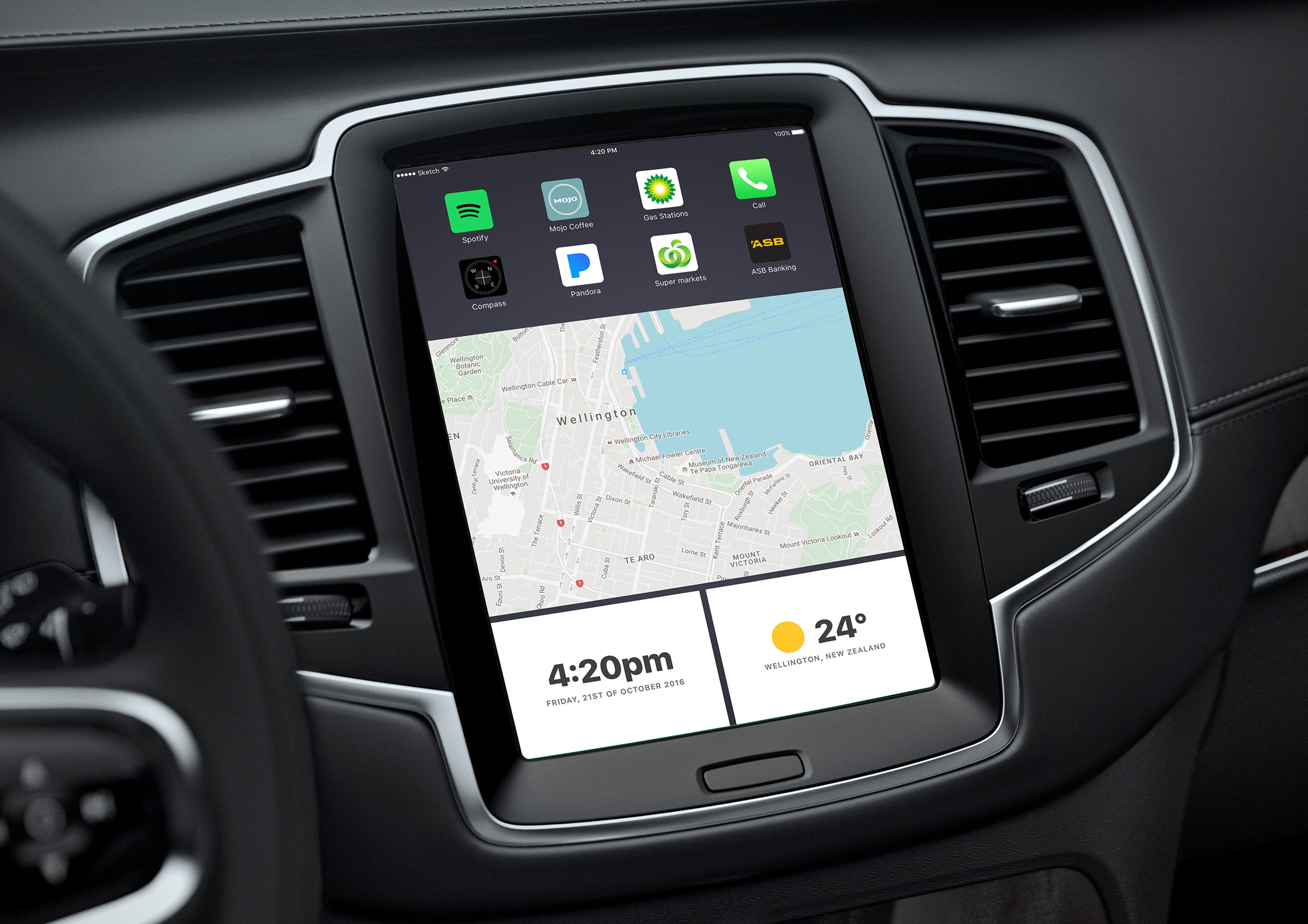
Show the weather in your product
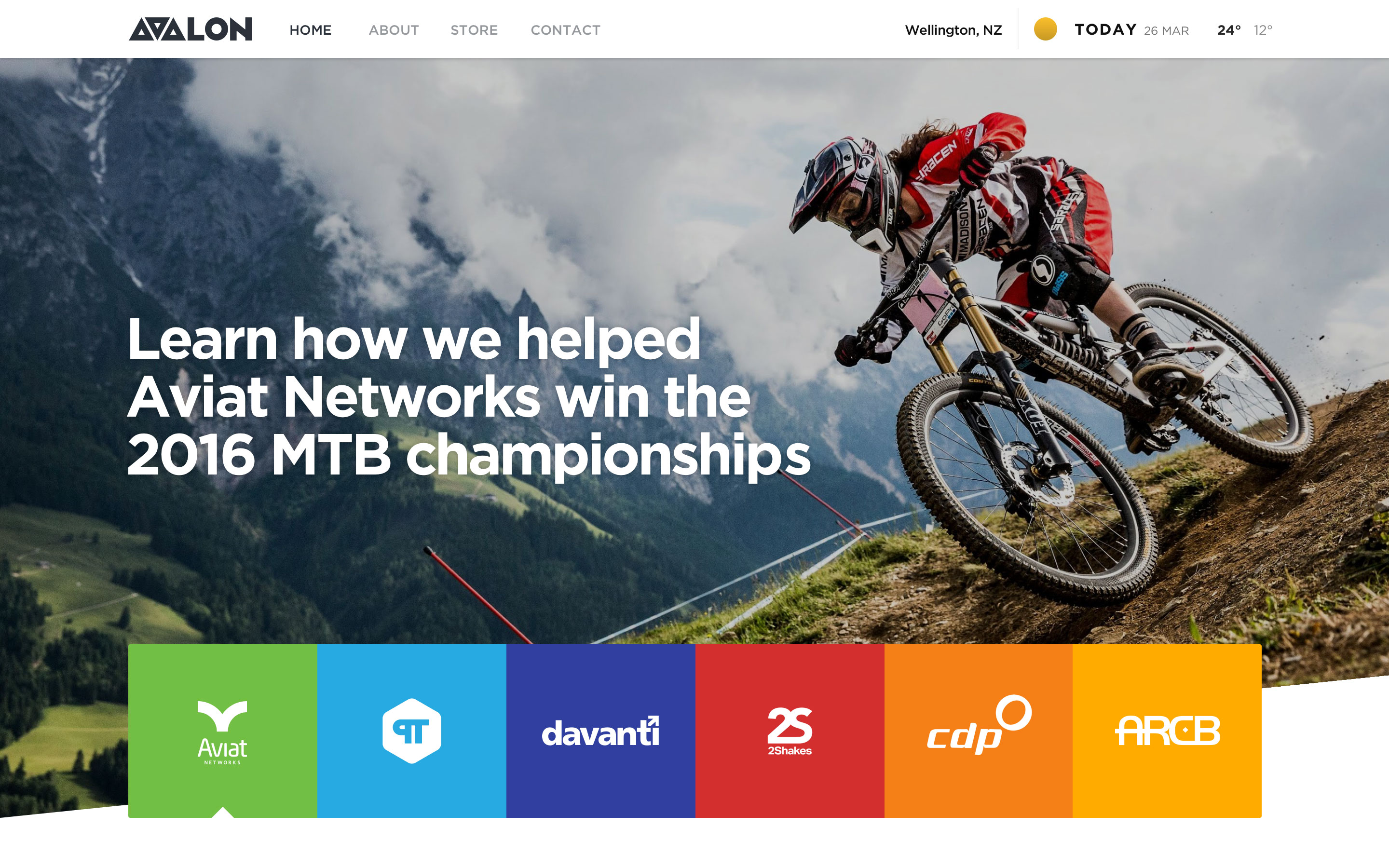
This is an example of how the weather widget is displayed as part of the header navigation of this website. Given the various layouts and configuration options, it could also be incorporated into a sidebar or footer design.
