A practical breakdown of the 10-step design process I've developed over 19 years of UX/UI work, from the initial brief and sketching through to feedback, iteration and delivery.
When people ask me this, I’ll be honest, it’s not something I’d given a lot of thought to. I knew I had a process, I just hadn’t taken the time to write it down or acknowledge it as one. Until now.
I was reading Mike Monteiro’s book Design is a Job. Mike makes the point that there’s no magic “make pretty” or “improve UX” button in design tools, and you can’t consistently pull a rabbit out of a hat for every project. There has to be a solid design process in the background, something you can rely on to produce the work and results you know you’re capable of, sometimes even surprising yourself.
AI tools may help close the gap between what’s in your head and what’s on the screen, however, this isn’t a replacement for time on tools, regardless of what the headlines say. It’s no substitute for coming up with inventive ways to solve problems and delight customers. Use AI as an assistant to bounce ideas off and act as a sounding board.
The 10-step process at a glance
Before we dive into the details, here is a quick look at how these steps break down into four distinct phases:
Discover: Steps 1 -> 2
Core focus: Understand the problem, gather context, and align on project constraints and timeframes.
Define: Steps 3 -> 5
Core focus: Turn insights into rough sketches and early user flows, stress-testing concepts with engineering.
Design: Steps 6 -> 7
Core focus: Lock down the structural design system foundations, responsive layout variables, and rapid prototypes.
Deliver: Steps 8 -> 10
Core focus: Run cross-functional team walkthroughs, protect the user experience, check accessibility, and ship polished work.
You may need to tweak the process from time to time, but the fundamentals are there to guide you. Here’s what works best for me.
1. Start with a brief
A simple conversation with the person you’re working with to learn more about the project. By listening, asking “why,” and digging deeper, you can act as a true design consultant to get a real understanding of the problem they are actually trying to solve. You’ll get a feel for the style, tone, and constraints. In my experience, constraints add clarity. They help you design products in a way that meets client expectations, matches their budget, aligns with their timeframes, and delivers the right level of detail. Great design is all about collaboration. When you operate as a strategic partner and work together with the client, you build trust and produce far better results.
2. Establish a timeframe
After I understand the problem, my next question is usually, “when do you need it by?”
Timeframes are an essential guardrail. Instead of restricting you, they keep you laser-focused and on target to deliver exactly what the product team needs, when they need it. They give you a clear sense of what you can and can’t realistically deliver. Crucially, a well-planned timeframe ensures you meet deadlines, ask the right questions, validate assumptions, and protect the time needed to speak with customers and stakeholders.
During brainstorming, you may need to set aside great ideas purely because of time, but if an idea is strong enough, hold onto it in a product backlog. It might be just what you need on a subsequent release. I’ve lost count of the amount of times I’ve returned to early explorations to help solve future problems. Keep everything.
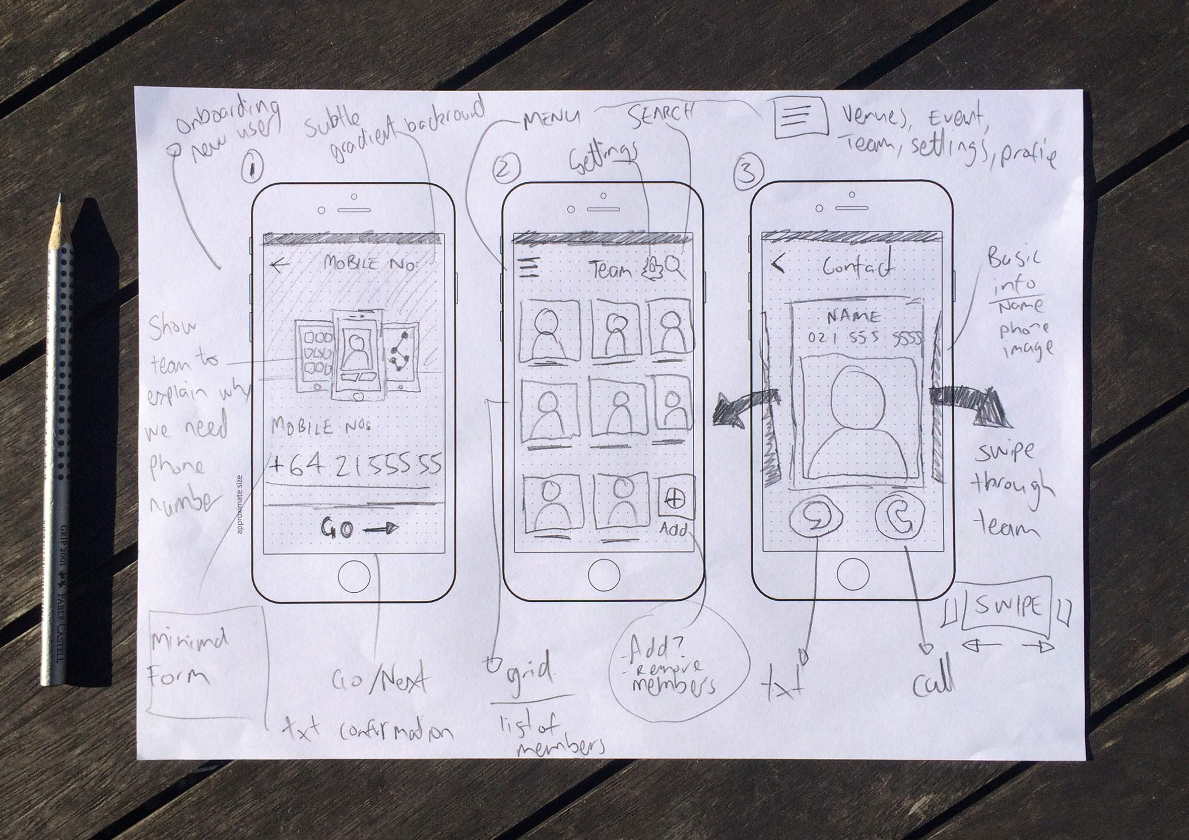
3. Initial sketching
I can output ideas quicker and at better quality using a pencil and sketchpad. It’s also a great excuse to step away from the screen. Going analog means you’re less likely to get distracted by notifications, email, or other interruptions which break your flow and focus. You’re also not burning time focusing on Design 101 problems such as spacing, alignment, and hierarchy. Instead, you’re giving yourself permission to be messy, unrestricted, and inventive.
I recently started using a Pomodoro timer to help timebox me when trying to generate as many ideas as possible. This exercise is all about quantity rather than quality.
In my experience, every time I’ve opened Figma and started designing without a plan or rough sketch first, the results haven’t been as strong and the process has taken a lot longer. With modern design systems, it’s incredibly easy to slide right into high-fidelity execution too early, so I really have to force myself to make time for this step before rushing in.
4. Collaborate with developers
I like to bring developers in early to share ideas and flesh out concepts. The real power in product design lives in “the overlap” having enough cross-disciplinary knowledge to explain what you want, while deeply understanding and respecting the constraints coming back from the other side. Too often, there is a breakdown in communication because designers present flat, idealistic layouts without providing information in a format that makes sense to engineering.
Bringing developers in early is an opportunity to look at a blank canvas together. You can align on technical constraints like existing frameworks, APIs, and limitations before anyone gets attached to a concept. This builds a shared understanding, fosters trust, and completely breaks down the “us vs them” mentality between designers and developers.
5. Re-sketch initial ideas
Back to the drawing board. This is the beauty of design and the reality that your first ideas are rarely your best. Those initial sketches were never precious; they were a conversation tool, because it’s always easier to speak to visuals.
Based on what you’ve just discovered with your engineering team, you can revisit your notepad and flesh out concepts further. This is where you start mapping out user flows and complex interactions. It doesn’t need to be polished, as it can be as simple as boxes, arrows, and callouts to show how a user moves from A to B.
The more you uncover, discover, and deepen your understanding of the problem, the more iteratively you can refine your solution. It’s the perfect time to add missing elements you may have overlooked or simply been unaware of before the technical review.
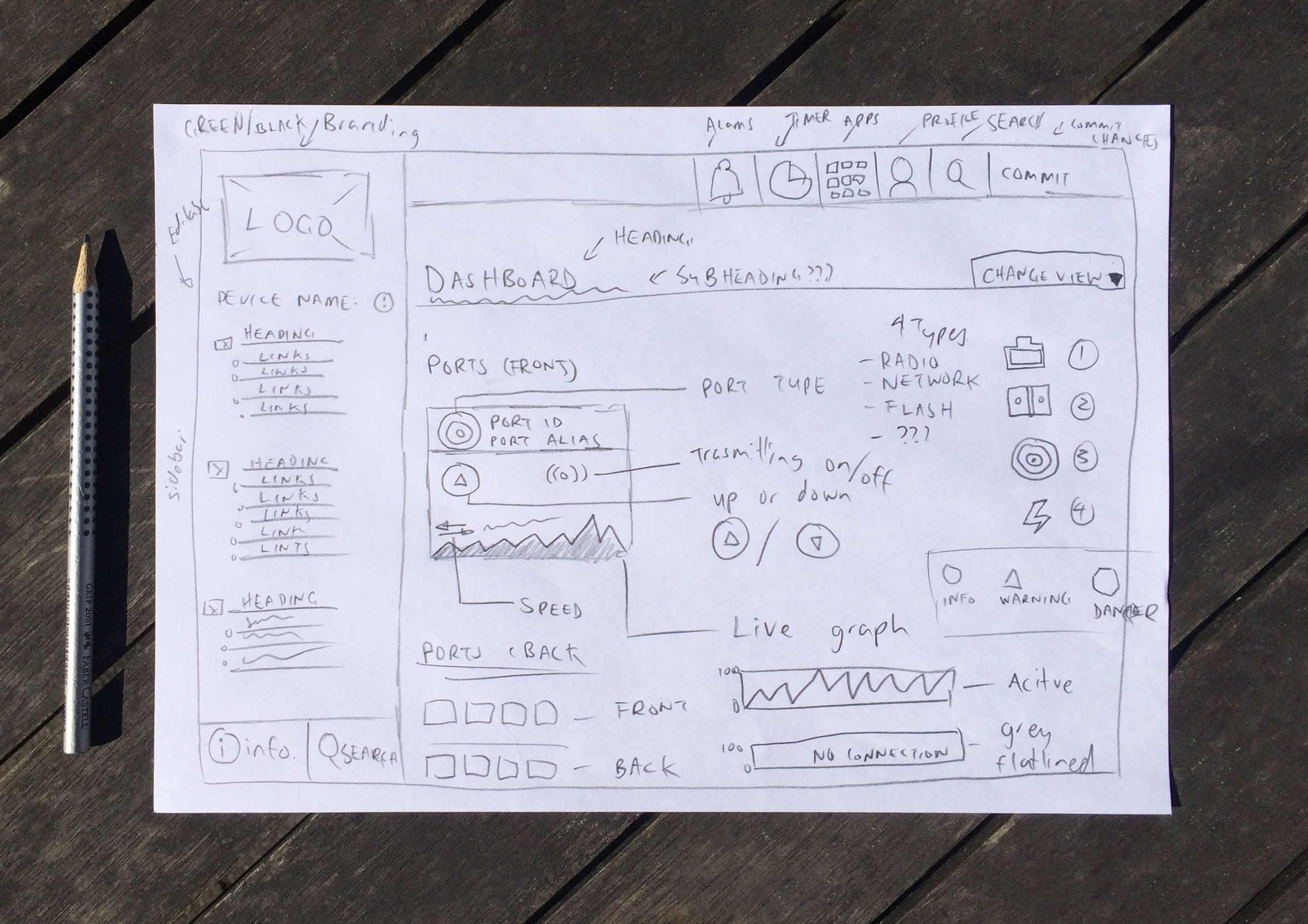
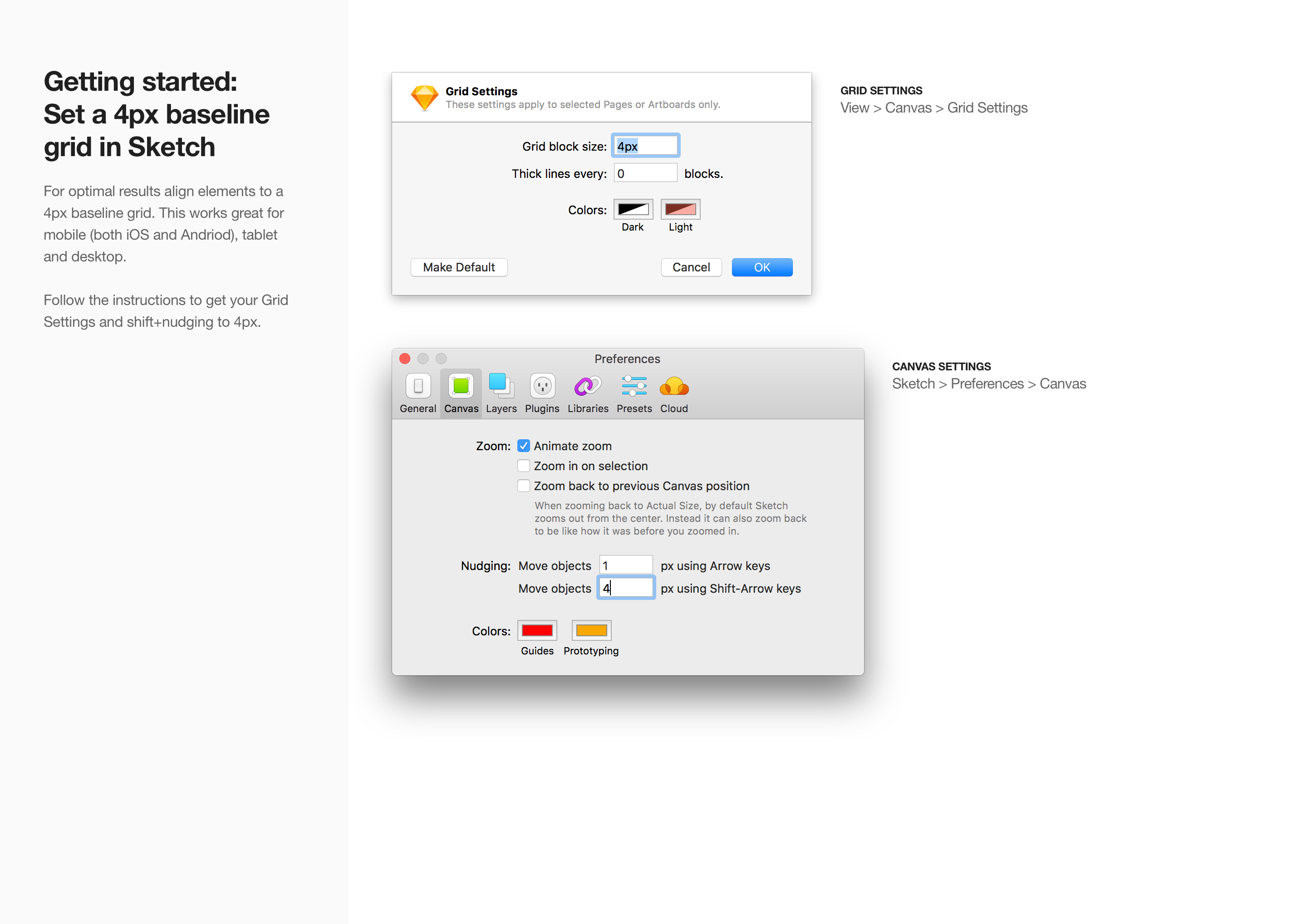
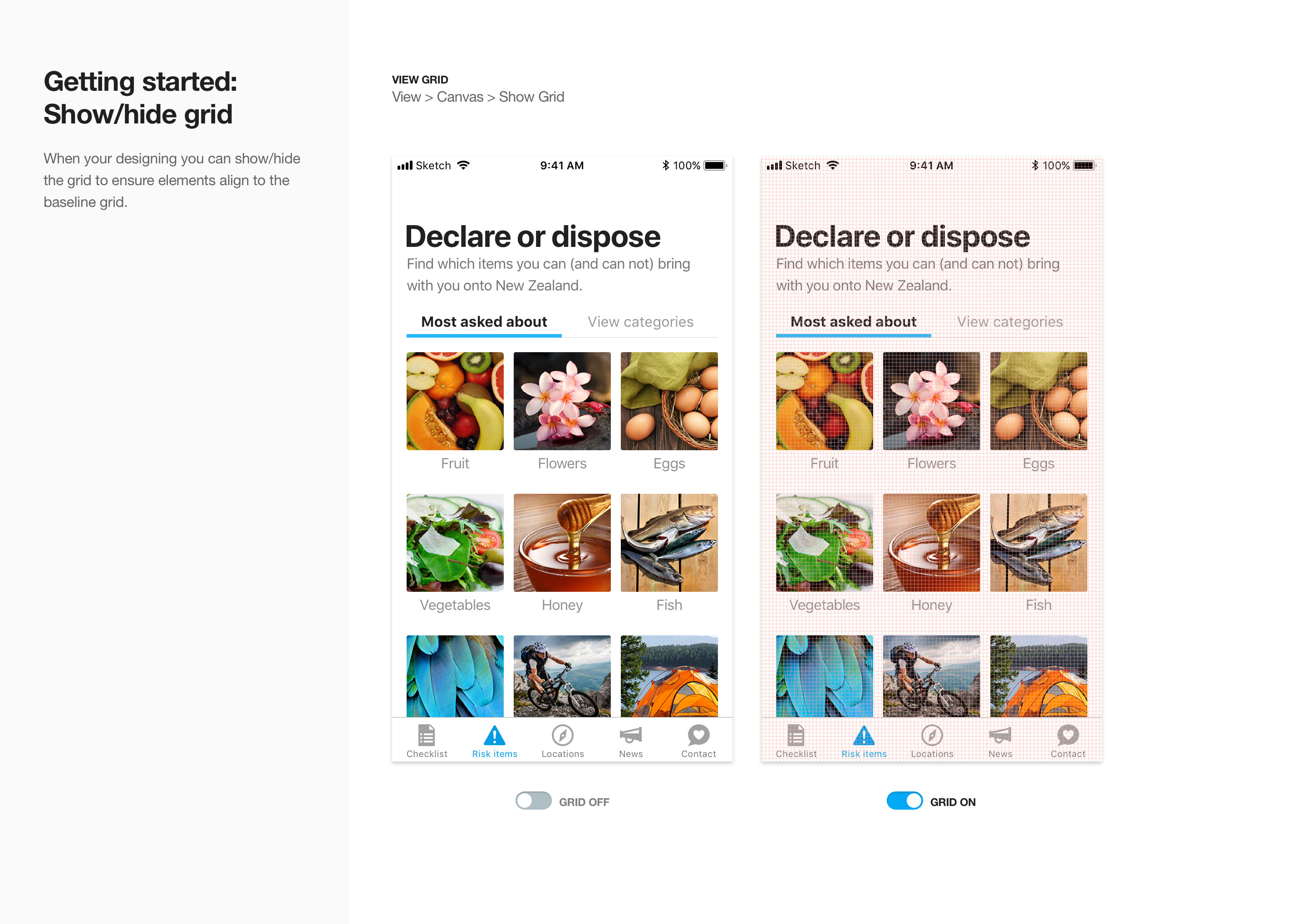
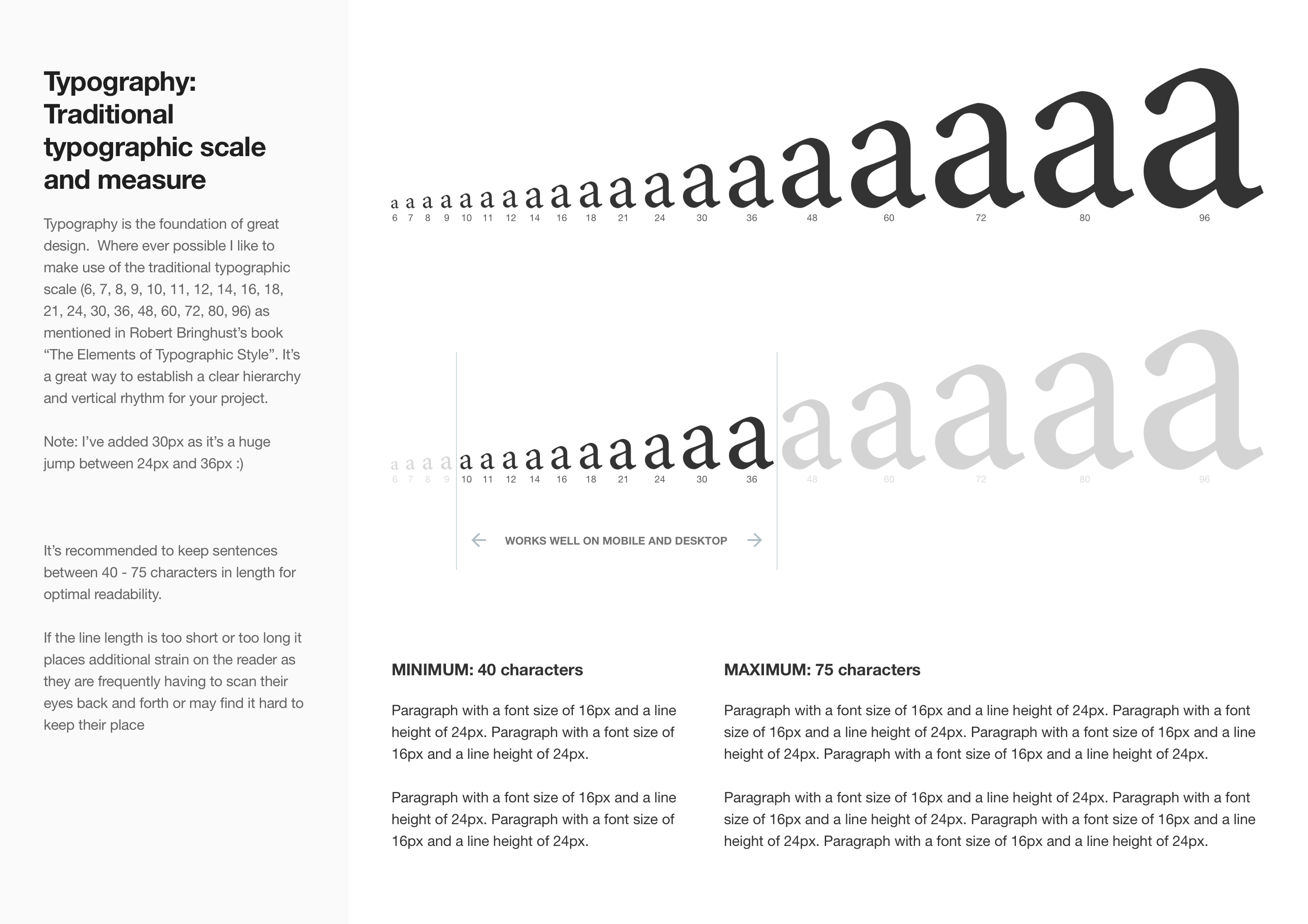
6. Set up the document
Getting the canvas ready. Before touching a single layout, you have to slow down and lock in your structural foundations. When working on modern cloud platforms or mobile apps, this is where you adopt, adapt, and extend the existing design language, ensuring strict alignment with platform standards like Apple’s Human Interface Guidelines or Google’s Material Design.
This means defining your responsive layout grids upfront, establishing your breakpoints for mobile, tablet, and desktop, alongside setting content widths, columns, margins, and padding. You might choose to configure all of these variables right at the start or design them on demand as you go, but the mindset is always the same: build one, use many.
You are establishing a scalable system where component padding is anchored to a rigid 4px/8px baseline grid and type scales follow a consistent ratio. Once this framework is in place, the entire design process becomes infinitely more scalable. Getting these numbers locked in ensures that every subsequent screen feels completely cohesive rather than retrofitted later. It’s the kind of systematic foundation that’s invisible when done well, but immediately obvious when it isn’t.
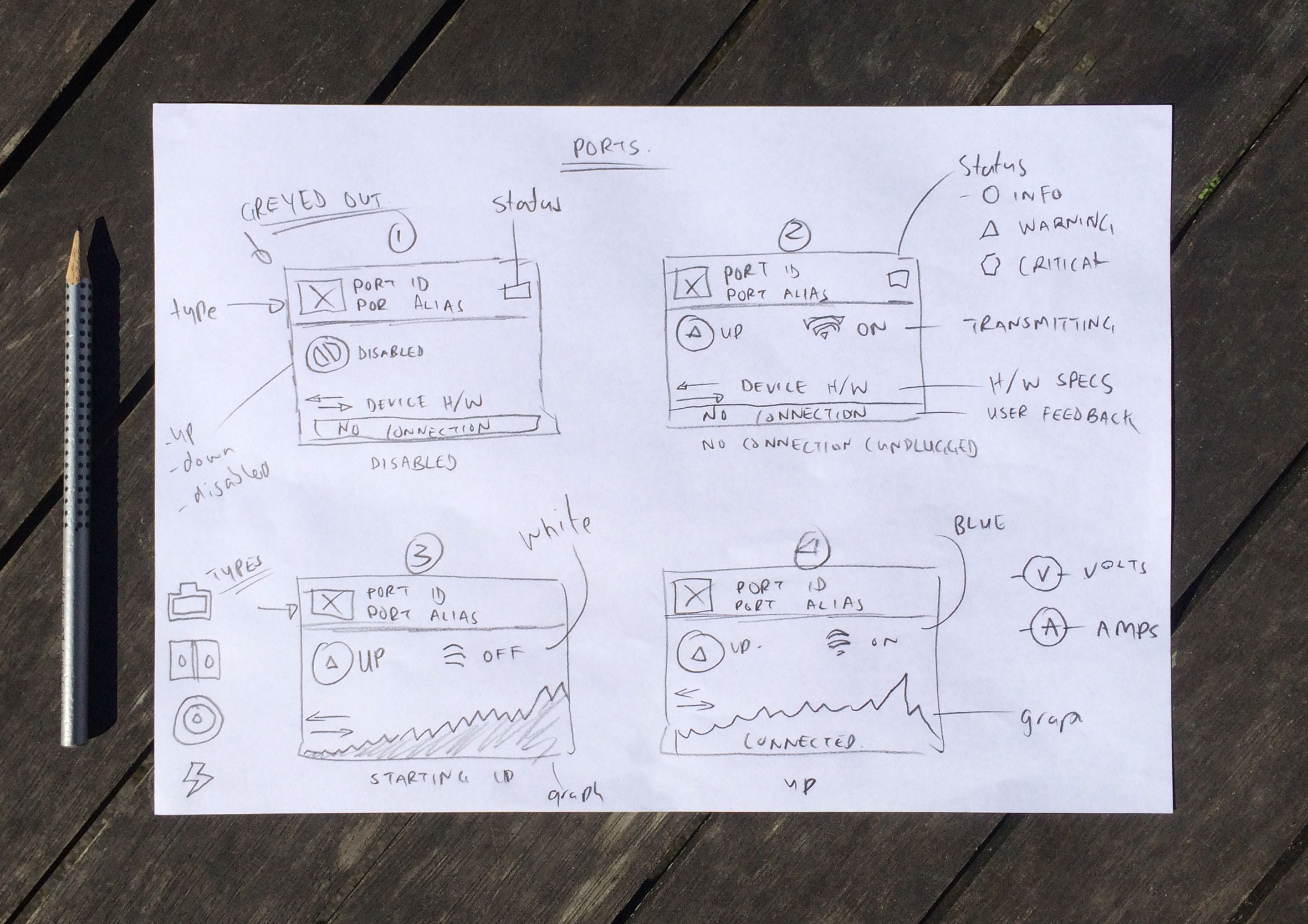
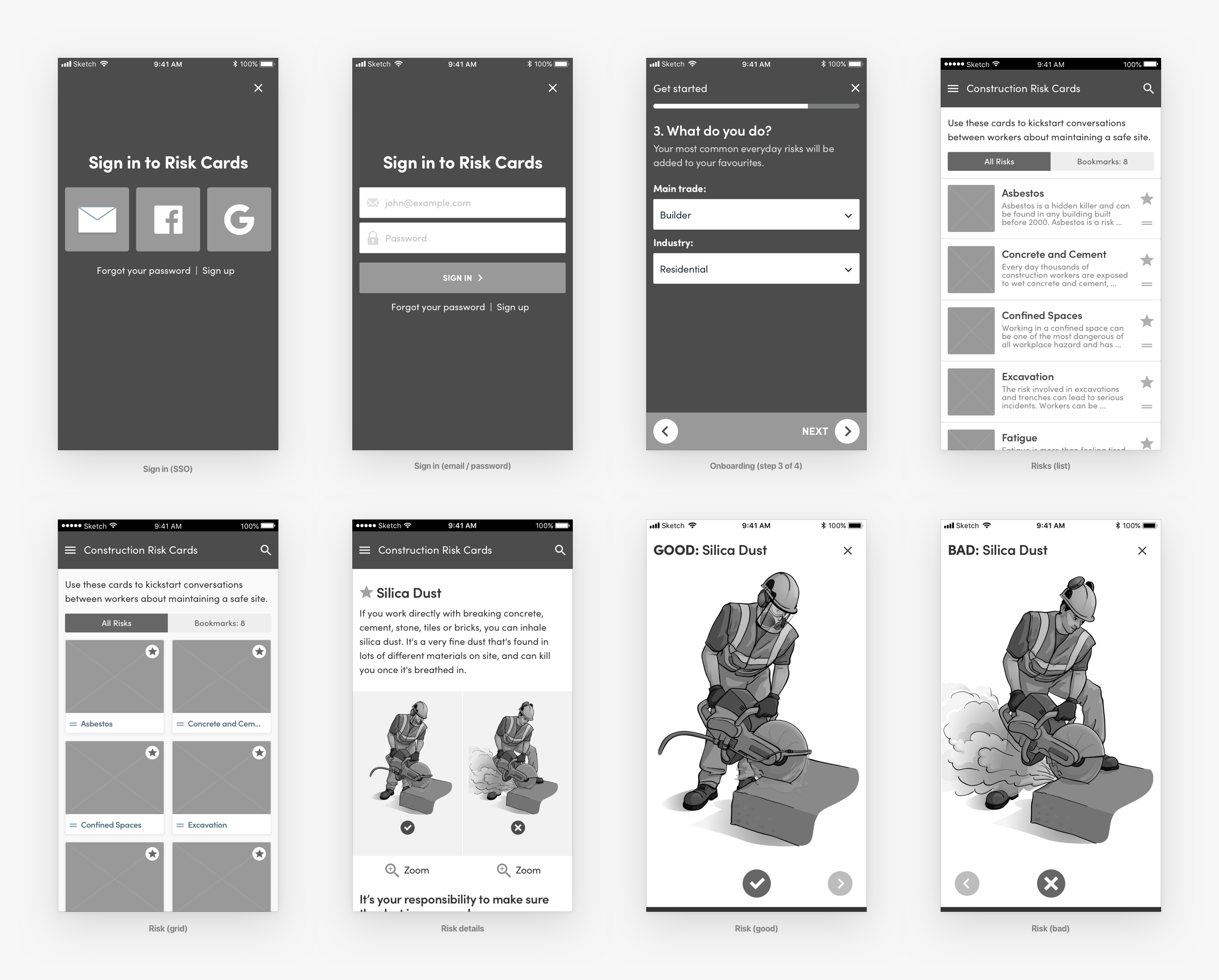
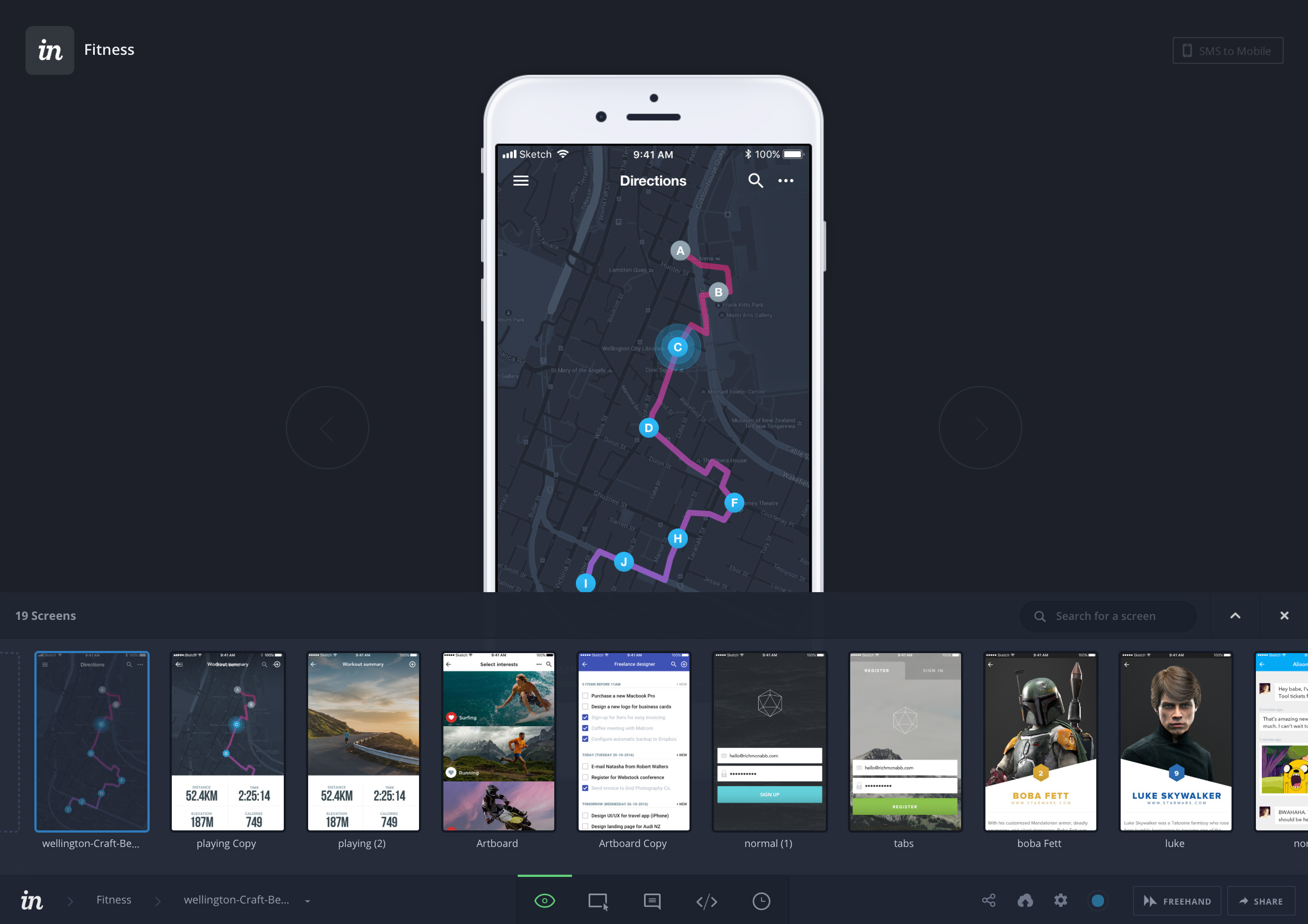
7. Wireframes and rapid prototypes
Depending on the project, I’ll create wireframes or rapid prototypes to map out user flows and basic interactions. The hardest part of product design is rarely coming up with the idea, it is helping other people see it. When a concept is not landing with stakeholders, it usually comes down to a breakdown in communication because you haven’t set the scene well enough or you are missing a vital piece of the puzzle.
Building a rapid prototype is not about precision or winning design awards. Think of it as a communication tool to make the idea real enough to react to. Nothing validates a user flow faster than when your hands are doing the movement, rather than just eyeballing it on a flat design file. This is an incredible way to help people experience what the final product will look and feel like before too much time is invested in polished design.
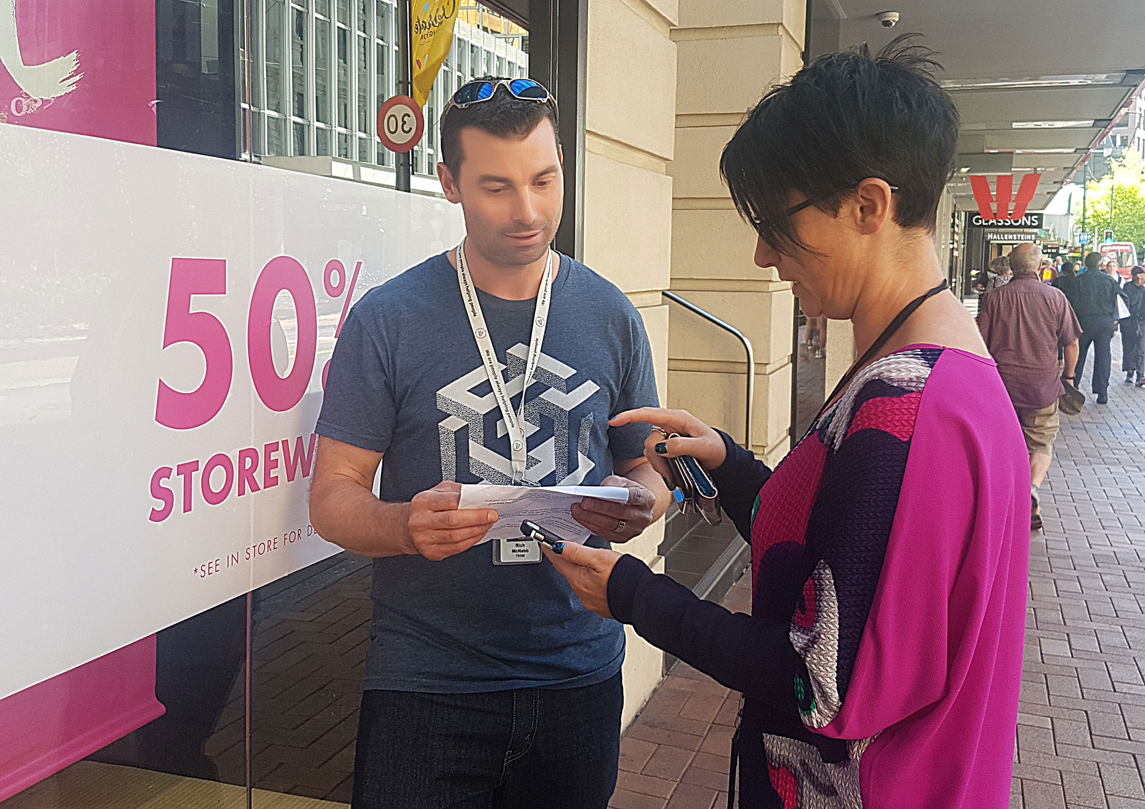
8. Get feedback early and often
Share work early and often. Before heading too far in the wrong direction, I show rough sketches and ideas to get a sense of whether I’ve understood what the client is after. This applies equally to external customers and internal team members.
Instead of waiting for a grand reveal, I run deep-dive walkthroughs with the full product team, bringing together developers, testers, business analysts, and product owners to dissect the designs and user flows as a group. This is a much more in-depth version of showing quick sketches along the way, ensuring absolutely everyone is on the same page.
During these sessions, I deliberately point out the limitations of my own knowledge, ask targeted questions, and provide clear recommendations for areas of improvement. By gathering feedback collectively, we catch technical and logical blind spots early. It might feel uncomfortable showing unfinished work at first, but you waste less time and design with greater confidence when you know you’re on the right track.
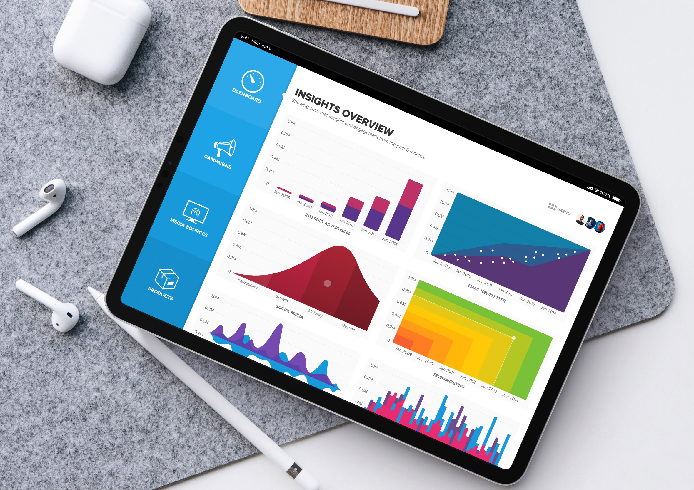
9. Explain your decisions
Always show your work and walk people through it. At the very least, record a video of yourself doing a walkthrough of the design and invite people to follow up with an in-person chat or a quick video call. This gives your team the flexibility to digest the concepts on their own time while keeping your rationale completely intact.
Sell your designs: When people understand your process they’re more likely to get behind your work. It builds trust and makes it easier for them to see the value in what you’ve created.
Defend your work: You were hired to do a job someone else doesn’t have the skills to do. Be prepared to explain why a requested change could compromise the design and, more importantly, the message it’s trying to communicate. This requires a delicate balance: you have to know when to stand your ground to protect the core user experience, and know when to compromise to keep the project moving forward.
10. Reiterate, polish, deliver
Take the feedback on board and ask the right questions to make sure you understand what the stakeholder or client actually means.
Statements like “The logo needs to be bigger!” could actually mean “We feel like it’s not getting enough attention compared to the rest of the page” once you dig a little deeper. As a product designer, your job is to translate those subjective comments into objective design problems.
This final phase is also where the invisible work happens. It is where you thoroughly check your contrast ratios, font sizes, and touch targets to ensure the interface complies with modern accessibility standards (WCAG). Designing for everyone isn’t an afterthought; it is built into the final delivery.
Keep polishing, refine the edge cases, and deliver on time. I want the work I produce to reflect the best I’m capable of. I love design, and I want to keep growing.
Recommended reading
I picked up a copy of Design is a Job by Mike Monteiro. I can’t recommend it highly enough for anyone trying to navigate the business side of creativity.
Finding your own process
A design process isn’t a rigid set of rules written in stone. It is a flexible framework that evolves alongside your experience, the industries you work in, and the teams you partner with. Whether you are a startup trying to find product-market fit or working within complex enterprise design systems, having a reliable baseline allows you to navigate ambiguity with total confidence.
Over 19 years as a Wellington product designer, this 10-step approach has been my anchor. Not because it never changes, but because it gives me something to push against when a project gets complicated.
If you are curious to see how these steps translate into real-world outcomes, take a look at my design experience and work history to see the types of complex problems I love to solve. Every project is an opportunity to refine how we work, break down silos, and build digital products that people genuinely love using. All the best finding a process that works for you!